 Plus
Plus

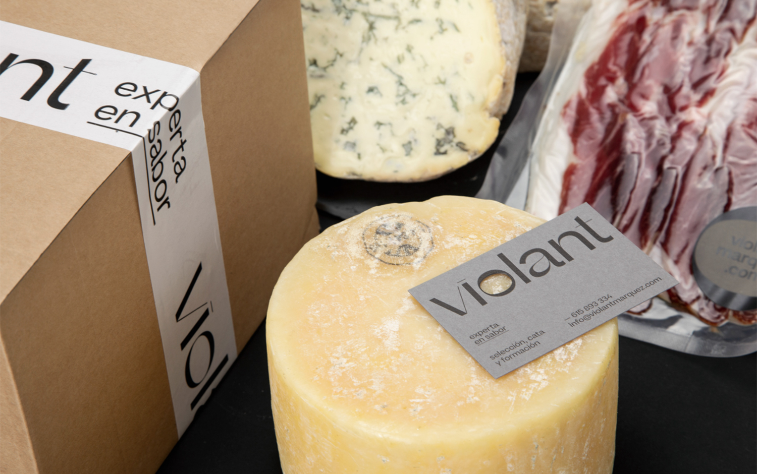
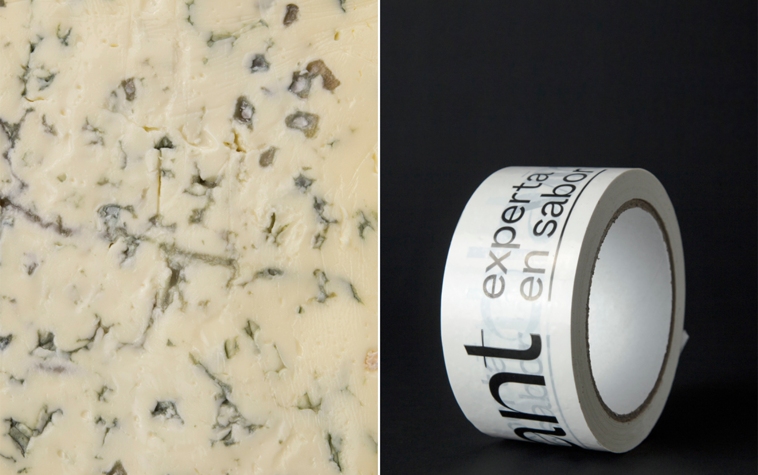
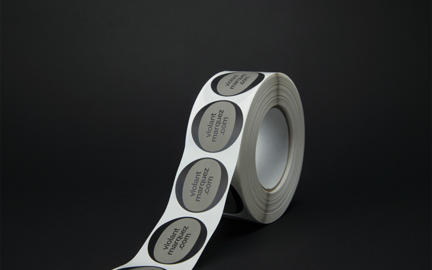
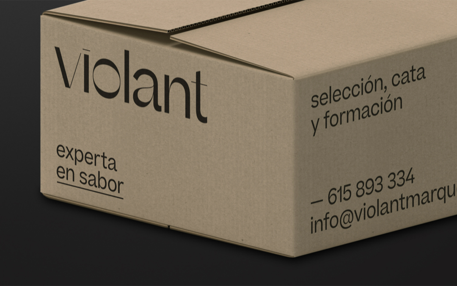
Today, we're taking you to the largest Iberic country well-known for its charcuterie and exquisite foods. Violant Márquez is passionate about gourmet products that select and handle only the best for her clients of all Spanish regions. To increase and expand her business, she asked Palouzié Studio to design a new identity and label system.
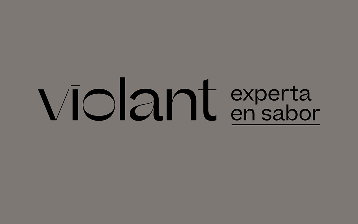
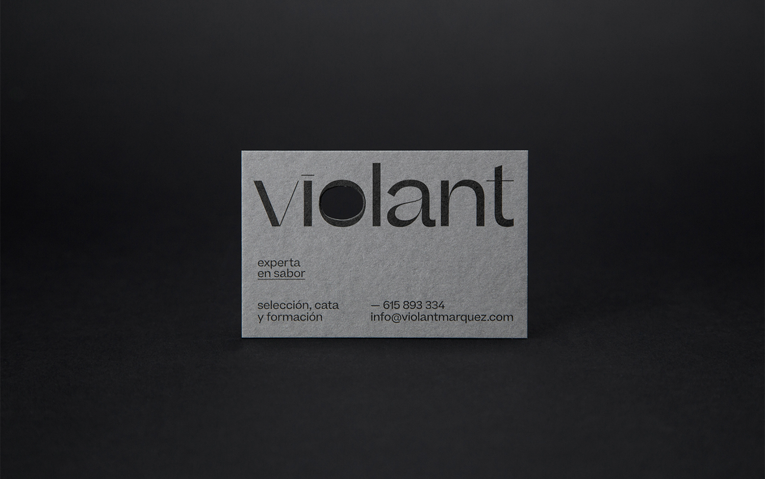
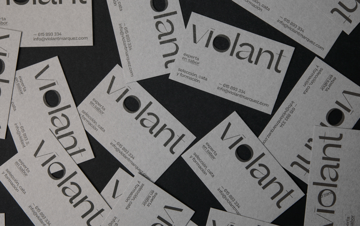
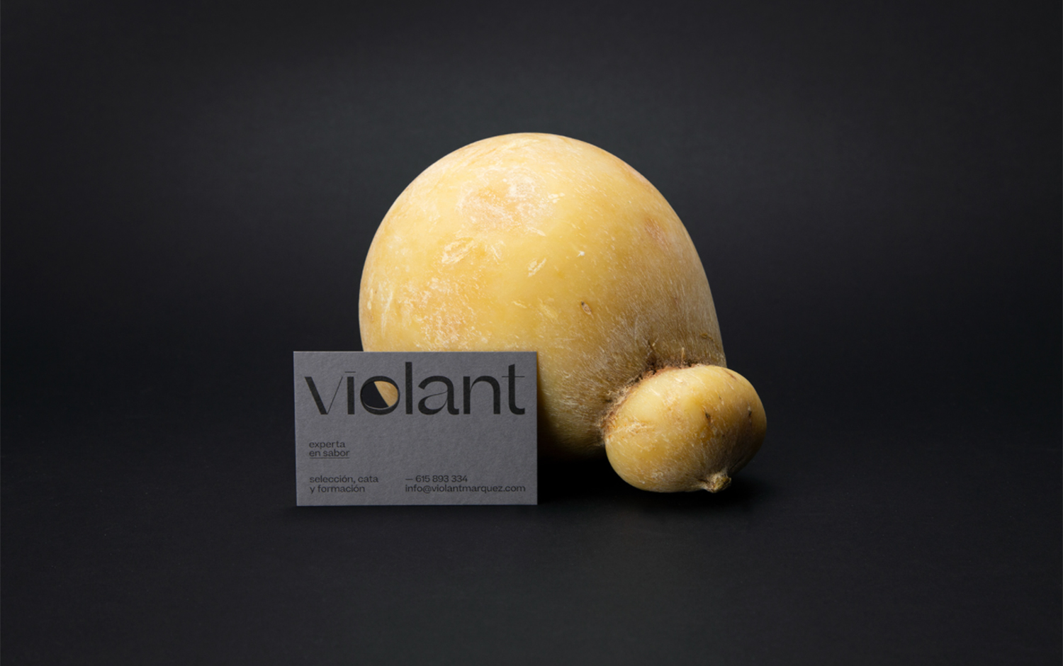
With the exactness of a sculptor, Violant's specialty is acorn ham hand cut. Also, she offers tasting events and training lessons. However, she is famous for ham-cutting, cheese, salmon, oil, or wine lots complete the experience. Palouzié Studio creatives came up with a mostly typographic design, for which they customized it to bring uniqueness and recognition to Violant's brand. Plus, it reminds us of hand-cut products. The font's flexibility correlates to the variable with Violant's slices. Moreover, the center icon is the letter O, representing the sight when selecting products and the taste when tasting them.
All in all, each element combined with others creates an ultra-balanced composition. Palouzié Studio designed a brand that perfectly matches Violant's personality, emphasizing her elegance, femininity, professionalism, and experience.
Credits: Palouzié Studio
