


Irene Salvadeo
ItalyFebruary 23, 2026
Mindsparkle Mag


Bringing Liguria’s most iconic street food into Milan — with a visual language as bold as its flavor.
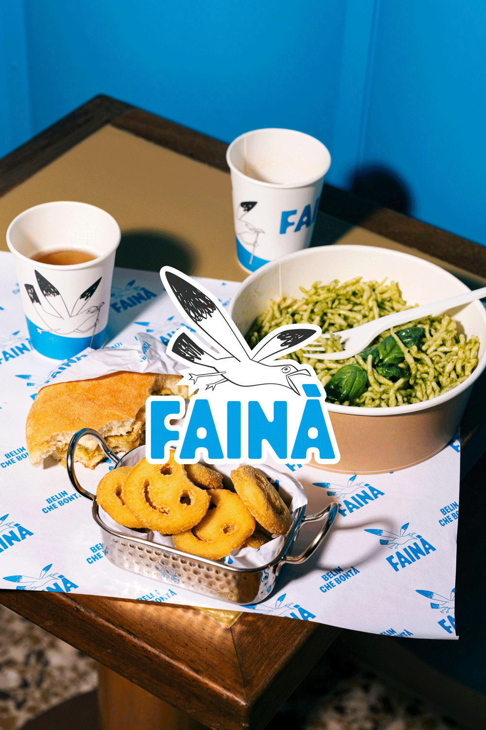
In Liguria, farinata is not just food — it’s ritual. Baked in large copper pans, sliced into irregular triangles, eaten standing up with paper wrapped around your hands, it belongs to everyday life. Made from chickpea flour — or wheat flour in Savona’s version — it represents the kind of cuisine that doesn’t try to impress. It simply exists. Honest, essential, deeply territorial.
Transplanting something so culturally rooted into Milan could have easily resulted in a nostalgic copy-paste. Instead, Fainà Milano chooses reinterpretation over imitation.
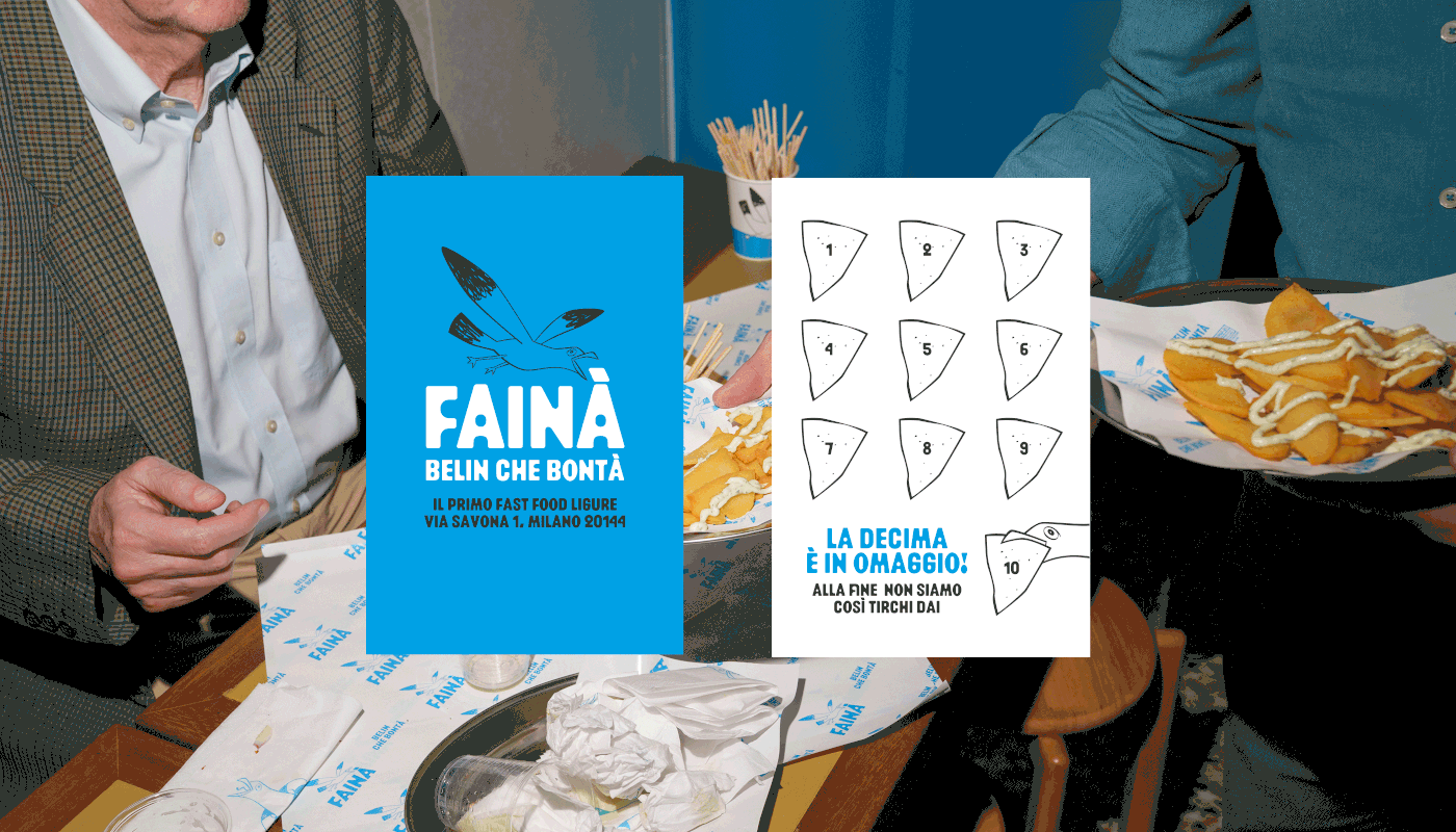
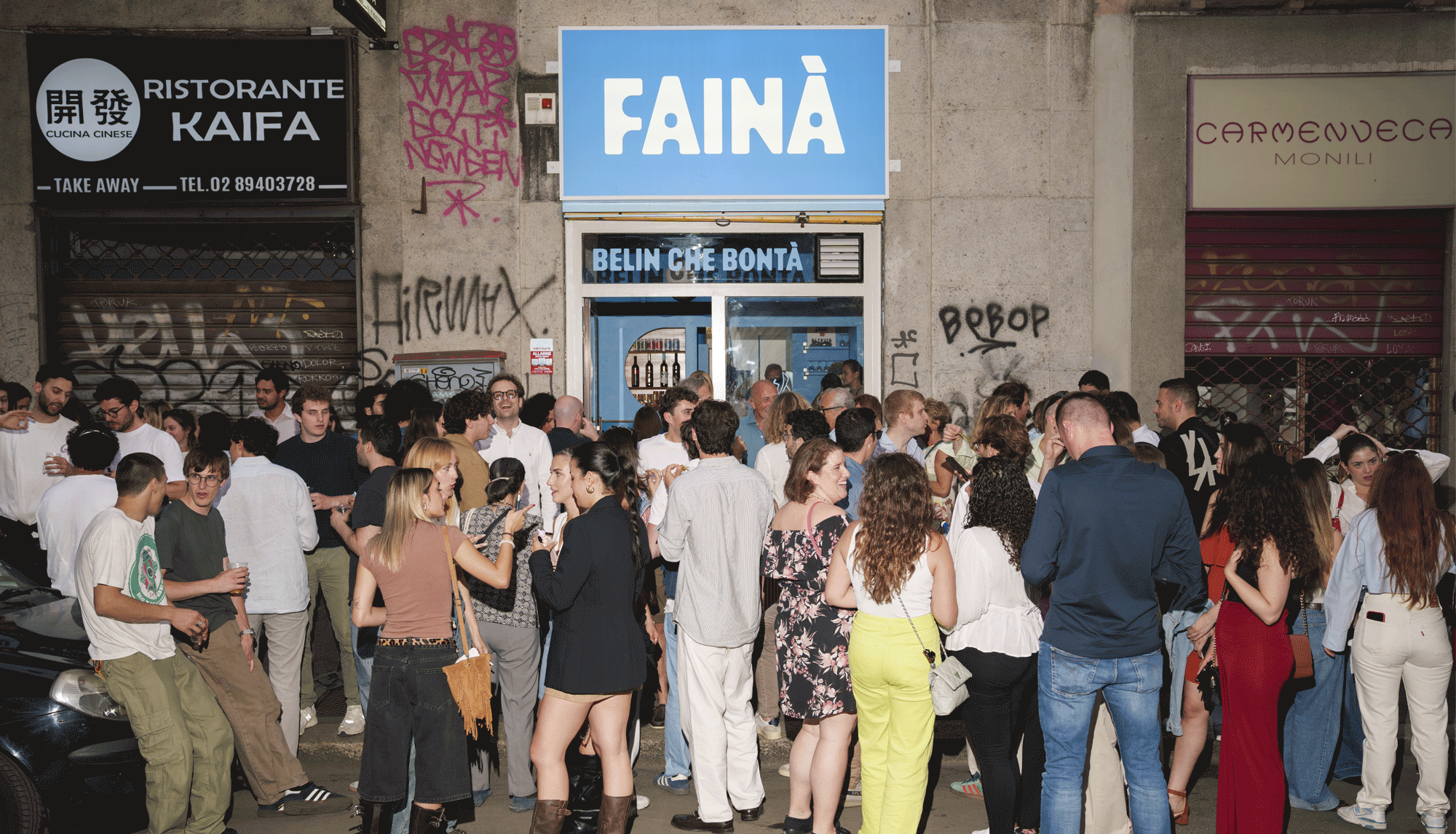
Located on Via Savona — a name that quietly nods to Ligurian geography — the street food concept translates coastal memory into an urban visual system. And it does so with remarkable clarity.
The entire identity, designed by Irene Salvadeo, builds a bridge between places through color, typography, packaging, and motion. Rather than leaning into rustic clichés, the brand adopts a contemporary, almost graphic boldness. The dominant Mediterranean blue immediately evokes sea and sky, but in a saturated, urban key. Paired with crisp white and black linework, it feels confident, young, and unmistakably Milanese.


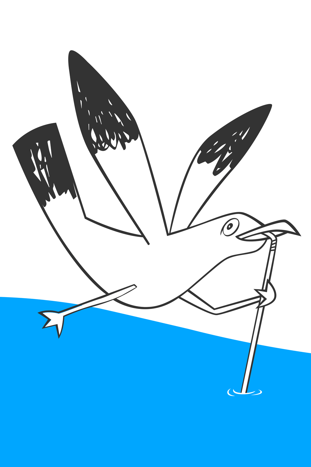
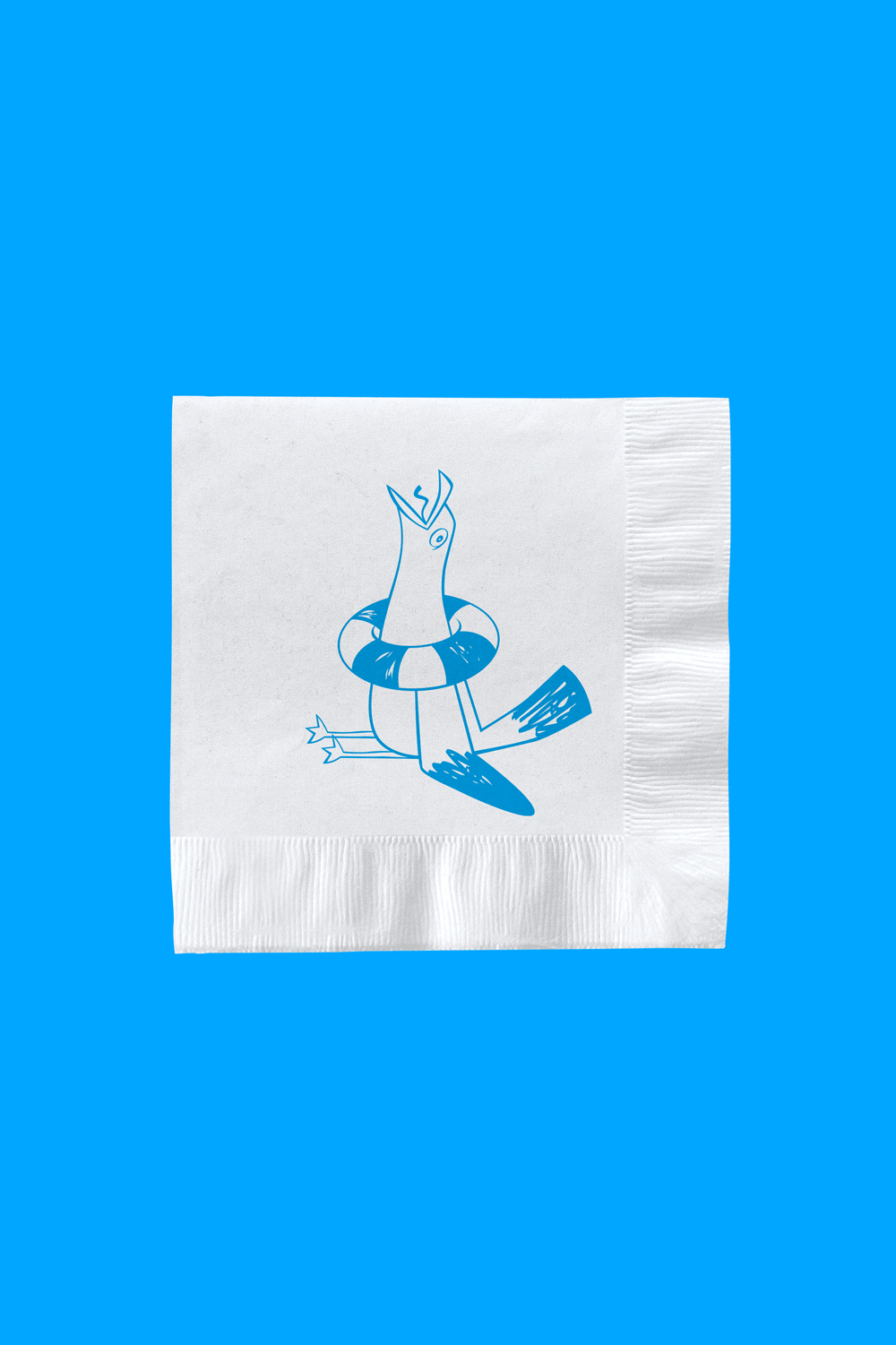
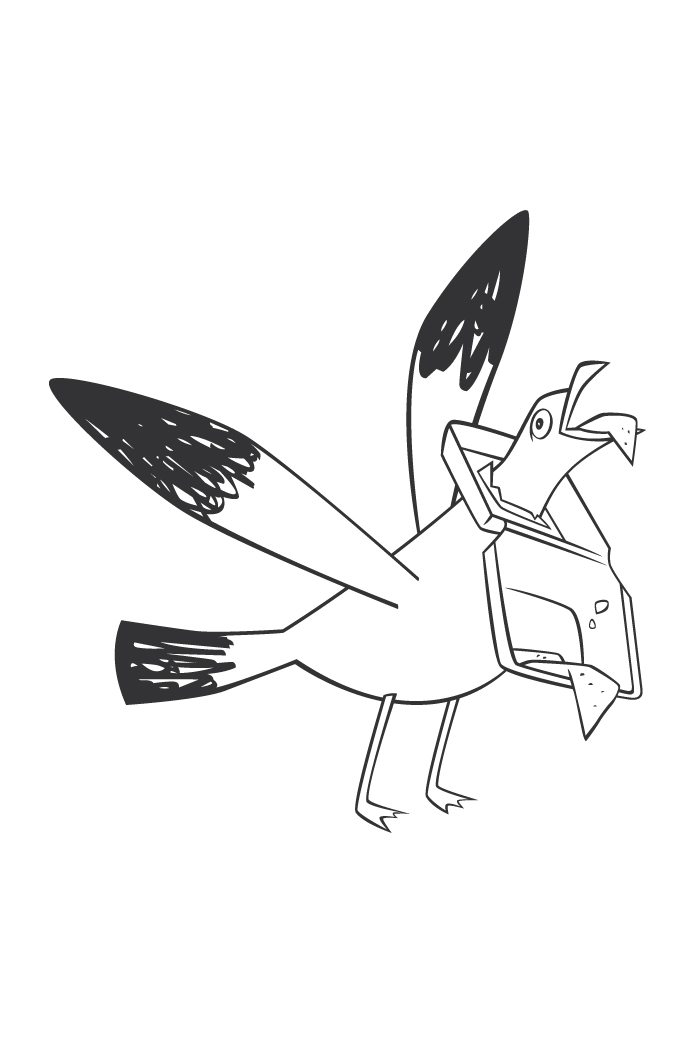
At the center of the system is the seagull — illustrated and animated by Ester Zirilli. A familiar coastal presence, the seagull here becomes more than a symbol; it becomes a character. Its simplified, slightly playful outline gives it personality without turning it into a cartoon. It flies across packaging, cups, loyalty cards, and motion graphics, acting as a connective thread across touchpoints. The decision to keep the illustration clean and linear makes it highly adaptable — equally strong in static applications and animation. It’s a mascot, but with restraint.
Typography plays a crucial role in balancing nostalgia and modernity. The choice of Maroni by Calame Bureau is particularly effective. Its rounded, generous letterforms feel almost edible — soft yet substantial. The weight distribution and slightly compressed proportions give the wordmark presence without aggression. There’s a friendliness in the curves, but also authority in the bold structure. It avoids the overused retro-Italian trope and instead delivers something contemporary that still feels rooted in tradition.


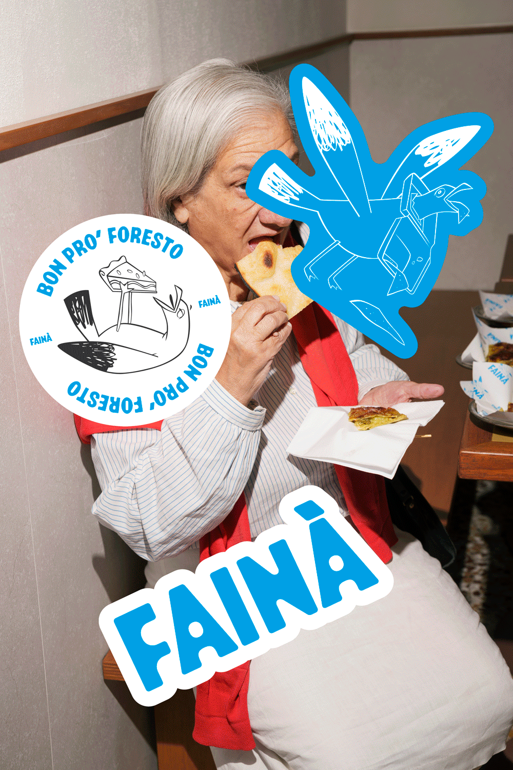
The word “FAINÀ” itself becomes an object — large, tactile, and almost sculptural across posters and packaging. It’s not decorative; it’s declarative.
Packaging reinforces the concept with equal strength. From takeaway bags to wrapping paper and loyalty cards, every surface carries the identity cohesively. The blue blocks of color create instant recognizability, while the seagull and typographic treatments maintain consistency. Even the stamp-style loyalty card — offering the tenth slice as a gift — reflects the street-food informality while maintaining graphic rigor.


What makes Fainà particularly compelling is its balance. It doesn’t romanticize tradition, nor does it strip it of meaning. Instead, it translates it — visually and culturally — into a Milanese context.
The result is more than a fast-food spot. It’s a small migration story told through design — where a seagull leaves the Ligurian coast and finds a new perch in the city.
.
Credits: Irene Salvadeo


