 Plus
Plus

Coach, a Flavor-First Take on Better-For-You Chocolate Spreads
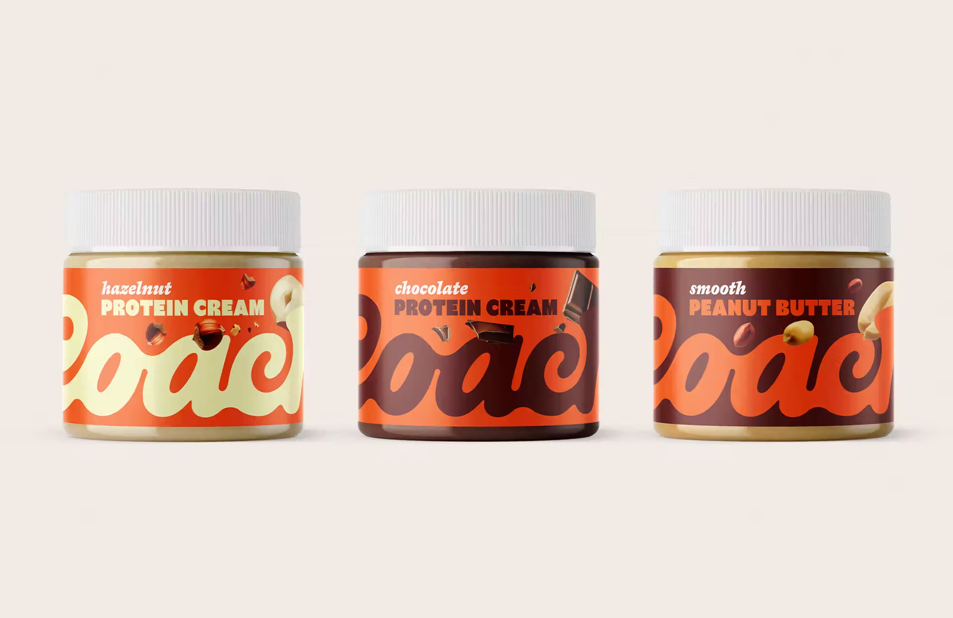
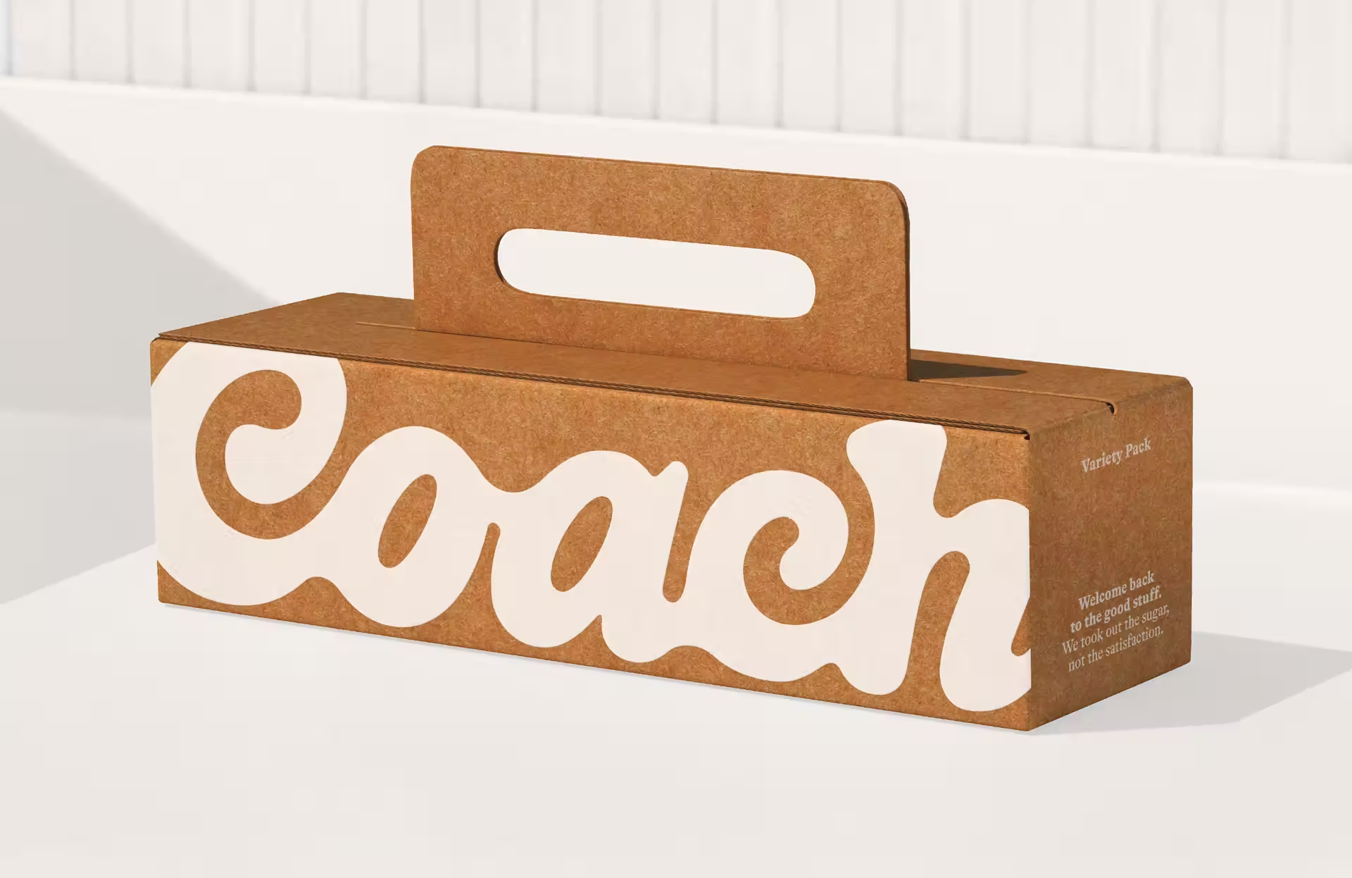
Relish redesigned Coach, a sugar-free, protein-boosted chocolate spread, with a warm, unified system that signals ˝this tastes amazing˛ at a glance, then lands the clean-label proof where shoppers expect it.
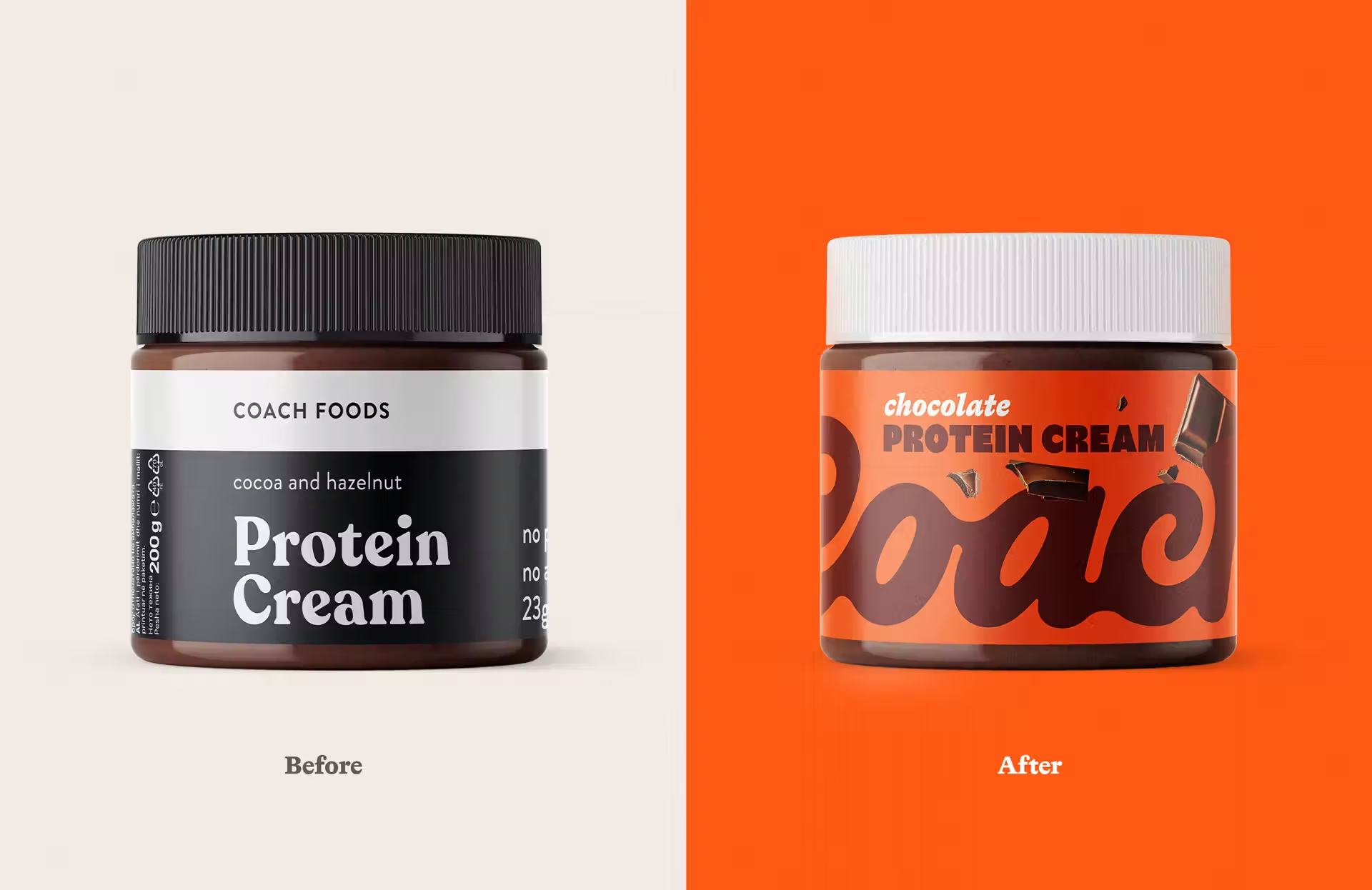
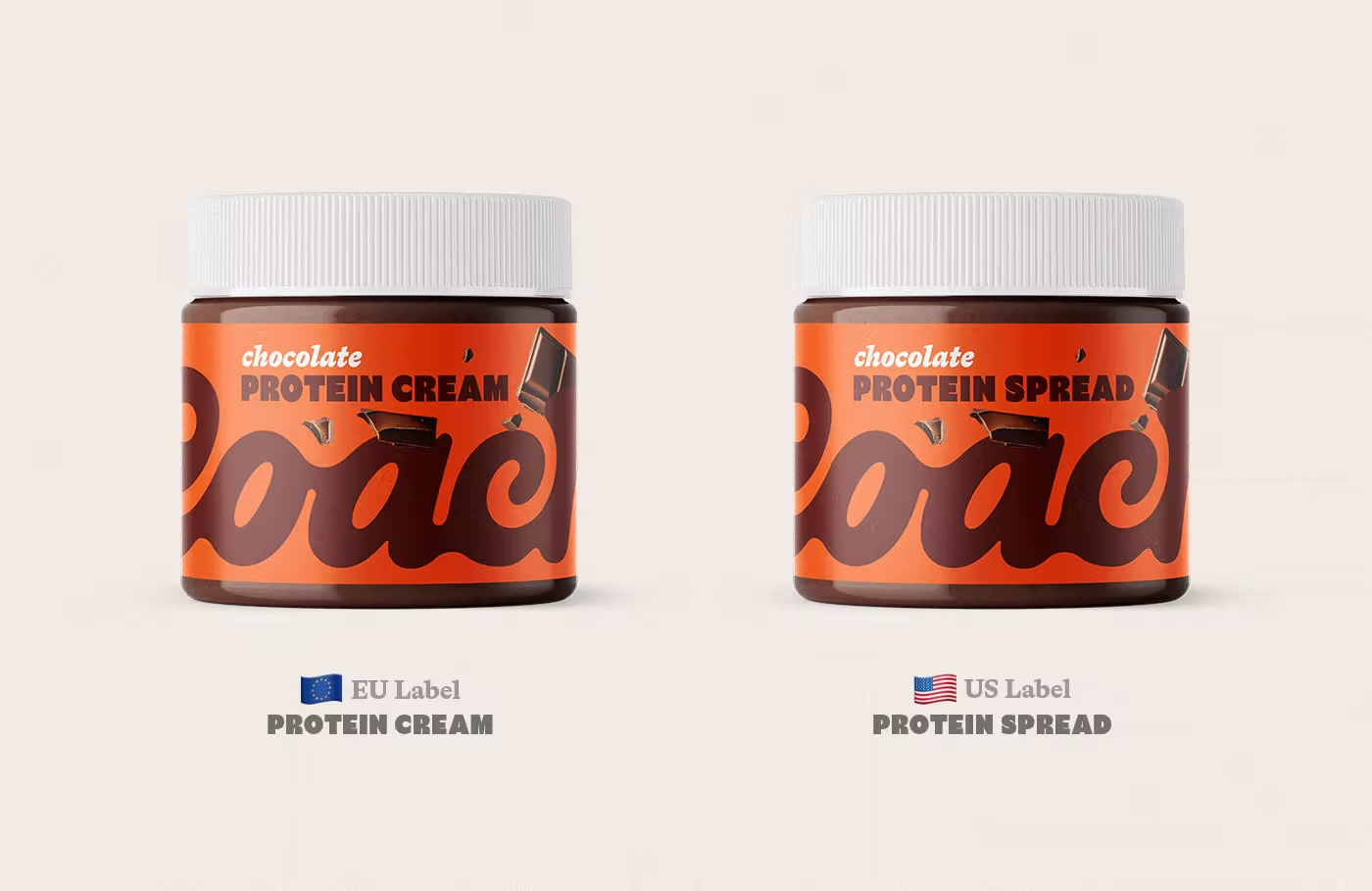
Coach Foods makes Nutella-style spreads without sugar, sweetened with alternatives and boosted with protein. The taste is indulgent, the profile is cleaner, and the promise is nostalgic comfort without the crash. The problem, their old pack did not say any of that on shelf. Each flavor used a very different color, pink next to black next to blue, so the range felt scattered. Minimal design read as neat, not craveable. In a loud aisle, the jars were easy to miss.
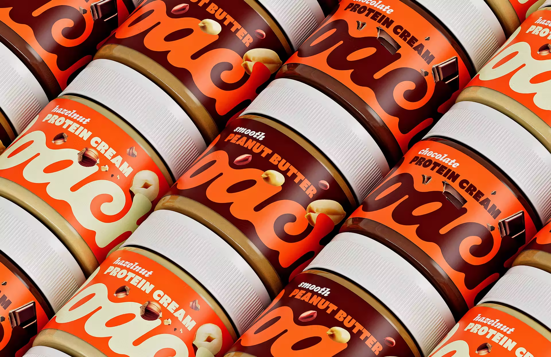
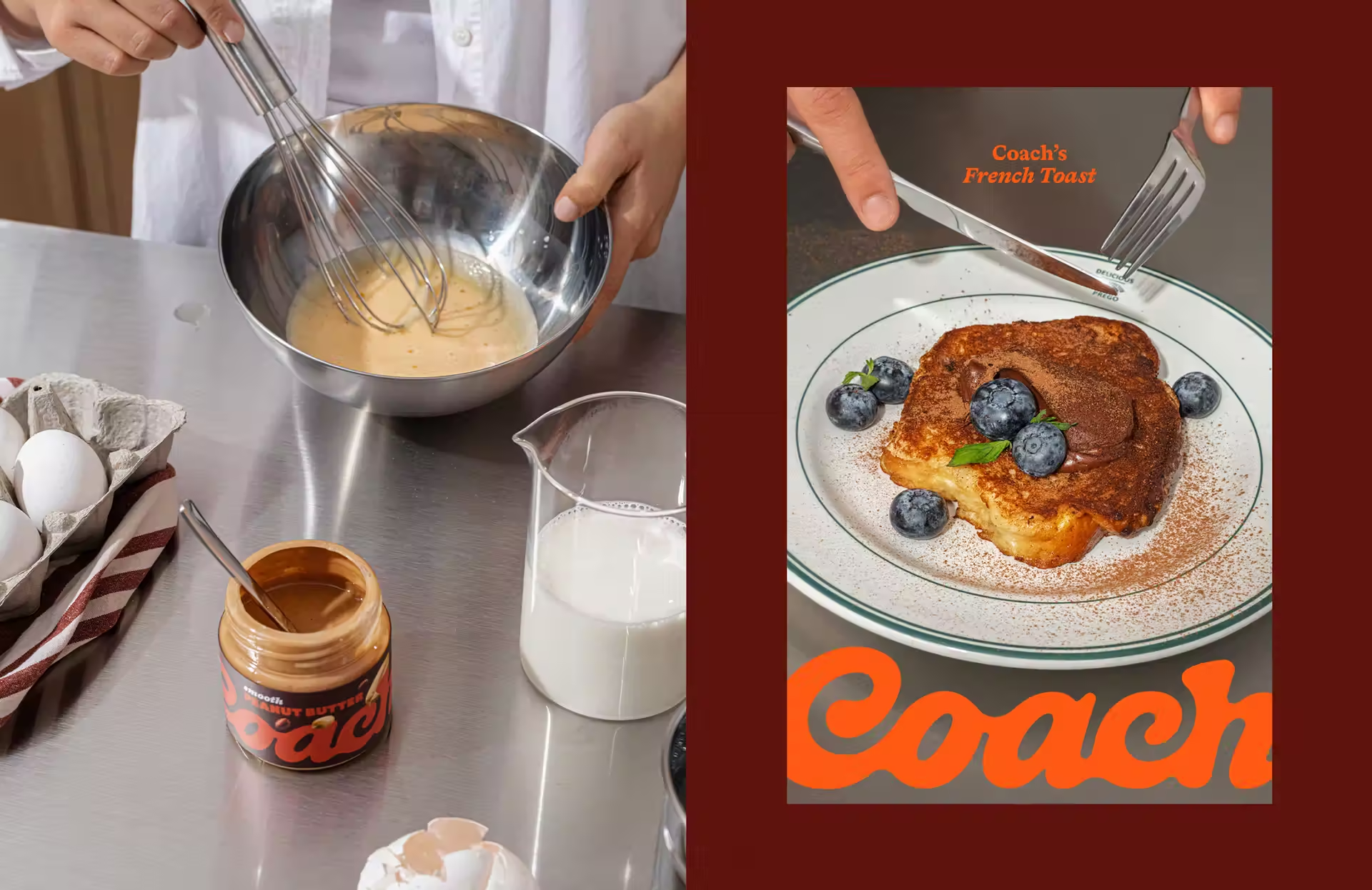
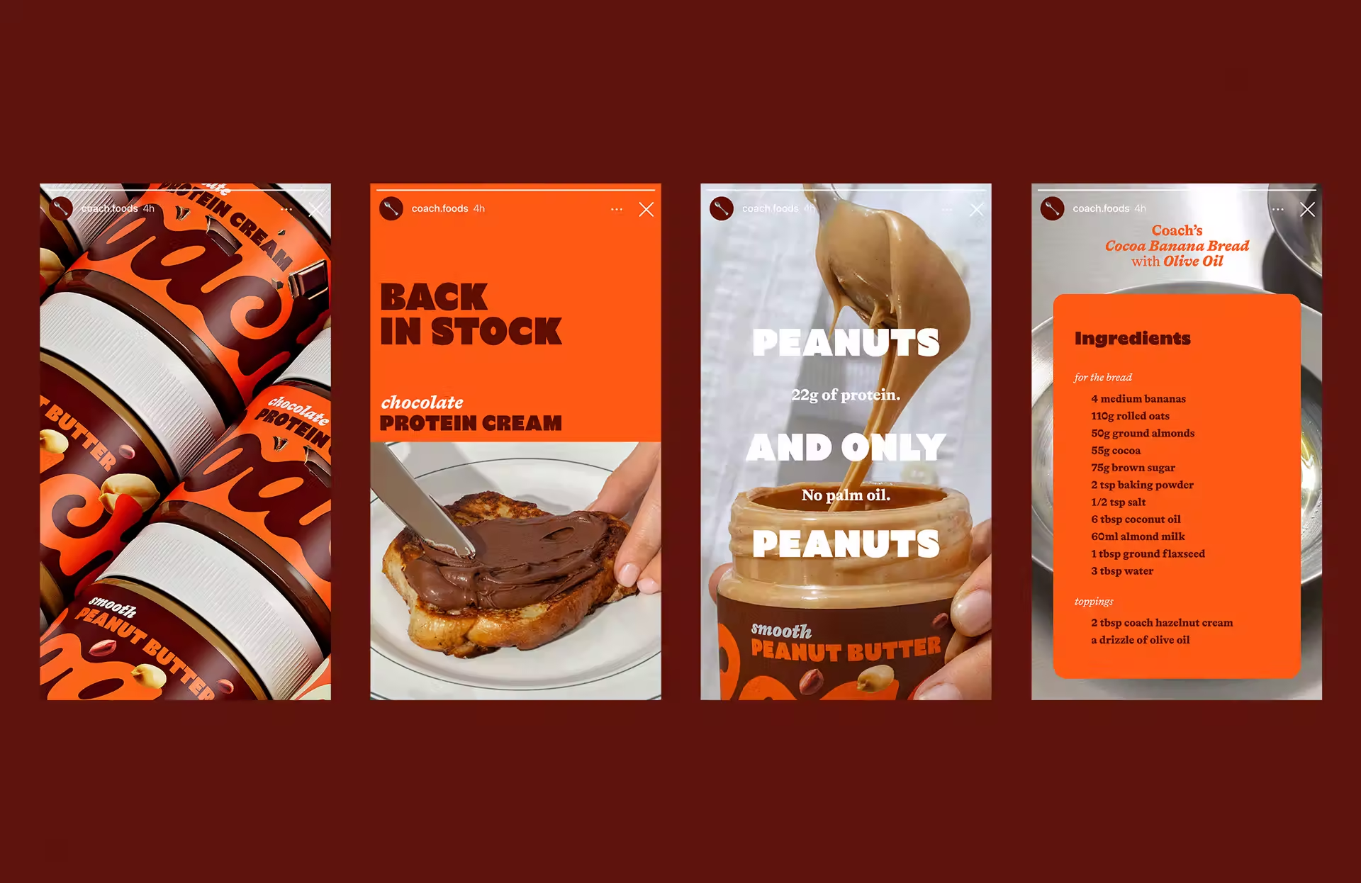
Relish reset the hierarchy. Flavor first, clean label second. The name shortened from Coach Foods to Coach for clarity and recall. A warm core palette now ties SKUs together so the brand reads as one family from a distance. Up close, small ingredient cues, peanuts, hazelnuts, chocolate pieces, help shoppers find their flavor without cluttering the label.
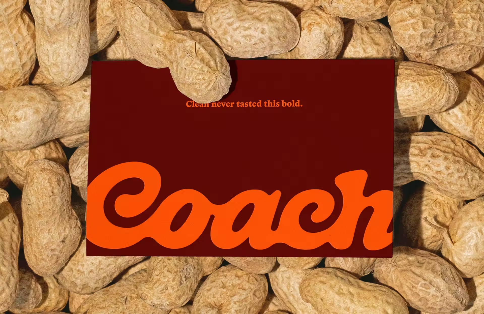
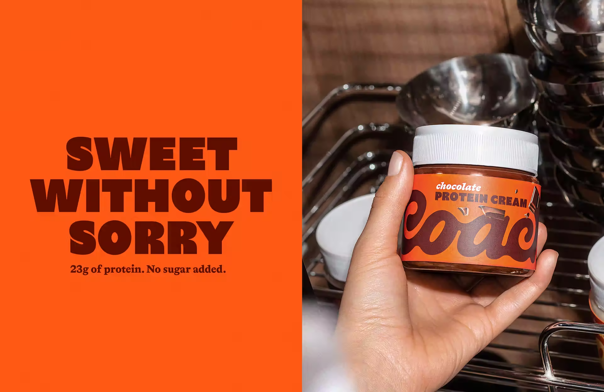
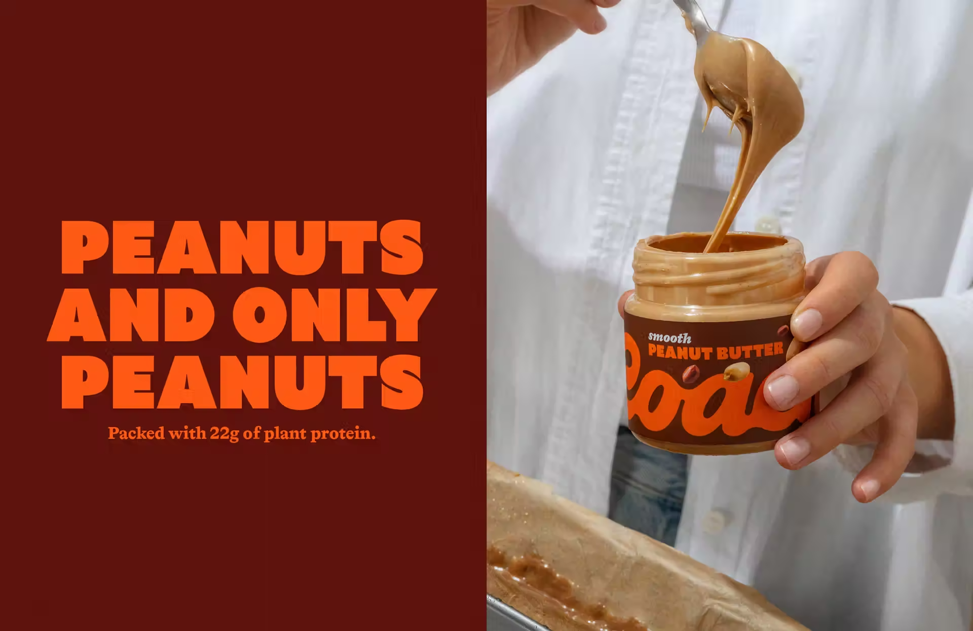
The logotype carries a soft hint of retro, familiar but current. Typography is bold and simple to scan. Claims and nutrition live where people expect to find them, so reassurance is there after the grab. The result is a range that looks indulgent at first glance, then confirms the better-for-you story on review.
Coach rolls out across the Balkans in 2026, with a US direct-to-consumer launch planned for the second half of the year.
The guiding line for the work, Clean never tasted this bold.
Credits
Client, Coach Foods
Brand Identity and Packaging Design, Relish
Creative Direction, Dimitar Popov
Design, Anastazija Manasievska
Photography, Anja Kalin
3D Renders, Zach Peterson
Unlock everything with Mindsparkle Mag Plus.
Get exclusive access to Premium features:
Credits: Relish
