 Plus
Plus

Von Trier is an architecture and interior design practice based in Dubai, working across borders with a sensibility shaped by movement, observation, and restraint. When it came to defining their visual identity, the task was not to compete with the architecture—but to quietly echo its values.
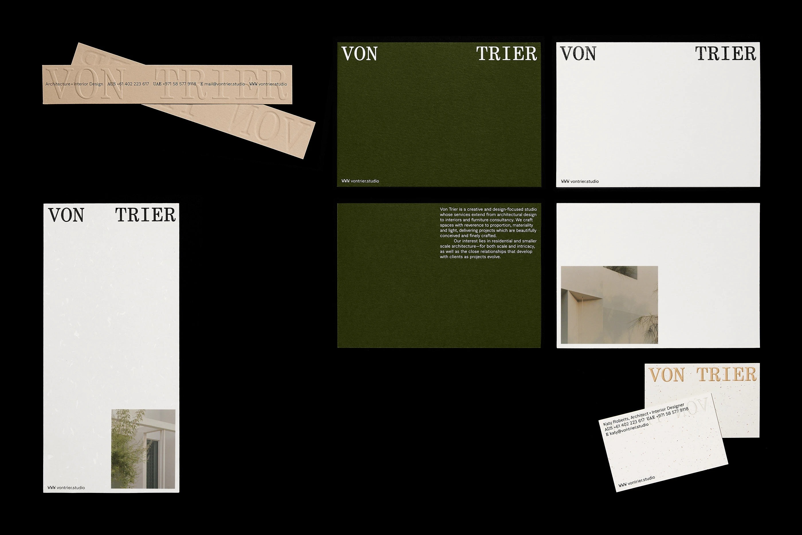
Designed by BOTH Studio, the identity translates Von Trier’s refined, nomadic ethos into a visual language that feels calm, tactile, and confident. Space is used generously. Typography breathes. Nothing feels overstated—yet every decision is intentional.
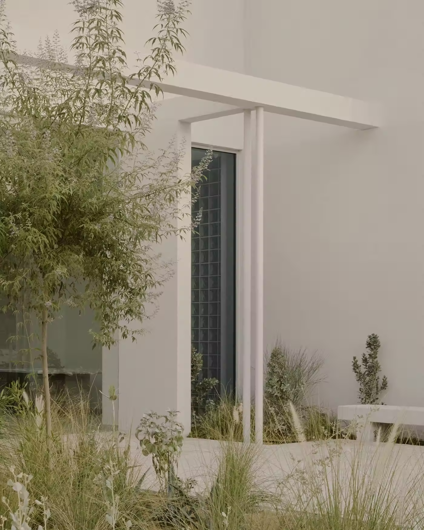
The palette draws from nature rather than trend: warm mineral tones, soft neutrals, and surfaces that feel grounded and human. This restraint creates an approachable presence while maintaining a clear sense of authorship—an identity that doesn’t announce itself loudly, but rewards closer attention.
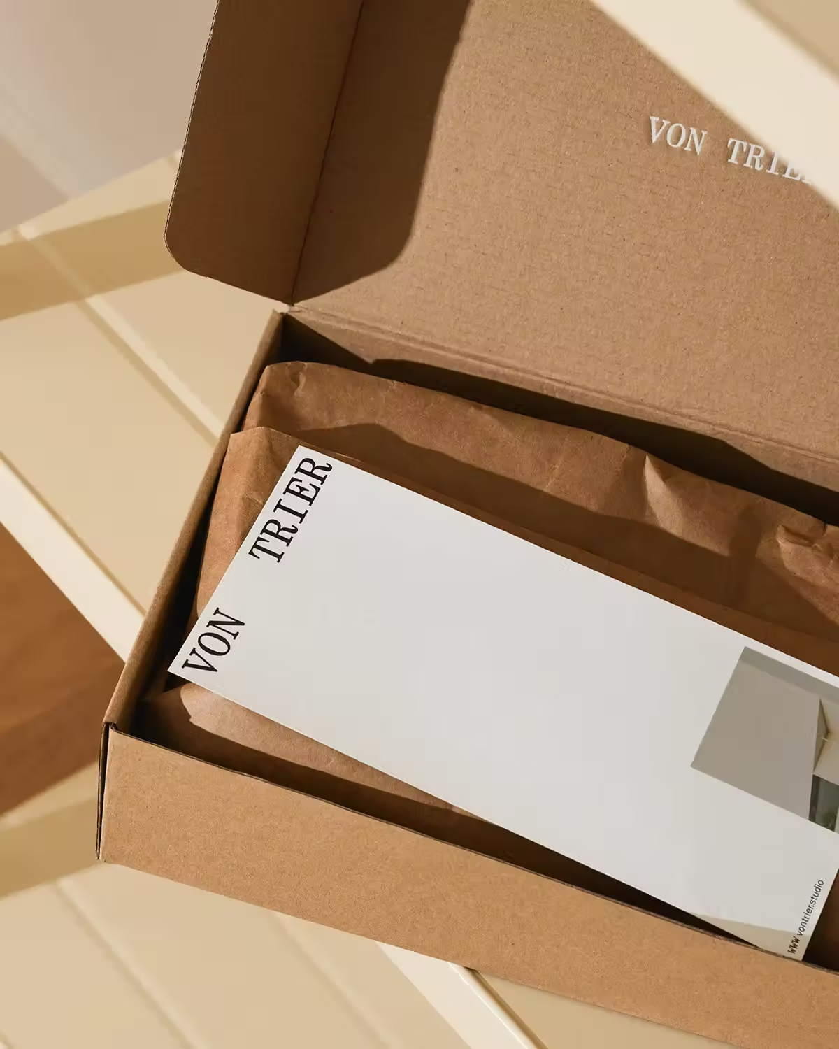
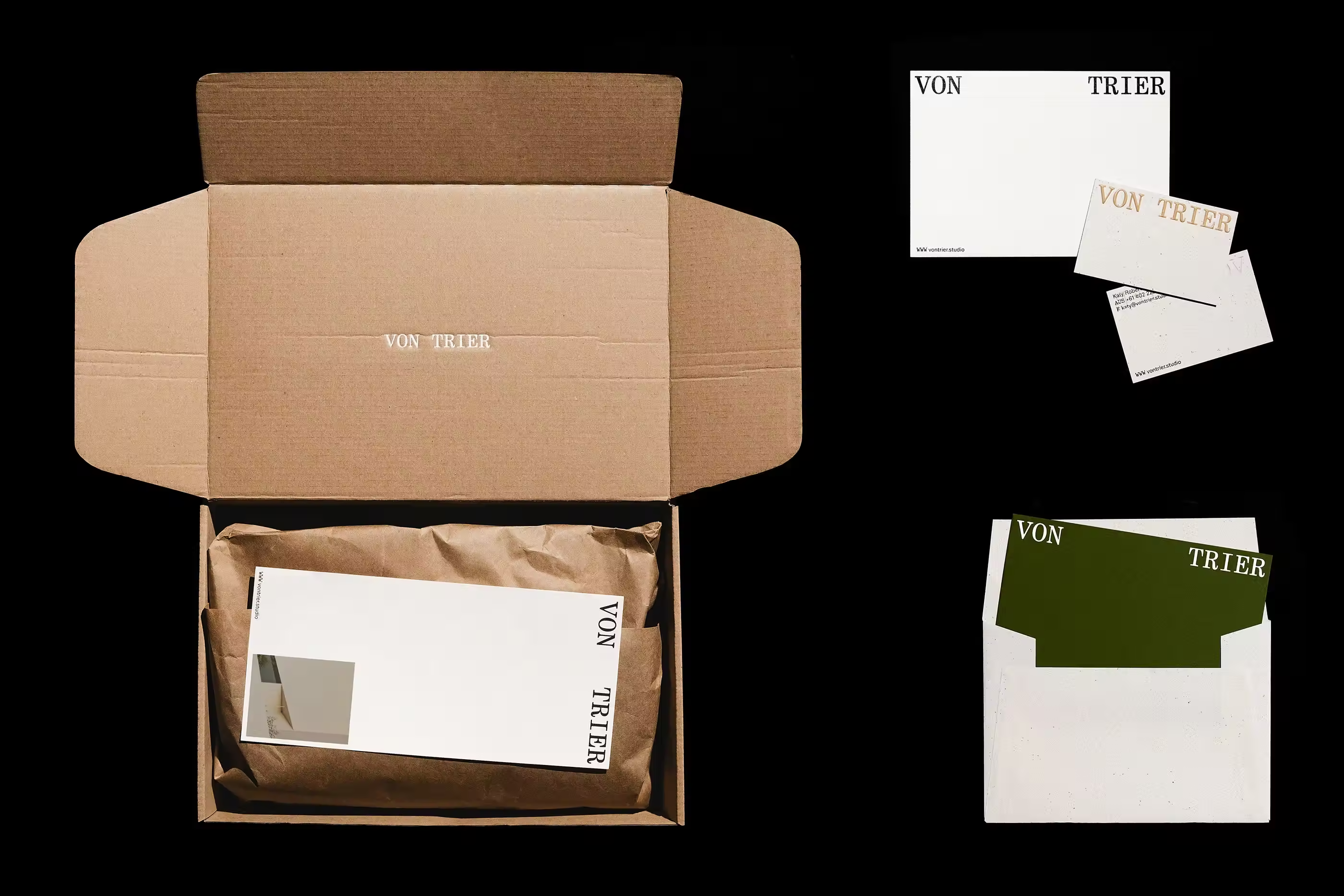
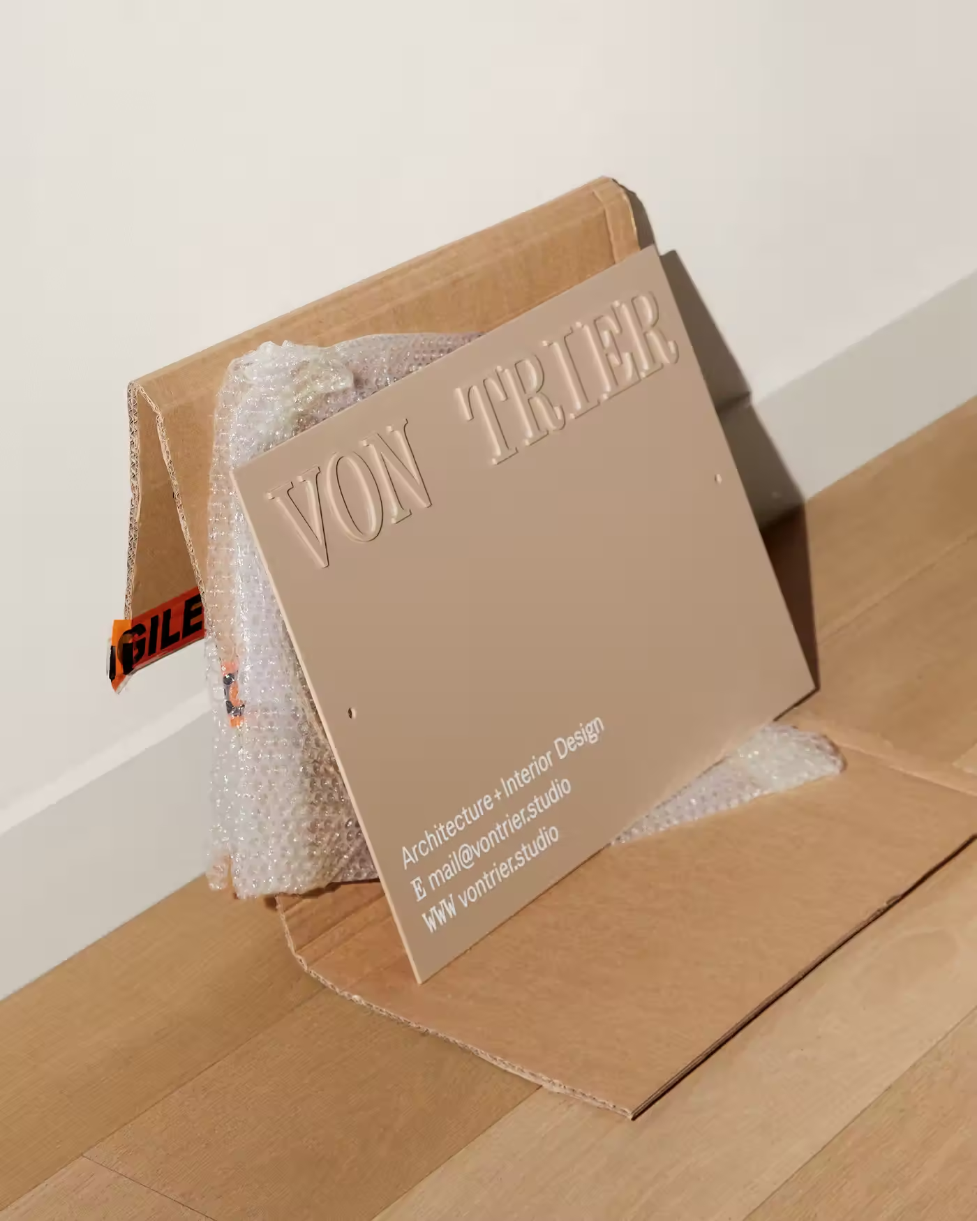
What makes the Von Trier identity particularly compelling is its flexibility. Across applications, the system adapts without ever becoming decorative for decoration’s sake. Whether on print, packaging, or presentation materials, the branding consistently supports the architectural work rather than framing it too heavily.
This “step-back” approach mirrors the practice itself: thoughtful, precise, and deeply aware of context. The result is a brand that feels lived-in rather than imposed—designed to travel, evolve, and remain relevant across geographies and projects.
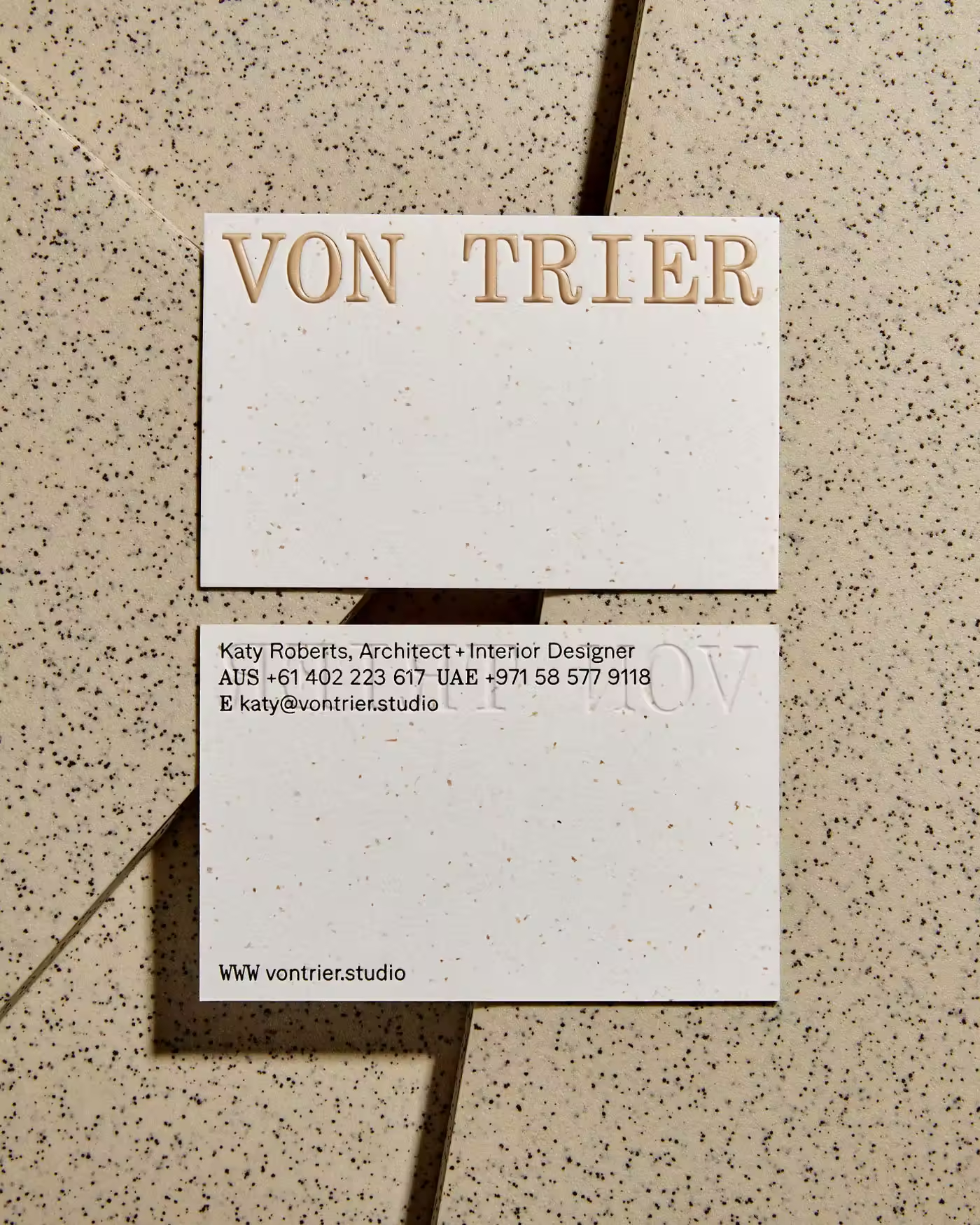
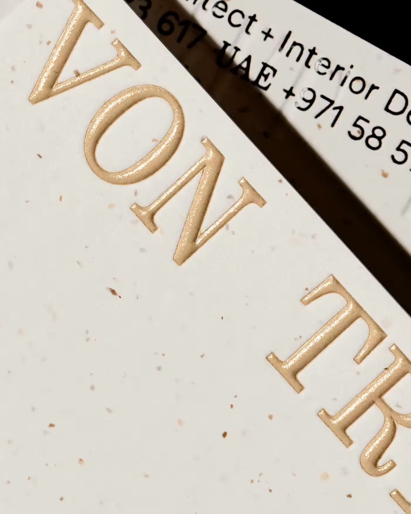
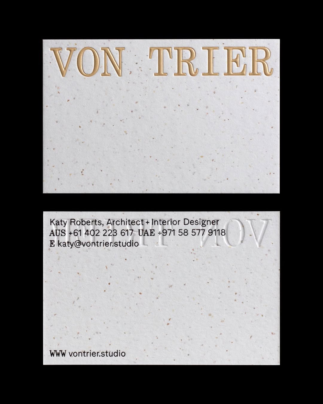
A closer look at the business cards reveals where the identity truly comes alive. The high attention to detail when it comes to picking the right paper (more details in PLUS section) combined with a precise beautiful embossed logo speaks for itself. The print was done by Jot press in UK.
The glossy beige foil emboss catches the light with restraint, never overpowering the typography. It’s a finish you notice only when you tilt the card—an interaction that feels almost architectural in itself.
This is printing as an extension of concept: material choices that reinforce the studio’s values of precision, sustainability, and calm confidence.
Von Trier’s identity is a reminder that strong branding doesn’t need to shout. Sometimes, it simply needs to be well-considered—allowing texture, space, and material honesty to do the talking.
A quietly confident system for a practice that designs the same way.
Unlock everything with Mindsparkle Mag Plus.
Get exclusive access to Premium features:
Credits: BOTH Studio
