


NICE GUY
SlovakiaFebruary 25, 2026
Mindsparkle Mag


Slovak basketball has stepped into a new era — confident, focused, and unapologetically ambitious. With a comprehensive strategy and a striking new visual identity, Slovak Basket introduces a unified brand for basketball in Slovakia, built to elevate the sport both culturally and competitively.
Created by design practice NICE GUY, the identity is anchored in the powerful slogan Mierime vysoko (“We aim high”). More than a tagline, it captures a mindset — one that speaks to growth, aspiration, and the collective ambition to push Slovak basketball forward.
Importantly, this is not a rebrand of the Slovak Basketball Association (SBA) as an institution. Instead, it is the creation of a new umbrella brand for basketball in Slovakia as a sport — a platform designed to inspire players, engage fans, and reposition basketball within the national sports landscape.
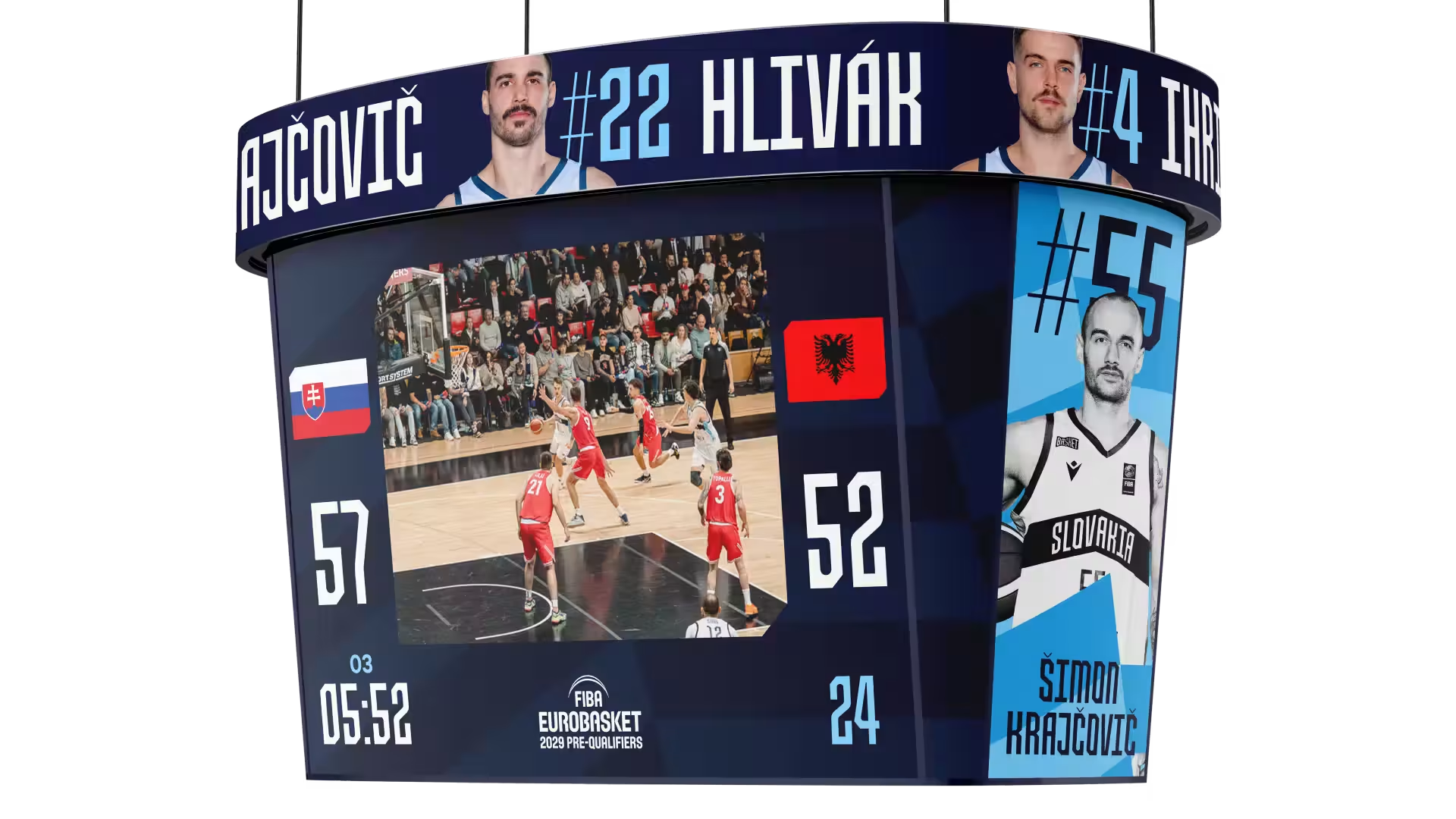
At the heart of the visual language is a bold upward-facing arrow — a clear and immediate symbol of momentum and elevation. The logotype cleverly emphasizes the “SK” within “Basket,” reinforcing national identity while embedding it seamlessly into the name itself. The custom typeface, Basket Narrow, developed by Setup Type, brings a condensed, energetic rhythm to the system and serves as the primary communication typeface across applications.
The new identity is already visible on the jerseys of both the women’s and men’s national teams, as well as across digital platforms and official communications. Unified, sharp, and future-oriented, the brand creates a cohesive presence that speaks to younger audiences while motivating players and coaches to think bigger.
With Slovak Basket, the message is clear: the trajectory is upward — and the ambition is shared.


Unlock everything with Mindsparkle Mag Plus.
Get exclusive access to Premium features:
Credits: NICE GUY
Strategy: Pavol Kyselica
Lookbook Photography: Jakub Čaprnka
Photodirection: Bára Tabačková
Other: Trukru Studio


