 Plus
Plus

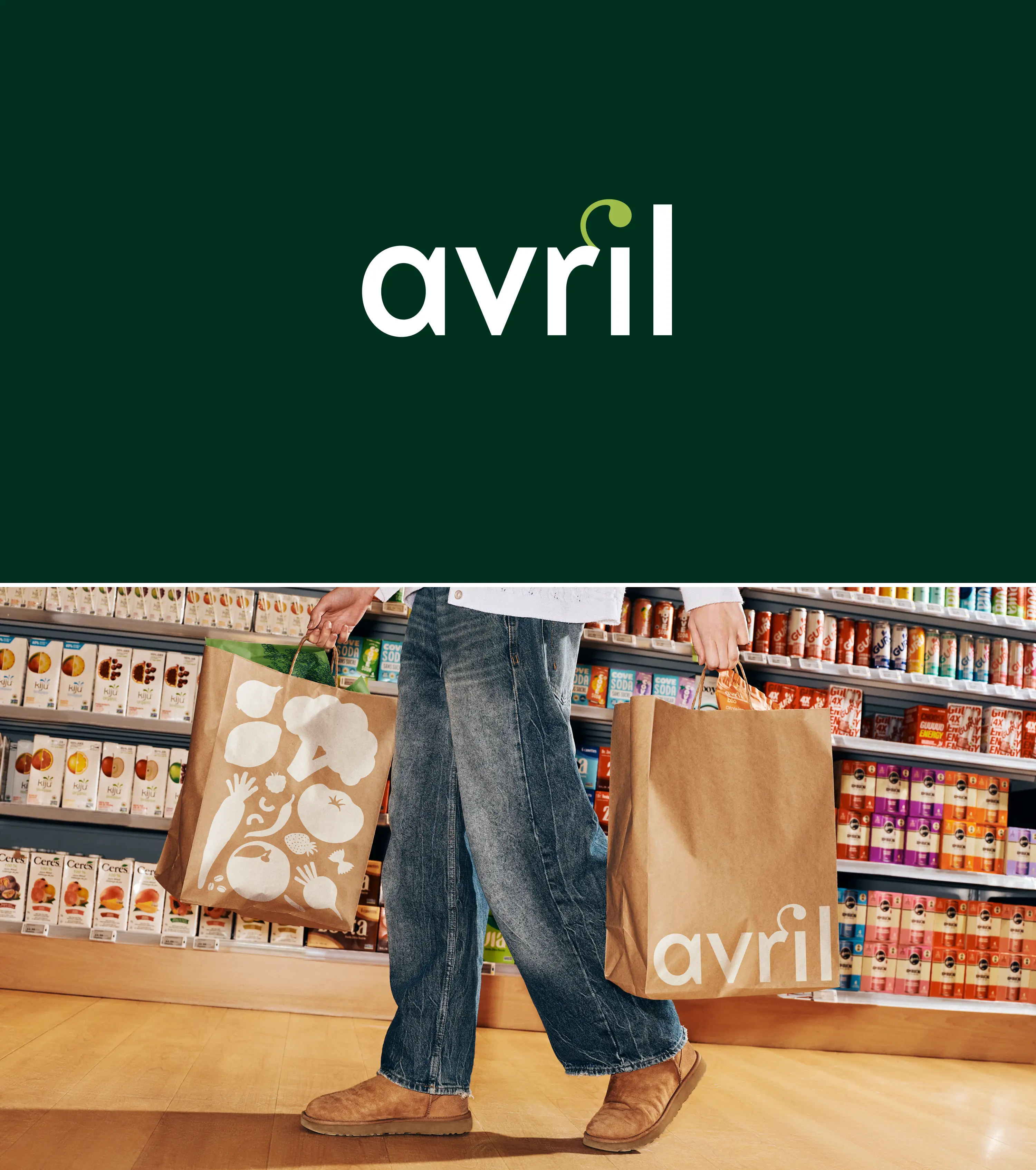
Avril, the fastest-growing natural and organic grocery retailer in Canada, is entering a new phase of growth with the launch of a revitalised brand identity. The objective for Caserne was clear: evolve the brand without compromising the high standards that built its credibility, while making it more accessible to a new generation of consumers.
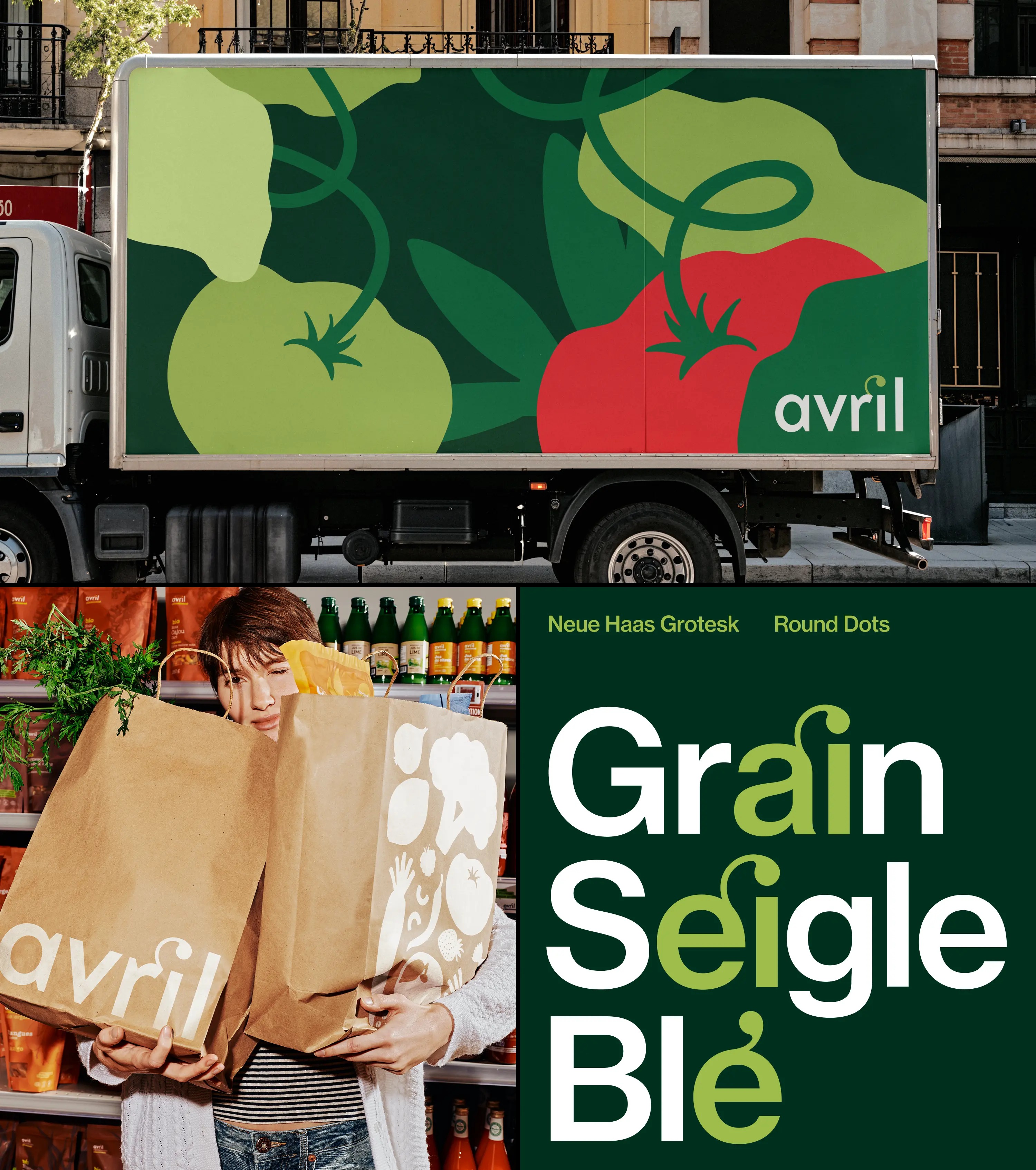
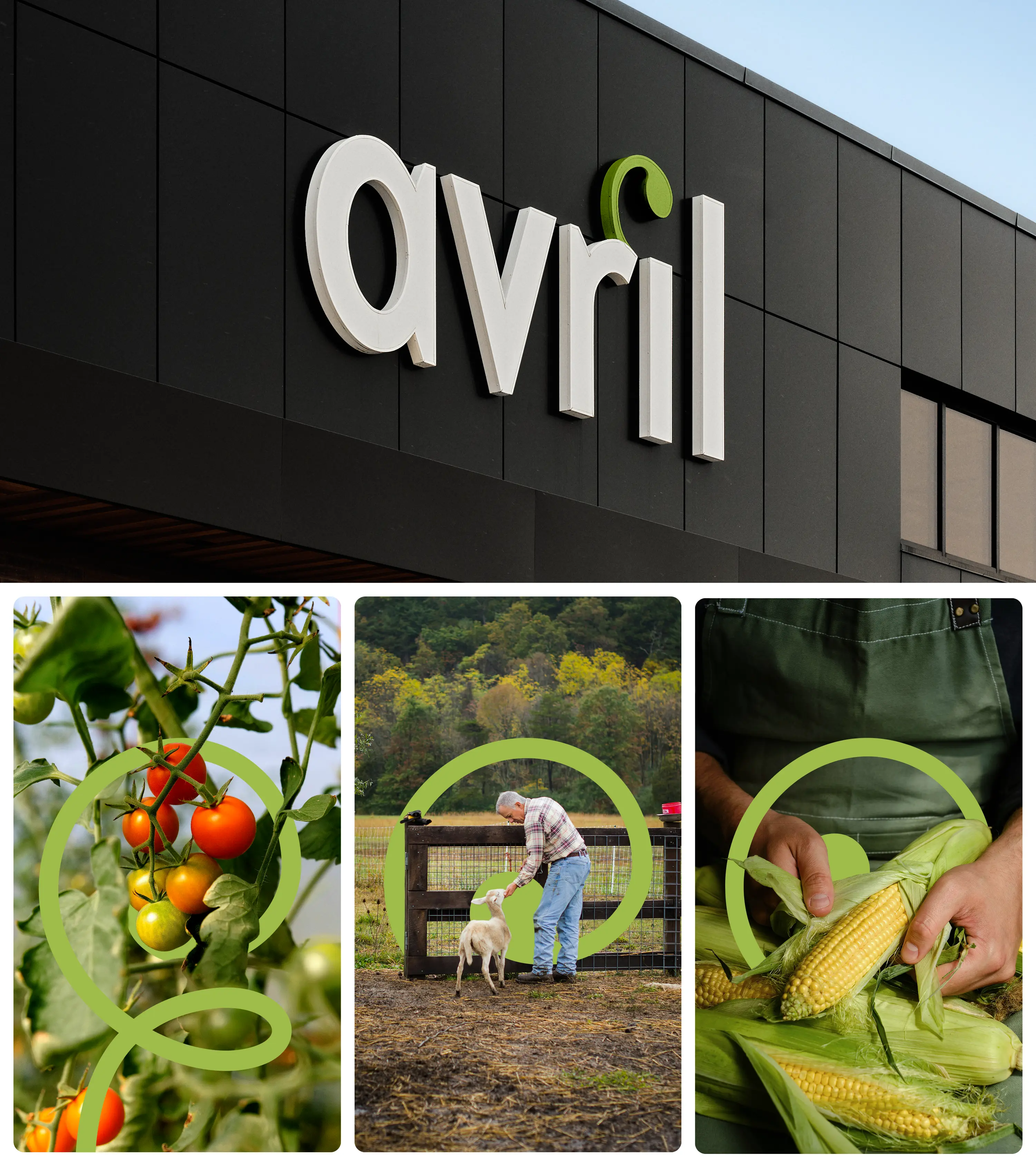
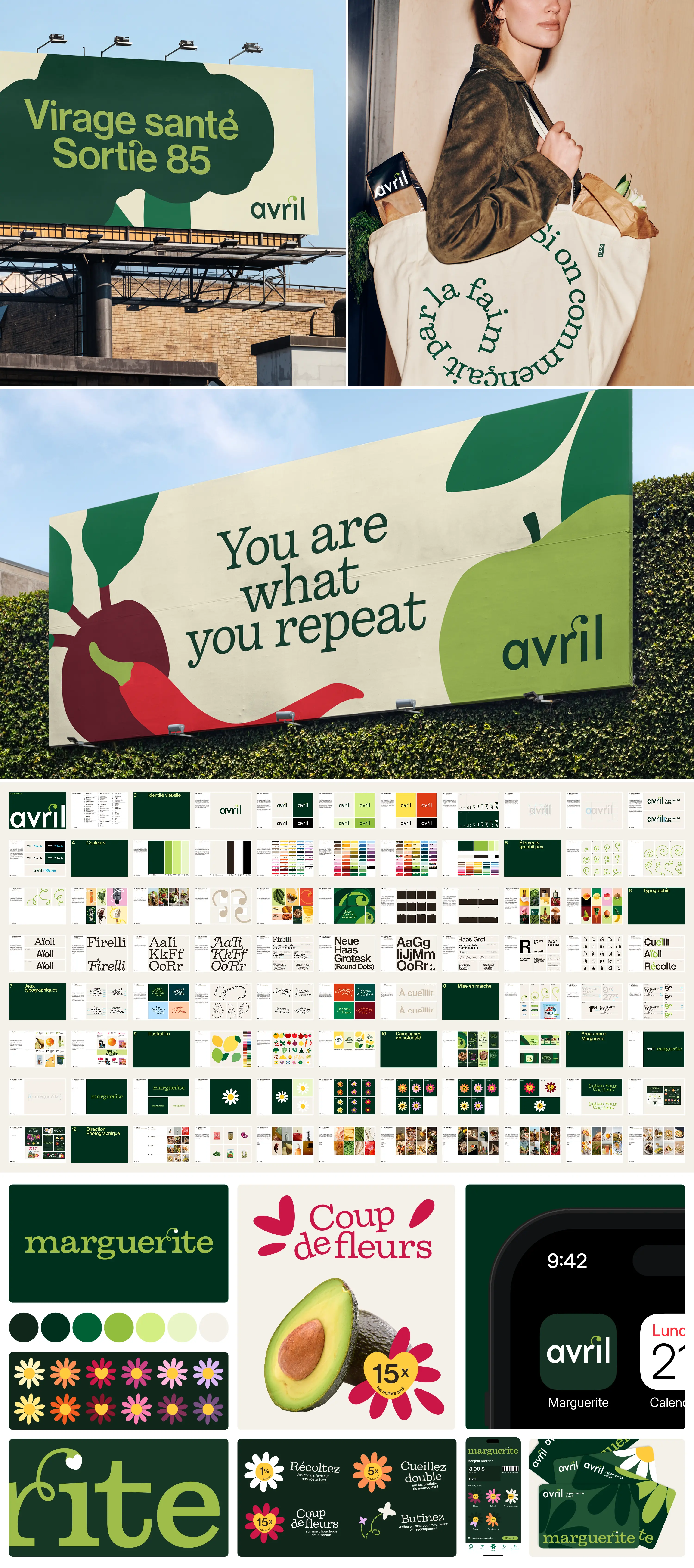
The project was guided by a single principle: opening up the brand without diluting it. In a category often perceived as rigid or intimidating, the challenge was to reassure loyal customers while welcoming new audiences, without pressure or prescription. The identity solution emerged from within the brand itself. Avril’s growth symbol, already iconic, was amplified to become the anchor of the entire system. Reimagined as a modular and flexible device, it now extends across all touchpoints, embodying the idea that meaningful change happens one small step at a time.
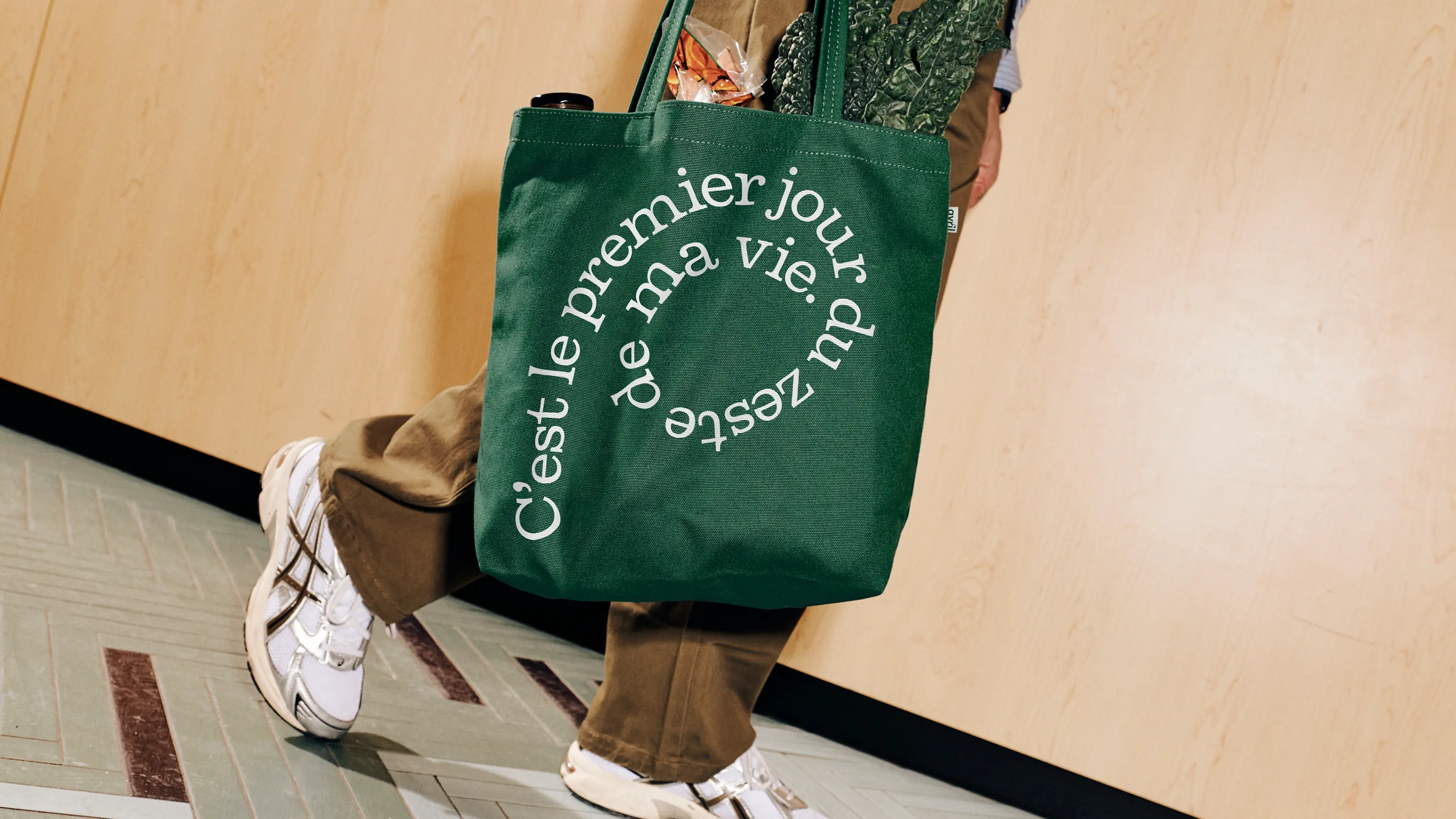
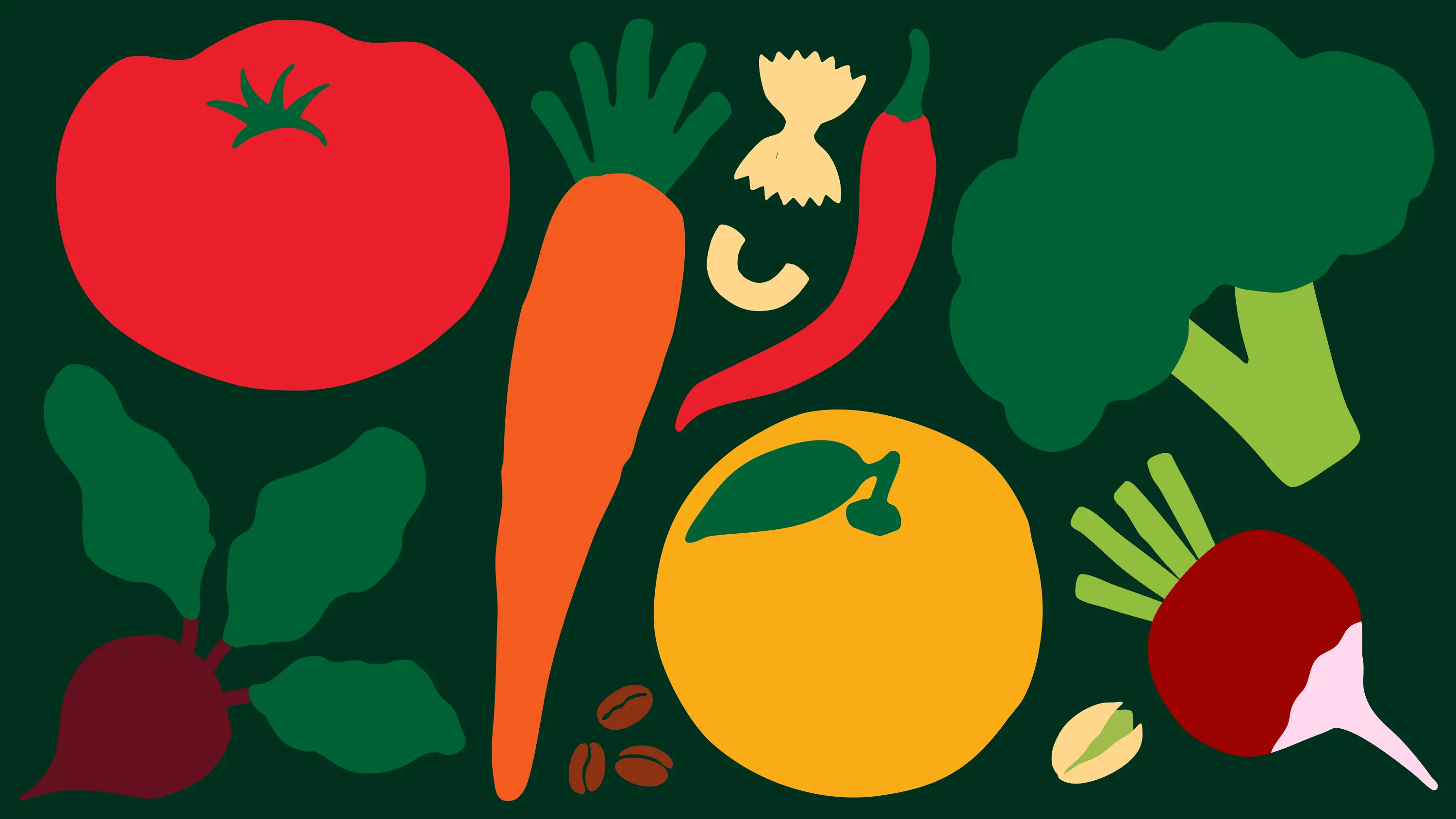
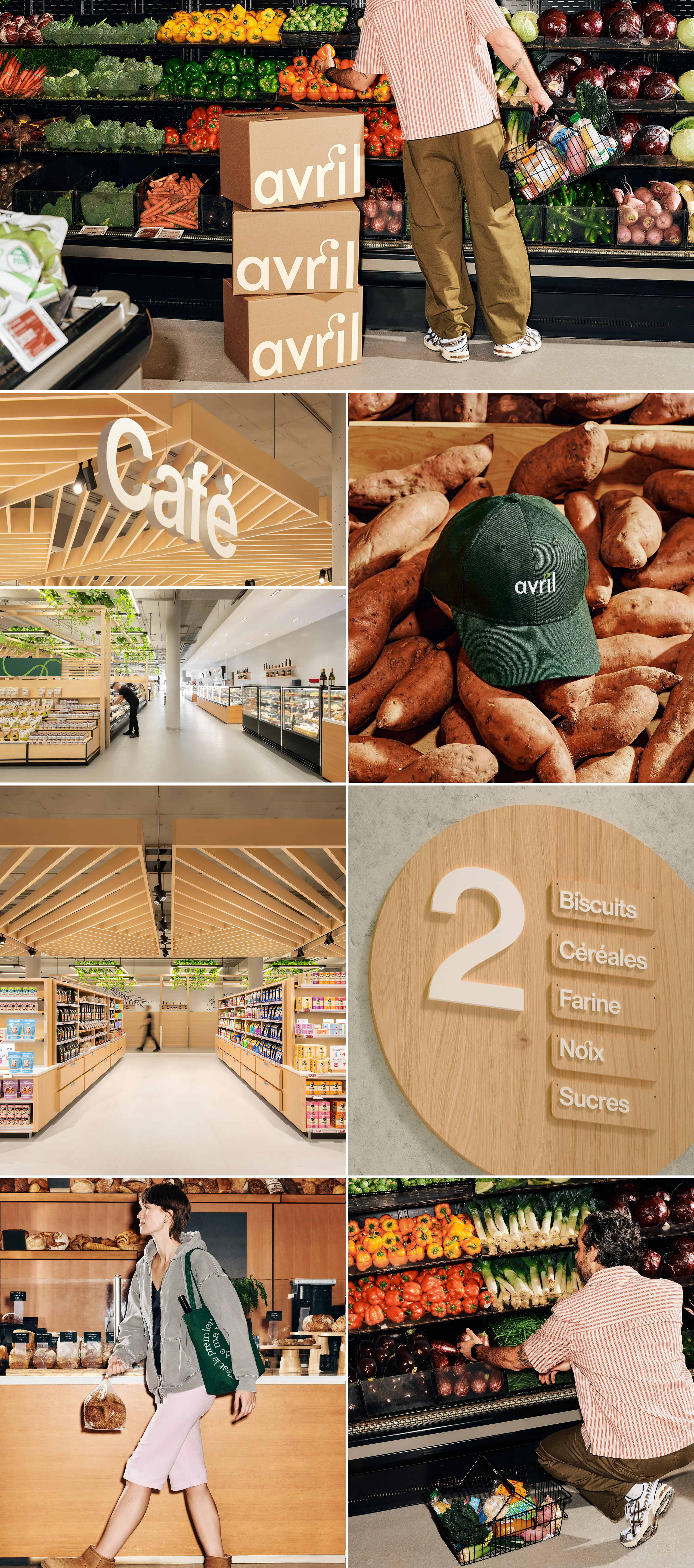
Supported by a more vibrant colour palette, typography that balances authority and warmth, and a bold, generous illustration language, the refreshed identity forms a coherent, flexible, and instantly recognisable system. Rolled out across Avril’s 13 stores, private-label products, loyalty platforms, and first brand campaign, this evolution goes beyond a visual refresh. It marks a confident strategic repositioning, one that grounds the brand in expertise while making it more open, inclusive, and future-facing.
Credits: Caserne
