 Plus
Plus

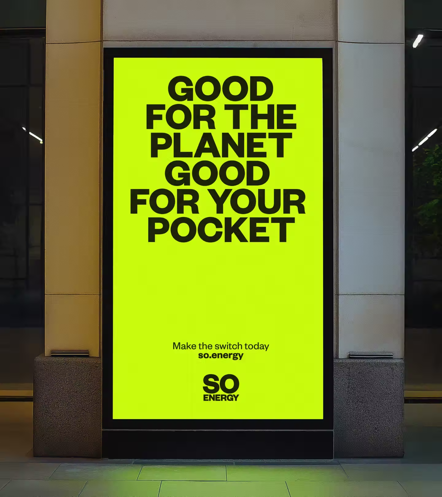
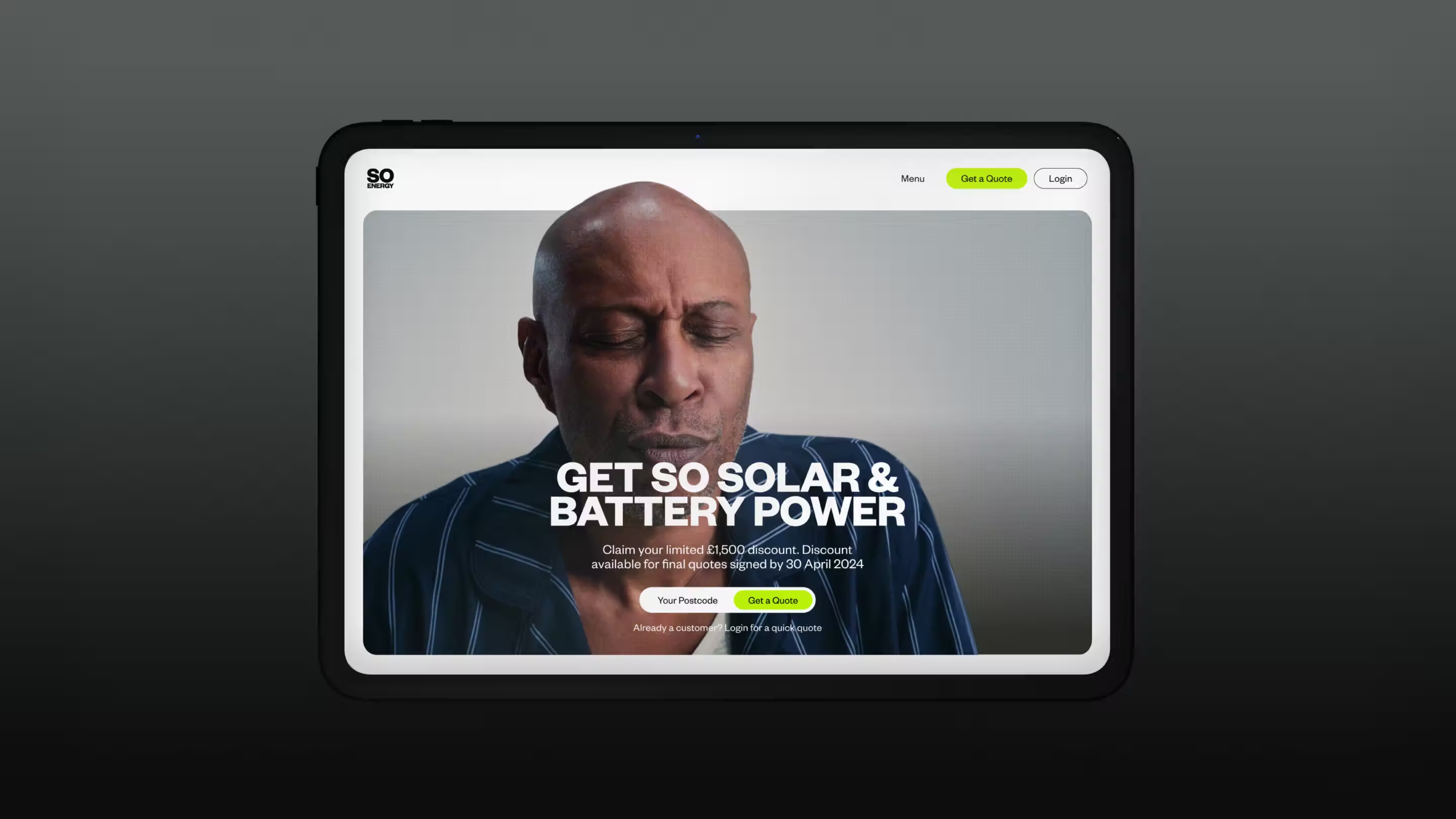
Studio Blackburn energises So Energy with bold new brand identity and campaign. The goal was simple: position So Energy as a confident challenger in a market long dominated by the ‘Big Six’. Building on Studio Blackburn’s original 2021 brand, the refreshed So Energy identity brings clarity, warmth and cohesion. It makes renewable energy relatable, easy to understand, and, most importantly, impossible to ignore.
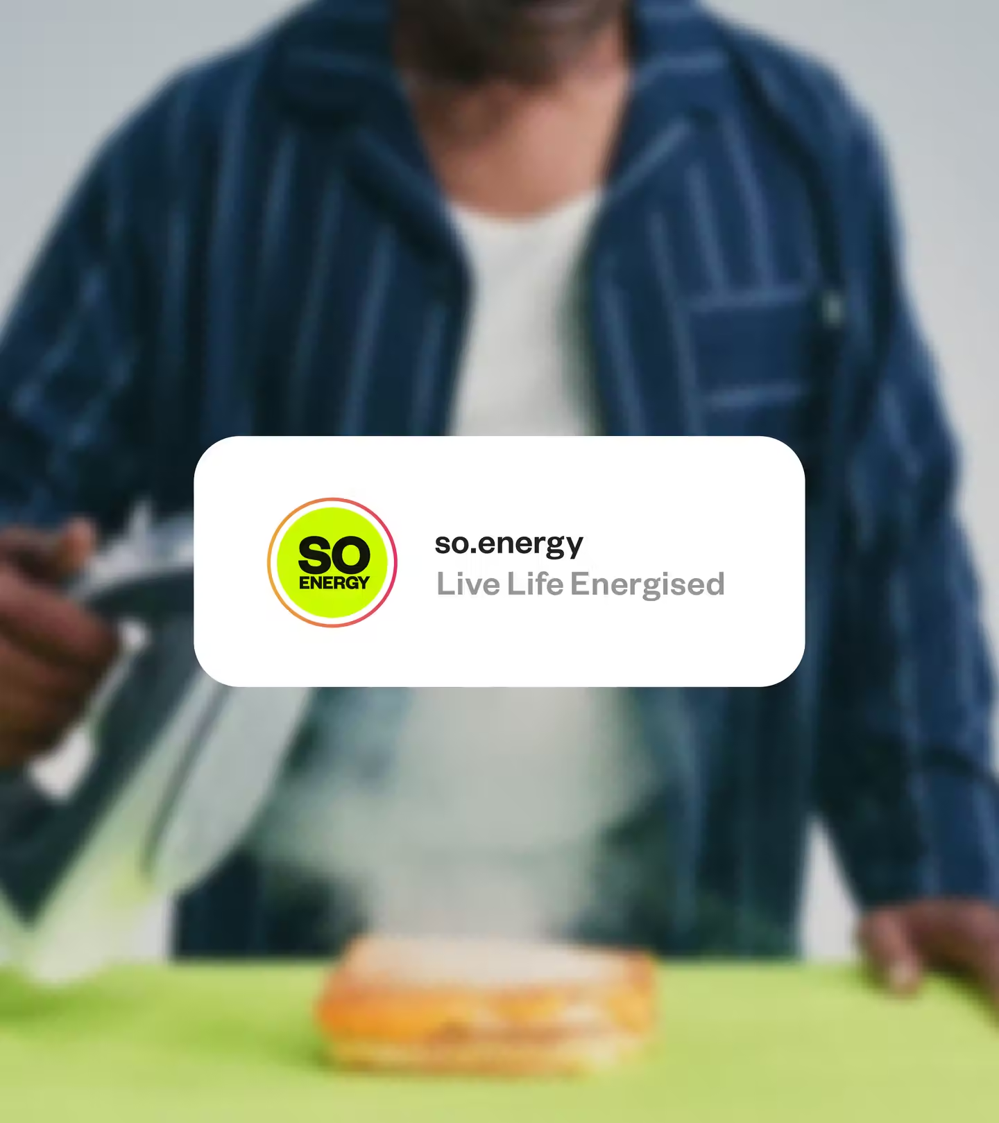
At the heart of the refresh is So Energy’s new external voice, ‘Live Life Energised’. The phrase captures the spirit of a company that wants customers to spend less time thinking about energy and more time enjoying what it enables.
‘Live Life Energised’ runs through every part of the identity and campaign, shaping tone of voice, motion, illustration and acting as a unifying idea that brings consistency and energy across all touchpoints.
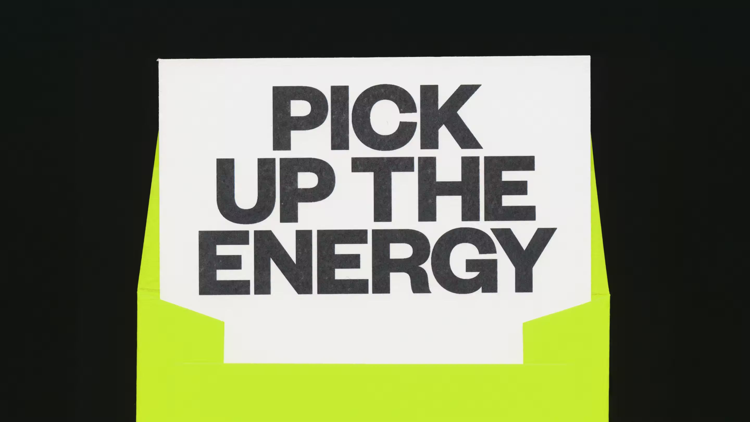
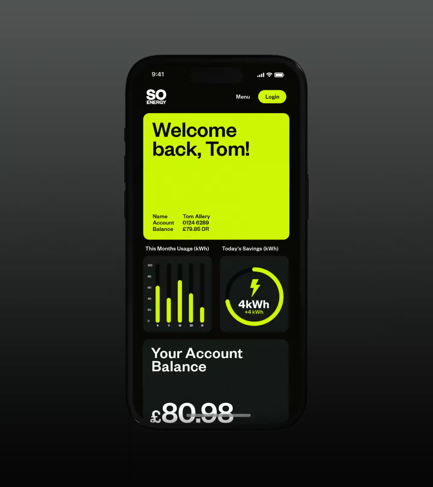
Leading the refresh is the introduction of “Electric Yellow”, a distinctive hue that sits somewhere between yellow and green. It feels unhuman yet natural, loud yet approachable. The colour creates a unifying visual language across digital ads, comparison sites, social content, and customer communications.
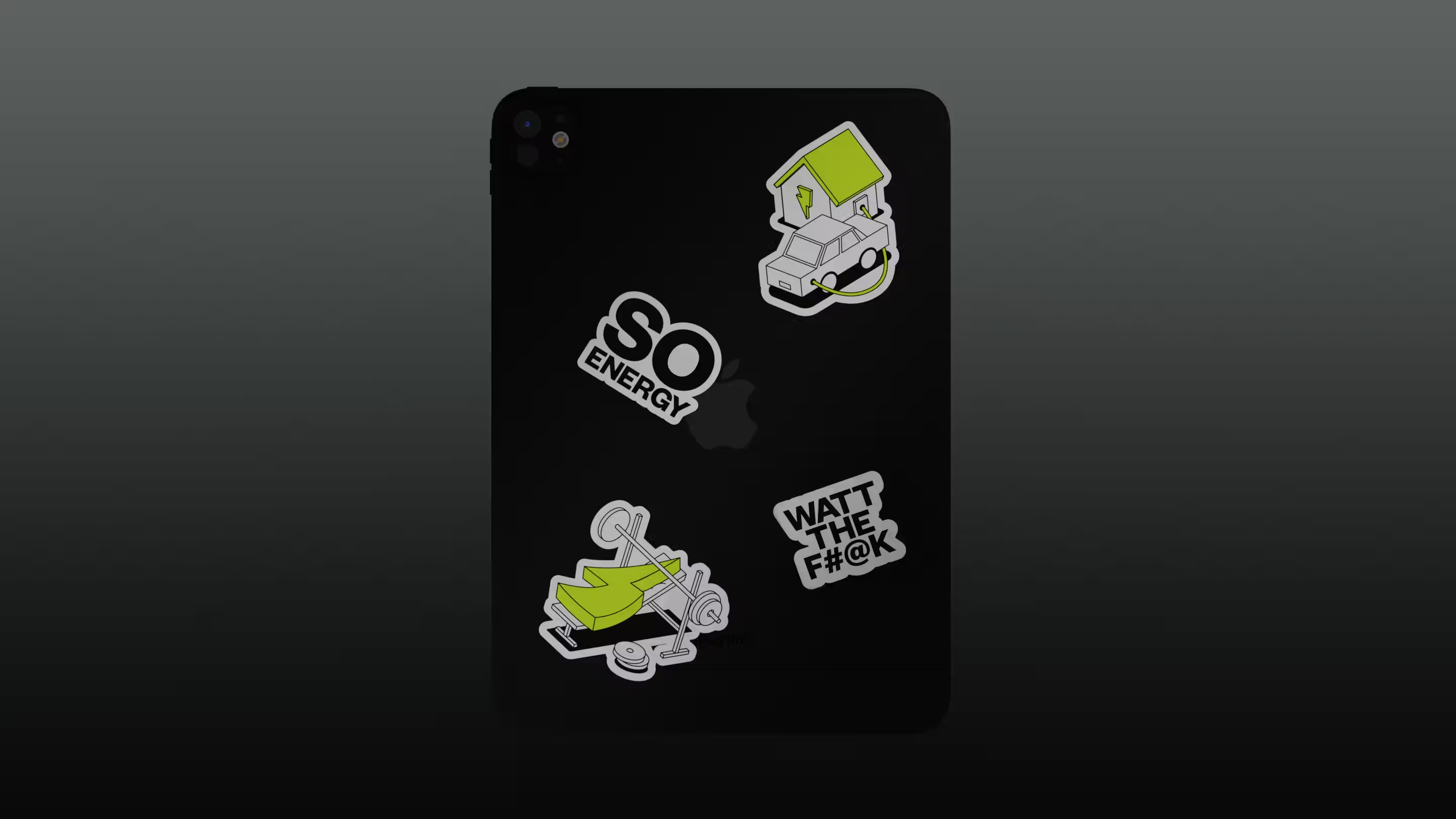
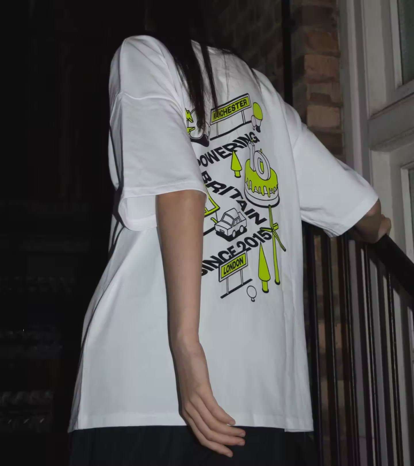
If energy powers our lives, the brand should reflect that energy. The new motion system transforms short messages into vibrant bursts of movement, while a refreshed illustration style adds warmth and personality. A redesigned iconography suite enables clear and universal communication for a service where answers need to be fast and simple.
In a sector often viewed as faceless and complex, the campaign positions So Energy as clear, cohesive, and refreshingly different. Under the banner “We Do Energy, You Do You,” it celebrates customers’ individuality and empowers their unique pursuits with sustainable and affordable energy solutions.
Will Cooper, Senior Designer at Studio Blackburn:
“The brand is designed to stand out. From the colour palette to the art direction, we set out to challenge the conventions of the UK energy market.
So Electric remains the anchor, a distinctive colour that cuts through the noise while unifying every touchpoint for genuine brand consistency. We focused on shifting So Energy’s communication from something purely logical and expected to something more emotionally resonant, expressive and full of life.”
Unlock everything with Mindsparkle Mag Plus.
Get exclusive access to Premium features:
Credits: Studio Blackburn
Director: Tom Ivin
DOP: Amelia Hazlerigg
Producer: Josh Hillman
Editor: Tomoko Hirasawa
Colour & Grading: Studio RM
Sound: Guy Chase
Production Manager: Mel Brown
Runner: Ash Dunford
1st AC: Oliver Munks
2nd AC: Alexandra Brannan
Gaffer: Jonny Boomer
Spark: Amir Moulfi, Ash Clain
Stylist: Nathan Henry
MUA: Chiharu Wakabayashi
Art Director: Kit Falck
Art Director Assistant: Austeja Gokaite
Digi OP: Liam Aylott
