


SDCO Partners
September 15, 2021
Mindsparkle Mag


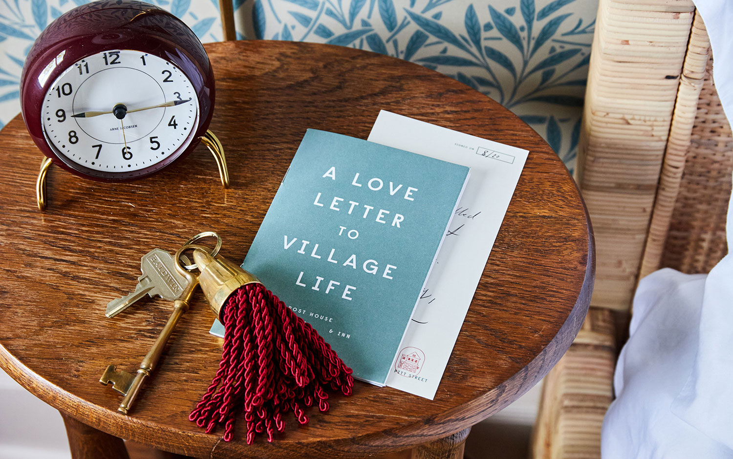
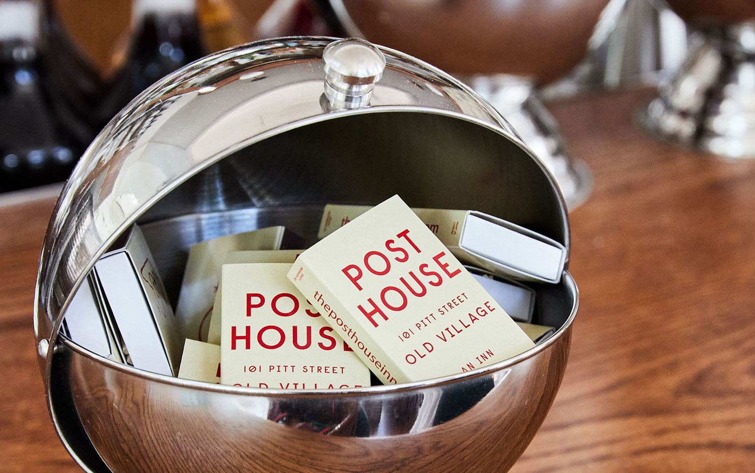
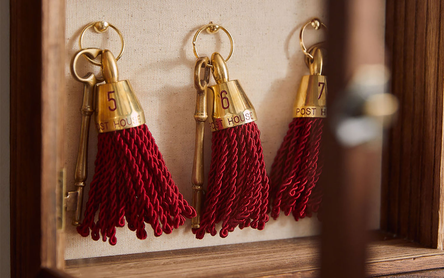
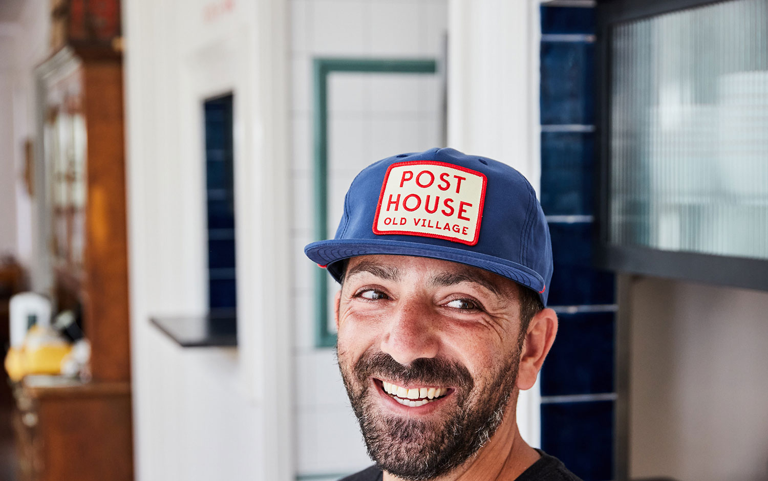
Now that traveling is being less restrictive, at least locally, the idea of a short escape from home to at least change the scenery is more likely. For this kind of brief escape, we're not in the look of a fancy place to stay, but somewhere that reminds us of home, but it's not our house. We're usually looking for a cozy place with a friendly ambient. Places like Post House are what we picture. Its brand identity was creatively in charge of SDCO Partners.
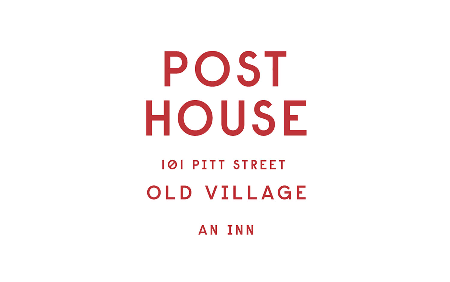
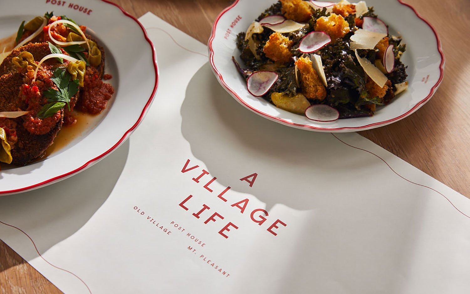
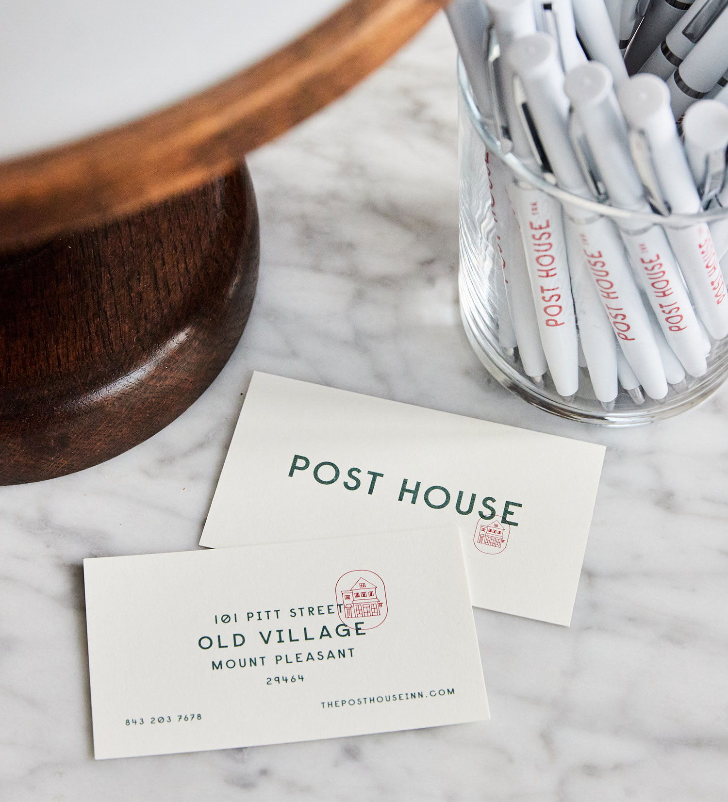
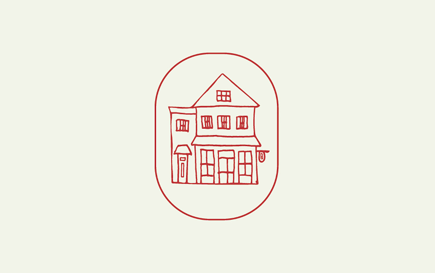
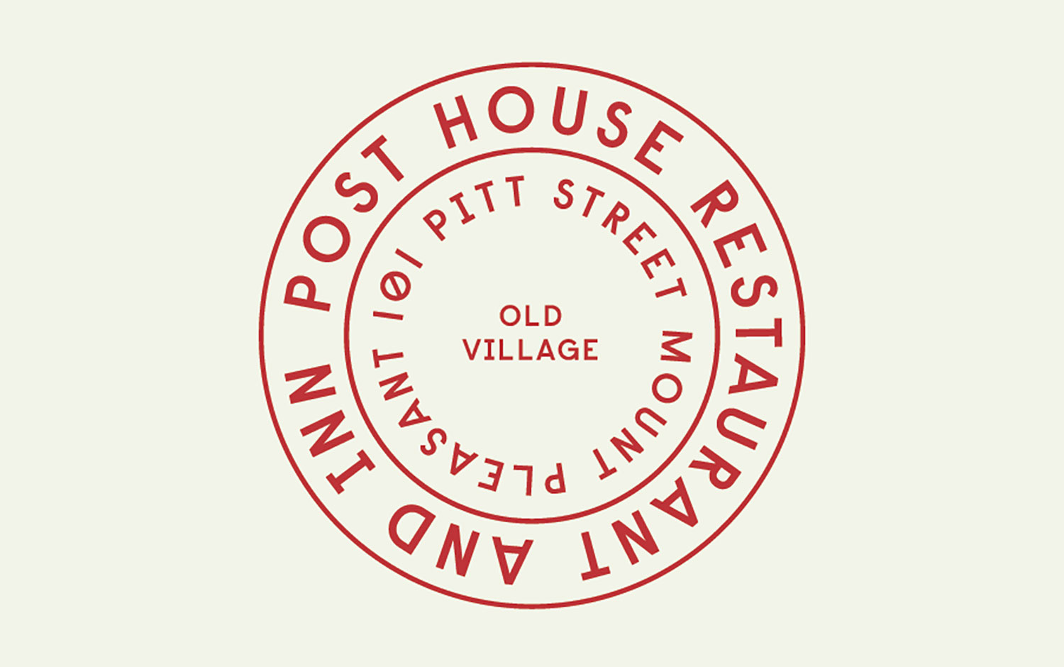
Reimagine a much-loved neighborhood eatery and inn to welcome back longtime guests and invite a new breed of intrepid travelers. Well, Post House is in charge of doing so. It embraces its guests with a warm, pleasant atmosphere. So, the brand’s visual identity has to reflect all this and more! SDCO Partners' designers came up with a concept that balances history and modernity, luxury and approachability for a consistent, flexible system that invites and intrigues. The visual language beautifully translates across everything from interior environments and in-room stationery to menus, postcards, signage, and dishware. Its name brings back to life what vintage post houses used to look like, not only architecturally speaking but its overall red-and-white aesthetic.
All in all, Post House's visual identity reflects comfort and modernity with a classy appeal from the vintage post office style. And we love the way its interior design perfectly matches the graphic and stationary. So, let this design post inspire you to plan your next brief vacation.
Credits: SDCO Partners


