 Plus
Plus

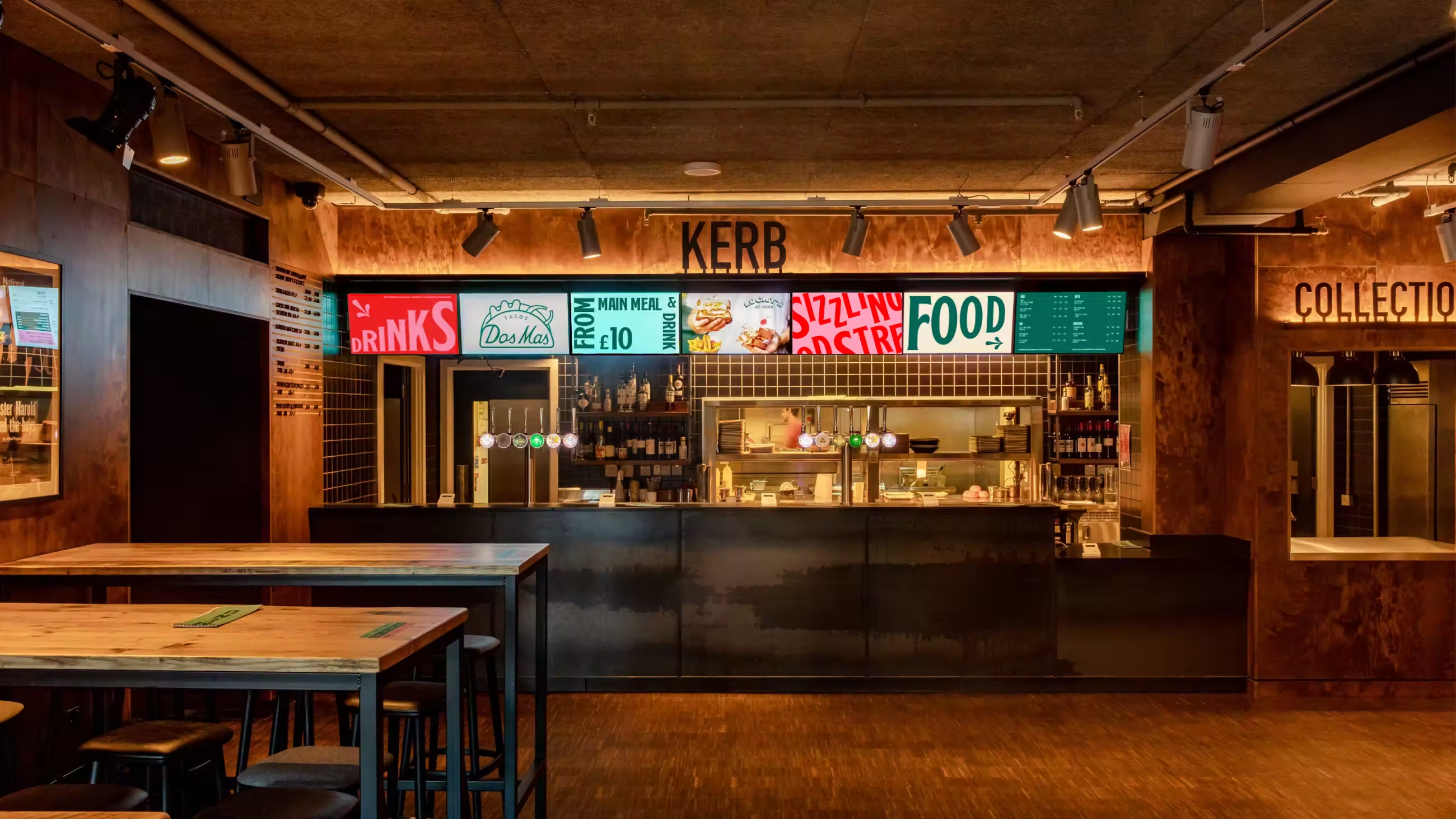
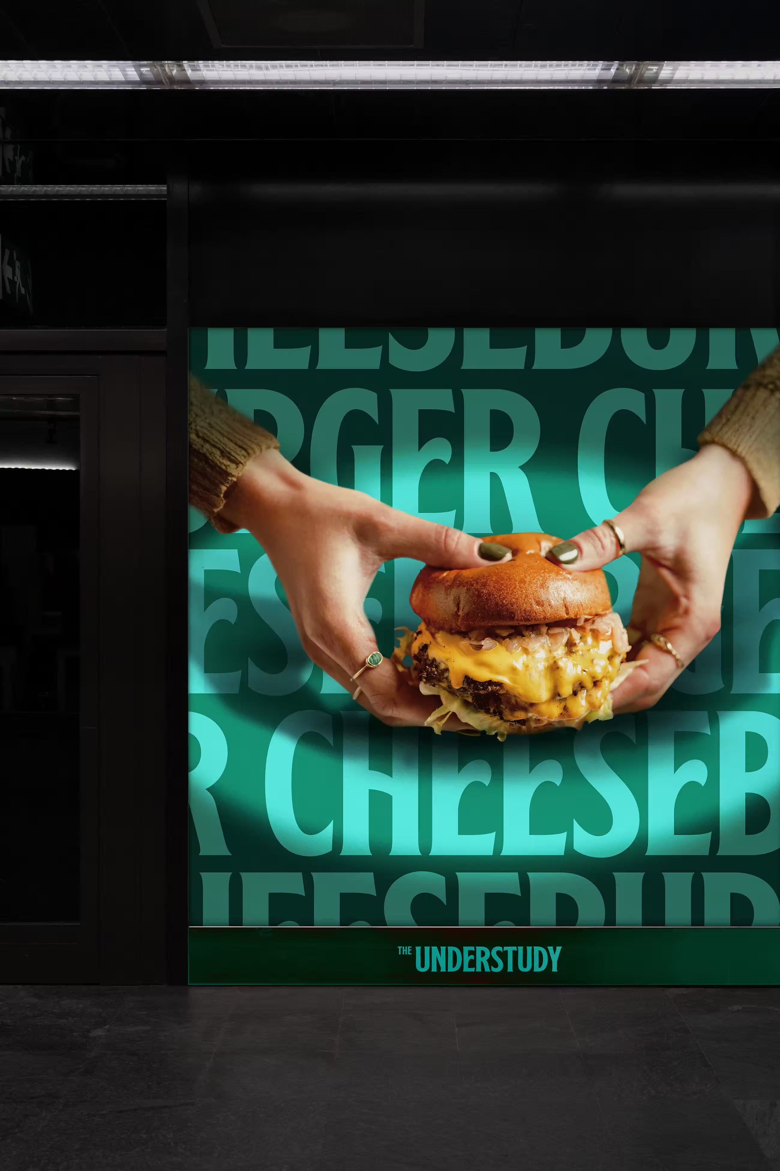
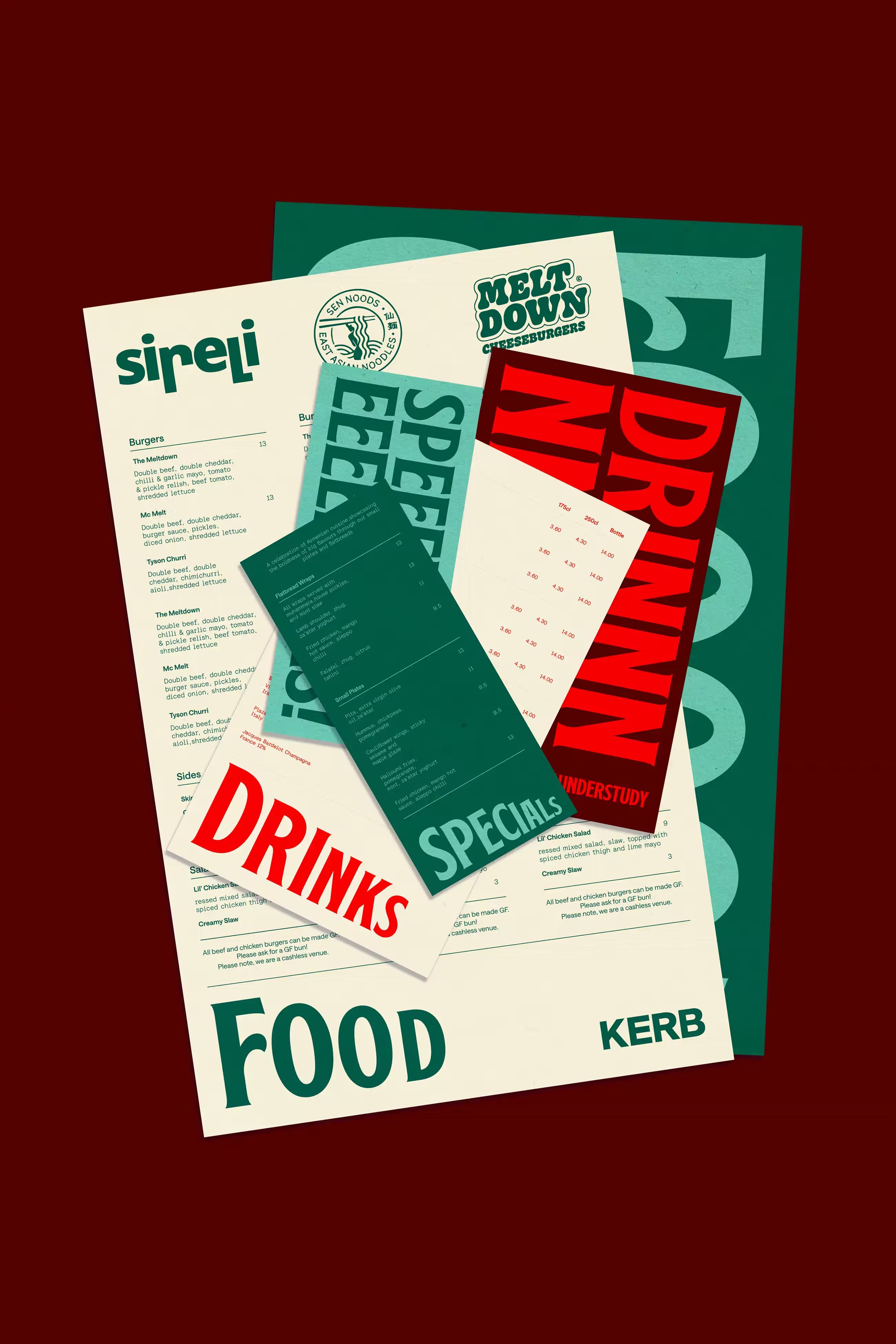
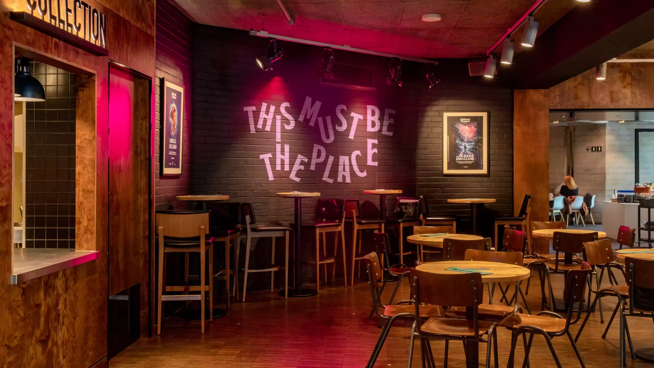
The creative approach for The Understudy balances the warmth and familiarity of a traditional British pub with the creative energy of the South Bank and the National Theatre. Through thoughtful use of typography and colour, the new identity blends classic heritage with contemporary freshness.
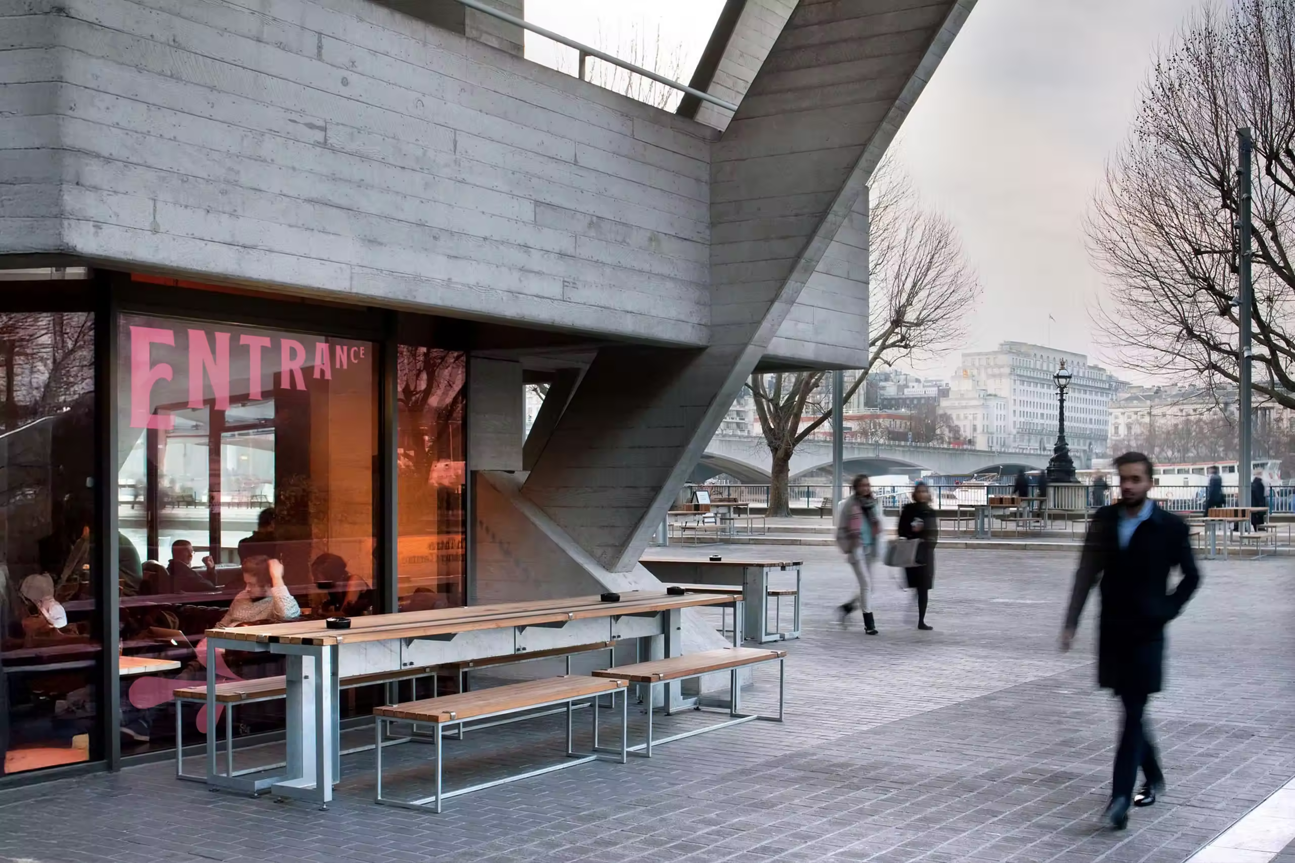
Because the existing physical space doesn’t immediately read as a traditional pub, the visual and verbal identity plays a key role in creating that atmosphere - distinctive, welcoming, characterful, and non-generic. This project represents an opportunity to redefine what a modern cultural pub can be, leaning into the how a punter feels when they go to their local pub, drink their favourite drink, and spend time with friends and family.
The identity by Design by Temple is designed to sit harmoniously alongside KERB and National Theatre Food & Drink, while giving The Understudy a confident, independent voice — one that celebrates great food, drink, and creativity.
At the core of the concept are sustainability and inclusivity. Every decision, from materials to messaging, reflects an eco-conscious, community-first mindset, championing local and ethical partnerships (which echoes partner KERB’s own values and initiatives).
Finally, subtle inspiration from theatrical language and visual storytelling, using light, shadow play, contrast, and layered narrative, creates a brand that feels bold, human, and deeply connected to its cultural setting.
When developing The Understudy’s identity, our goal was to create an experience that reflects both the energy of the National Theatre and the warmth of a traditional pub.
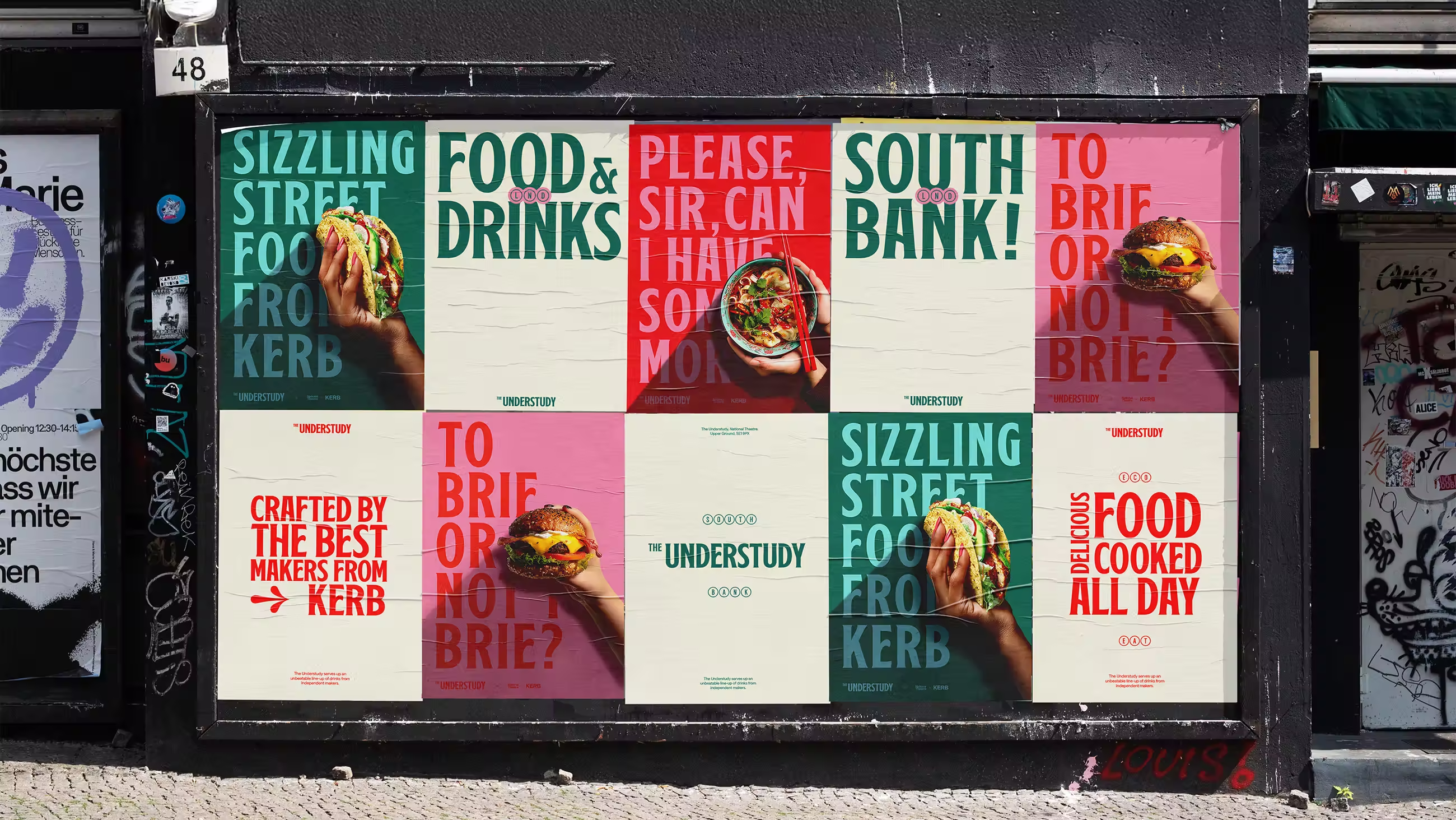
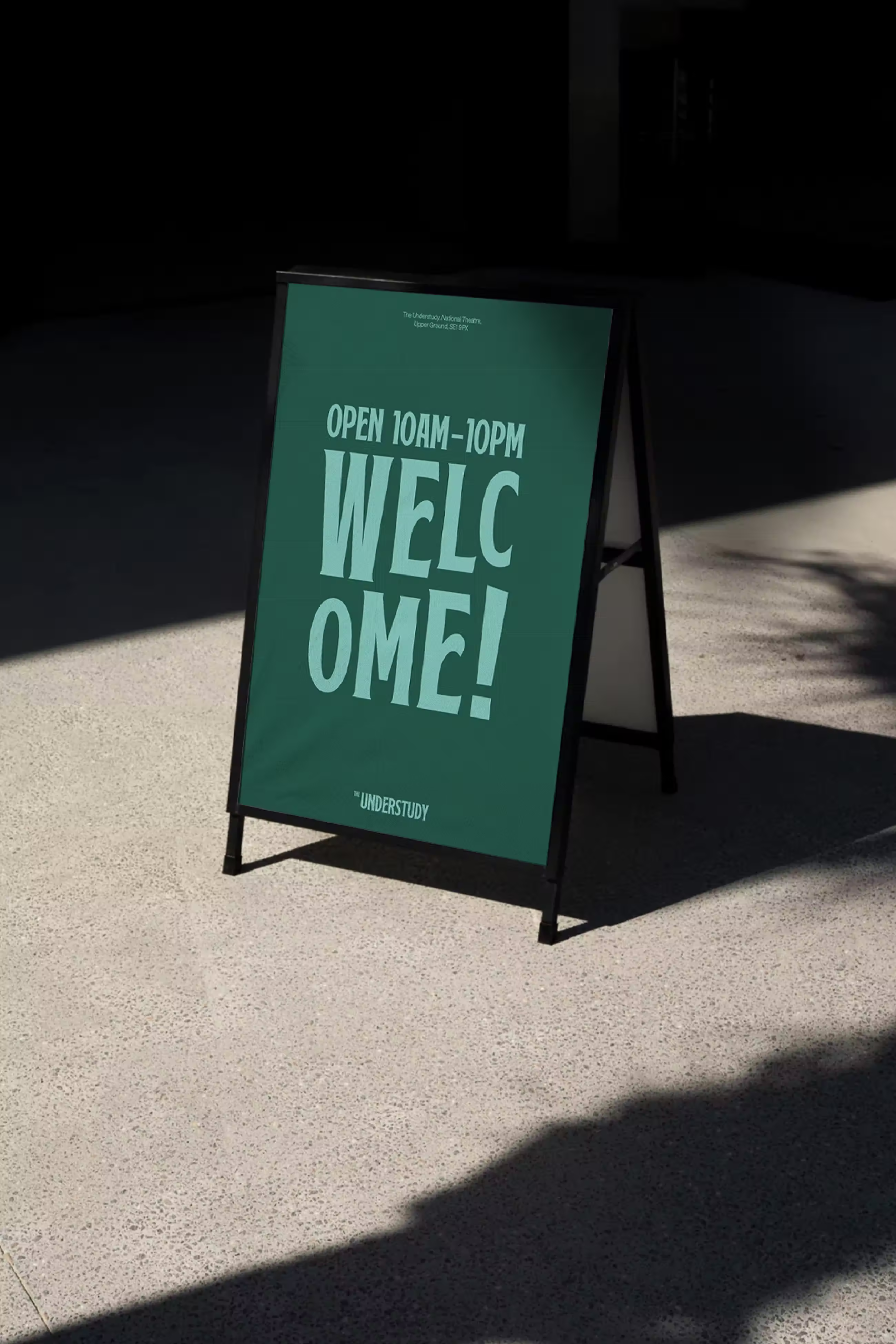
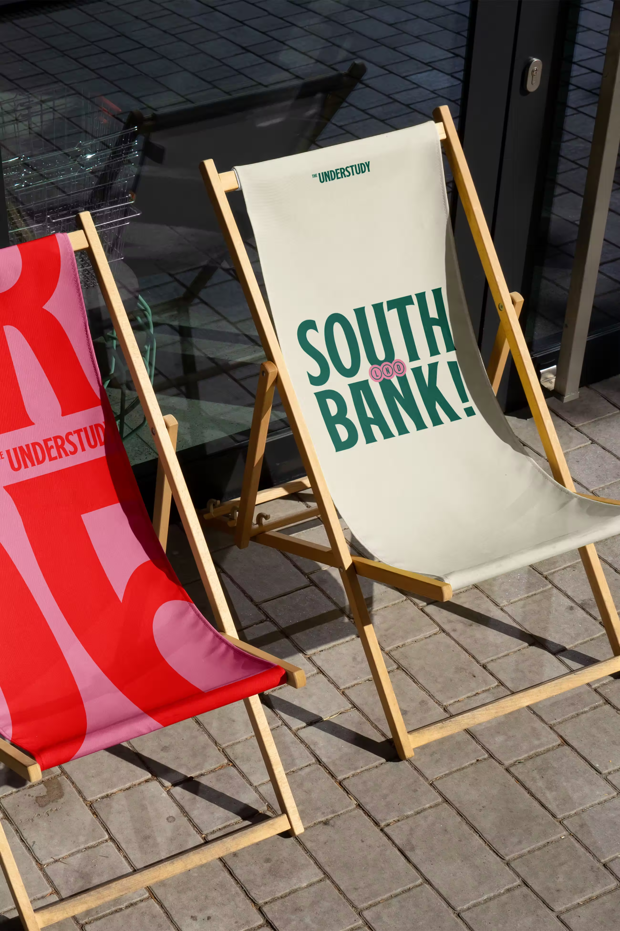
Typography played a central role. Dynamic Text captures the energy and drama of live theatre, bringing every word to life, while Modular Text draws on the bold, geometric forms of the National Theatre, adding structure and presence. Secondary Text, inspired by theatre seat numbers, introduces subtle details that connect the brand to the cultural heritage of the space. Together, these styles balance structure, playfulness, and warmth, making the identity unique and memorable.
The colour palette was designed to combine three worlds: KERB’s vibrant energy, the architectural and cultural presence of the National Theatre, and the familiar warmth of a traditional pub. This mix creates a contemporary look that feels rooted in history and conveys both dynamism and comfort, qualities essential for a space that thrives on social interaction and creativity.
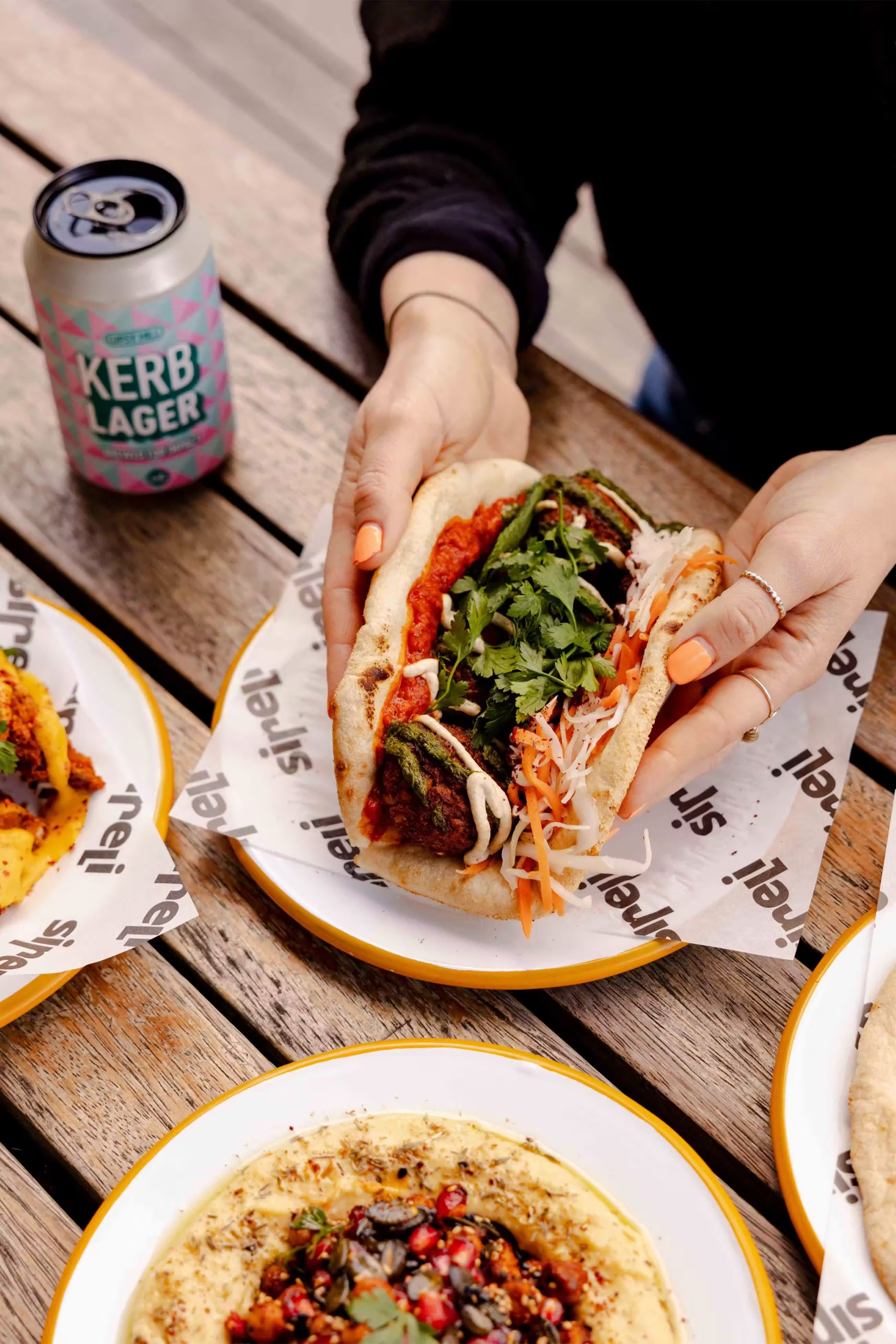
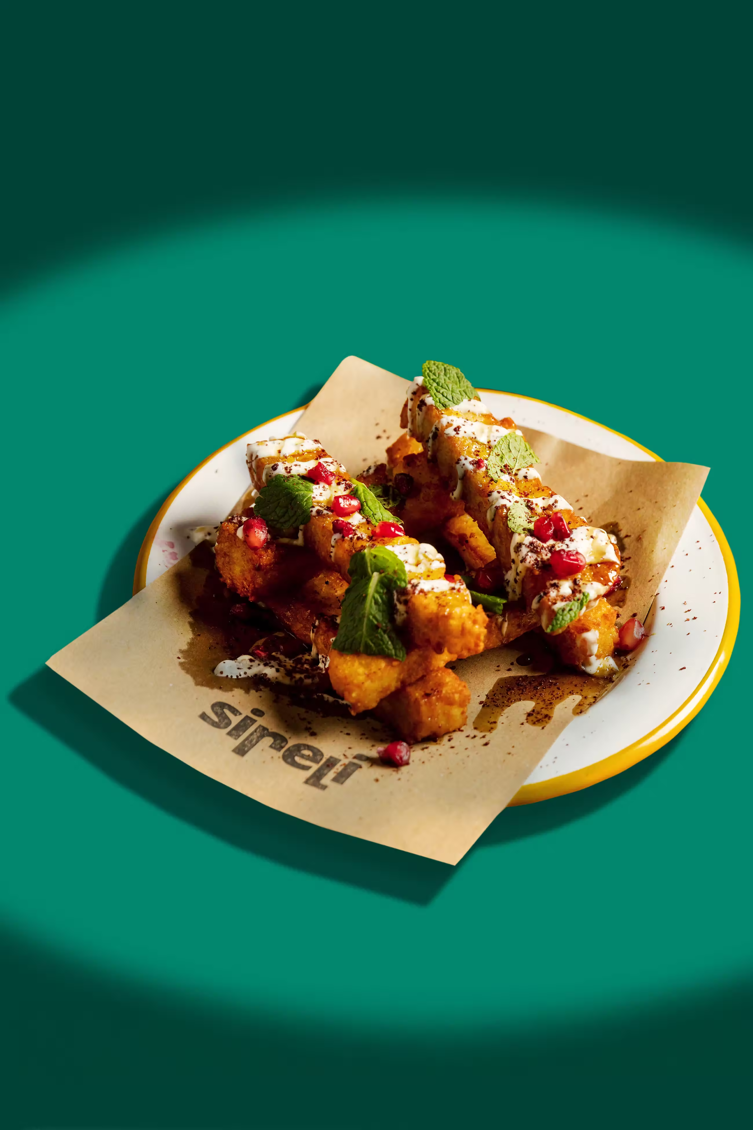
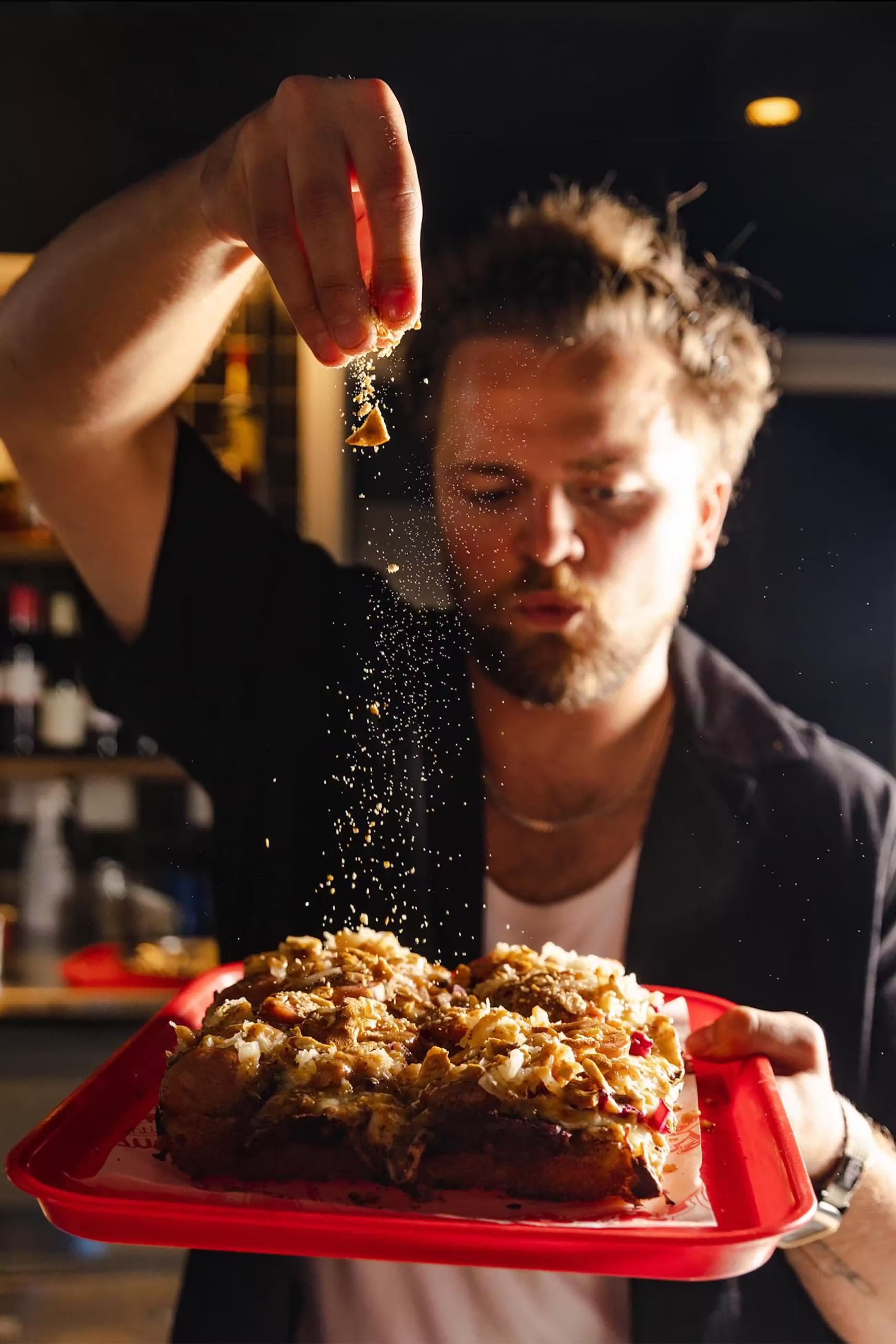
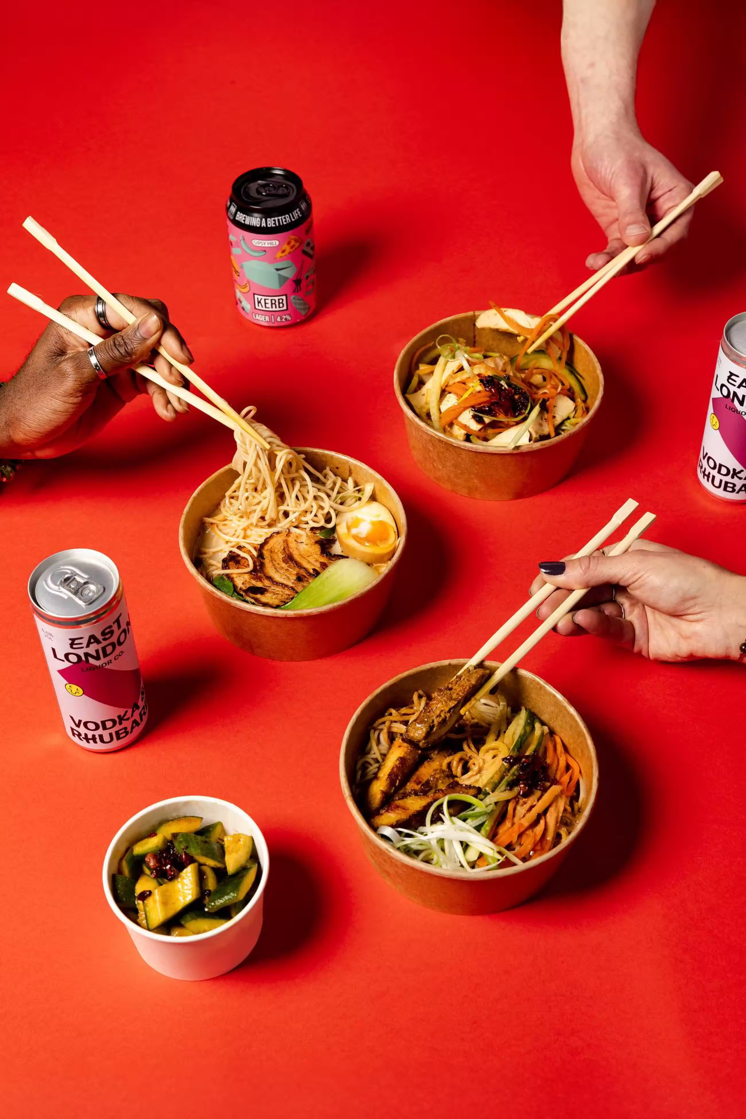
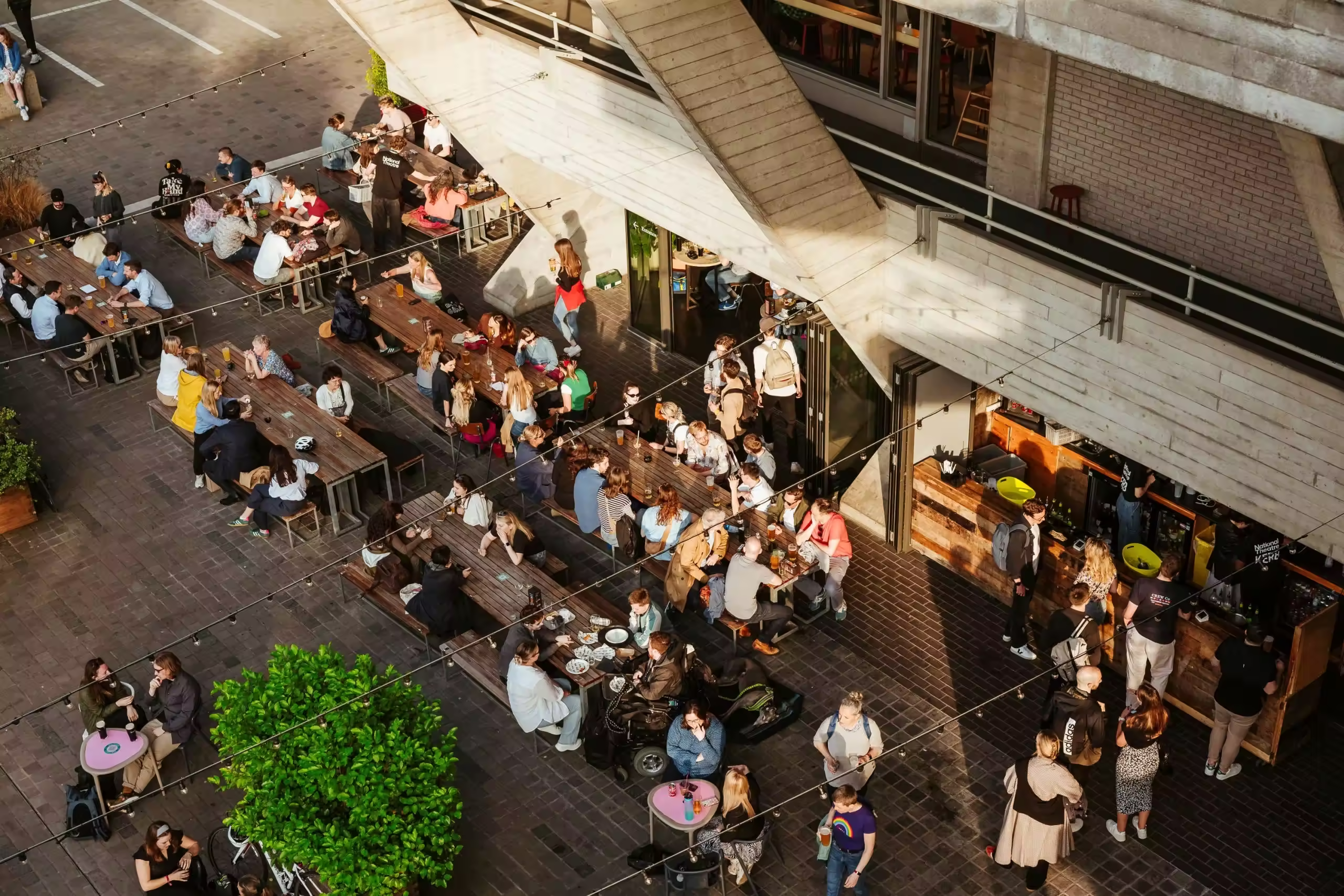
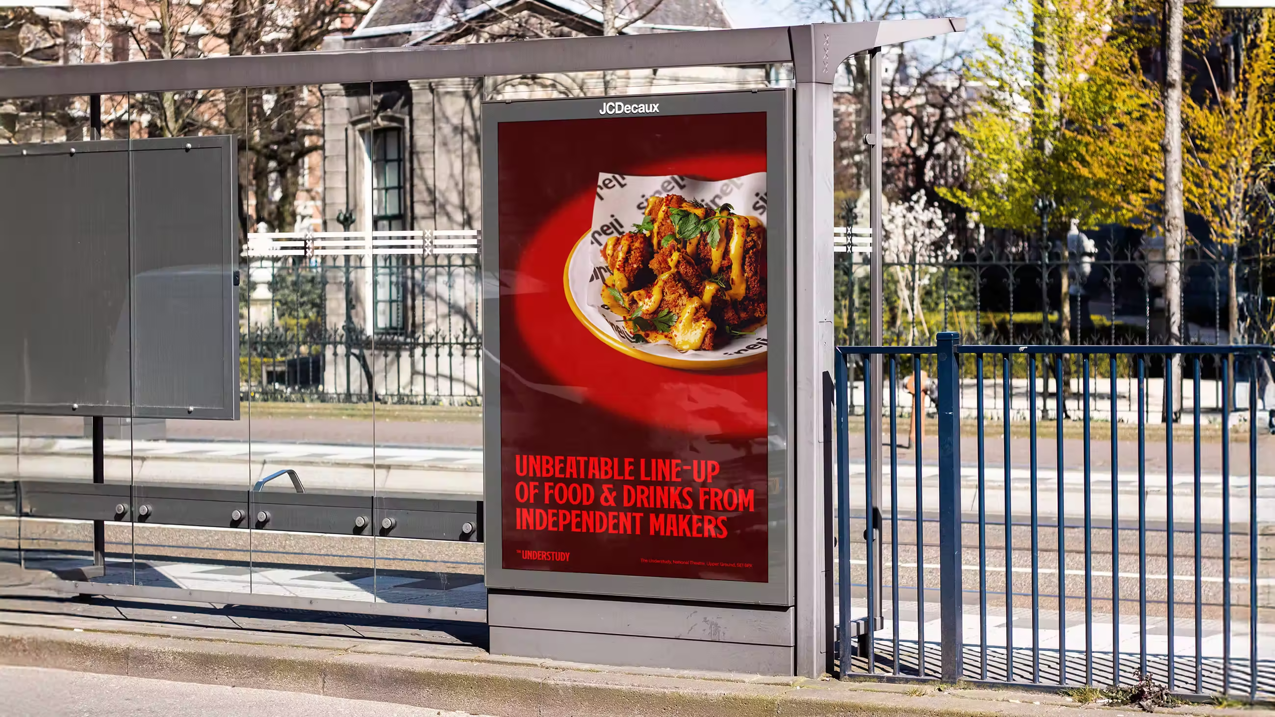
Photography was developed as a visual extension of the theatrical concept. Spot lighting combines overhead and side approaches to create focus, depth, and intimacy, evoking both the stage and backstage atmosphere. Everyday Acts captures people and food in authentic social moments, while Still Life arranges everyday objects like small stage sets, using light and shadow to add depth and character. Each image tells a visual story that emphasizes connection, storytelling, and presence.
All of these choices were made to make The Understudy more than just a bar. It is a living extension of the National Theatre, where every element from typography to colour, light, and photography tells stories, celebrates creativity, and invites people to feel part of a theatrical experience while remaining a welcoming and familiar place to relax, socialize, and enjoy a drink.
Unlock everything with Mindsparkle Mag Plus.
Get exclusive access to Premium features:
Credits: Design By Temple
Design Director: Ali Marshall
Content Director: Lewis Harrison-Pinder
Designer: Edoardo Maccari
Designer: Matt Hawkey
Project Manager: Courtney Baisch
