Le Periplo
May 04, 2020
Mindsparkle Mag


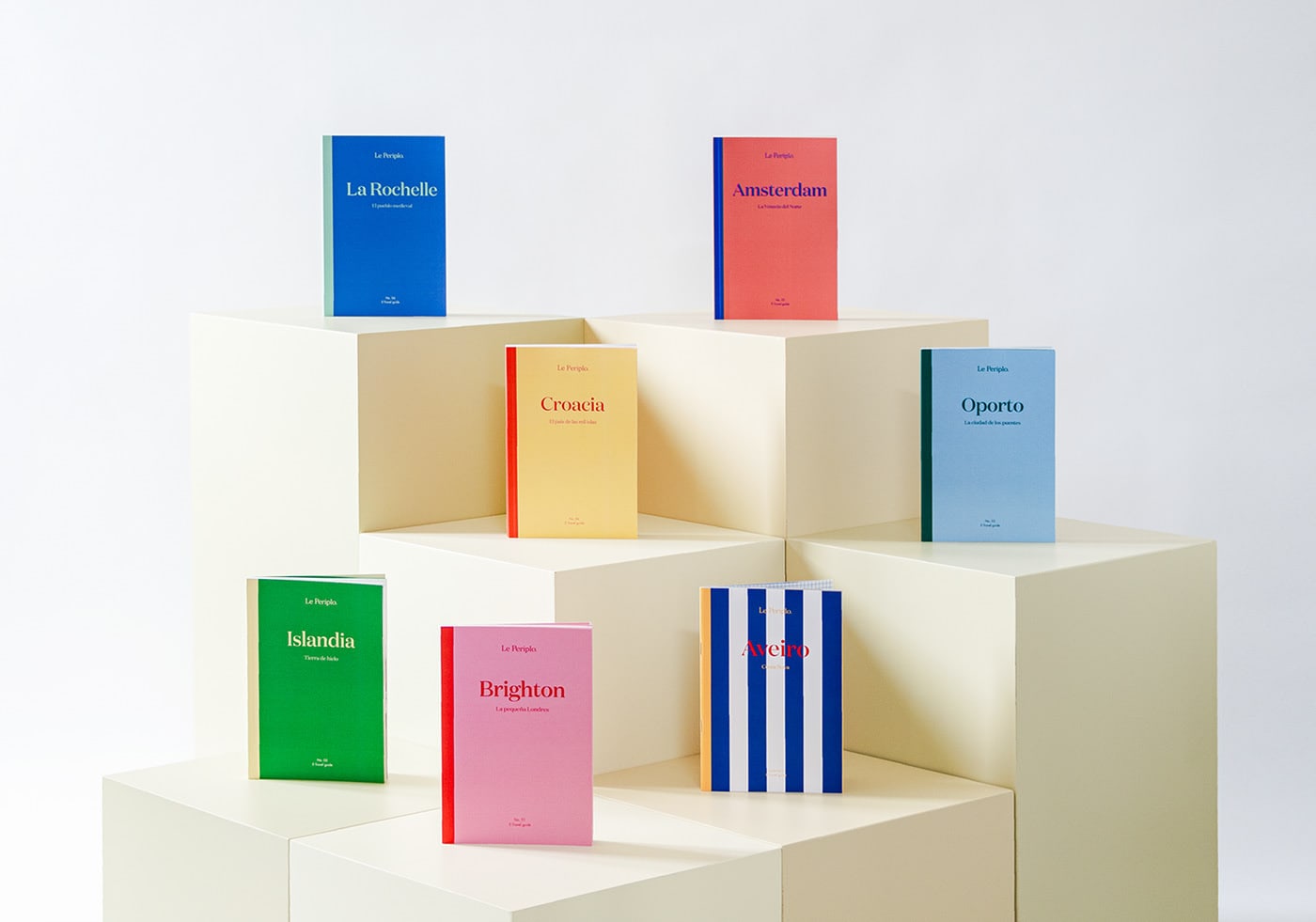
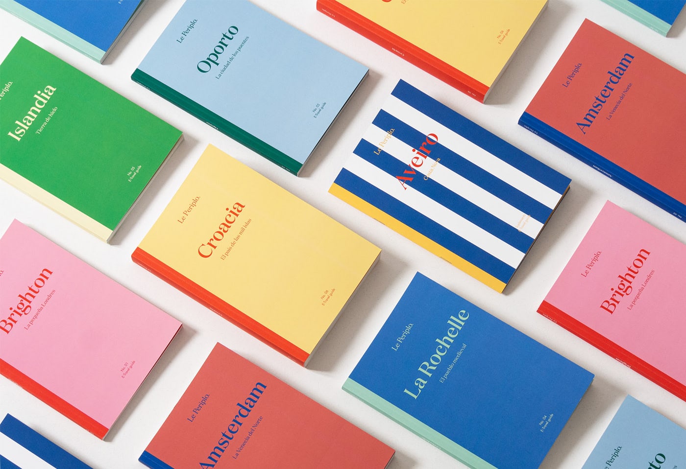
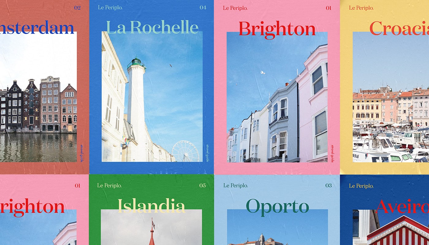
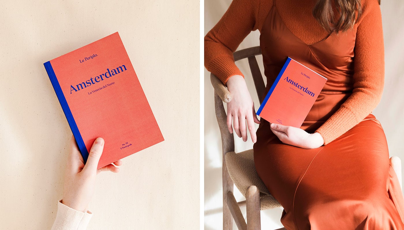
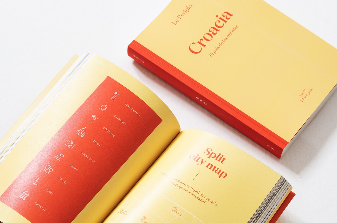
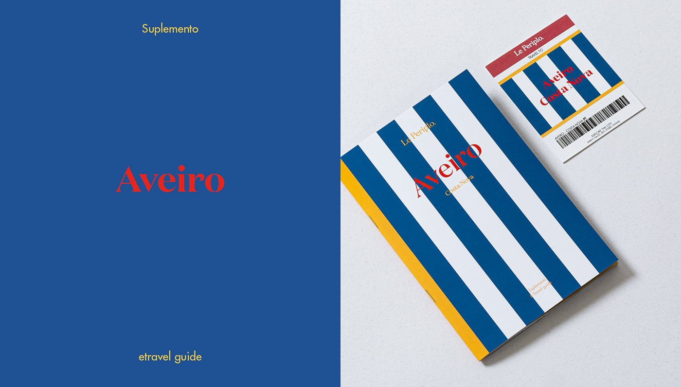
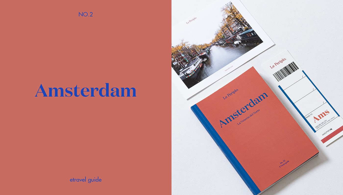
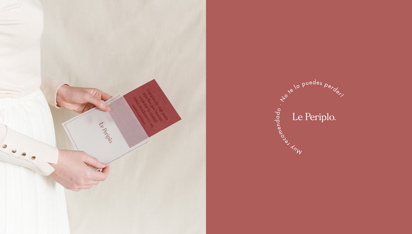
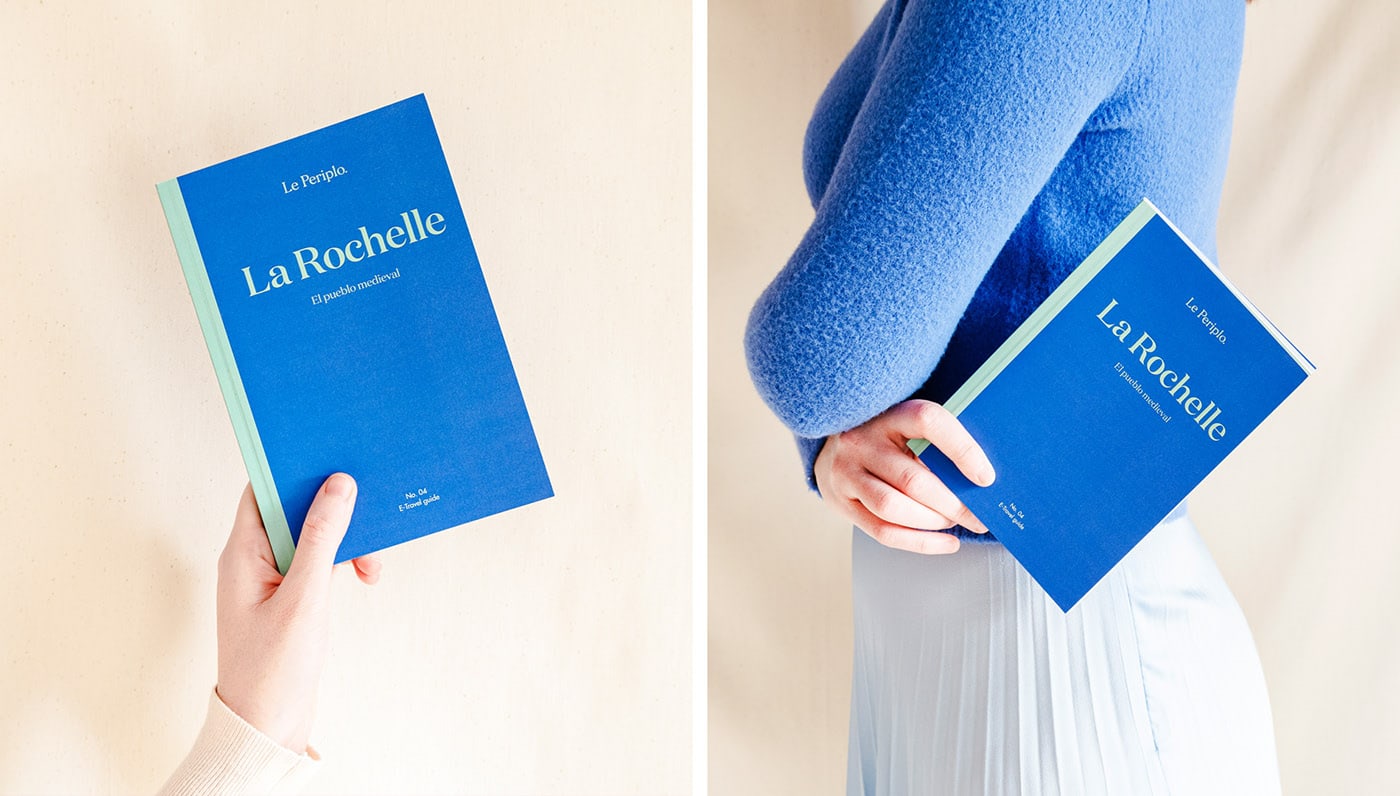
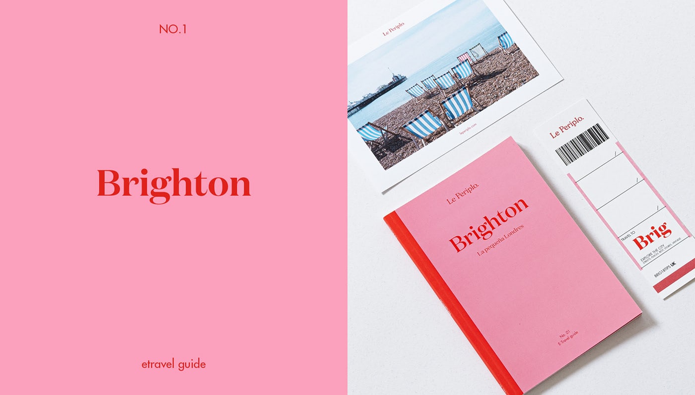
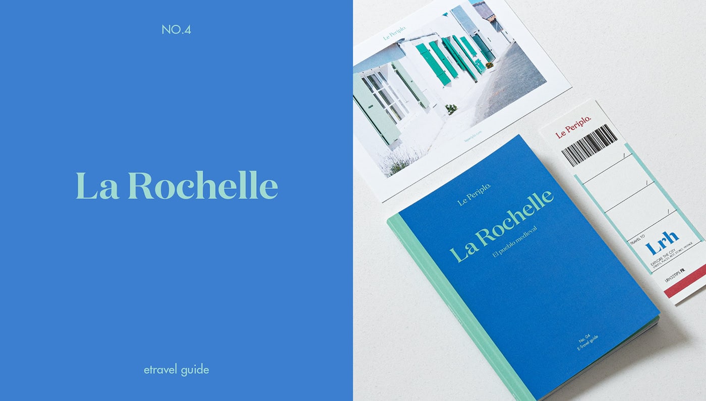
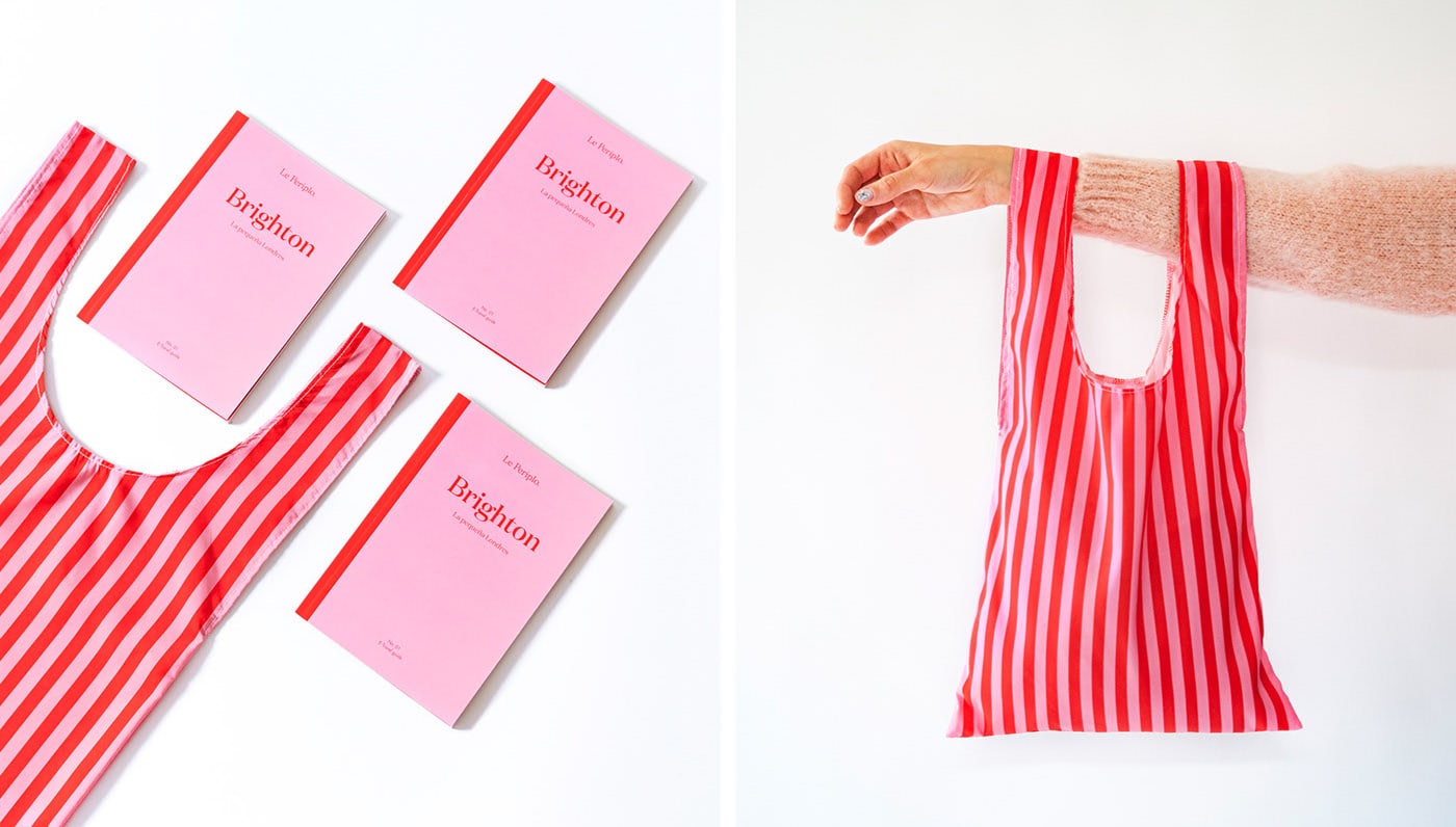
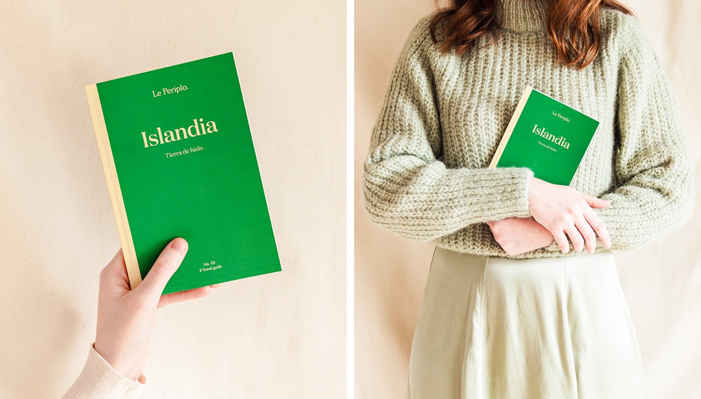
Le Periplo etravel guide are physical and digital travel guides, a brand created and based in Madrid / Barcelona. It arises from the idea of unmarking the common guides and publishing cities with a different perspective and focused on experiencing the moment that destination lives as a resident would.
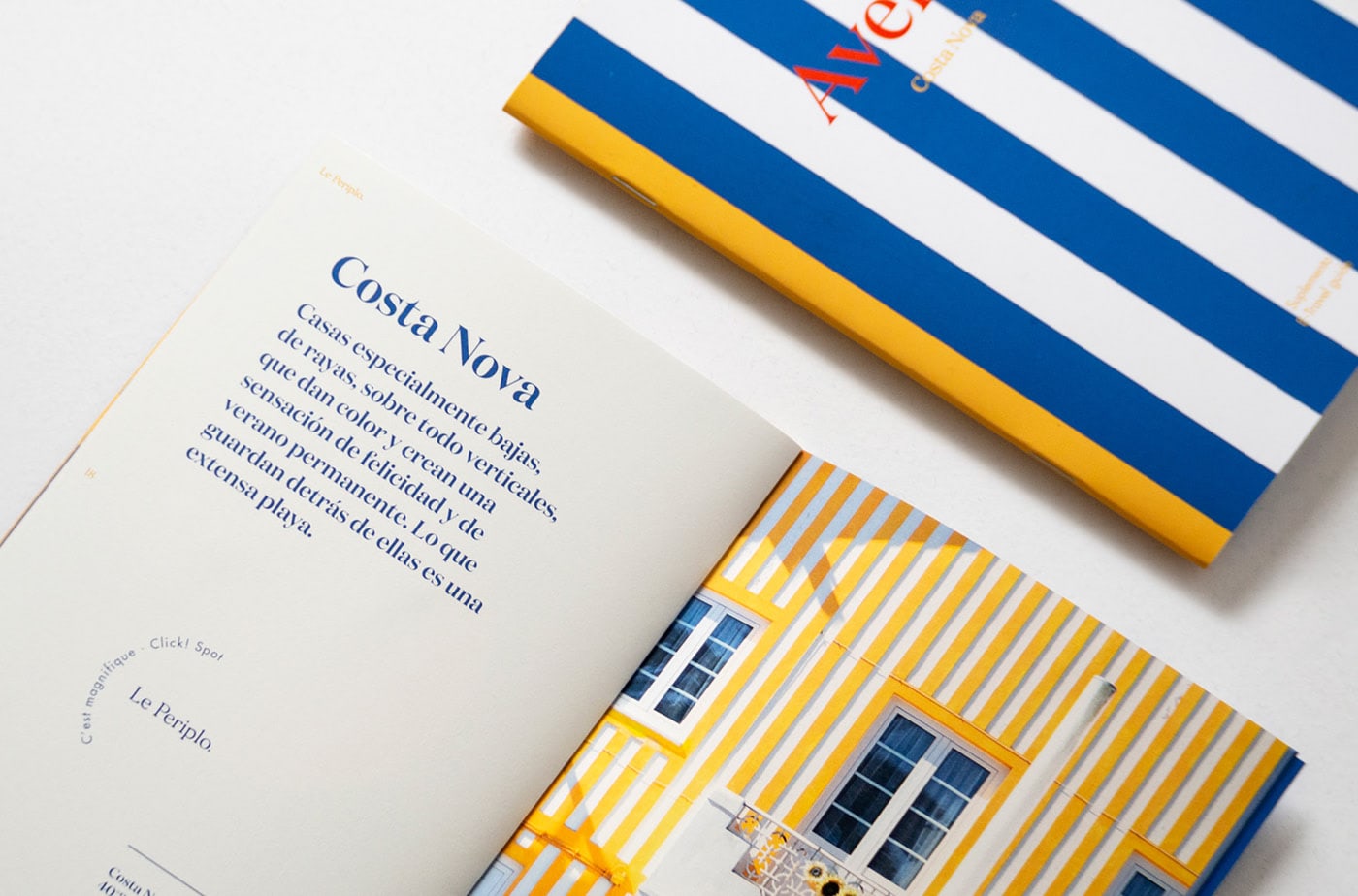
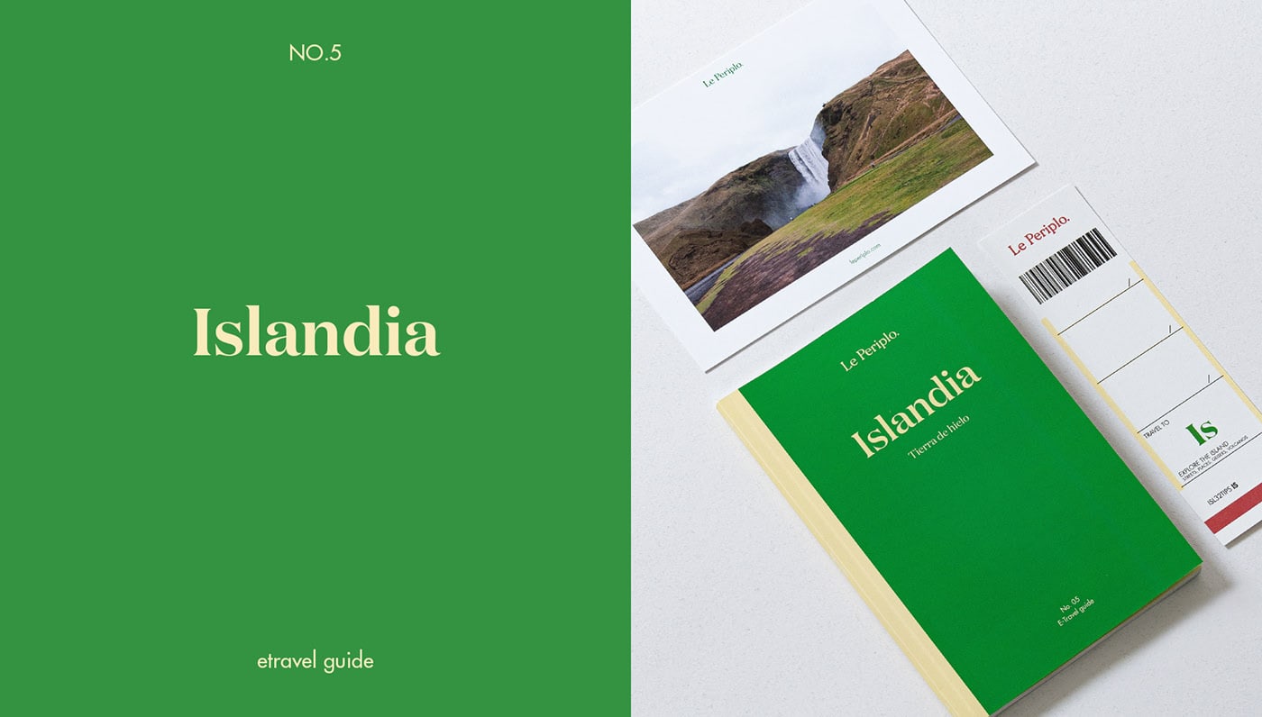
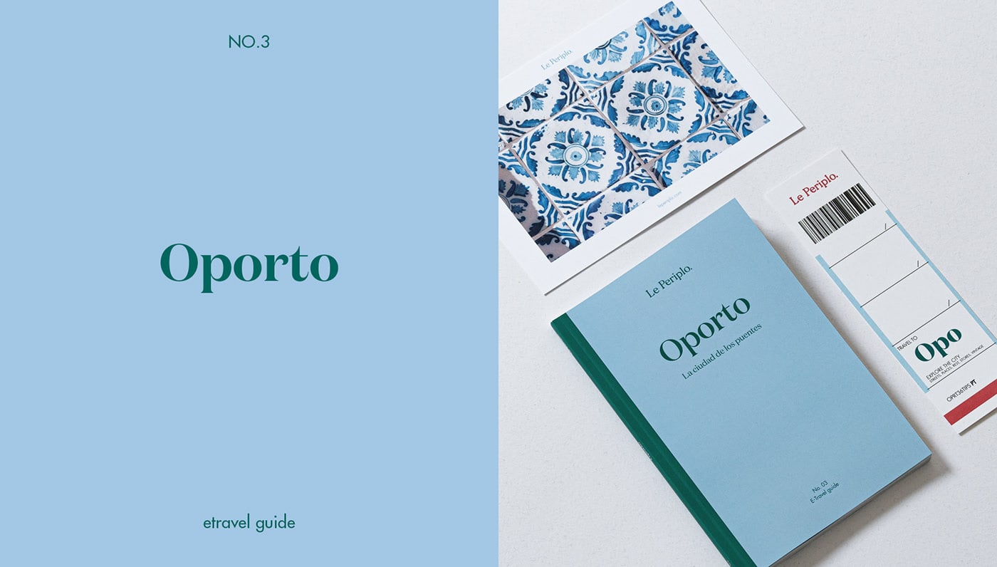
The corporate identity is based on a clean and timeless image, a key color and a typographic logo that plays with a current, fresh and colorful image that is represented in each guide making each number unique, but cohesive with the other issues.
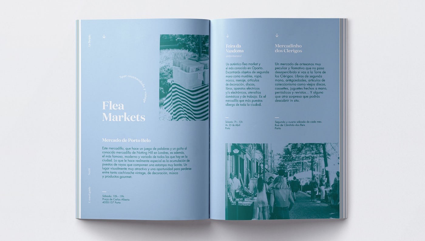
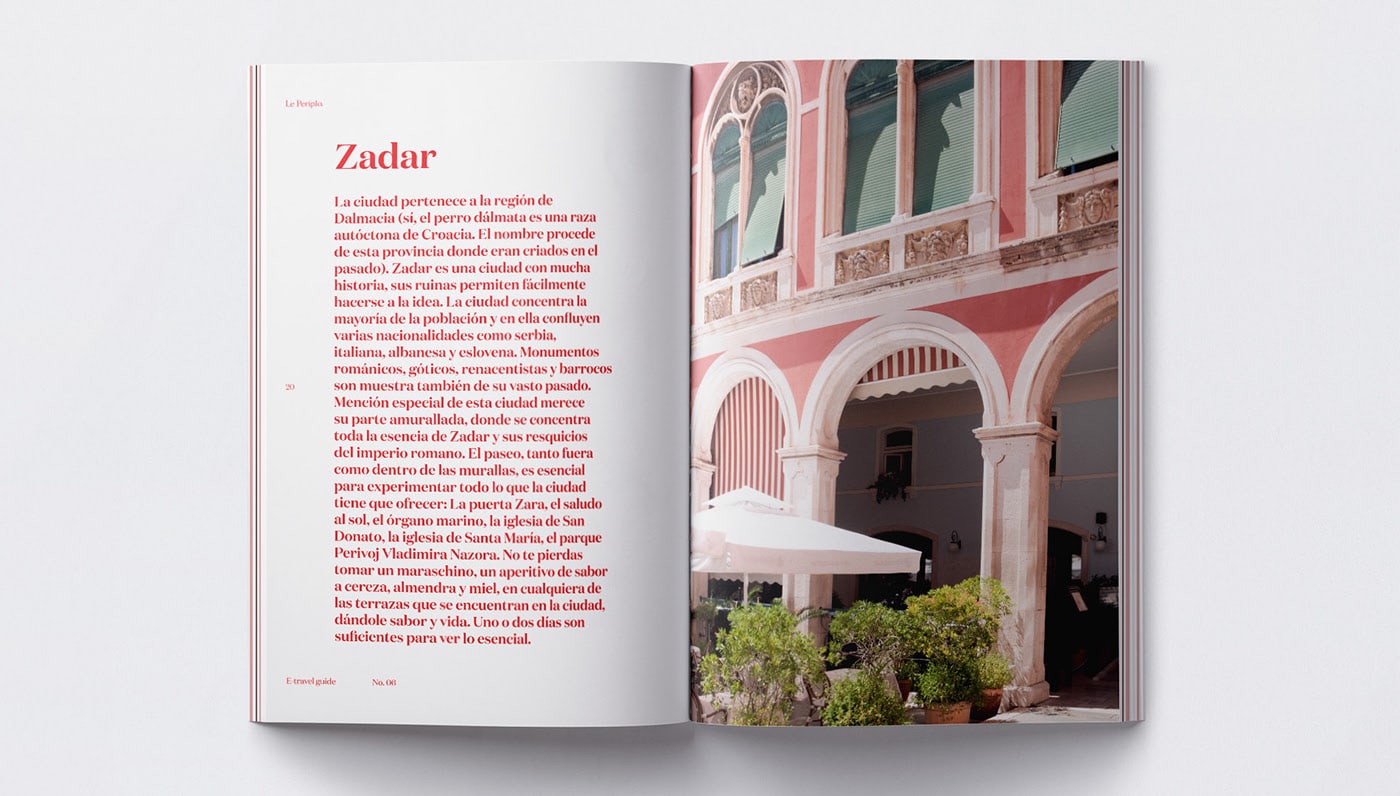
The corporate font that makes up Le Periplo logo is Morion. A serif typeface, elegant with soft shapes where the points and punctuation marks are made in rhombus shapes. A graphic resource to mark a location or a route. Another main typeface is Domain, also serif but with soft and curved shapes for titles, header texts and featured introductions. And the Futura Std as secondary typeface, is a sans serif font that facilitates readability.
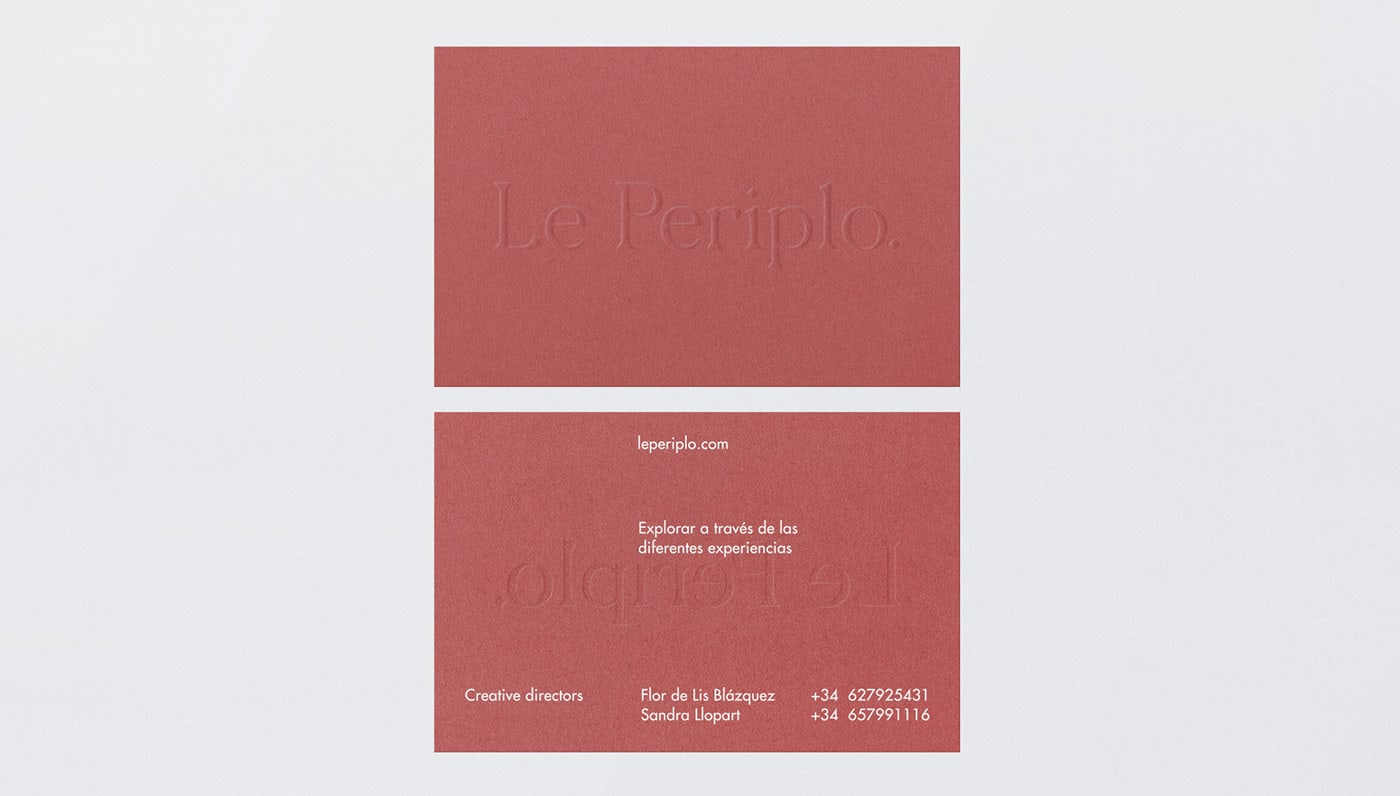
Marsala color plays an important role in the visual identity along black and white.
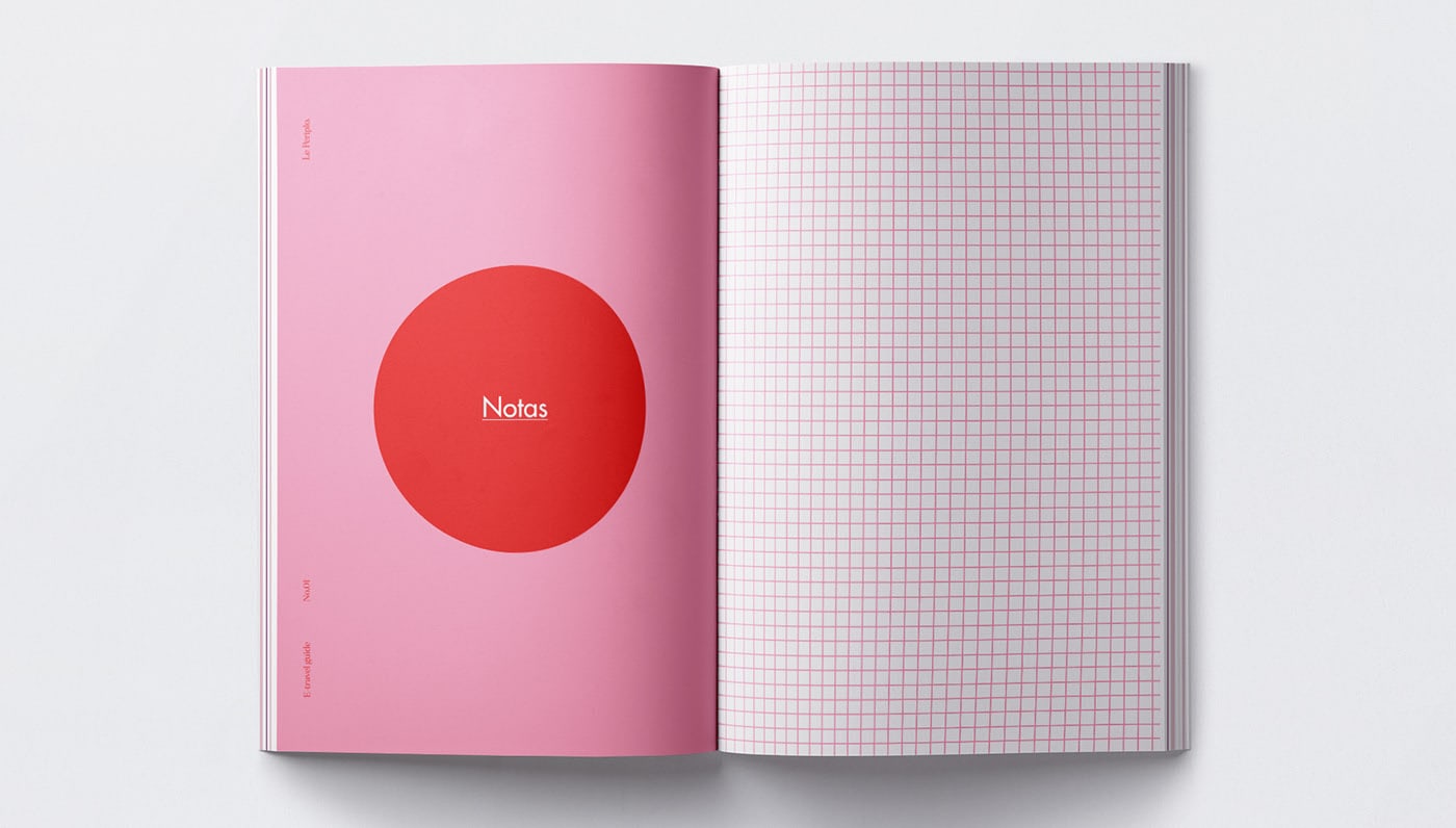
Grid messages such as notepad, passport stamps with messages and the presence of diamonds to define the information distribution. In addition to an iconographic system created to represent the type of recommendation / tip, where each icon is built on an unfinished line as if it were a tour.
Credits: Le Periplo