 Plus
Plus

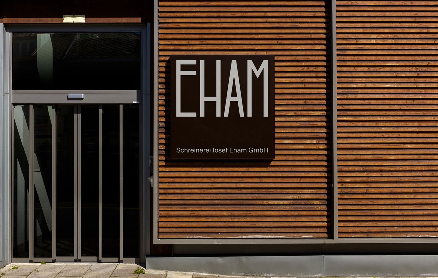
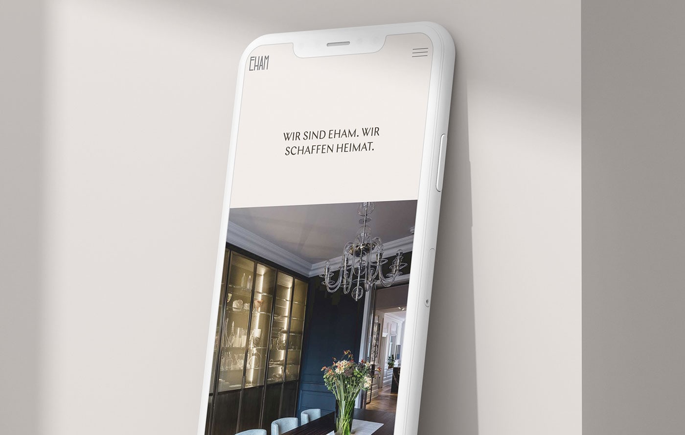
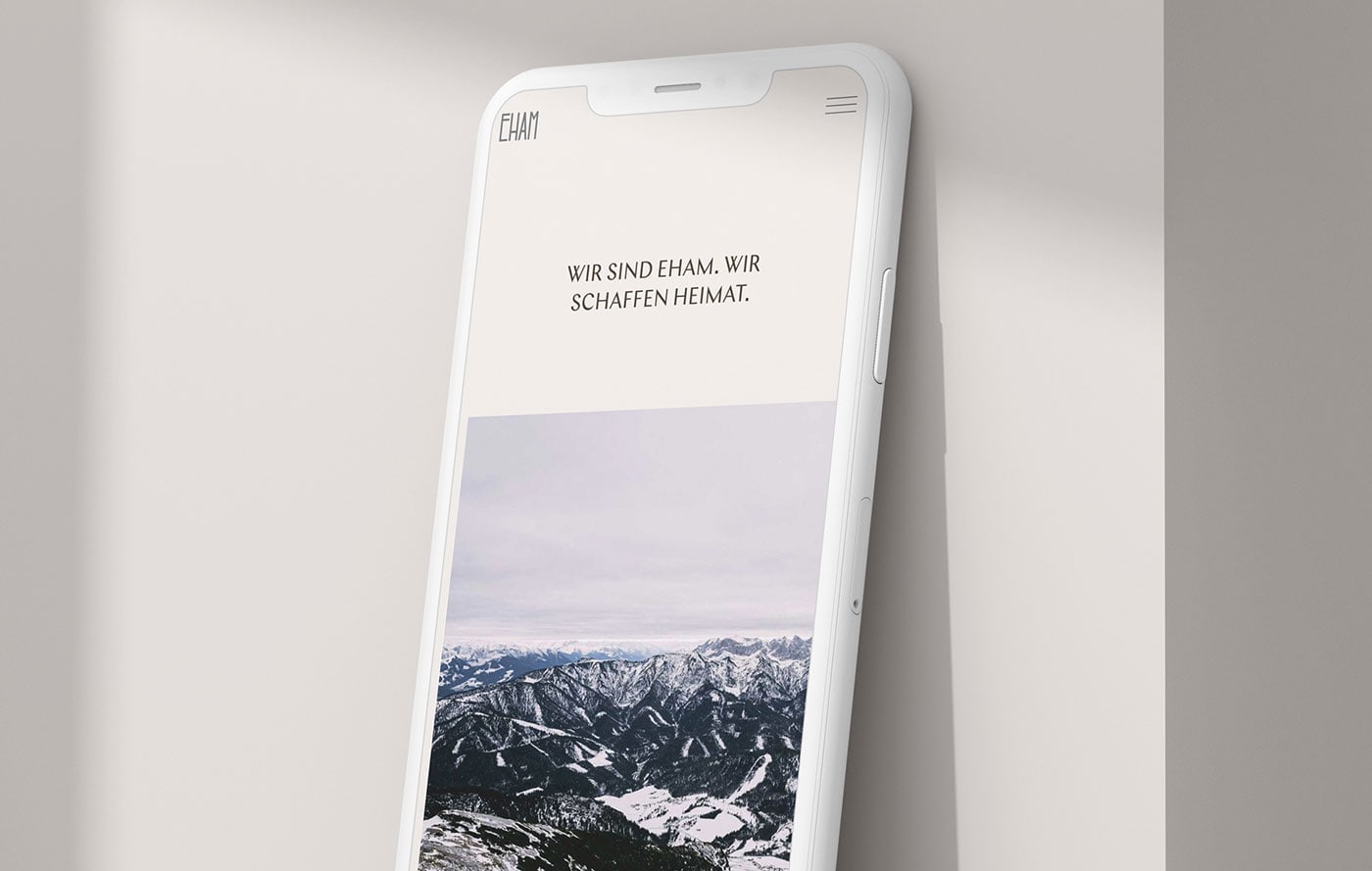
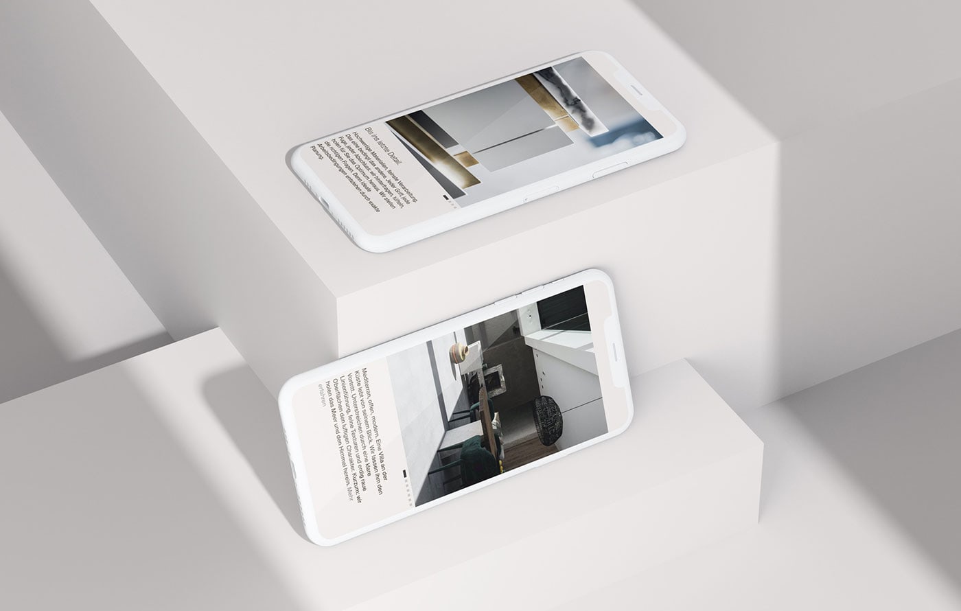
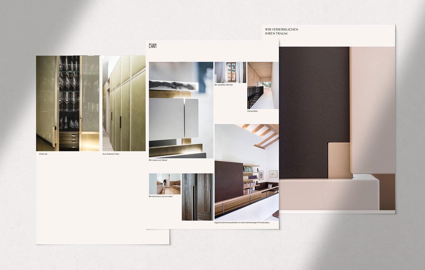
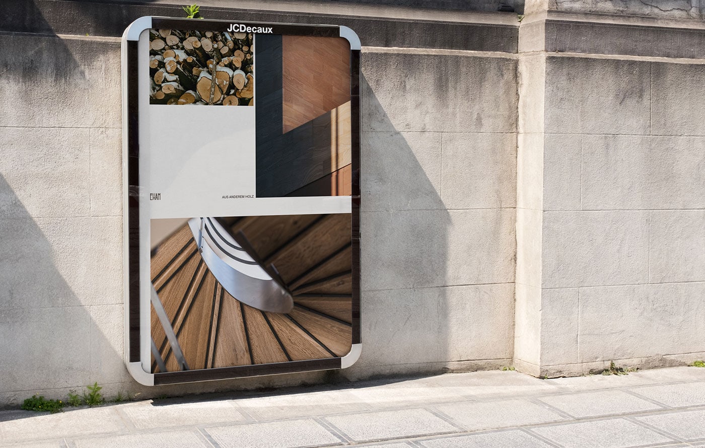
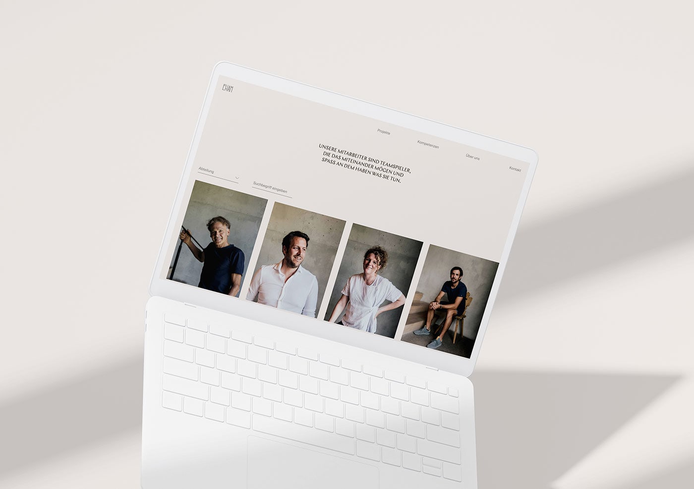
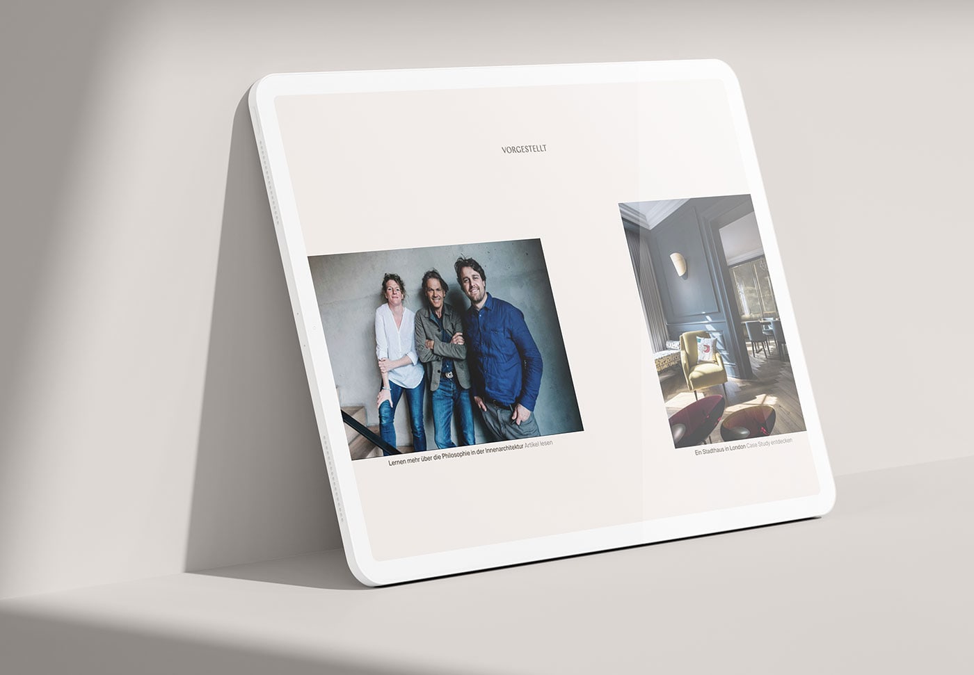
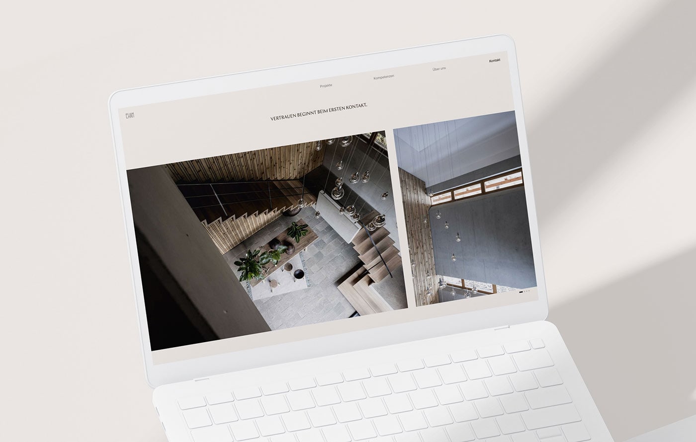
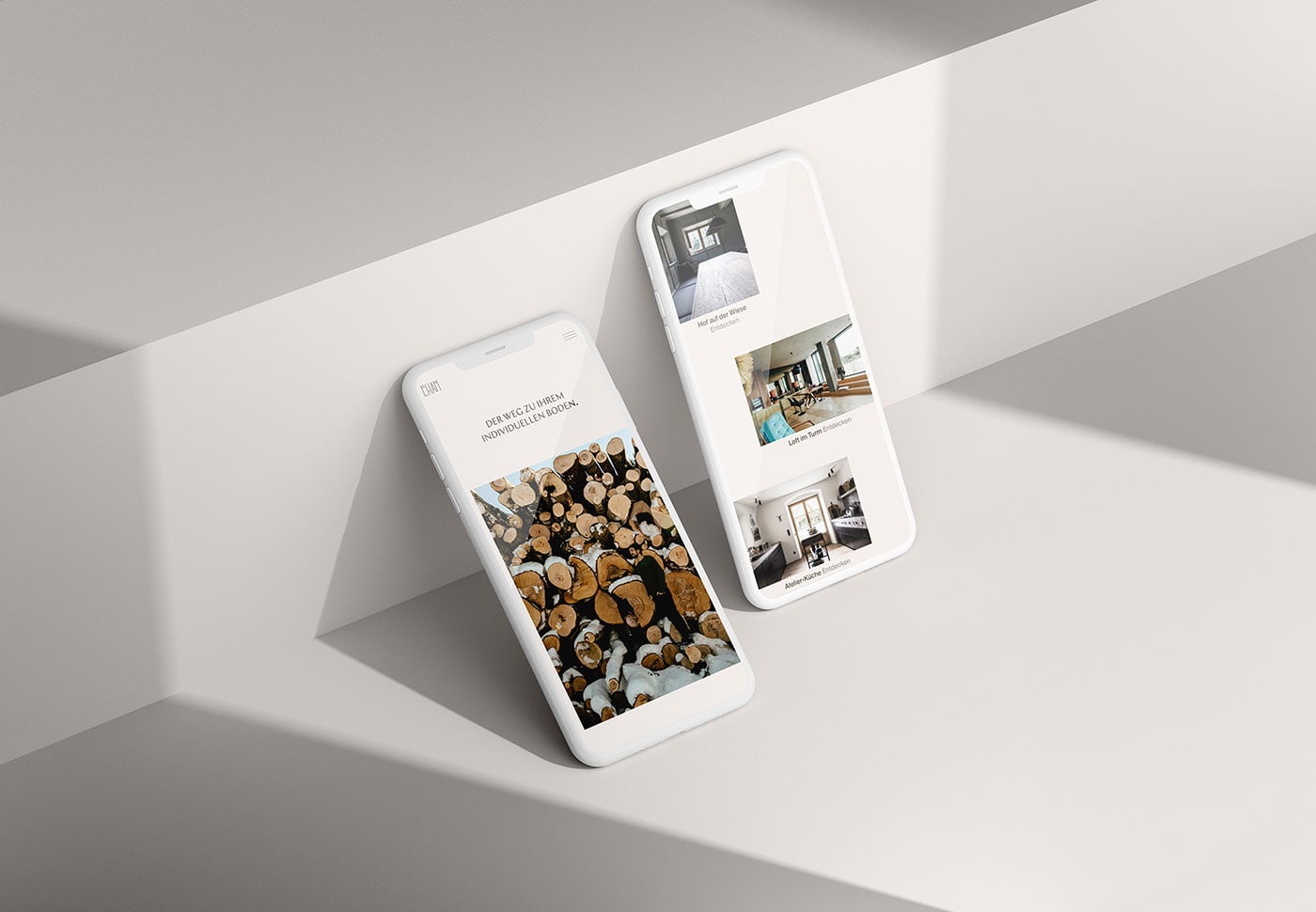
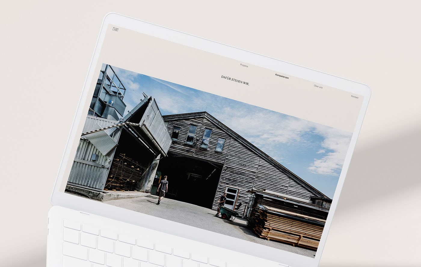
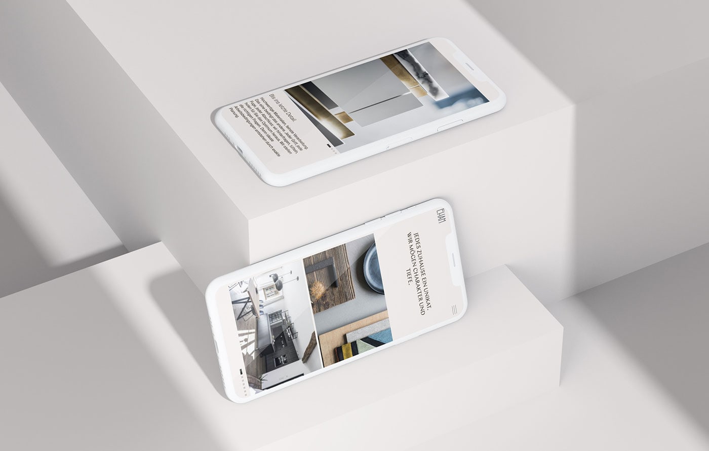
Moby Digg designed Eham Corporate identity. They developed the whole rebranding and website design for EHAM - a family-owned carpentry business rooted inBavaria, Germany. Their detailed work and high-quality products make EHAM a unique creative undertaking. By creating custom designs tailored to the likings of their clients – both in private and public sectors – EHAM translates their dreams with dedication and honesty providing full service along with project management, an in-house interior design team, as well as a wood workshop and showroom.
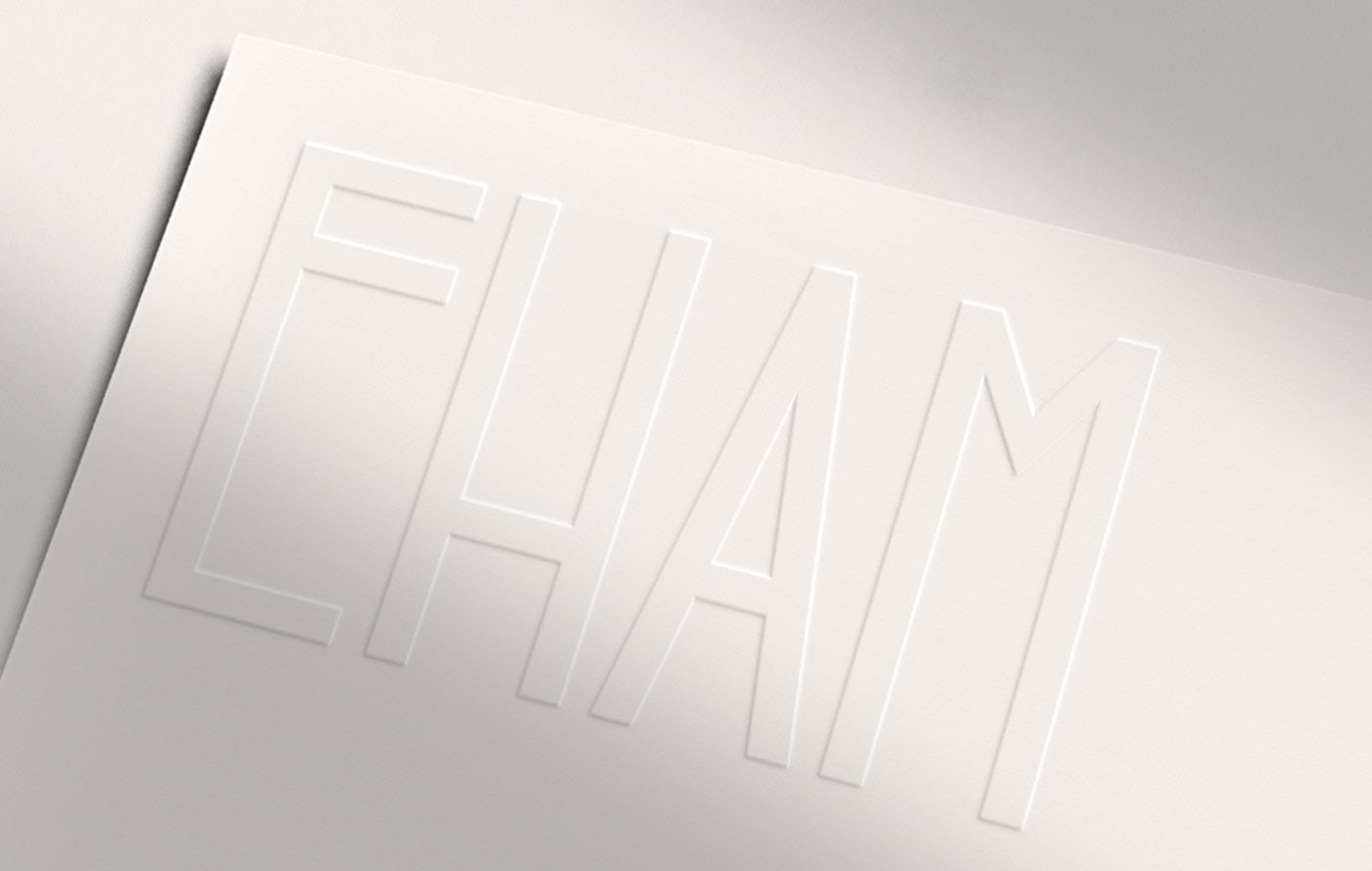
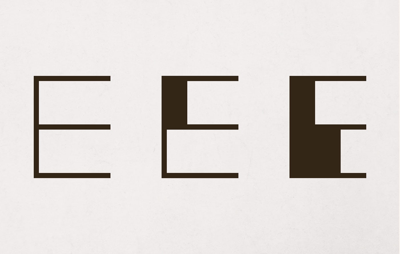
With the brand redesign, Moby Digg aimed to create a cohesive image between the work that EHAM produces, their values, their identity and bring freshness into EHAM’s world. Dealing with a family business with a long-standing tradition, they decided to engage the client in the redesign process. Starting off, they wanted to maintain some of the key elements of the old logo, such as and crossbars in letters“E” and “H”. Based on these letterforms we created a custom variable font, morphing between the old and the new.
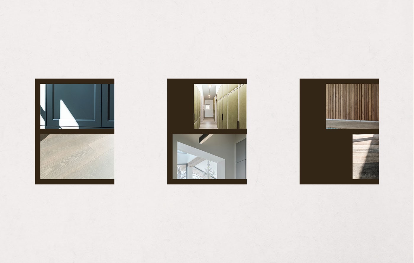
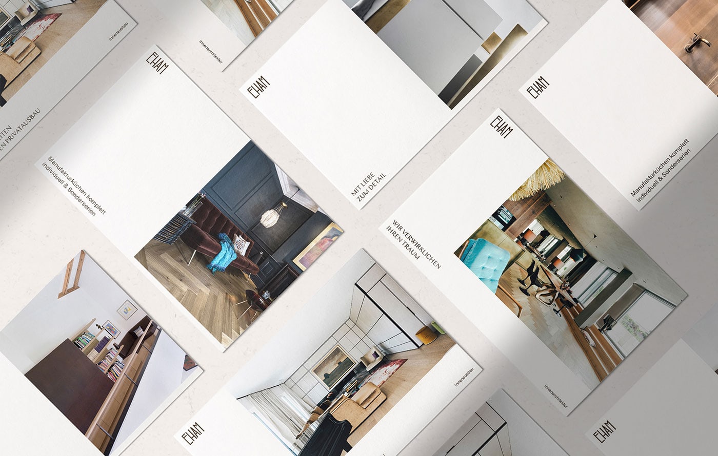
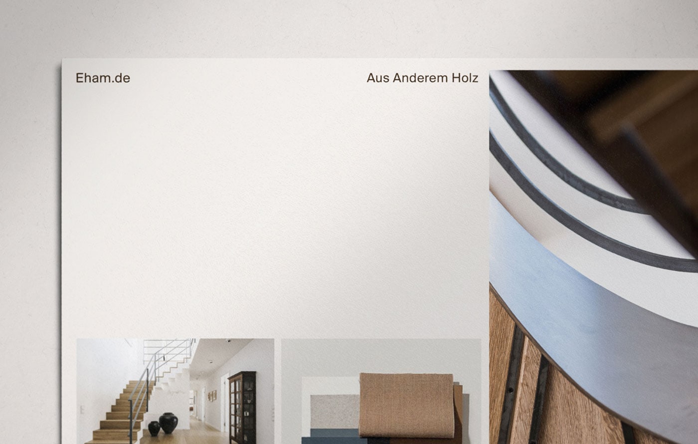
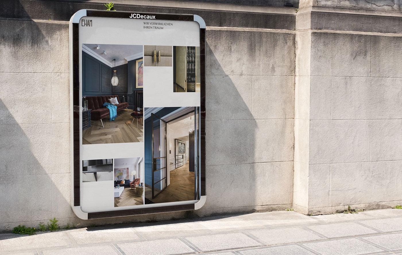
They used the thickness of the letter as the starting point for the gutter between images, allowing for more architectural, modular and constructed layouts. The final grid system derives from letter form “E” by activating the left margins and distances between sections as composition elements. This results in a clean and tidy design, which plays with structure and building forms within white space, calling to attention the intricate interplay of wood structures and architectural choreography.
Credits: Moby Digg
