Plus
Plus

 Menu
Menu


Sid Lee
August 01, 2016
Mindsparkle Mag


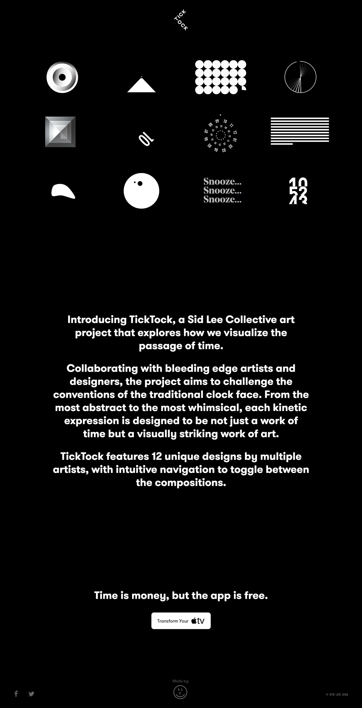
Sid Lee created this striking promotional site for TickTock, a collective art project that reimagines how we visualise the passage of time. Set against a deep black canvas, a grid of minimal white icons — a spiral, a triangle, a dotted matrix, a radial burst — hints at twelve kinetic clock faces designed by an array of artists. The bold, rounded sans-serif typography anchors the layout with confident, friendly clarity, while the monochrome palette lets each abstract form breathe. It is a playful yet refined exercise in art direction and typography that turns telling time into a visually arresting experience.
Includes freebie bundle, unseen BTS insights and more.