Plus
Plus

 Menu
Menu


Anonymous
July 19, 2016
Mindsparkle Mag


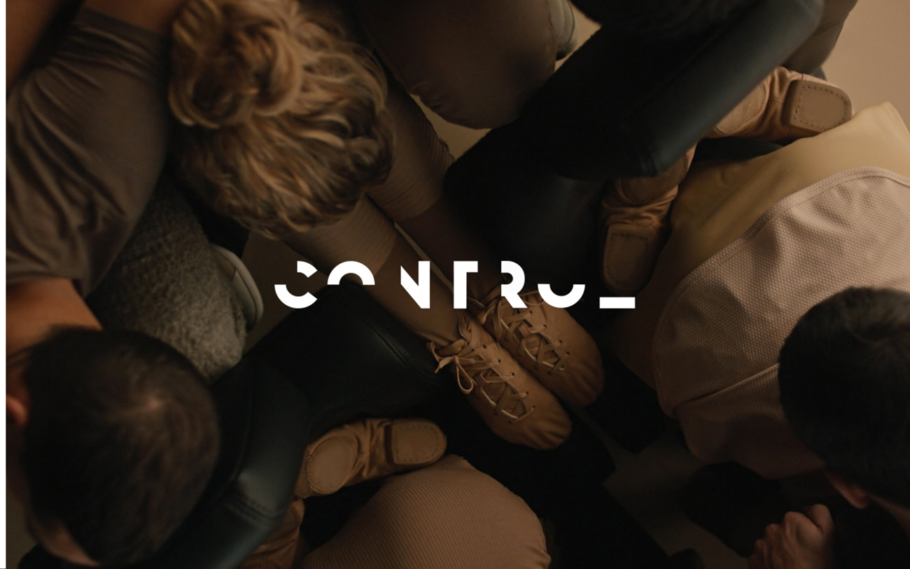
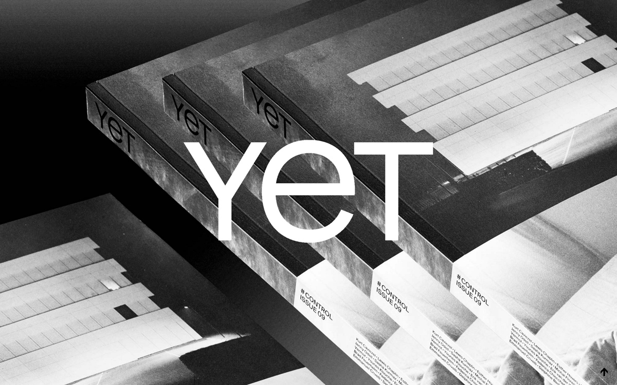
Control Films sets its stall with pure cinematic atmosphere. The landing view is a single full-bleed, warm-toned film still — an overhead composition of dancers' feet and pointe shoes gathered in a tight cluster — with a crisp white "CONTROL" wordmark floating dead centre. That logotype is the design's signature: geometric letterforms cut with half-circle counters that feel precise and contemporary against the soft, sepia grain of the photography. There is no clutter and no chrome, just image, mark and mood, trusting the footage to carry the story. It's a confident exercise in restraint, where strong typography and full-screen art direction do all the work of the web design.
Includes freebie bundle, unseen BTS insights and more.