Plus
Plus

 Menu
Menu


YET
May 28, 2016
Mindsparkle Mag


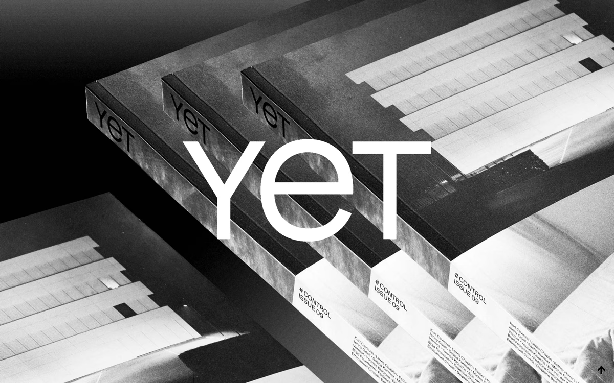
YET gives its independent photography publication a striking, high-contrast home on Yet Magazine. Grainy black-and-white imagery of stacked issues fills the screen, overlaid with a bold lowercase wordmark that anchors the whole composition. The monochrome palette and confident scale give the page a raw, gallery-like intensity that suits a magazine built on strong photography. It is a beautifully austere piece of editorial web design, where restraint becomes the statement. Moody, tactile and quietly powerful.
Credits: YET
More in Alcohol & Spirits Packaging
Includes freebie bundle, unseen BTS insights and more.