 Plus
Plus

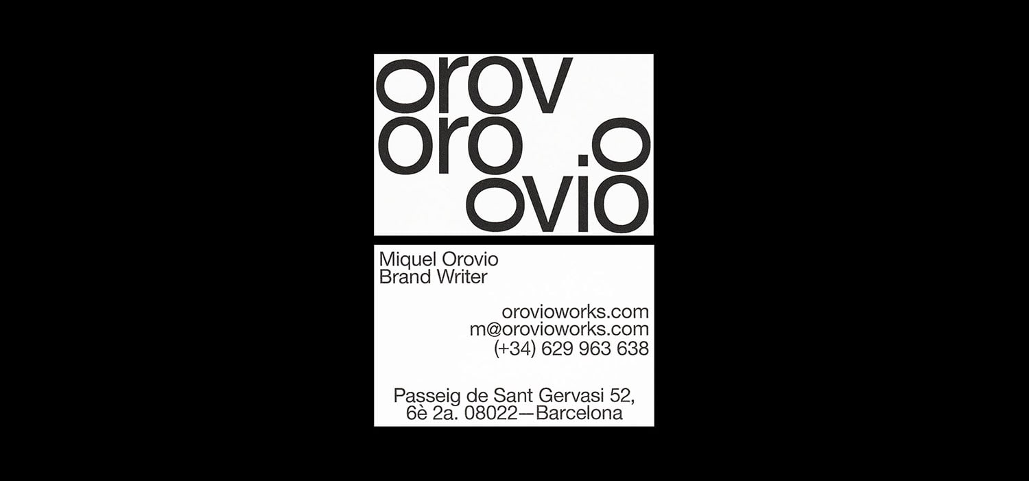
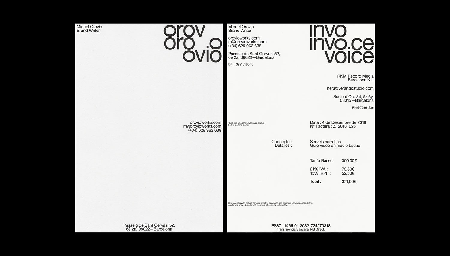
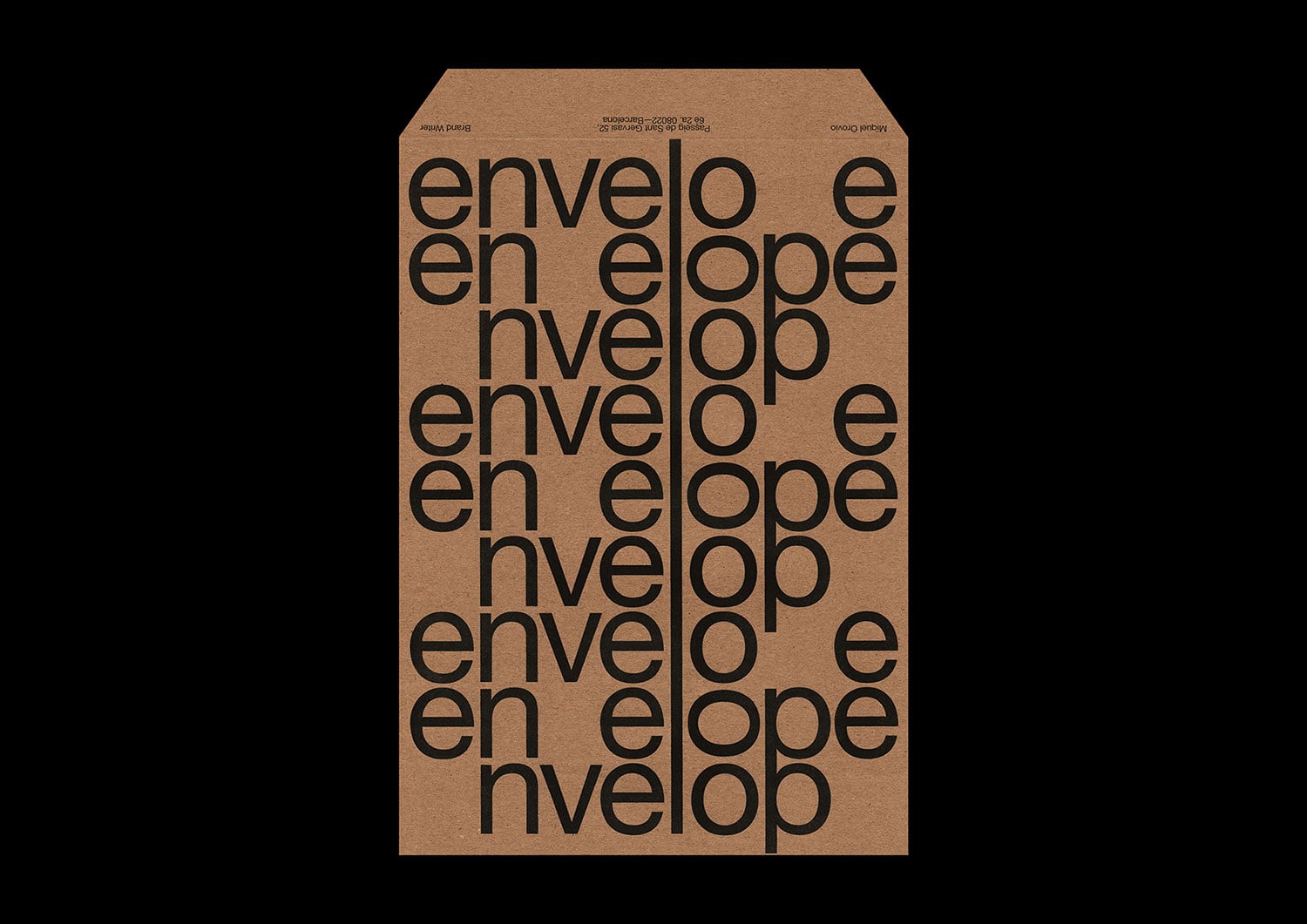
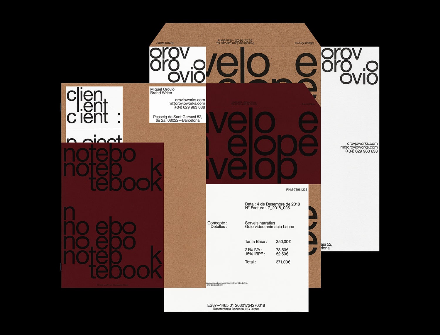
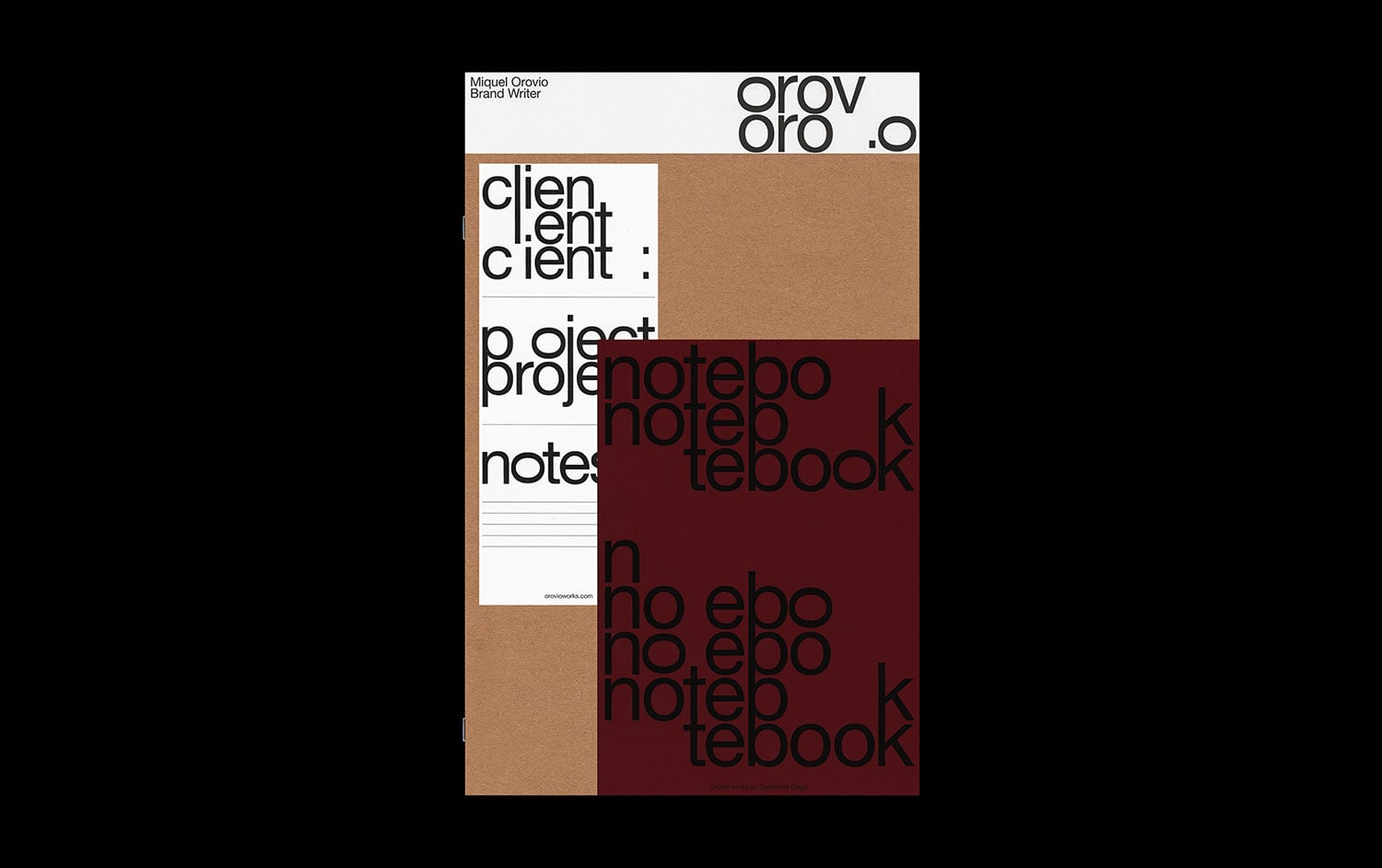
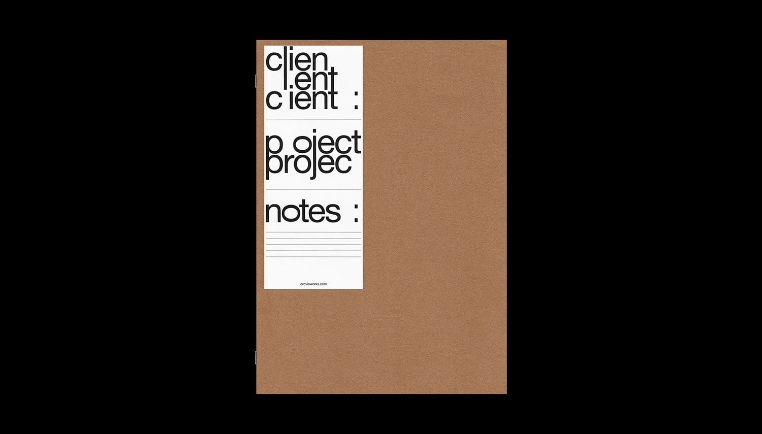
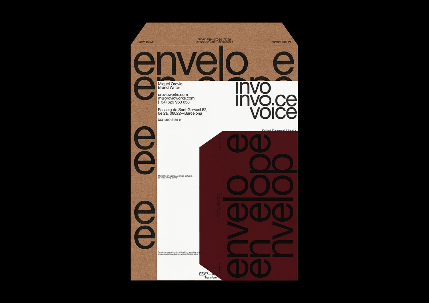
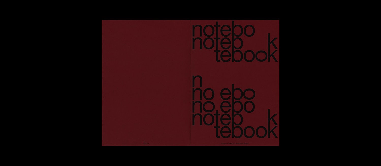
Quatrième Étage designed the visual identity for Miquel Orovio, a Barcelona-based brand writer. Business cards, stationery supplies and identity system. Based on Orovio’s mantra «Think like an agency, work as a studio and be like a rolling stone» we have collaborated with him to create a modular identity based on words, letters and signs. We used repetitions to symbolized sentences, paragraph and get a bit of density to play with.
Then by removing some of the letters, words or signs in the composition we tried to emulate Orovio playing with their meanings in a defined space (the format). We have chosen to sometimes turn the "O" to the horizontal to get the concept around the "3" back. It also give a twist to the identity that evokes Miquel’s unique creativity. Finally we have divided the informations in three text block, with three alignment, one ferré left, one centered and one ferré right to reinforce the tripled aspect of the identity.
Credits: Quatrième Étage
