Tine Daum
September 28, 2020
Mindsparkle Mag


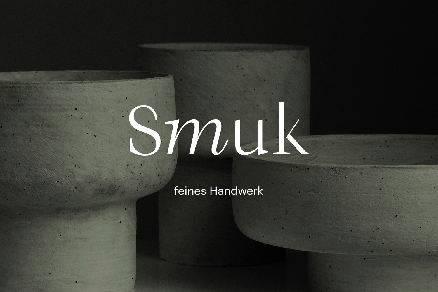
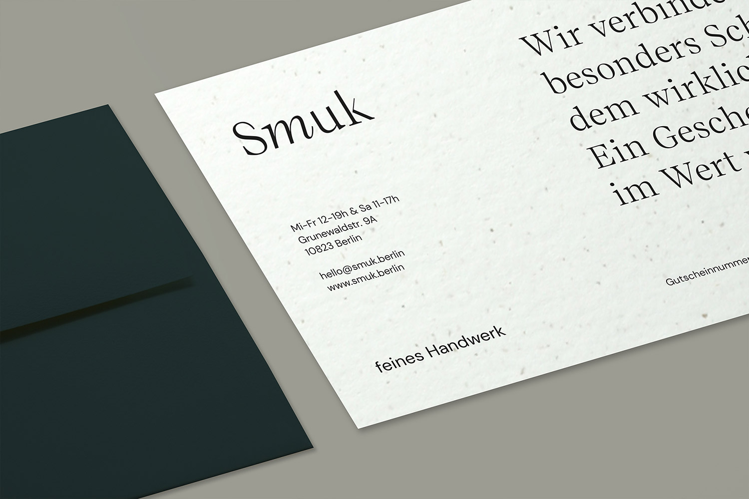
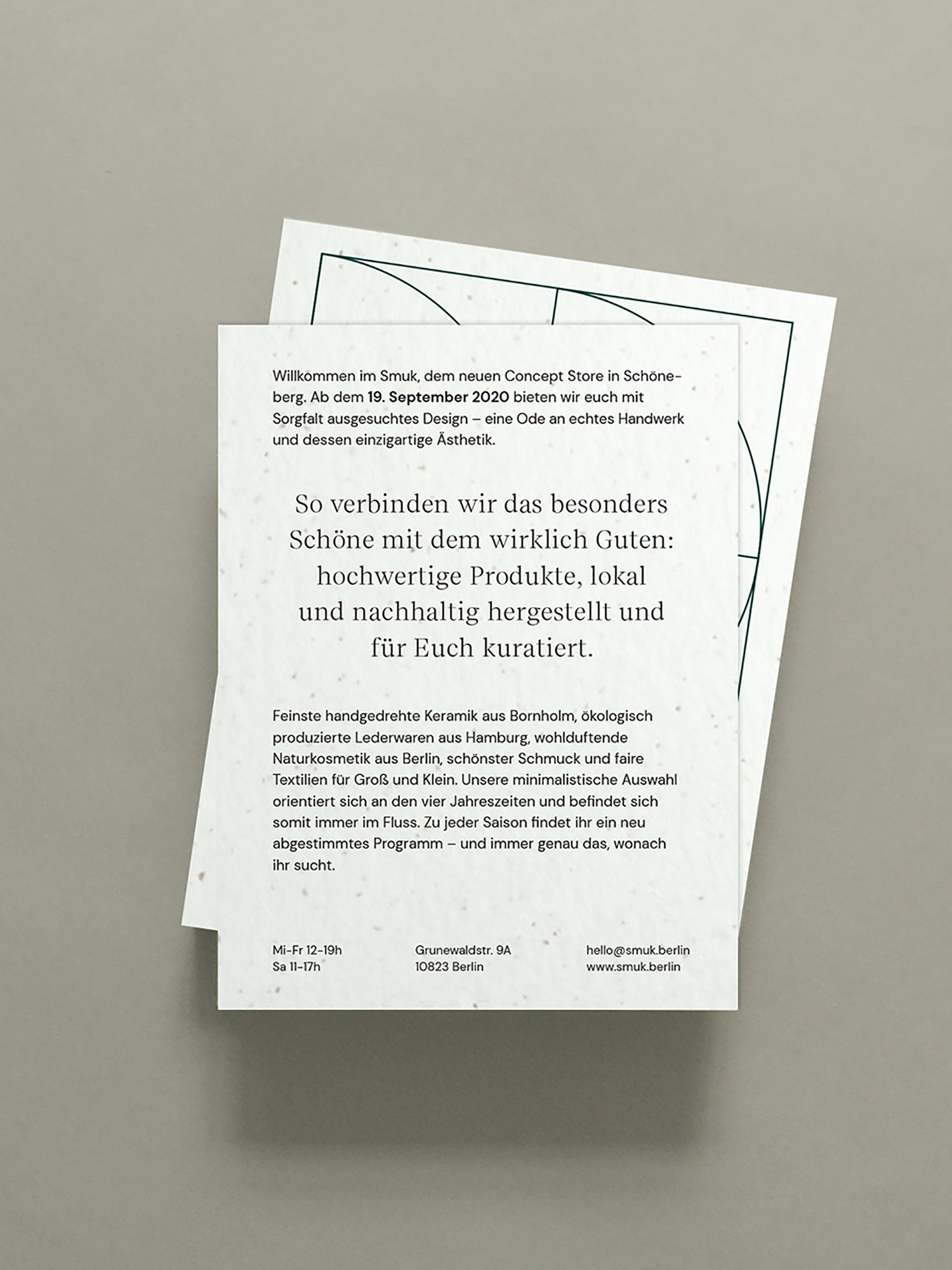
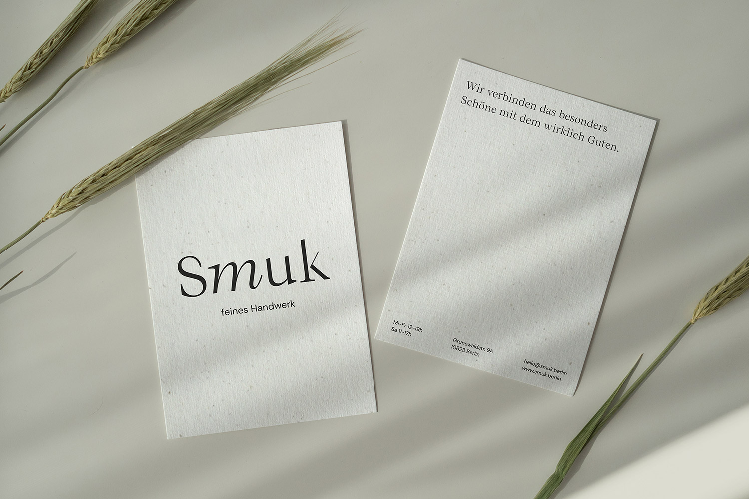
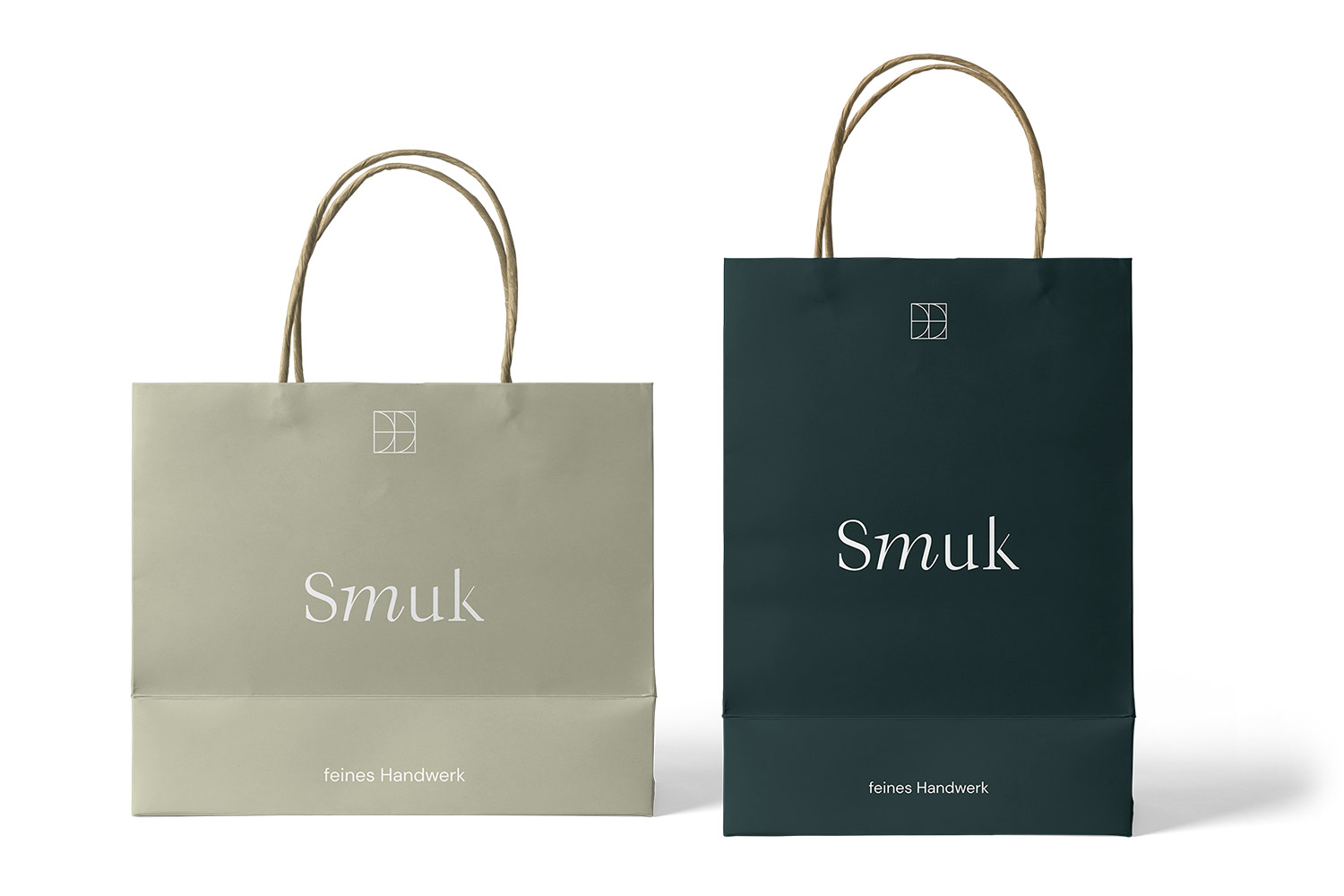
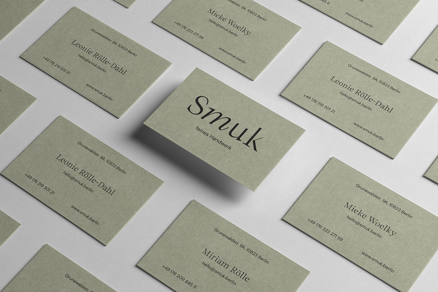
Tine Daum designed the Corporate Design für Smuk – a Berlin concept store owned by three women following their obsession with unique and handmade high-quality products – is not just about fair-trade and eco-friendly manufacturing: it’s about the story behind each business and its goods. Applying exactly the same ethos to the store’s branding and print materials, Tine Daum crafted a graceful and minimal wordmark and integrated it in a collateral system driven by materials and structure. Different shapes of green reflect Smuk’s focus on sustainability, while a special attention to typography evokes the individual, personal touch that is central to the shop’s curational concept. Smuk is about natural materials, intriguing textures and sustainable craftsmanship. This is echoed in the color system, but also the paper itself: it is made of 50% recycled wood fiber.
Credits: Tine Daum