


LOTIPA
December 03, 2025
Mindsparkle Mag


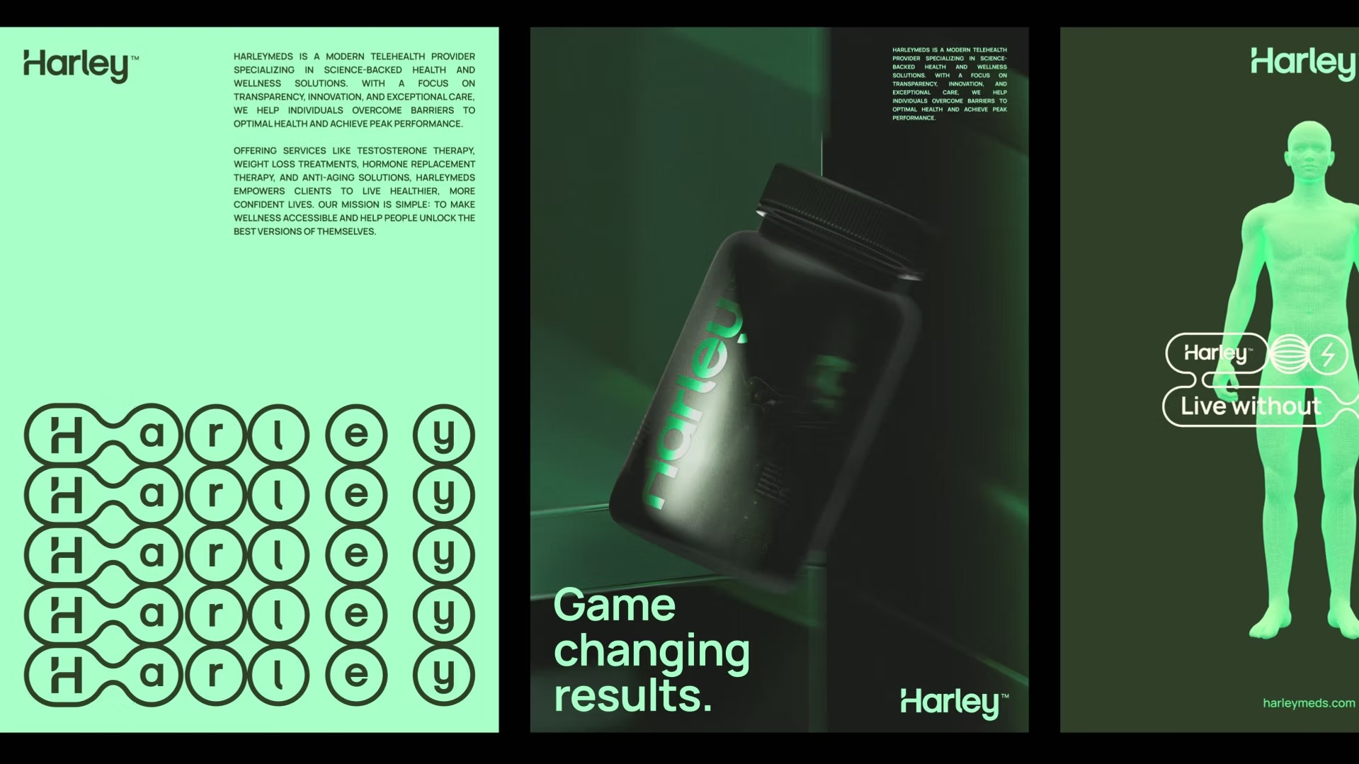
HarleyMeds is a modern telehealth provider specializing in science-backed health and wellness solutions. With a focus on transparency, innovation, and exceptional care, the company helps individuals overcome barriers to optimal health and achieve peak performance.
They had the right vision. It just needed the right skin.
Despite delivering real results through wellness treatments, the brand came across as cold and clinical, like a generic telemedicine service. Functional? Yes. Aspirational? Not even close.
Lotipas challenge was to reposition Harley as a lifestyle brand without losing its healthcare DNA. Lotipa built a strategy that connected emotionally with its audience. Harley Meds became more than just treatments; it became a gateway to vitality, confidence and the clearest version of yourself.
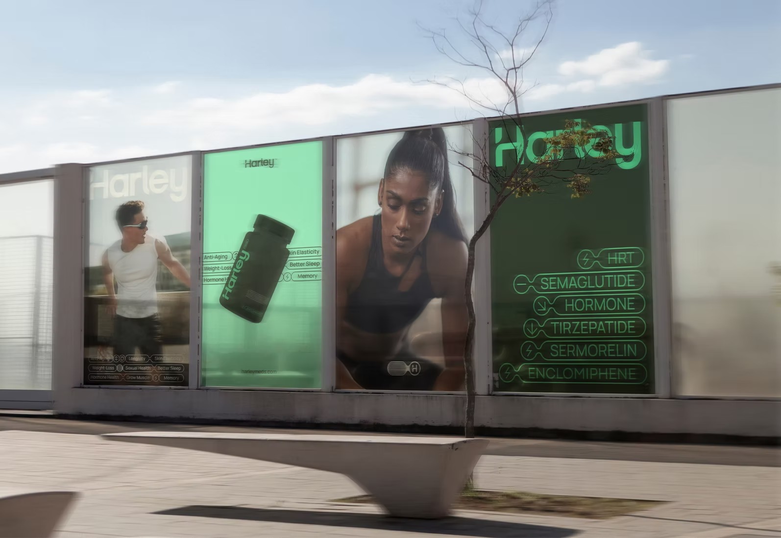
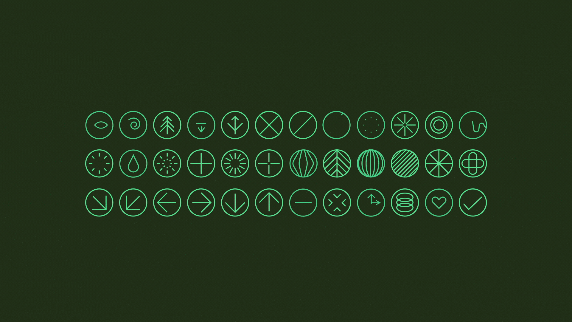
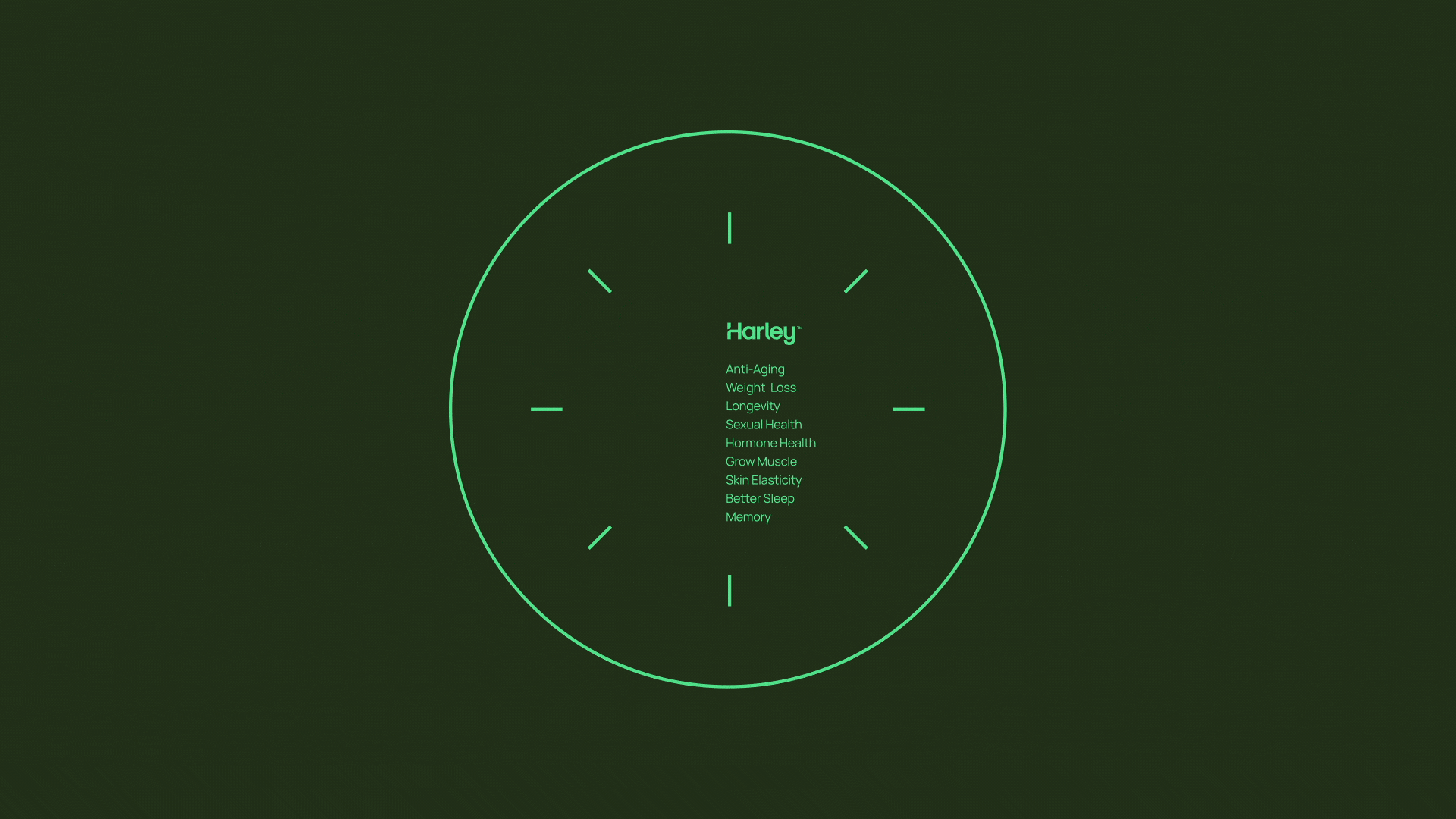
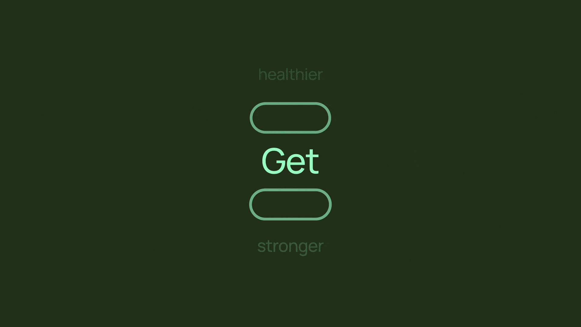
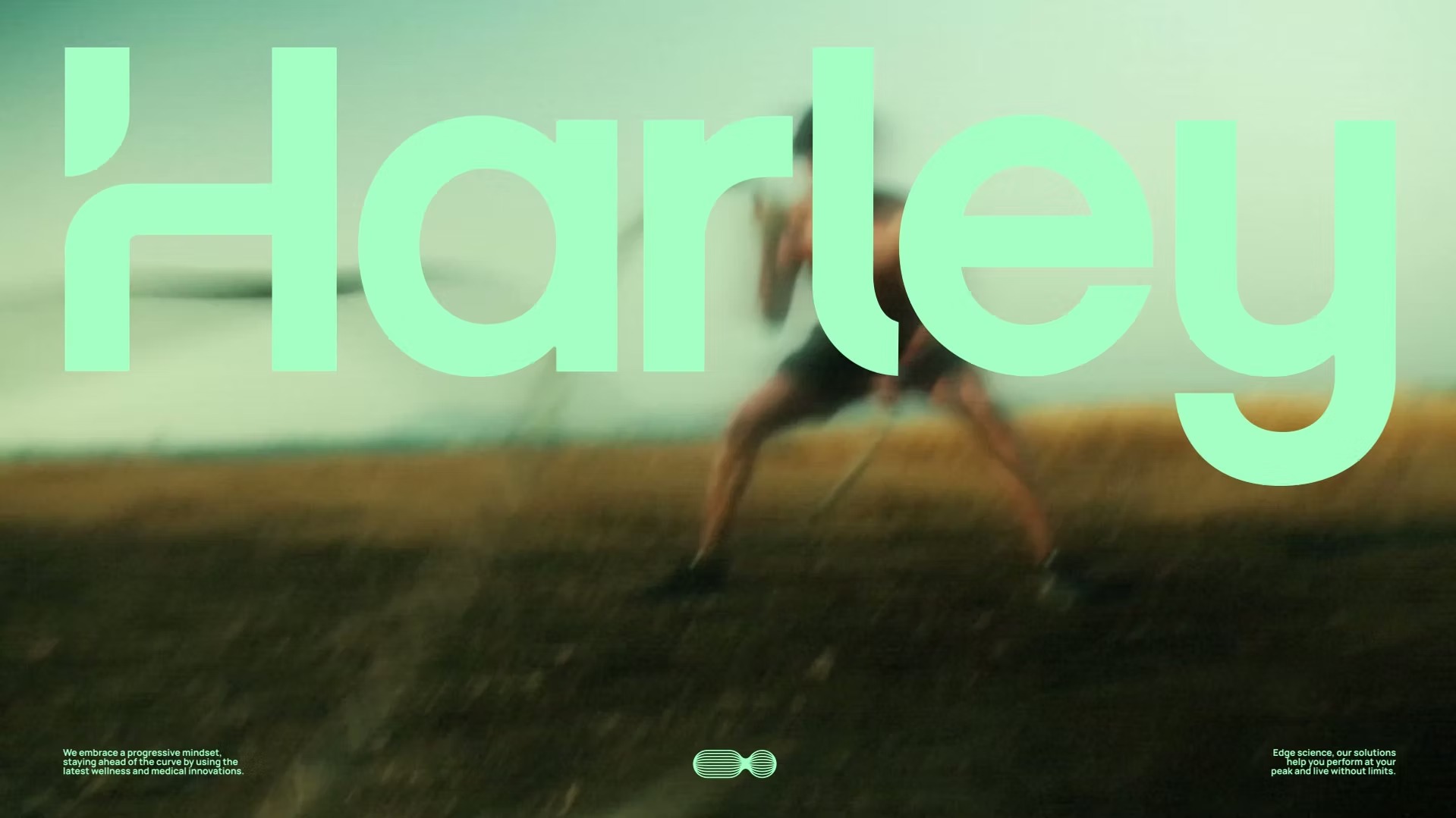
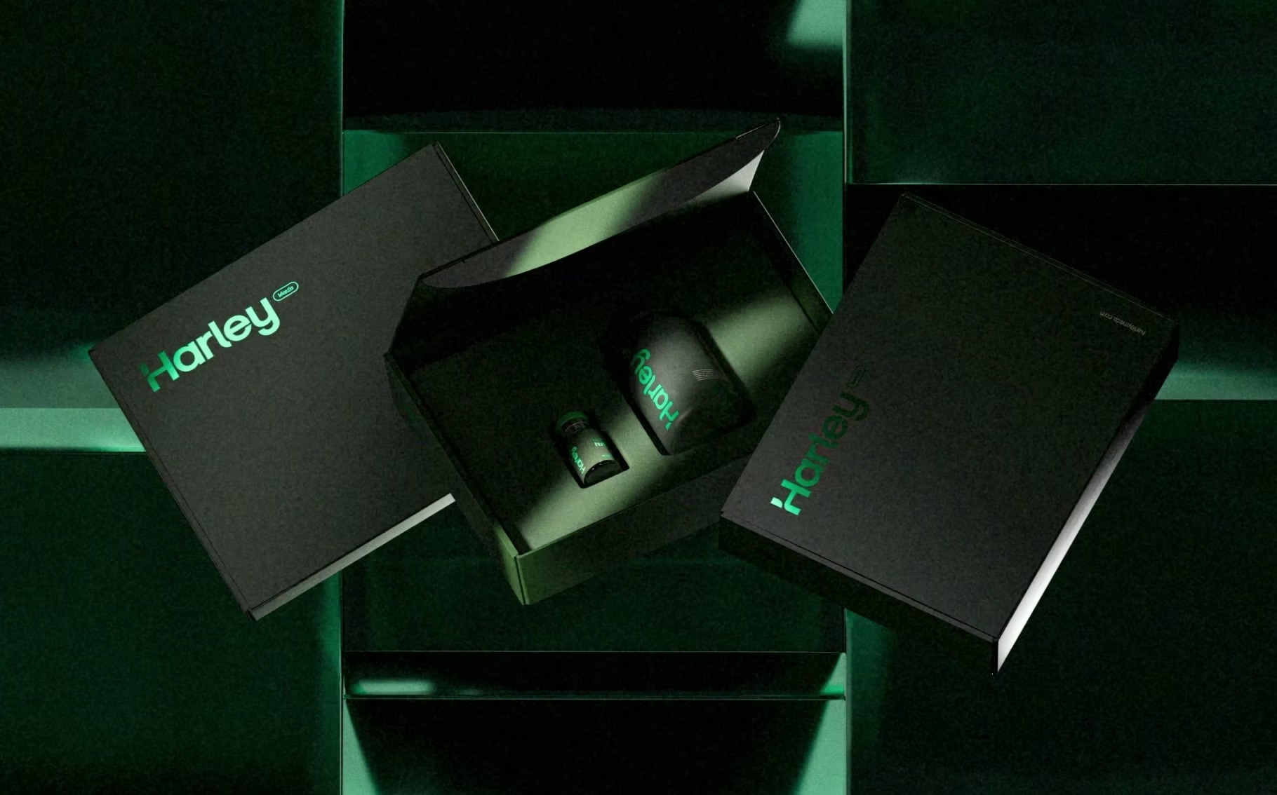
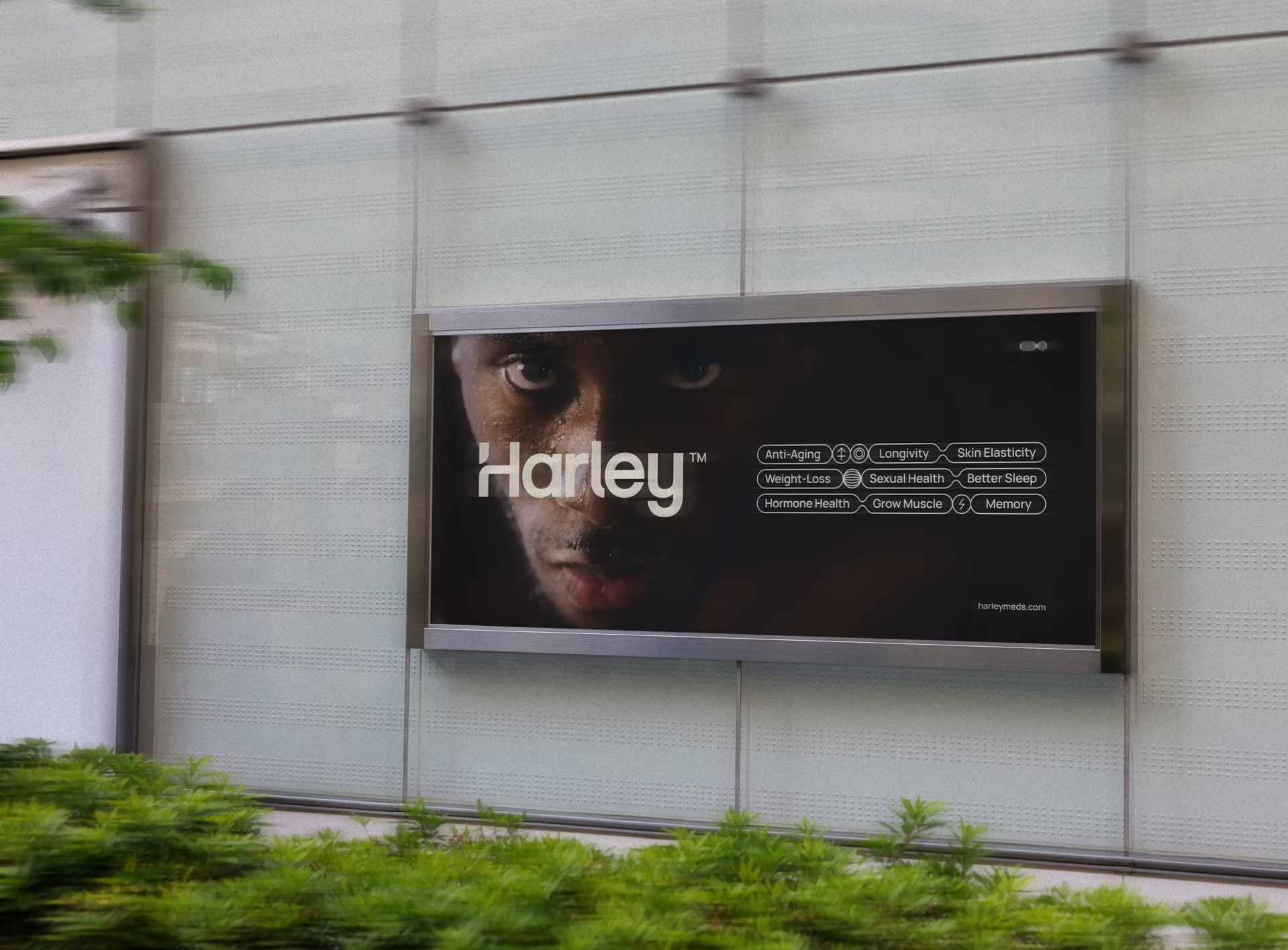
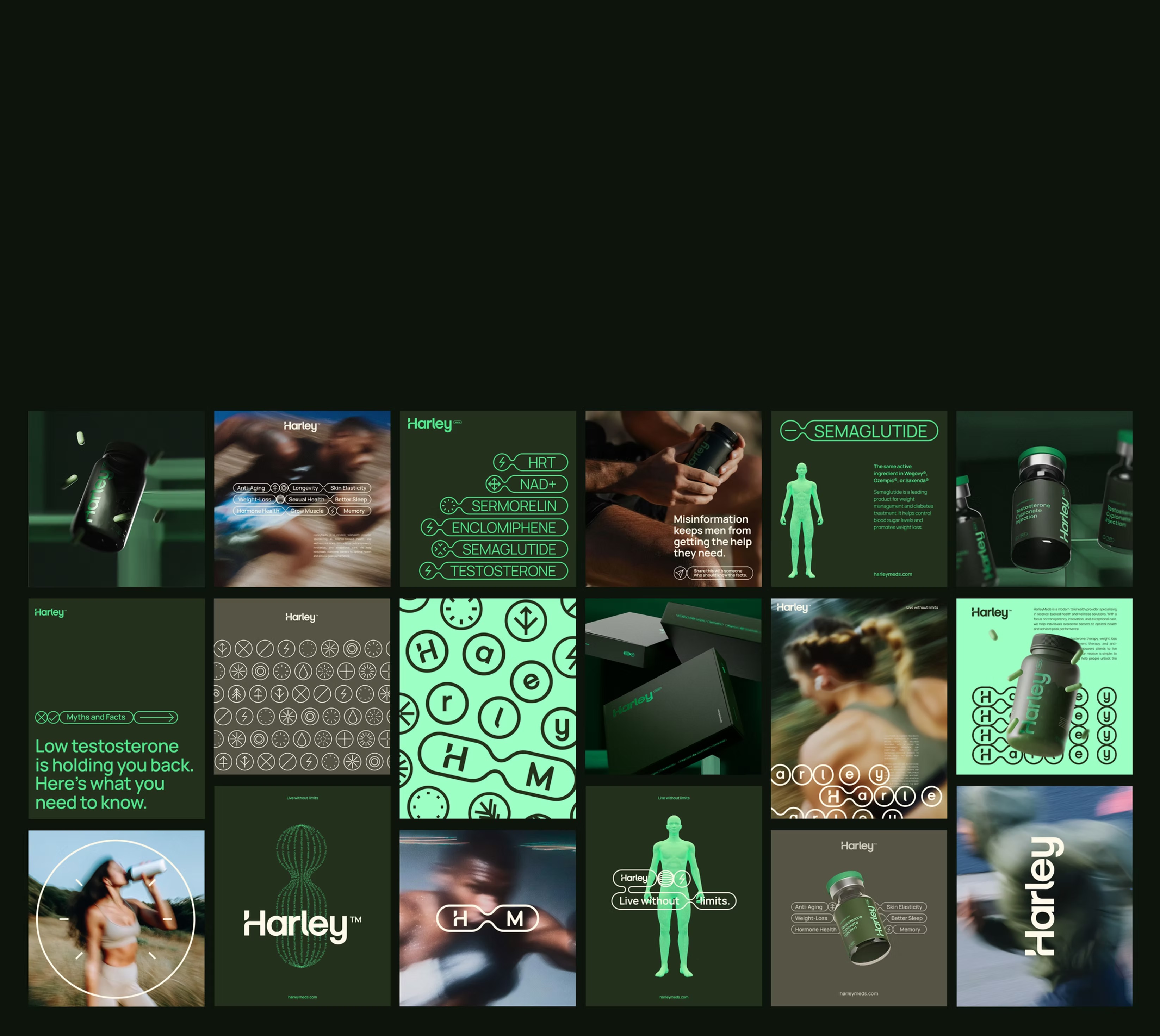
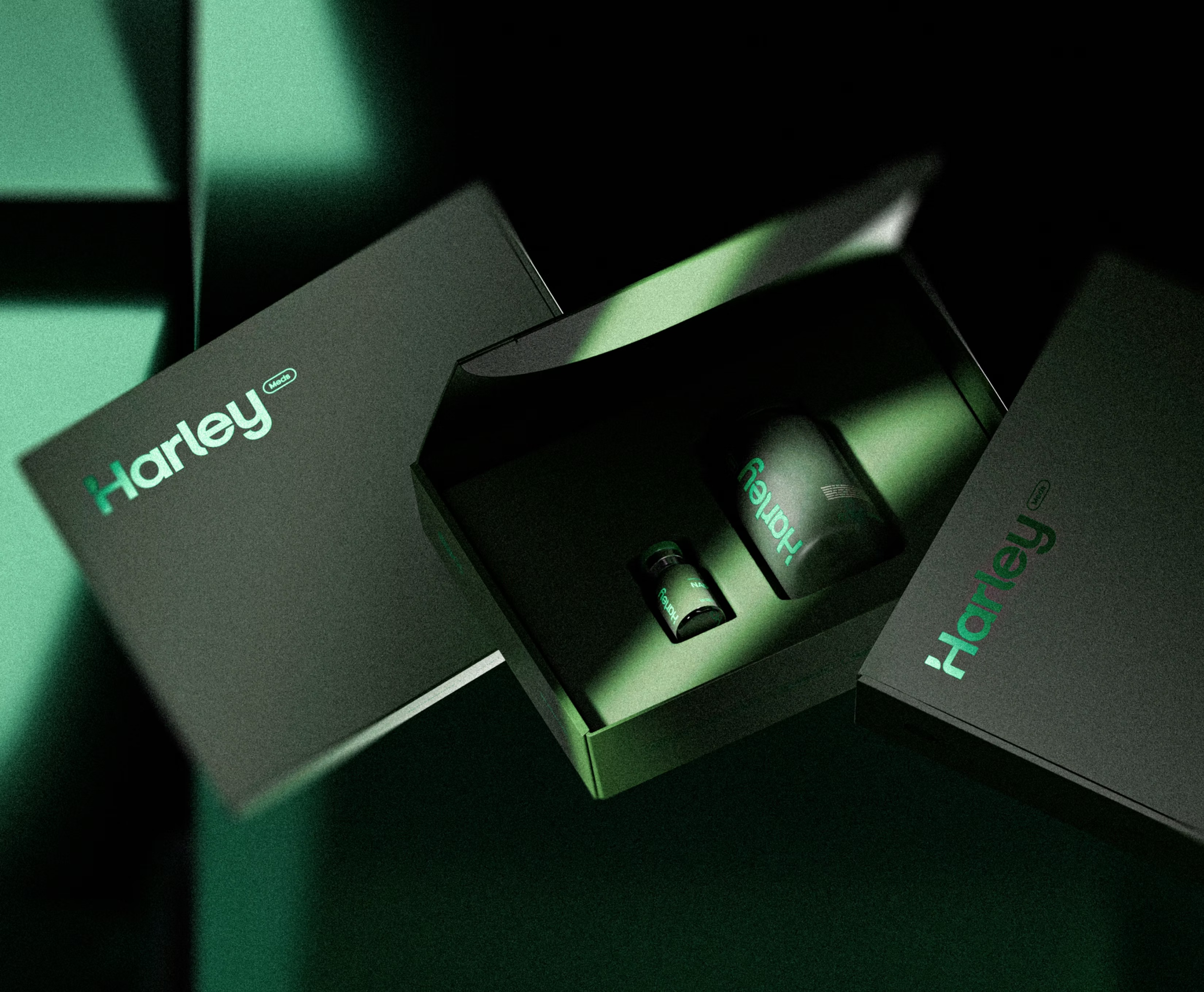
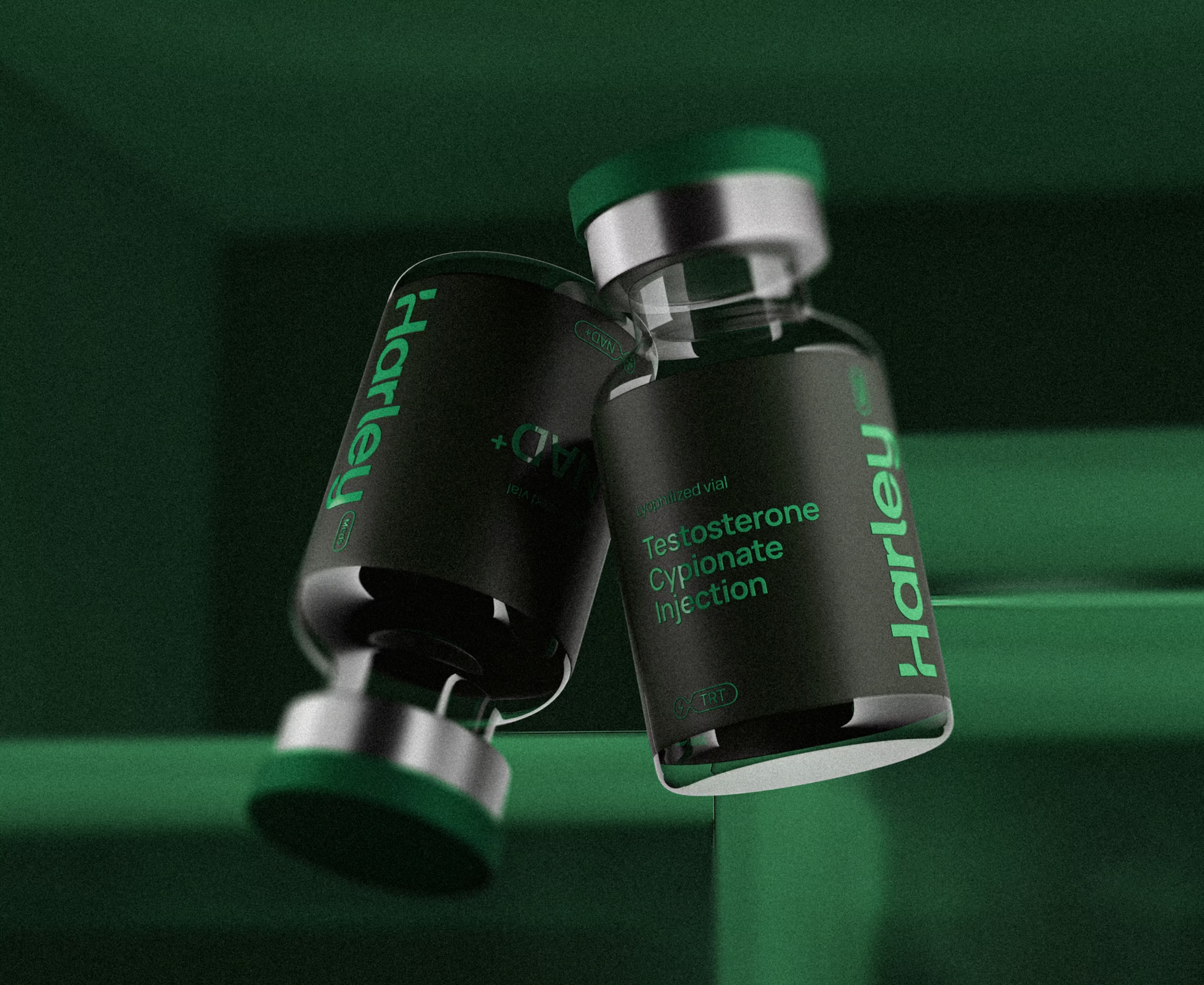
Visually, they took the pill — the most basic healthcare symbol — and transformed it into a bold, memorable brand icon. Around it, the studio developed a flexible identity system with multiple logo variations, a custom icon set tied to product benefits, and a graphic language that blends trust with transformation.
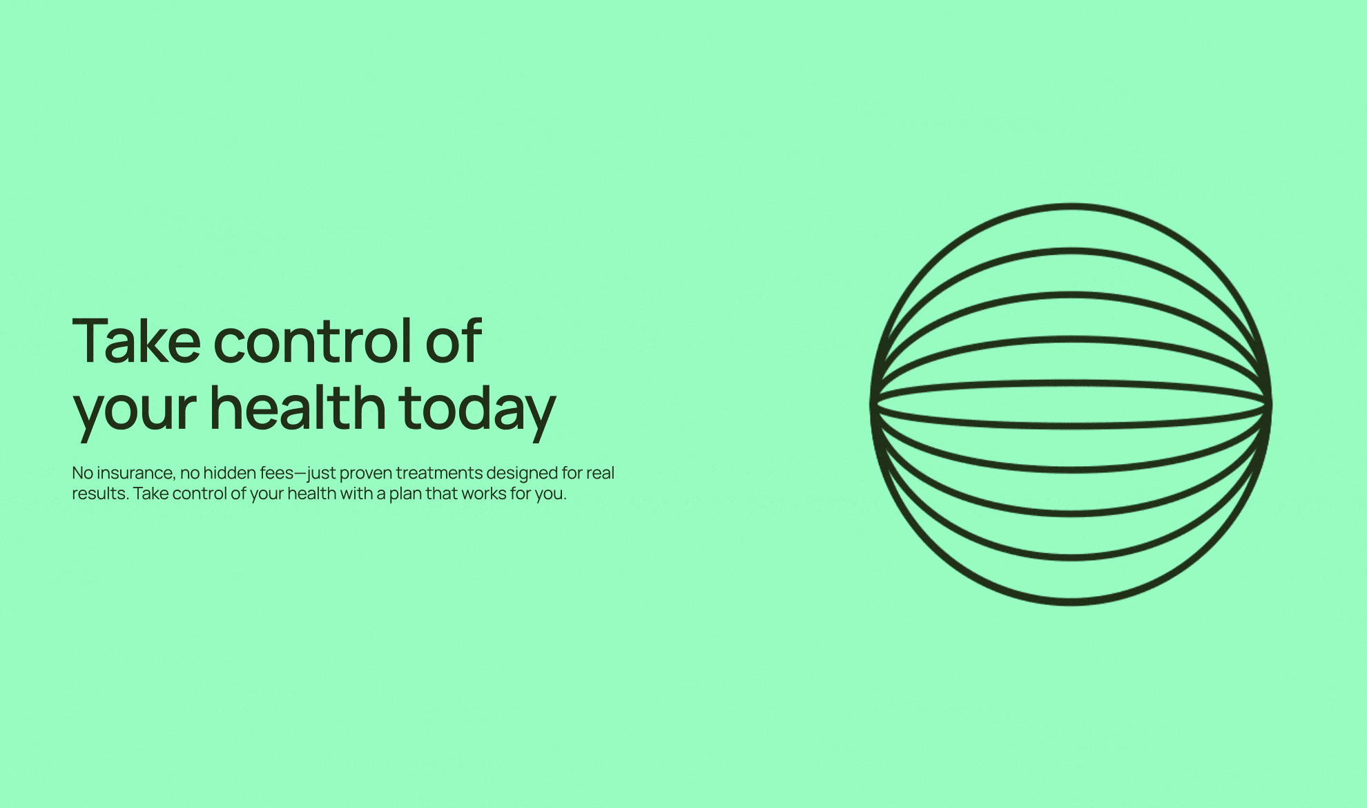
A bold color palette, assertive typography and clean layouts give the brand clarity, presence and energy. Photography brings it closer to people, focusing on expression, confidence and lifestyle — everything the old Harley was missing.
The result? Harley Meds relaunched with a brand that finally matched the impact of its products. In the first week, bookings tripled, setting a new pace for growth.


Credits: LOTIPA


