Kim Knoll & Kyle Eertmoed
May 29, 2020
Mindsparkle Mag


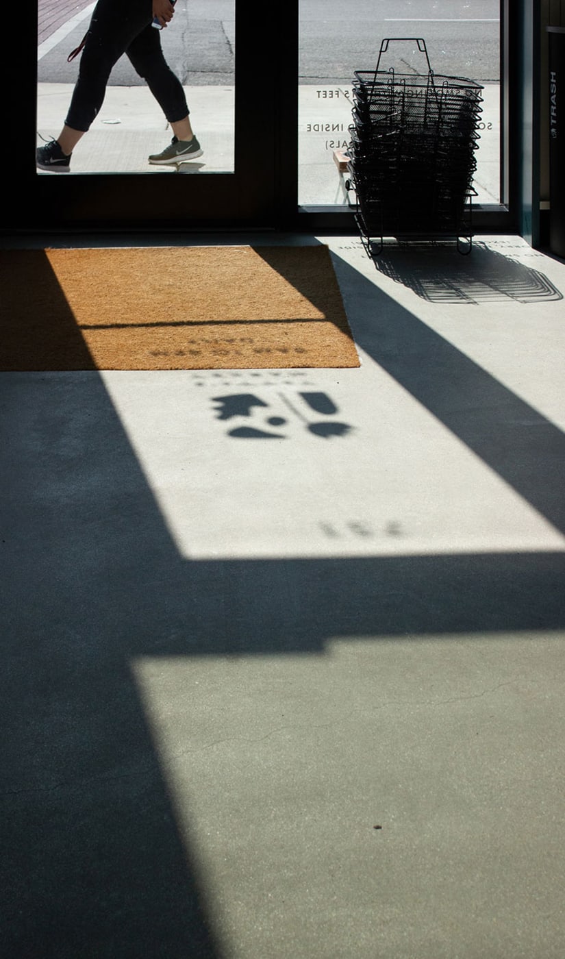
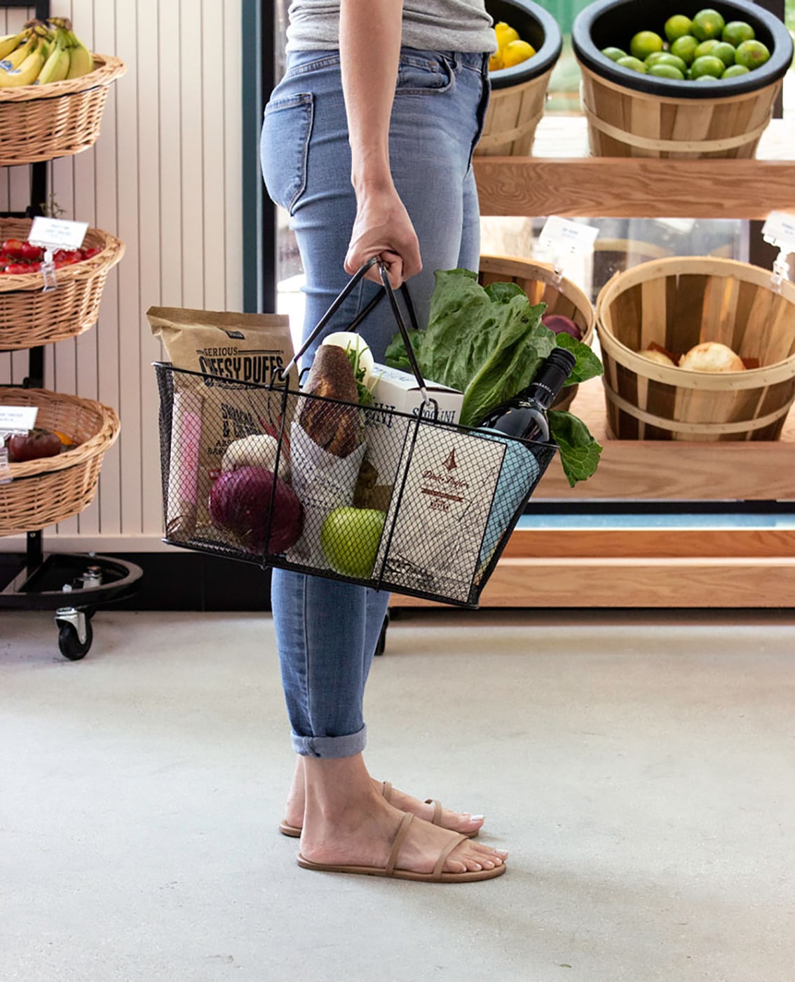
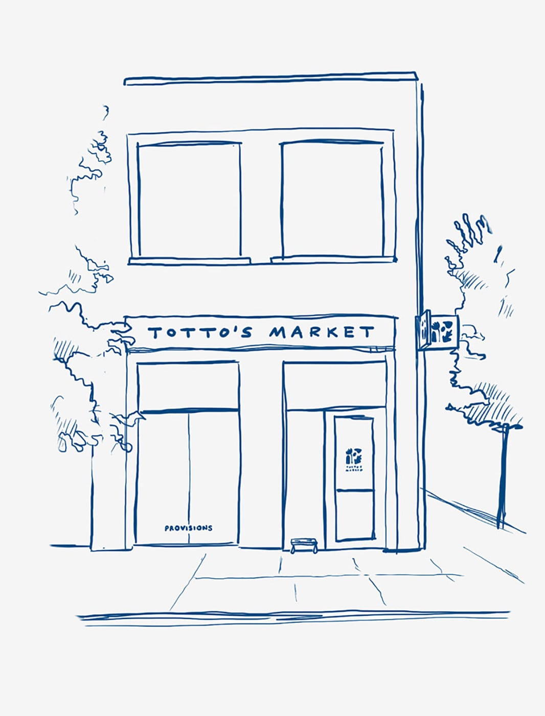
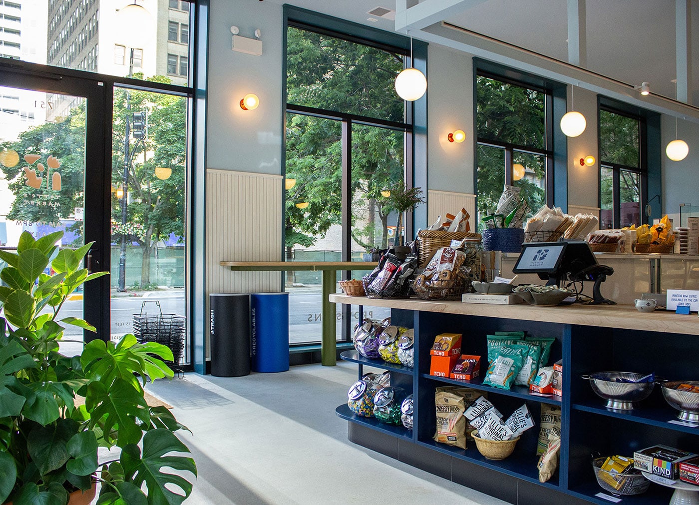
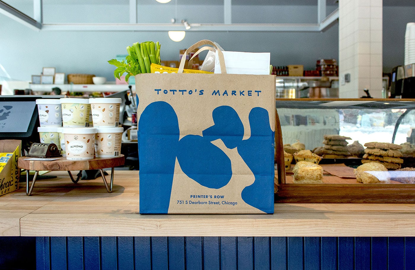
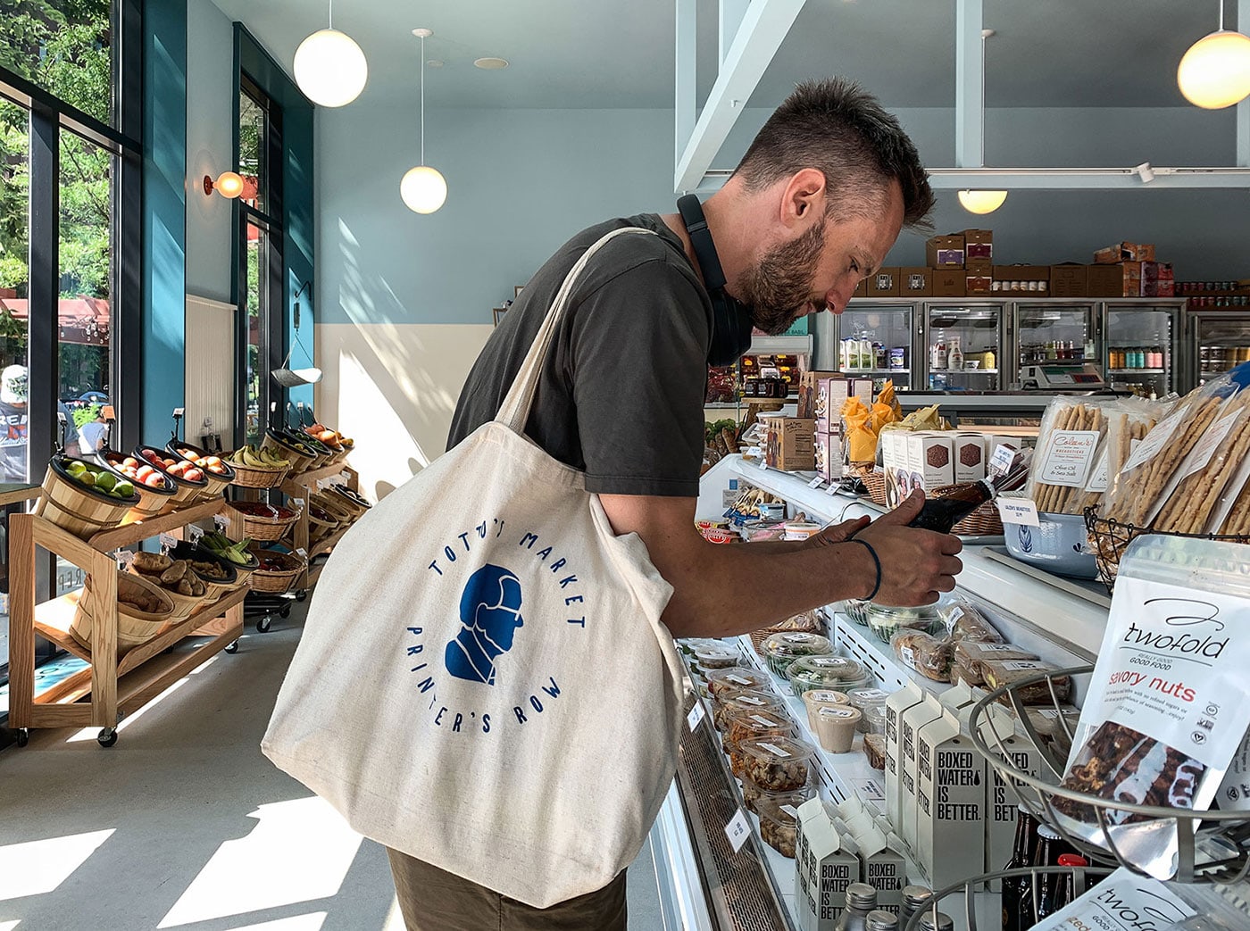
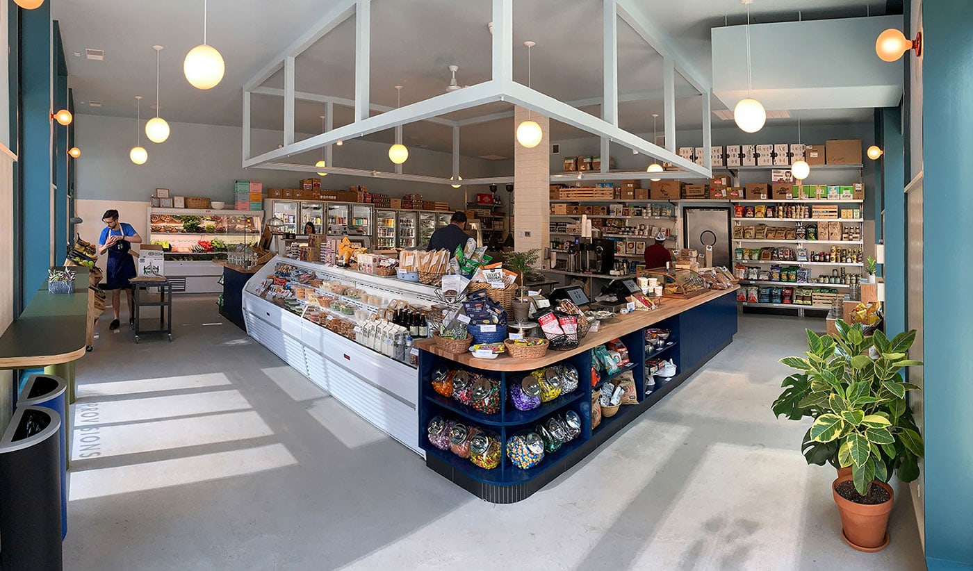
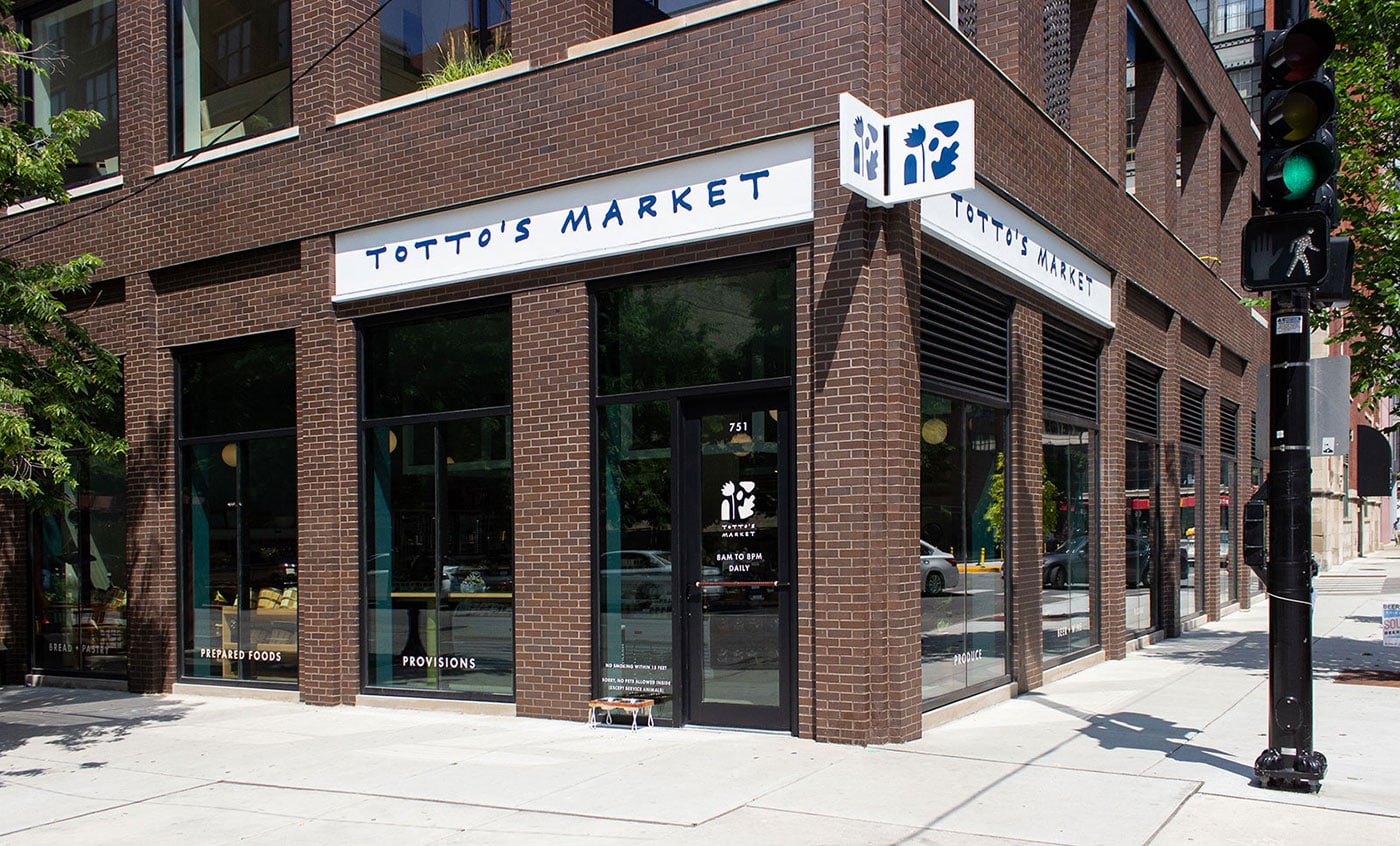
Knoed designed Totto’s Market - a charming grocer in the heart of Chicago’s Printer’s Row neighborhood. The market is named after the owner’s dad, “Totto,” who dedicated his adult life to back-bending customer service in the grocery industry. Totto’s son, Scott, took those old-school values and merged it with a modern-day market that listens to the neighborhood’s grocery needs. Scott is all about making people smile, whether it’s being his charming self or creating moments to brighten their day. Knoed wanted the brand to feel like Scott, warm-n-fuzzy with undeniable character.
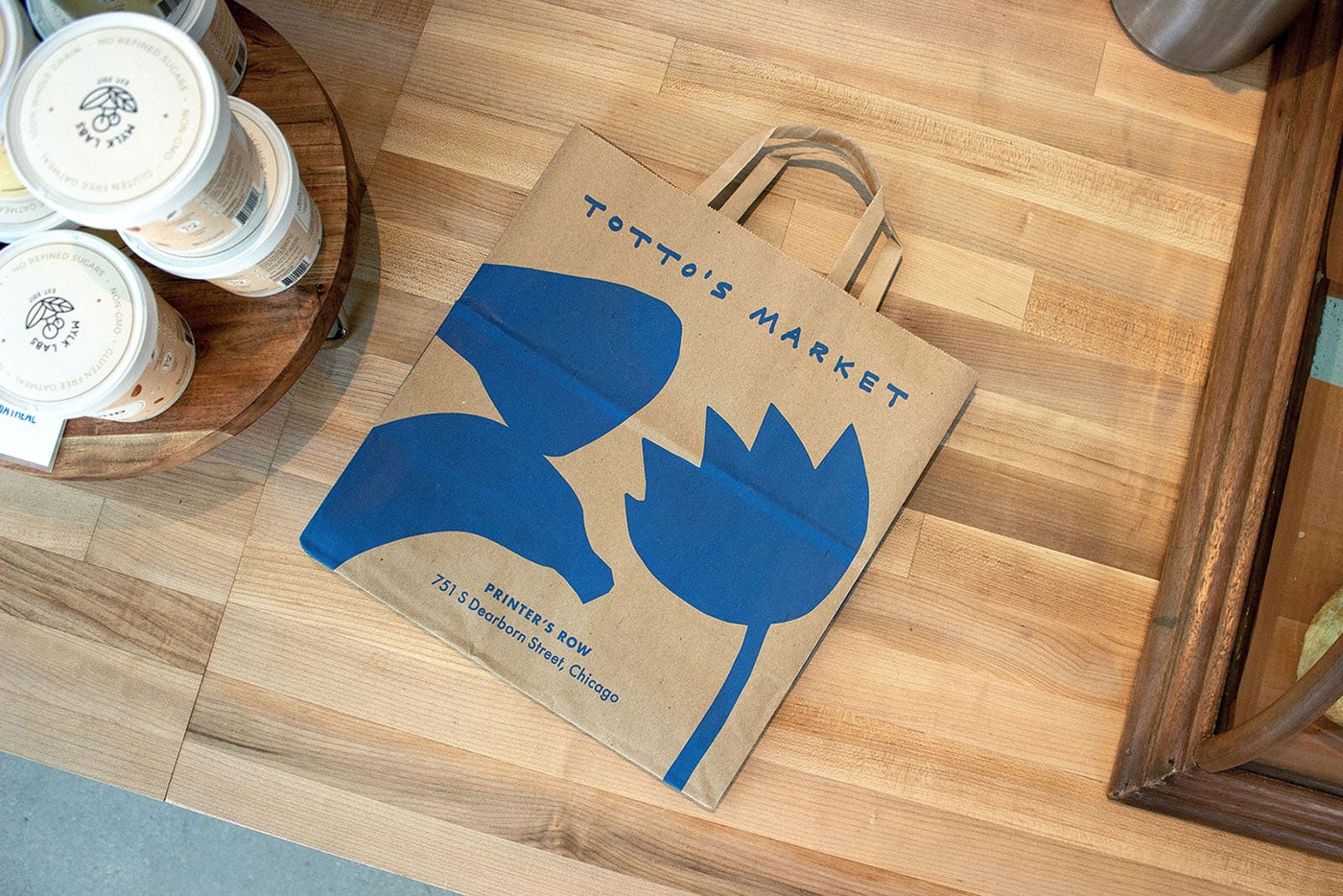
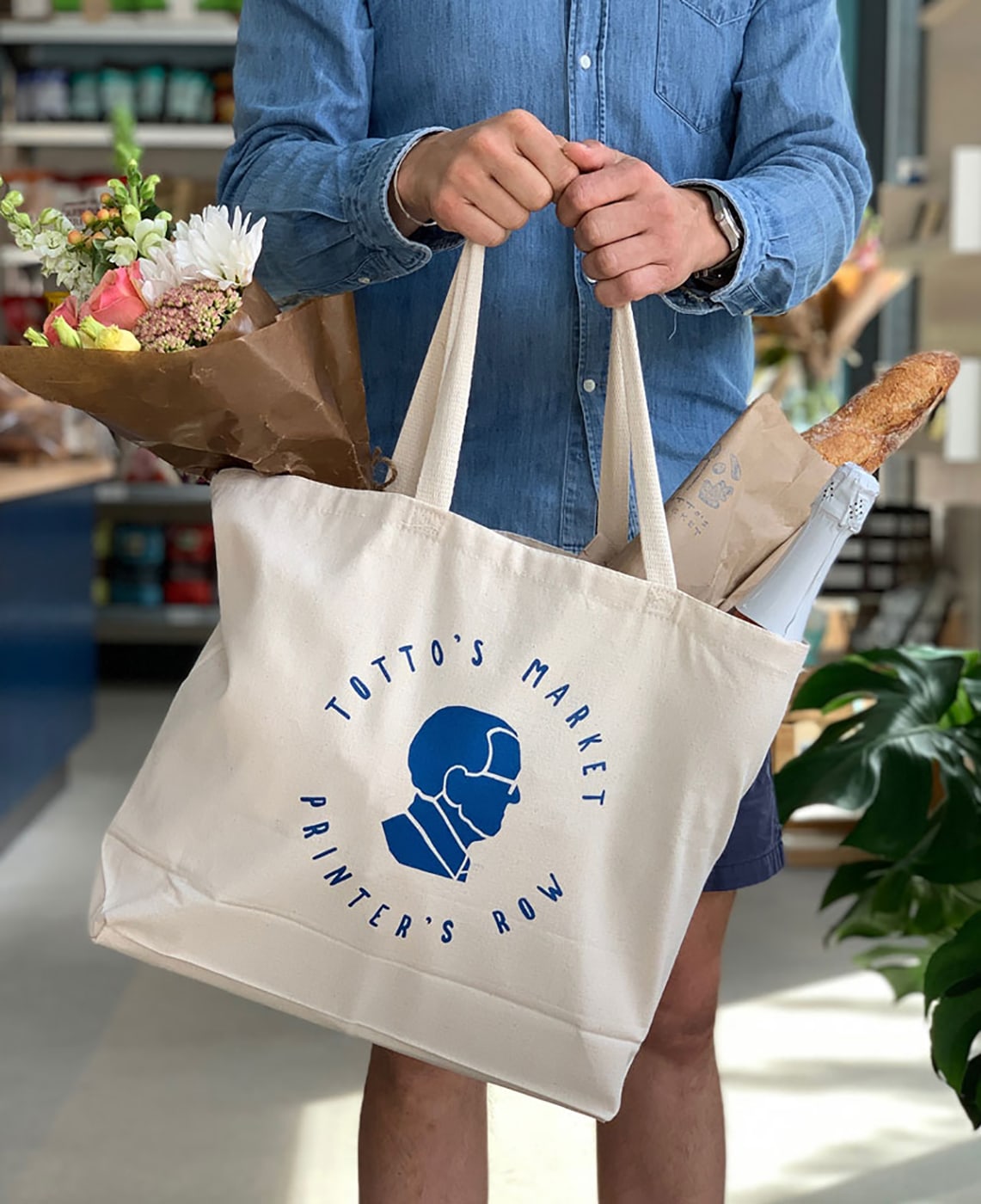
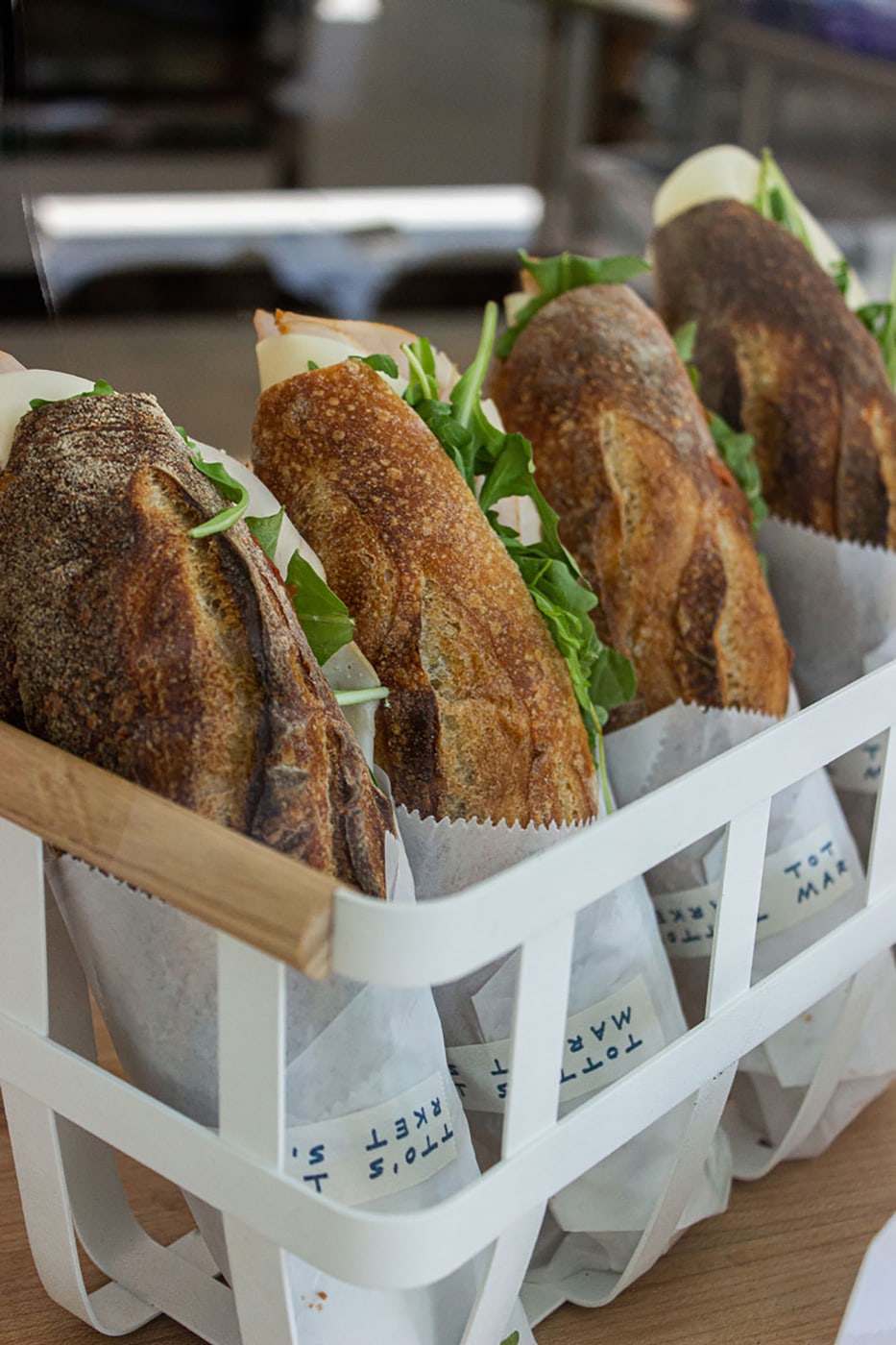
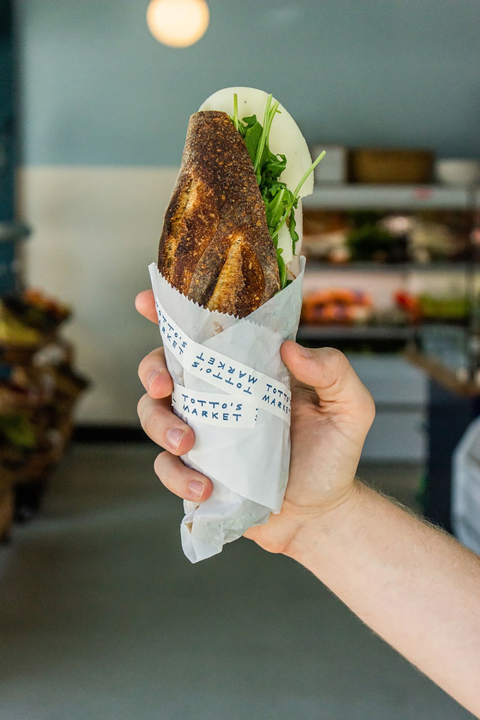
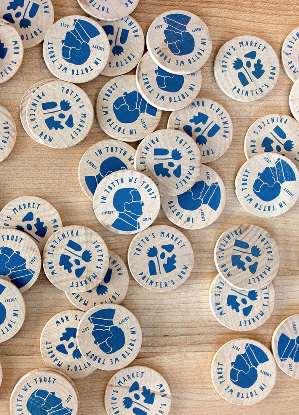
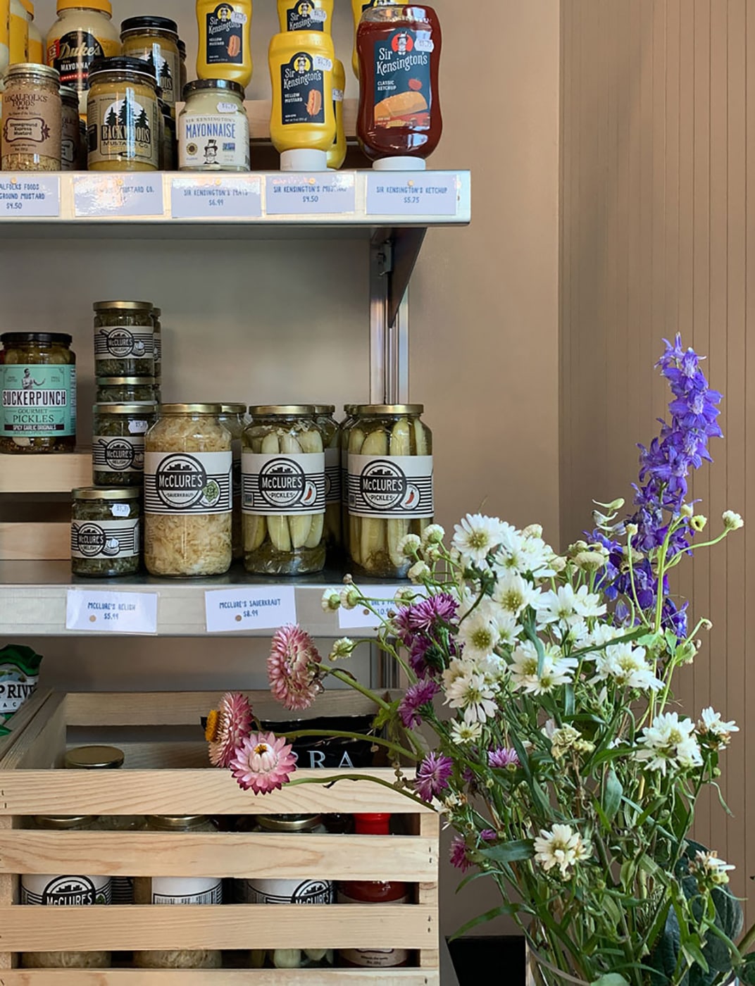
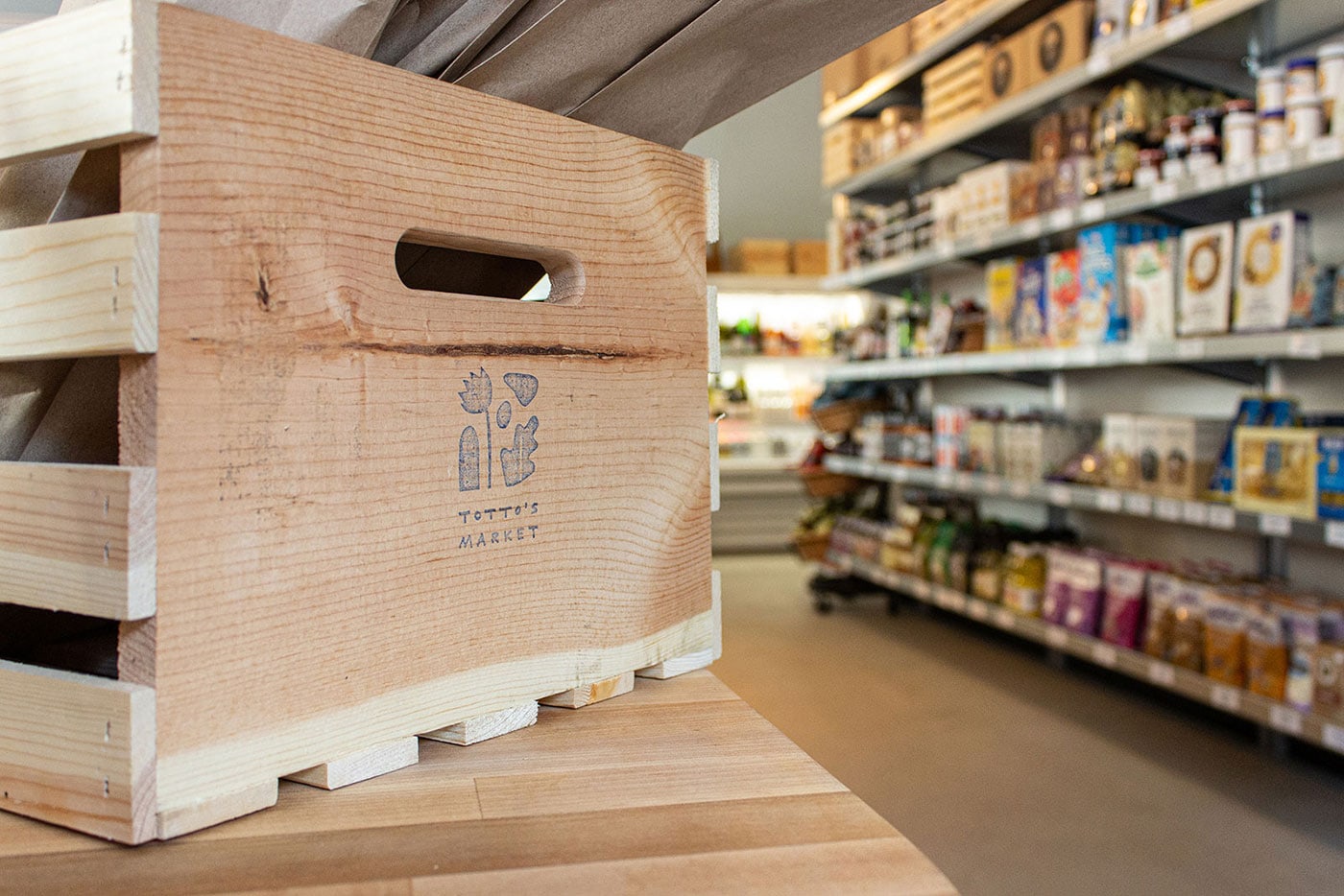
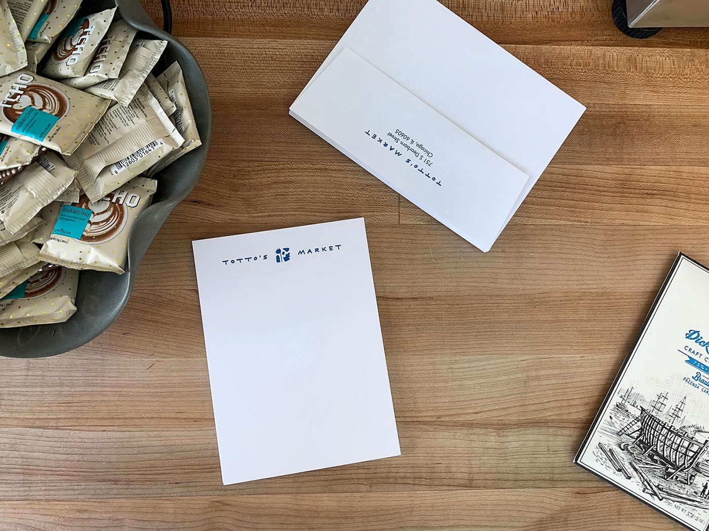
Knoed made everything feel human by creating imperfect illustrations and handwritten type, along with rubber stamps for the coffee cups and wooden crates so that each is unique. It was important to Scott that neighbors know Totto's Market sells perishable items (since many small Chicago markets don't) so Knoed illustrated that point (literally) by representing the different perishable categories you can find at Totto’s in the logo—bakery, floral, dairy, meat and produce.
They created a set of 16 food illustrations and used them in different ways to design the collateral. Every detail with building out the market was considered, even down to wrapping the door handlebars in leather bike tape to honor Totto’s days of cycling.
Creator: Kim Knoll & Kyle Eertmoed


.avif)