Marc Ligeti, Kristina Nyjordet, Thor Erik Ramleth, Sindre Martin Dahl / Creuna Norway
October 12, 2017
Mindsparkle Mag


The stunning
for Krone Beer was created by a team of designers from
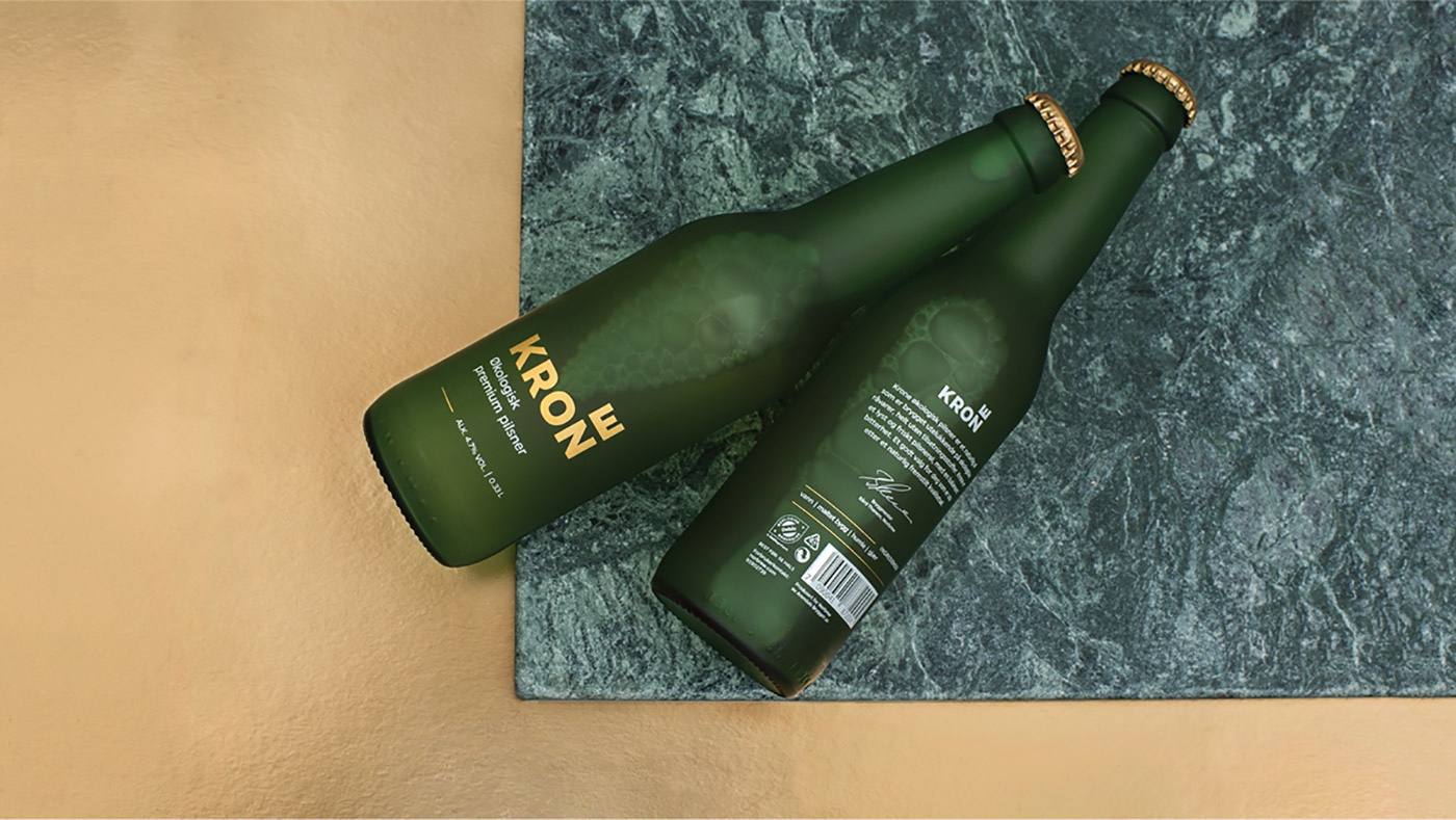
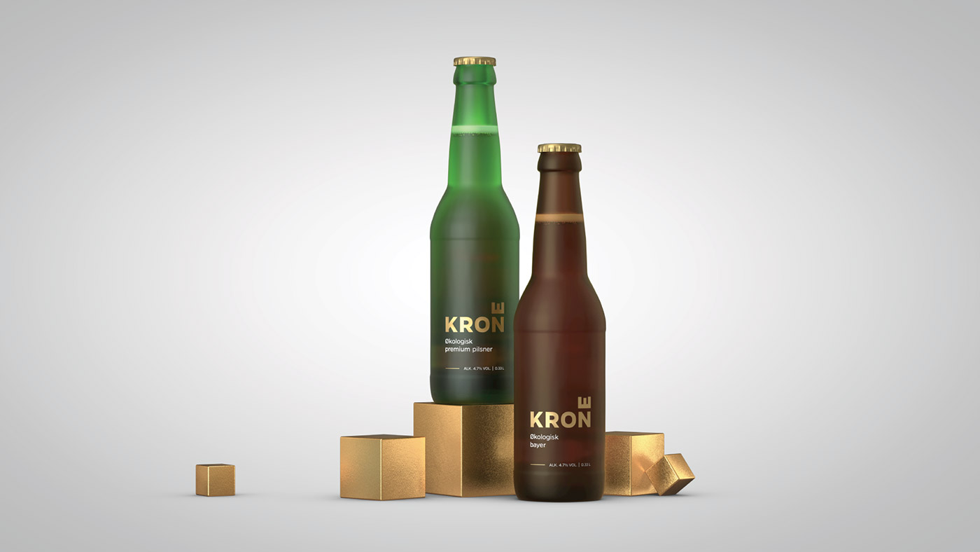
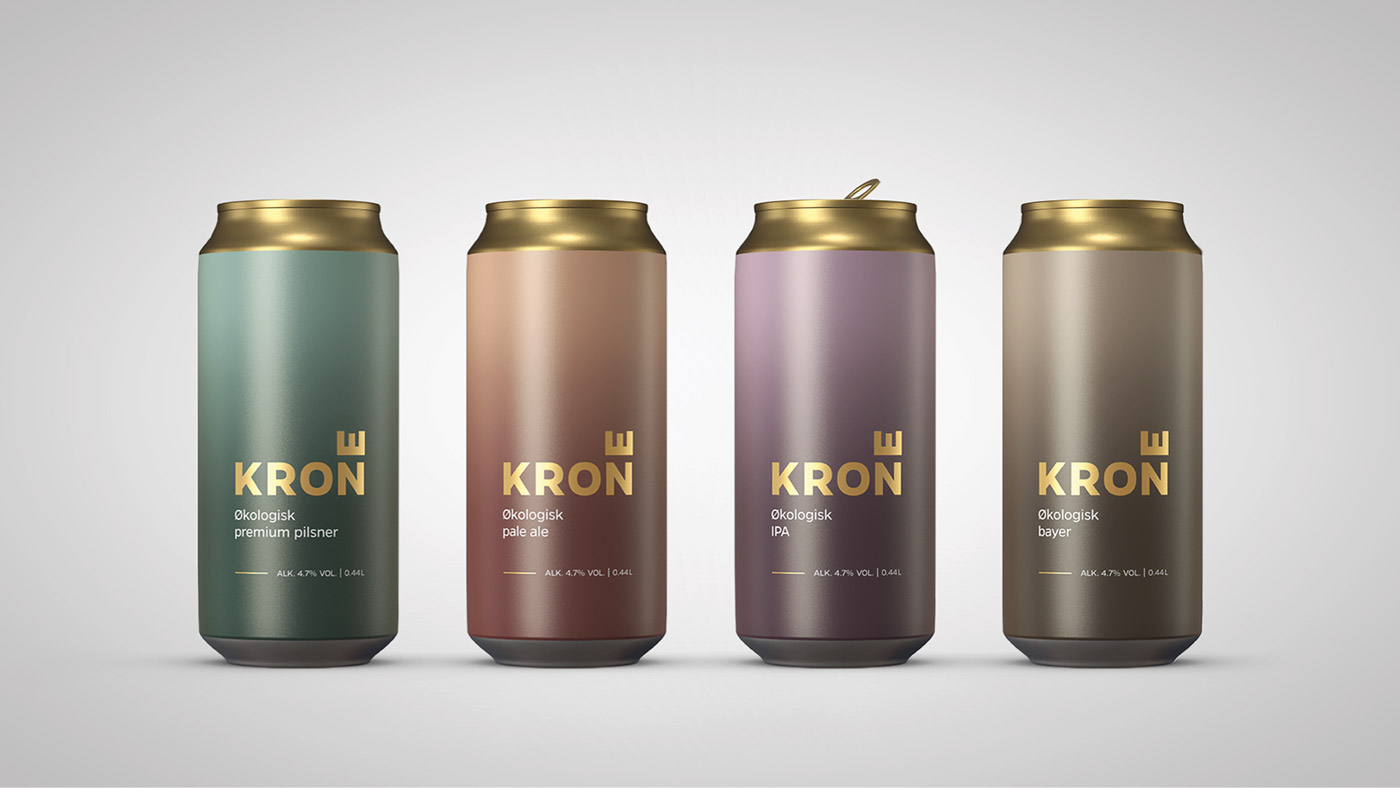
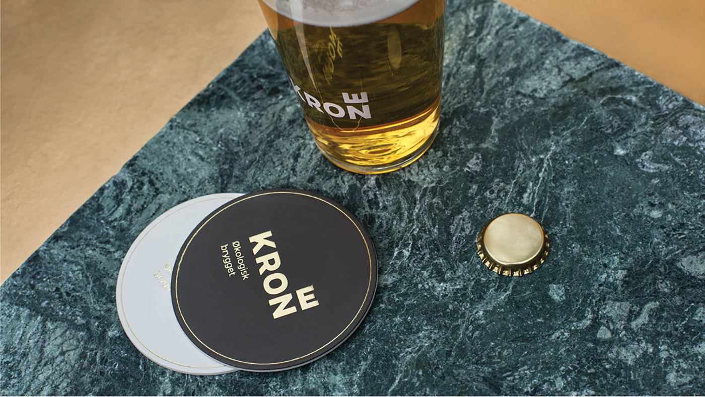
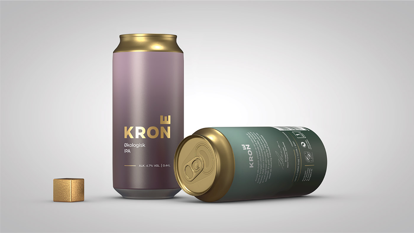
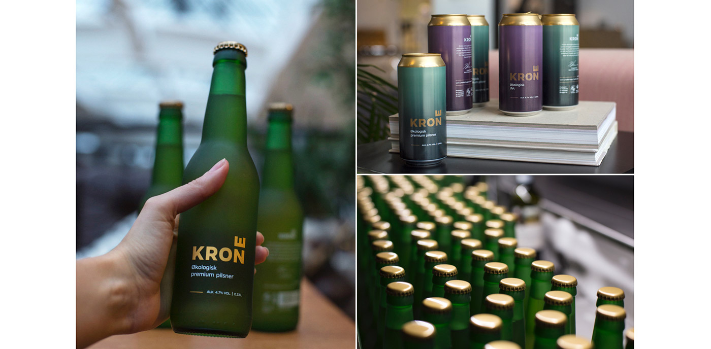
- Marc Ligeti, Kristina Nyjordet, Thor Erik Ramleth, with 3D work from Sindre Martin Dahl. Krone, meaning 'crown' in Norwegian - which is visualised by the horizontal E in the logo - is a new ecological beer brand on the market, competing with established Norwegian brands. The strategy for Krone was to present a bold and urban identity that stands out from competitors, while maintaining an elegantly minimal aesthetic that reflects the idea that quality can be reflected in simplicity. The beer itself embodies simplicity as it's made with just four natural ingredients. 'The design had to find a balance between daring to challenge the commercial market with an unconventional design while still having just enough beer tradition to compete against established brands'. The design is simple and modern, while the name, colour palette and choice of gold typography hint at beer tradition and quality.
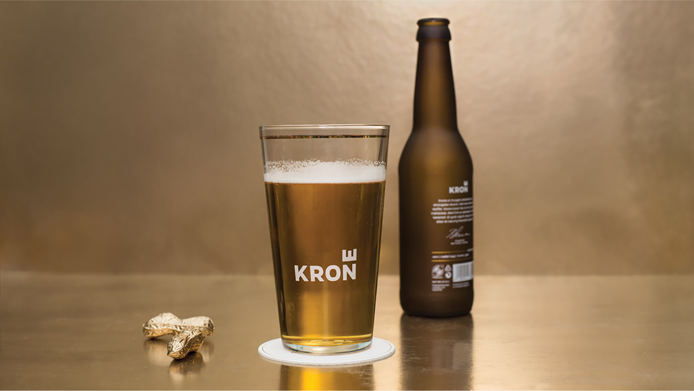
The branding also sought to reflect Krone's organic element, without prescribing to stereotypical organic product branding. The appearance of a frosted glass bottle was designed to stand out as well as entice consumers with its 'chilled' appearance. 'This is unique among beer bottles worldwide. We stripped away all that wasn’t essential, giving a sense of purity and putting the simple frosted glass in focus. Graphics are silkscreened directly onto the bottles, using real gold. The cans (0.4L) with matt finish harmonize the bottles.'