Airtype
March 03, 2018
Mindsparkle Mag


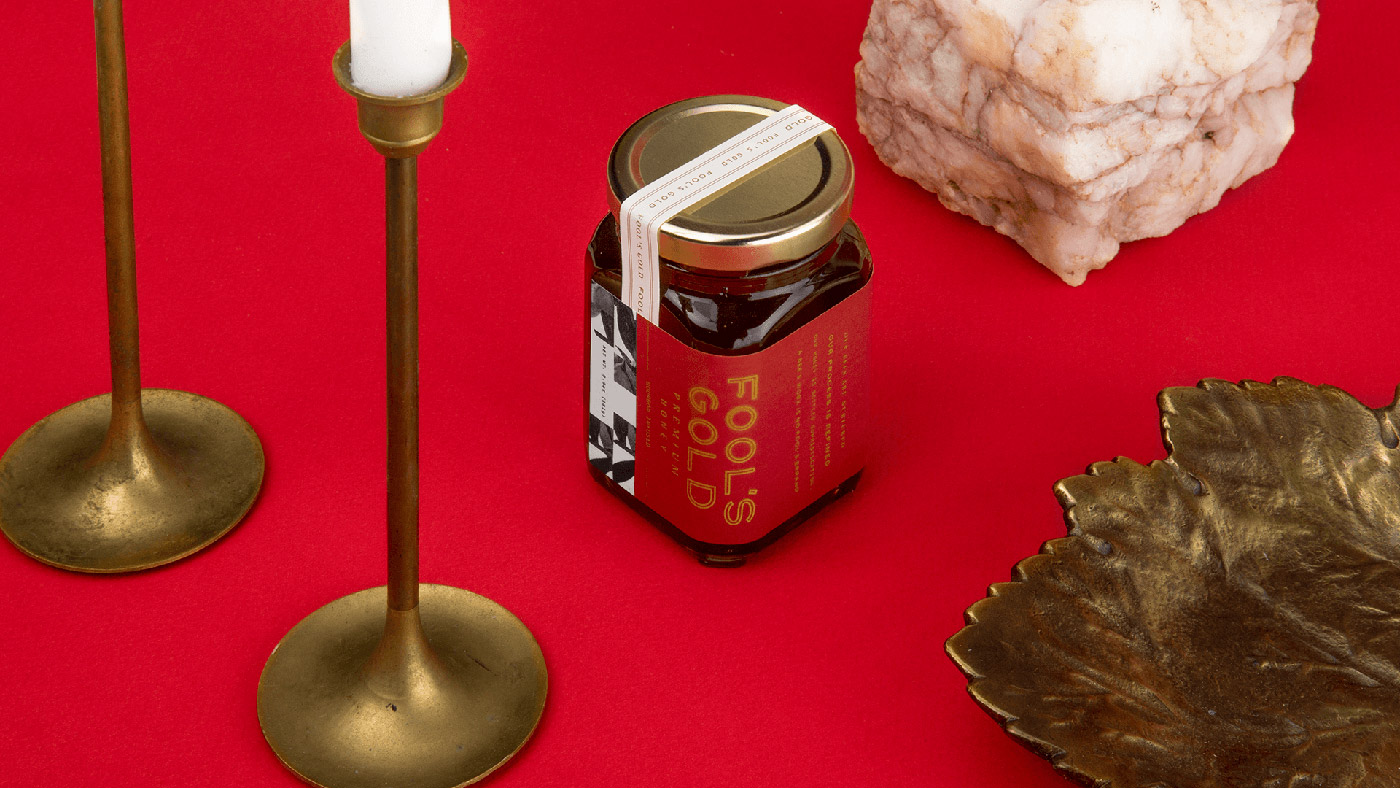
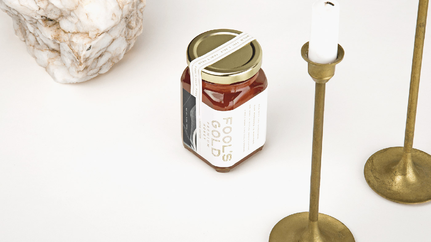
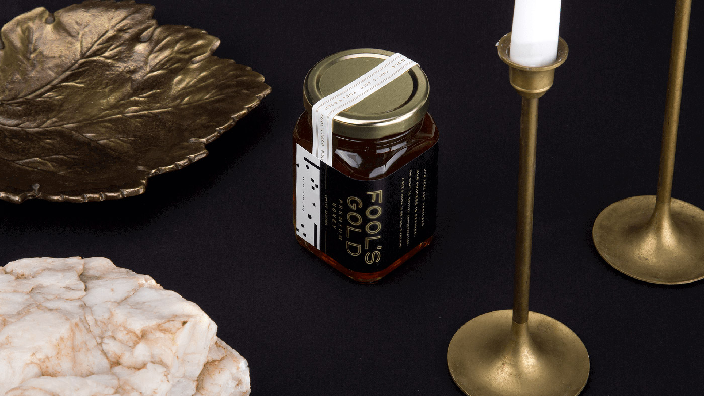
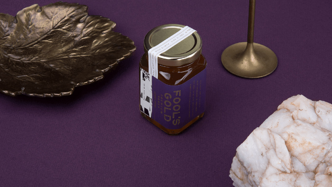
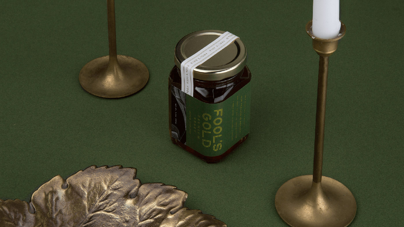
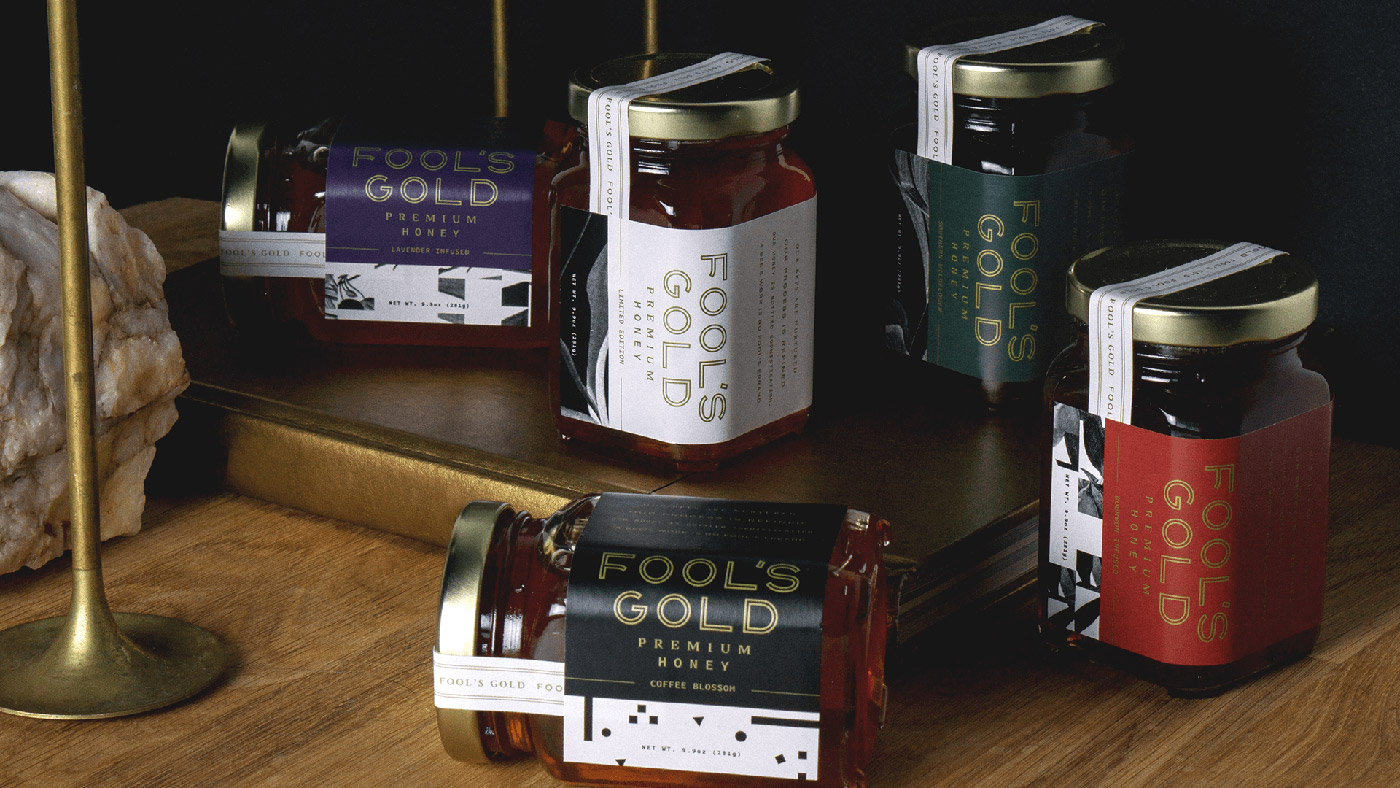
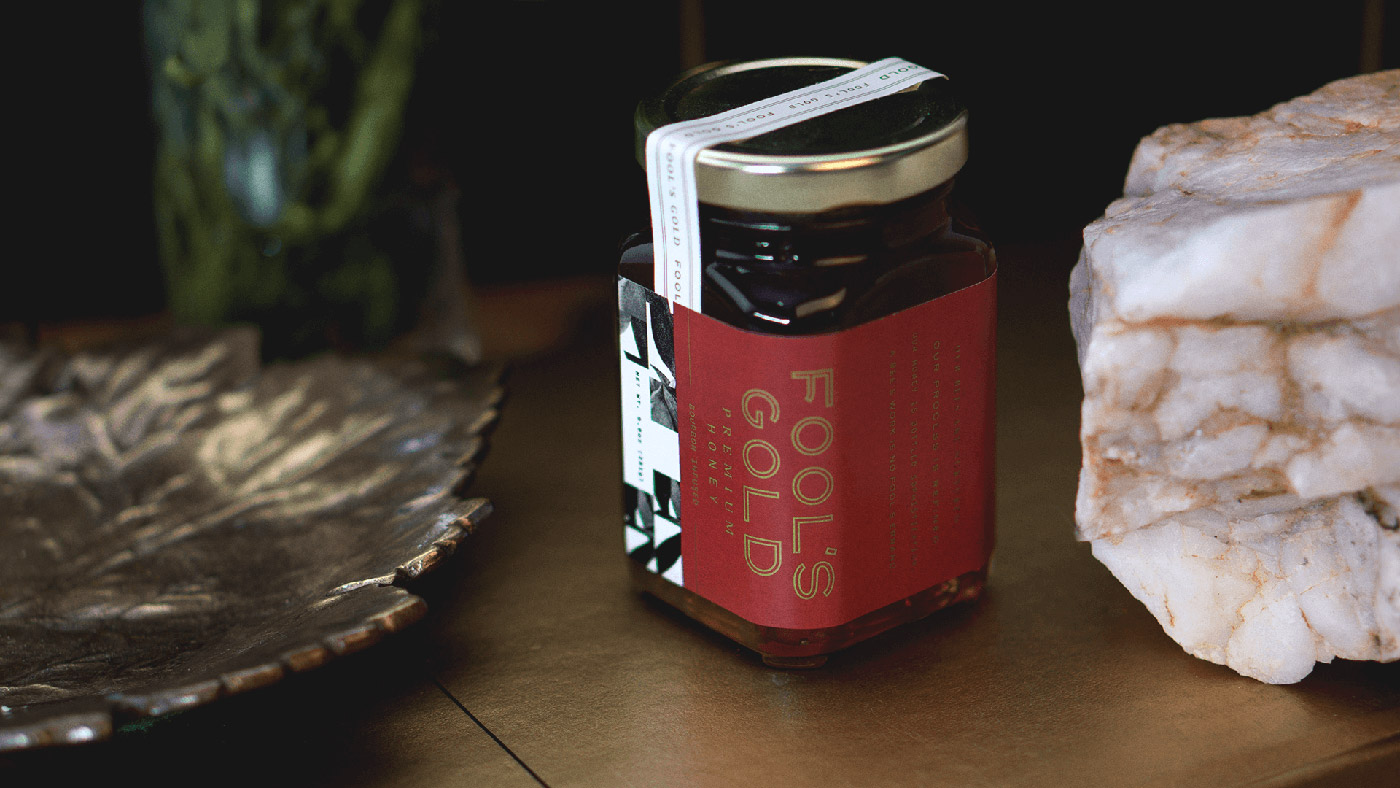
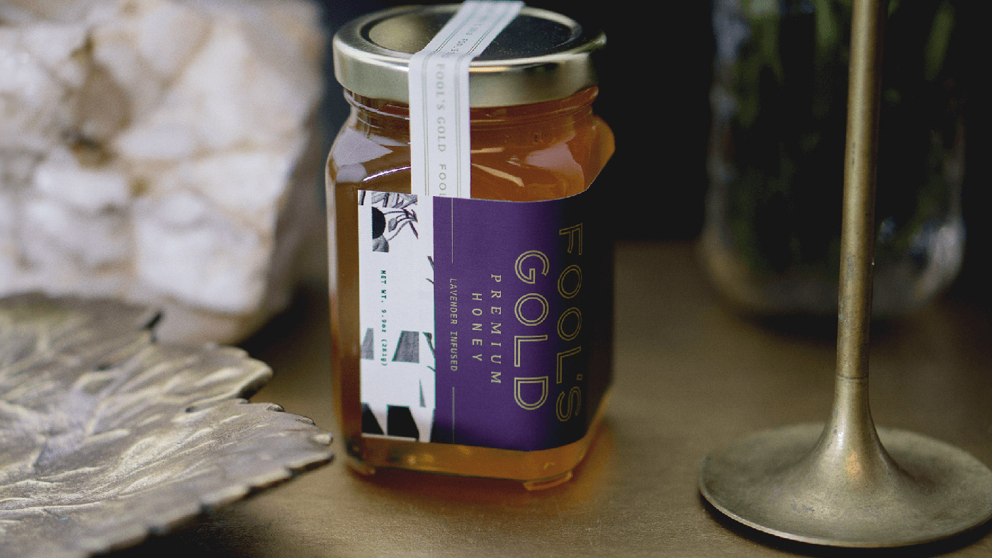
Colony Urban Farm, an urban gardening emporium, turned to design agency Airtype to help establish their private label nectar as a premium honey brand, including naming, branding and packaging the honey label.
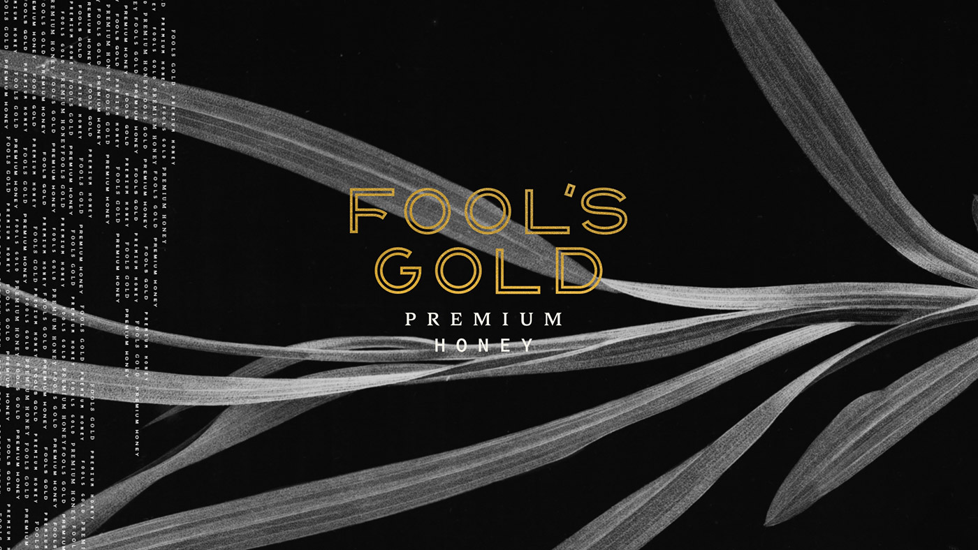
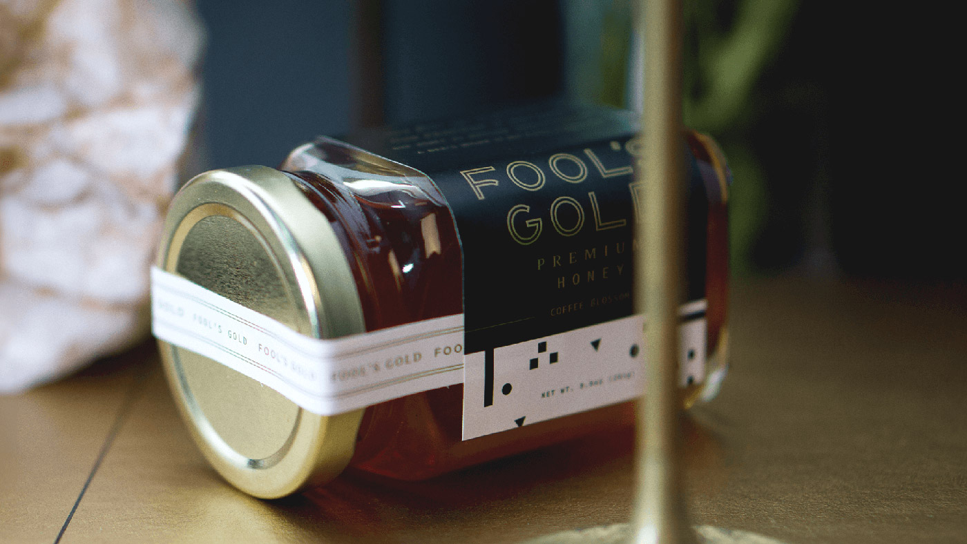
Drawing from a child-like sense of wonder and honey’s unmistakable hue, the name 'Fool’s Gold' stood out as a unique, classy and lighthearted name for a high-quality honey brand.
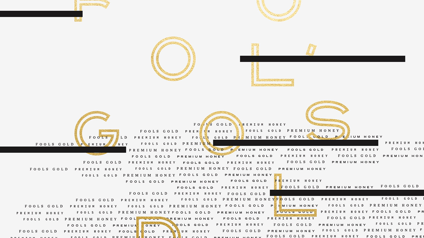
For its visual identity, Airtype desired to create a brand that's beautiful yet playful. Pairing the wordmark with mismatched typefaces gives the logo an off-kilter vibe, establishing a brand image that appears elegant, yet doesn’t take itself too seriously.
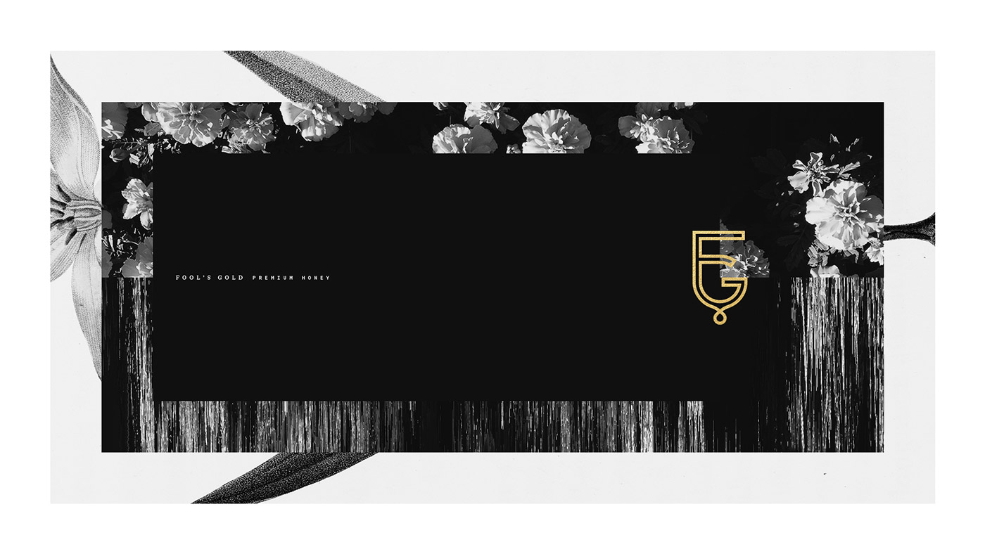
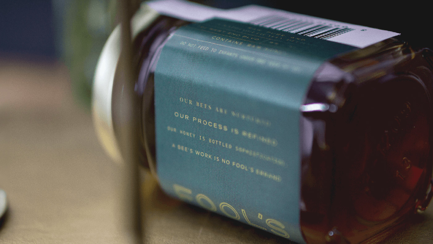
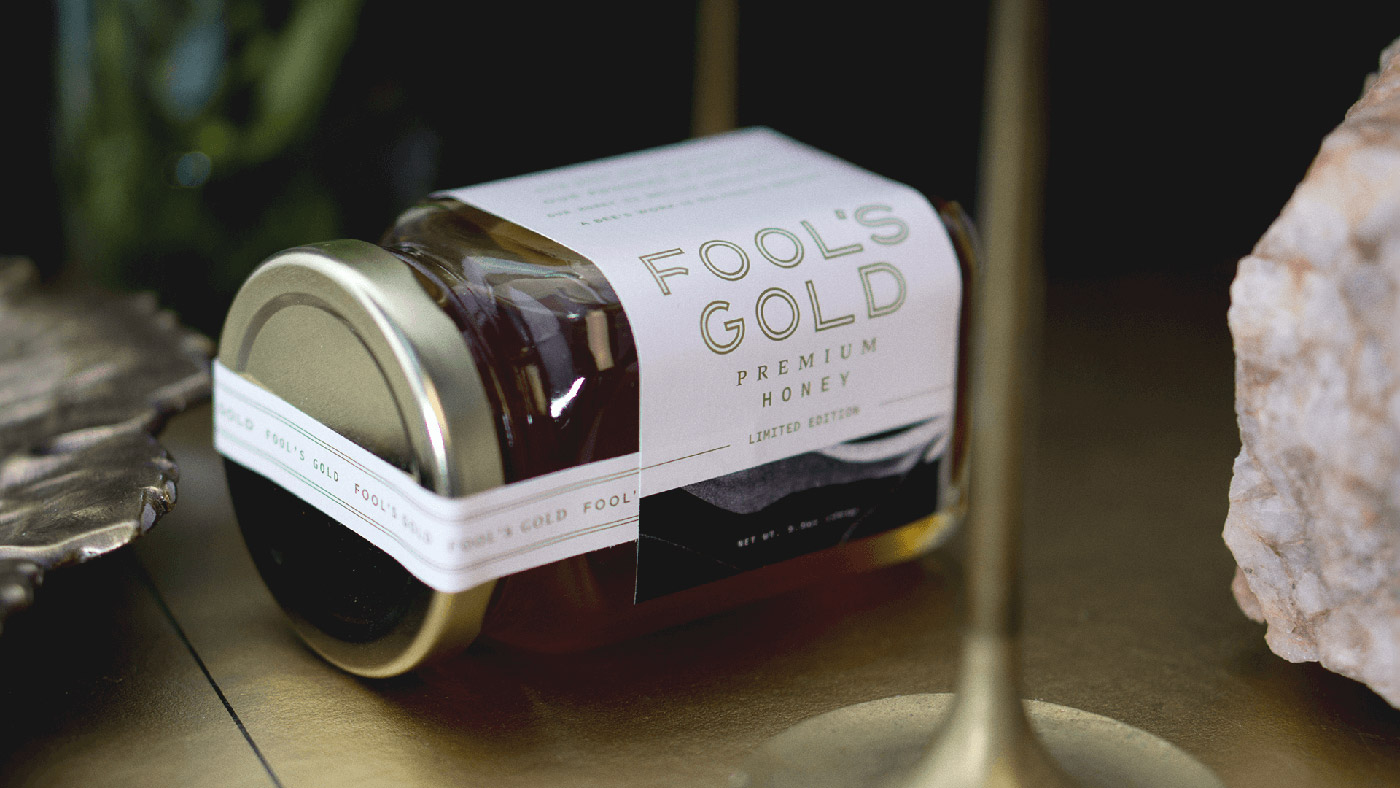
Airtype also created a series of abstract patterns to accompany the brand. Intentionally warped and skewed, the patterns bring a whimsical element to the visual identity. The geometric shapes serve as a subtle nod to pyrite, the brand’s mineral namesake.
When designing its packaging, the company’s evolving selection of flavour offerings presented an immediate challenge. Airtype built a colour system as an intuitive solution, allowing consumers to easily distinguish flavours through a palette of warm complimentary colours.
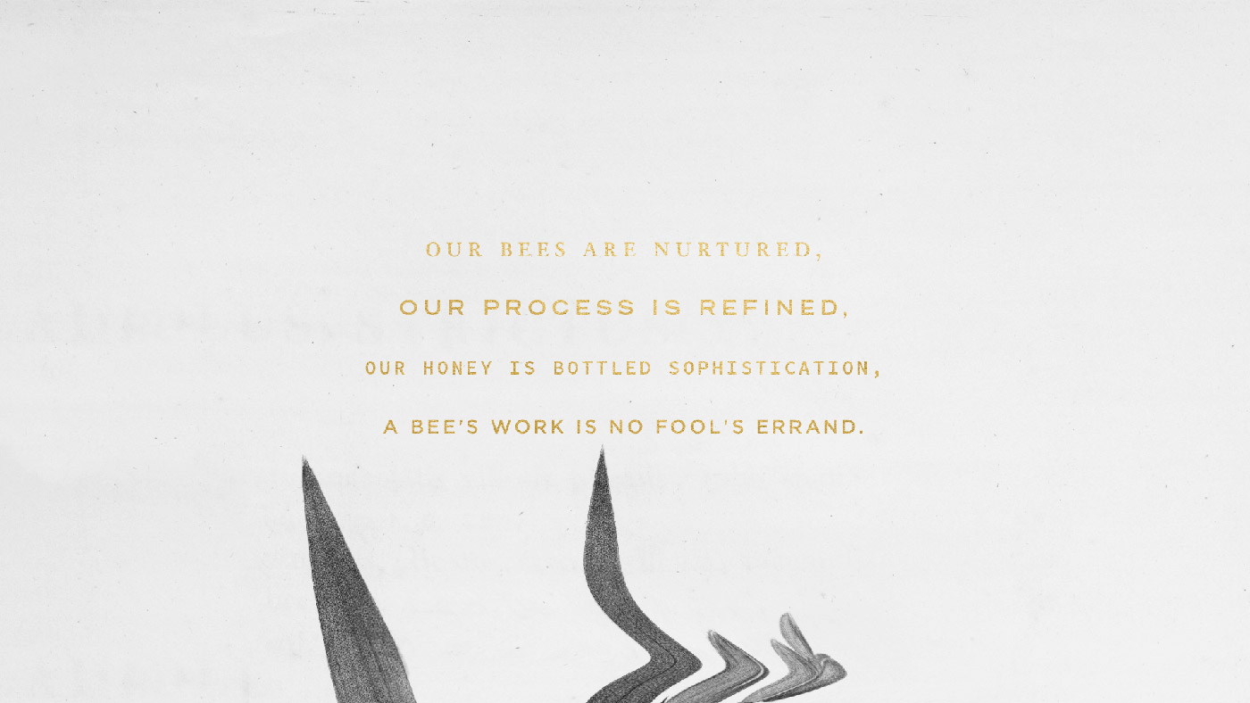
For retail customers, the brand's intention is to make finding Fool's Gold on the shelf feel like stumbling upon a hidden treasure. 'If you see a jar out there in the wild, be sure to give it a try. You'd be a fool not to.'
Credits: Airtype