Oddds The New Anthropology
September 26, 2017
Mindsparkle Mag


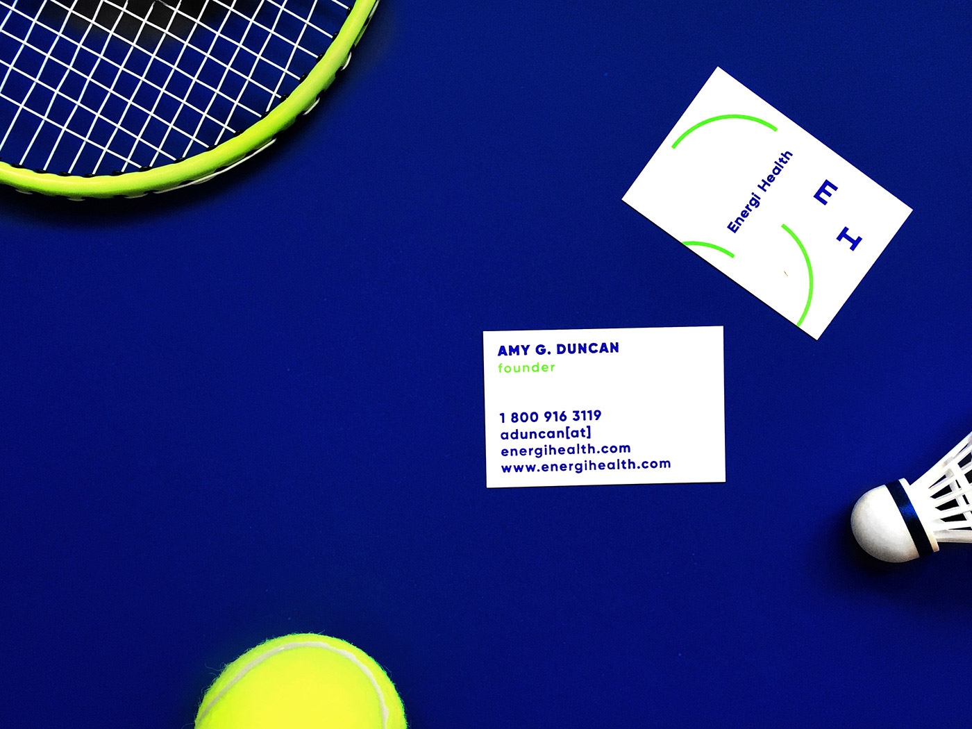
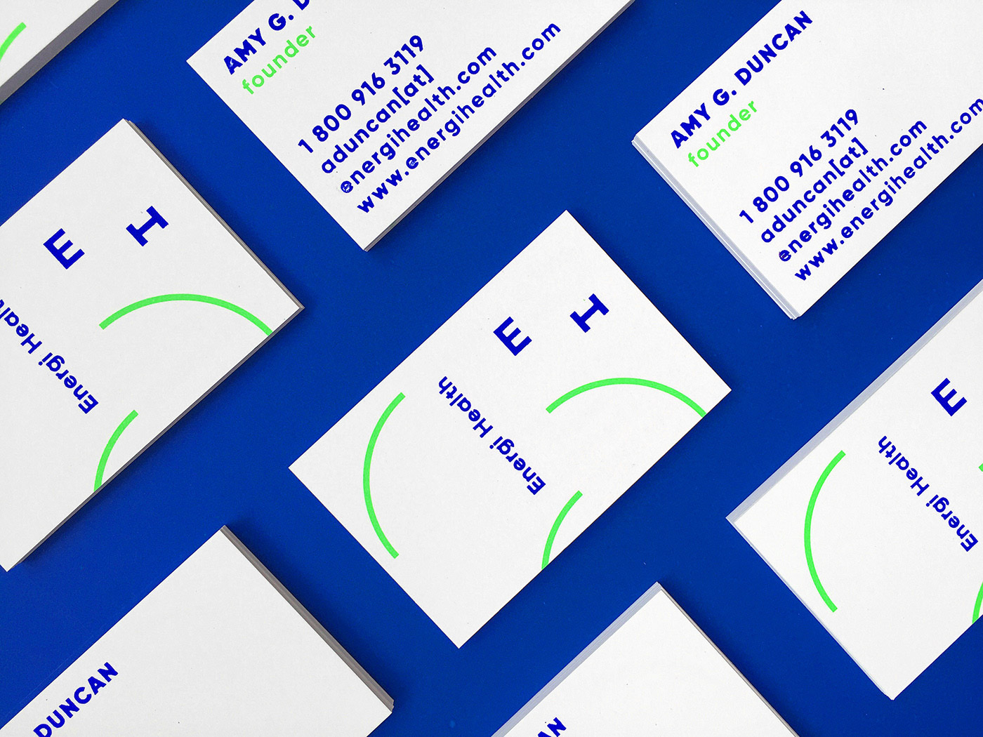
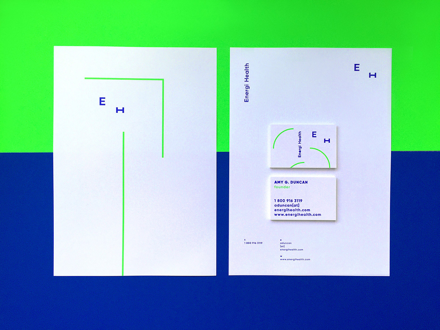
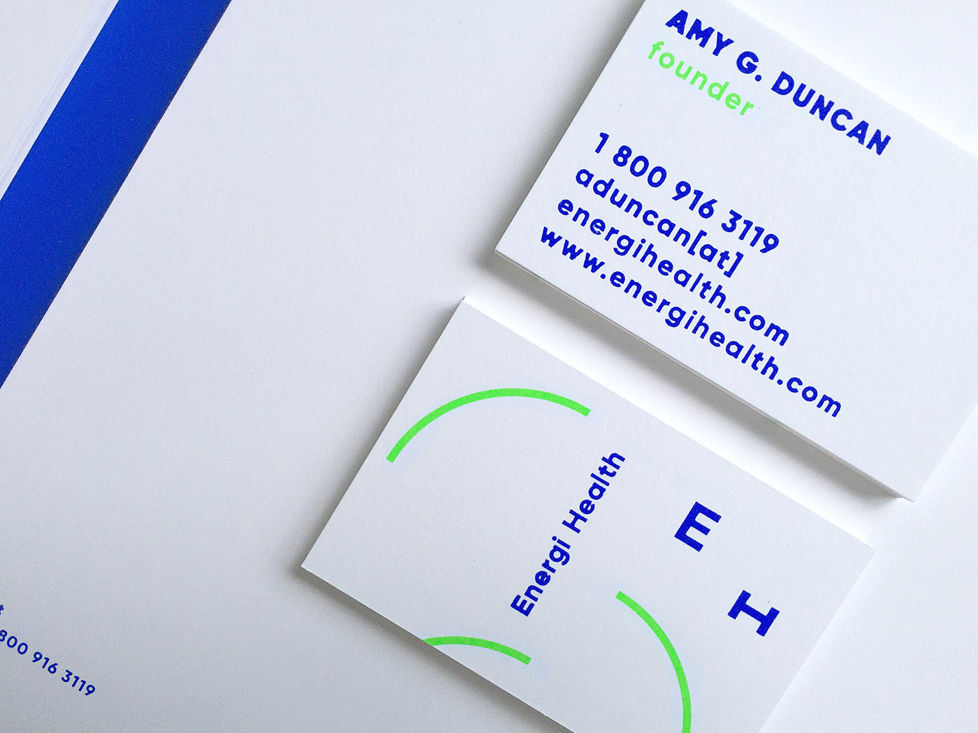
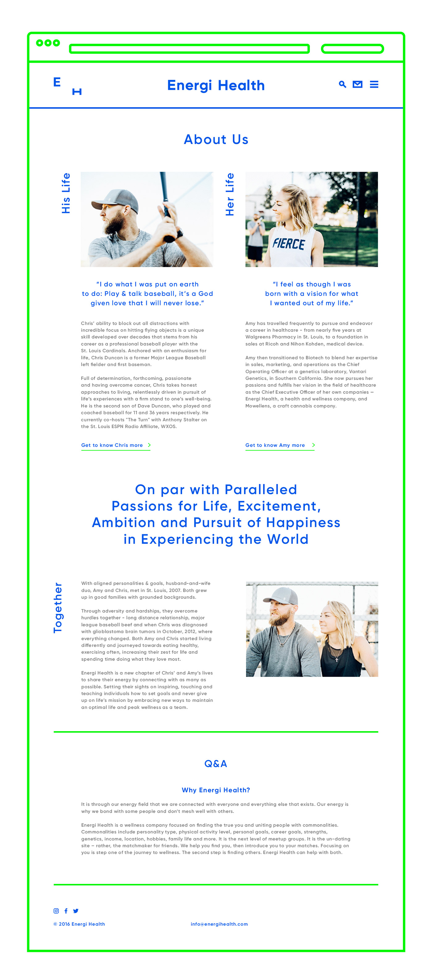
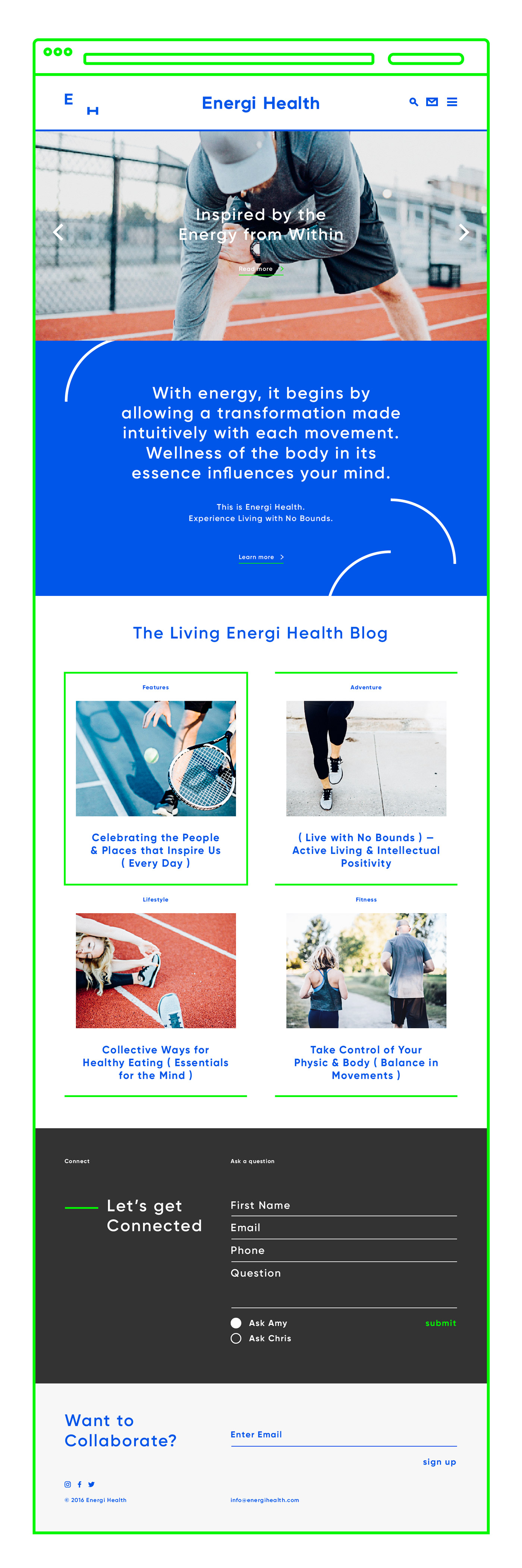
created the contemporary branding for Energi Health, a California-based health, wellness and fitness brand.
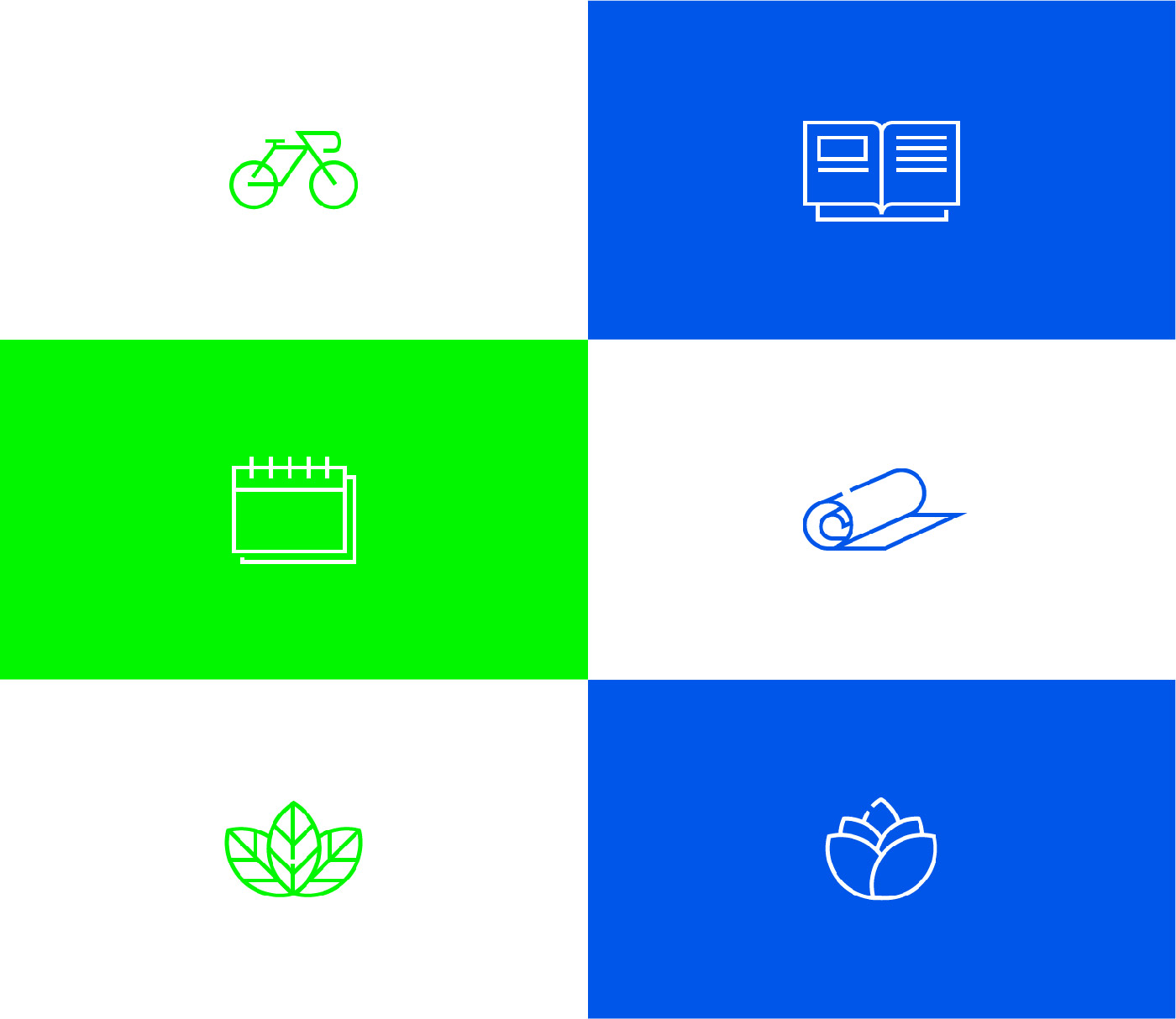
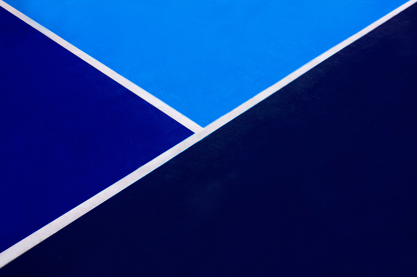
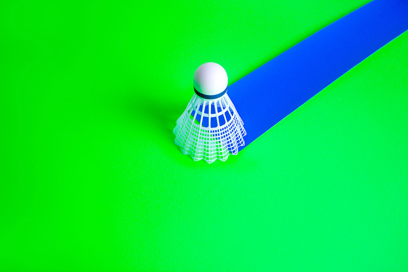
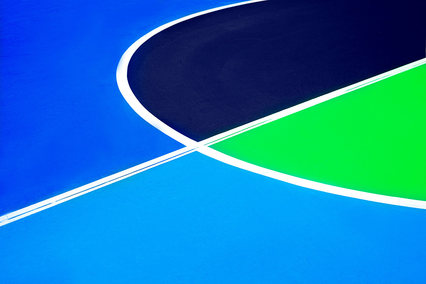
The branding, which features across its business cards, letterheads, website, and social media, was fittingly built around the concept of energy and dynamism. The identity features a minimal yet bold logomark, a fluorescent colour palette of green and blue, and playful graphics. Geometric curves, shapes and and lines feature across the branding which express movement and activity.
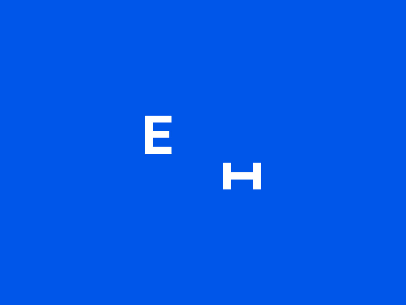
The diverse typography reflects Energi Health's versatility, while the simple initials logomark is minimal and simple, although it conveys a hidden meaning. Oddds say, 'The logomark expressing the initials of Energi Health is simple and grounded by extracting one's true self, as seen through the ‘H’ went rotated, intentionally becoming an ‘I’.'
Credits: Oddds The New Anthropology