

 Plus

 Menu


Butterfly Hunters
ArmeniaOctober 23, 2026
Mindsparkle Mag


In Armenia, the kebab shop has long carried a dated reputation: worn interiors, a heavy masculine atmosphere and little reason for anyone outside the regulars to walk in, women especially. Kebab.Lab set out to change that perception and to introduce Döner Kebab culture to the local market at the same time. The client arrived with nothing more than a name, and Yerevan and Vienna based design studio Butterfly Hunters was asked to turn it into a brand that could redefine the street food experience through food quality, interior design and every touchpoint around them.
Research pointed the studio toward two audiences: Millennial and Gen Z professionals working in tech and the creative industries. Despite the generational gap, both groups put a high value on cultural capital, expressed most clearly through their taste in music and design. That insight pushed the brand identity beyond food and into a cultural experience its audience could recognise itself in, summed up in the tagline House Kebab, House Music.
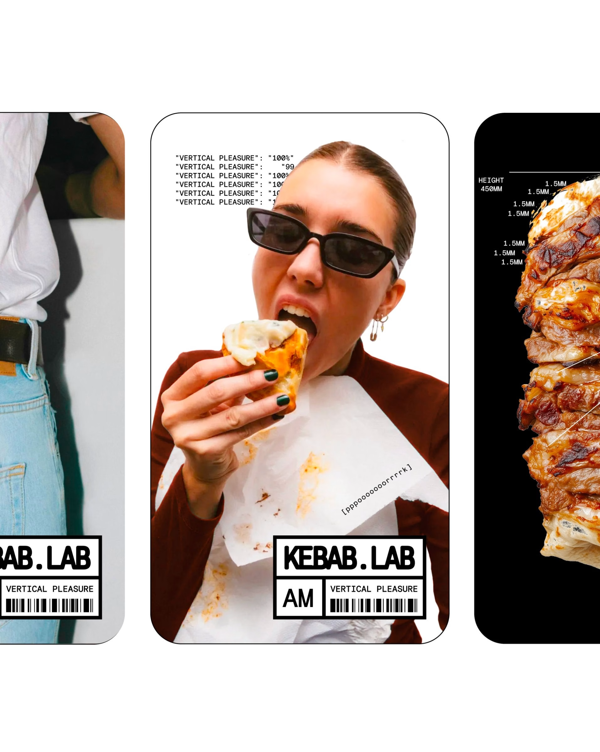
The idea at the centre of the identity is a playful genius: absurd levels of clinical precision applied to something as unpretentious as a kebab. The döner spit is measured and annotated like a lab specimen, trays are inspected under a magnifying glass, and the packaging reads like equipment from a research facility. Takeaway bags, boxes, drink pouches and bottles carry the same monospaced labels, order fields and "designed to satisfy" lines, so every item in a customer’s hand belongs to the same experiment.
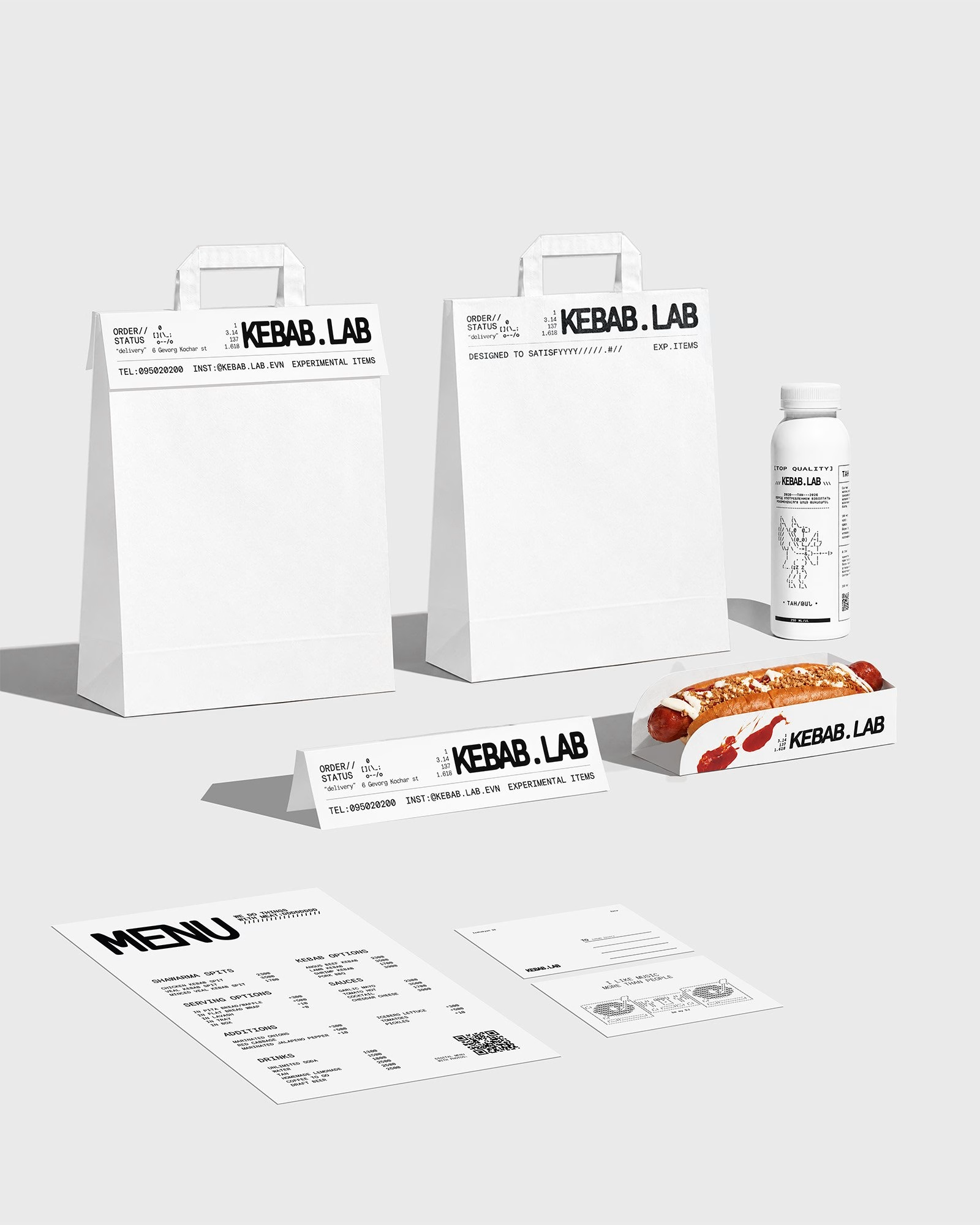
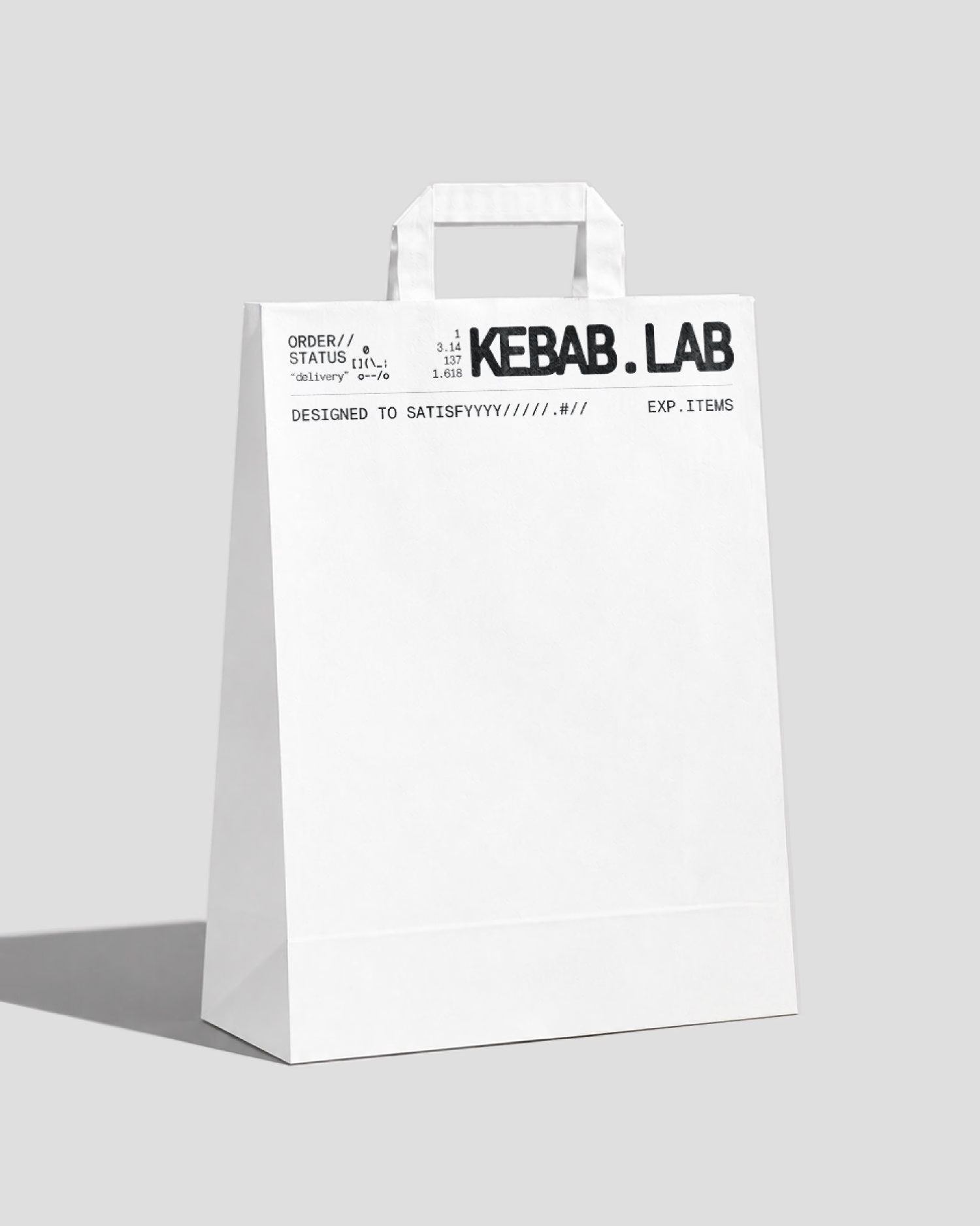
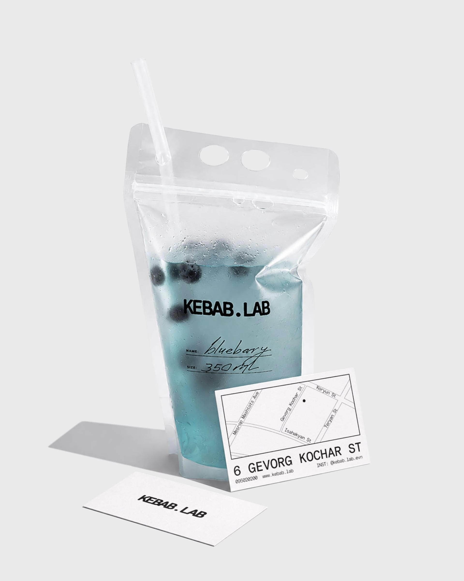
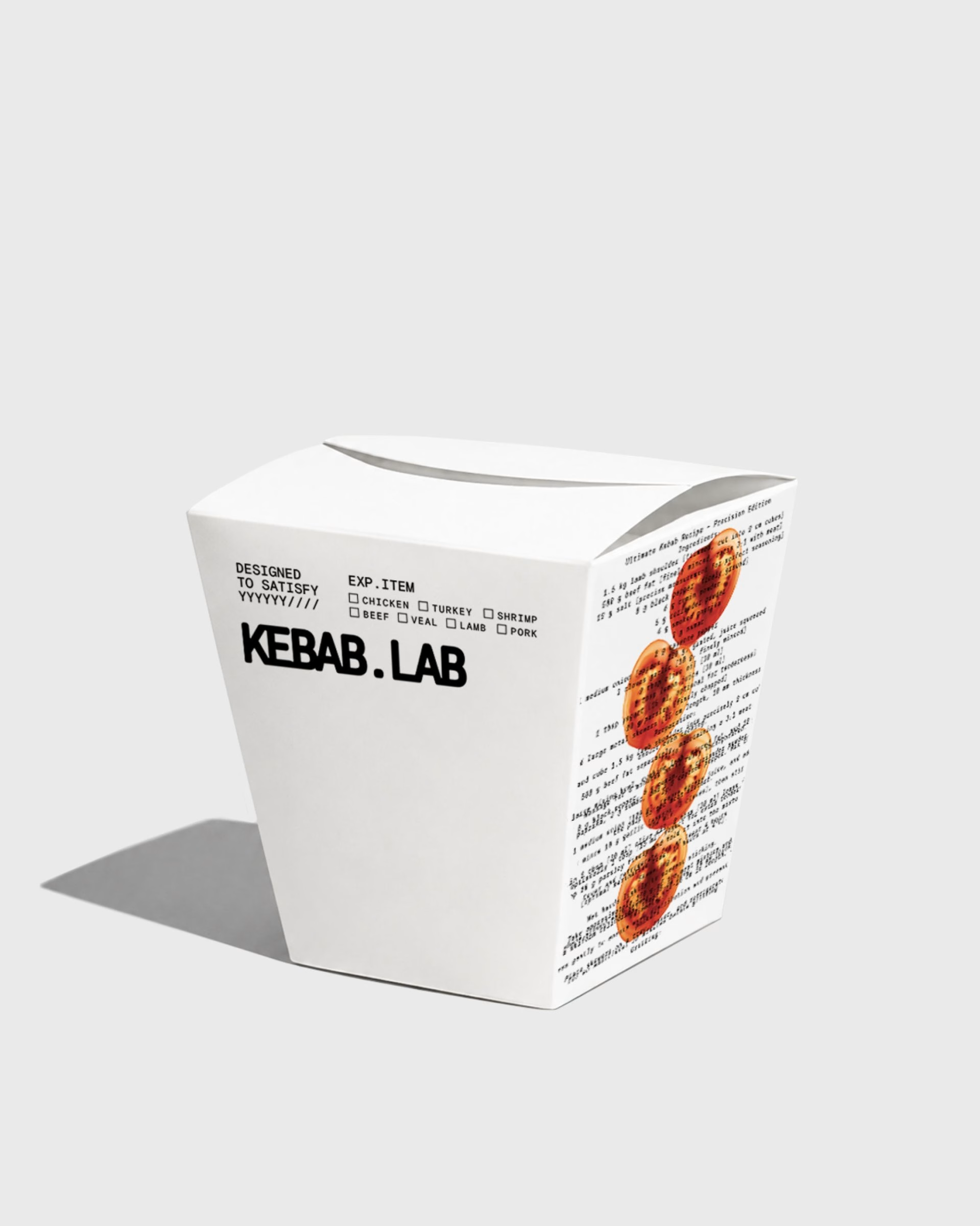
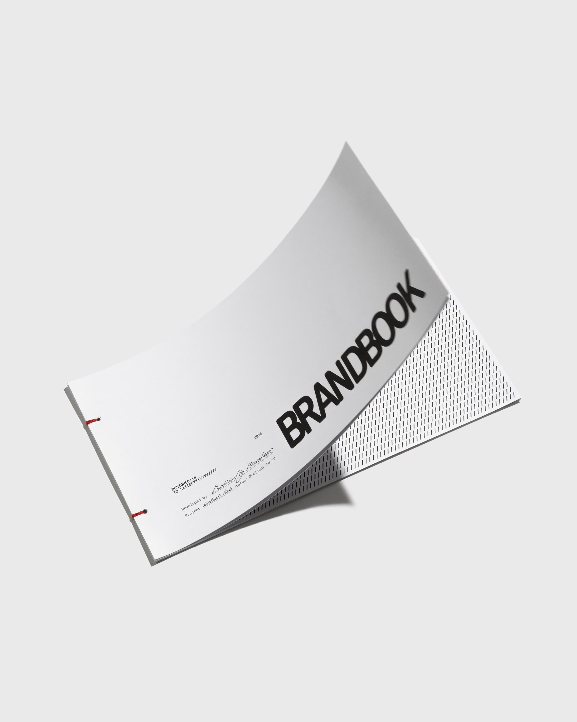
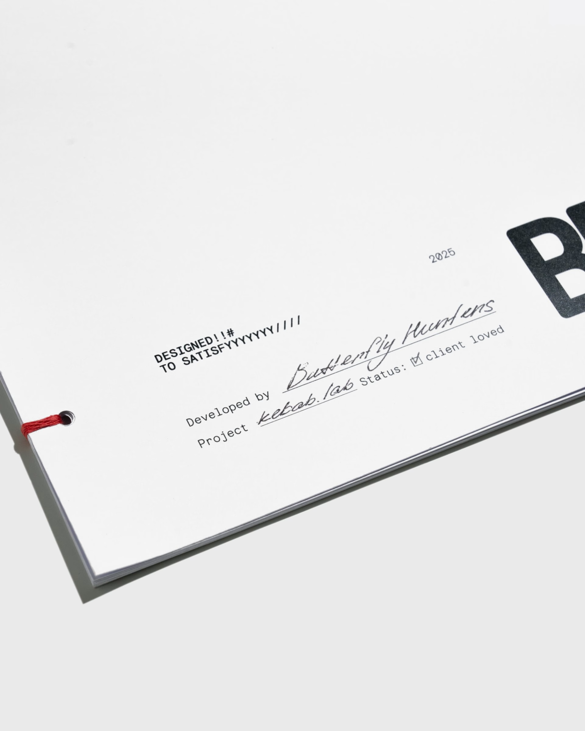
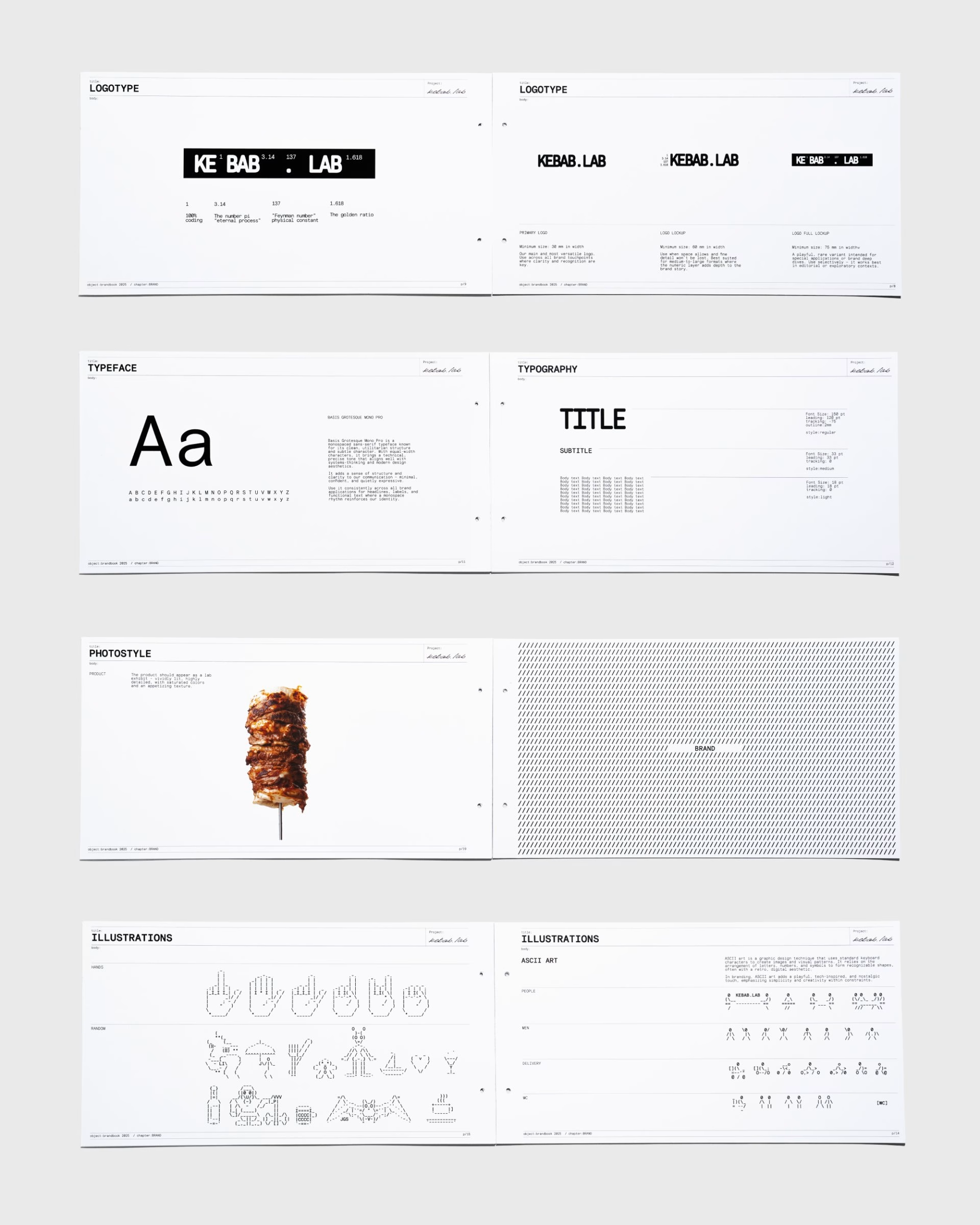
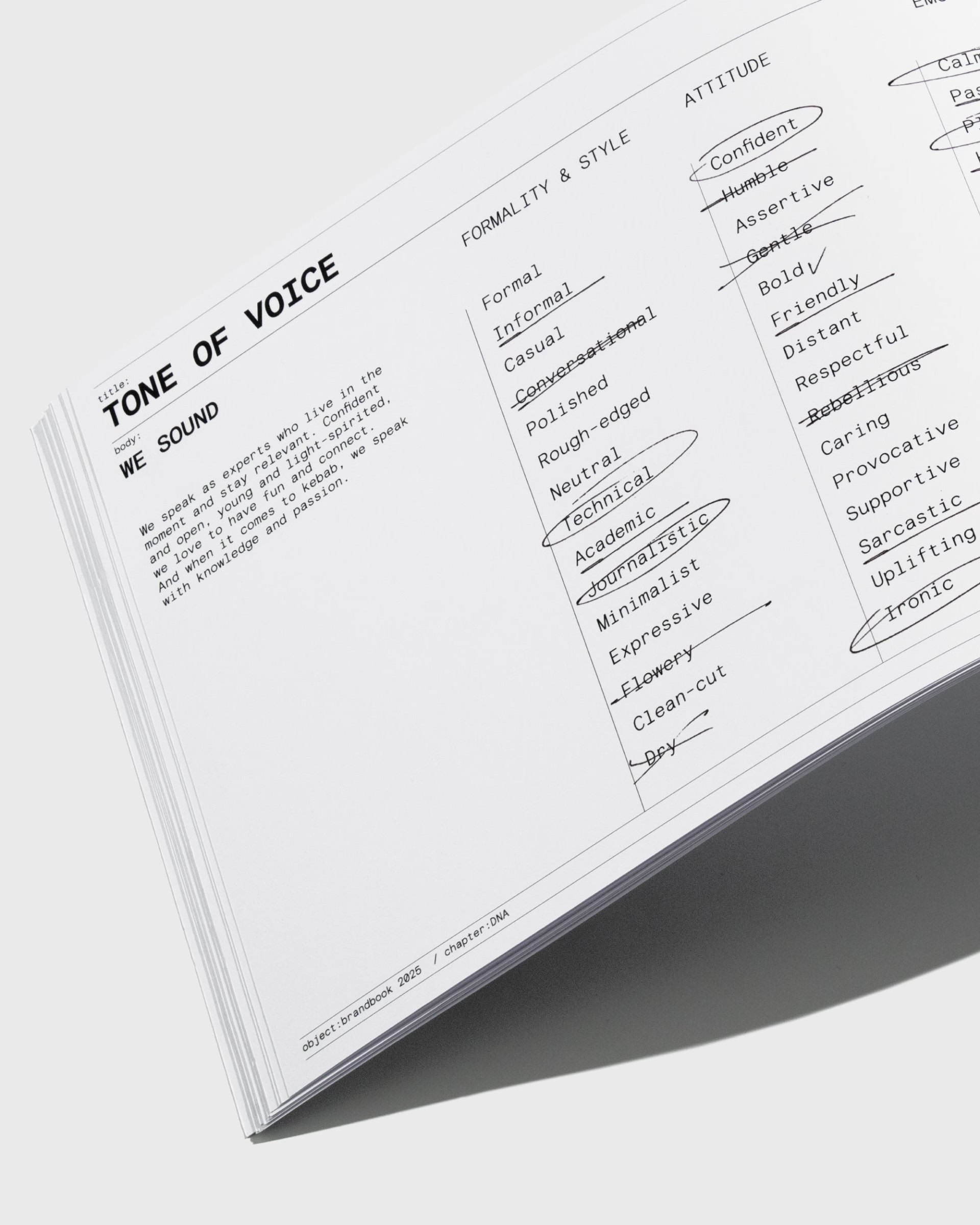
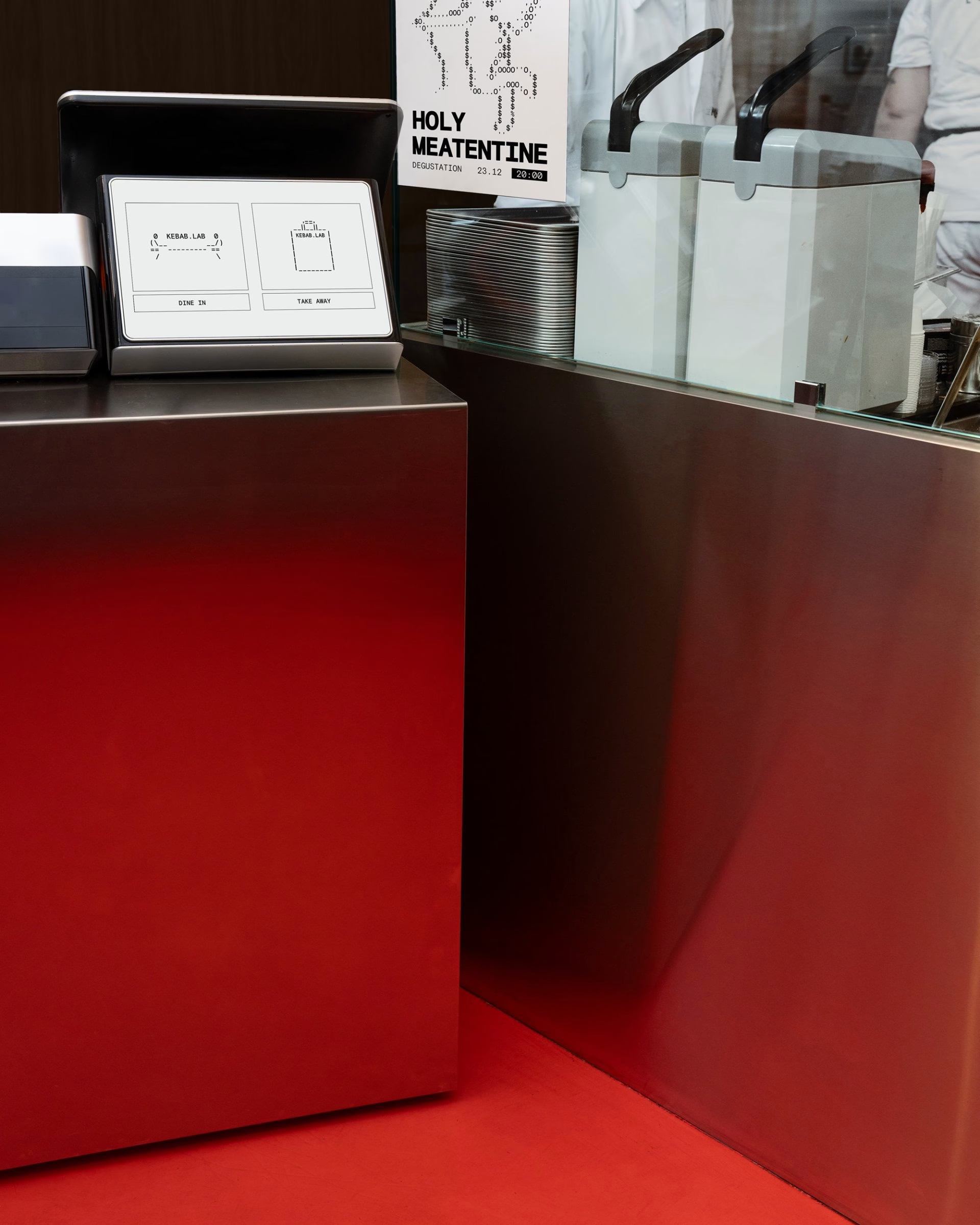
Behind the packaging sits a brandbook that treats the system with the same seriousness the brand pokes fun at. It sets out the typography, product photography rules, illustration library and social media matrices, along with a tone of voice that balances confident expertise with a wink. ASCII-style illustrations, menus, aprons and a "Holy Meatentine" mascot give the team a toolkit that stays recognisable from a sticker to a full menu board.
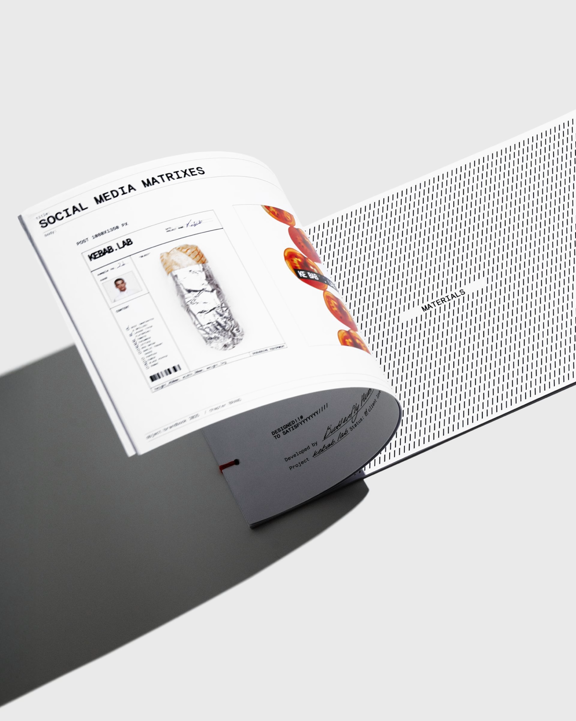
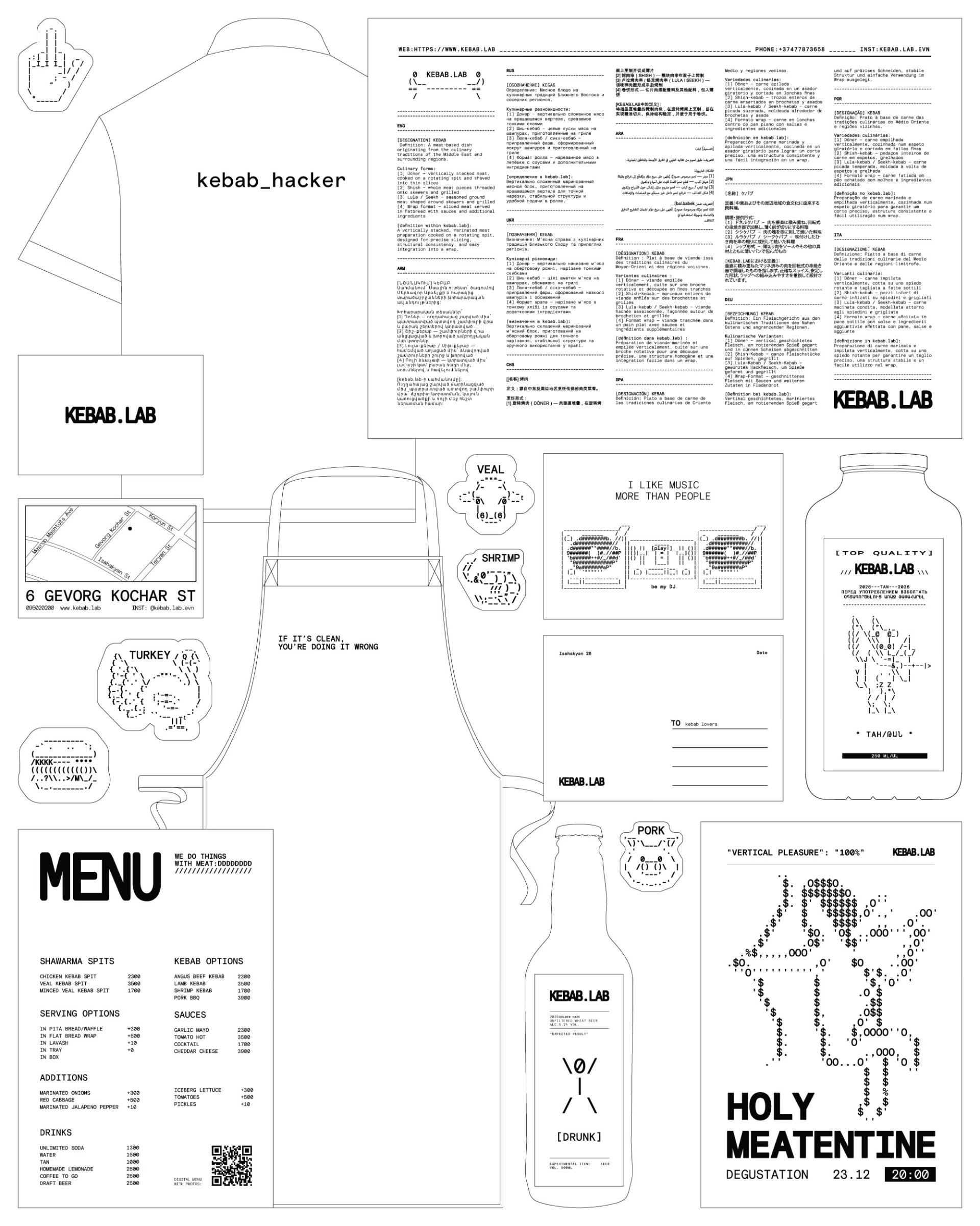
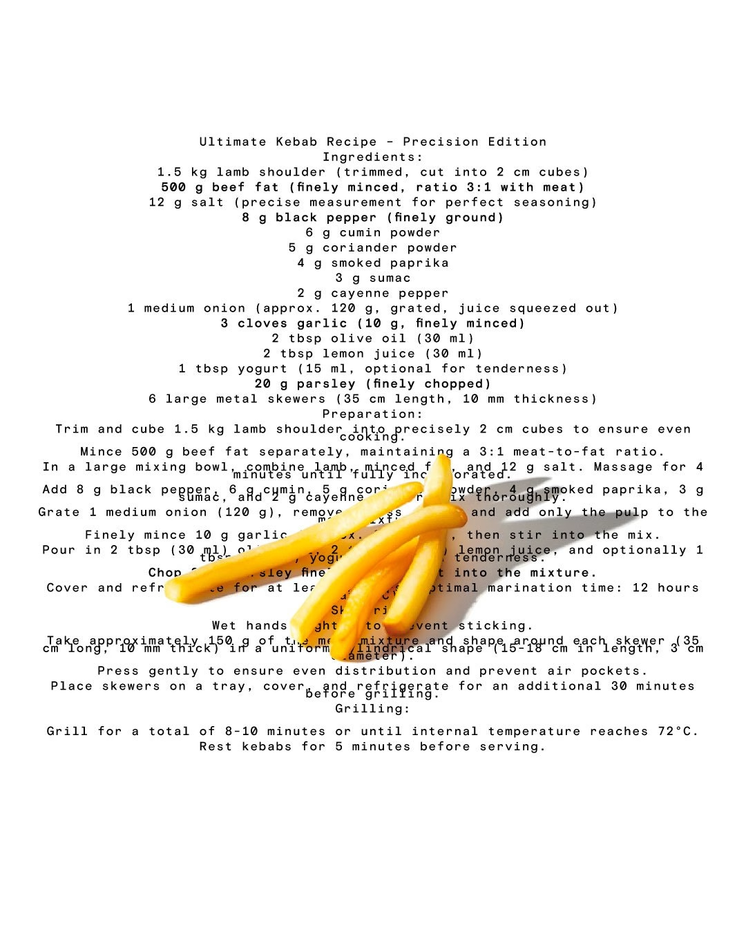
On social media, the lab aesthetic meets food that has to look as appetising as possible, which was the trickiest balance in the whole project. Butterfly Hunters paired clinical white layouts and barcode-like lockups with close, saturated food photography and short motion pieces, so the product shines without the brand looking artificial. Posts range from a precision recipe written like a lab protocol to "vertical pleasure" campaign shots of guests biting into a döner.

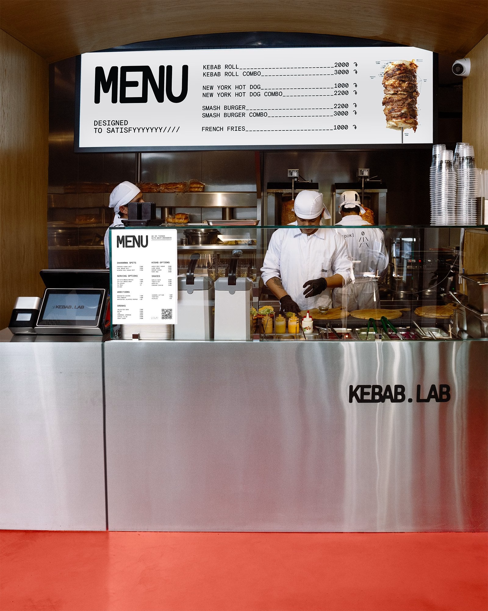
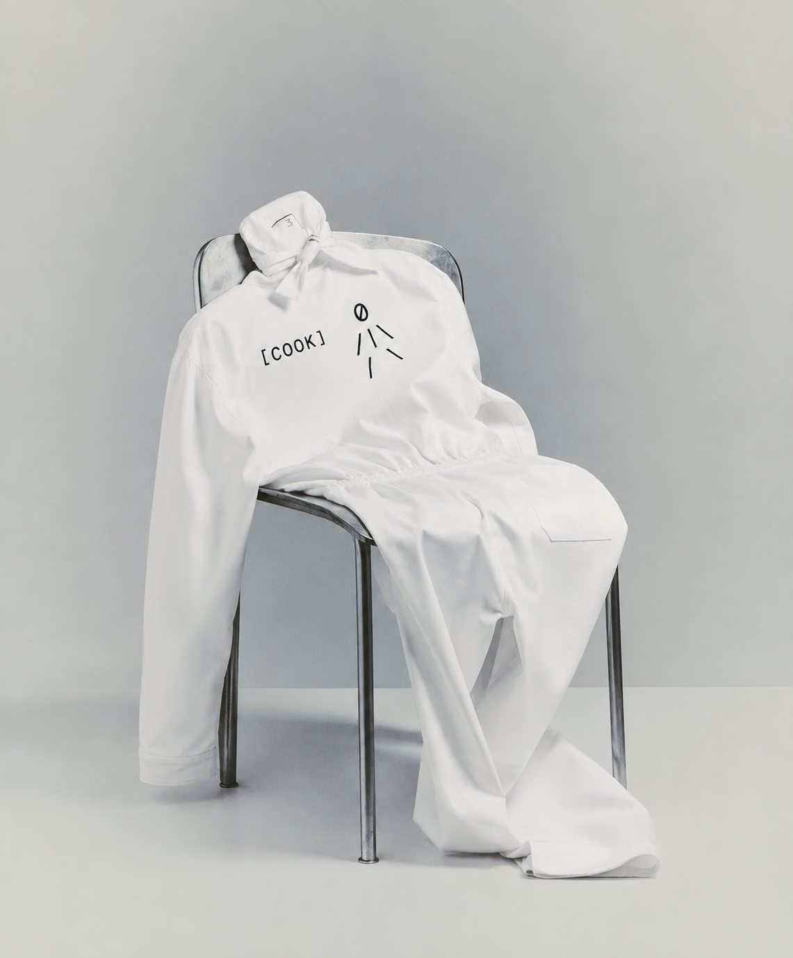
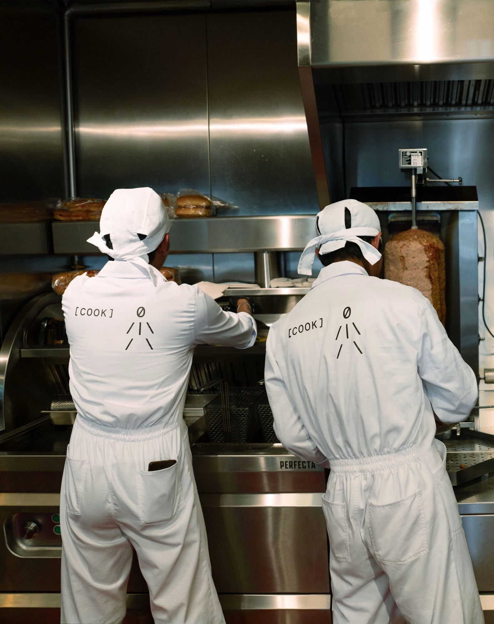
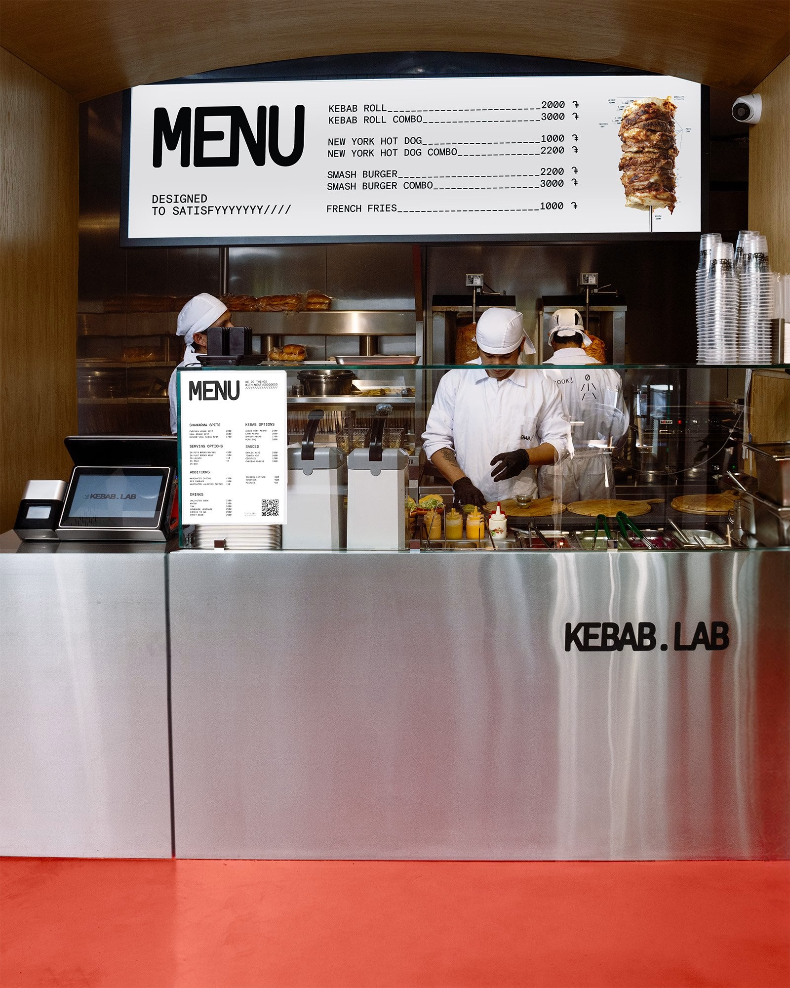
The studio also set the interior direction, and the restaurant translates the identity into stainless steel, red flooring and white workwear. Cooks in boiler-suit uniforms work behind a polished steel counter under a menu board set in the same monospaced type, while curated house music plays through serious sound gear. The result turns a familiar food category into a cultural destination that appeals across genders and generations through shared values rather than nostalgia.
Unlock everything with Mindsparkle Mag Plus.
Get exclusive access to Premium features:
Credits: Butterfly Hunters
Brand Identity & Interior Direction: Butterfly Hunters
Concept & Strategy: Eliza Malkhasyan
Art Direction: Christina Khlushyan
Concept, Art Direction & Graphic Design: Irina Alaverdyan
Animation & Motion Design: Davit Mkhitaryan
More in Restaurant Branding
Stay on top of this week's design. Insights, top picks & more.