 Plus

 Menu


Junyoup Bong
October 27, 2026
Mindsparkle Mag


Fig Coffee is a neighbourhood café in Seocho, Seoul, with a crowd of regulars and a room that is full most of the day. The project began as a simple packaging enquiry, but early conversations made it clear the café needed a new identity rather than a new bag. The owners agreed to a full rebrand, which put real weight on the designer who had suggested it.
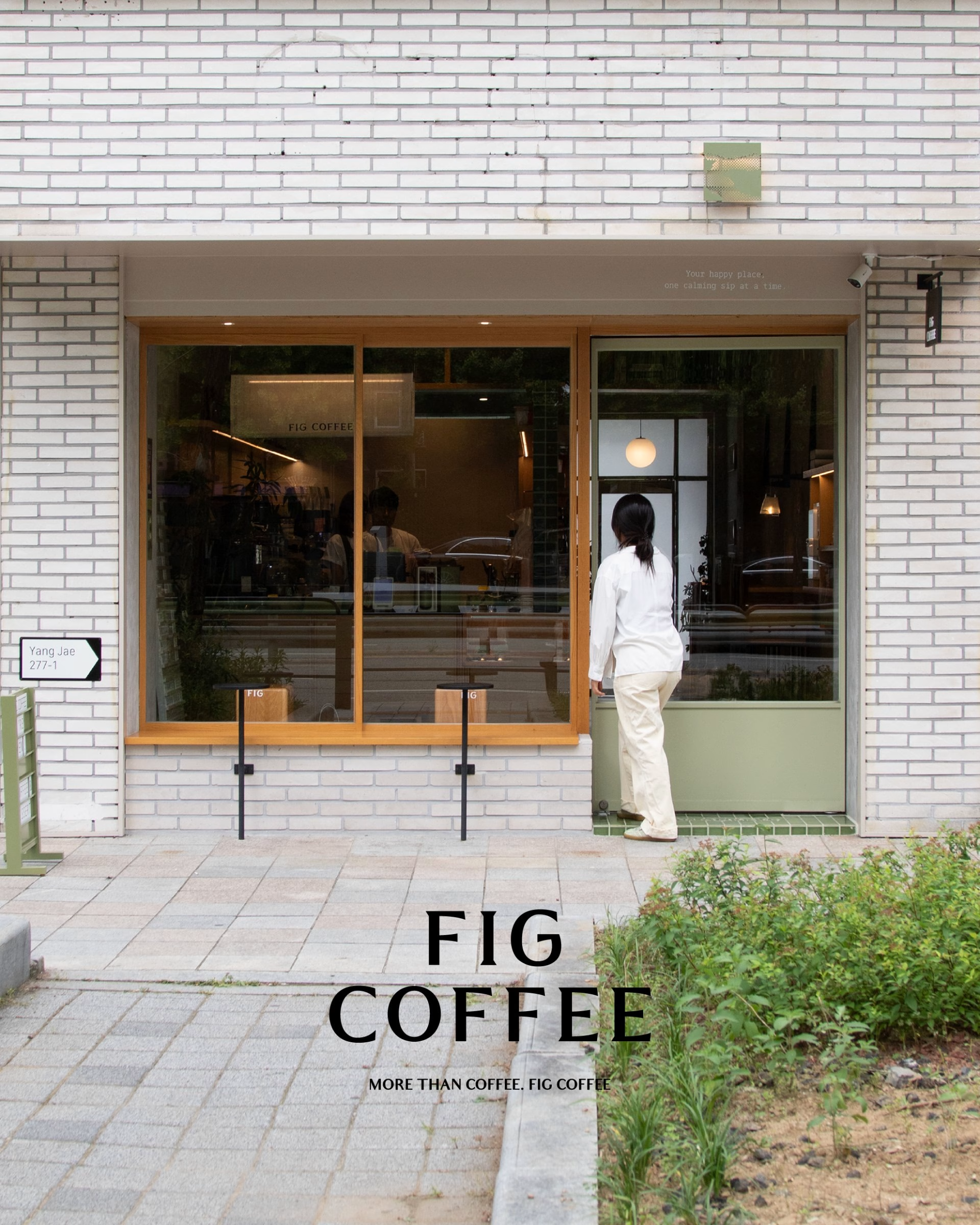
Seoul-based designer Junyoup Bong directed and designed the rebrand. The obvious route was the fig itself, but building on the fruit felt limiting, so it was set aside in favour of what actually makes the café work. The new wordmark is a simple all-caps sans, stacked as FIG COFFEE on the storefront and run together as FIGCOFFEE on packaging, and it sits on glass, a hanging blade sign and opening-hours lettering without competing with the room behind it.
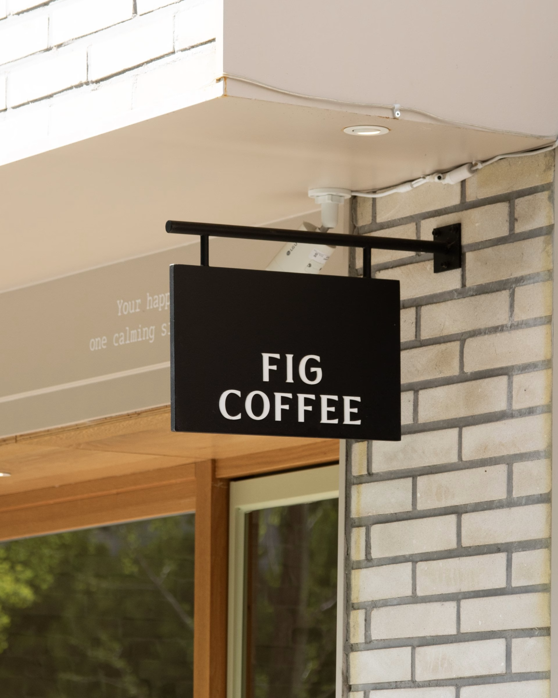
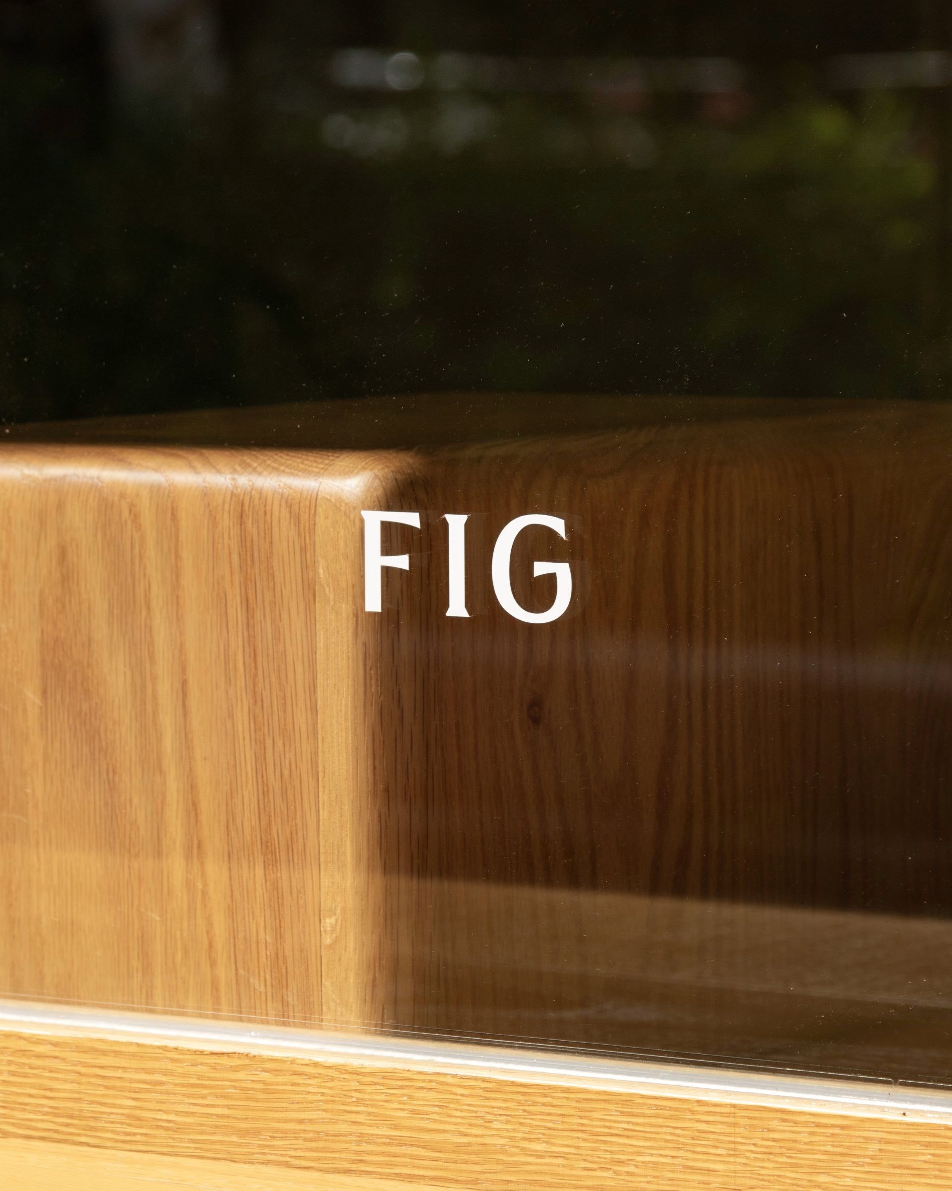
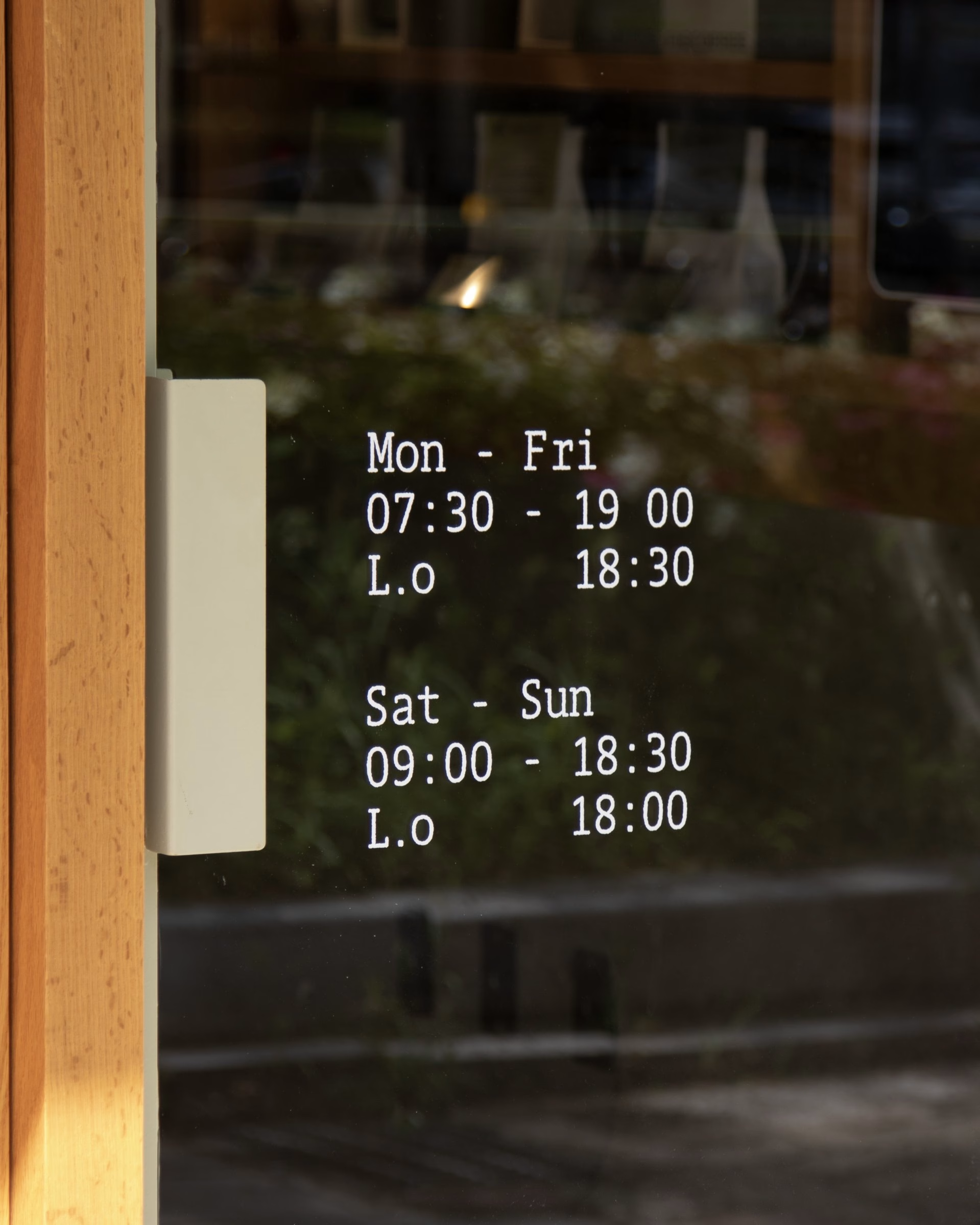
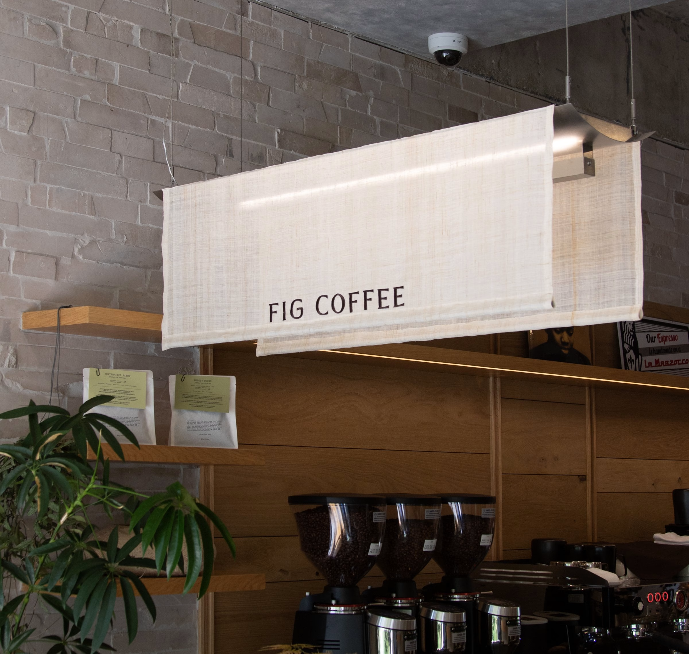
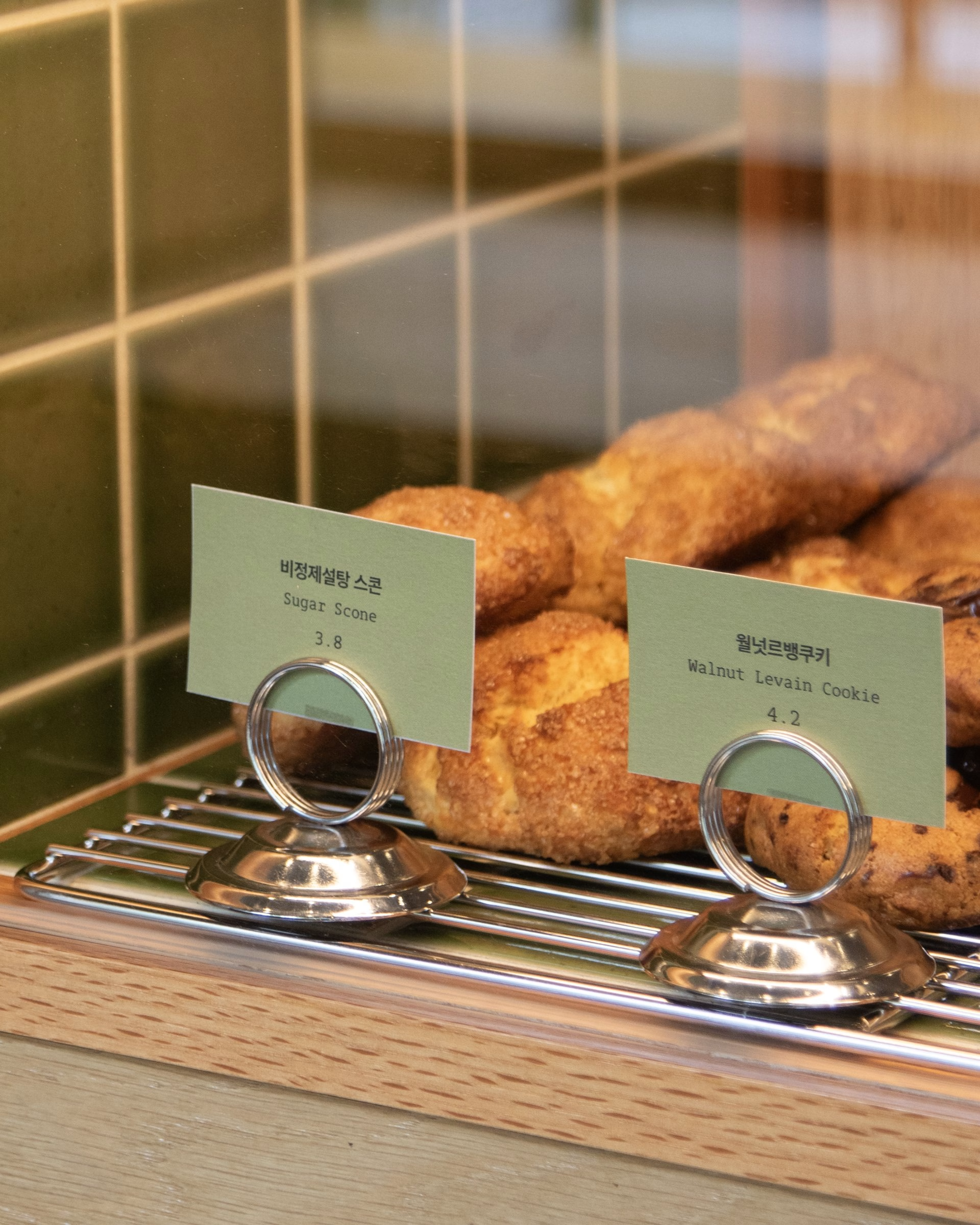
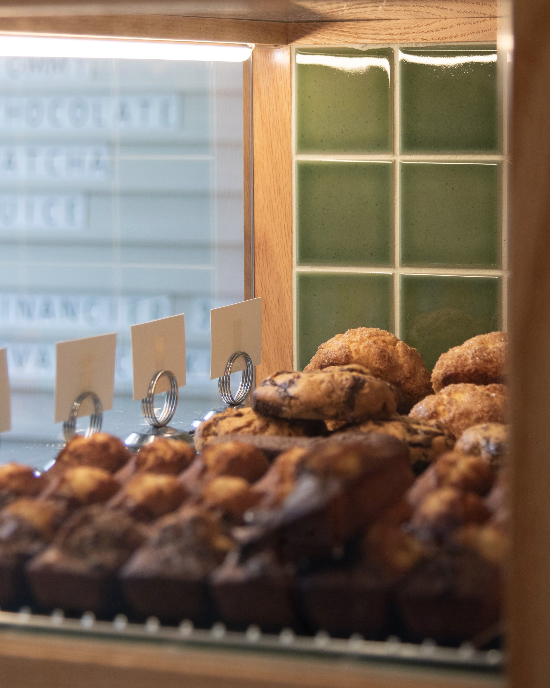
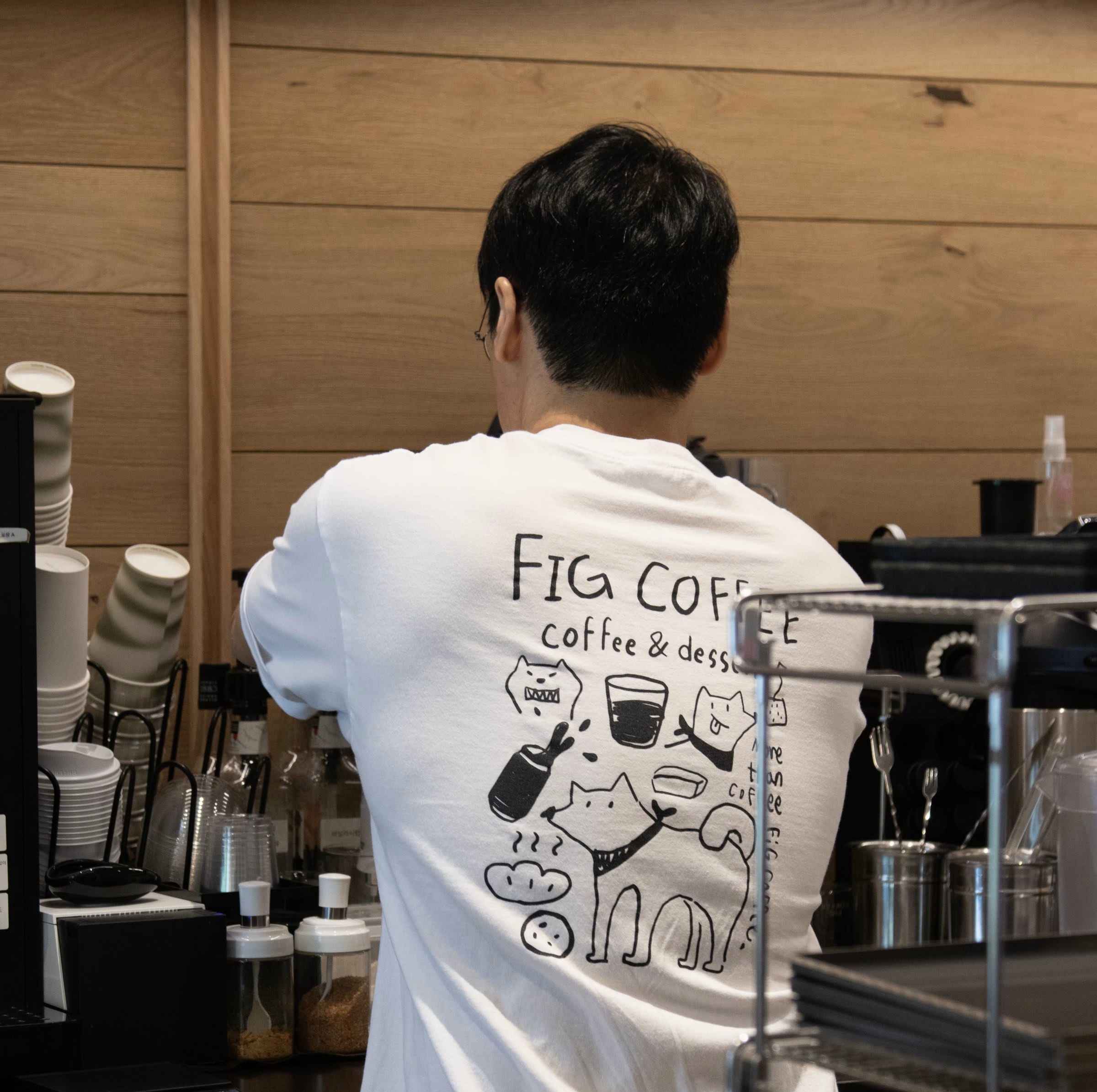
What makes the café work is its people. Every meeting took place in a full room, and the project text notes that loyalty like that has to come from something real. The identity follows the regulars through their day, from the menu board and the counter to bread under glass and staff in branded aprons and tees.
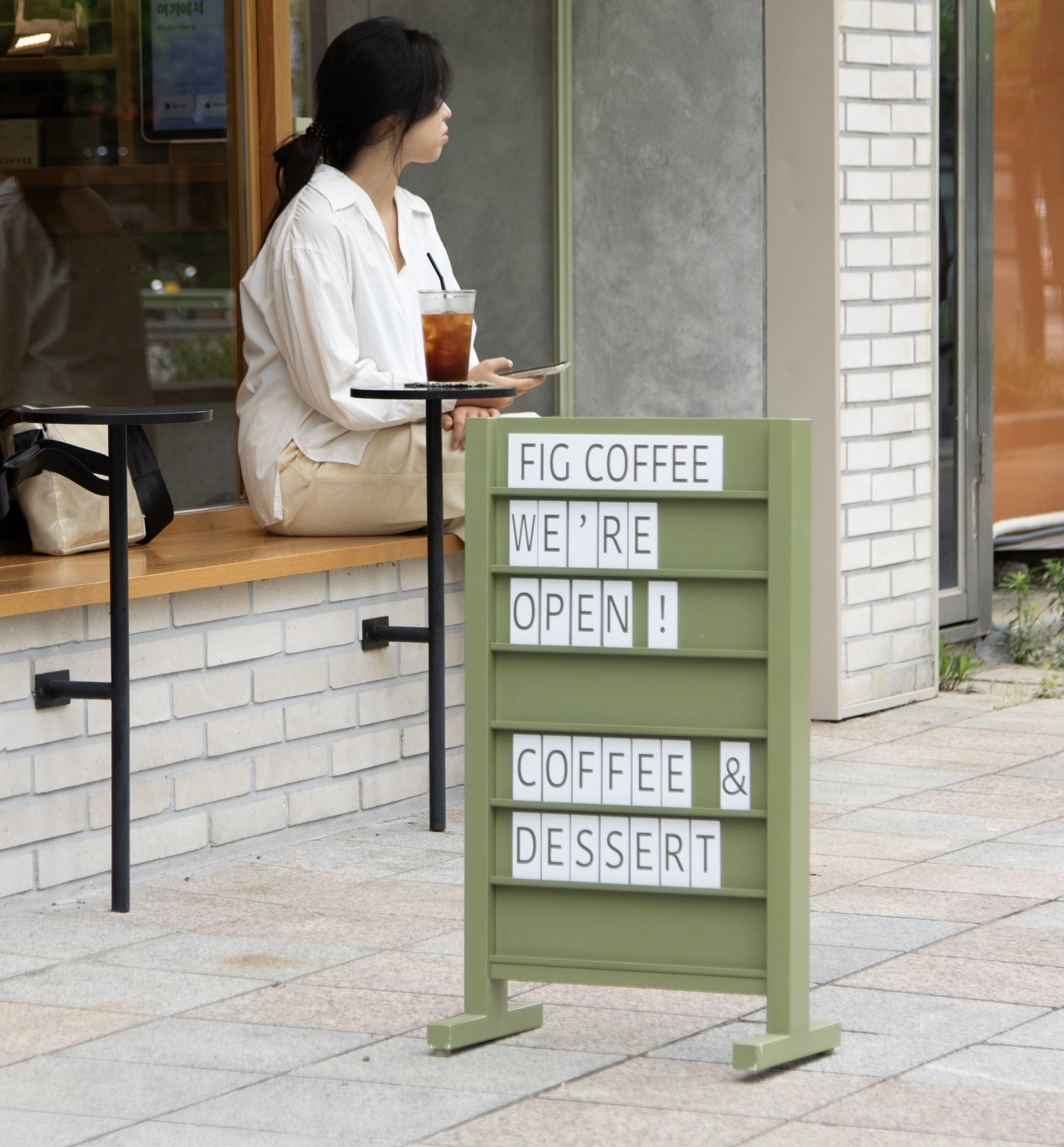
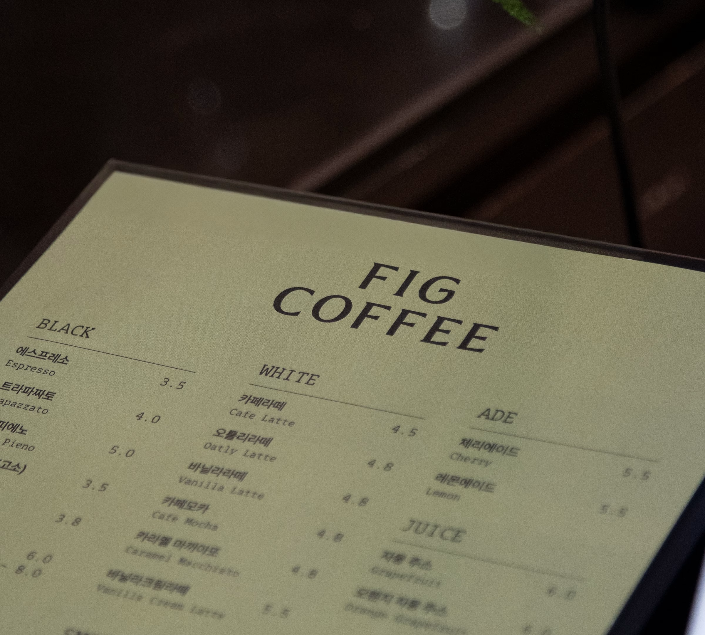
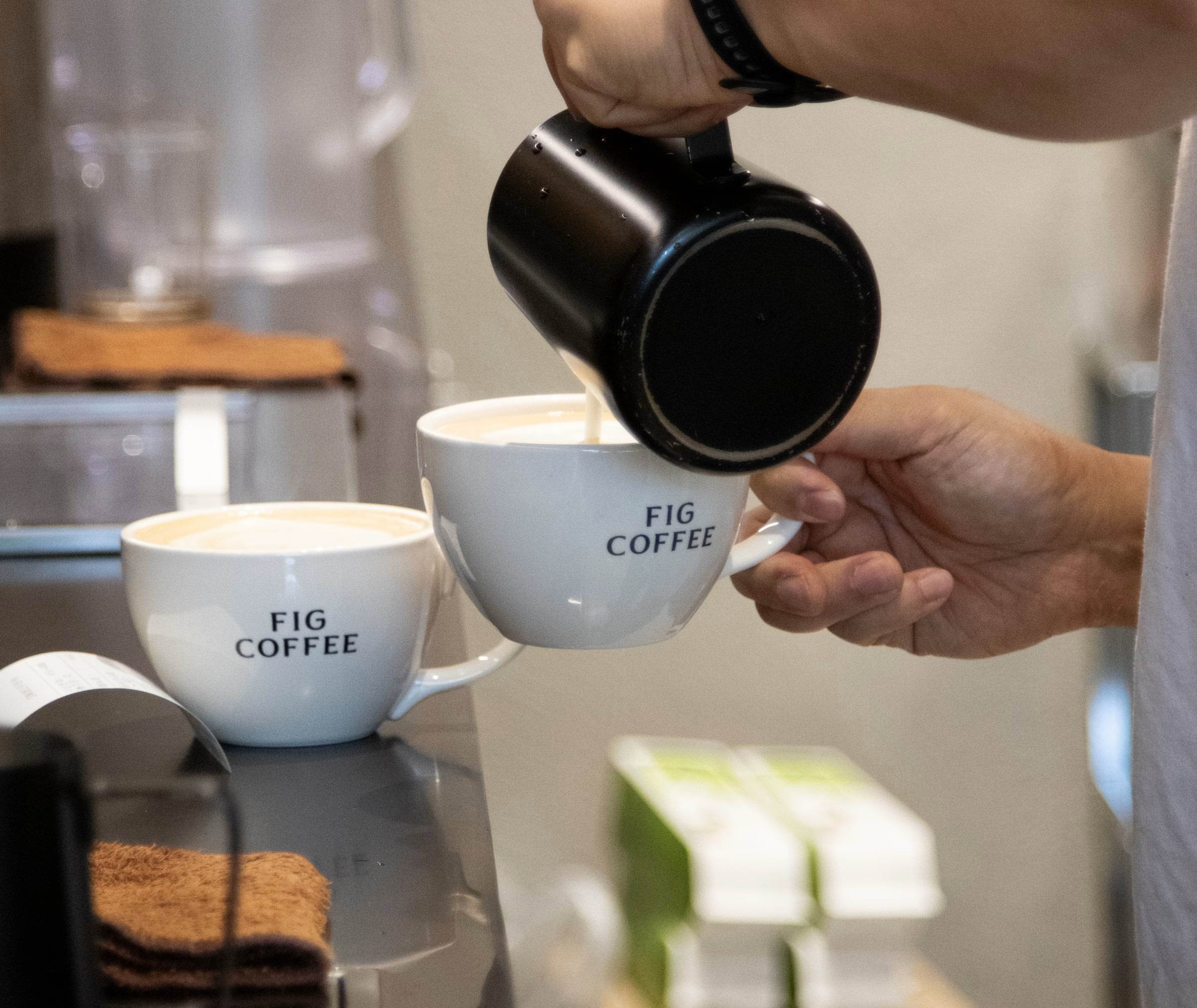
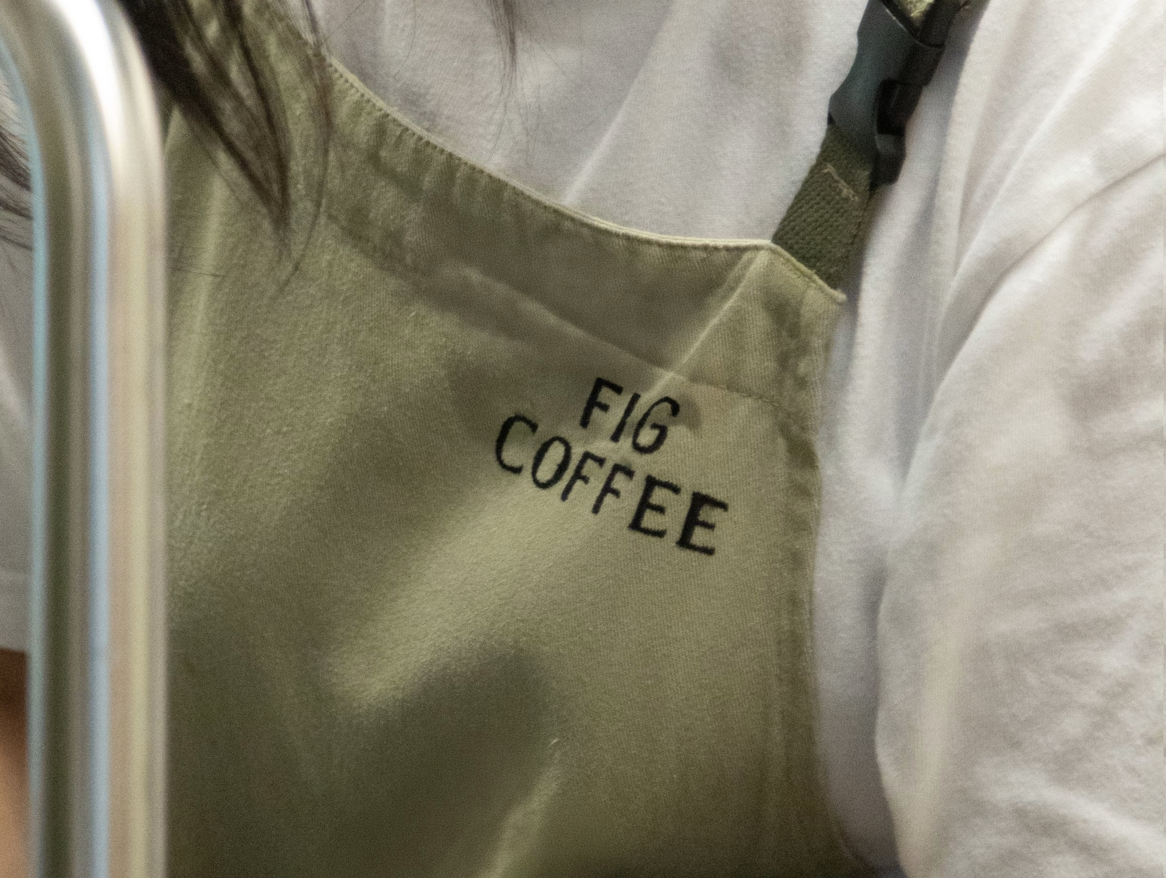
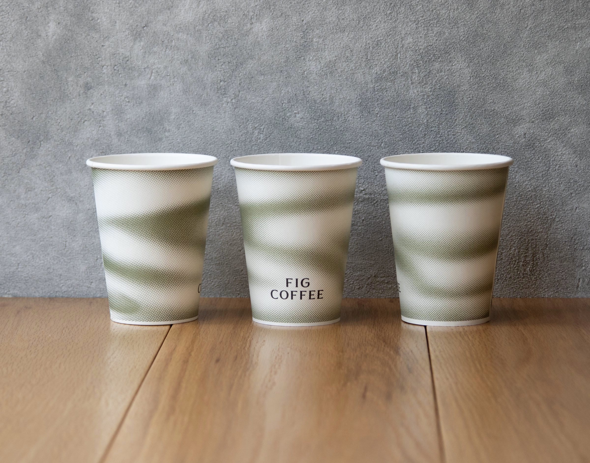
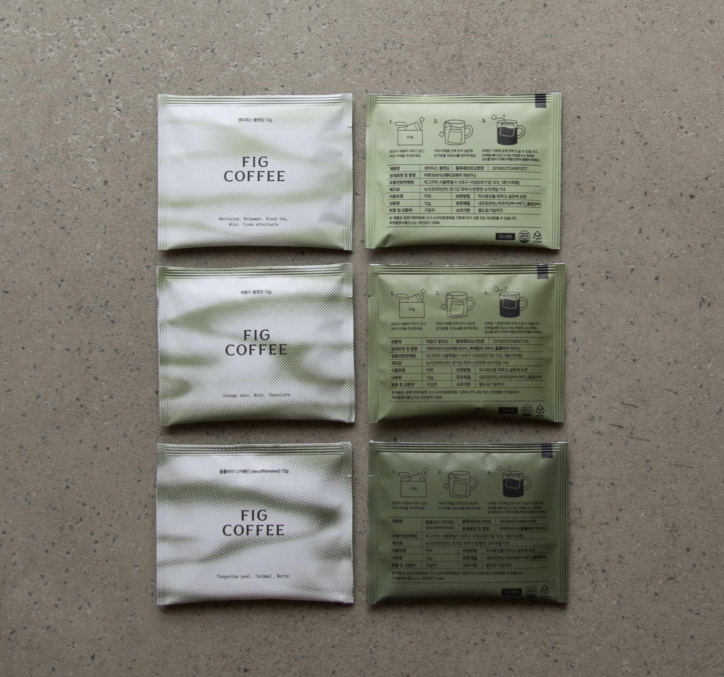
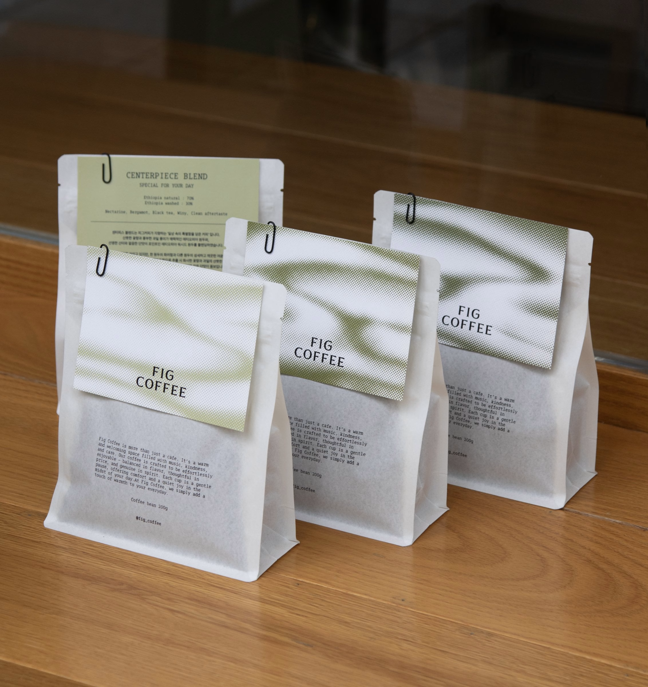
The core graphic device is a pattern built from dots. Gathered together, the dots form soft waves and gradients that stand for a café completed by the people who gather in it. The pattern runs across cups, tins and bags, fading from deep green into white so that no two items look quite the same.
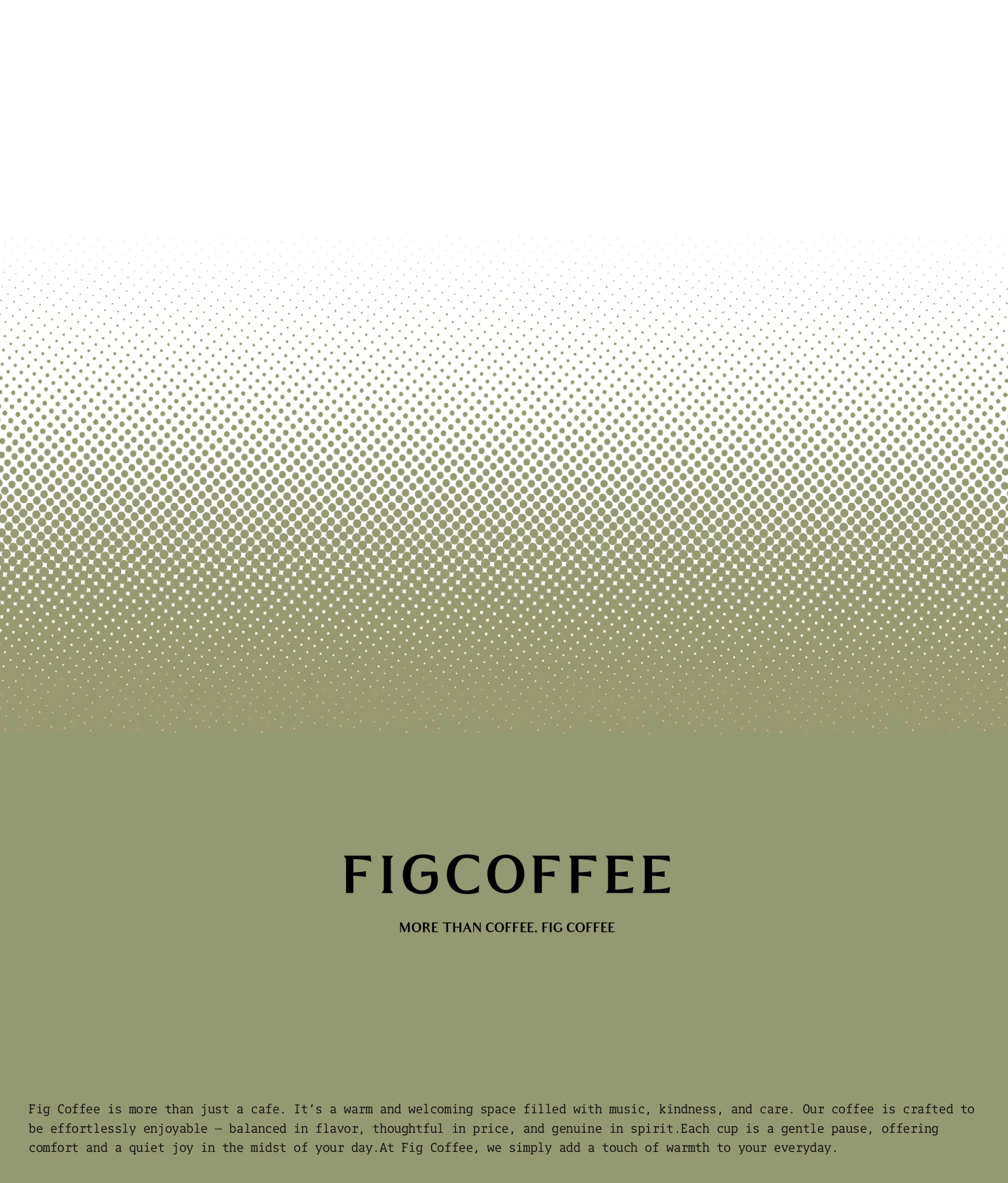
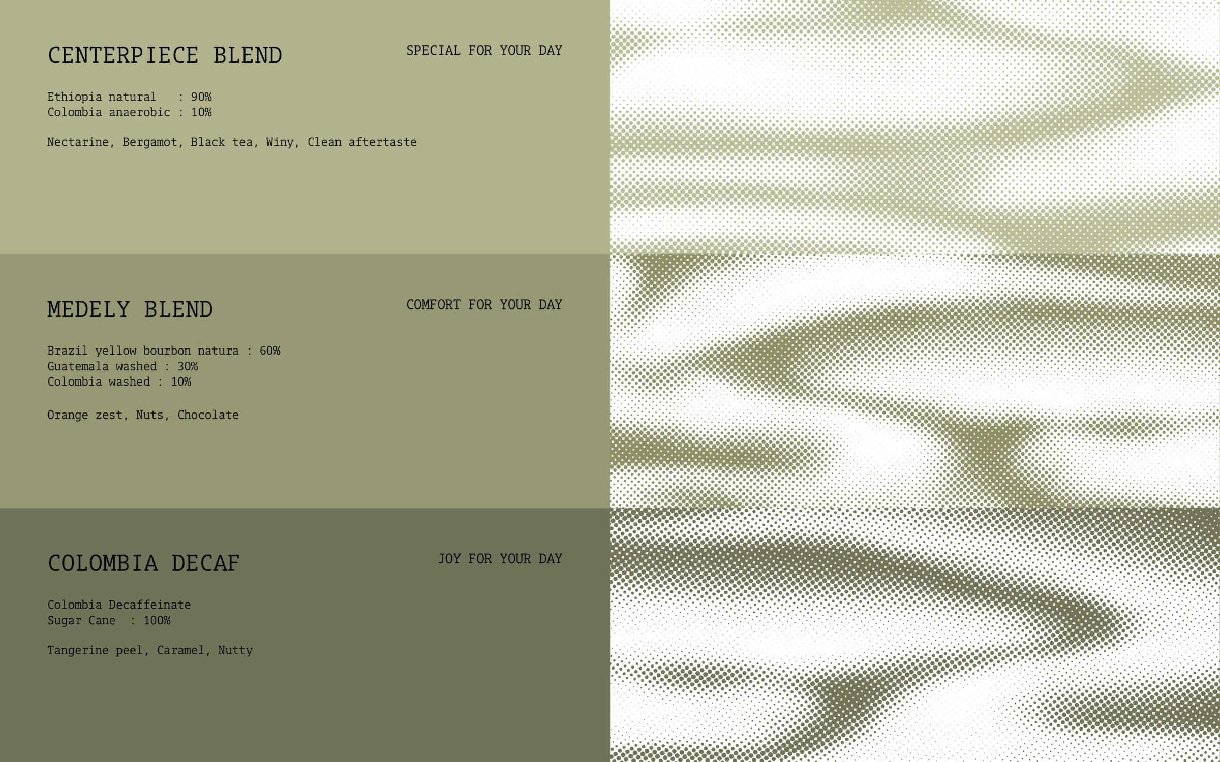
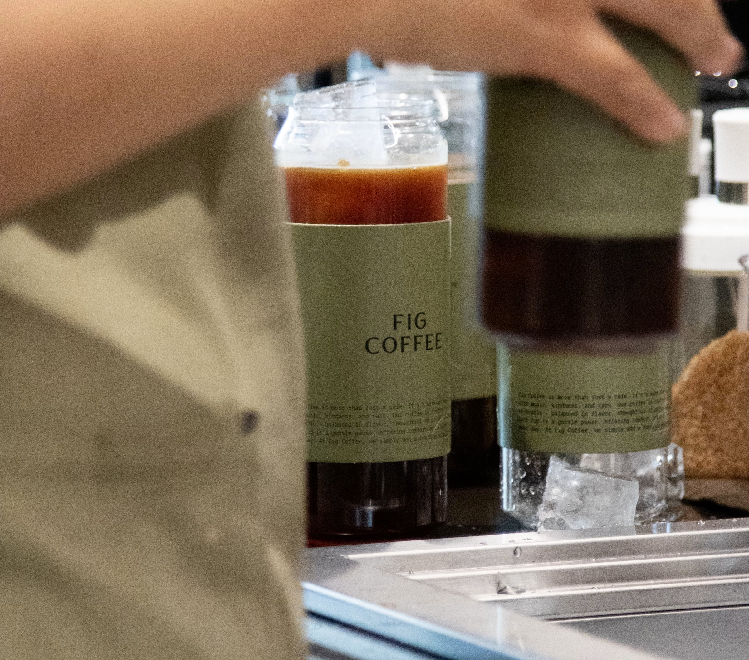
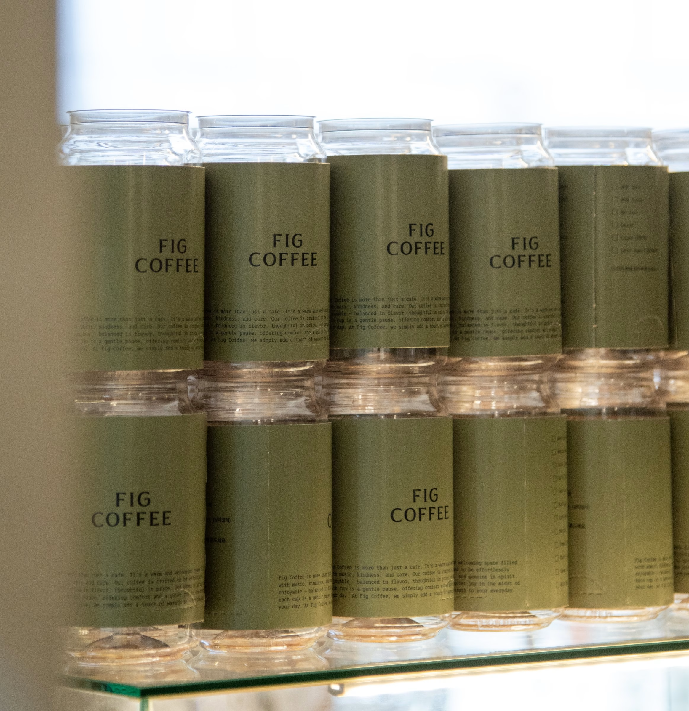
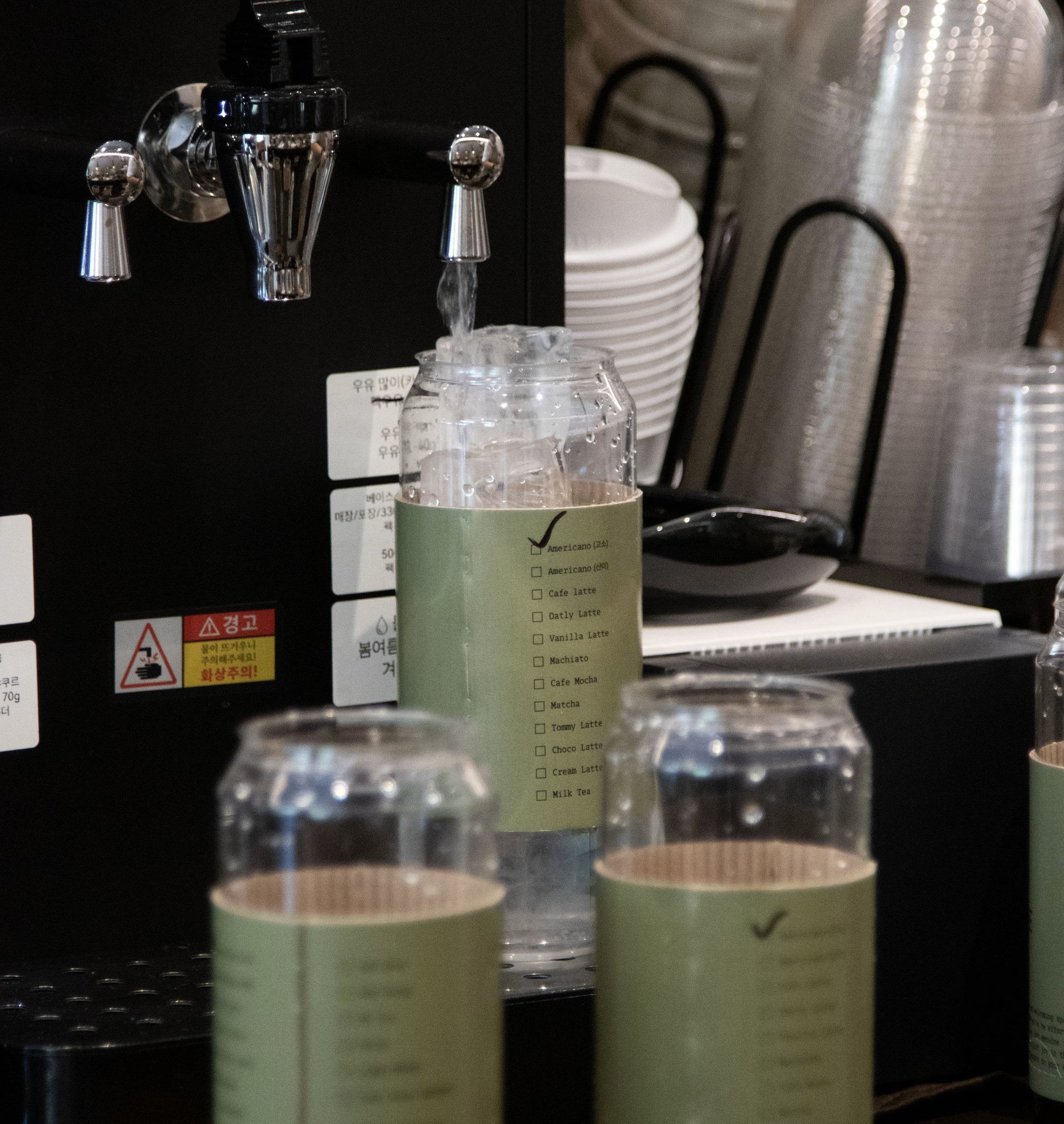
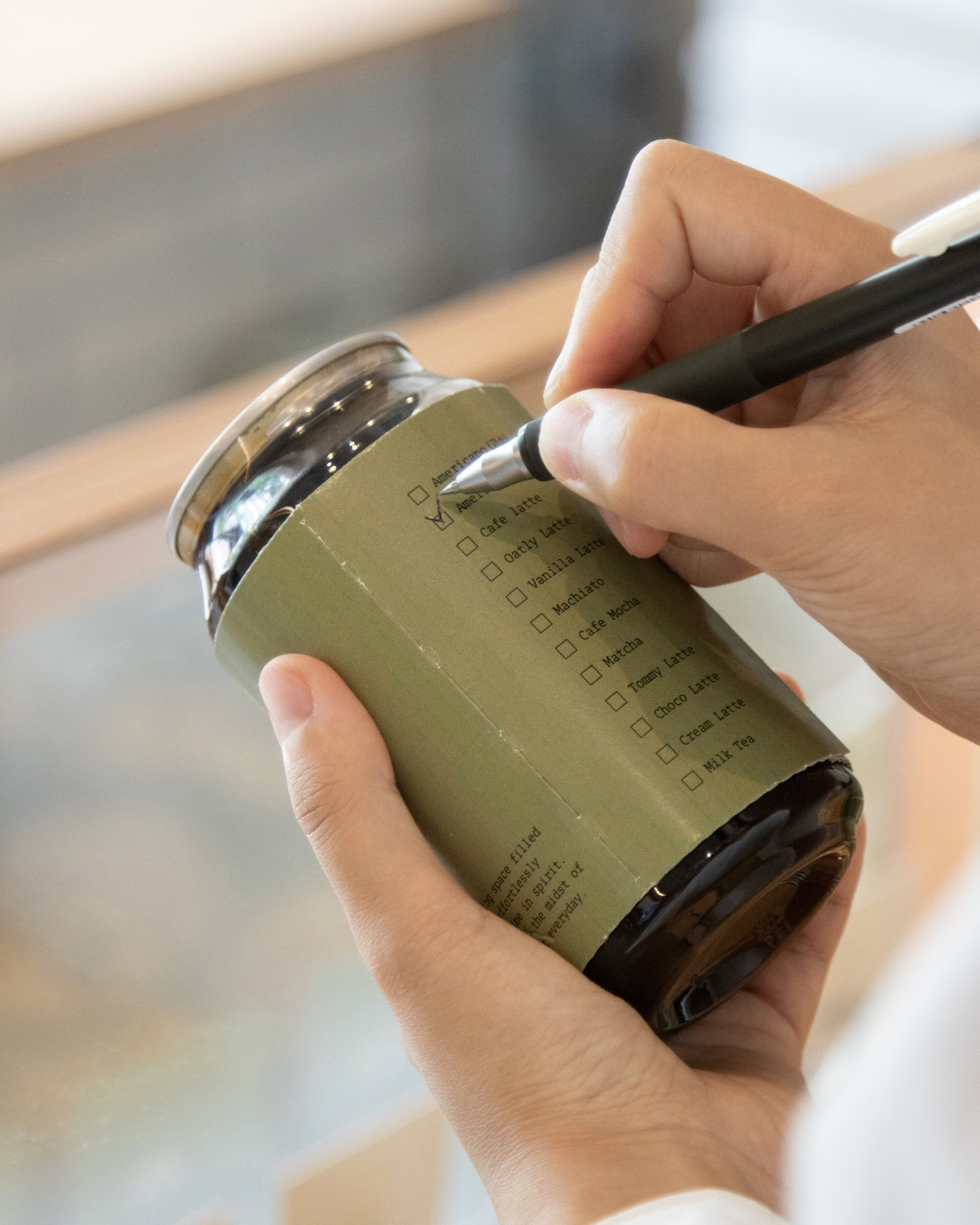
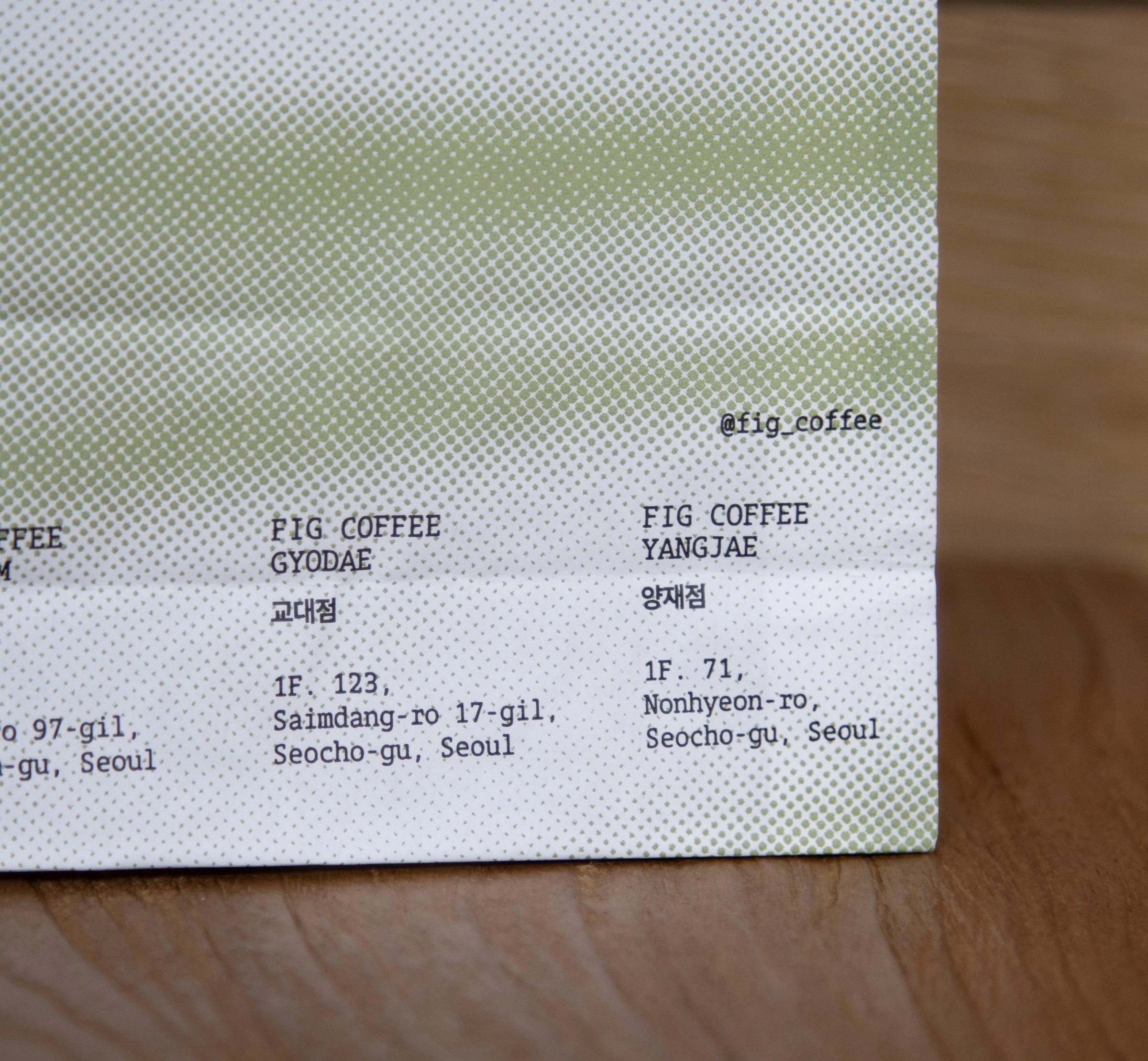
Colour was chosen for mood rather than meaning. Green suits the lively character of the café, so it is split into a range of shades, from pale sage to a deeper olive, that let the system shift across materials. Coffee bags, takeaway carriers and paper cups all carry the same tones, with the wordmark set small and the gradient doing the talking.
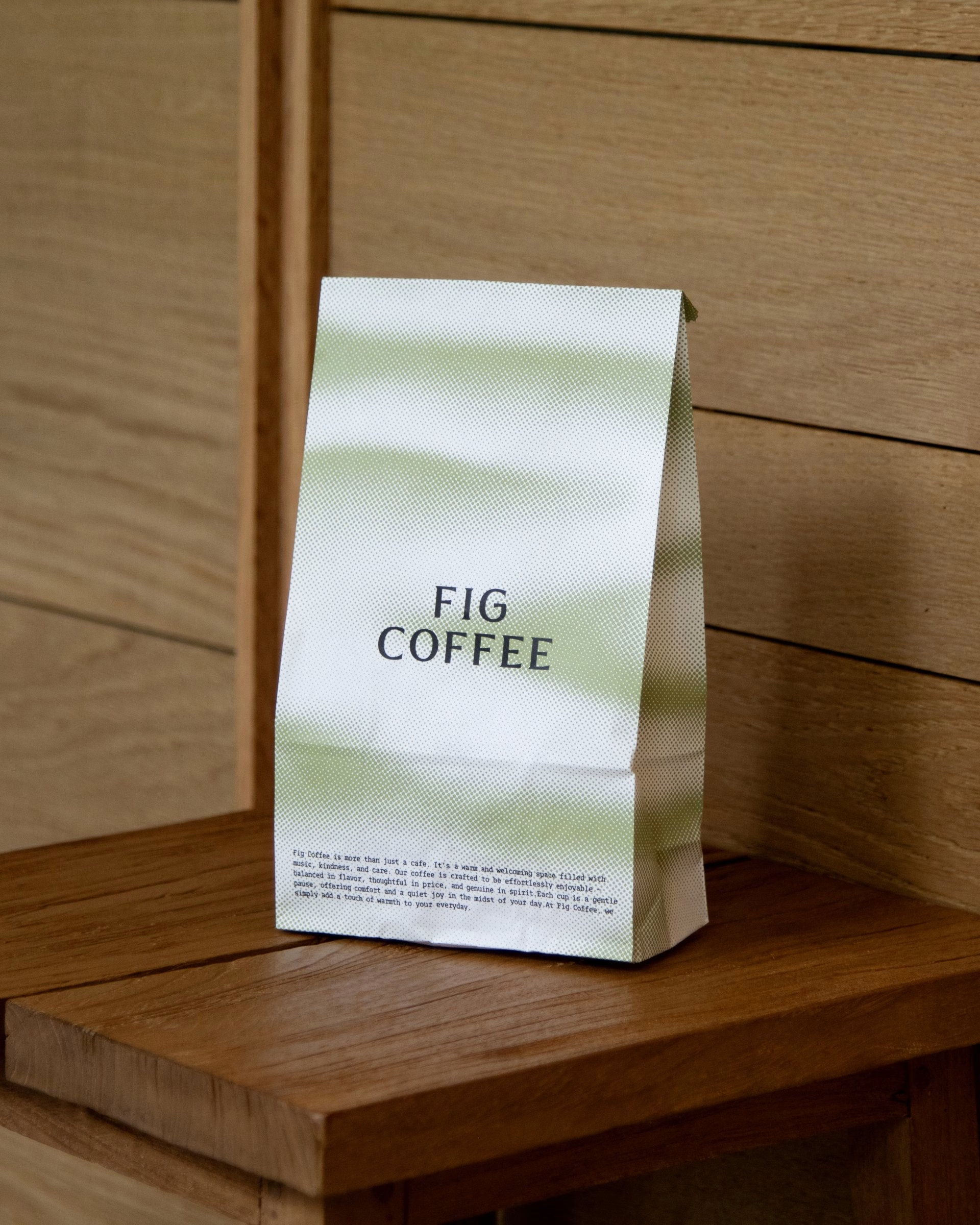
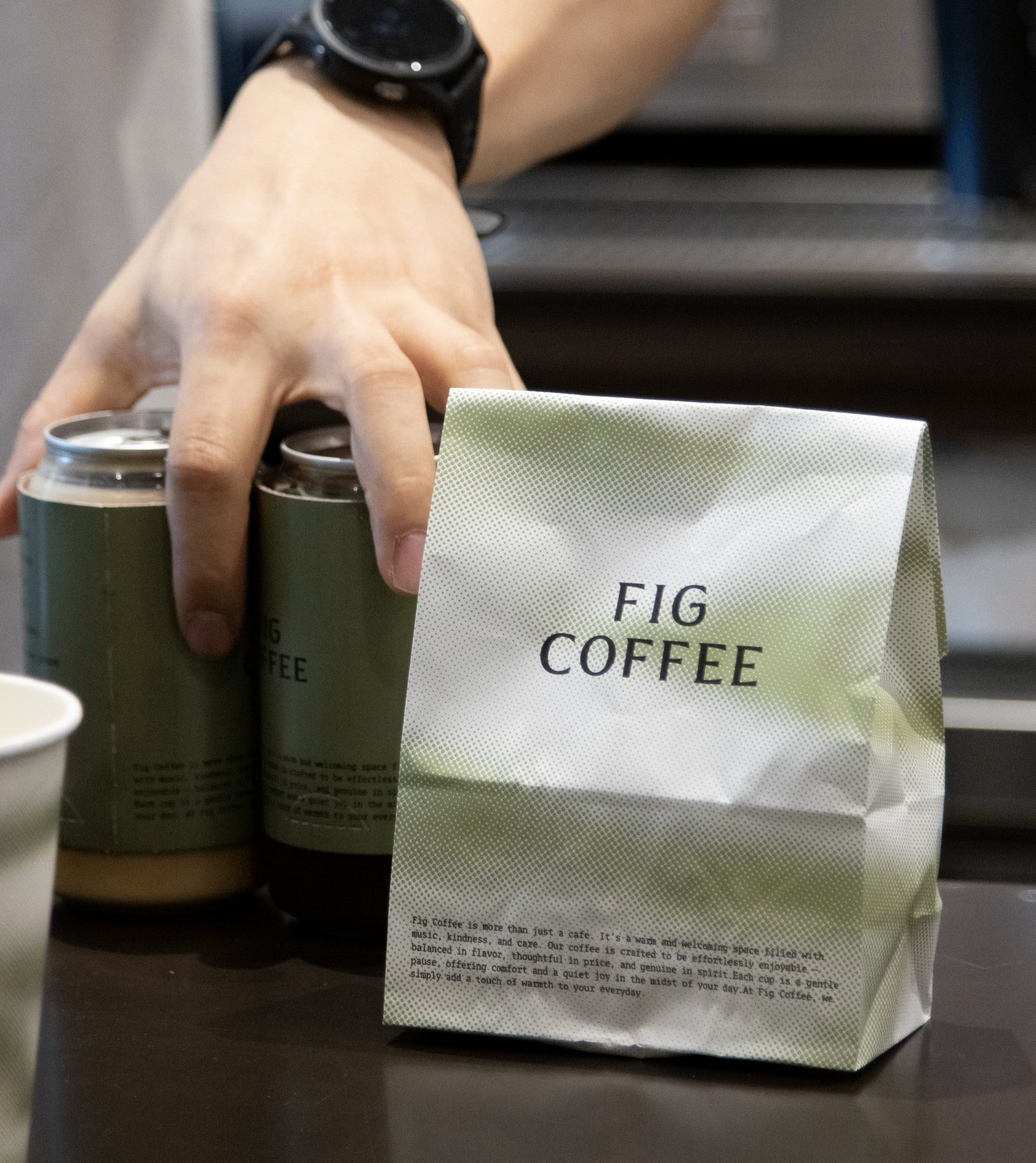
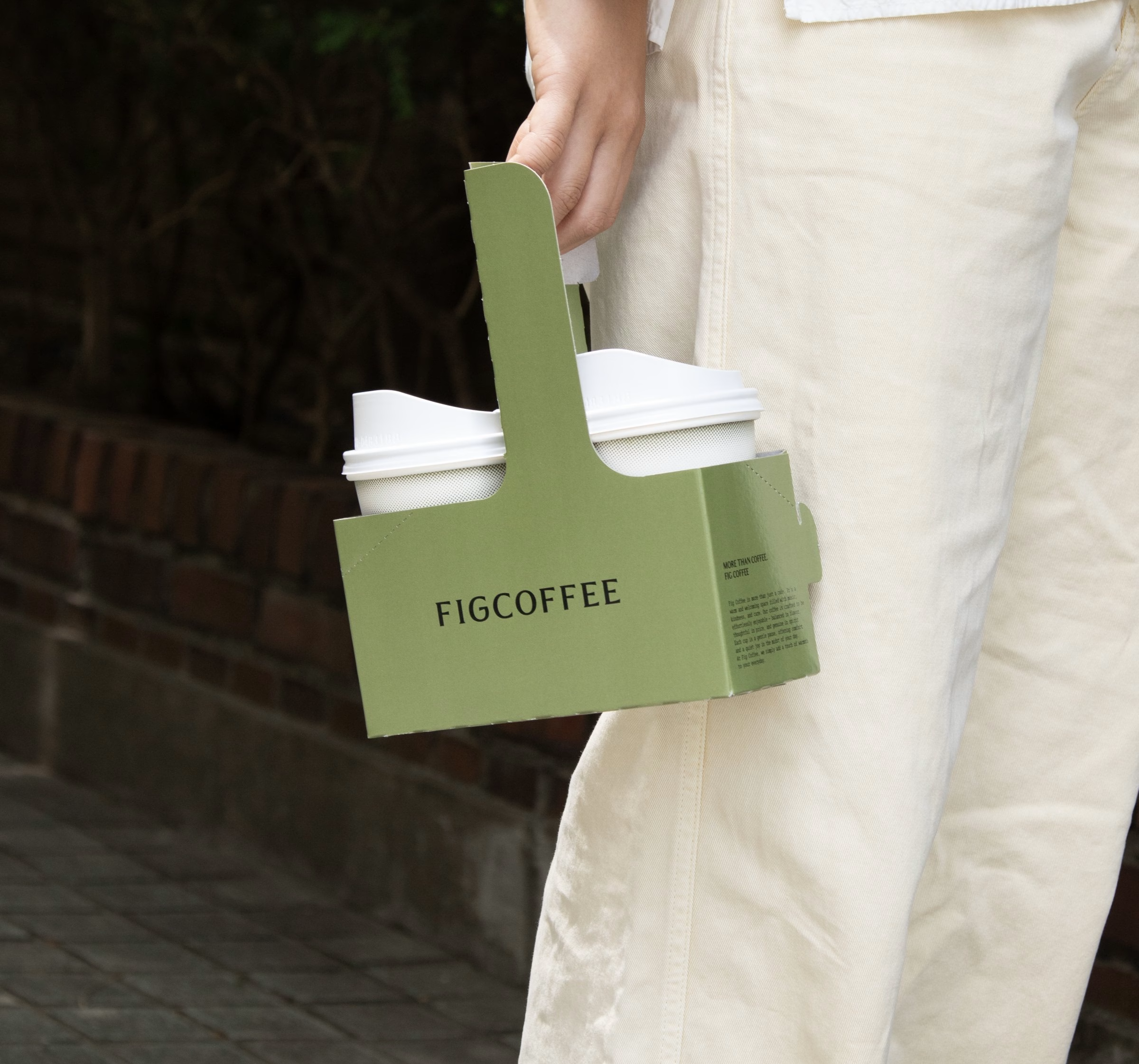
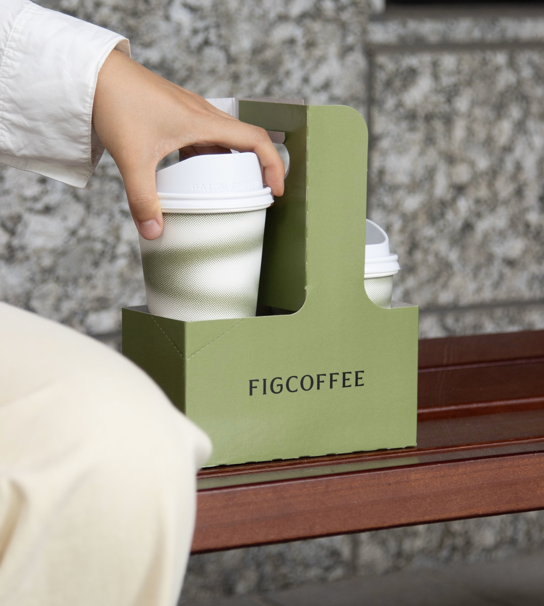
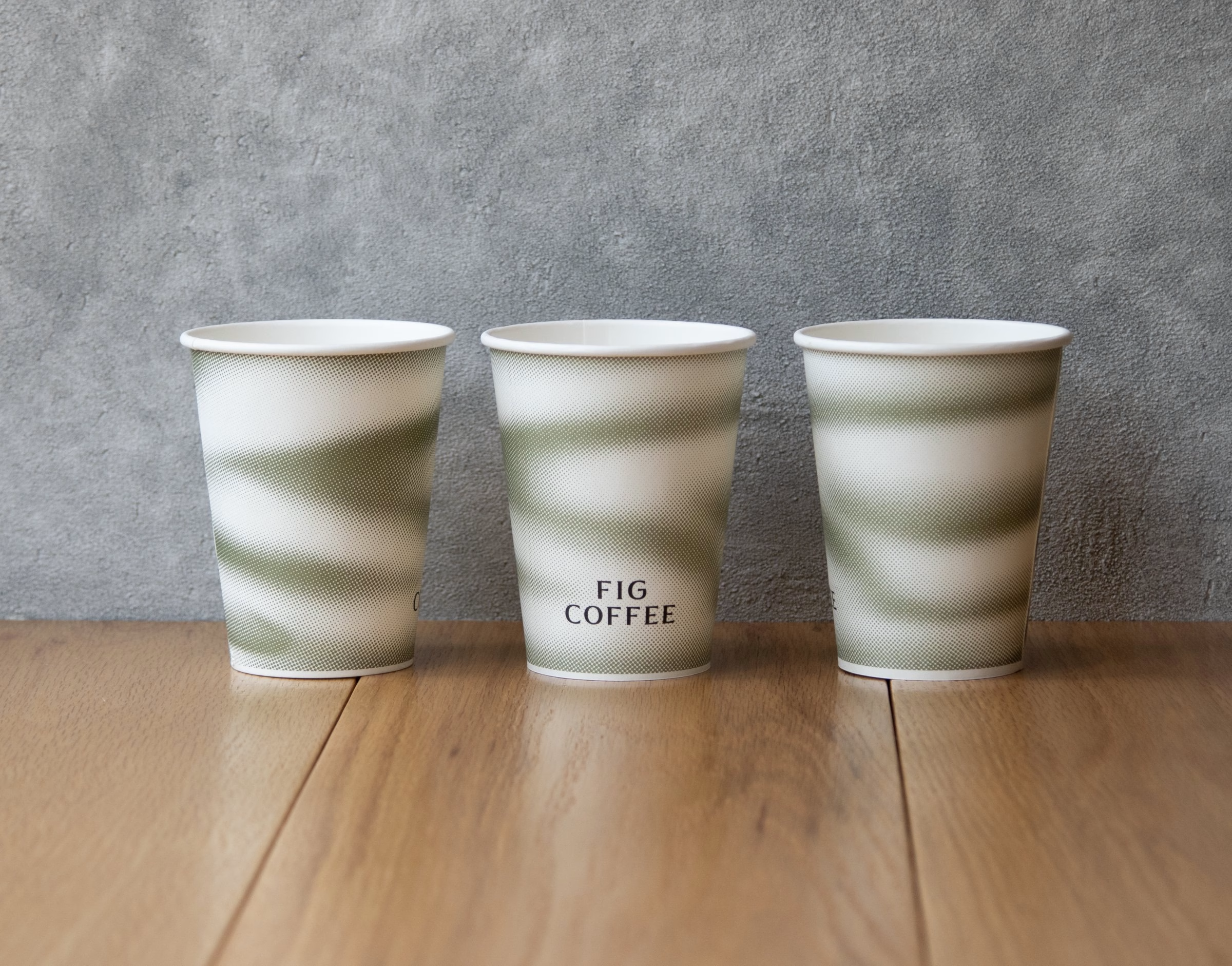
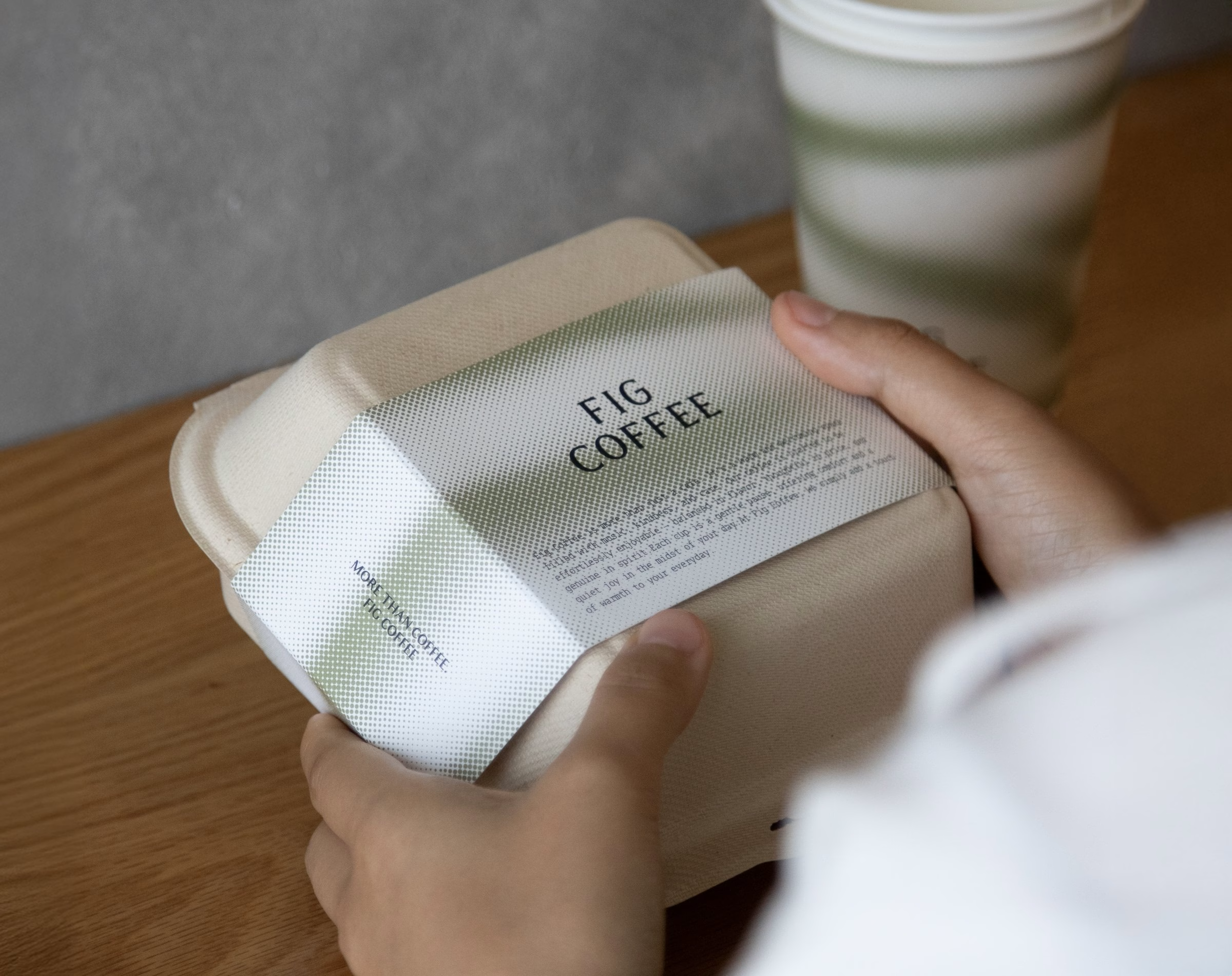
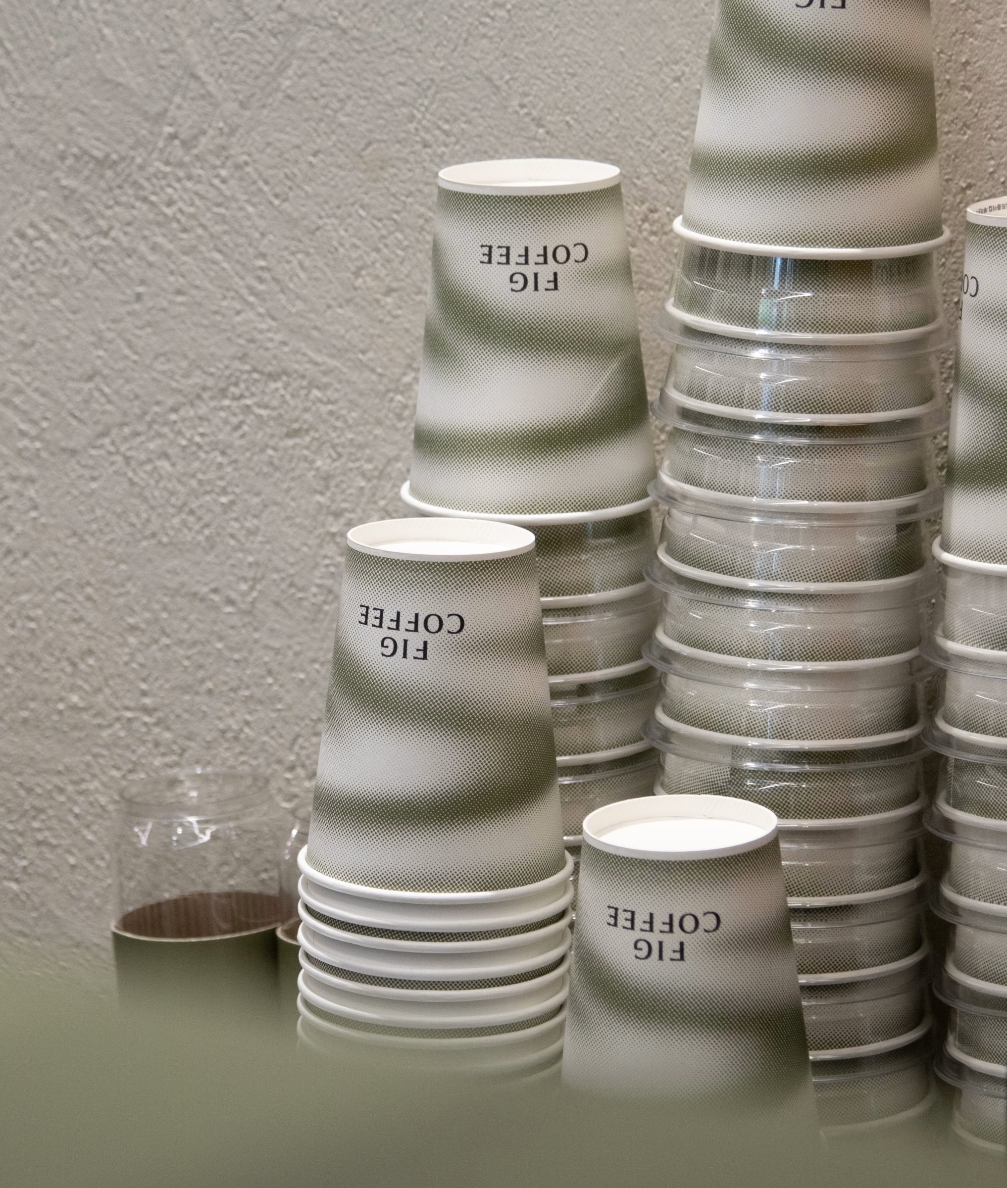
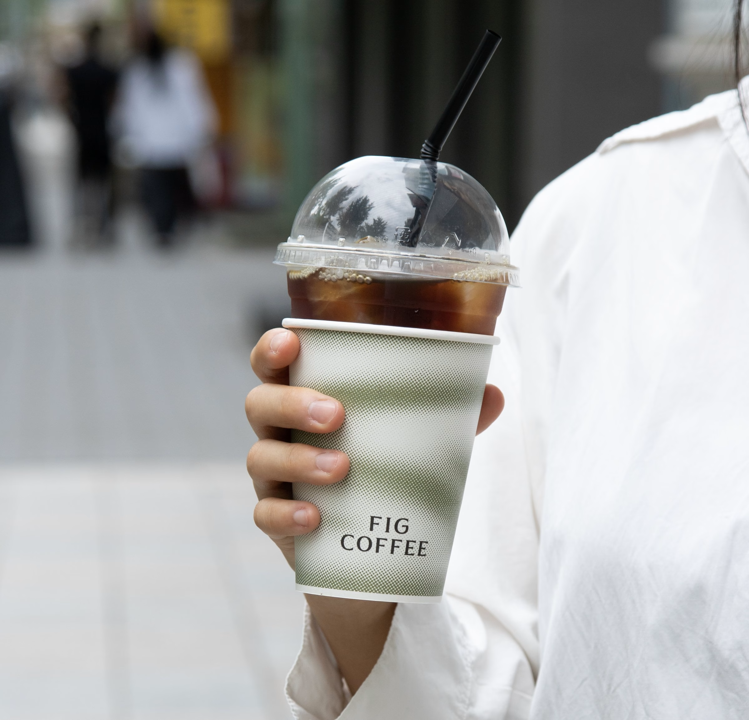
Getting there was not simple. Graphics that look effortless proved hard to produce, and many of the items were being manufactured in large quantities for the first time, which meant visits to several production sites to check the work. The range spans retail shelving, drip-bag sets, boxed coffee and shopping bags, each one tied back to the same green palette.
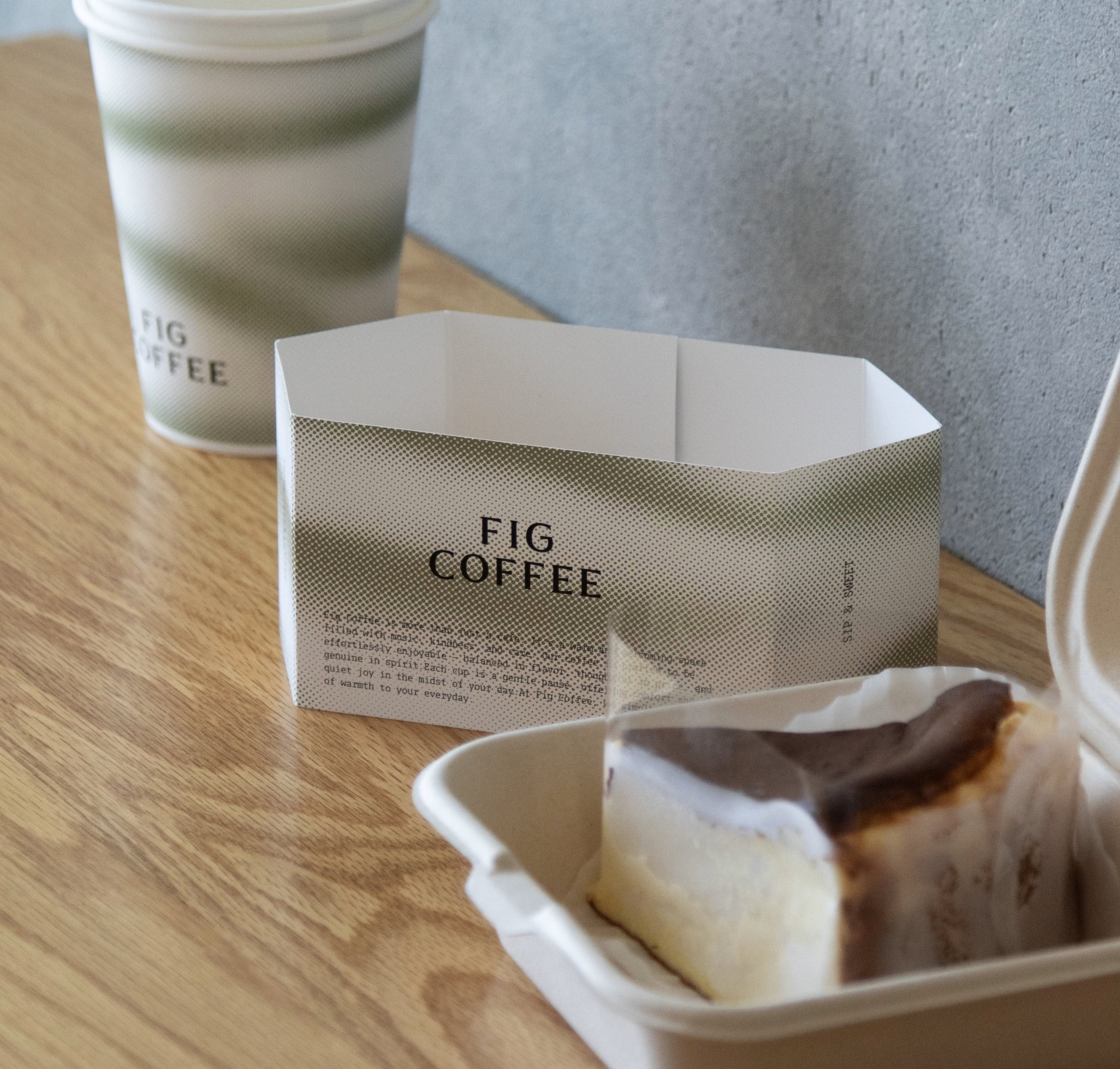
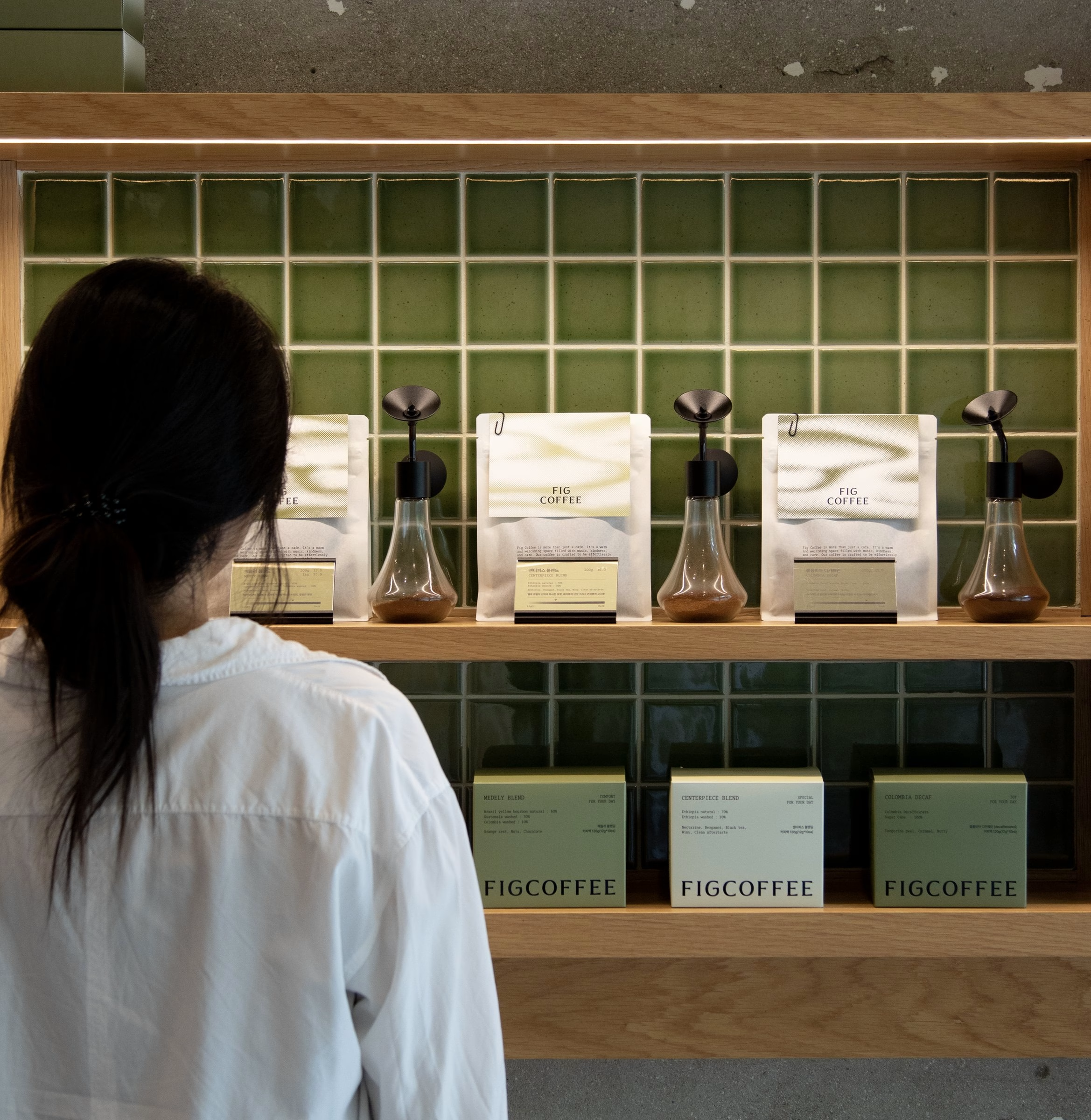
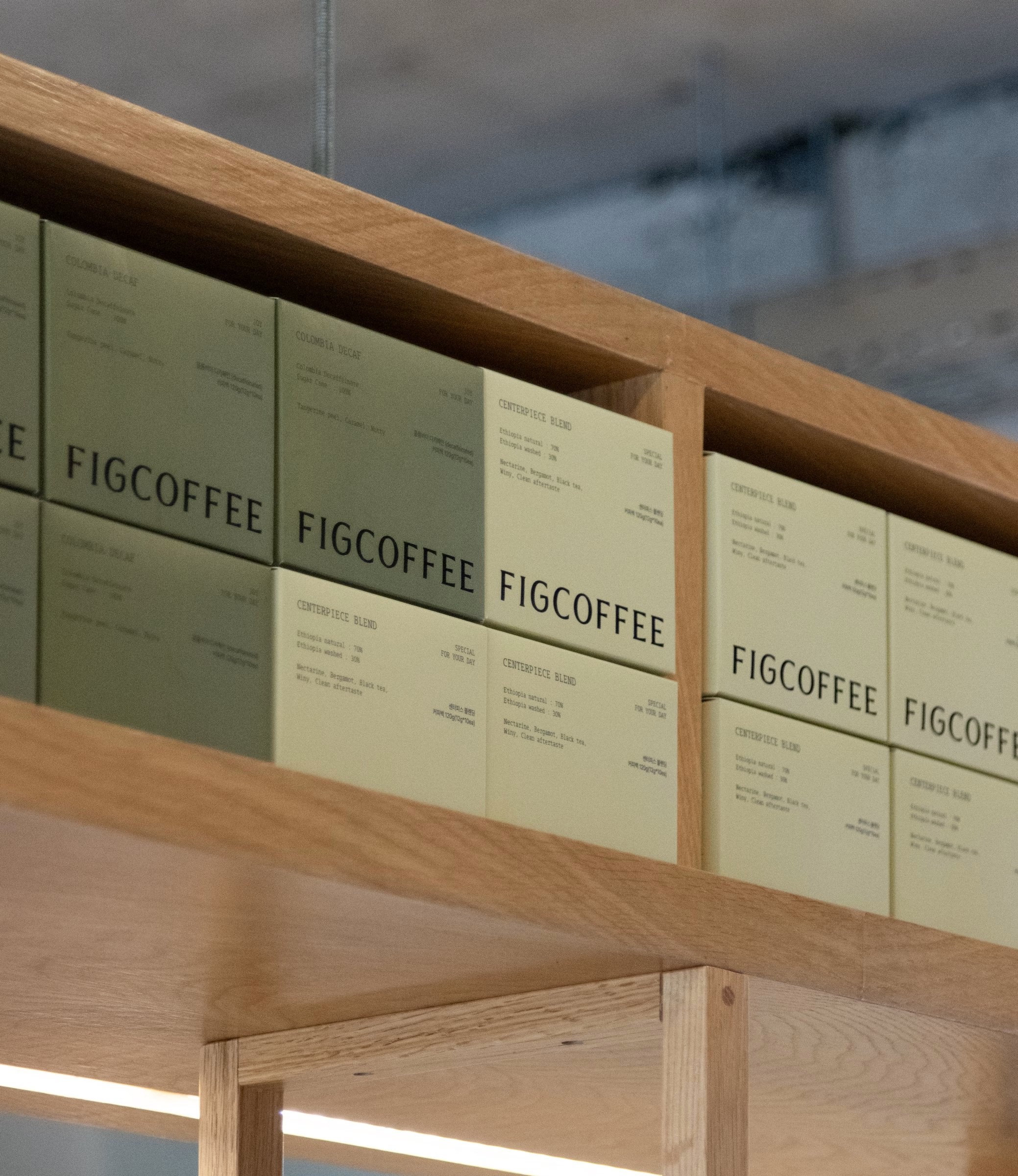
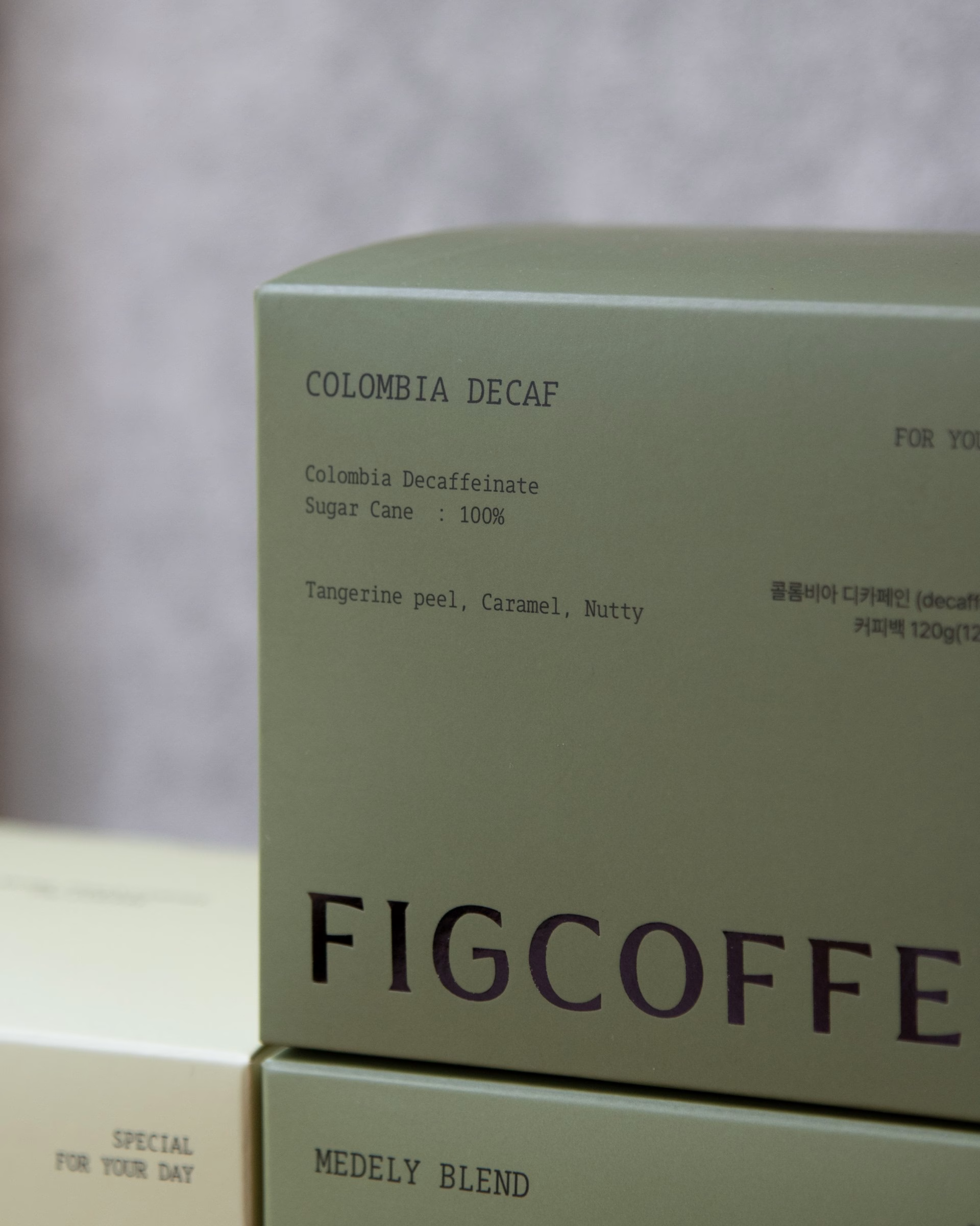
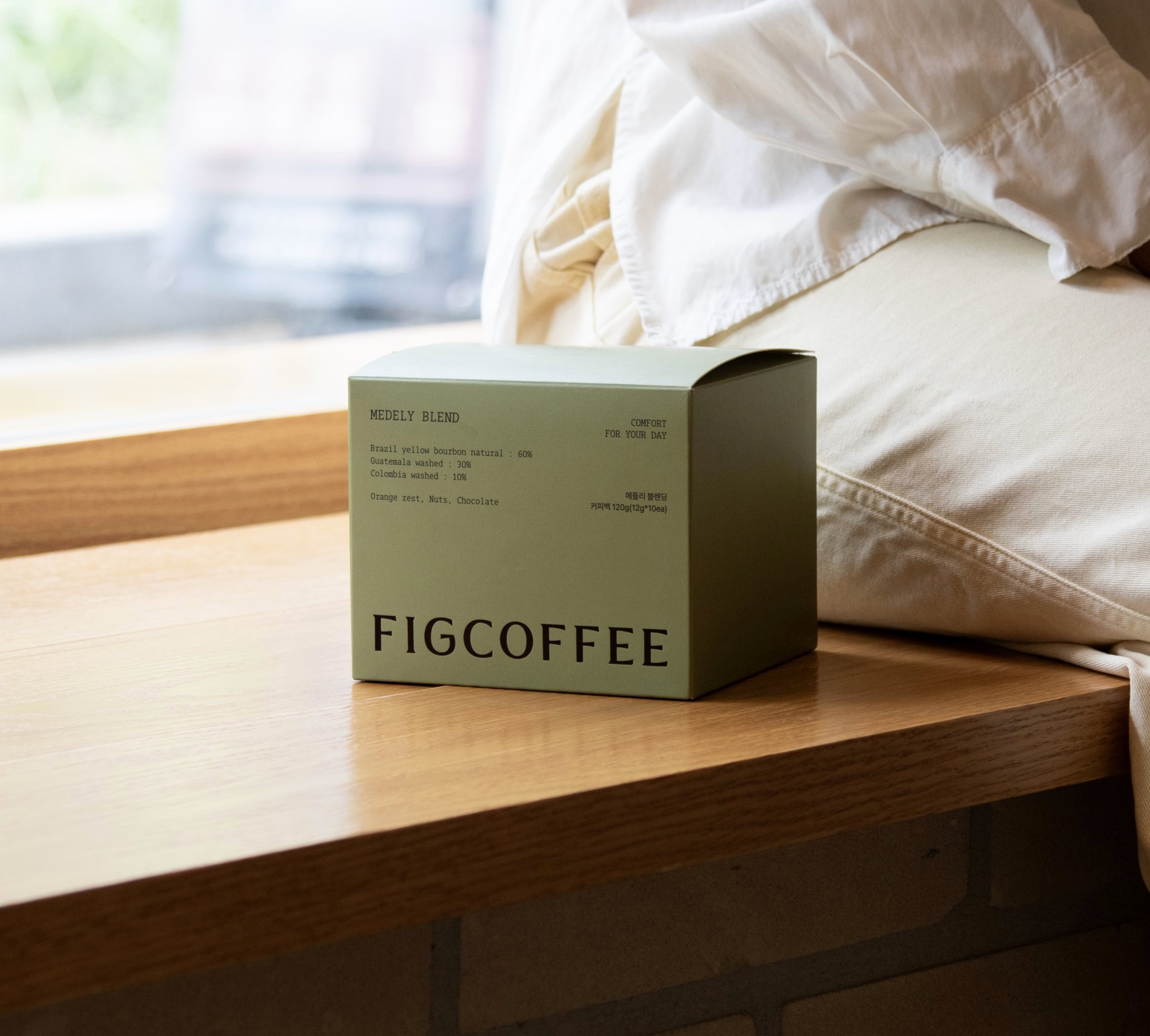
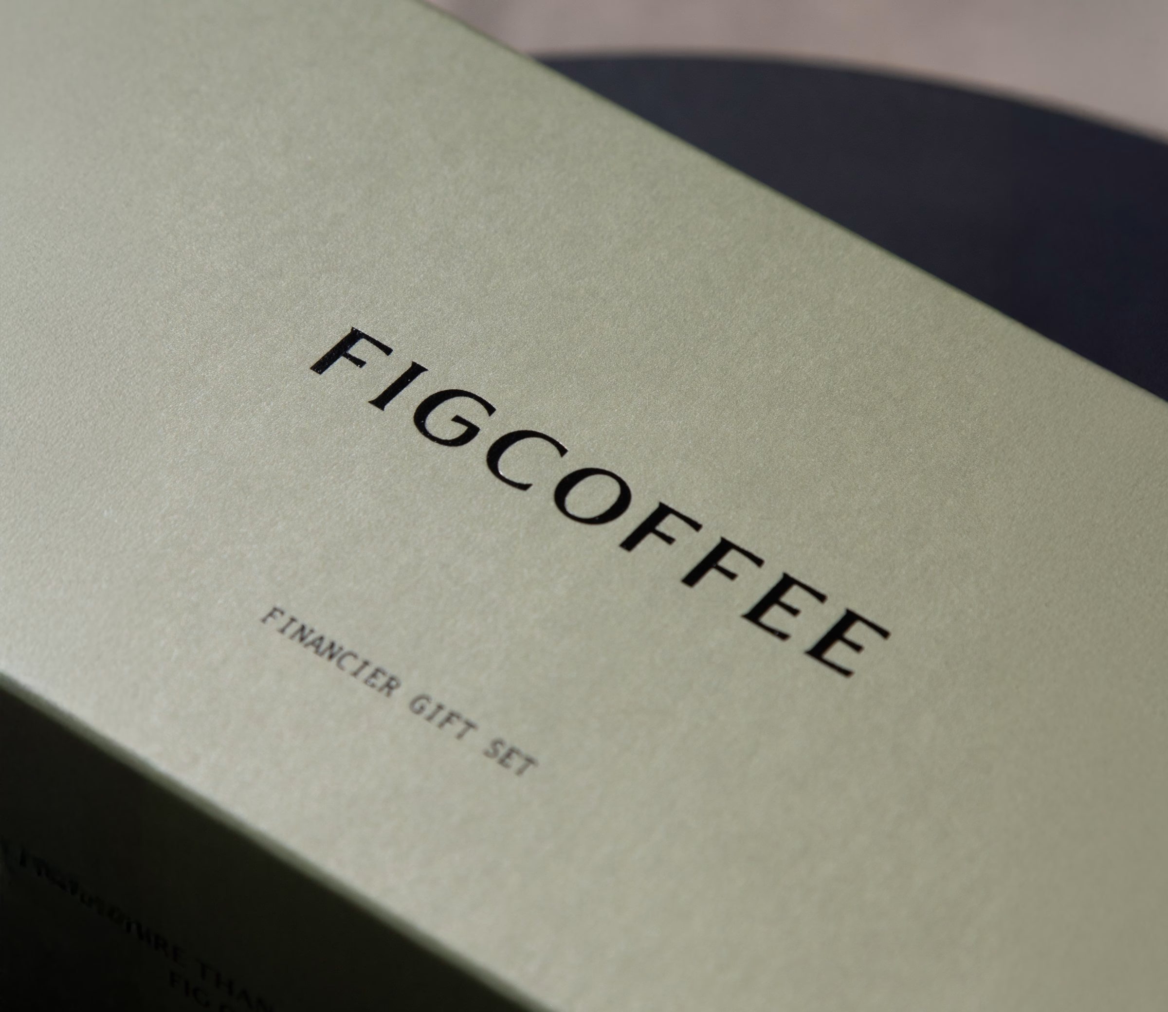
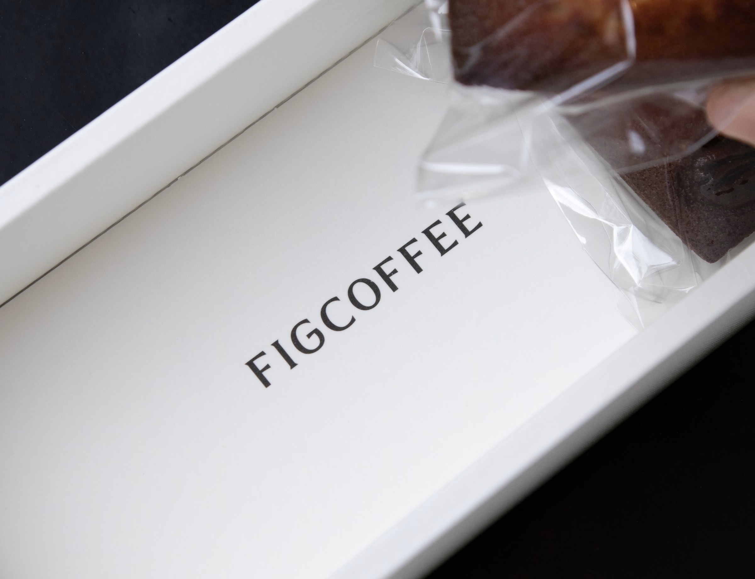
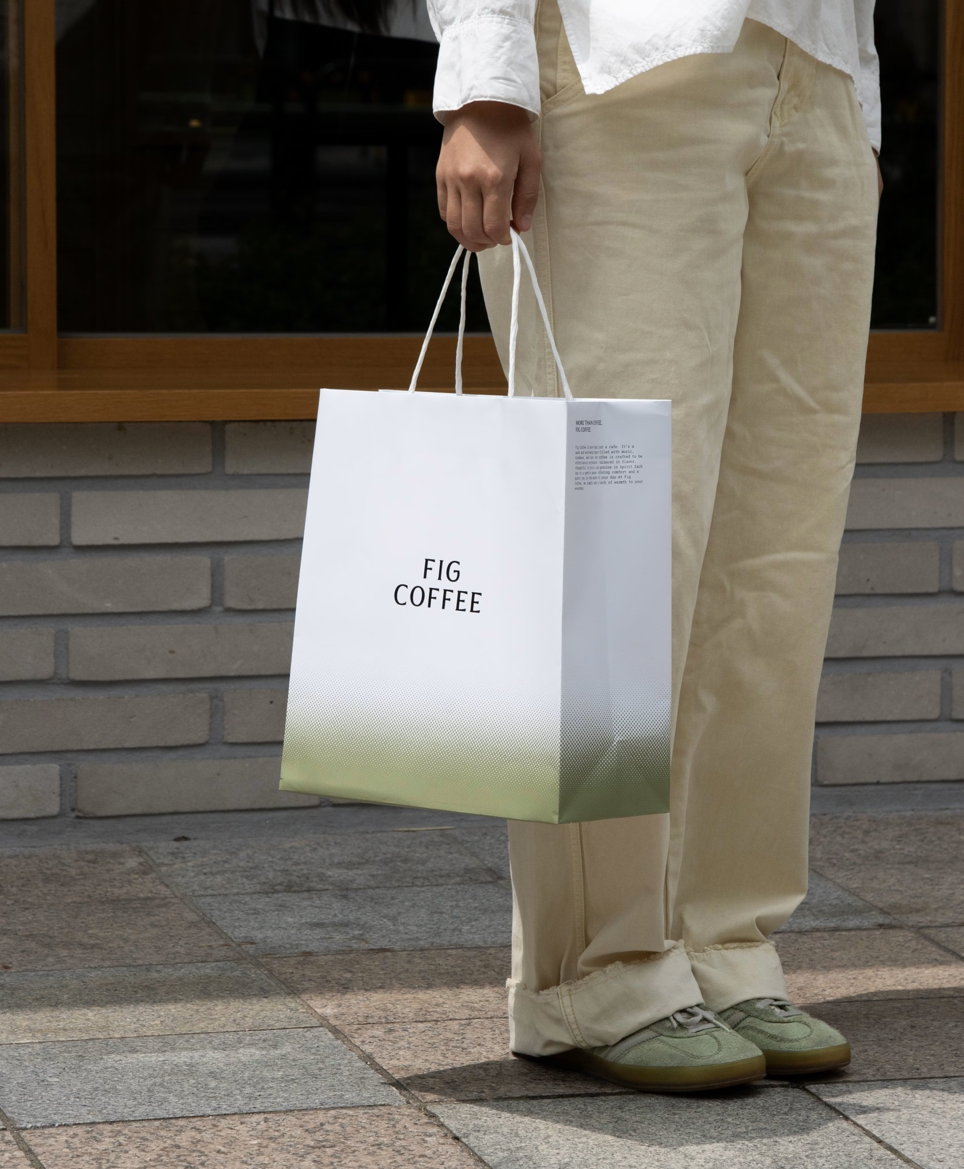
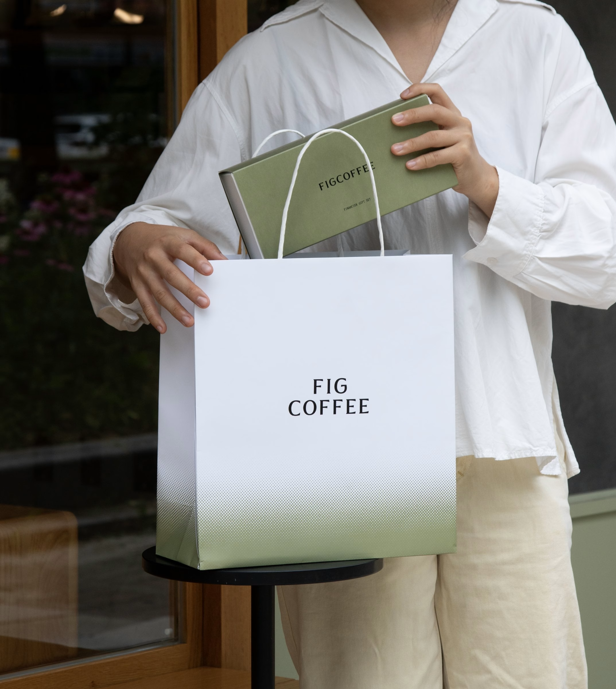
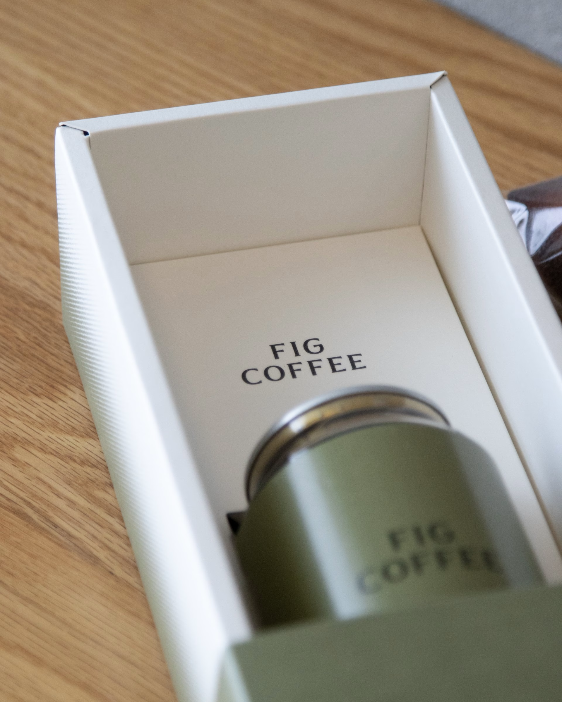
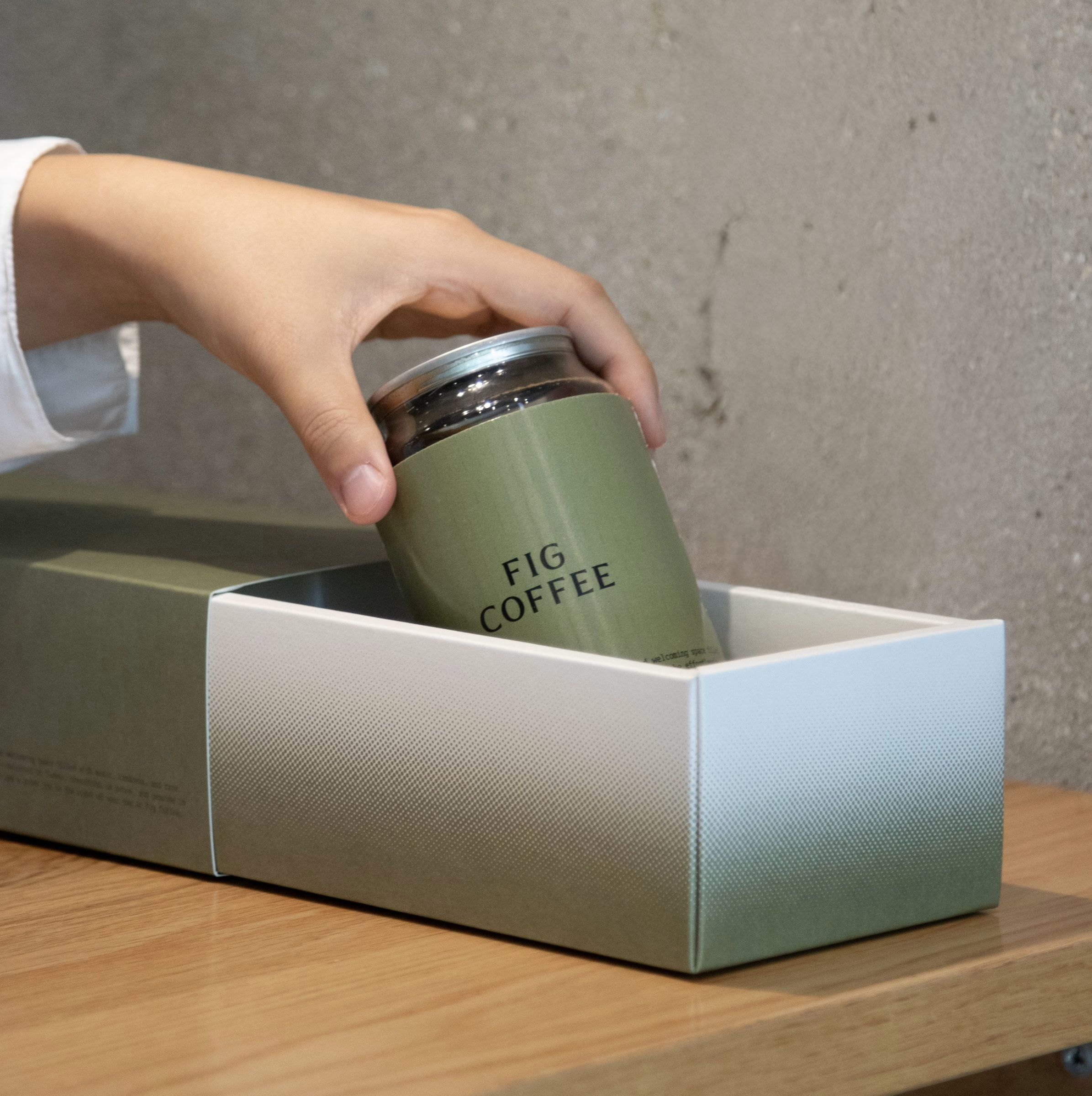
The last pieces are the gift boxes and carry bags that leave the café with its customers. A solid green sleeve slides over a white inner box, and the shopping bag carries the FIG COFFEE mark above a gradient band. In the project's own closing line, the hope is that the work helps Fig Coffee grow a little greener.
Credits: Junyoup Bong
Direction & Design: Junyoup Bong
More in Coffee Branding
Includes freebie bundle, unseen BTS insights and more.