
 Plus
Plus

 Menu
Menu


Wagon Studio
ColombiaJuly 15, 2026
Mindsparkle Mag


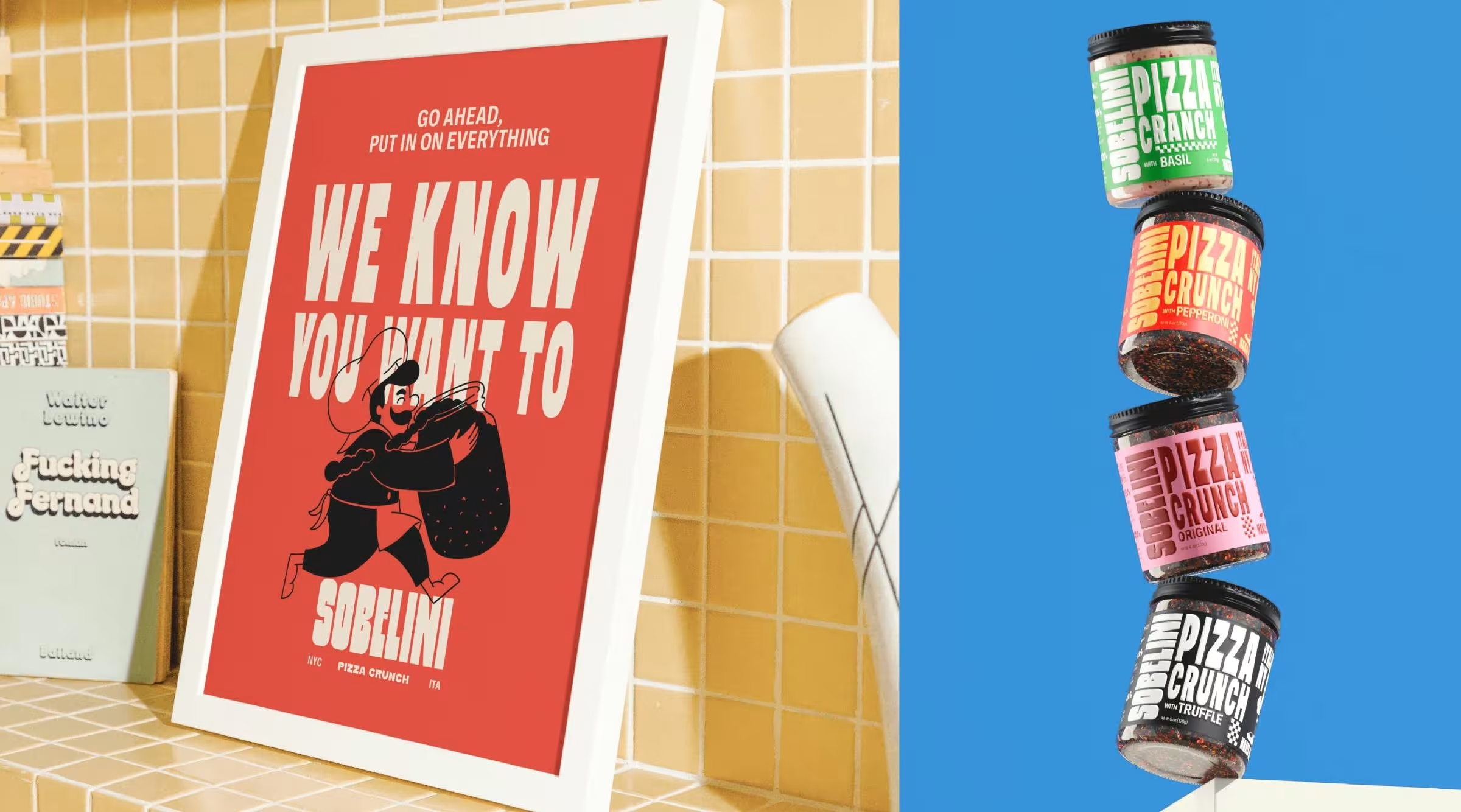
Wagon Studio designed Sobelini Pizza Crunch around a single cultural truth: that Italian craft and New York attitude don't cancel each other out — they make each other stronger. Most packaging tells you what a product is. Sobelini's tells you where it comes from, what it believes in, and exactly why it doesn't look like anything else on the shelf.
The packaging design system was built around typographic dominance. Oversized, vertically structured typography transforms each jar into a bold graphic object, turning flavor descriptors like "PIZZA CRUNCH" into the central visual gesture — readable from distance, striking at scale. High-saturation colors carve out a distinct identity for each flavor while holding the full range together as a graphic family. The transparent jar removes the barrier between design and product, allowing texture and richness to reinforce authenticity and appetite appeal from the inside out.
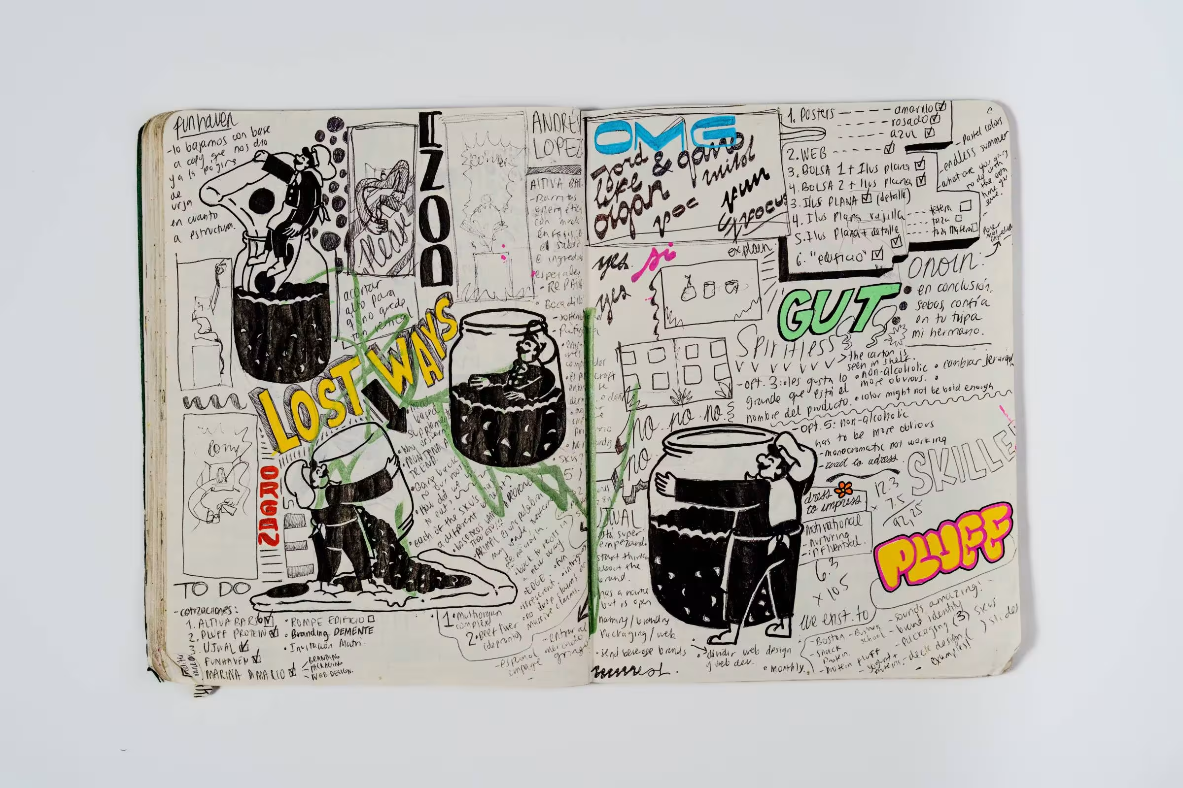
Checkerboard motifs and a living illustrated chef character — an illustration inspired by the founder himself — thread through the packaging as cultural markers: geometric Italian craft meeting New York street confidence. The character appears in a series of playful, exaggerated scenarios that reinforce his almost comical obsession with pizza, from enthusiastically topping every meal imaginable to literally bathing in Pizza Crunch. That visual language travels across every application — jars, boxes, shipping materials, social content — maintaining the same intensity and cultural richness at every scale.





Unlock everything with Mindsparkle Mag Plus.
Get exclusive access to Premium features:
Credits: Wagon Studio
Brand Identity & Packaging Design: Wagon Studio
Creative Director & Illustrations: Cristina Donado
Branding Art Director: Alejandra Avellaneda
Design: Maria Fernanda Mejia
Design & Case Study: María Victoria Márquez
3D Renders & Animations: Cubo Studio
Case Study: Gustavo Andrés Calderón
Case Study: Jordan Cubillos
Copywriting: Natalia Estévez
More in Brand Identity
Includes freebie bundle, unseen BTS insights and more.