 Plus
Plus

 Menu
Menu


Polar, Ltda.
October 15, 2026
Mindsparkle Mag


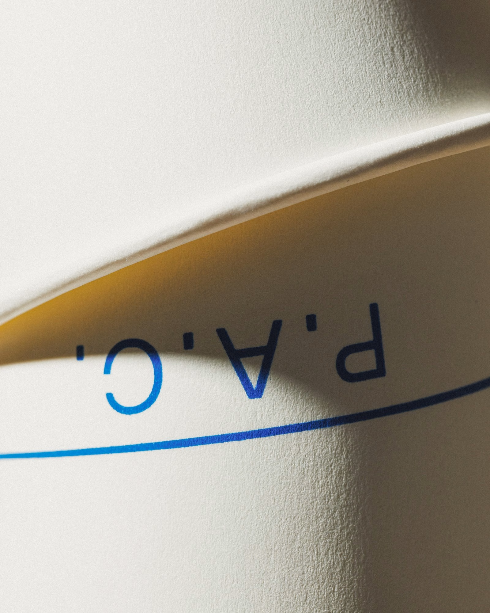
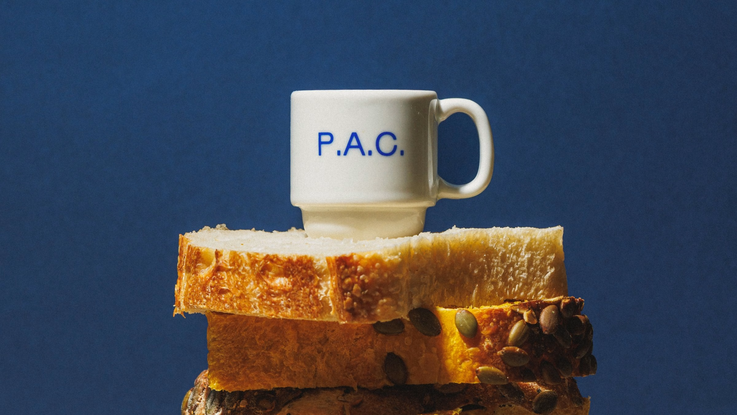
P.A.C. is a São Paulo bakery that started as an experiment in almost every sense. Its founders had no professional kitchen experience, only a growing obsession with bread, an active sourdough starter and the urge to turn that obsession into something real. From day one, the menu, the service, the space and the look of the place were all treated as things that could be questioned, tested and changed.
That spirit shaped the visual identity designed by Polar, a São Paulo studio with an unusually close tie to its client. Two of Polar's four partners are also partners in the bakery, and the other two are among its most devoted regulars. Rather than a rigid system, the studio built a recognisable foundation that stays open to interpretation across packaging, ceramics, the space itself, menus and social media.
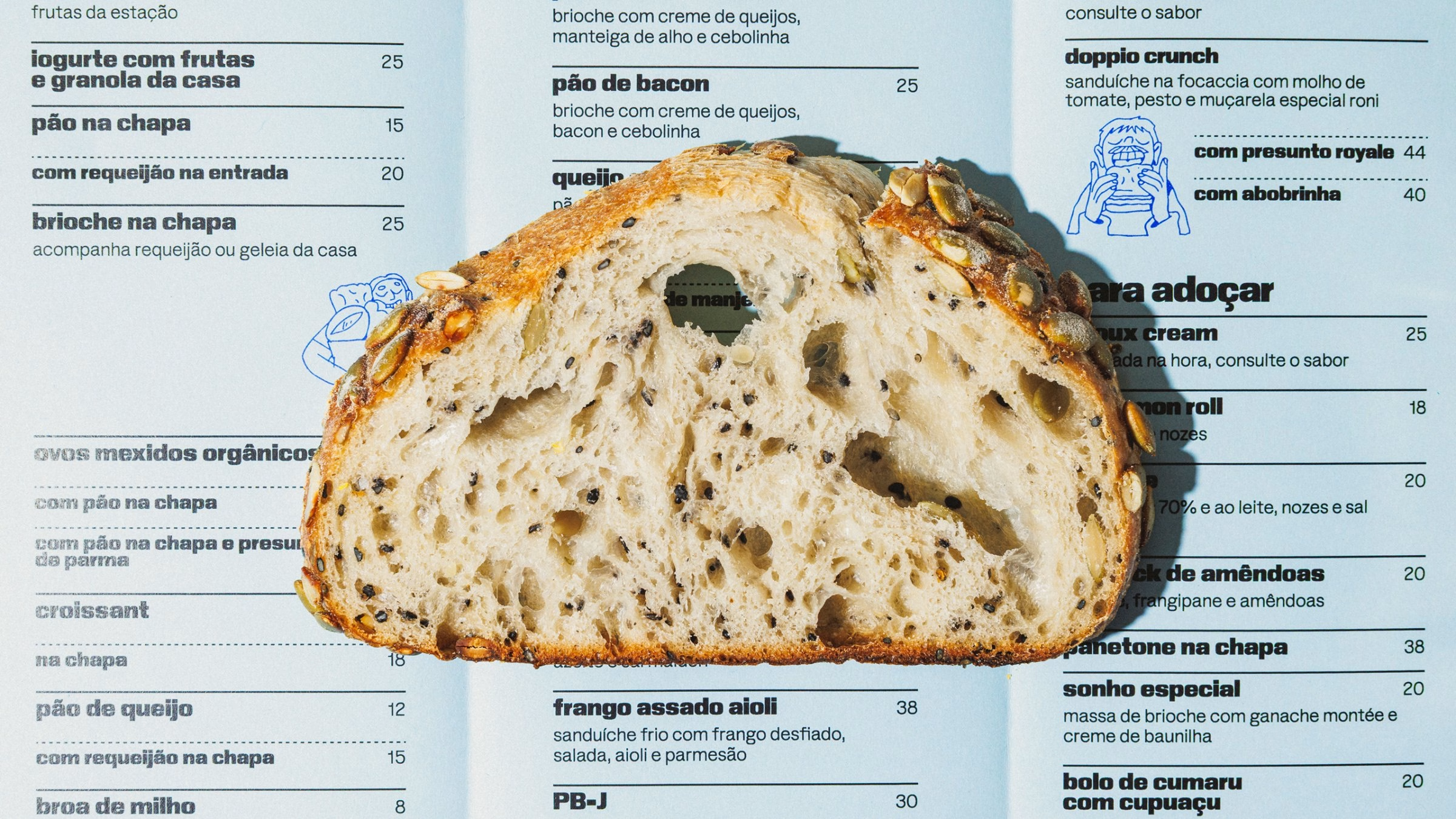
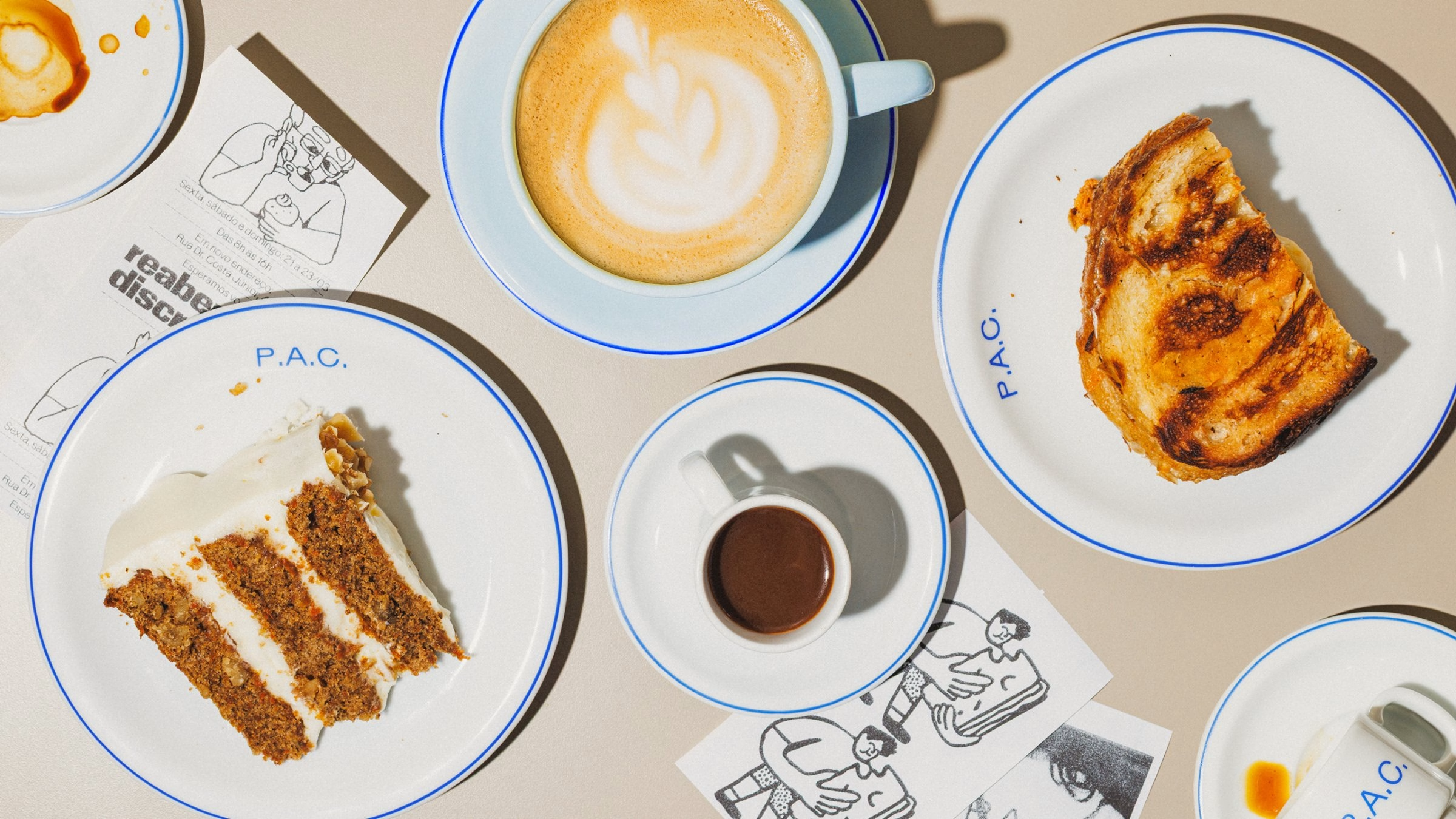
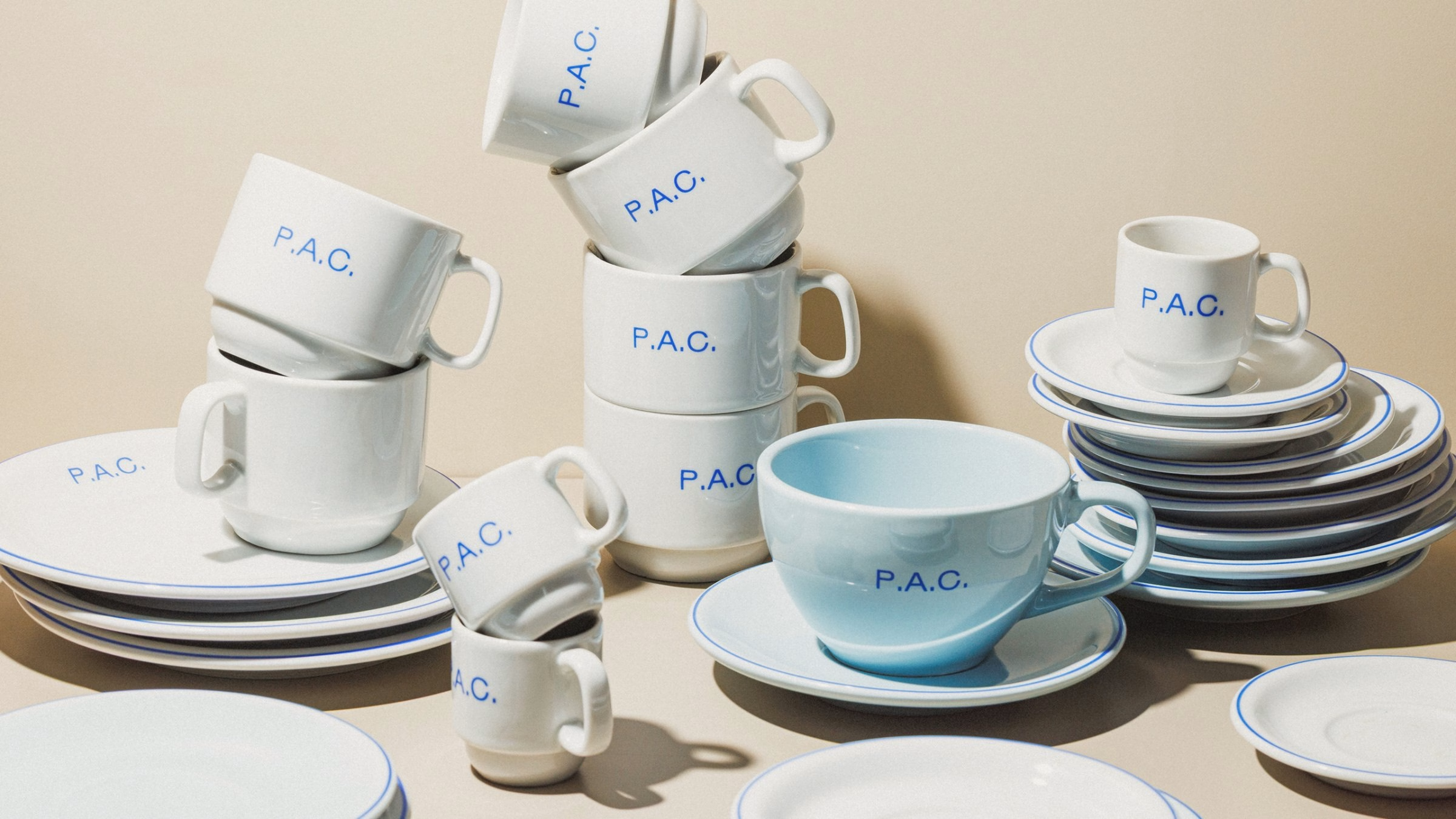
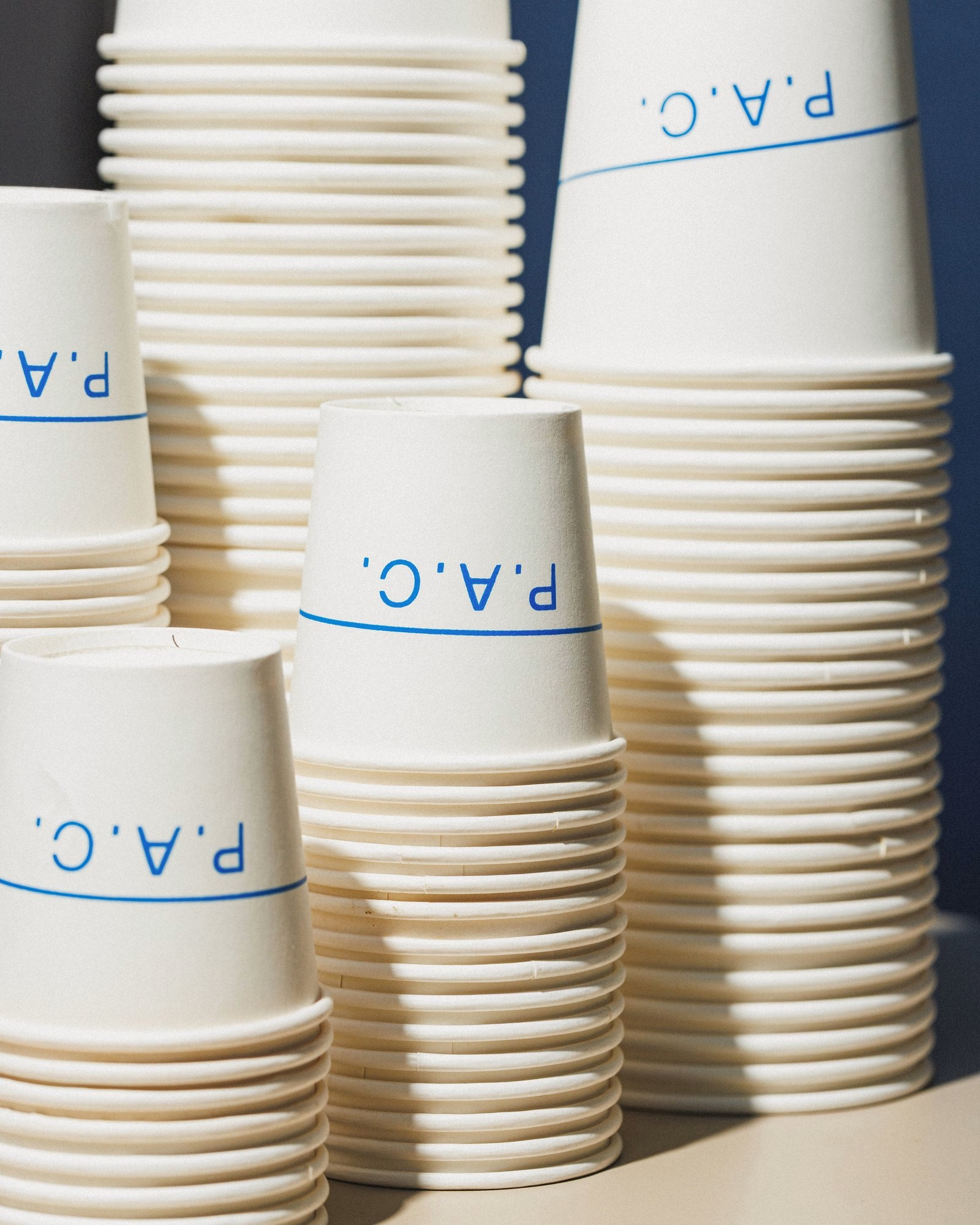
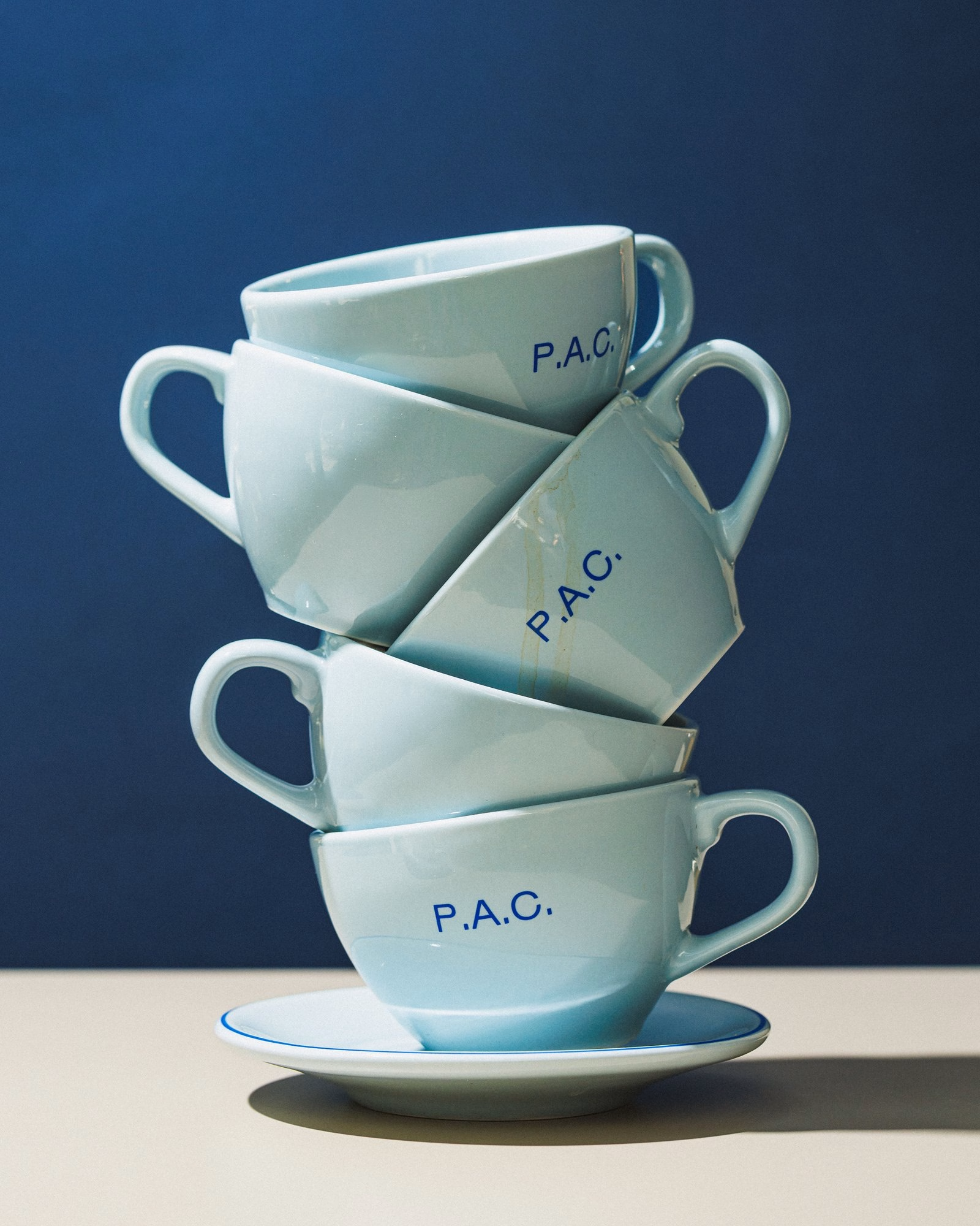
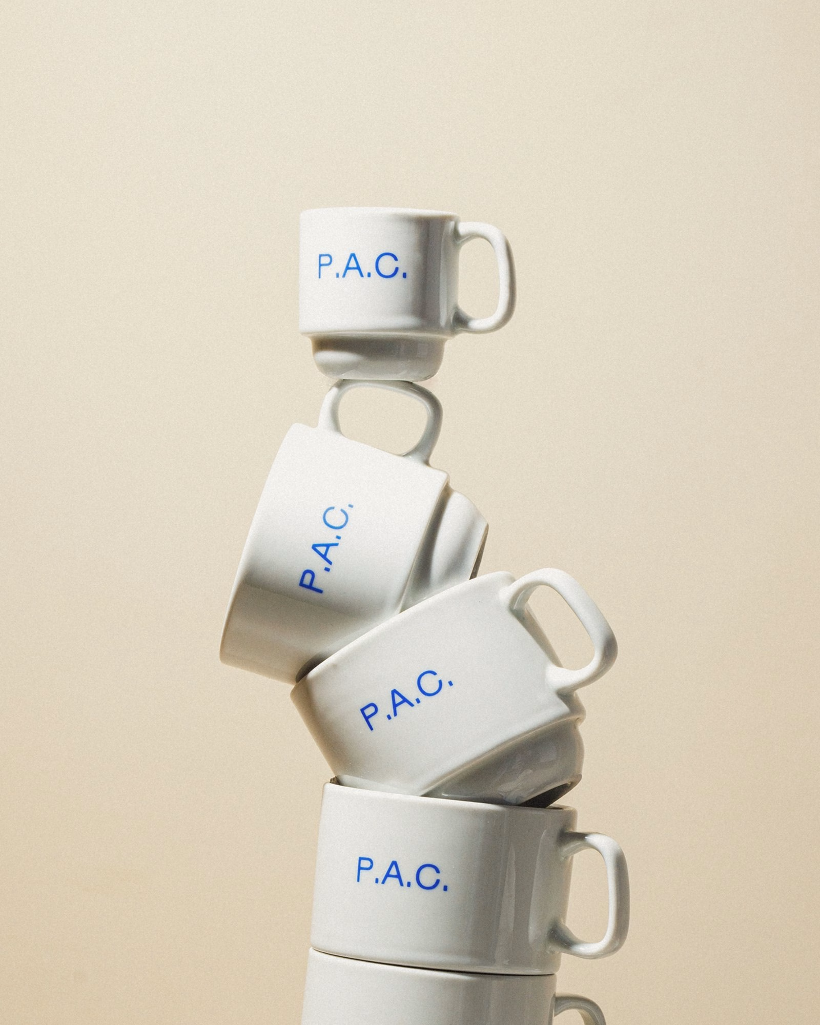
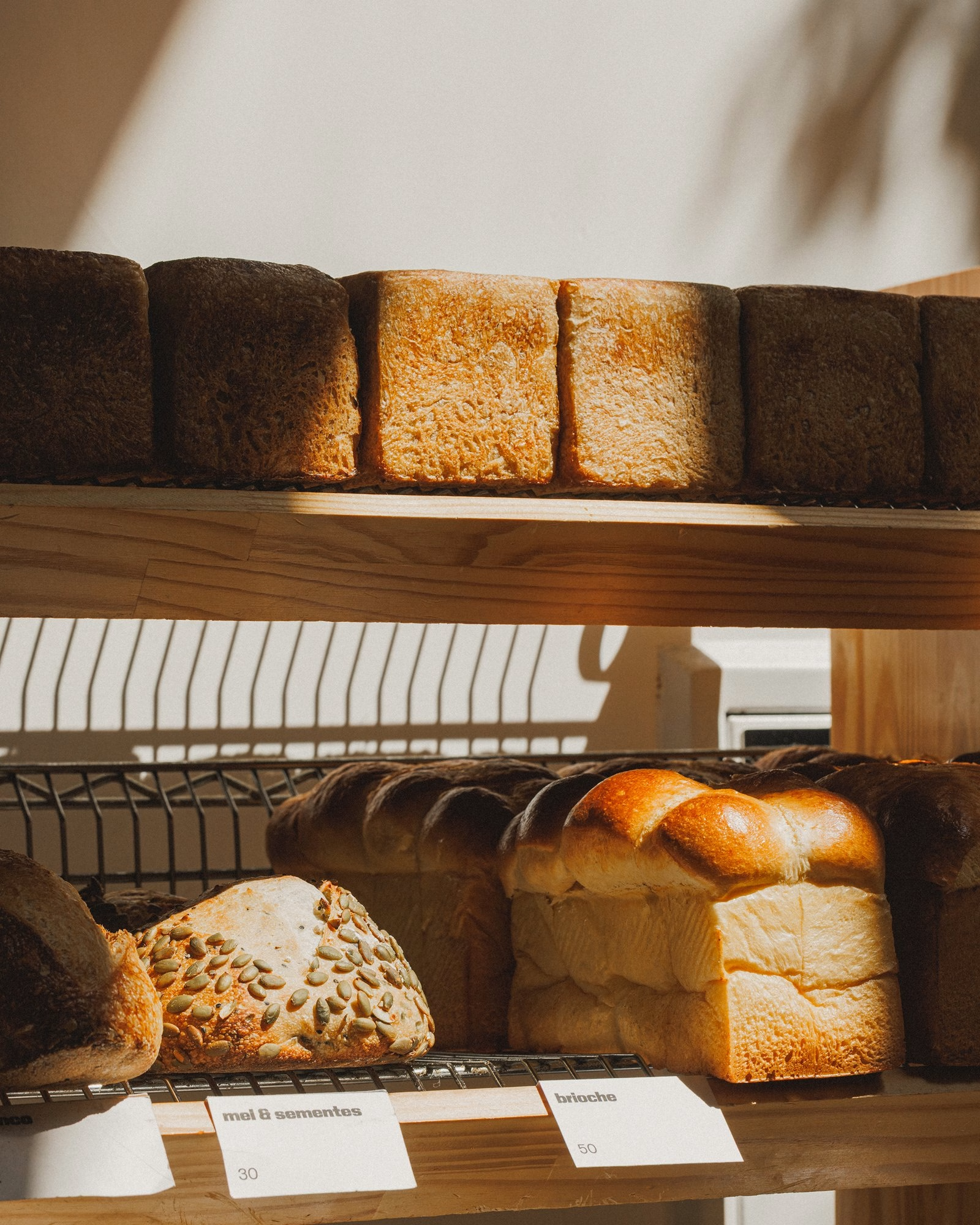
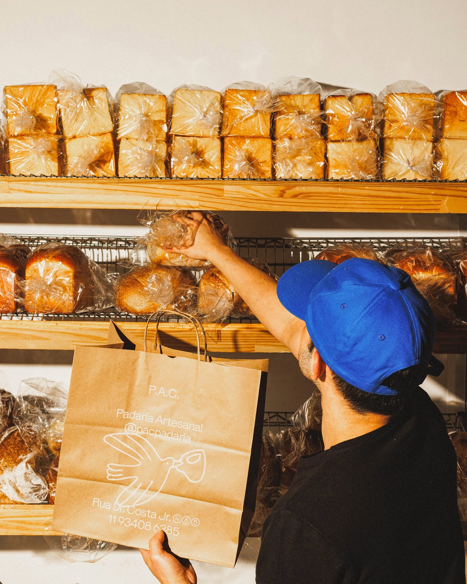
Typography carries much of the bakery's character, set in Gronland and KTF Rublena across cups, mugs, bags and signage. Illustration adds a second layer of expression, sometimes playful and direct, sometimes abstract, dense or deliberately overbearing. Over four years Polar has worked closely with illustrator Beatriz Batisteli, whose loose linework draws on P.A.C.'s own community: people of every age and style brought together by a favourite loaf, an after-lunch coffee or a special occasion.
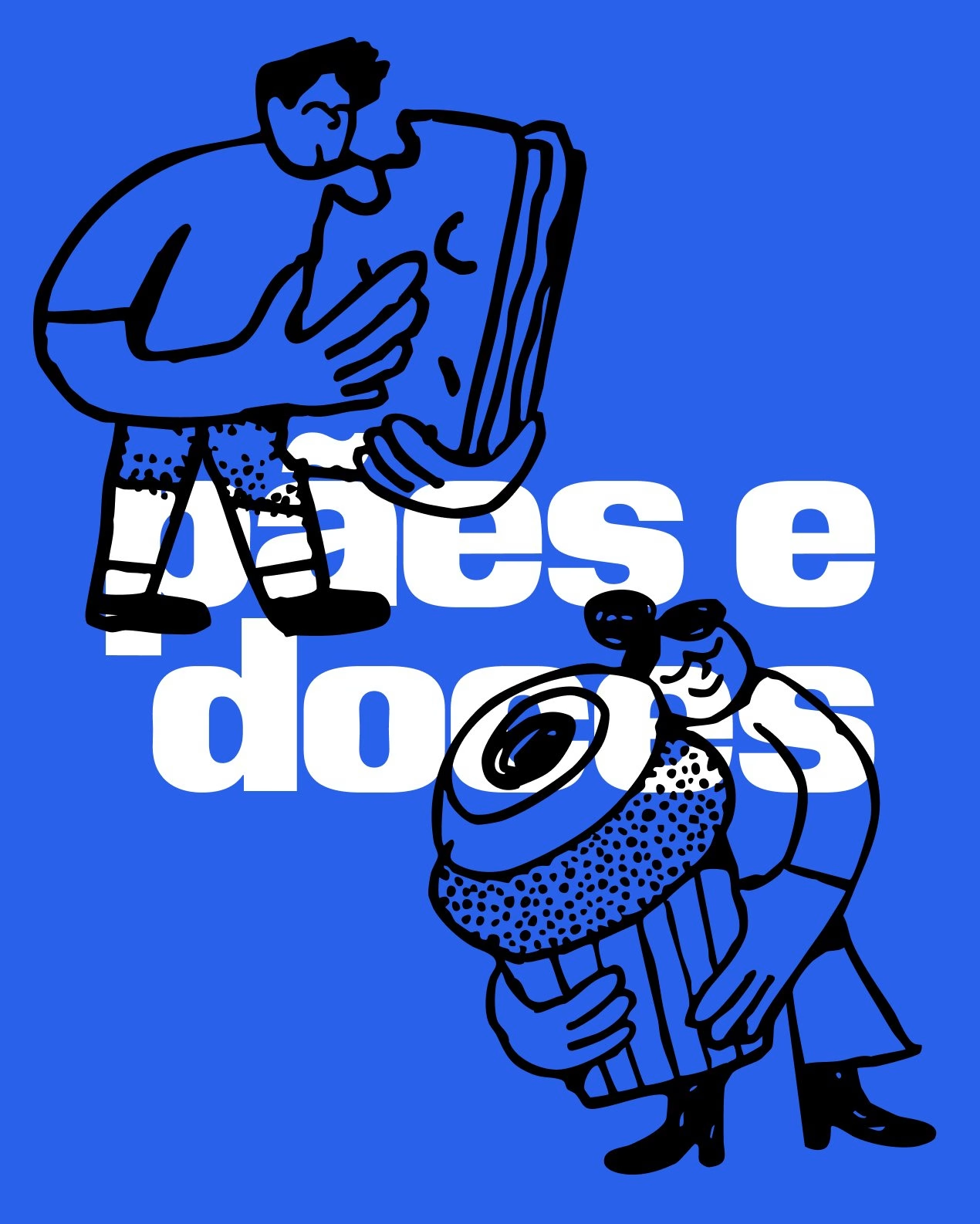
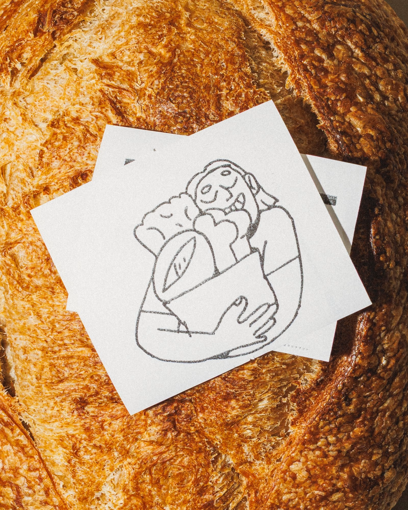
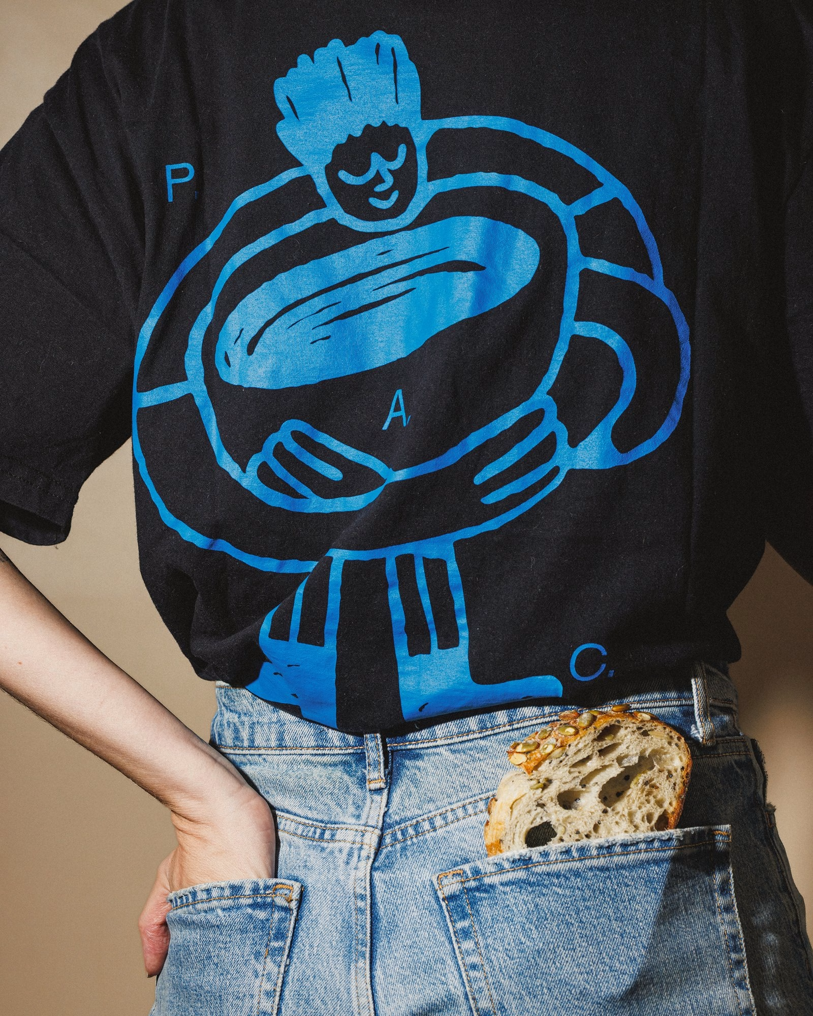
The identity is also comfortable with things that do not last. P.A.C.'s menu changes constantly, with new breads, pastries and specials appearing week after week, so Polar treats communication more like a run of ephemeral publications than a fixed set of brand assets. Posters, flyers and anniversary pieces come and go with the menu, and each one is free to look different from the last.
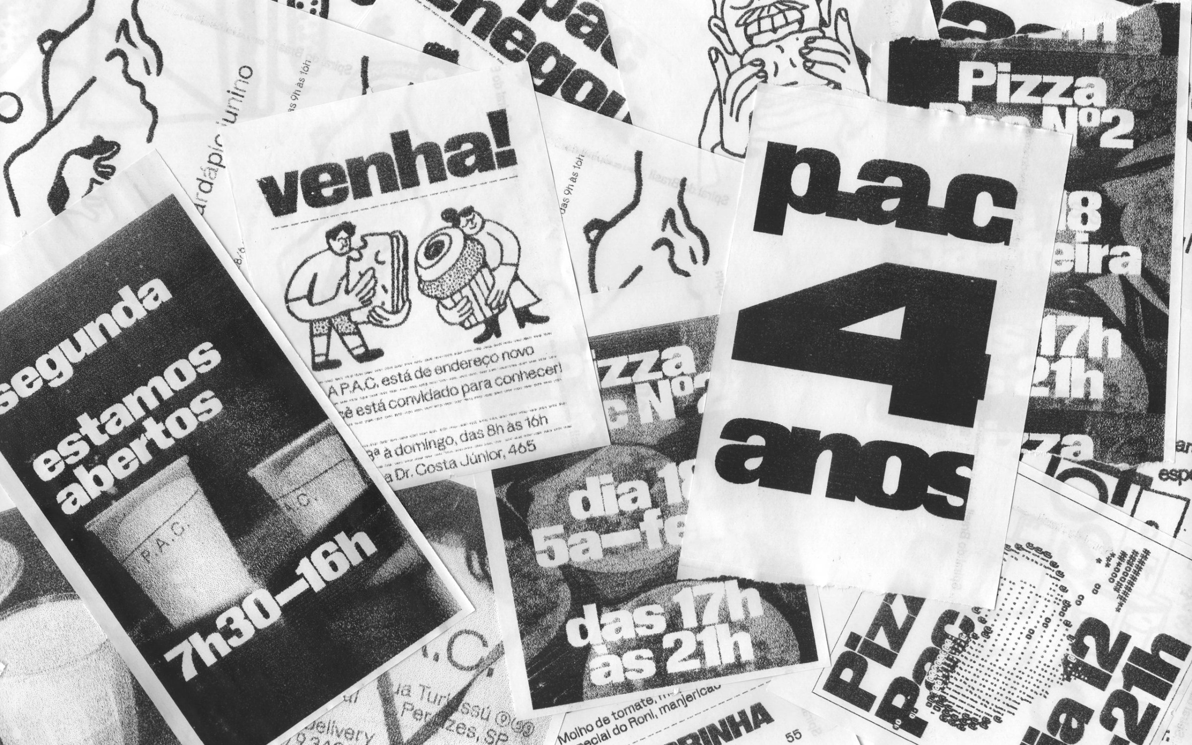
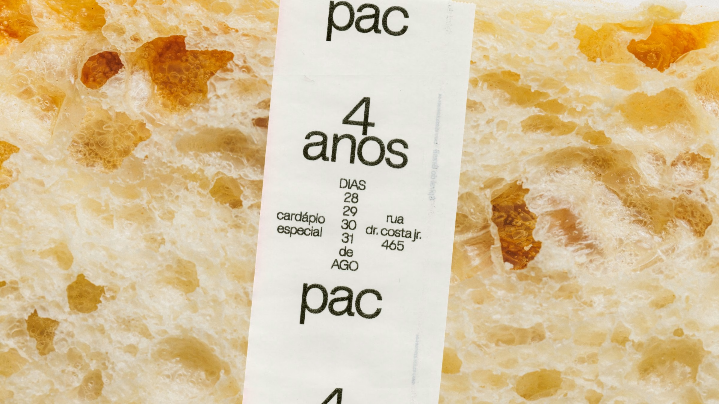
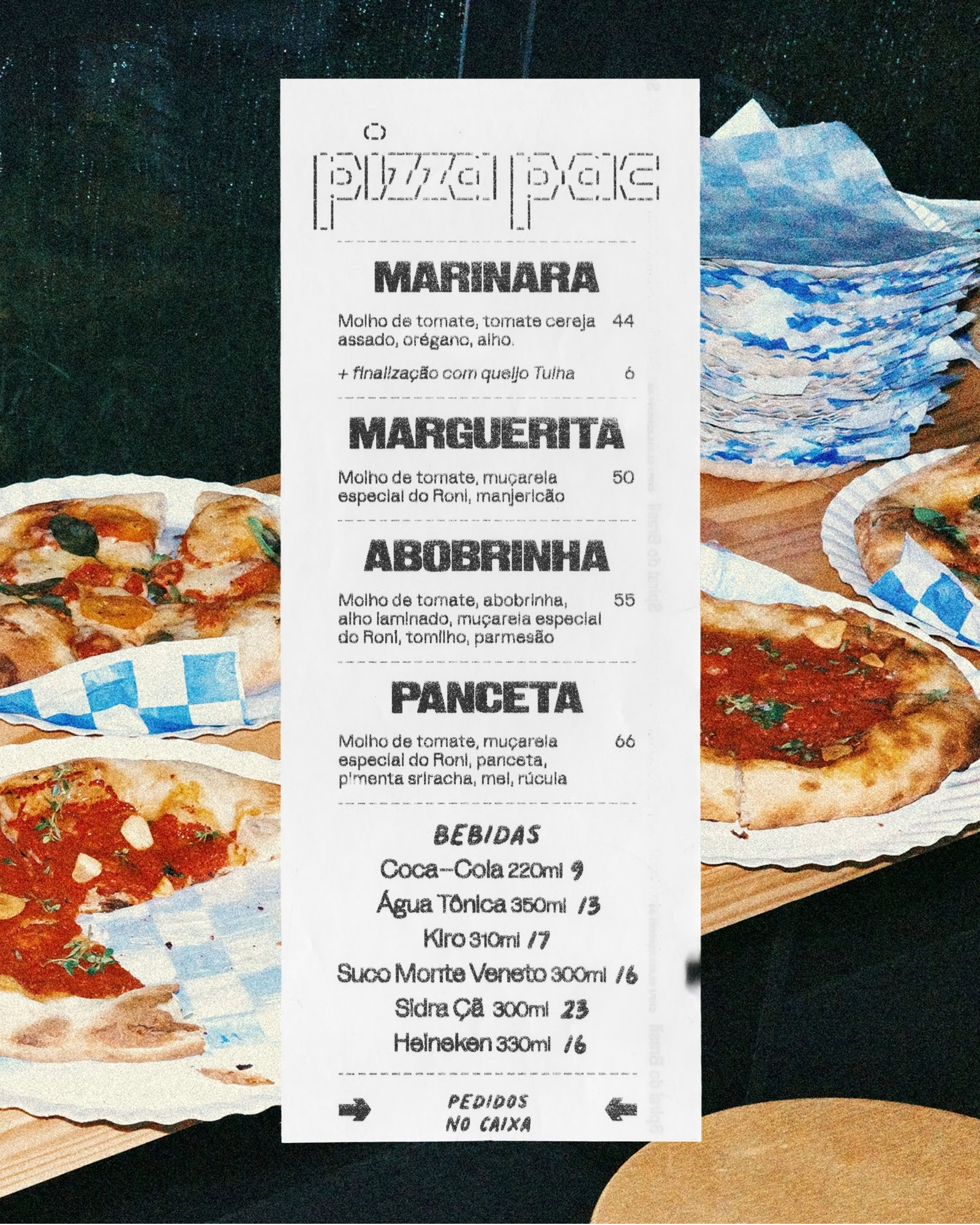
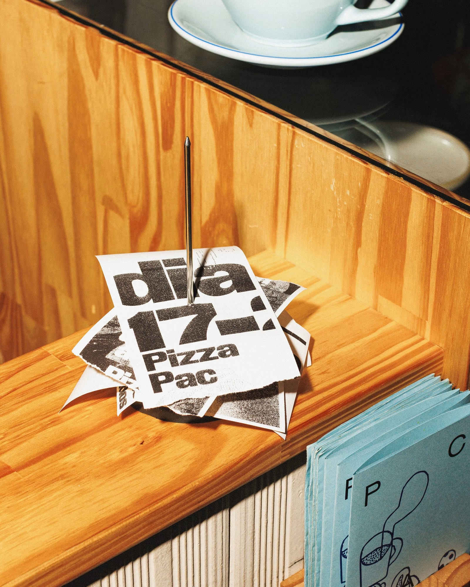
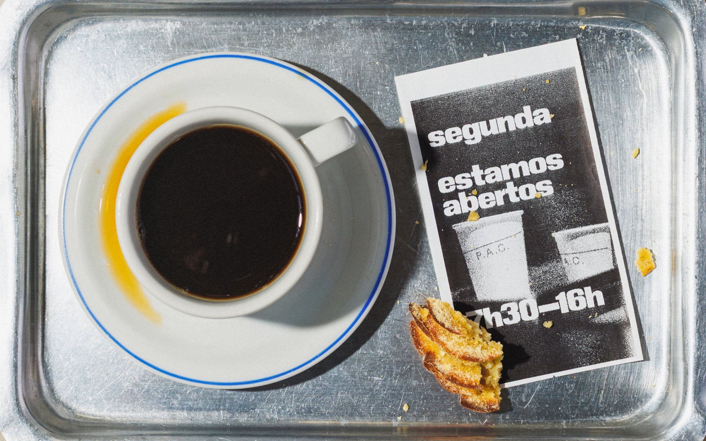
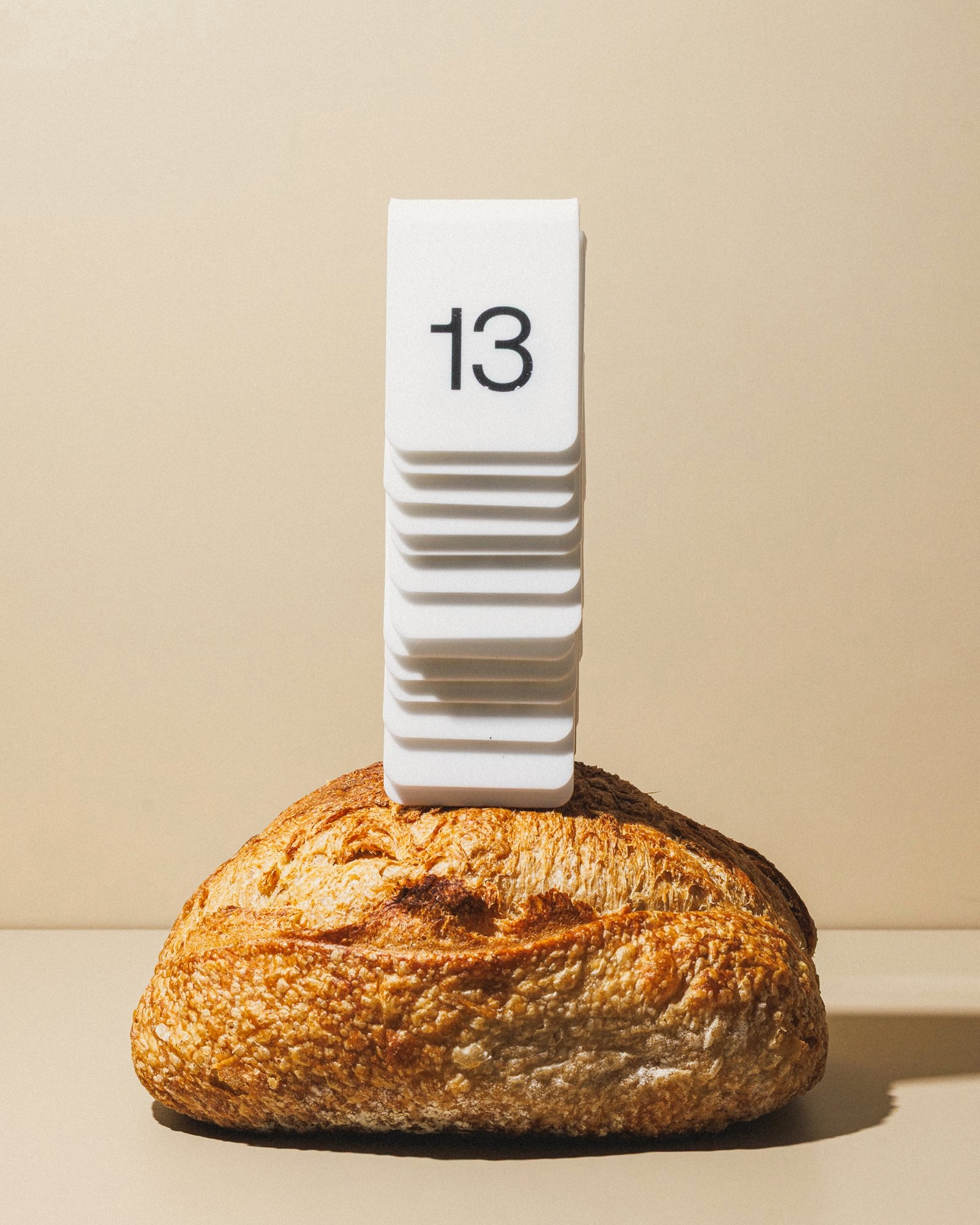
The most surprising design tool in the kit is the bakery's receipt printer. Instead of treating it as a production limitation, Polar turned it into a graphic medium, printing special menus on demand that last for a single weekend. Monochrome output, the coarse resolution of thermal printing and the paper's low opacity all become part of the visual language, and because the pieces are cheap and fast, some are carefully composed while others are deliberately strange, awkward or almost illegible.
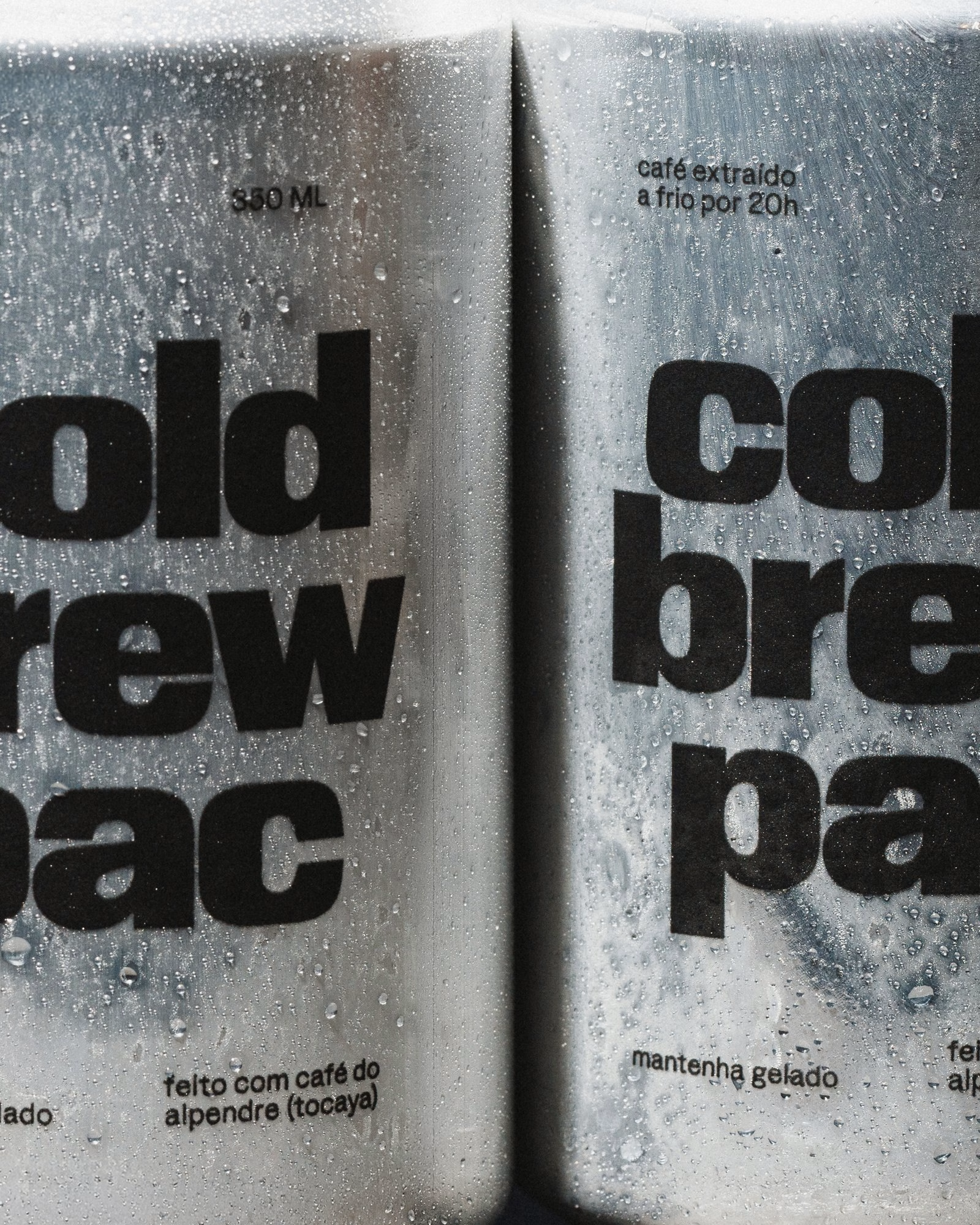
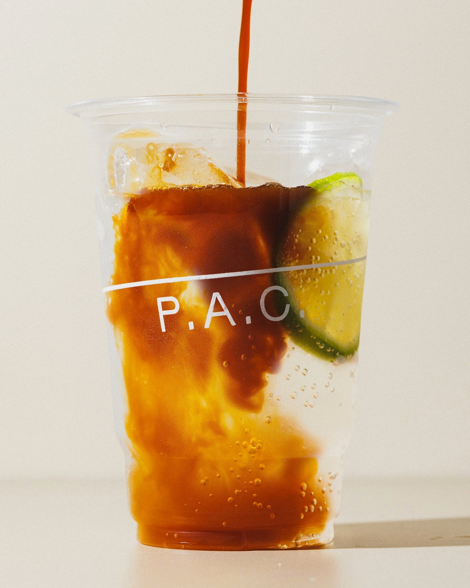
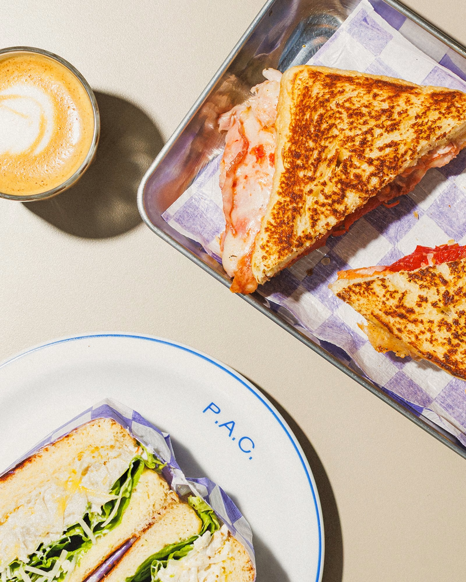
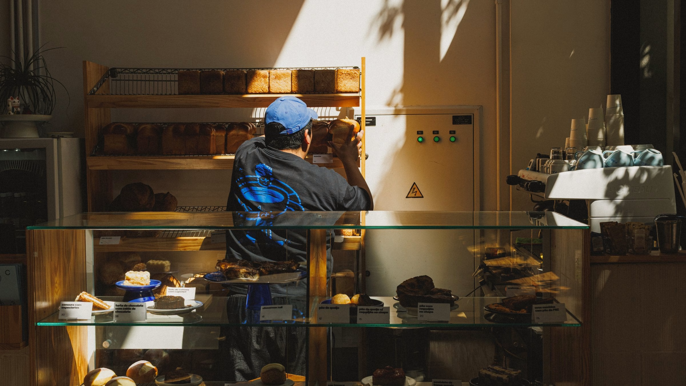
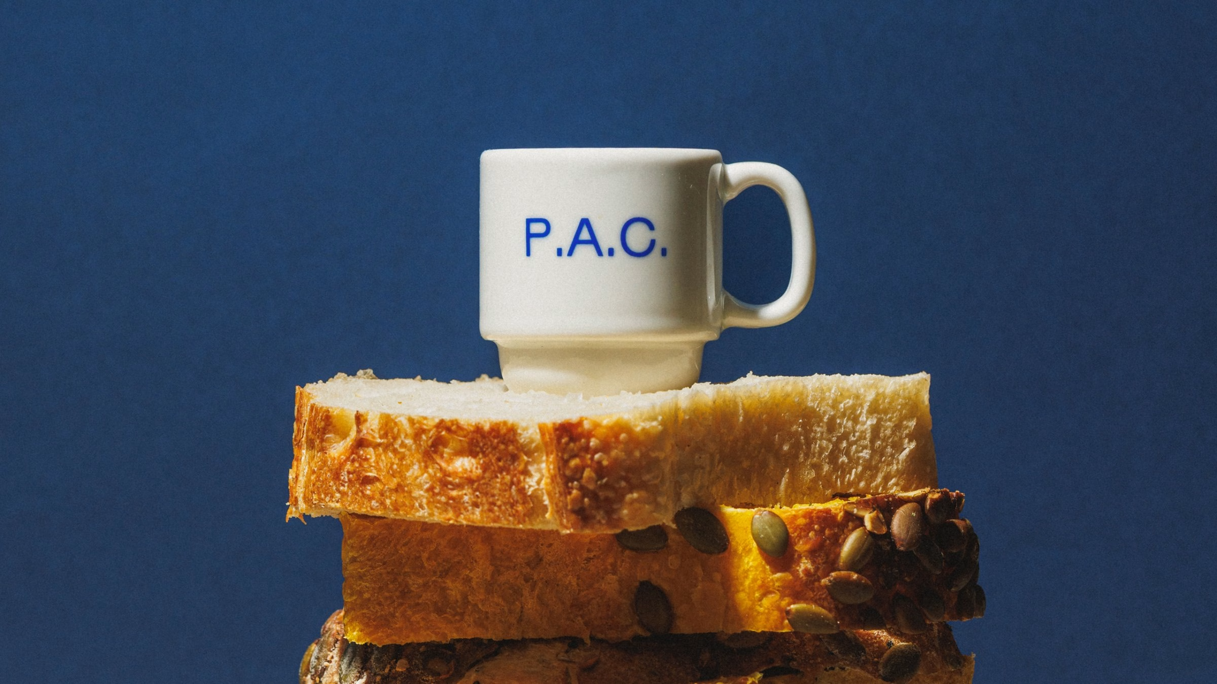
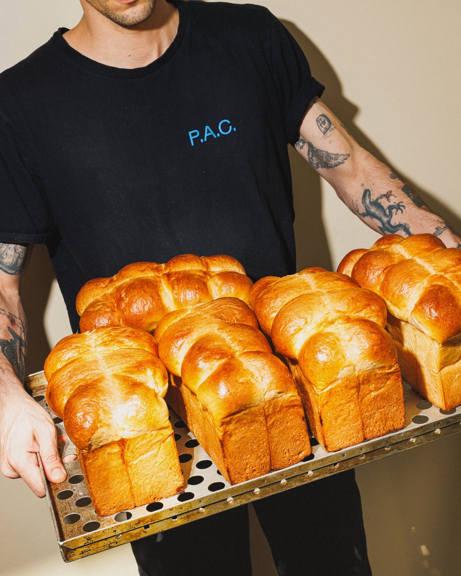
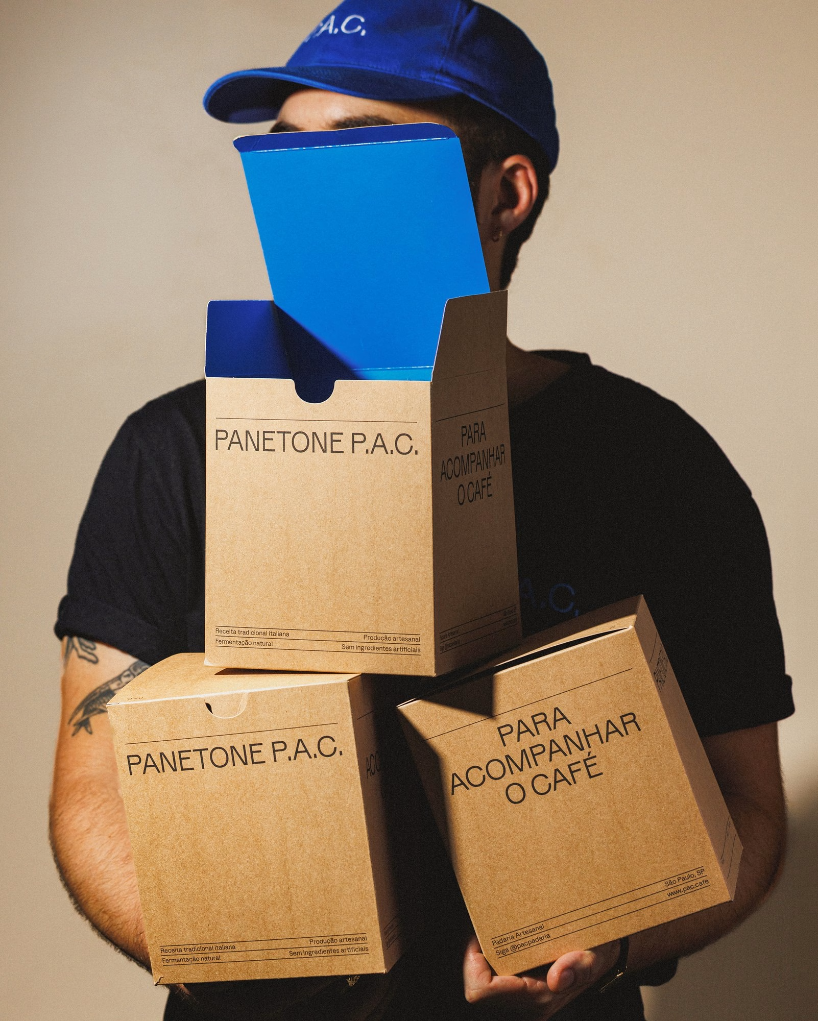
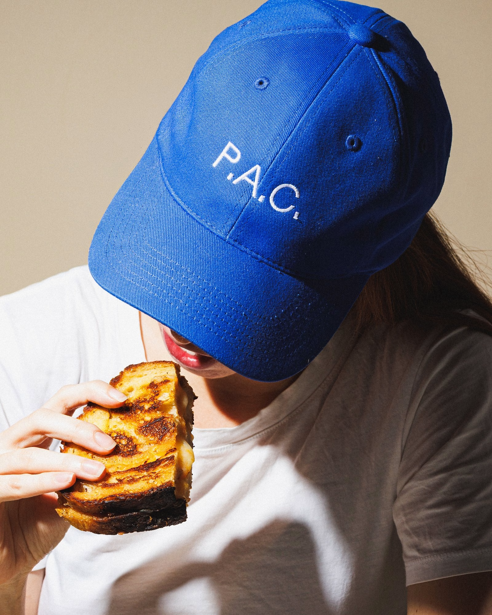
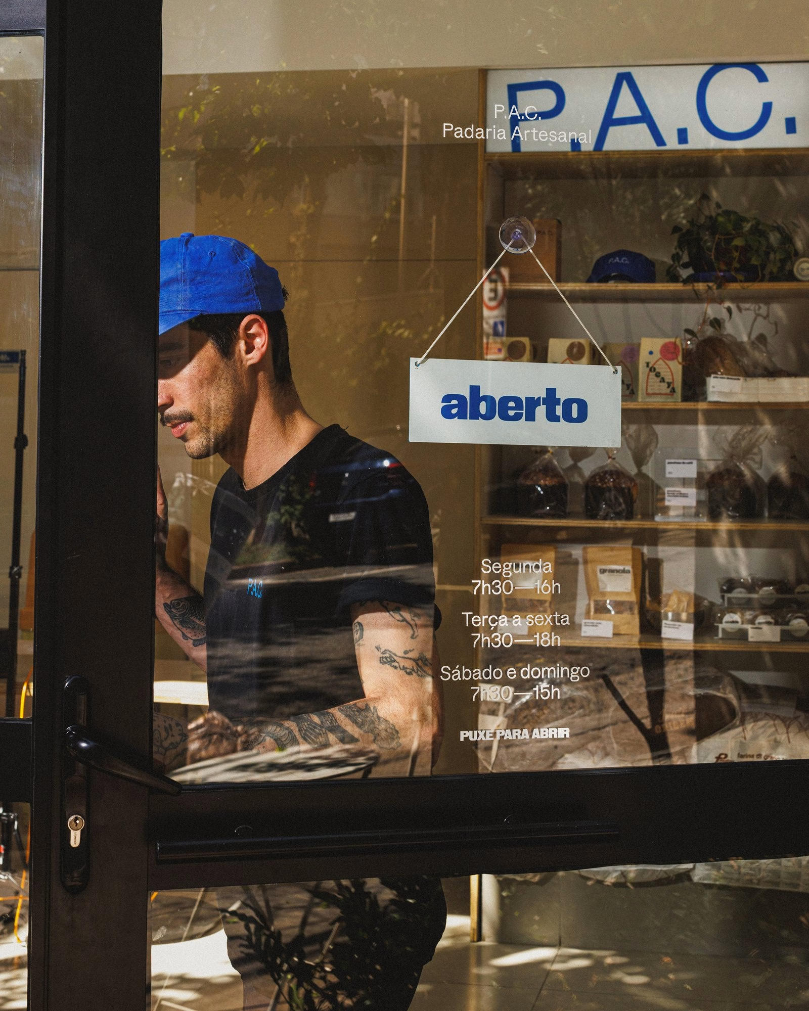
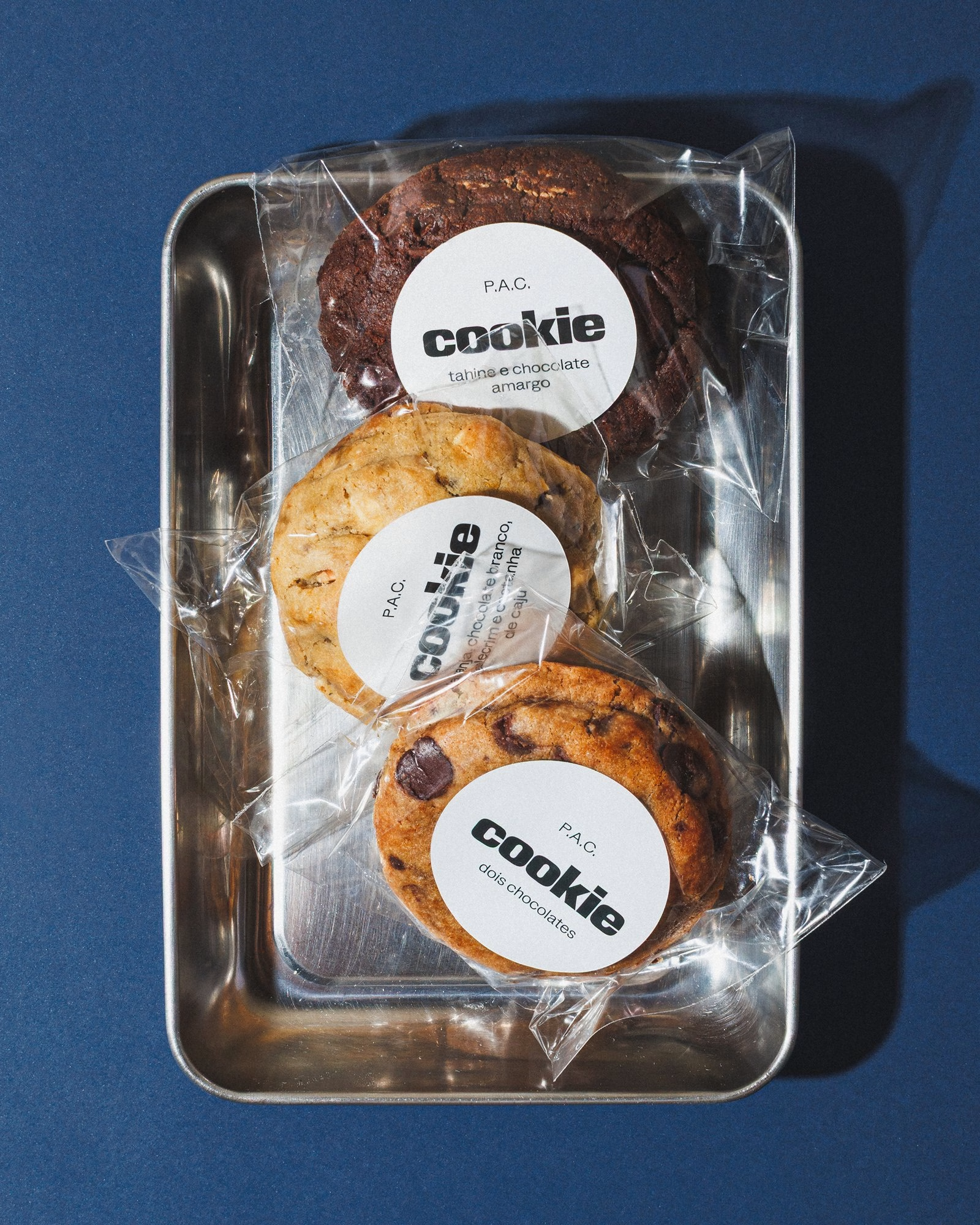
The same loose attitude runs through the physical touchpoints, from blue caps and staff tees to panettone boxes, cookie labels and paper bags. Motion designer Ronaldo Arthur Vidal extends the system into short animated pieces that keep the illustrations moving on screen. Polar describes the brand less as a finished system than as a working environment, one that cares less about consistency for its own sake and more about making room for new, quirky and delicious things to happen.
Credits: Polar, Ltda.
Brand Identity Studio: Polar, Ltda.
Creative Direction & Design: Bruno Ribeiro
Creative Direction & Design: Ralph Mayer
Design: Miriam Kim
Illustration: Beatriz Batisteli
Illustration: Miriam Moraes
Motion Design: Ronaldo Arthur Vidal
Case Study Creative Direction & Design: Lais Ikoma
Photography: Brejo
More in Food & Beverage Branding
Includes freebie bundle, unseen BTS insights and more.