Plus
Plus

 Menu
Menu


Bo Studio
October 08, 2026
Mindsparkle Mag


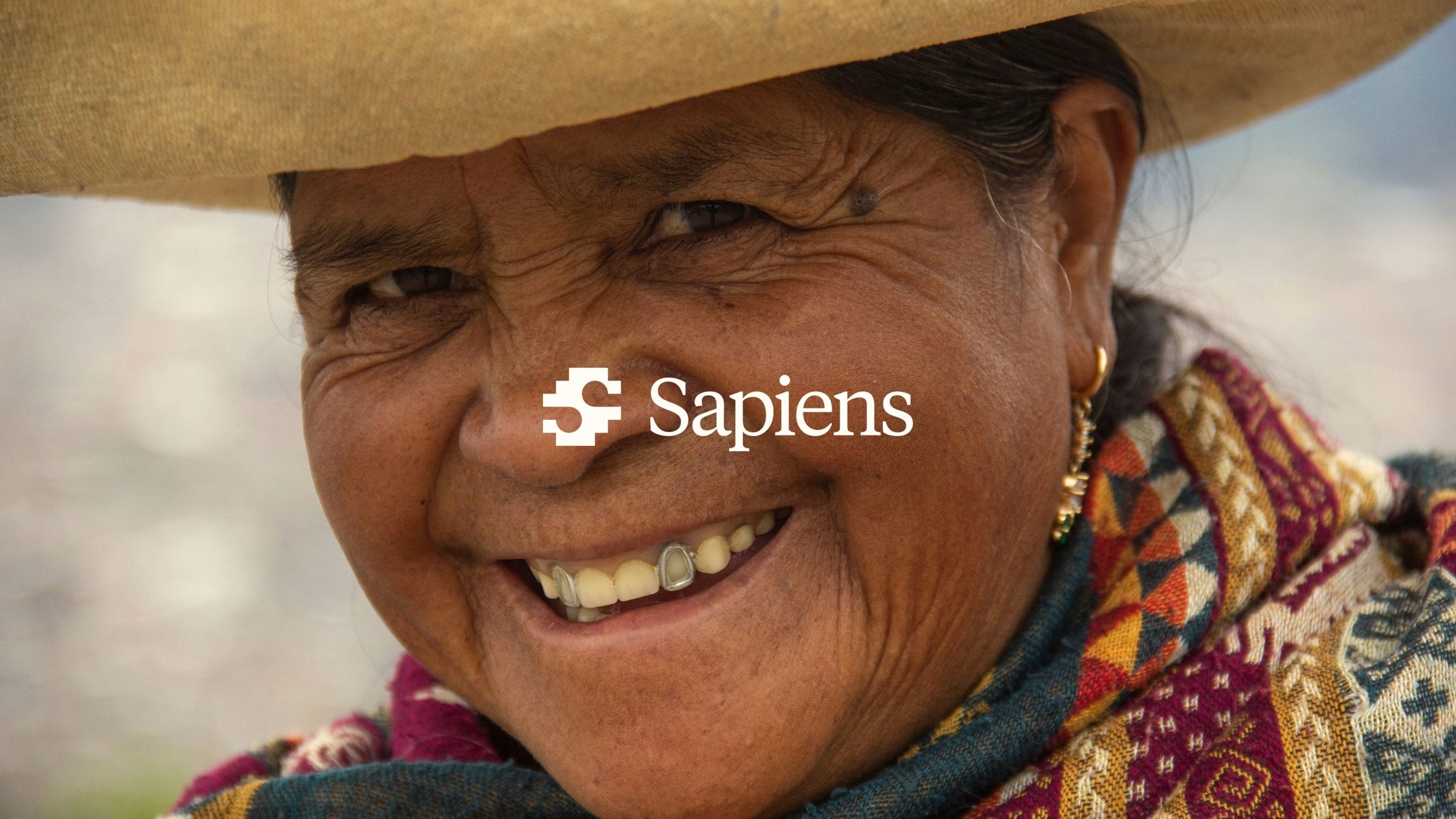
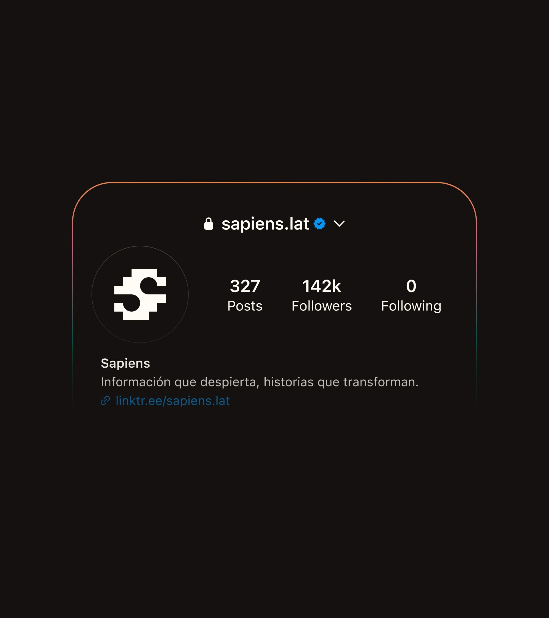
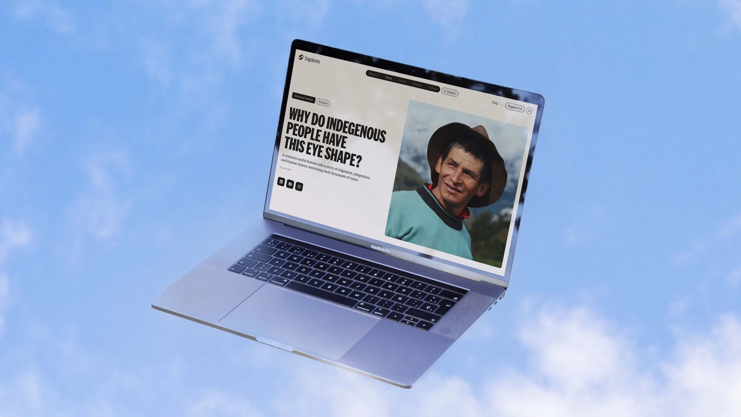
Sapiens is a digital media platform with a clear mission: to democratise information about sustainability. Its stories are organised around three pillars, science, culture and the planet, and the platform works with an indigenous-centred approach throughout. For its new identity, Sapiens worked with Bo Studio, the studio run by co-founders and lead designers Mihajlo Tunev and Jovan Puplievski.
The brief sounded simple: design a modern media platform that didn't look like one. Most news brands speak the same cool, interchangeable visual language, so Bo Studio had to dig back in time for inspiration. A long research phase explored indigenous culture, along with its ancient symbols and textiles.
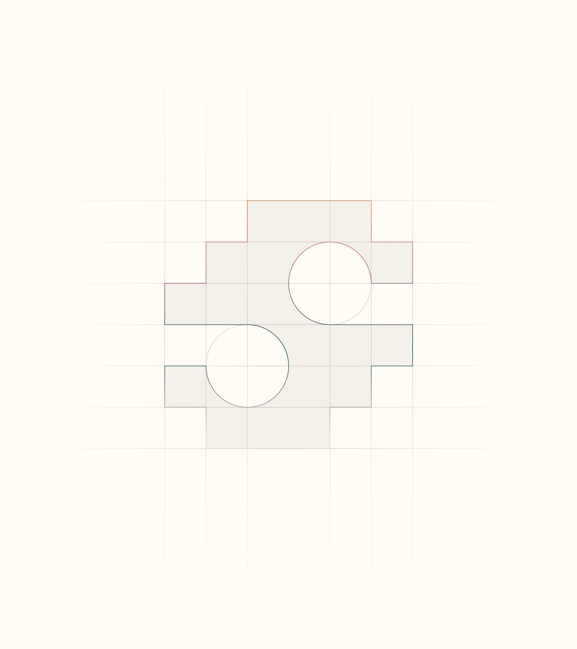
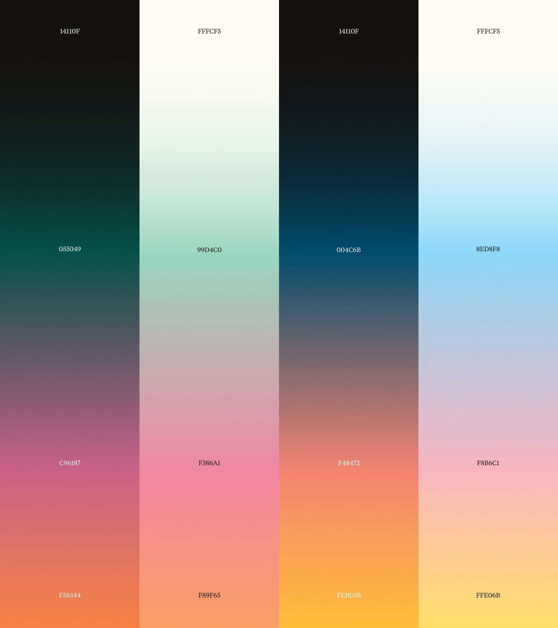
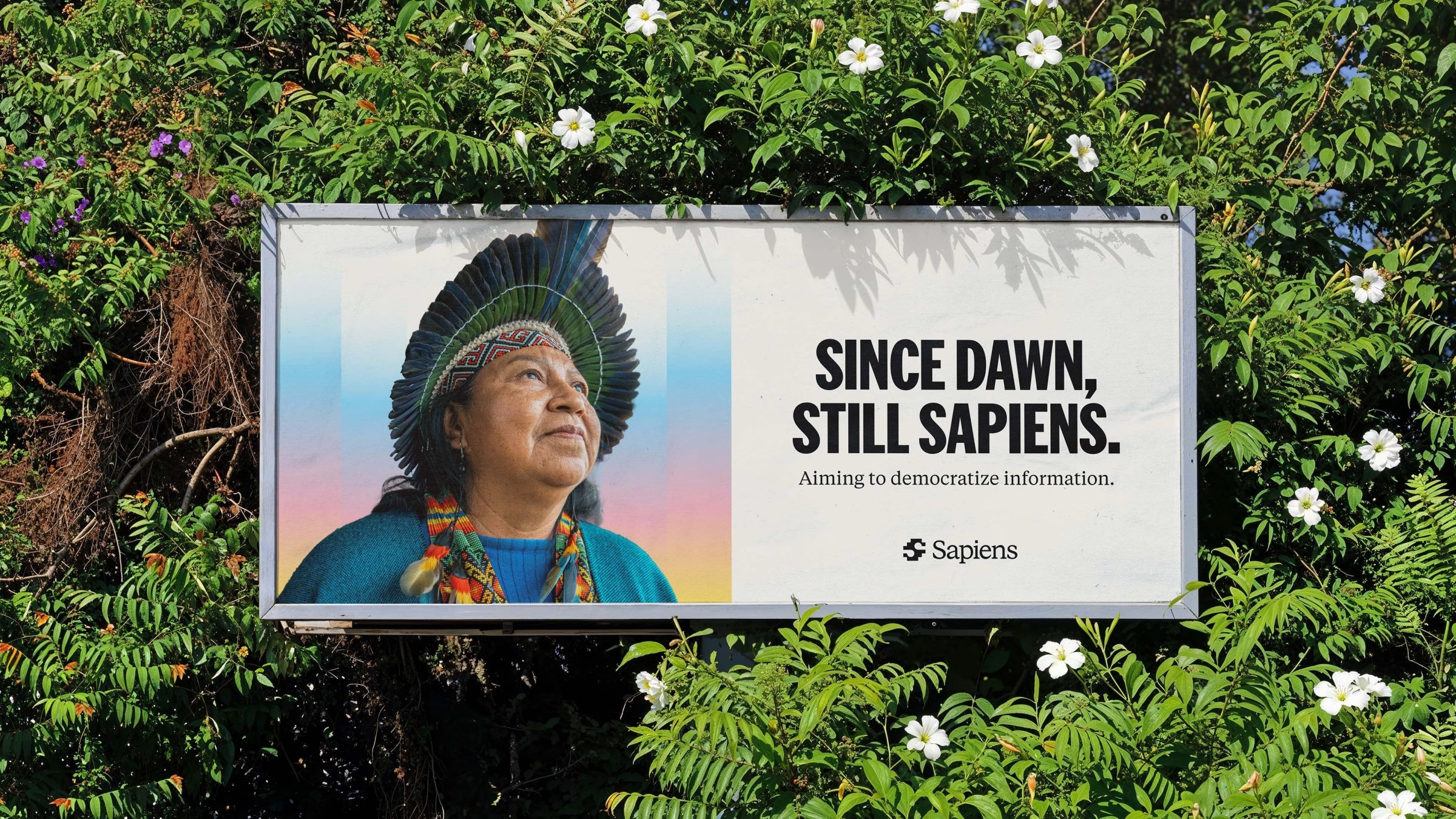
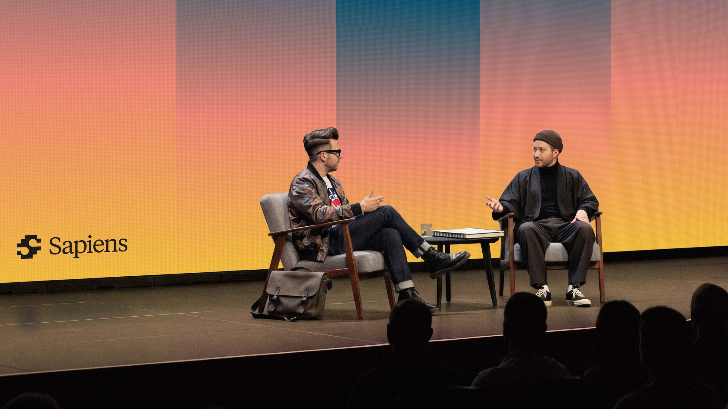
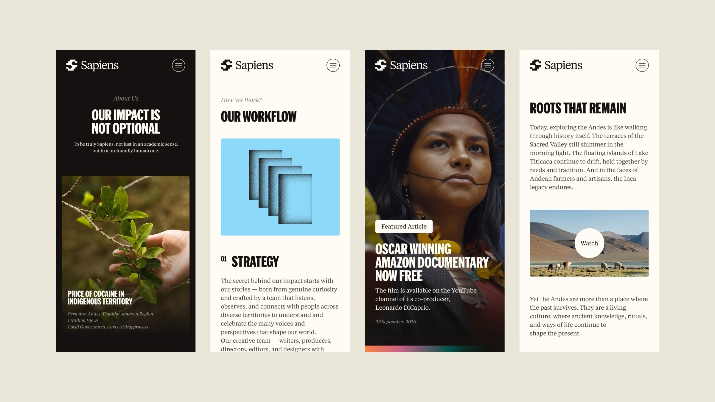
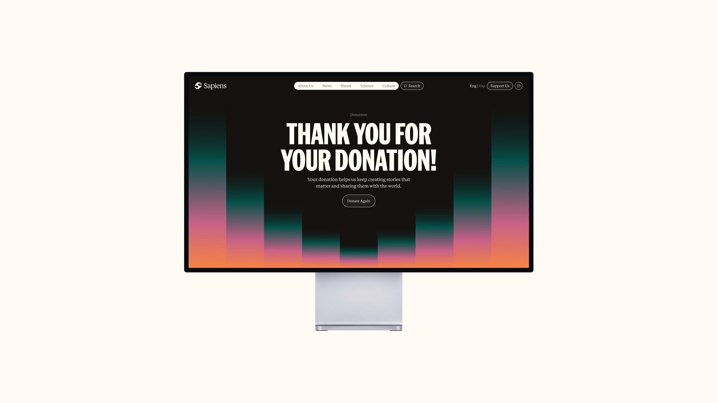
Out of that research came a visual language that is shaped by the past, yet speaks to the present. The stepped geometry of carved stone and woven patterns carries through into the symbol and the graphic patterns of the identity. A warm gradient palette, running from deep greens into sunset pinks and oranges, gives the system its colour.
When working on a news platform, typography has to do more than just look good. It needs to be instantly recognisable, clear and readable, and above all it has to look credible. The idea behind the type is not new at all: it has been used for hundreds of years in a now-dying form of media, the newspaper.
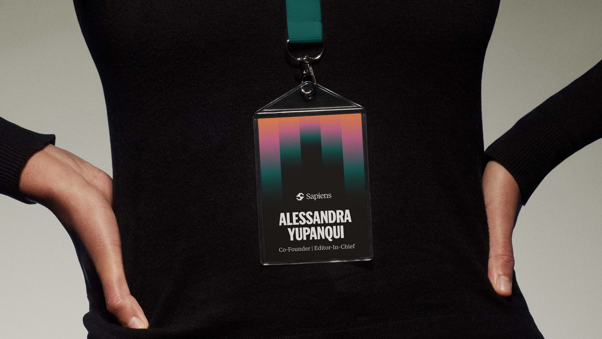
Bo Studio looked at old-school newspapers and the way they used type to create eye-catching headlines. The perfect candidate turned out to be American Grotesk by Klim Type Foundry. It takes the character of old newspaper typography and reinterprets it as a modern typeface, which sets the tone for every Sapiens headline, poster and screen.
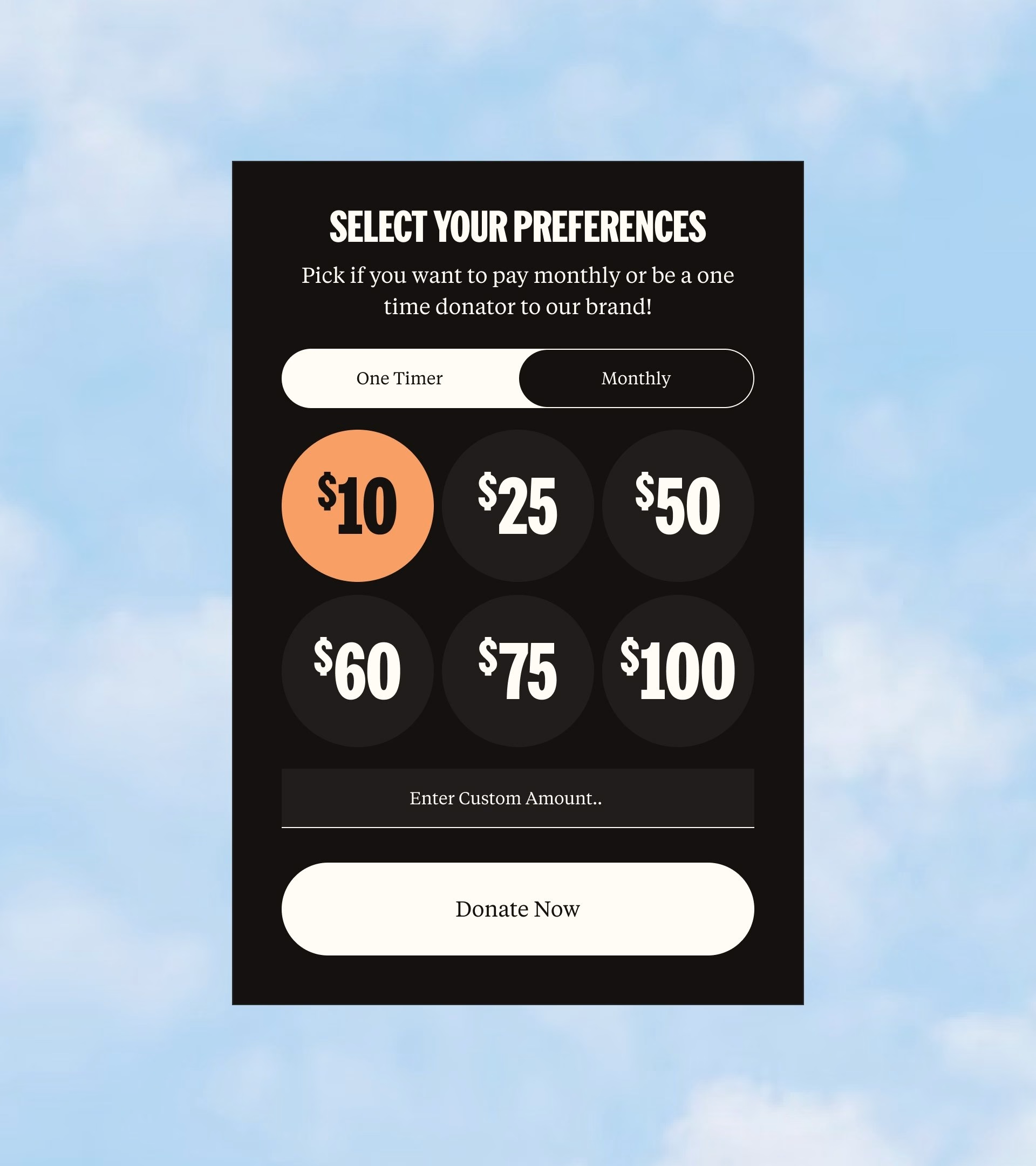
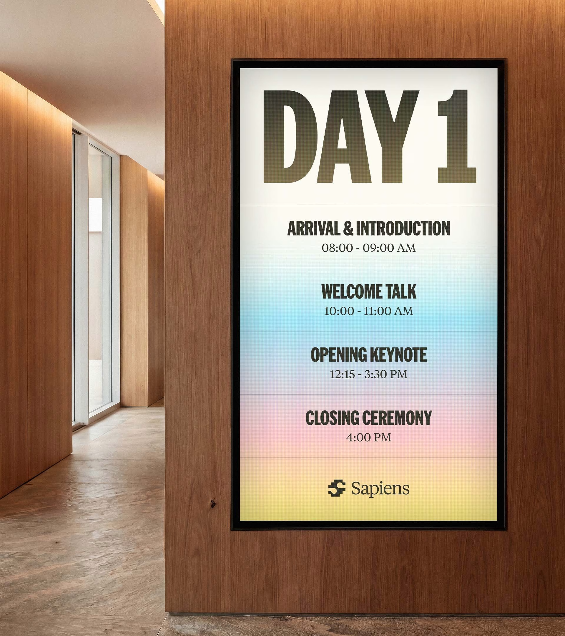
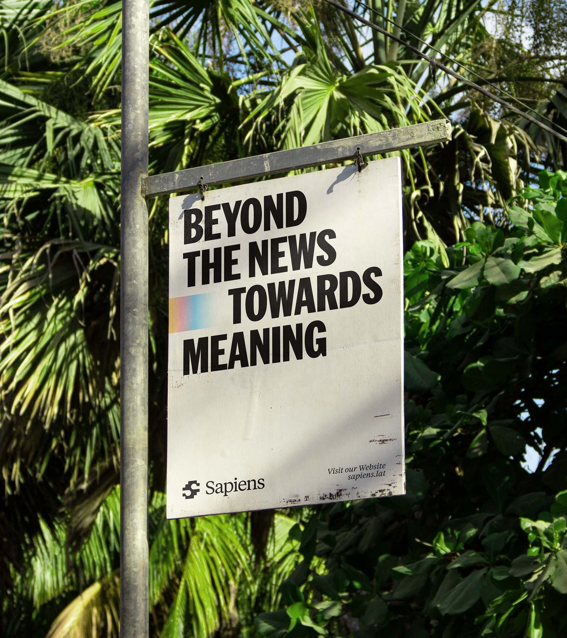

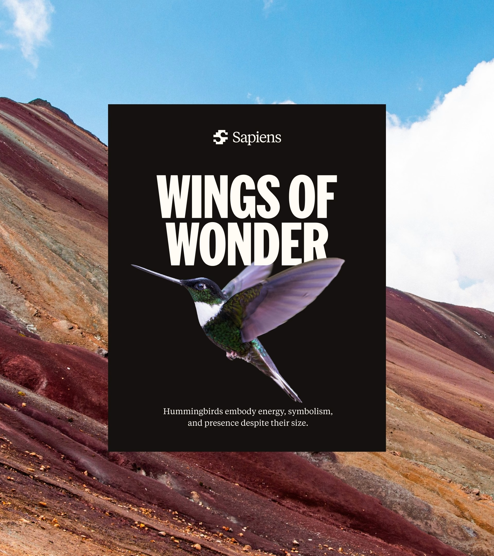
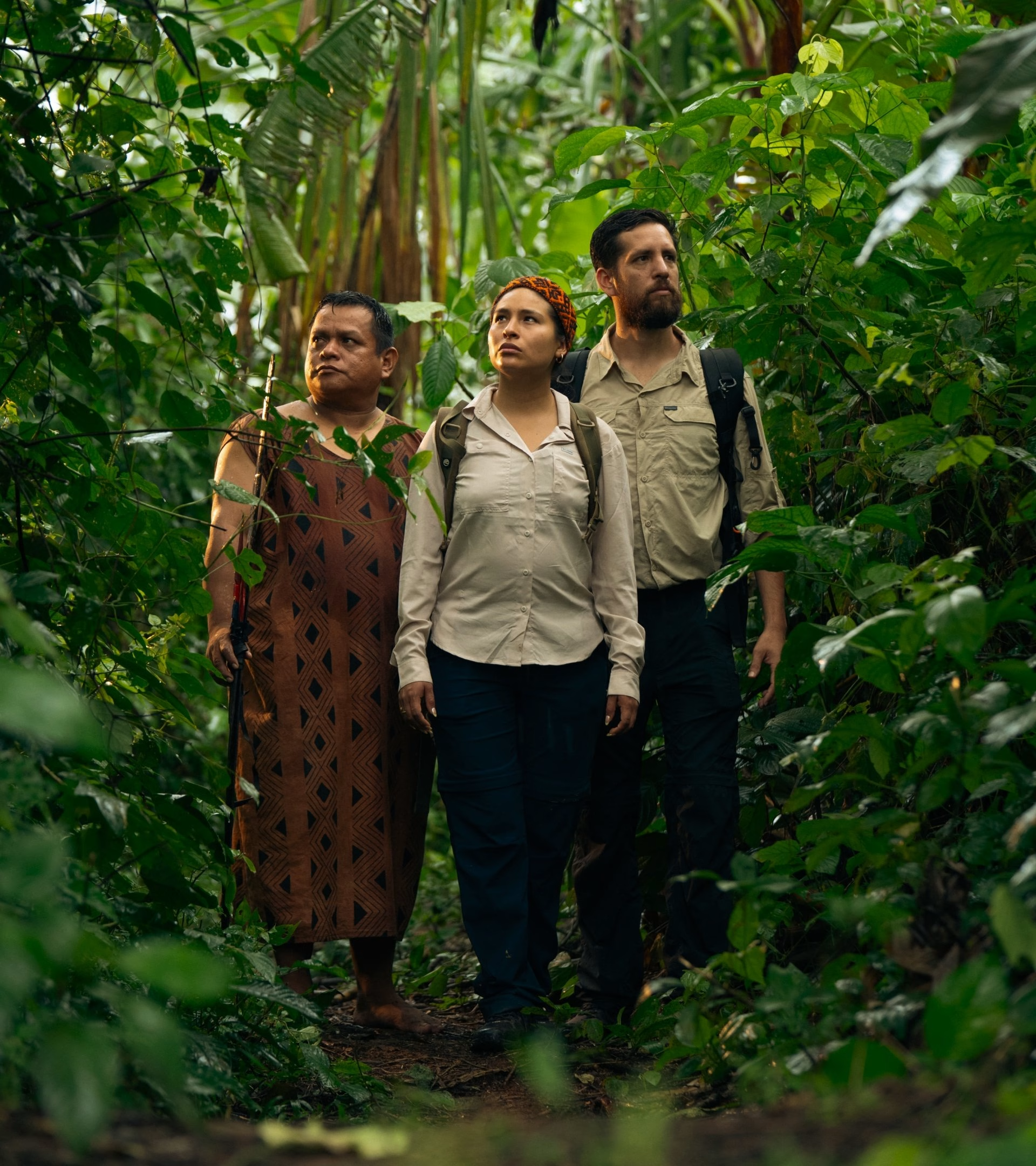
The system stretches from the digital product into physical space. Donation flows, data stories and social templates sit alongside billboards, event signage and conference lanyards, all speaking with the same voice. Indigenous faces and landscapes are given room to lead, with the type and gradients framing them rather than competing for attention.

The rebrand gave Sapiens a new voice for sharing its stories. What was once a brand that blended in with the crowd of news platforms now stands out with a colourful identity. It is built around telling complex stories in a way that is accessible and understandable to everyone.
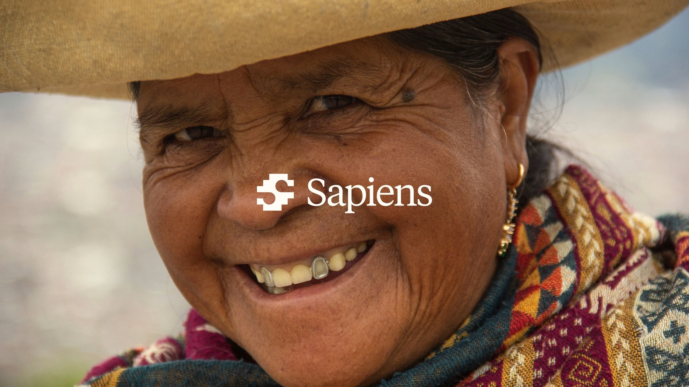
Credits: Bo Studio
Brand Identity & Design: Bo Studio
Co-Founder, Lead Designer: Mihajlo Tunev
Co-Founder, Lead Designer: Jovan Puplievski
More in Brand Identity
Includes freebie bundle, unseen BTS insights and more.