 Plus

 Menu


Bruno
United KingdomOctober 27, 2026
Mindsparkle Mag


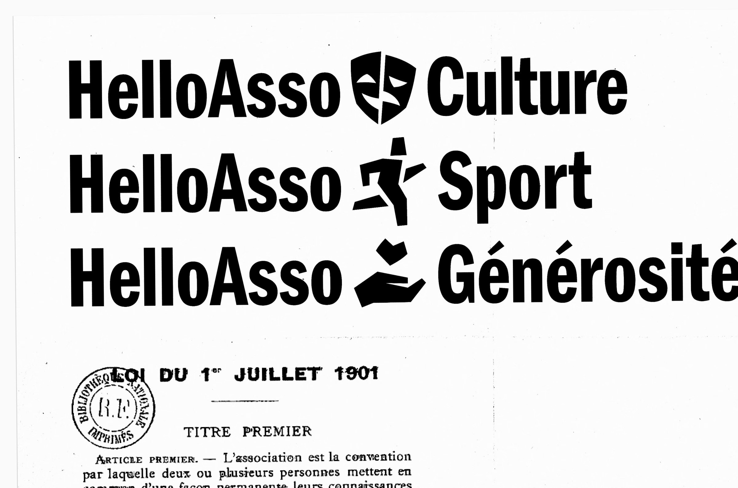
Since 2009, HelloAsso has helped people across France get involved by making life easier for non-profits. The free, solidarity-built platform grew from a single service into a suite of tools for even the largest organisations, so its brand architecture needed rethinking. Bruno created a strategic, verbal and visual identity built on a new brand architecture that gives a face to the individuals behind every collective.
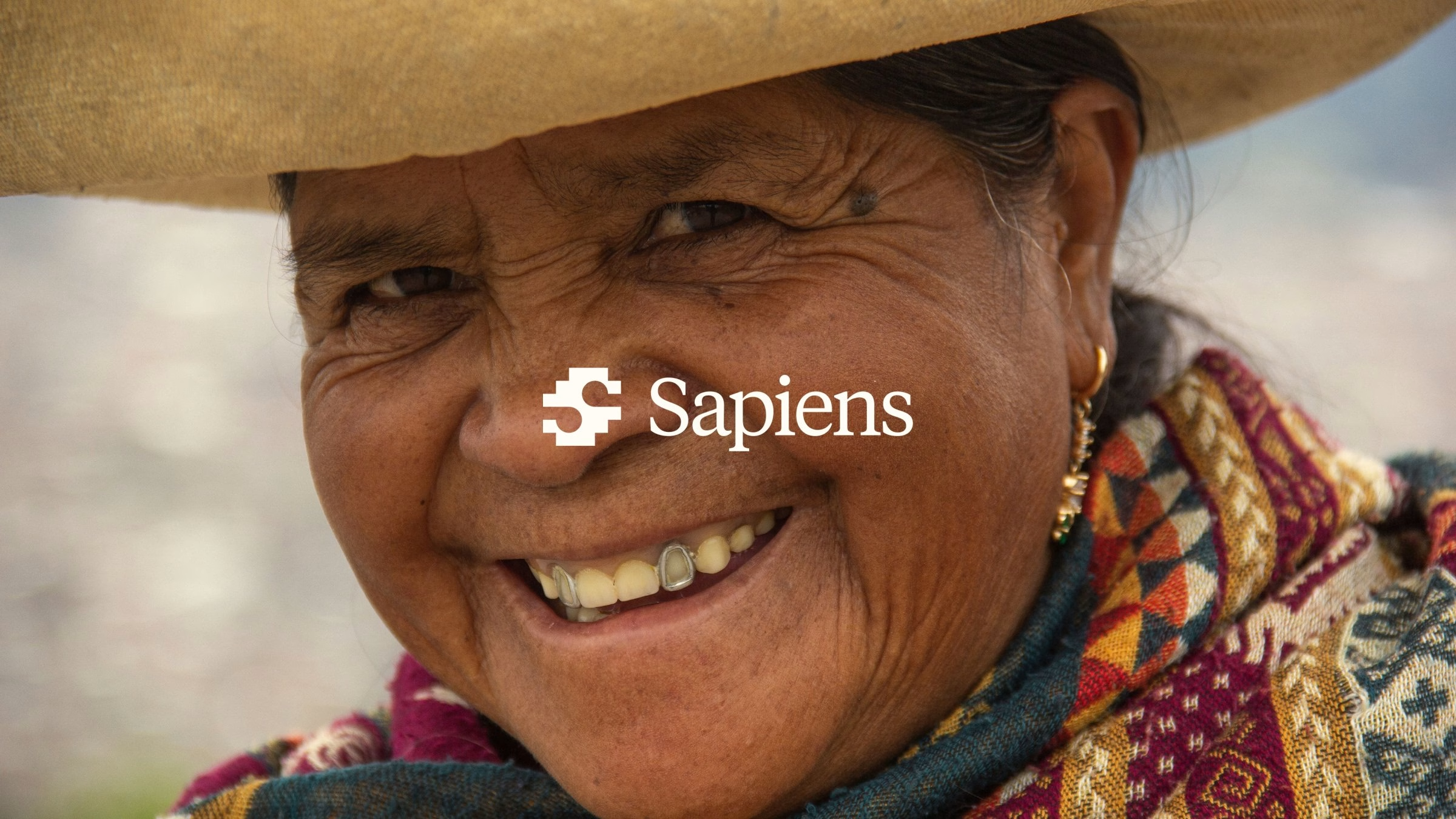
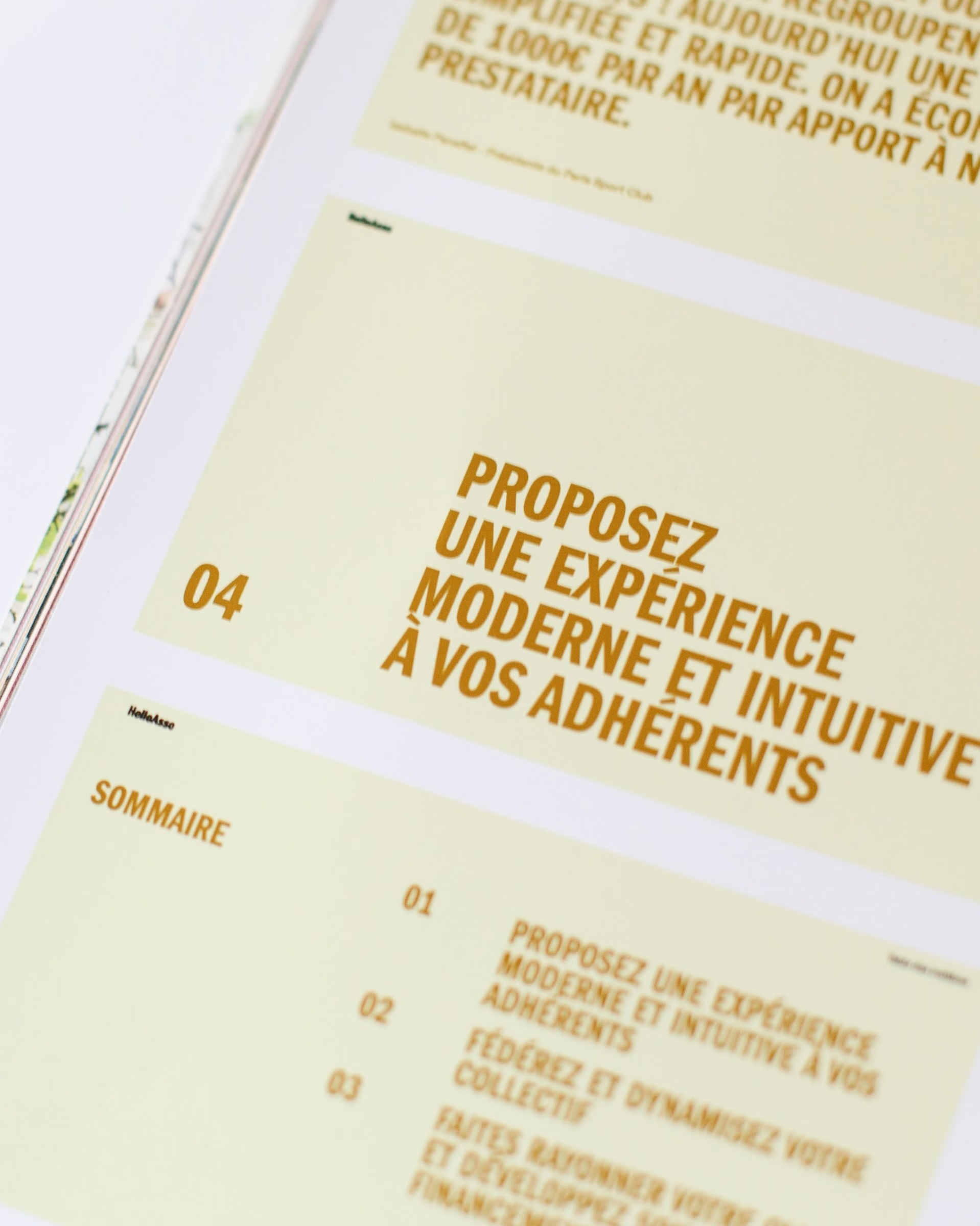
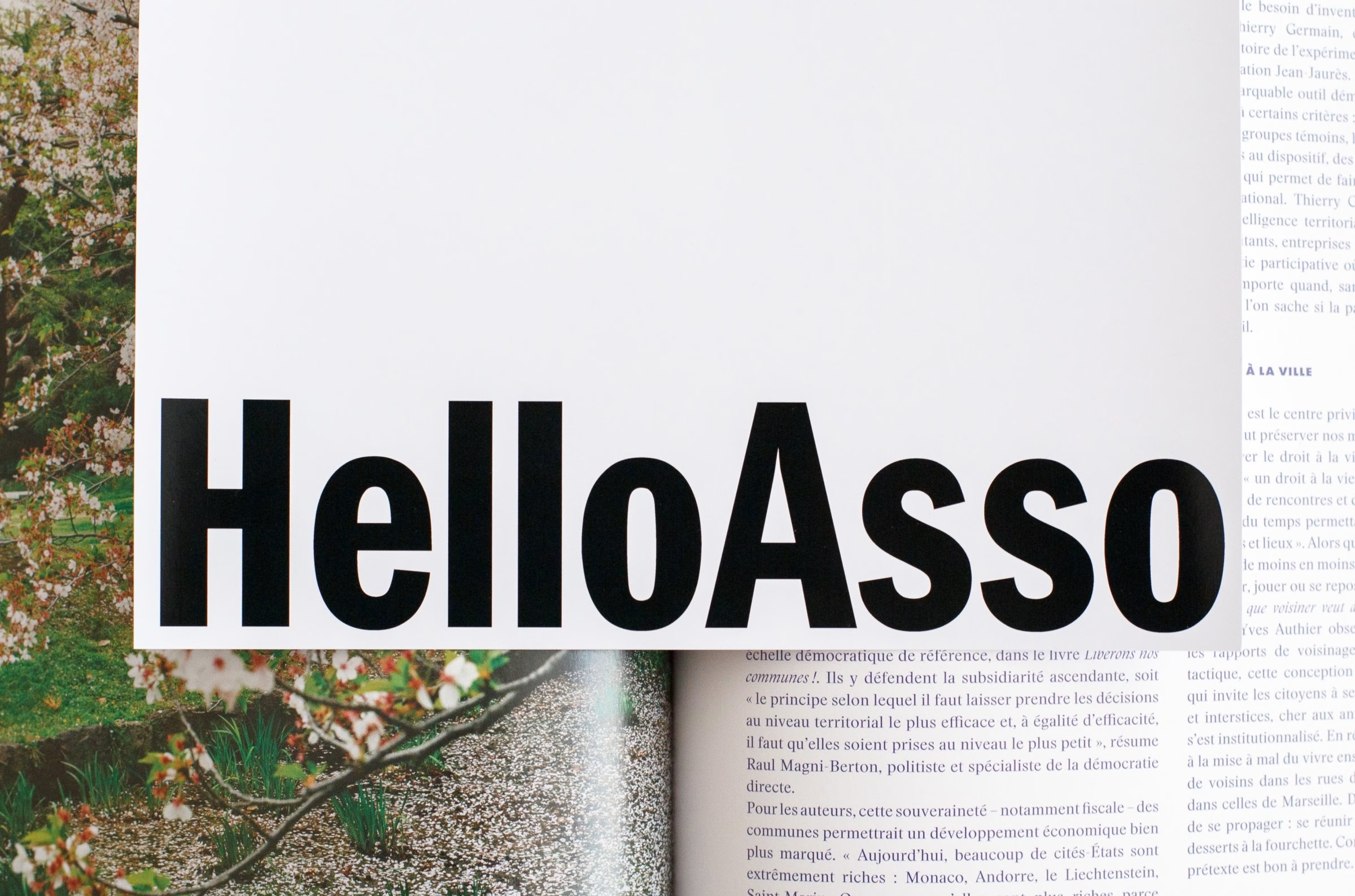
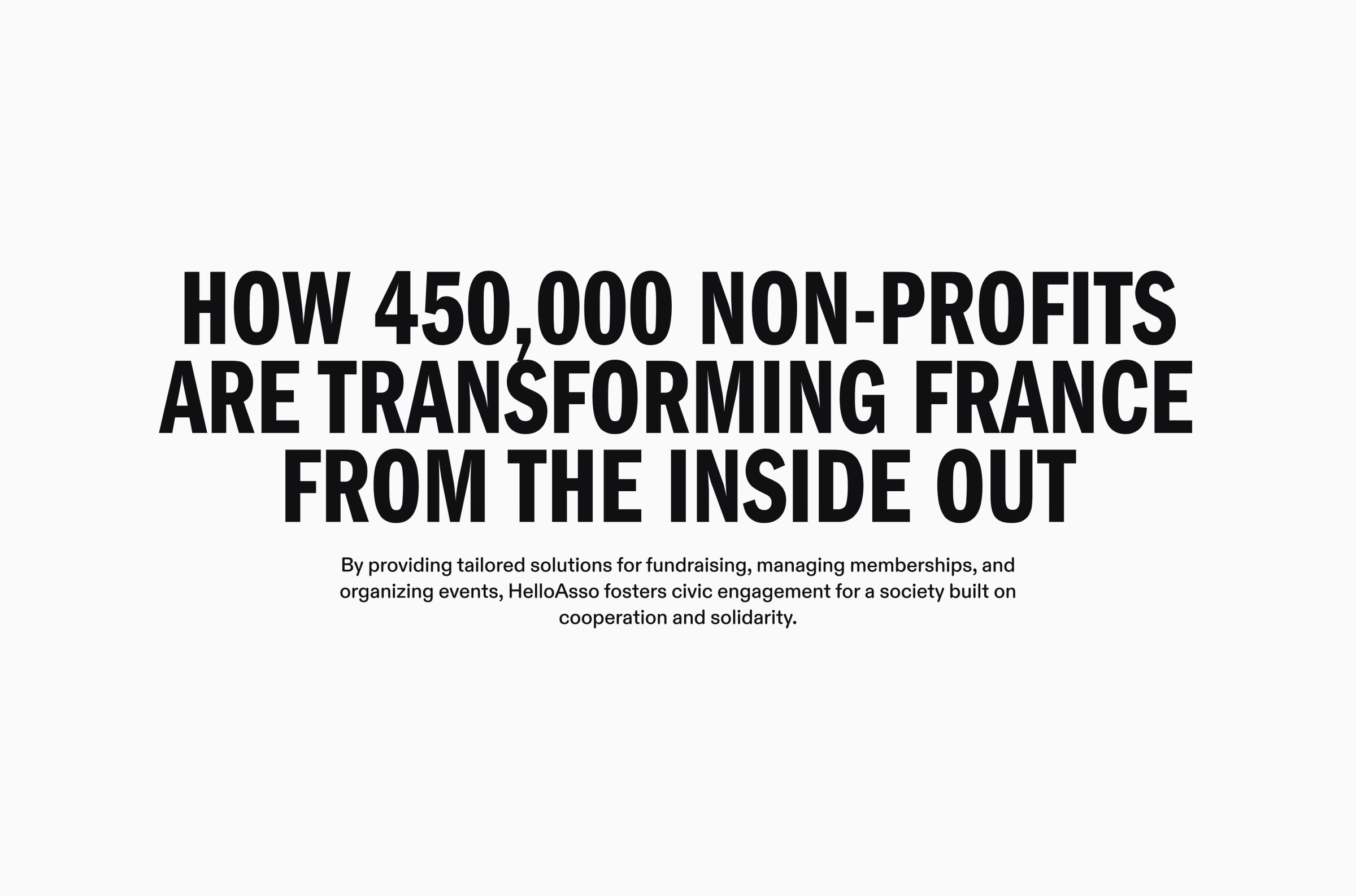
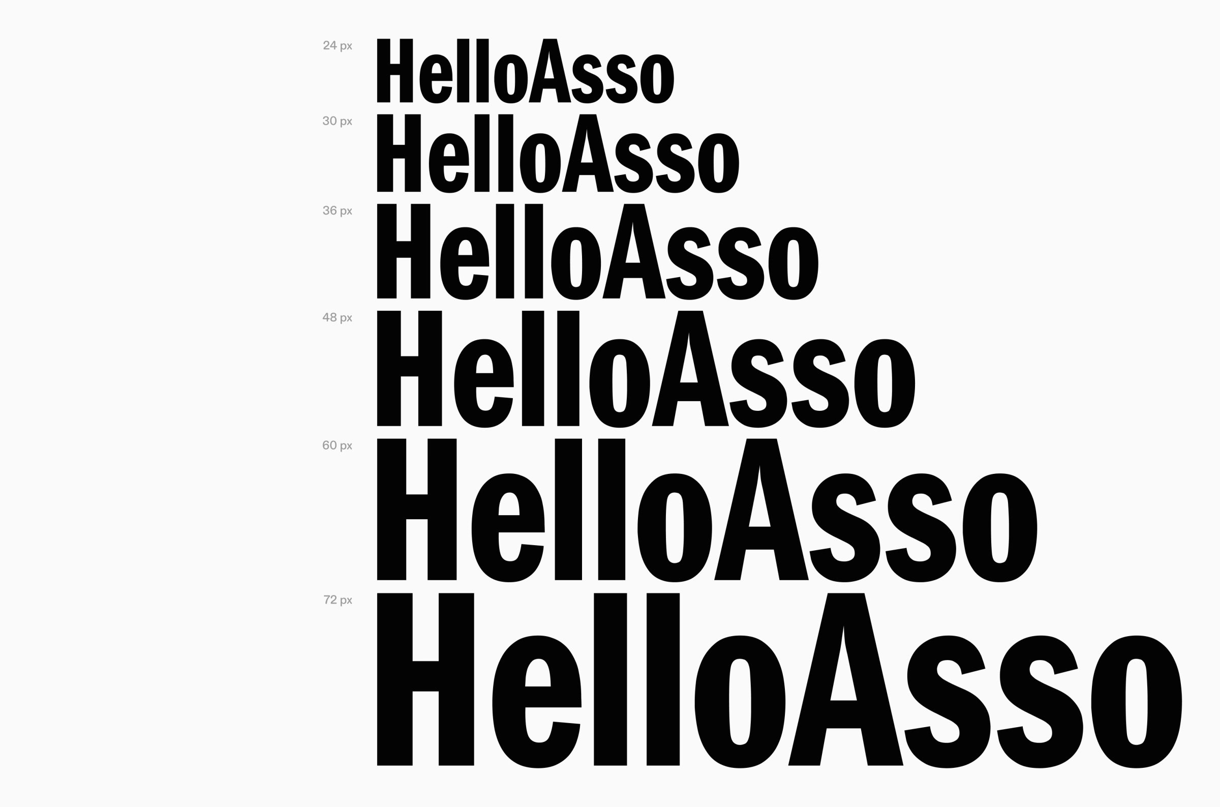
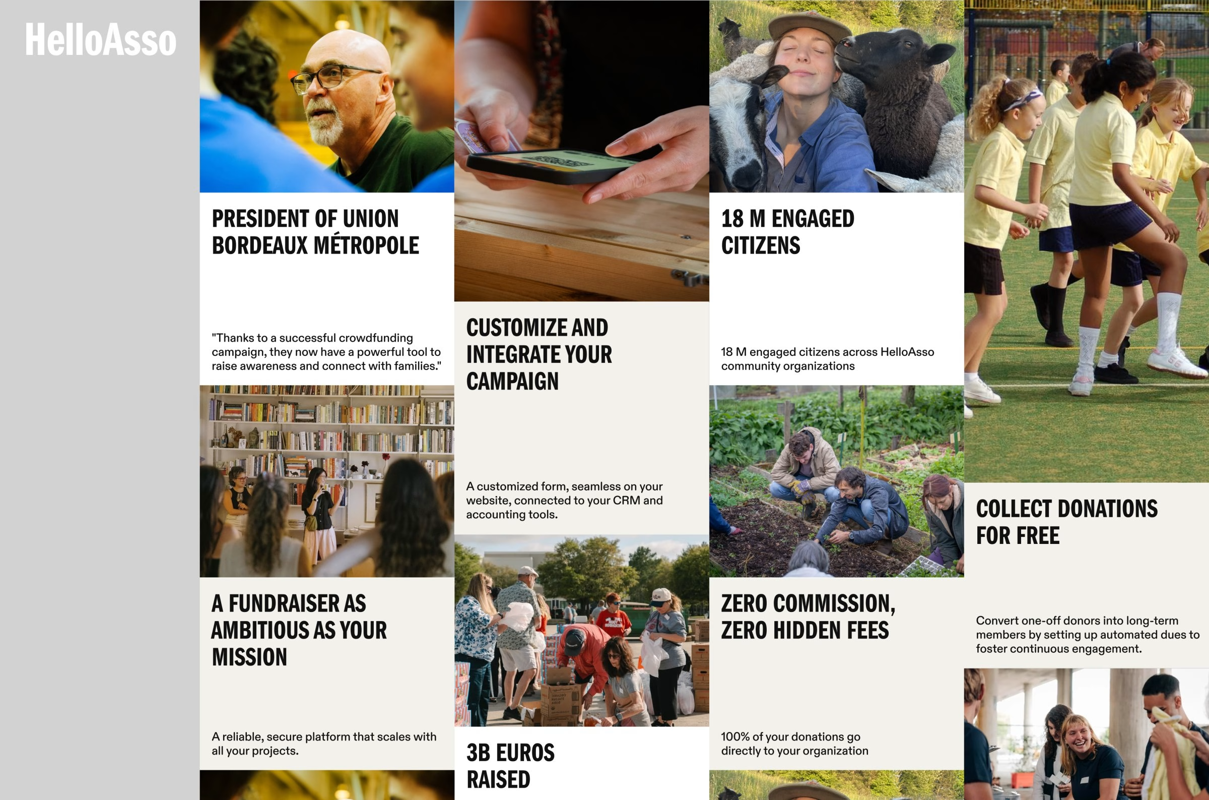
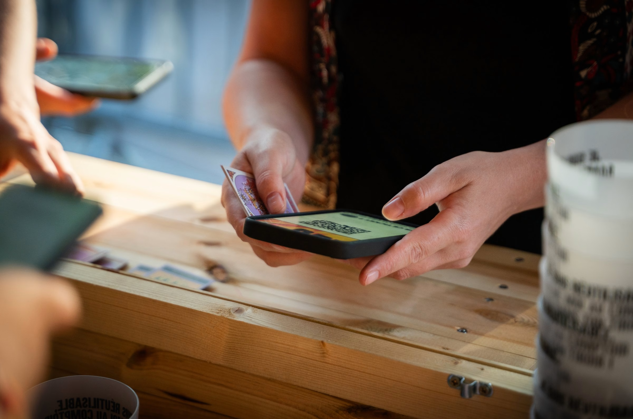
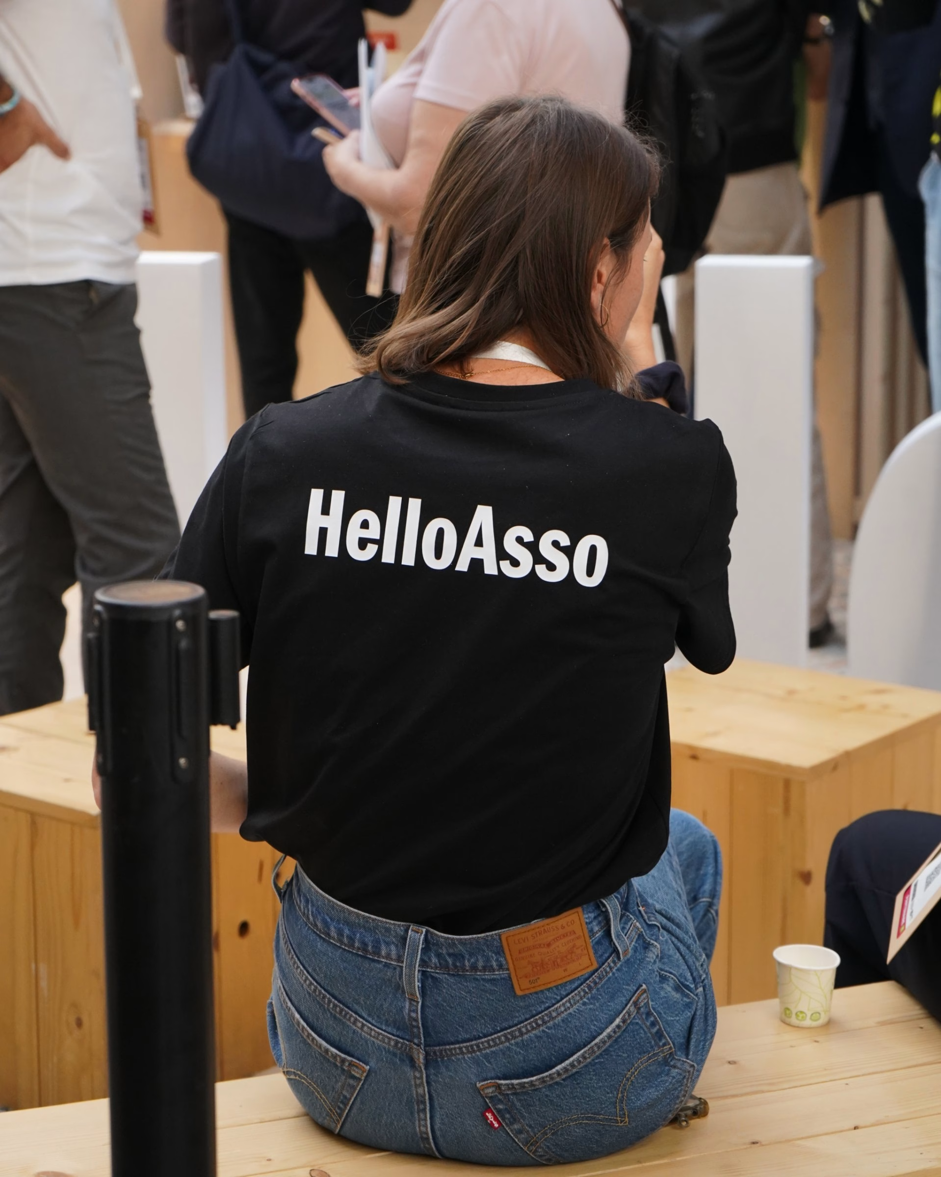
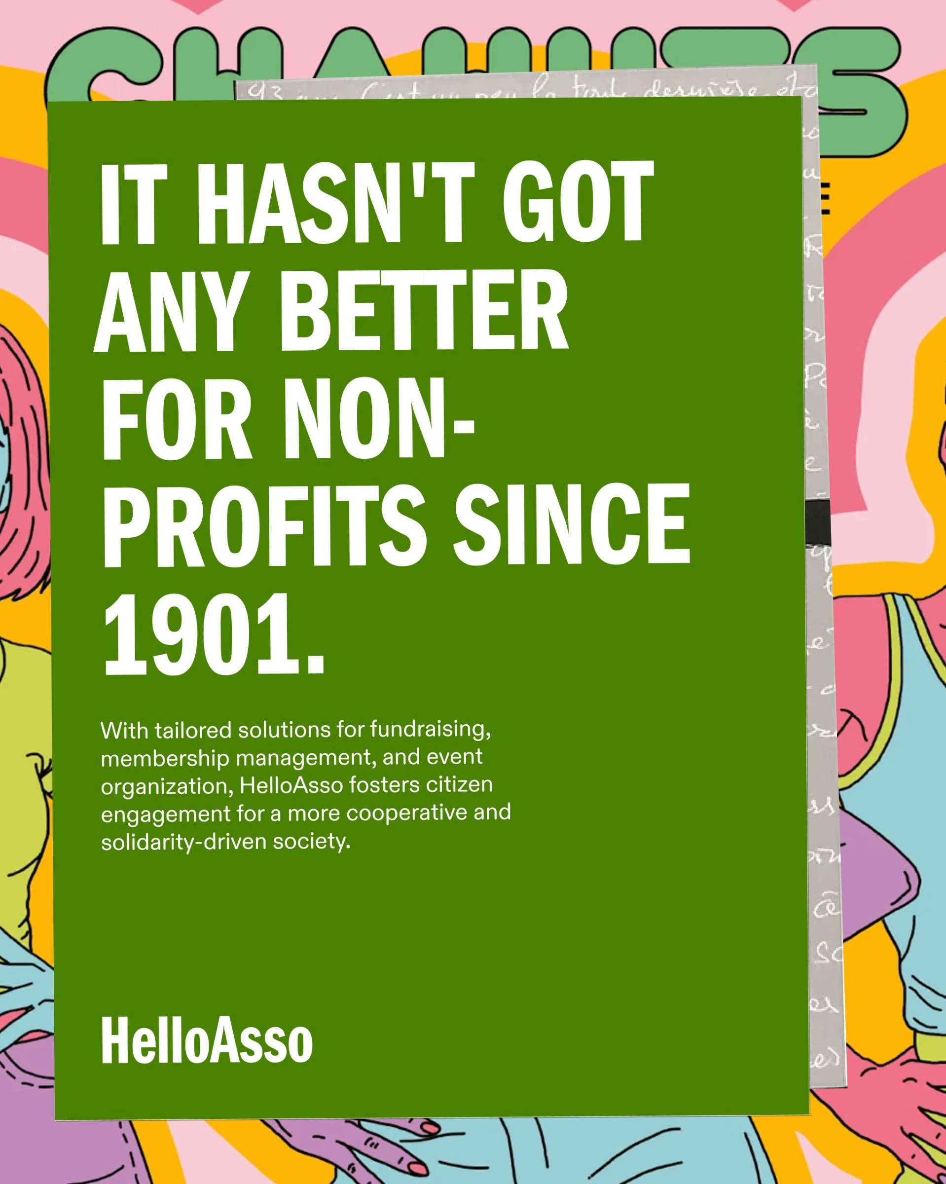
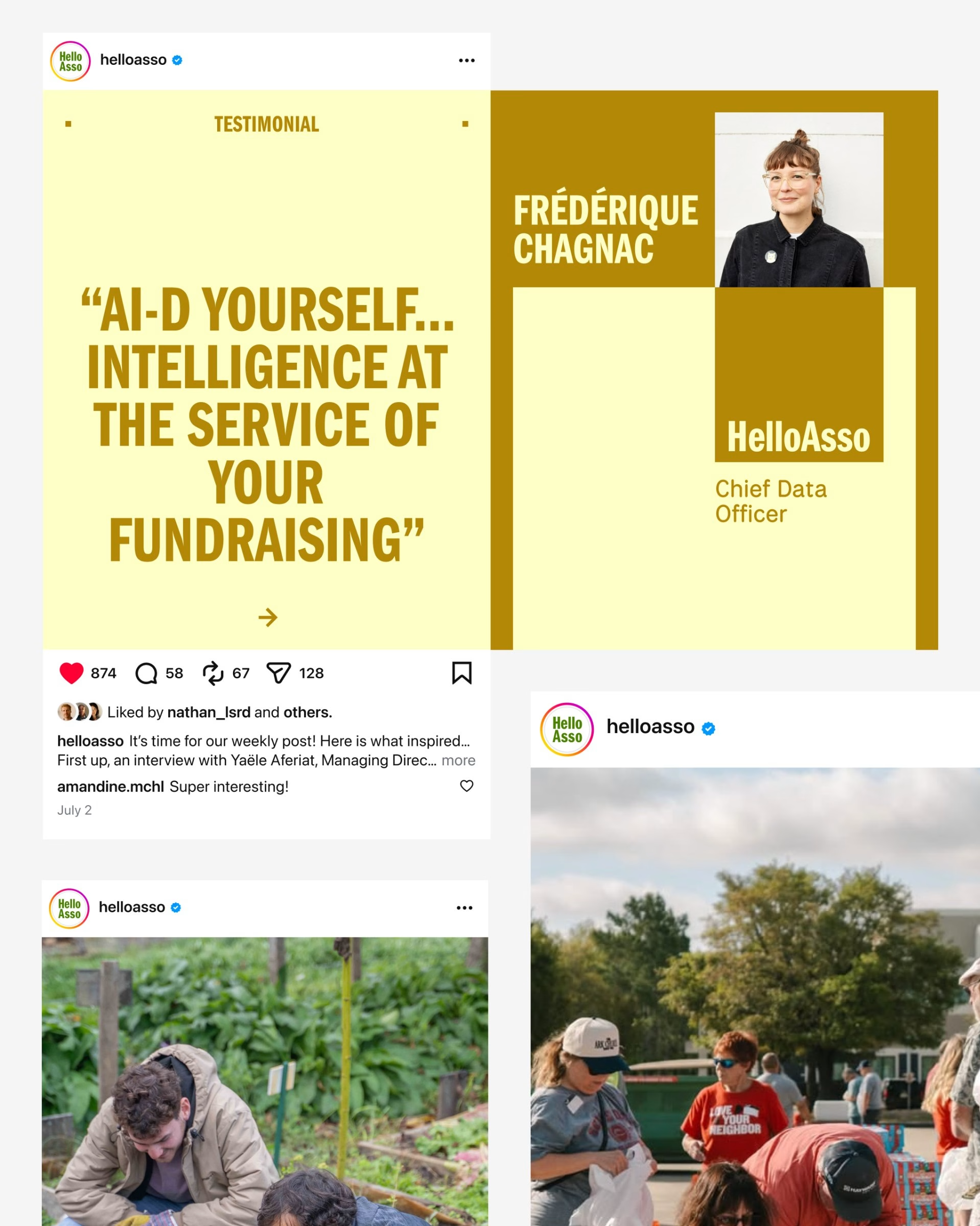
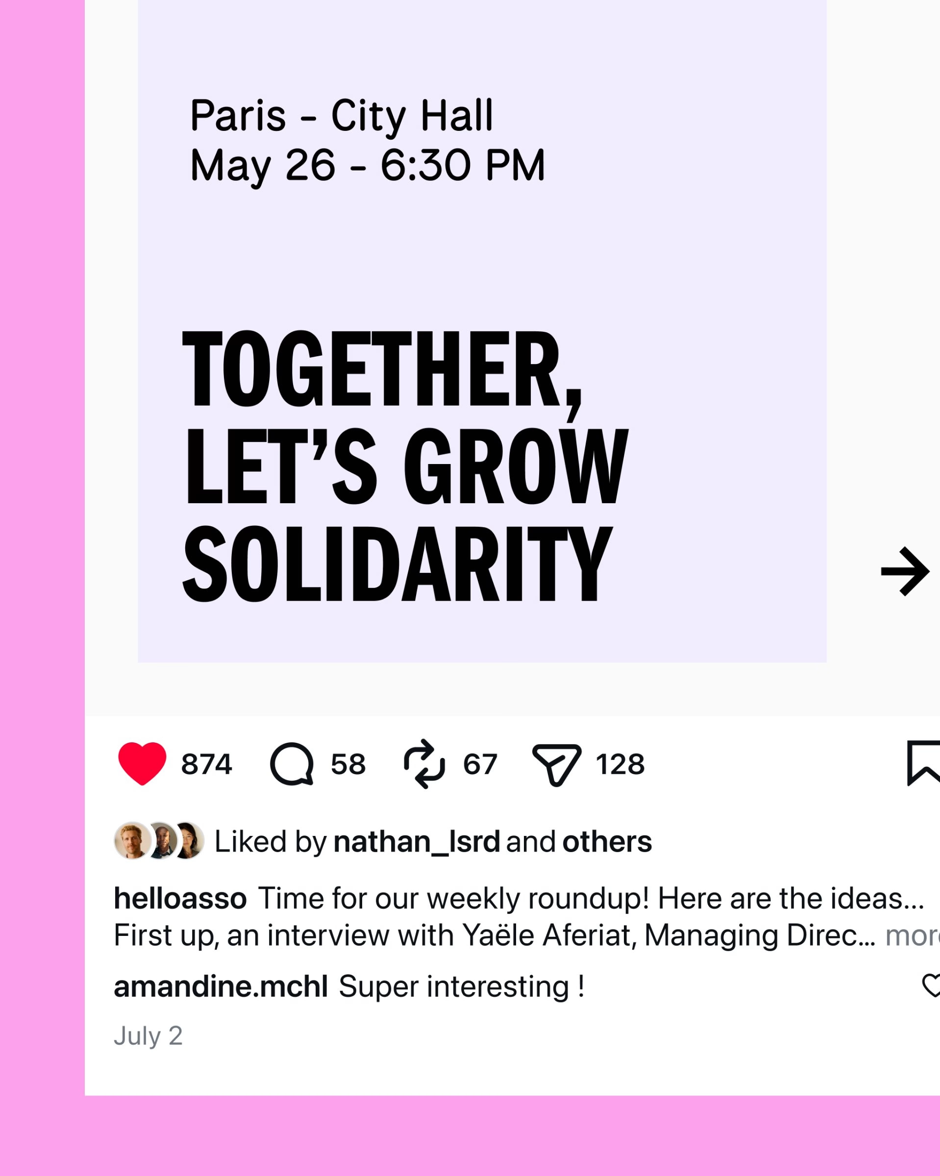
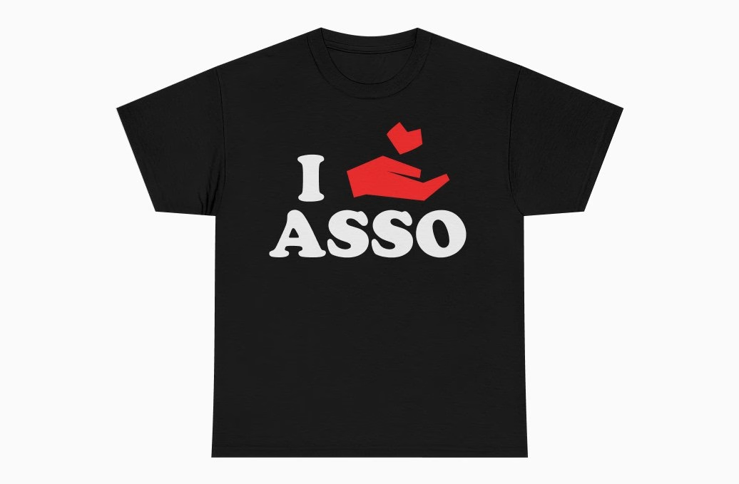
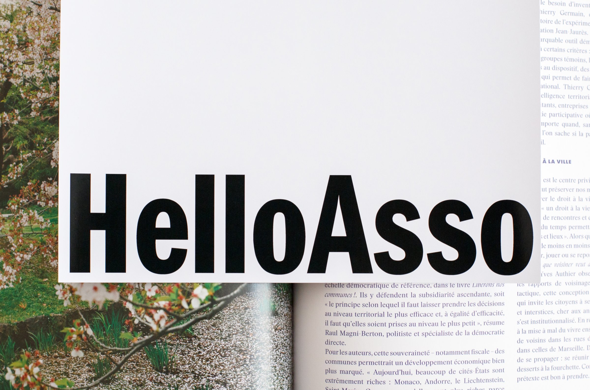
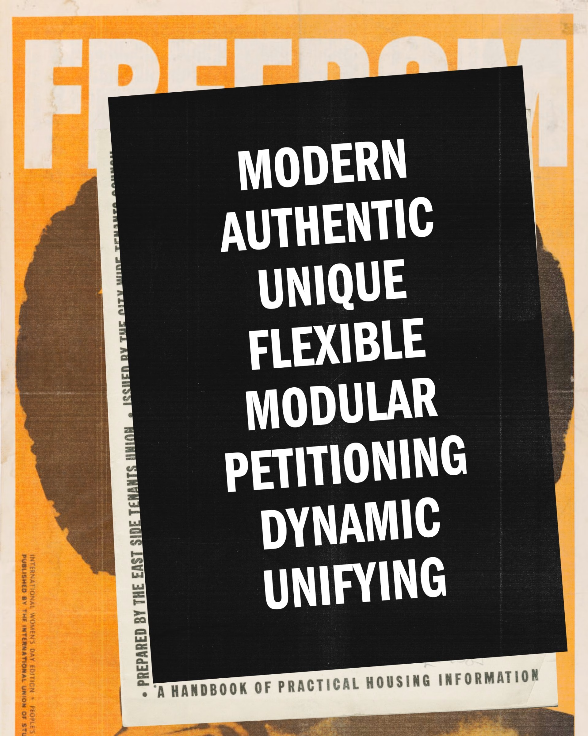
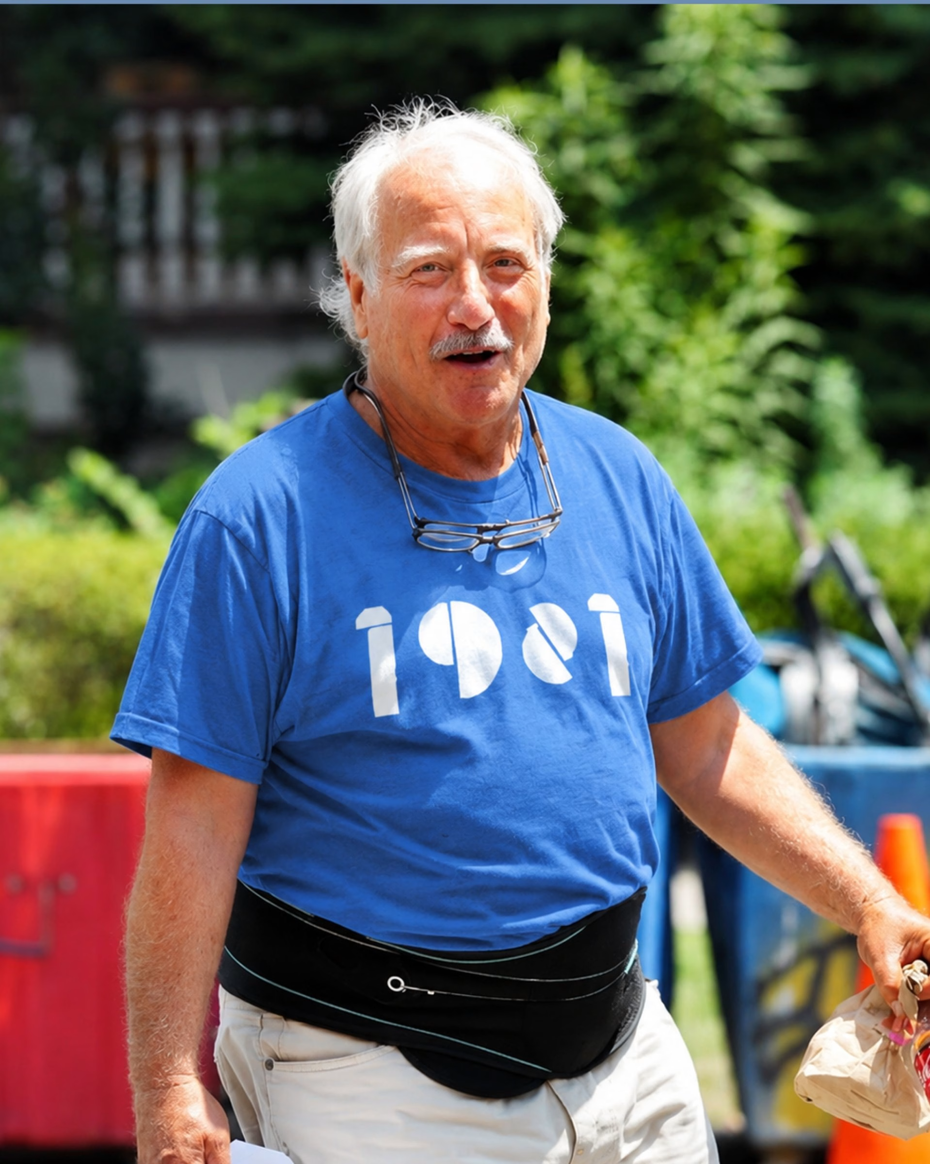
The starting point was that France's favourite brands are brands with values. HelloAsso is entirely free and built on solidarity, so it needed a face, a style and a world people could see themselves in. The result is a boldly campaigning parent brand with assertive slogans, typography that echoes 1970s posters, unapologetic black and white, an extroverted colour palette and candid photography of real people.
The mosaic pattern is the key device. It reveals the individuals behind the collective, and one square splits in two to give the text room to spread out. It is the thread that ties the parent brand to each of its offers.
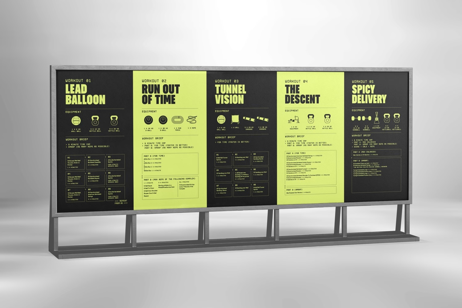
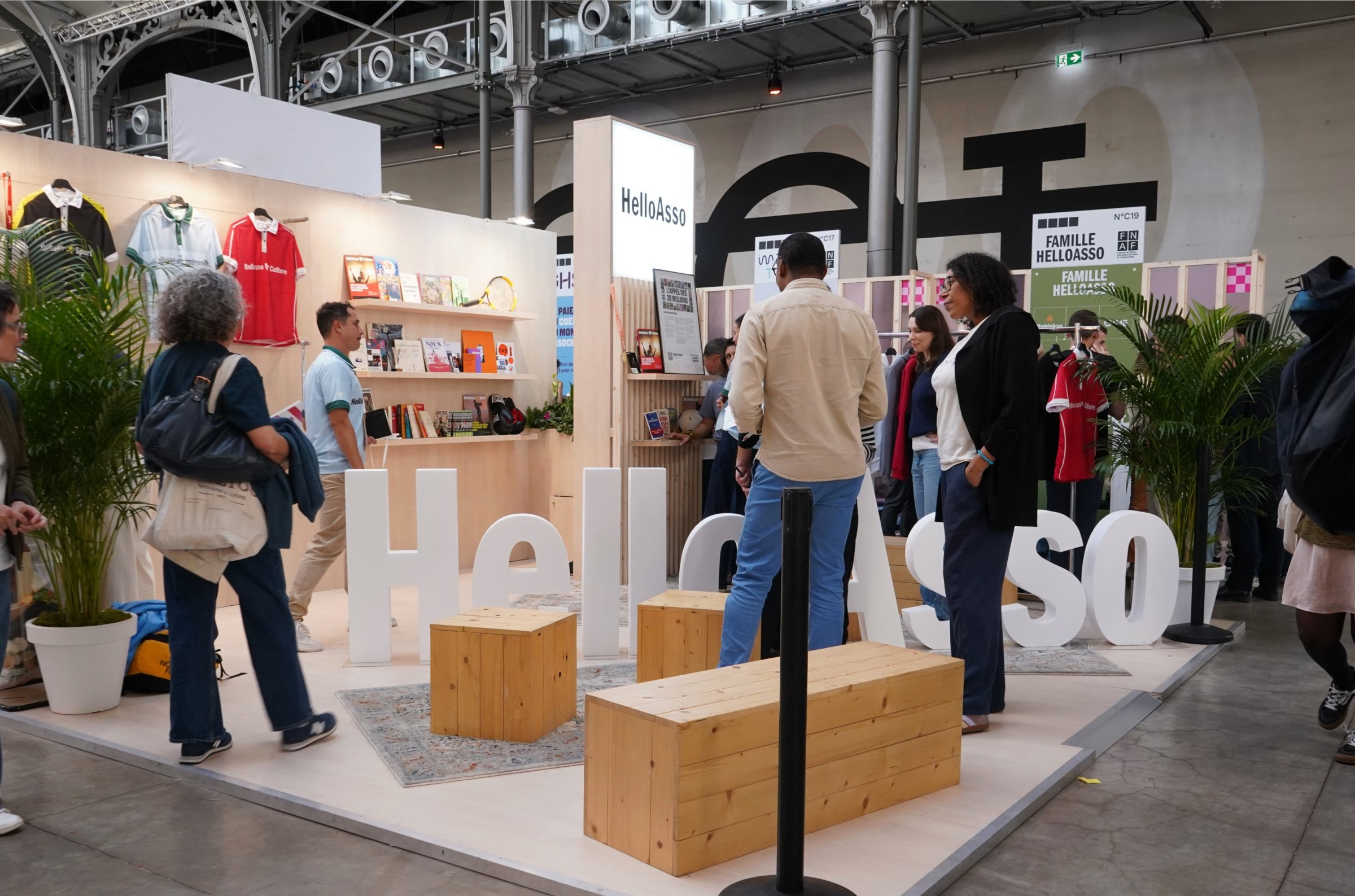
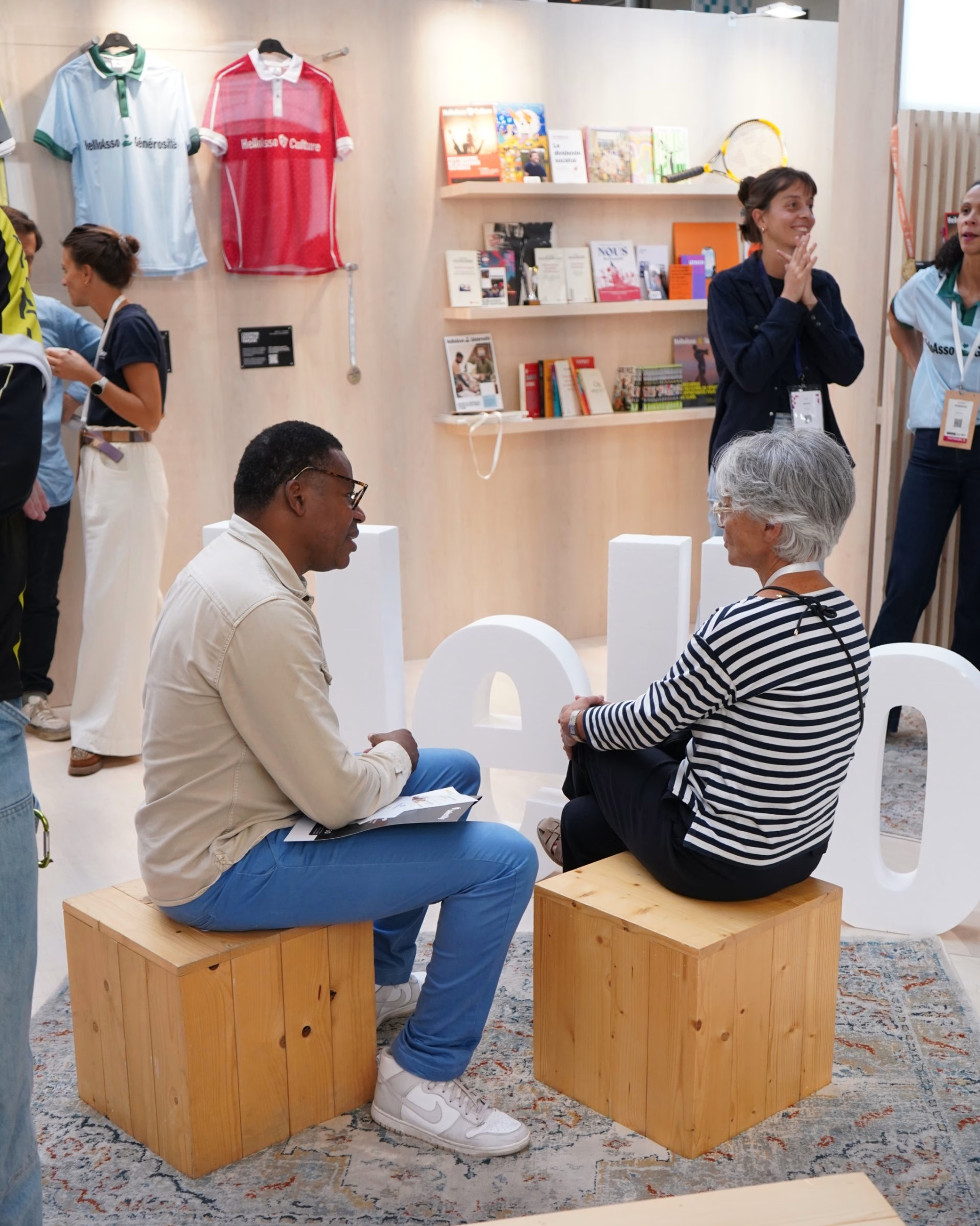
The three offers, Sport, Generosity and Culture, each carry their own personality and logo. HelloAsso Sport speaks the language of the pitch with an energetic lime yellow. HelloAsso Generosity is warmer, with natural colours and rounder layouts. HelloAsso Culture borrows from live performance, with theatre posters, a red, black and white palette and mosaic variations arranged in theatre-style banners. The HelloAsso Fund sits closest to the parent brand, in black and white without the green.
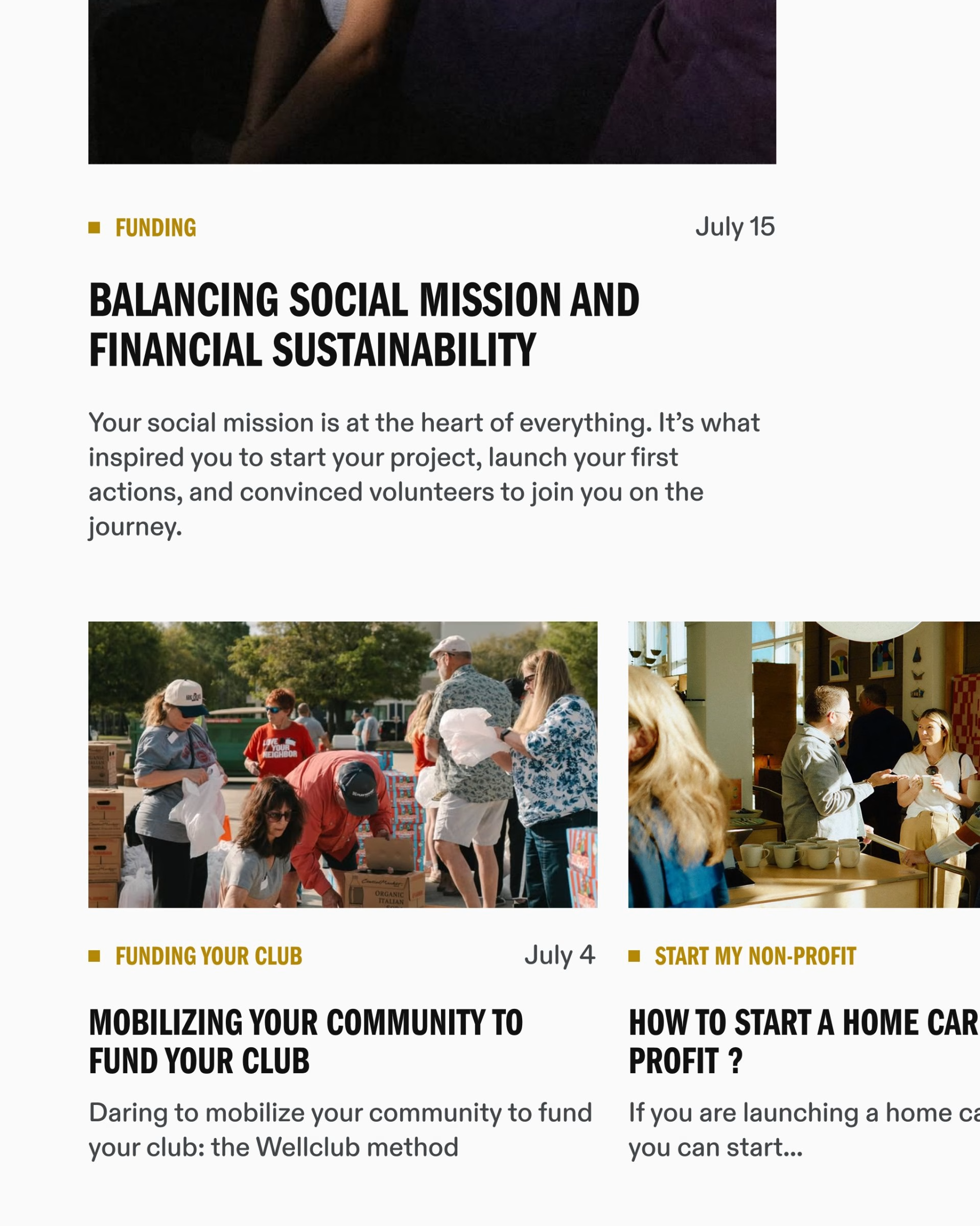
To give HelloAsso's teams a working reference, the brand identity guidelines live in an online brandbook, partly open to the public.
Credits: Bruno
Design & Creative Direction: Bruno
Executive Direction: Barthélémy Chalvet
Creative Direction: Pierre Jeannelle
Art Direction: Laura Dalex
Graphic Design: Florian Serre
Copywriting: Léa Texier
Web Design: Tony Lixivel
Web Development: Louis Prochwicz
Motion Design: Maël Masson
Illustration: Florian Becquet
Includes freebie bundle, unseen BTS insights and more.