


Black Friday 50% off Plus
Unlock InsightsBlack Friday 50% off Plus
Unlock Insights Menu


Pentagram
November 20, 2026
Mindsparkle Mag


“The Open Door will be the policy of this magazine.” Since 1912 that promise has guided Poetry, one of the most influential literary magazines in the English-speaking world. It gave Gwendolyn Brooks an early home, carried some of Carl Sandburg’s most important work and introduced readers to T. S. Eliot’s “The Love Song of J. Alfred Prufrock.” More than a century on, it still mixes emerging and established writers working at the edge of both verse and prose.
Far fewer readers know the organisation behind it. From its Chicago headquarters, the Poetry Foundation also stages exhibitions, hosts events, runs a library and a digital archive and awards grants, all in service of one purpose: to transform lives through the power of words. Pentagram, led by partner Andrea Trabucco-Campos, has now overhauled the whole brand, bringing the foundation’s programmes, grants, events and publications into one system for the first time.
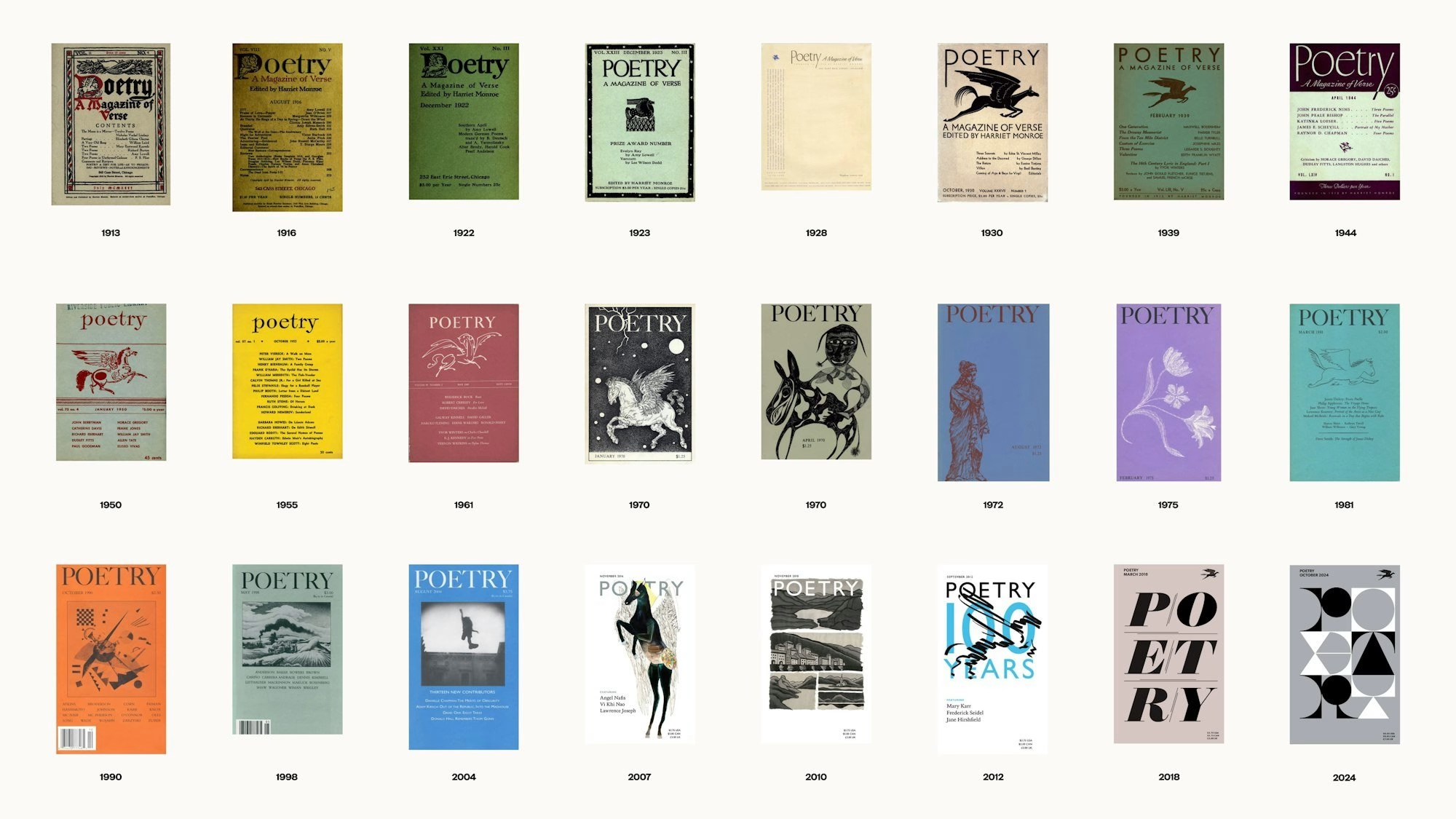
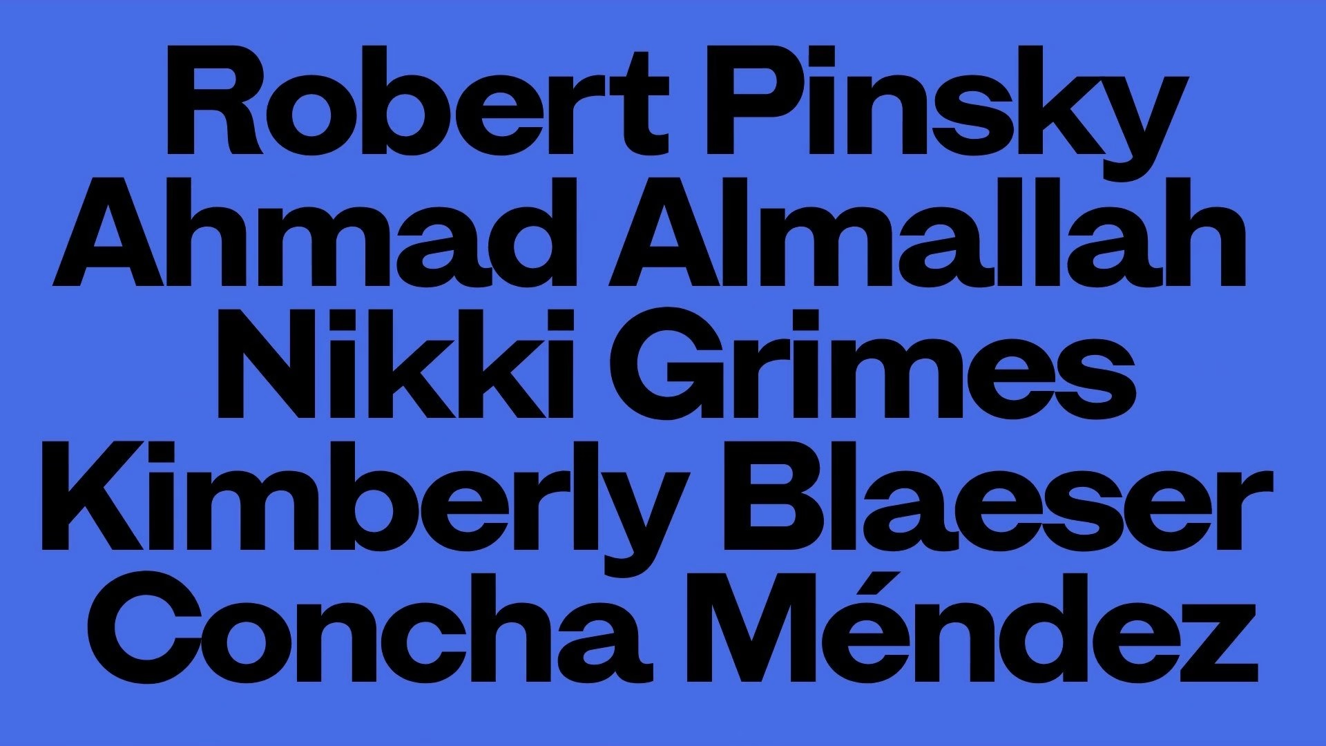
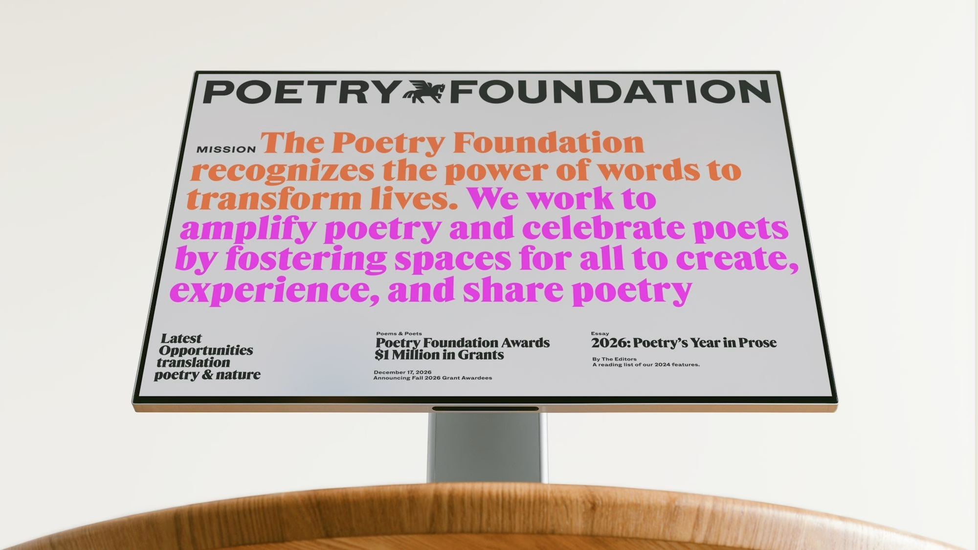
The new brand takes on a stubborn stereotype head-on: that poetry is elitist or old-fashioned. Surprising colour and dynamic layouts recast the foundation, and poetry in general, as a living part of contemporary culture rather than a museum piece. As Poetry editor Adrian Matejka puts it, the design reflects the magazine’s commitment to presenting “the cornucopia of contemporary poetry,” from the poems themselves to the poets and the communities around them.
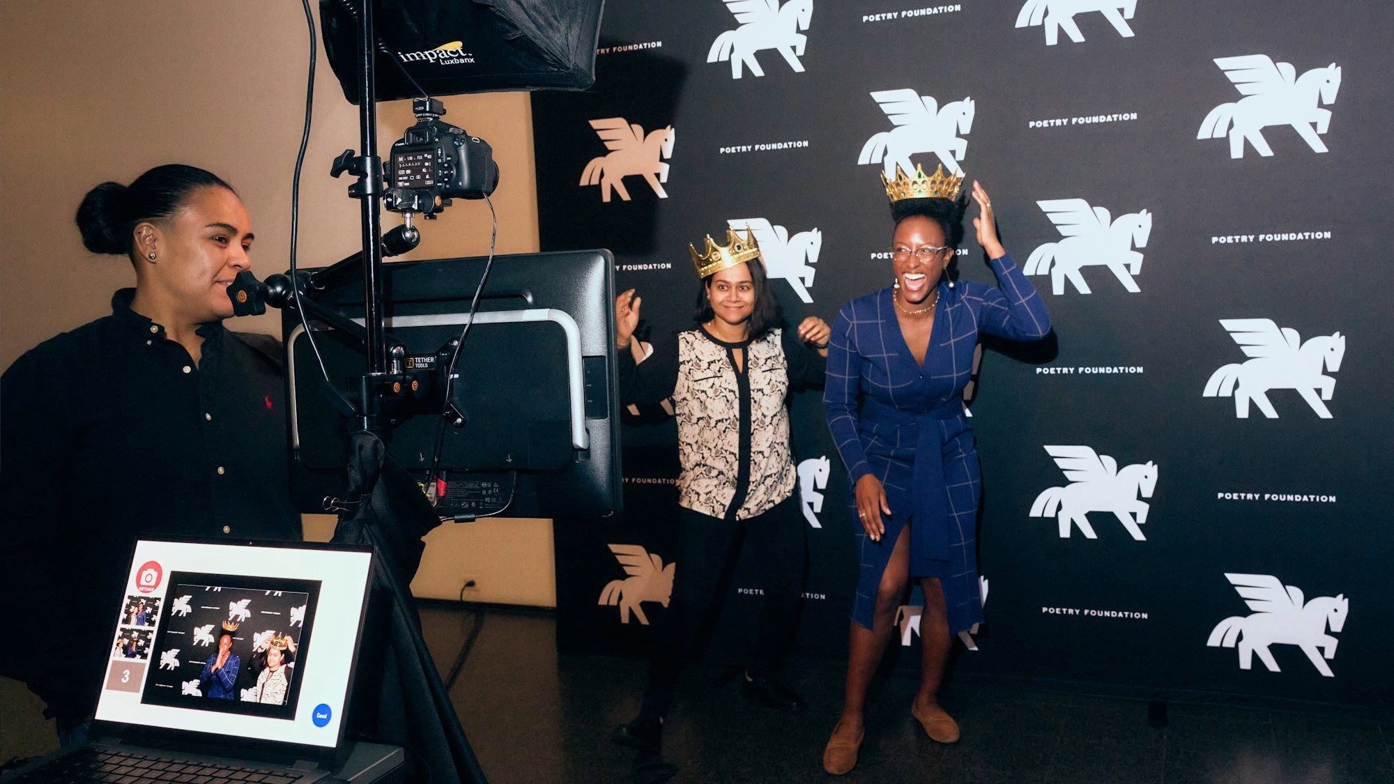
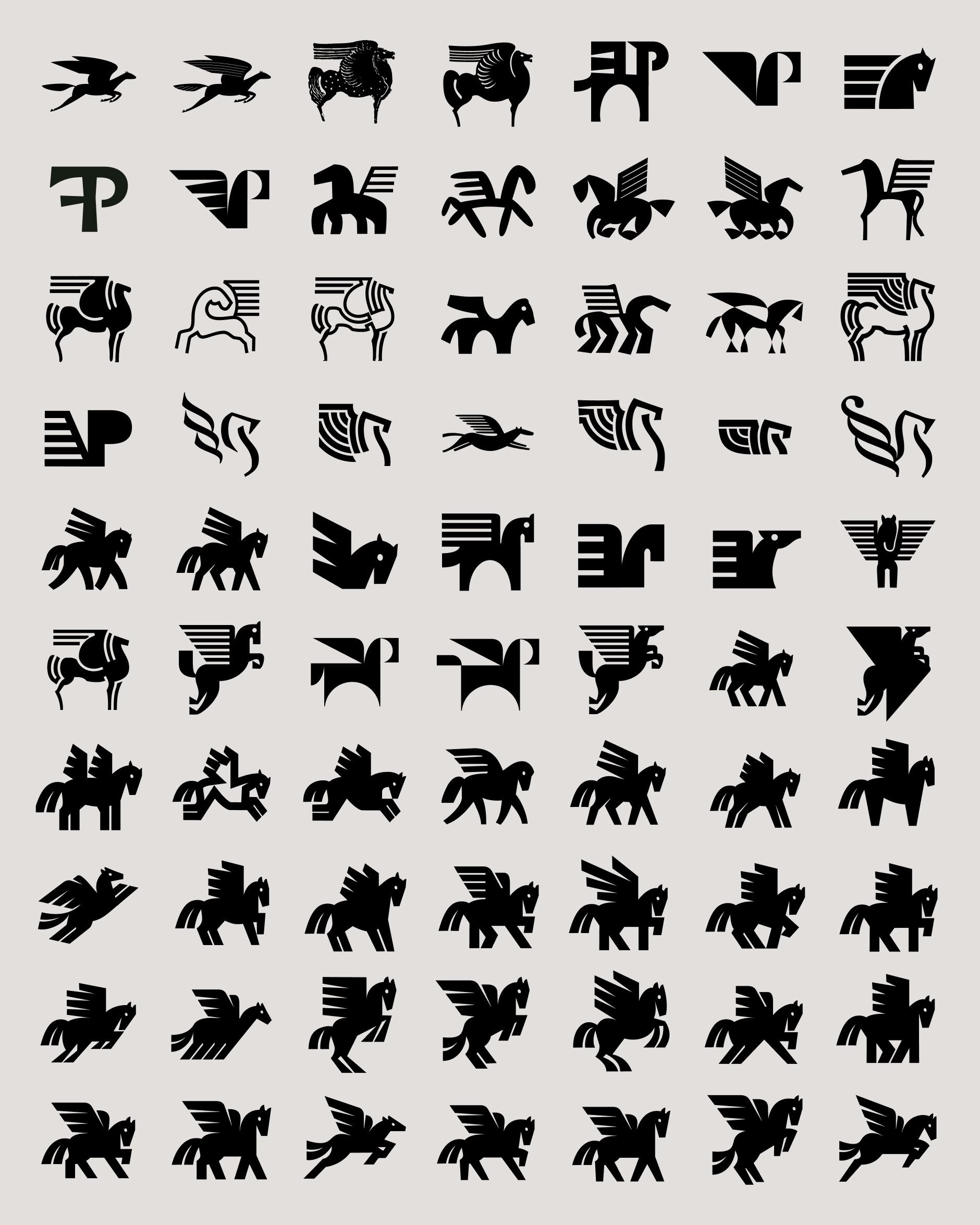
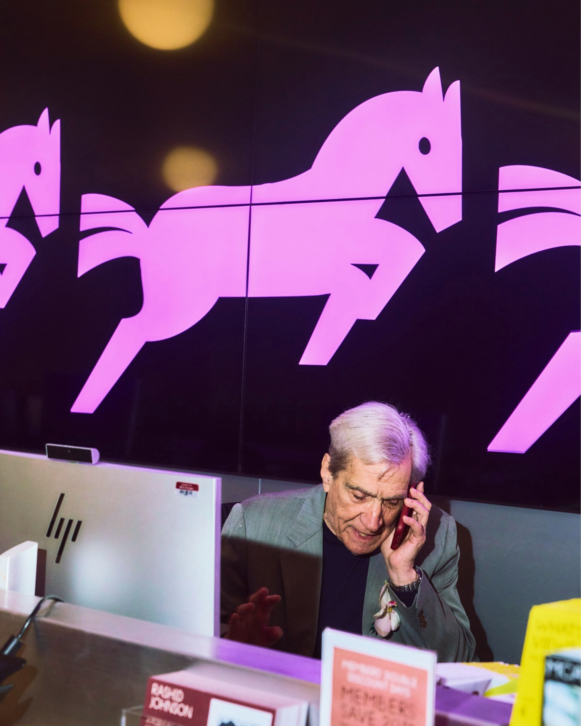
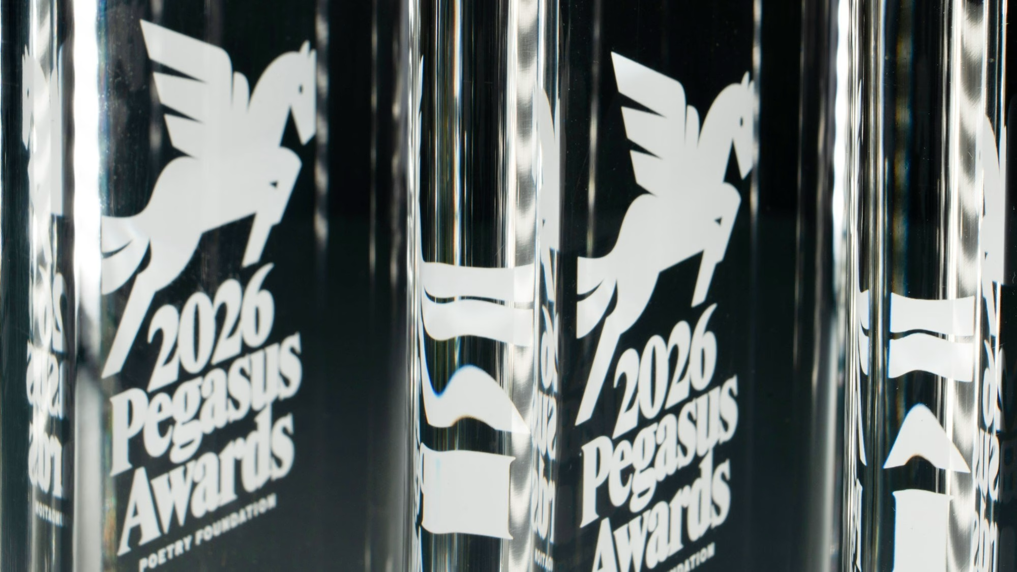
The face of the new identity is an old friend. The Pegasus has long been associated with Poetry magazine, and Pentagram redrew it as a true logo for the entire organisation, full of personality and now appearing in four poses: standing, rearing, galloping and in flight. The symbol was made to work at every touchpoint, from the spine of a book to the facade of the Chicago headquarters, so that wherever the winged horse appears, the foundation is at work.
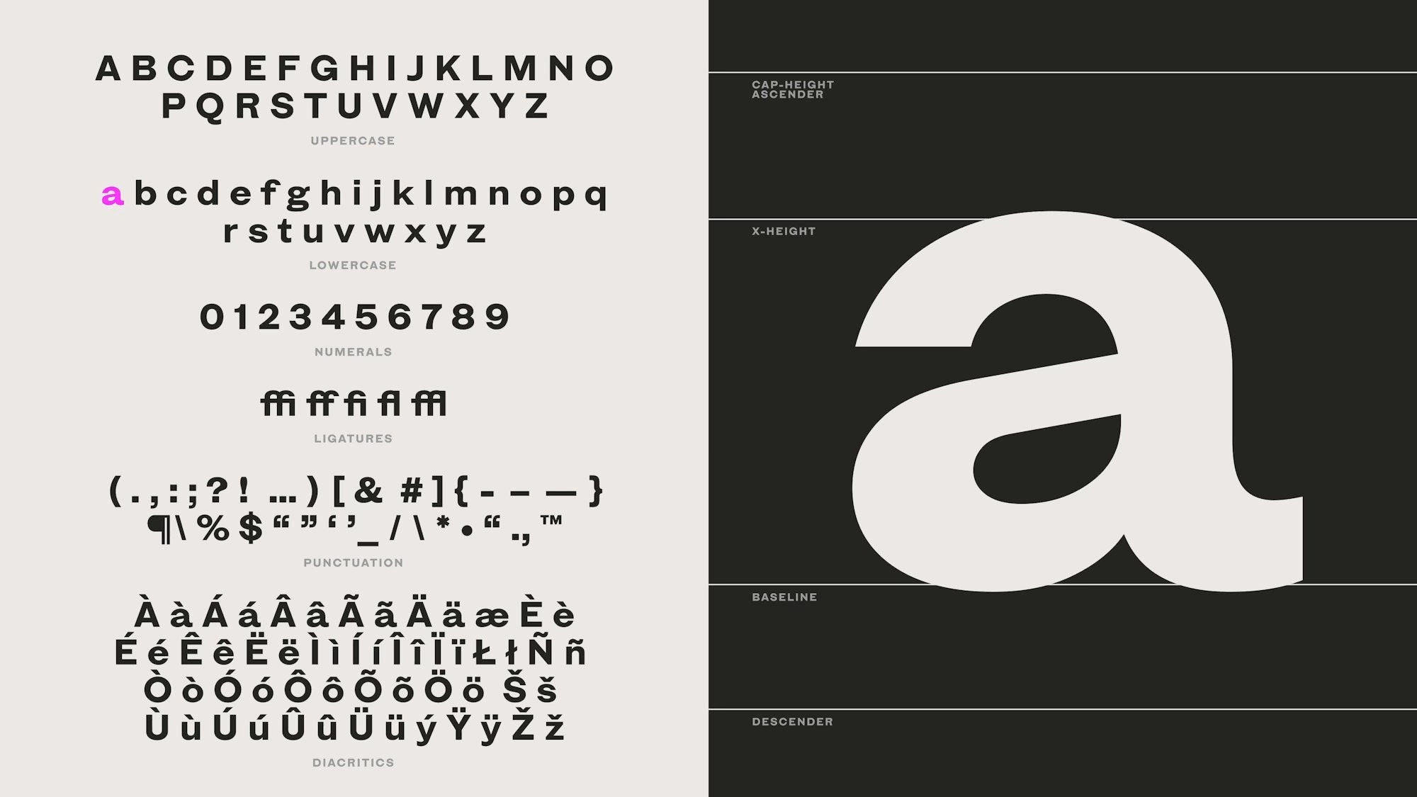
Type does much of the heavy lifting. The team looked to the vernacular lettering of the “City of the Big Shoulders,” as Carl Sandburg described Chicago in Poetry in 1914, and drew Times Gothic, a bespoke sans-serif redrawn from scans of a 1906 American Type Founders specimen. Type designer Shiva Nallaperumal was then commissioned to extend it into a typeface family that balances warmth with bold, vernacular confidence, much like the city itself.
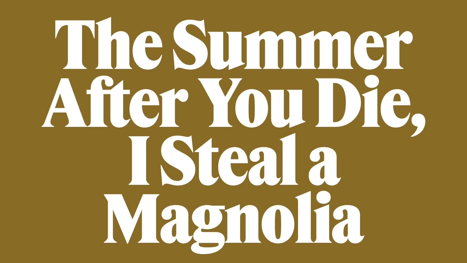
Instead of photography, the words of poets become the artwork. Lines, titles and names are set large and arranged along a central axis, a “stacking” motif that helps the foundation’s in-house design team produce consistent layouts quickly. The same logic carries from posters and screens to the website, so a reading series, a workshop and an exhibition all speak with one recognisable voice.
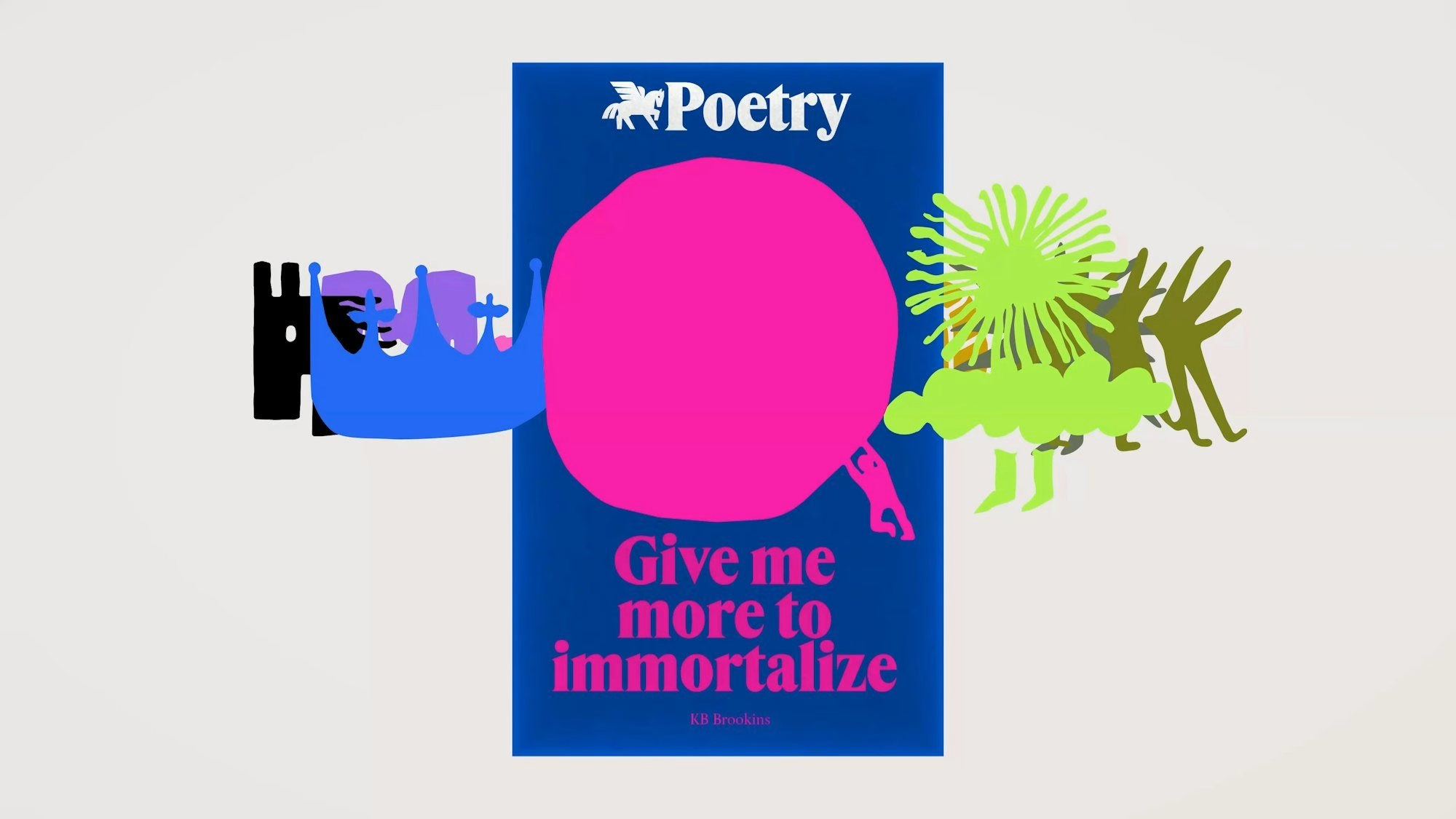
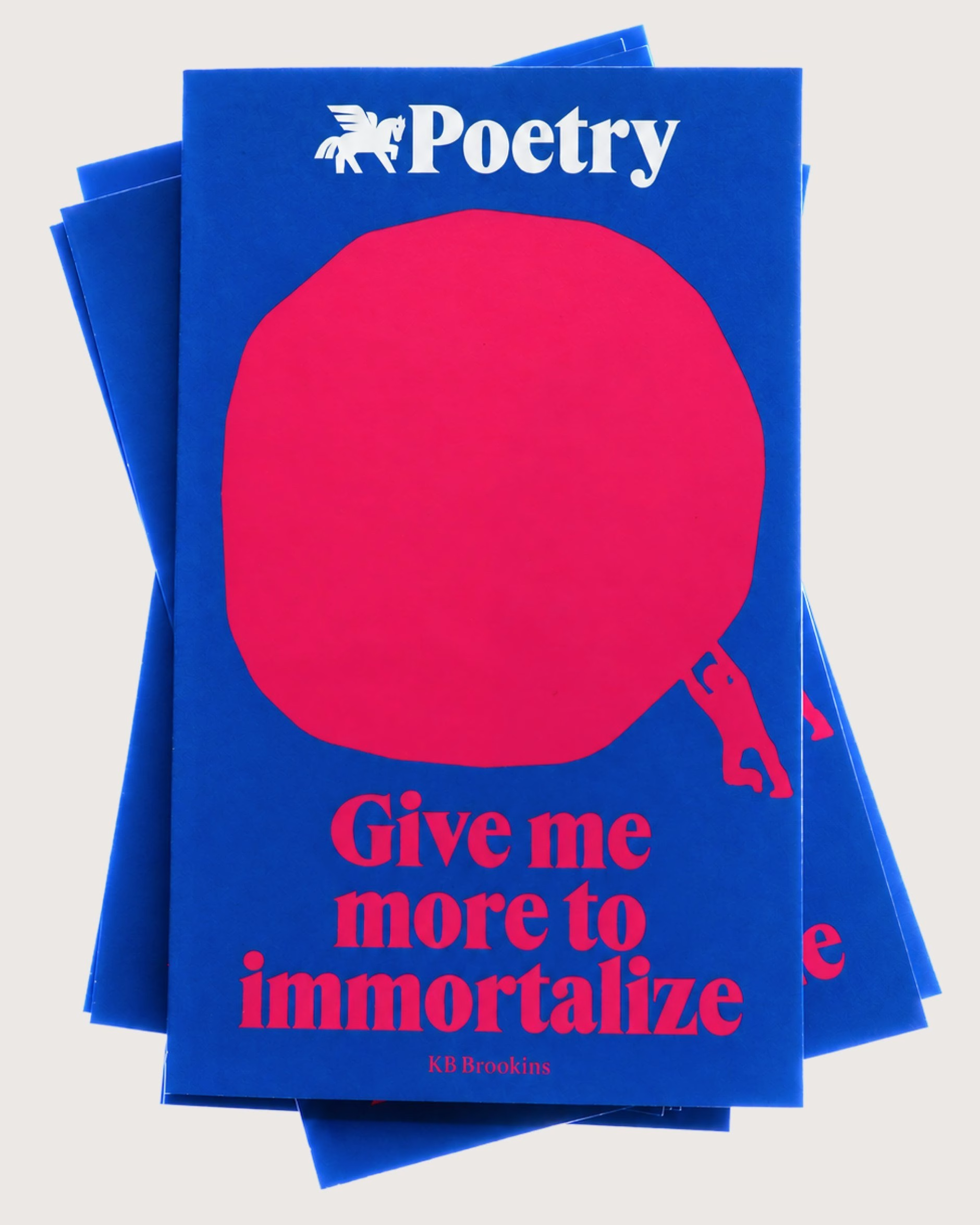
The project also continues Pentagram’s long relationship with the magazine itself. In 2016 partner Michael Bierut redesigned Poetry with a cover system that reimagined the word “poetry” on every issue, and the new covers pair a striking two-colour scheme with a line lifted from a poem inside, a modern take on the “Open Door” idea. The first issue carries a line from KB Brookins, “Give me more to immortalize,” while revised interior layouts make room for the nontraditional ways poets work with language today.
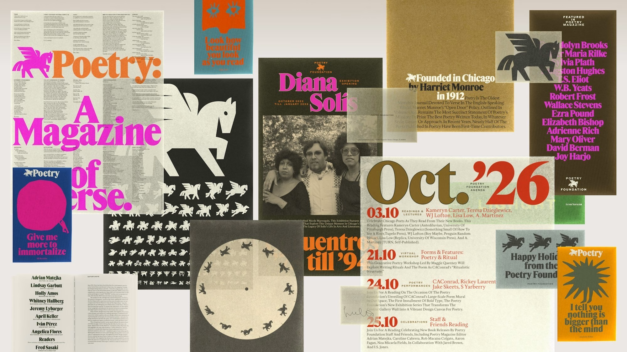
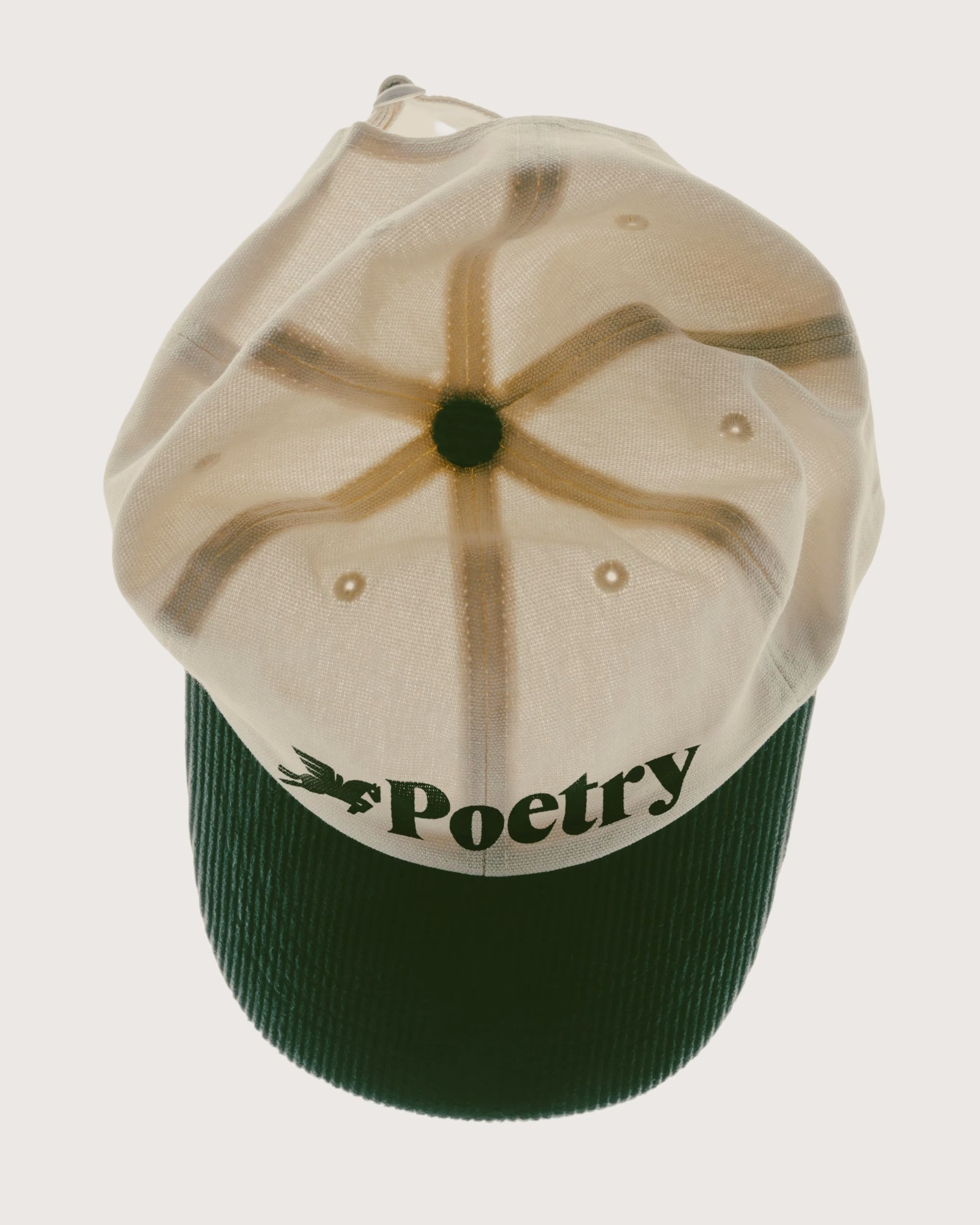
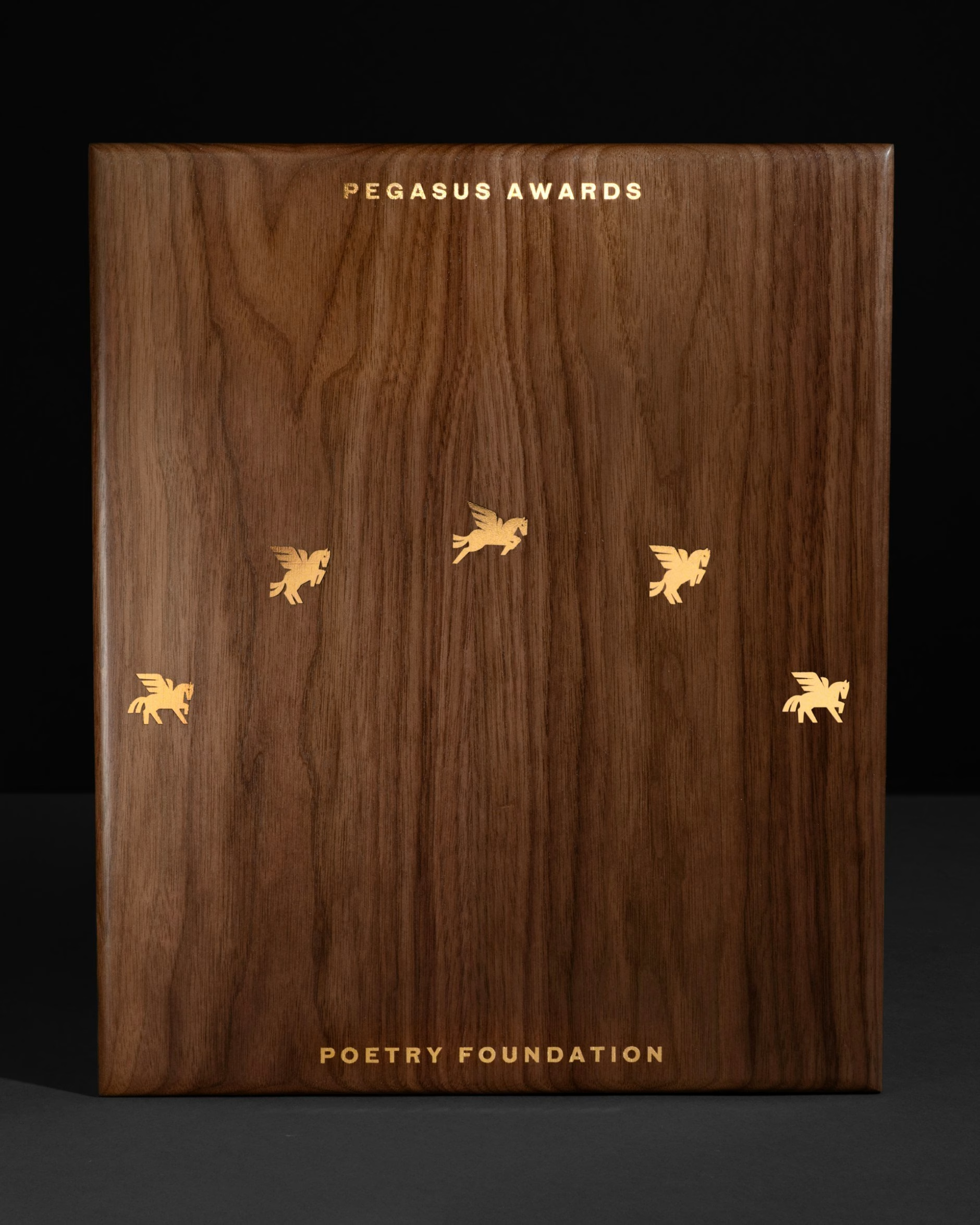
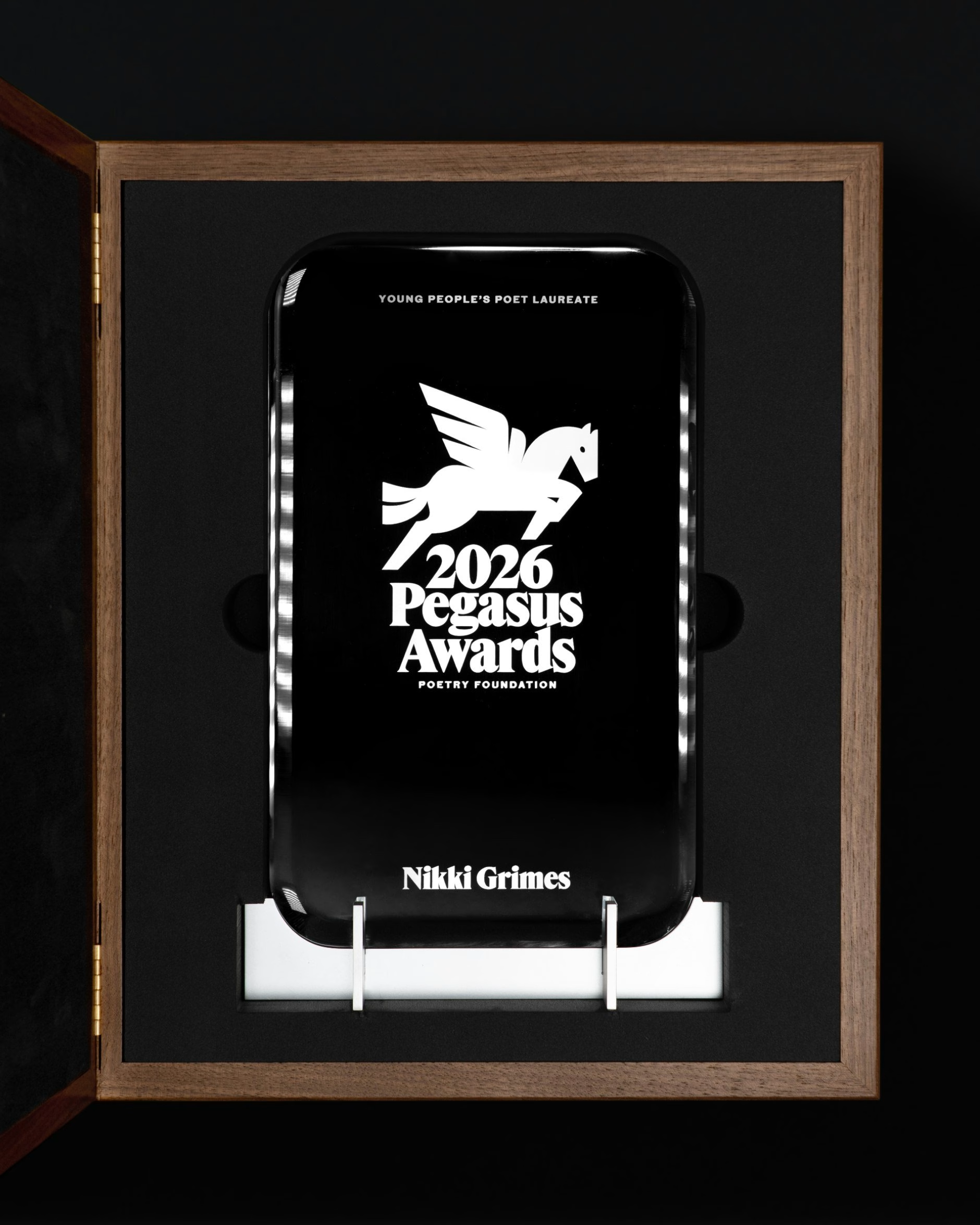
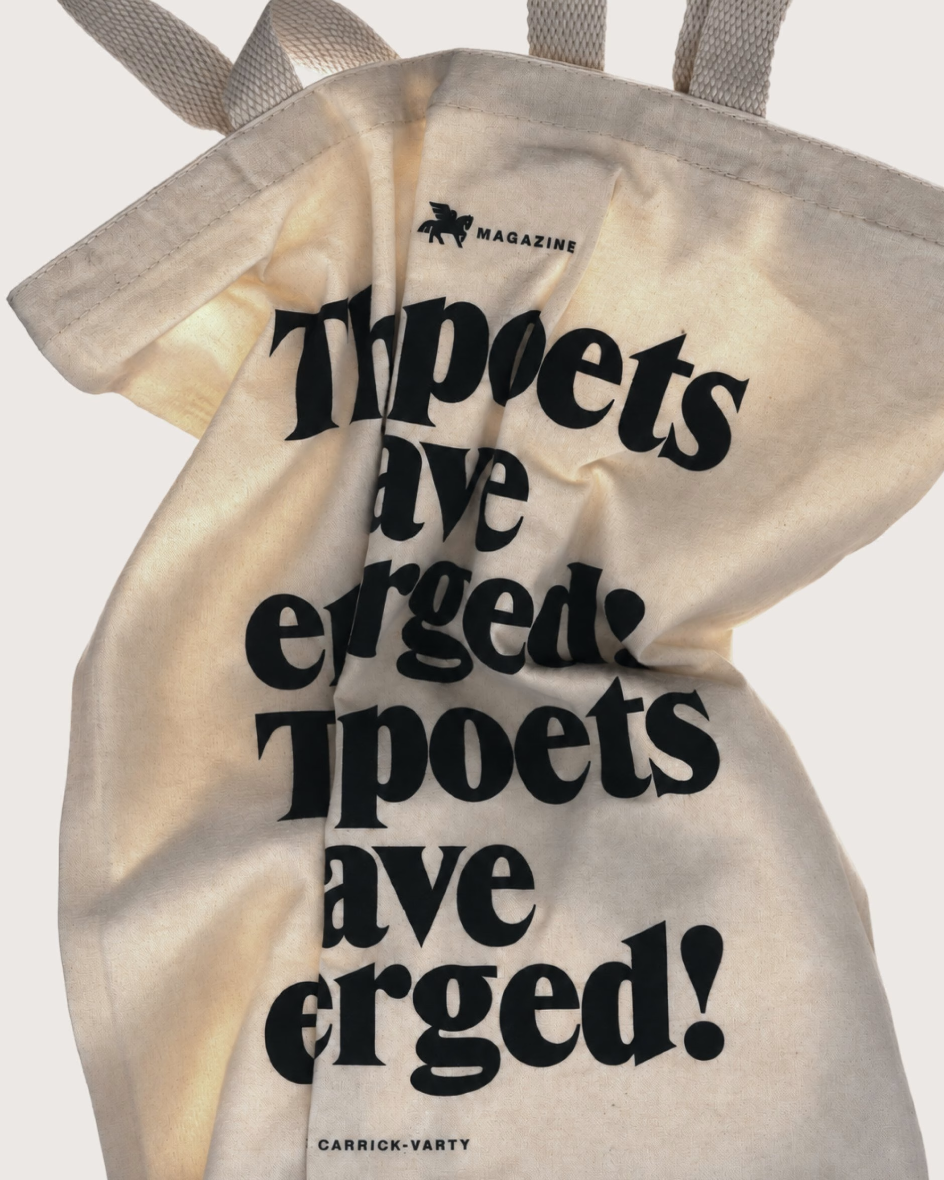
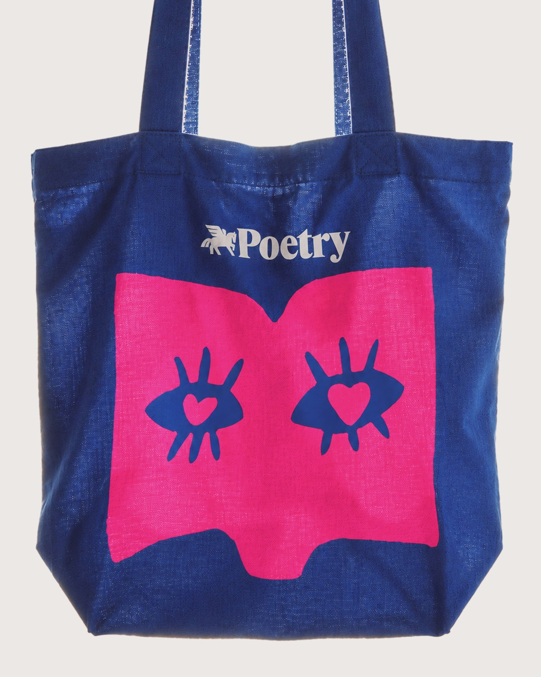
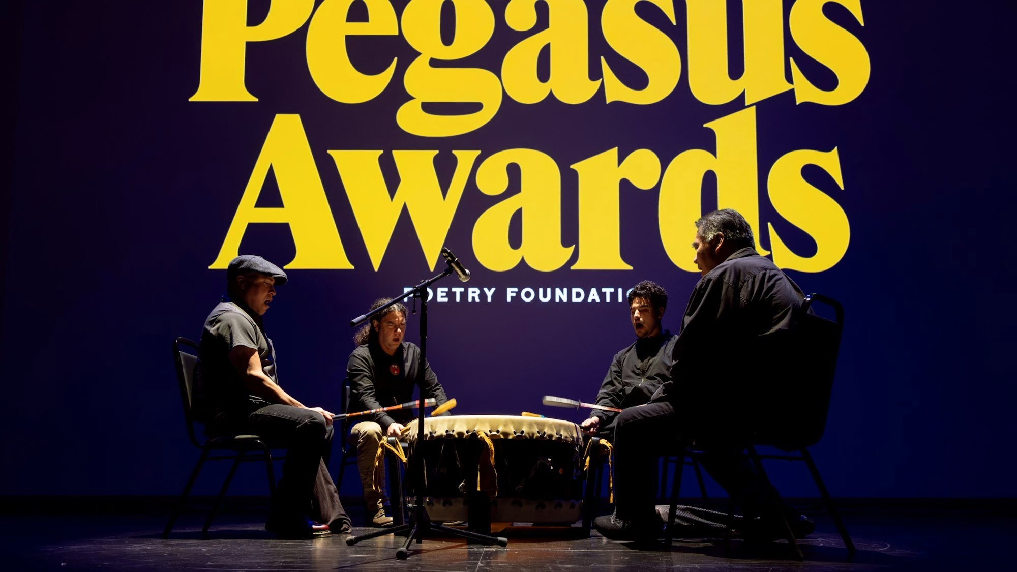
The visual language flexes from the expanse of a gallery wall to objects held in the hand, including the Pegasus Awards, the foundation’s annual literary prizes. Designed with Piotr Woronkowicz, the awards share the exact dimensions of Poetry magazine and gain depth through their materials, with a metal base that nods to Chicago’s architecture. Caps and tote bags carry the same voice into everyday life, which suits a brand built to open the foundation’s doors even wider.
Credits: Pentagram
Brand Identity & Type Design: Pentagram
Partner: Andrea Trabucco-Campos
Type Design: Shiva Nallaperumal
Award Design: Piotr Woronkowicz
Motion: Mallandrich
Project Team: Hui Zeng
Project Team: Mònica Losada
Project Team: Lauren Rush
Project Team: Pablo Nietos
Project Team: Sofia Flores
More in Brand Identity
Stay on top of this week's design. Insights, top picks & more.


 Plus