

 Plus

 Menu


Maria Marks Studio
November 09, 2026
Mindsparkle Mag


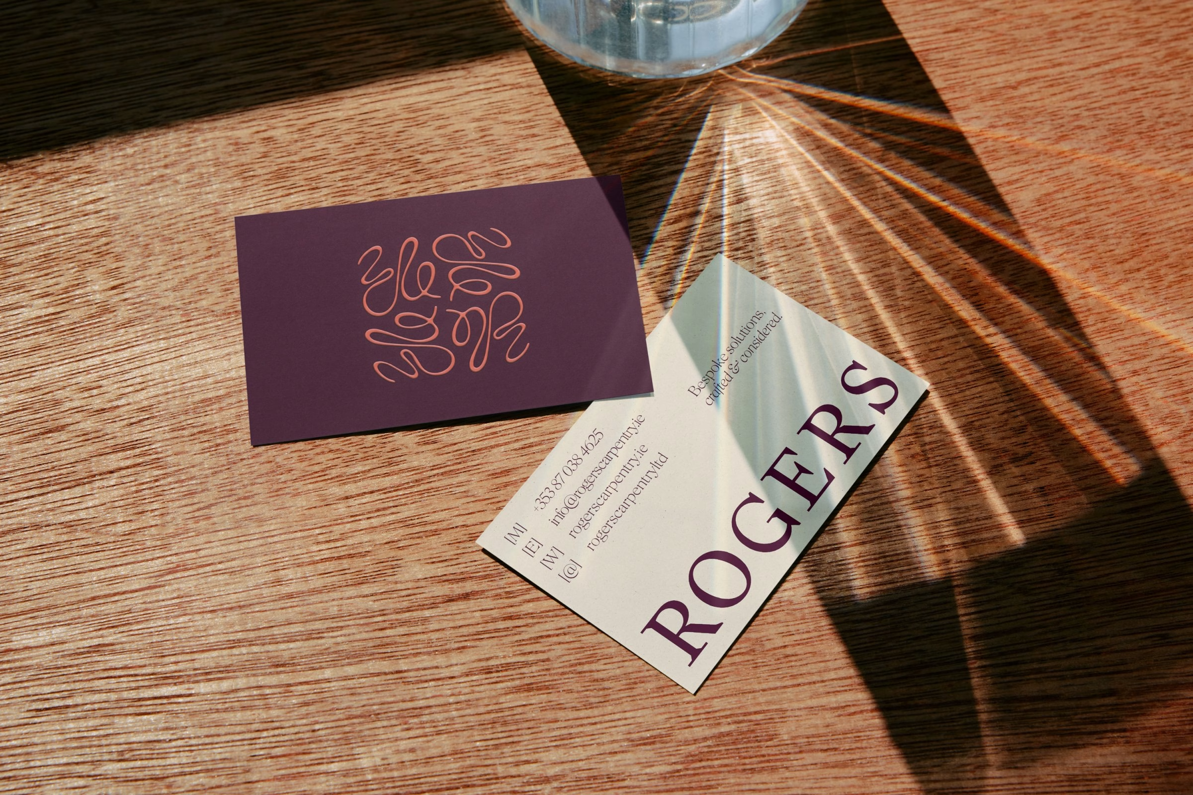
David Rogers is a master carpenter and a trained artist, and his brand had to carry both sides of that work. Maria Marks Studio set out to move Rogers Carpentry beyond the standard trade look, finding the balance between craftsman and artist that defines the business. The result is an identity built for a maker who is as much about the aesthetic as the build itself. Bespoke solutions, crafted and considered, is the tone the whole system is designed to hold.
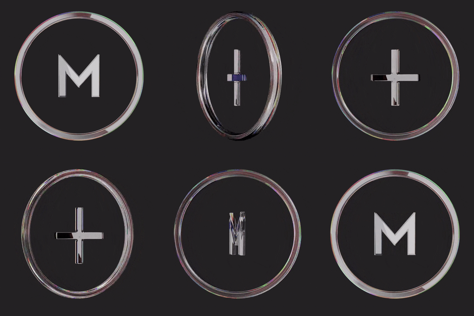
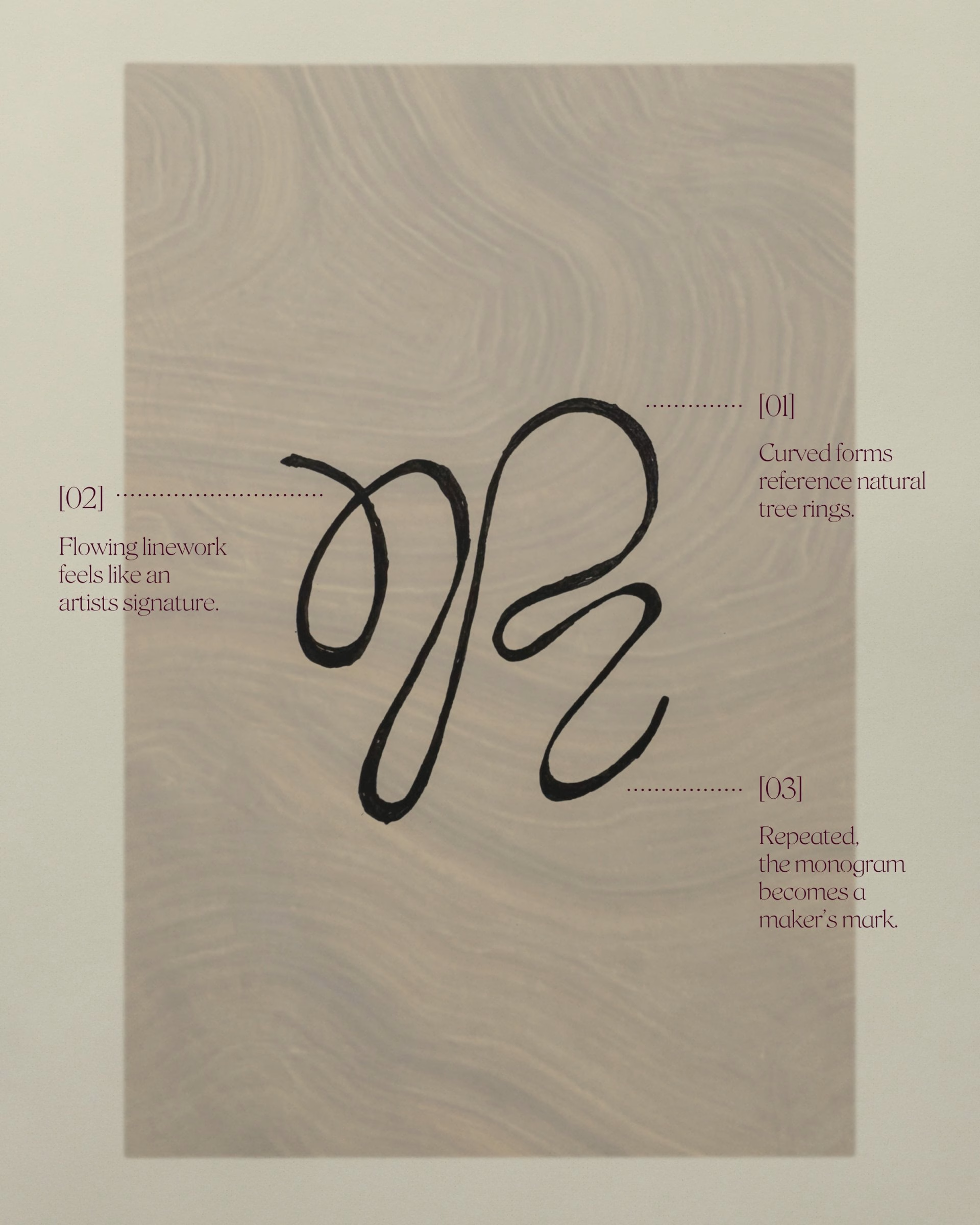
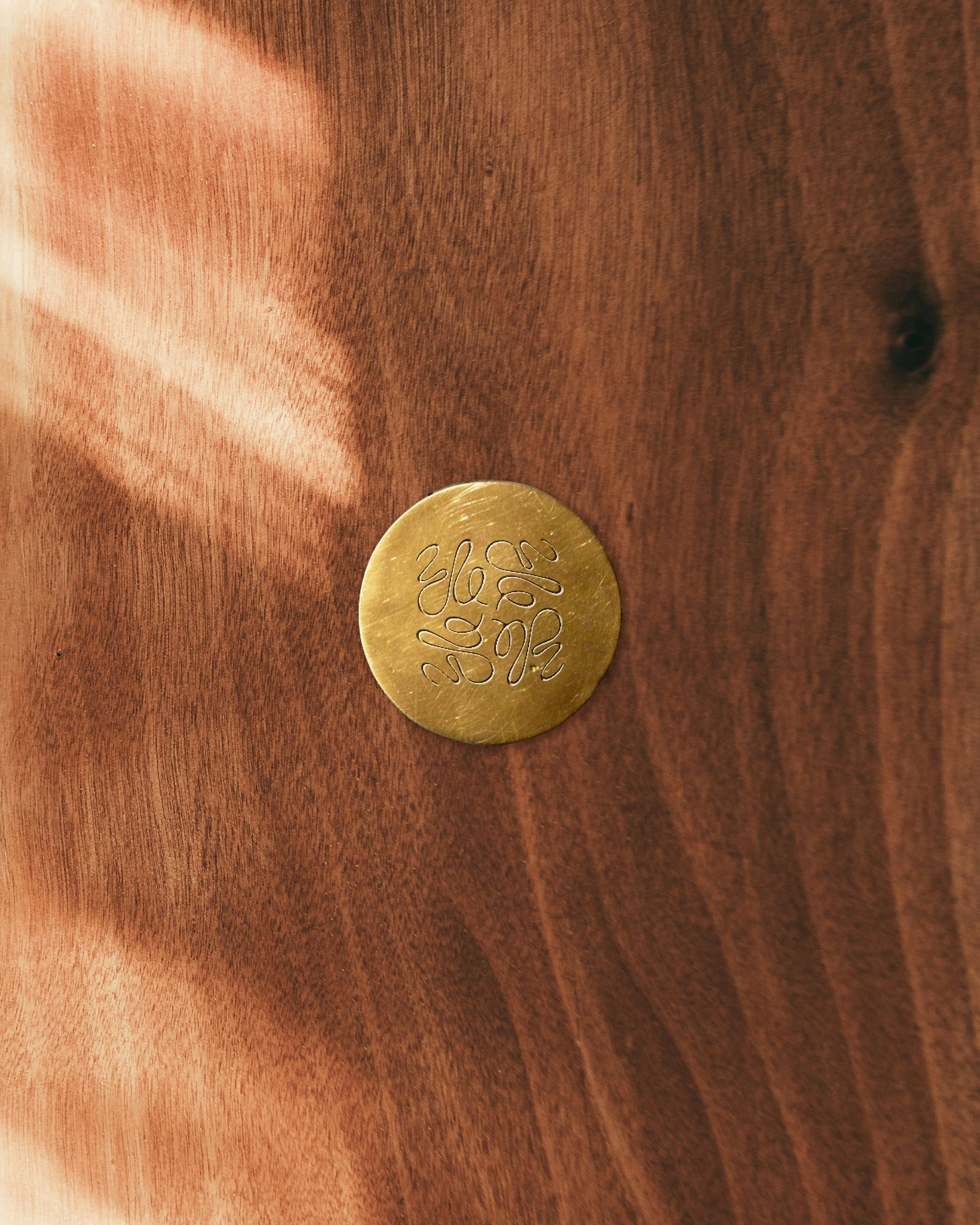
The artist speaks through the monogram, a single hand-drawn R whose flowing lines take their cue from the natural curve of tree rings. Read like an artist's signature, it works as a maker's mark that can be stamped in brass, embossed or repeated as a looping pattern. The sketches show how the mark was drawn by hand before any digital refinement, and that drawn quality is what keeps the monogram personal.
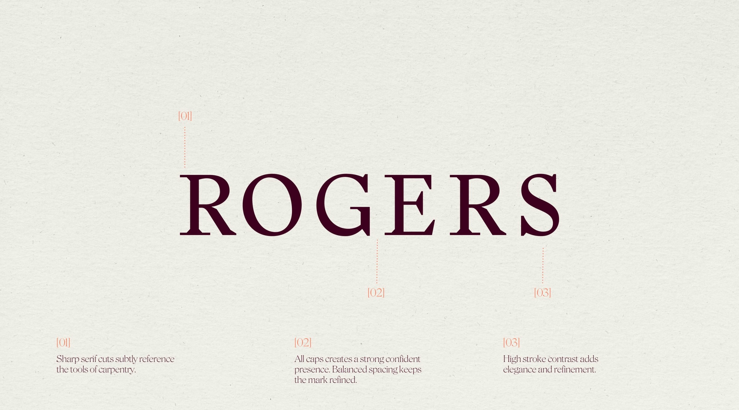
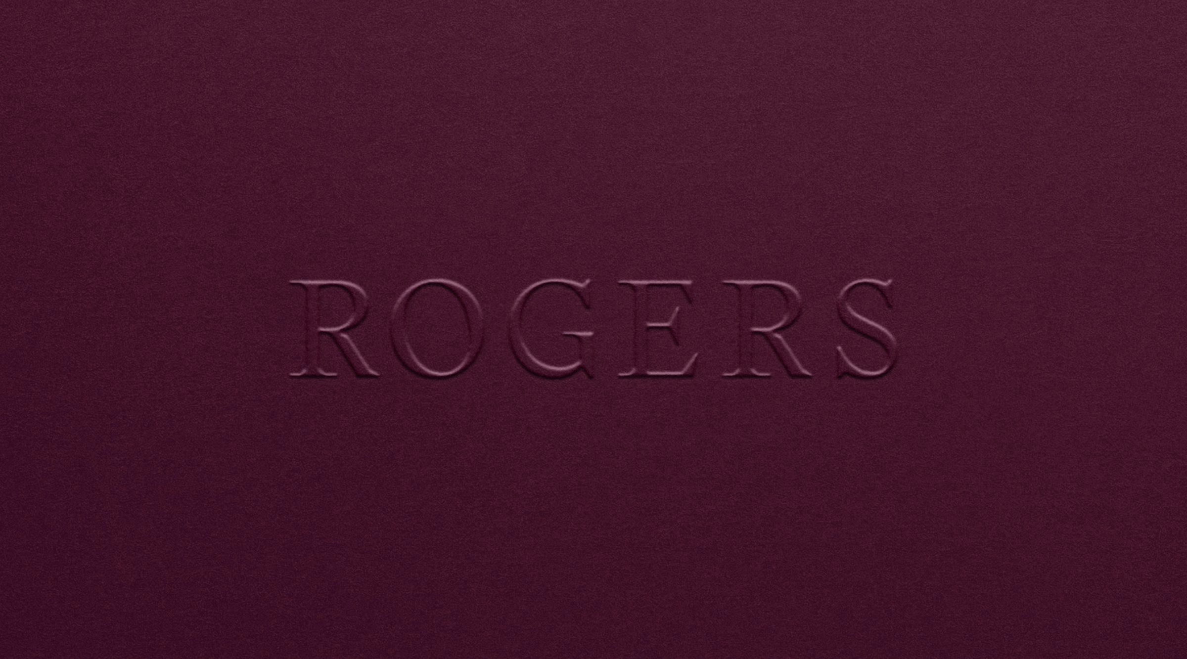
The craftsman speaks through the wordmark, set in Stanley by Optimo. Its sharp serifs echo the precision of a carpenter's tools, giving the name the authority of a trade brand. Roslindale Display by DJR and Neue Haas Grotesk Display sit alongside it, and together they form a considered typography system for signage, stamped metal and print.
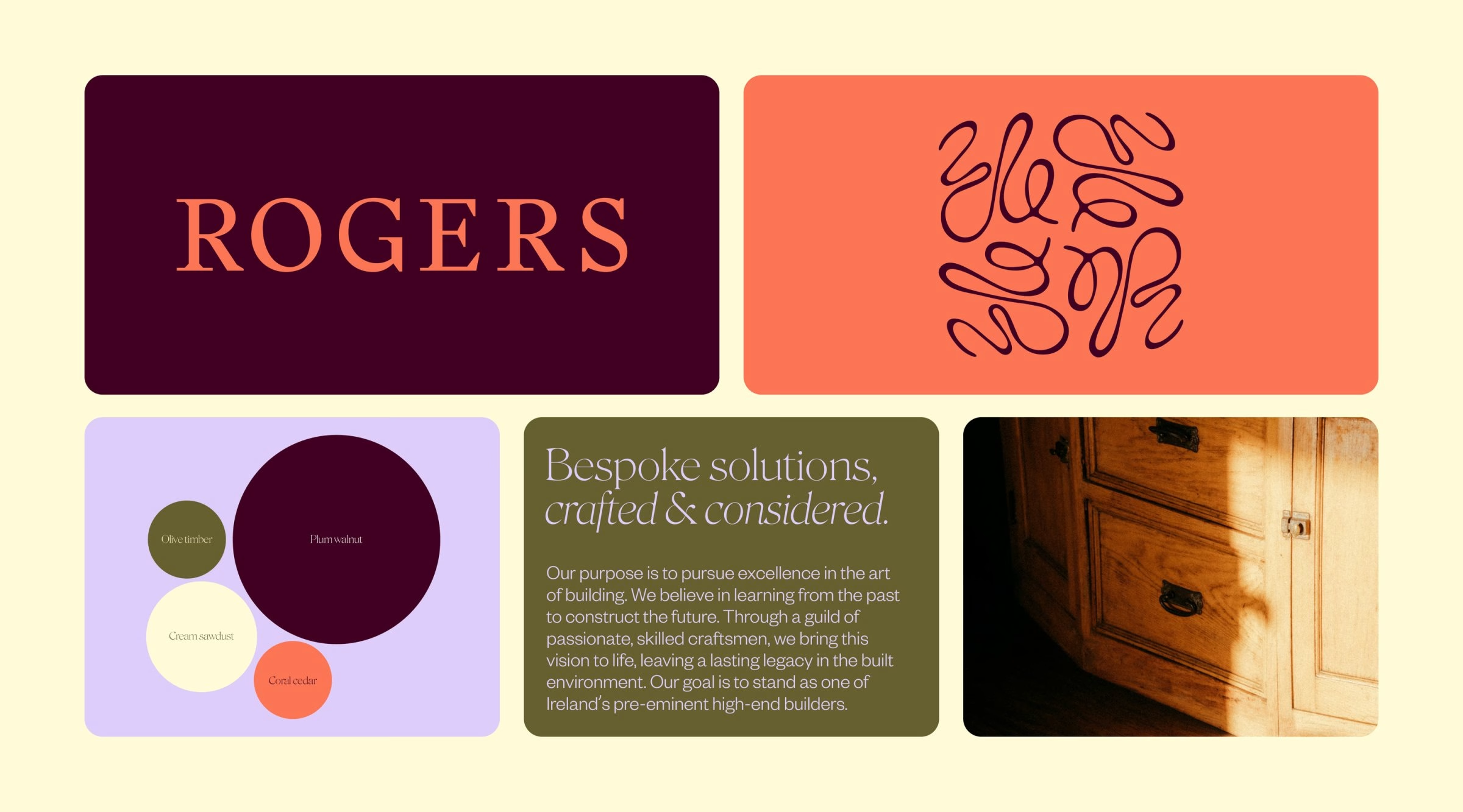
The palette follows the same balance. Deep, natural timber tones ground the brand in the material world of the workshop, while soft coral and lavender bring an unexpected lightness. Set against the wood-toned base, these lighter accents keep the identity from feeling heavy or purely industrial. The system carries across touchpoints without losing its warmth.
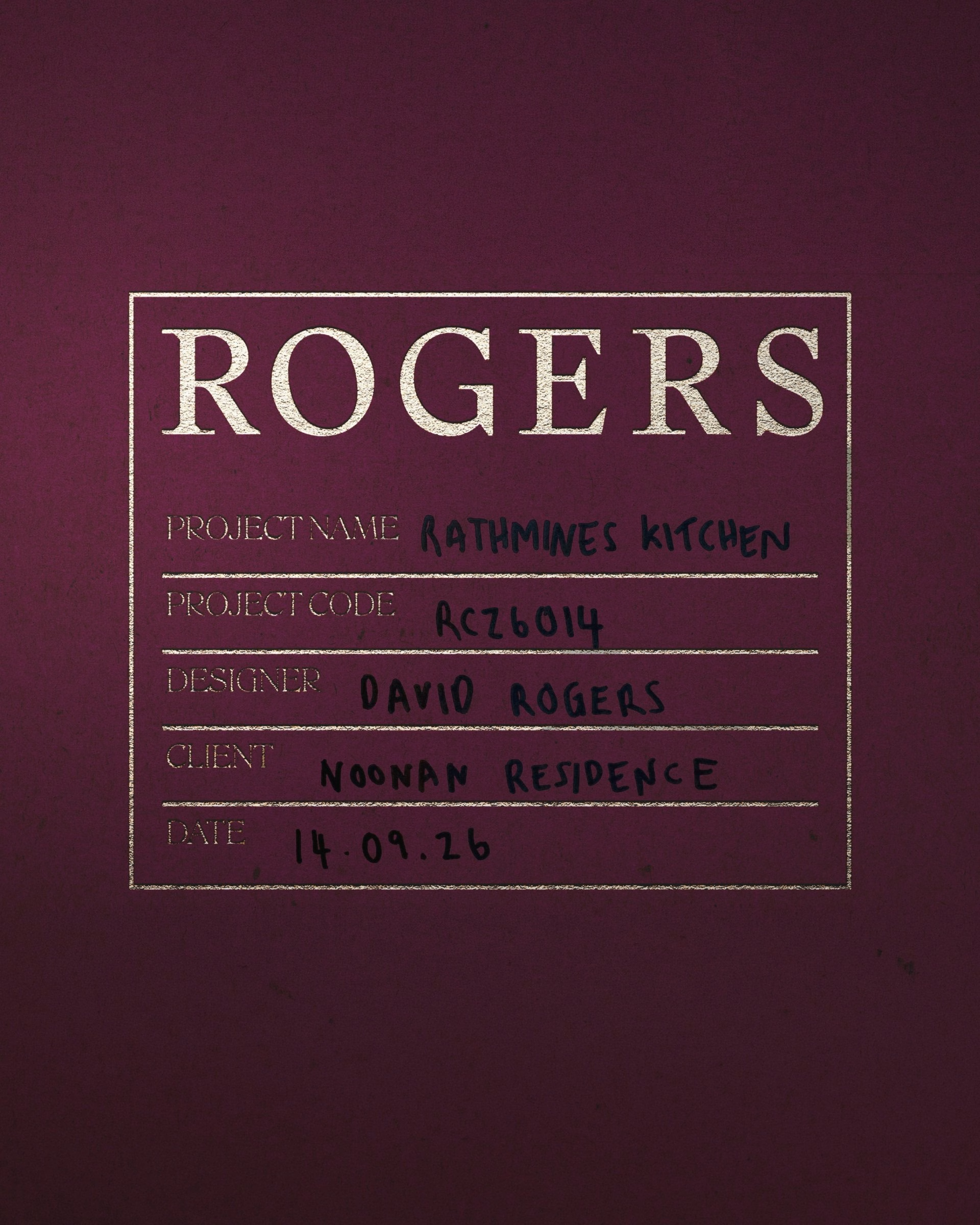
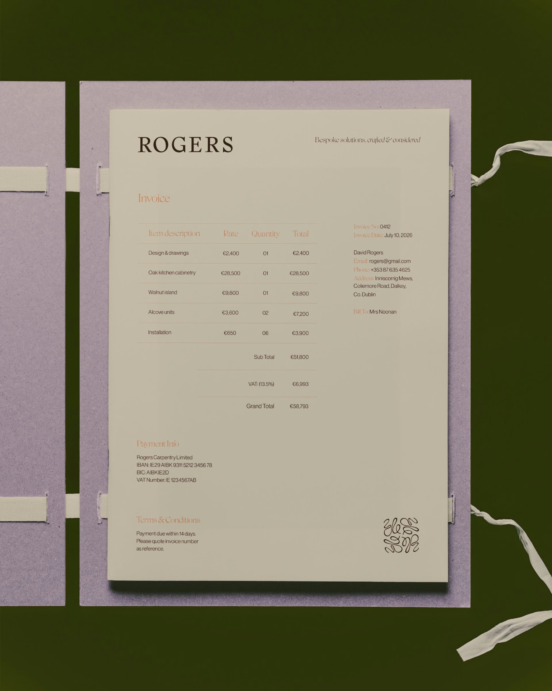
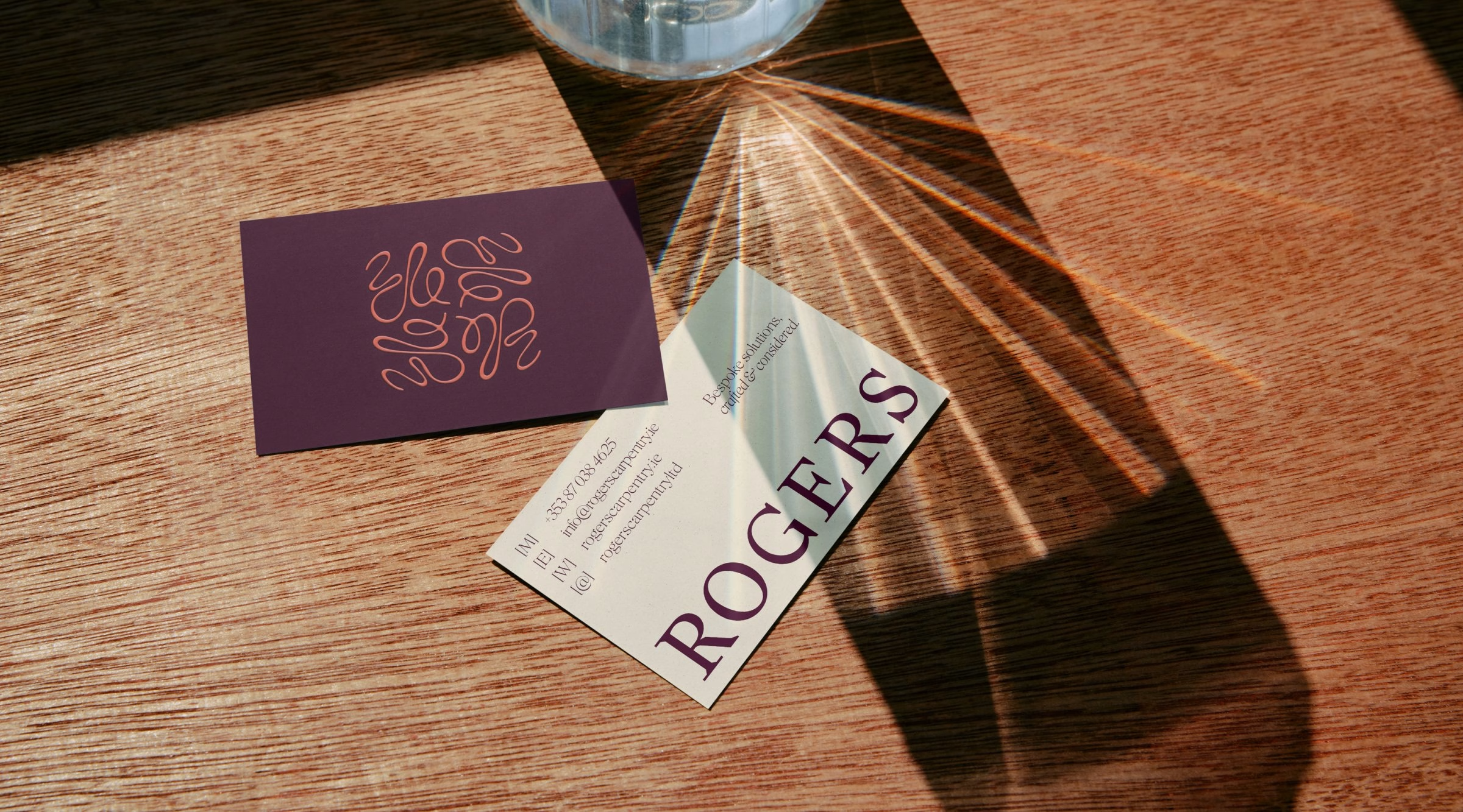
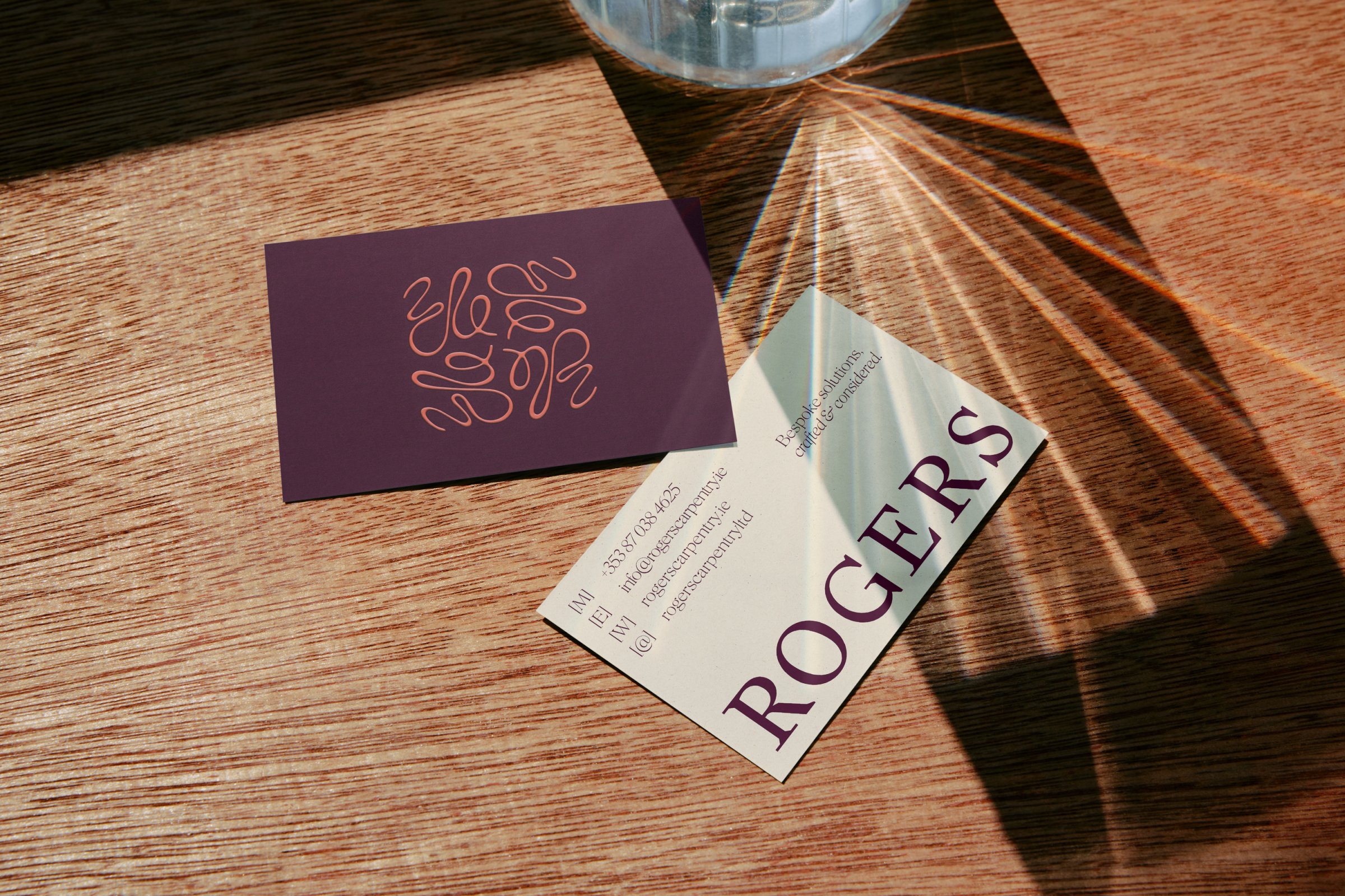
Stationery shows how the monogram and wordmark hold together at small scale. Business cards and the invoice use the same restraint, letting the brand speak through typography and the single mark. Clear hierarchy and generous space make even administrative documents feel part of the workshop identity.
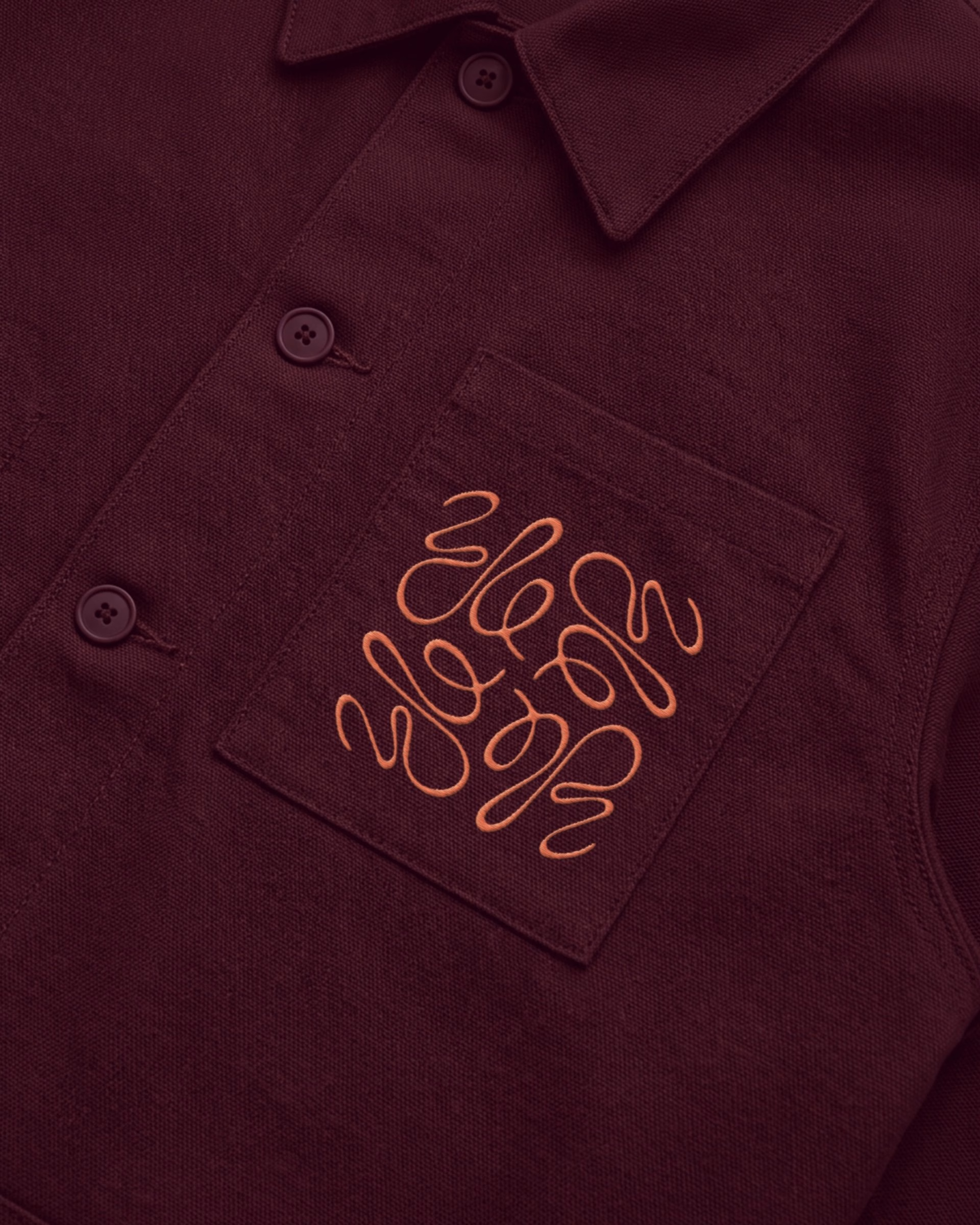
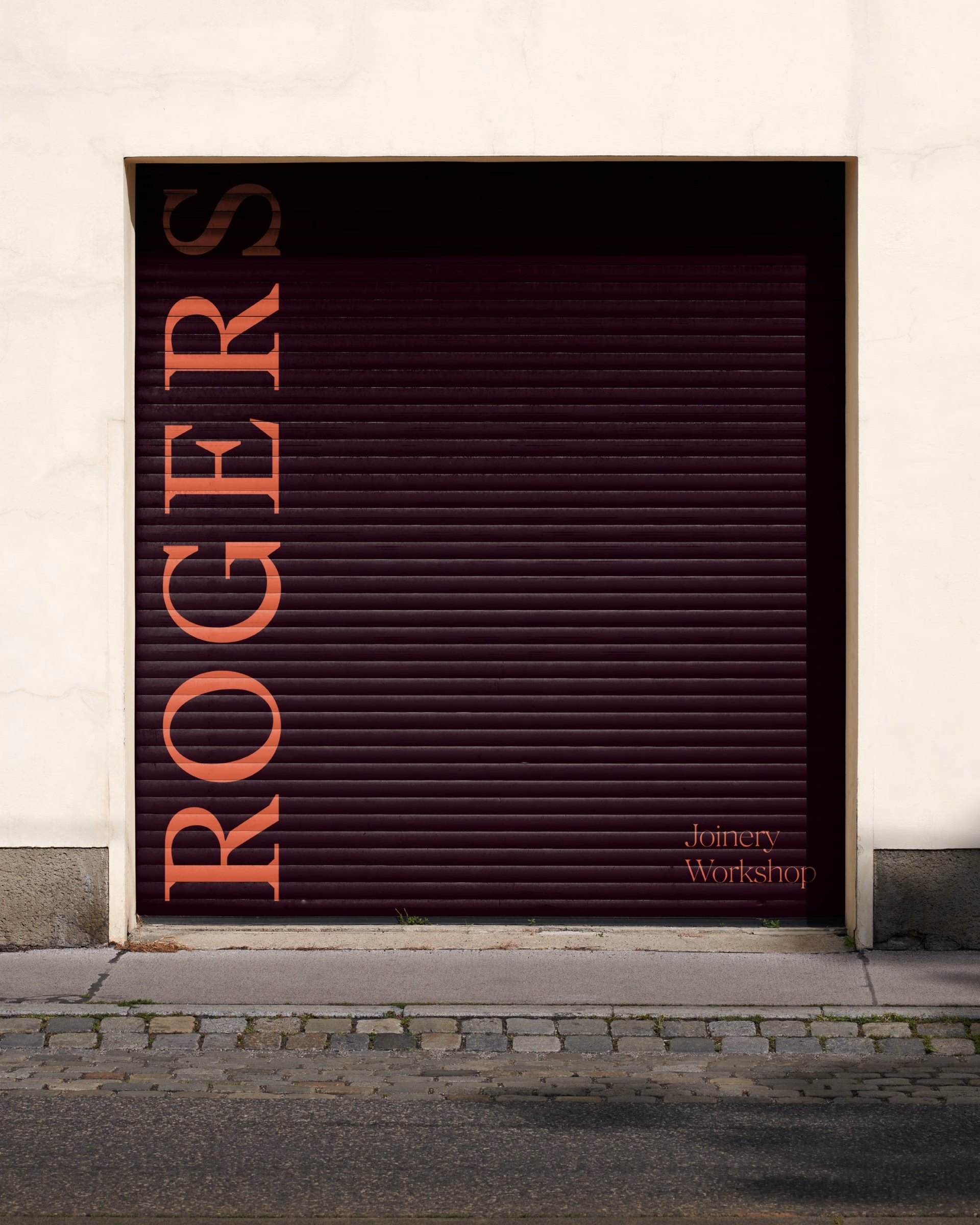
The identity extends beyond paper into the workshop itself. Branded workwear and a shutter sign carry the monogram into the physical environment where the work happens. Together they make the brand feel lived-in rather than applied.
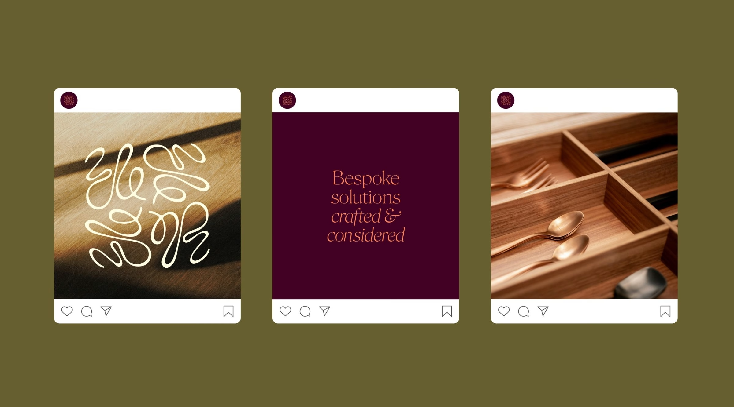
Online, the identity moves through social and web. Instagram tiles and the website film show how the monogram behaves in motion and across screens. Bespoke solutions, crafted and considered, is the line that ties every touchpoint together.
Unlock everything with Mindsparkle Mag Plus.
Get exclusive access to Premium features:
Credits: Maria Marks Studio
Brand Identity: Maria Marks Studio
Client: Rogers Carpentry
Typeface: Stanley by Optimo
Typeface: Roslindale Display by DJR
More in Brand Identity
Stay on top of this week's design. Insights, top picks & more.