Plus
Plus

 Menu
Menu


Hochburg Design
October 05, 2026
Mindsparkle Mag


Most grill brands begin with lifestyle, but Hochburg Design built Flamid’s identity from construction instead. In a metalworking workshop on the Swabian Alb, insulated, modular grill barrels are made from steel, Corten steel or gabion-filled cladding. Each one is crafted by hand, engineered down to the smallest detail and built to last for years by the fire.
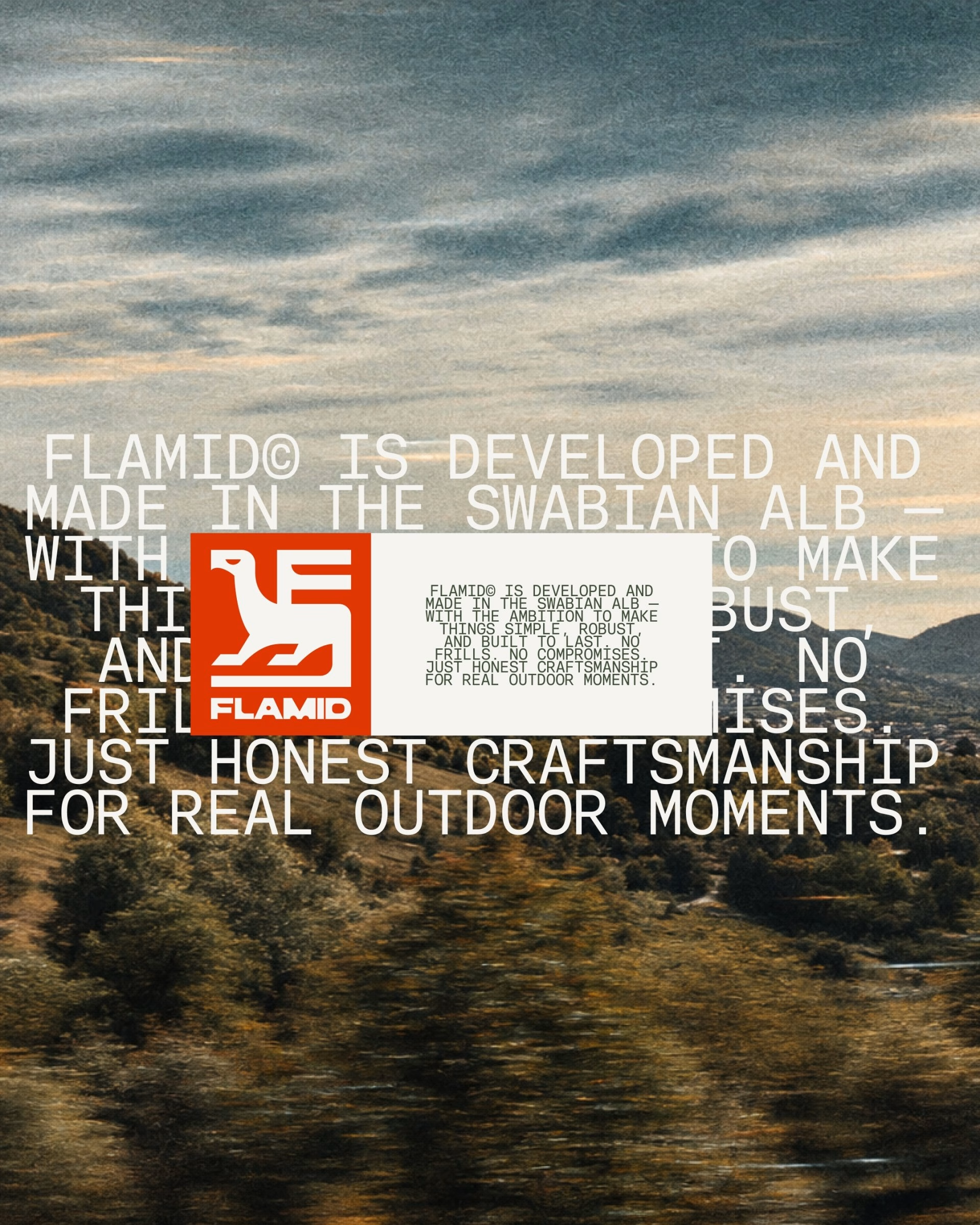
For Flamid, the studio developed the name, positioning and the complete brand world. The task was to make the product’s precision, material intelligence and longevity visible without translating its origins into rustic workshop nostalgia. Rather than relying on familiar outdoor codes, the team drew on the language already embedded in the product: maker’s marks, technical drawings, material and construction.
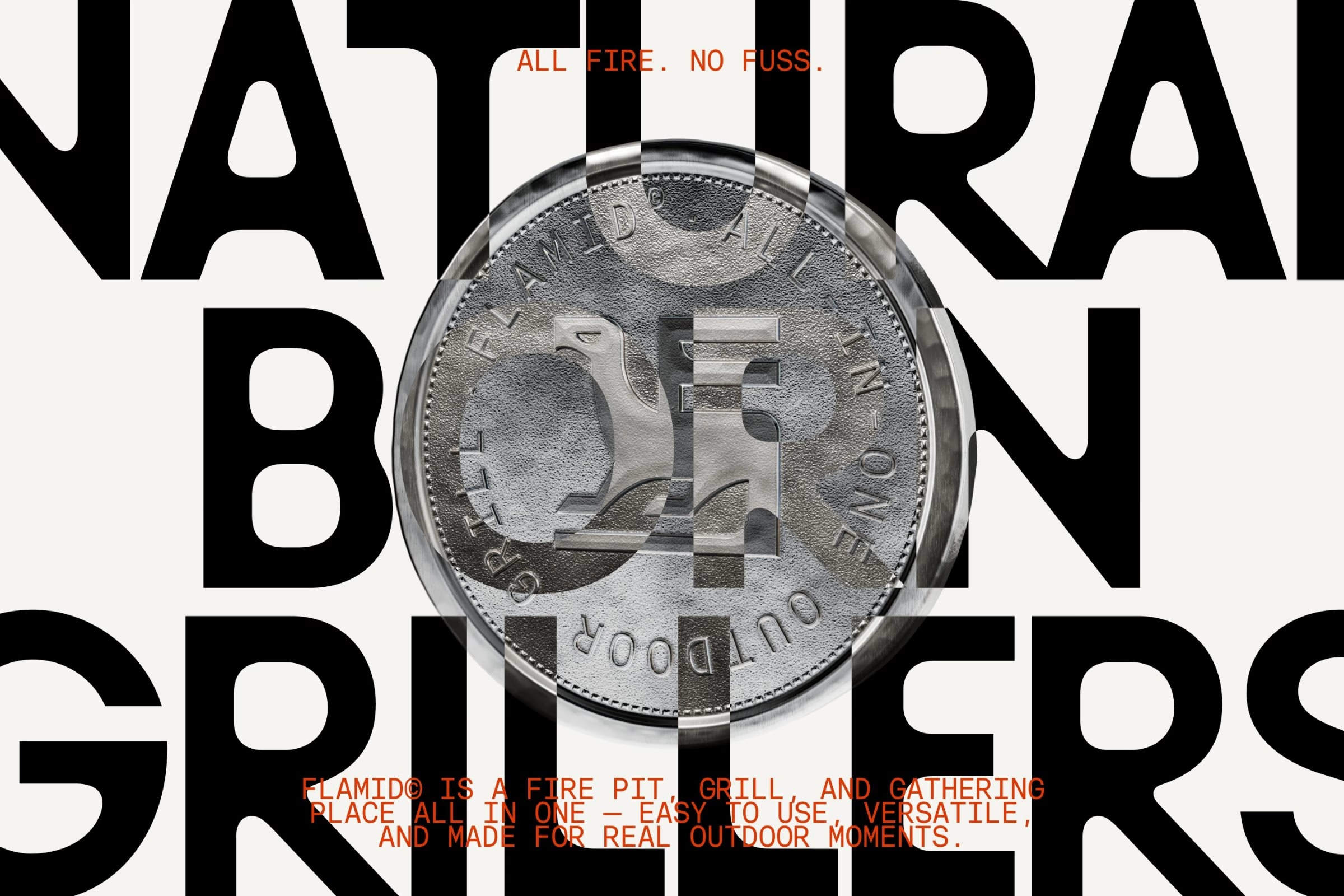
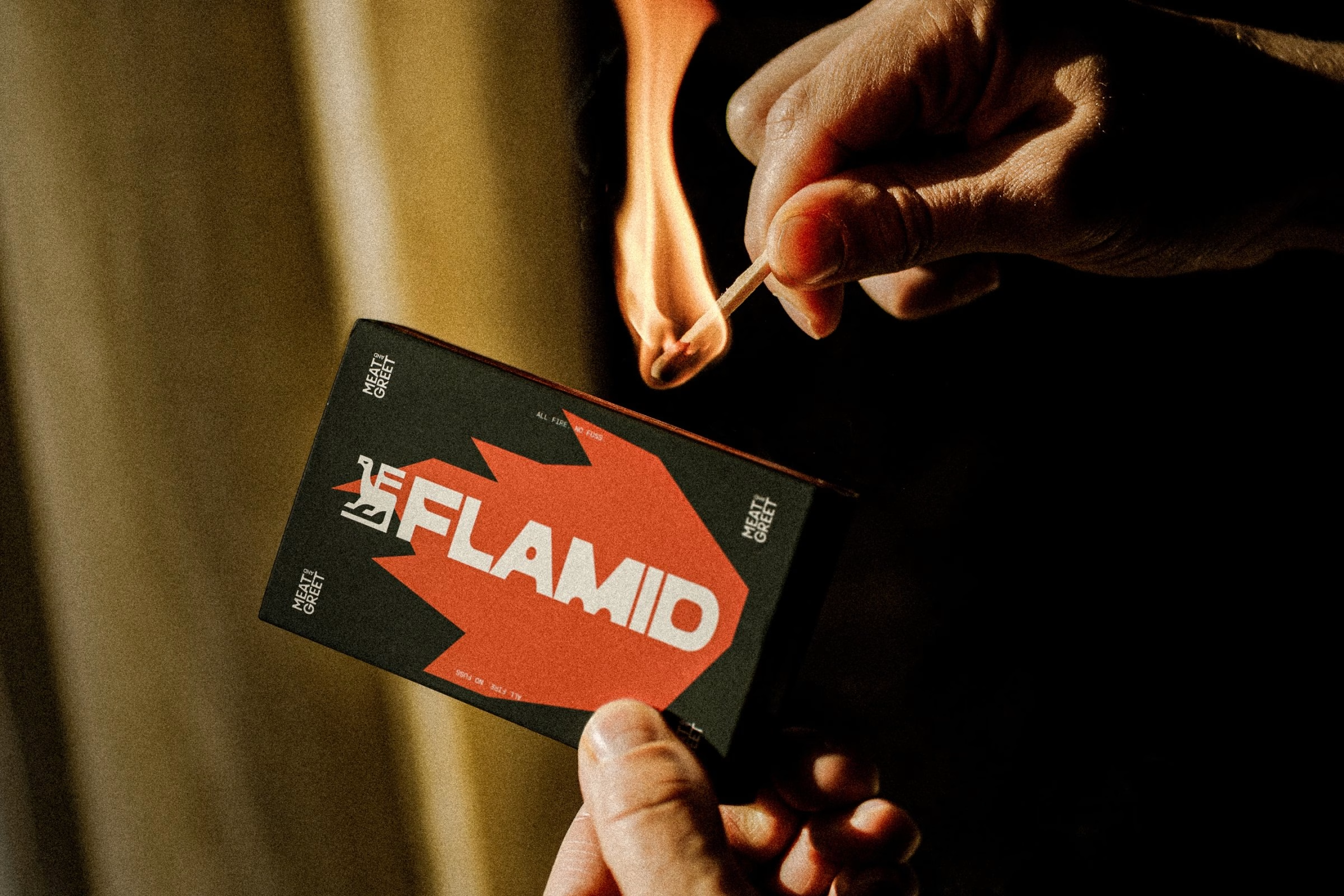
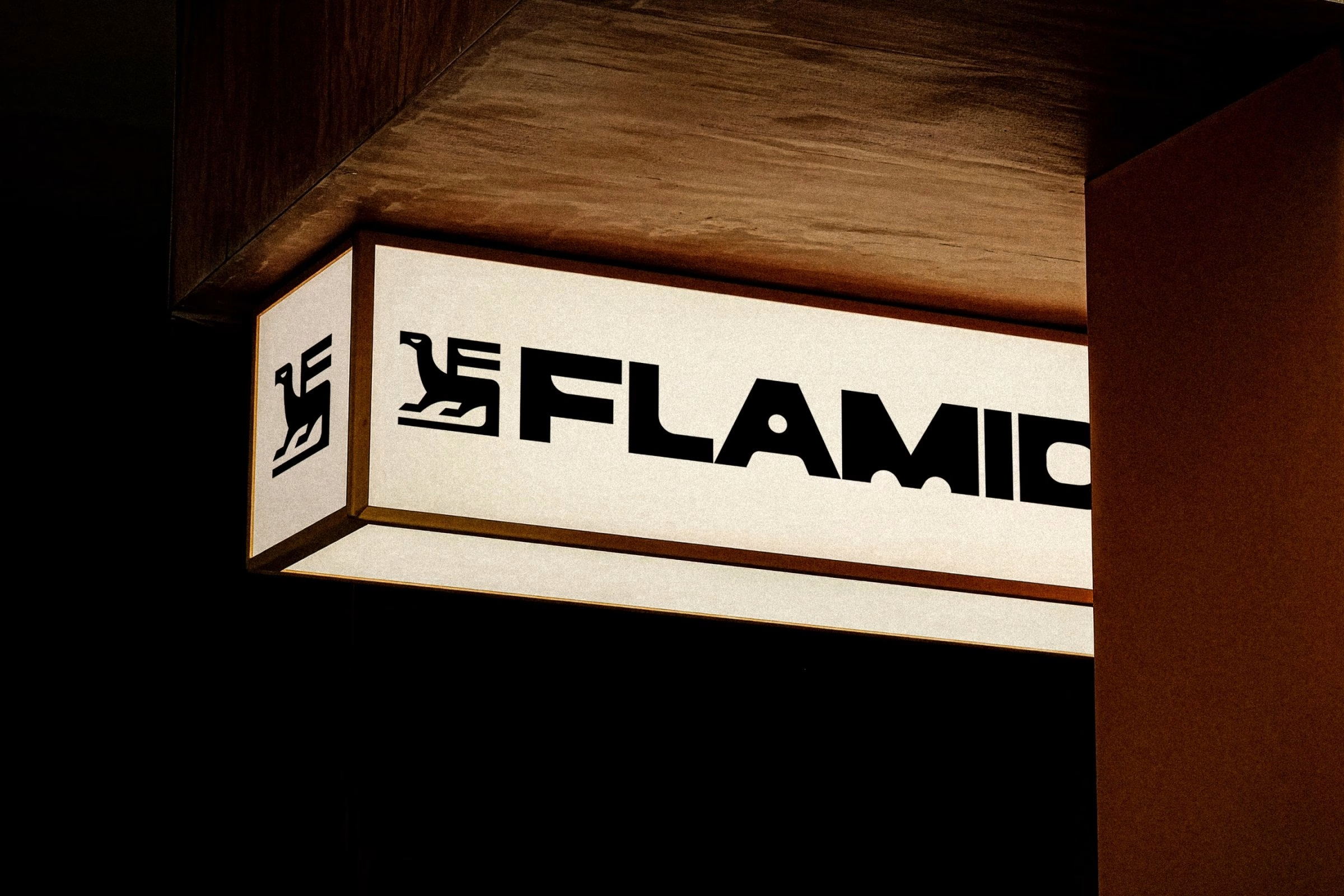
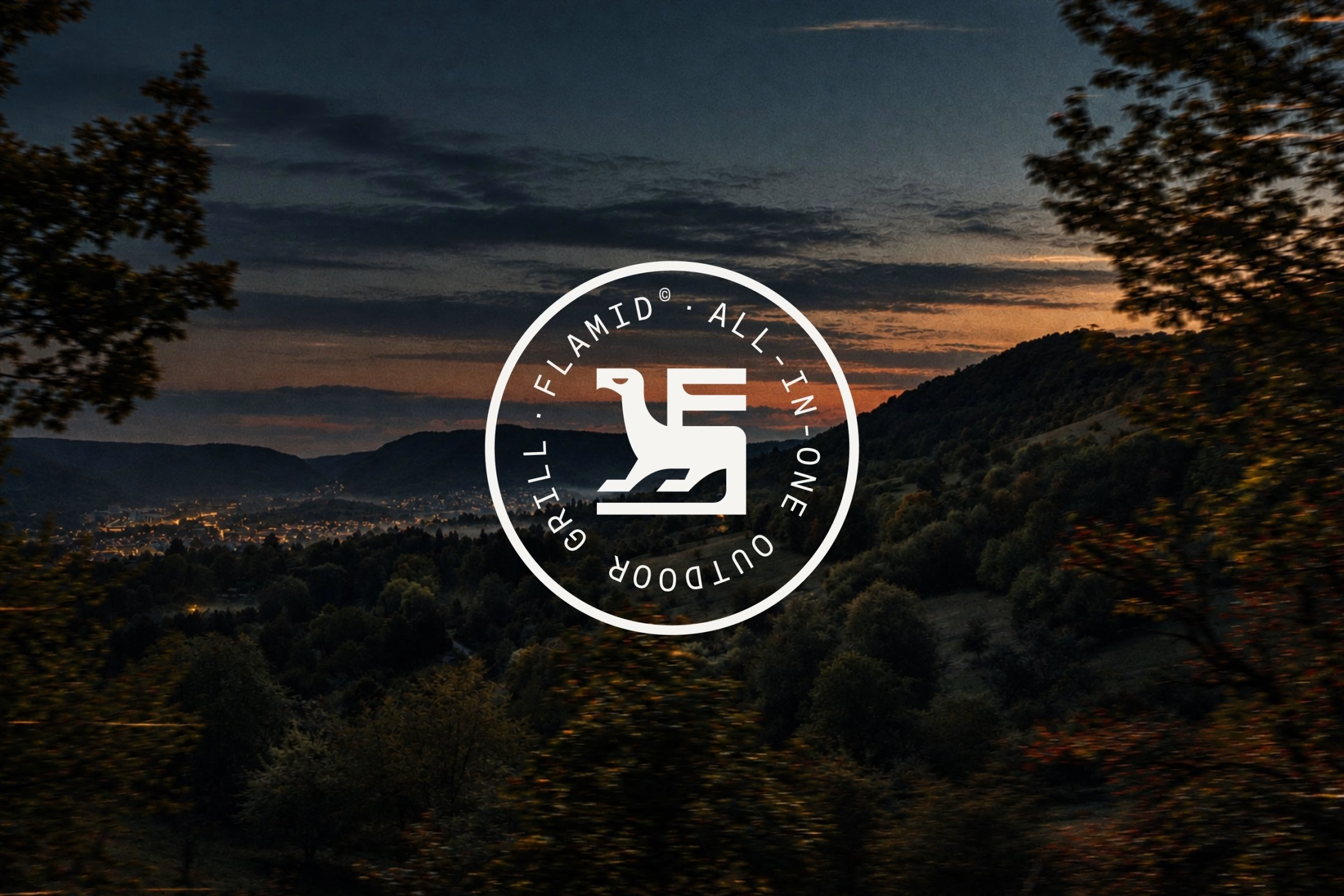
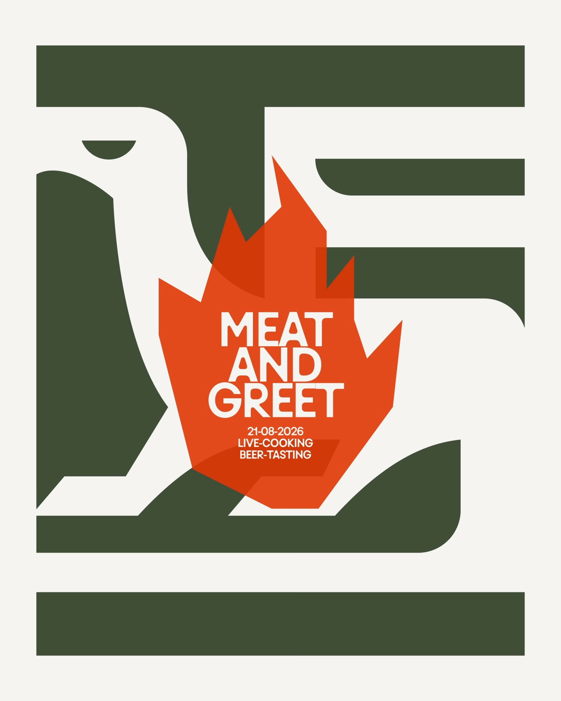
At the centre of the system is a symbol built on a strict grid, in which a bird of prey emerges from the letter F. It works as an embossing on the product’s nameplate, as a seal on merchandise, or at large scale on posters and vehicles. A wide, compact wordmark with punched-out curves gives the whole brand identity its weight.
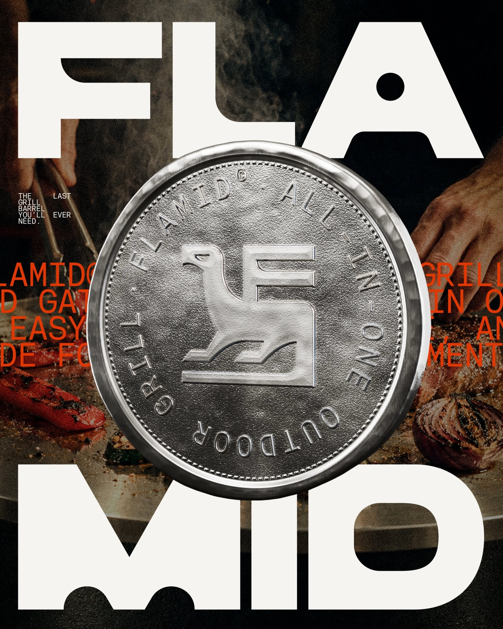
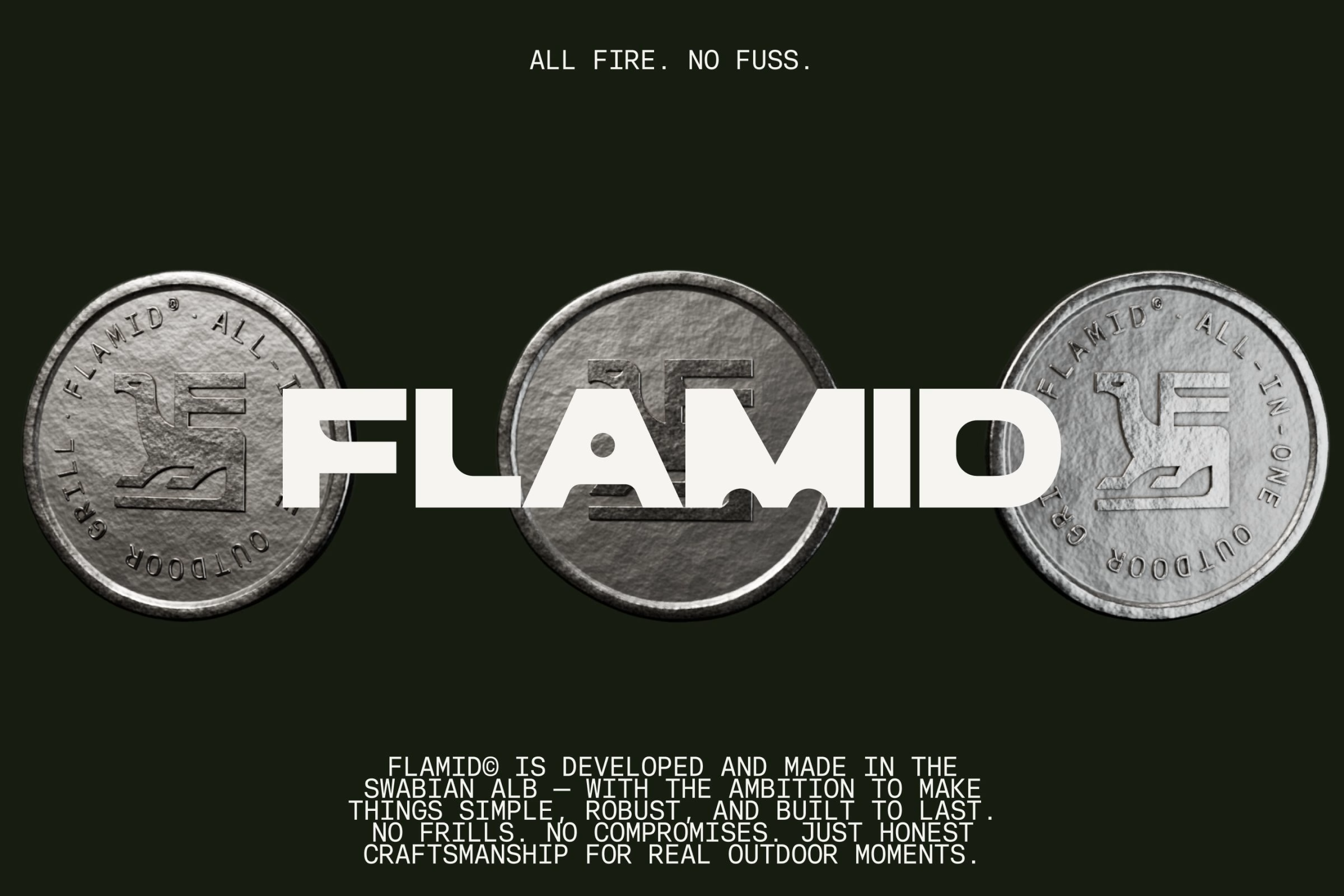
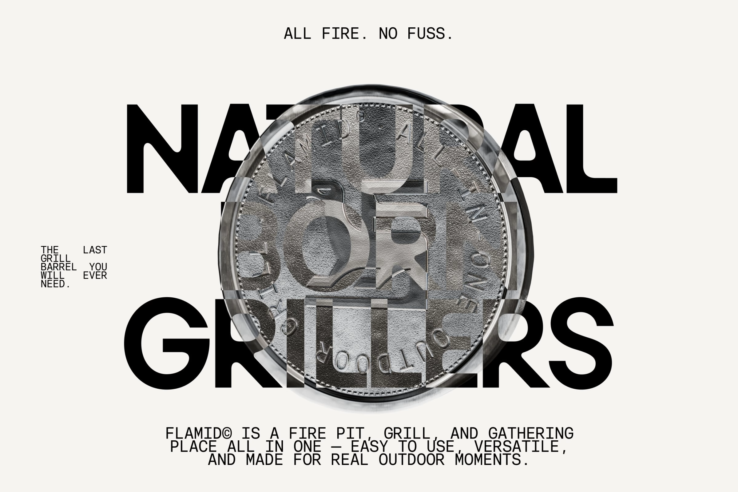
Monospace typography, technical renderings and wireframe models bring precision and function to the identity’s historical references. The palette of ember orange, deep Alb green and paper white comes straight from the setting, and it is paired with imagery of welding light, sparks and the Alb at dusk. Together these elements create a world that feels both elemental and engineered.
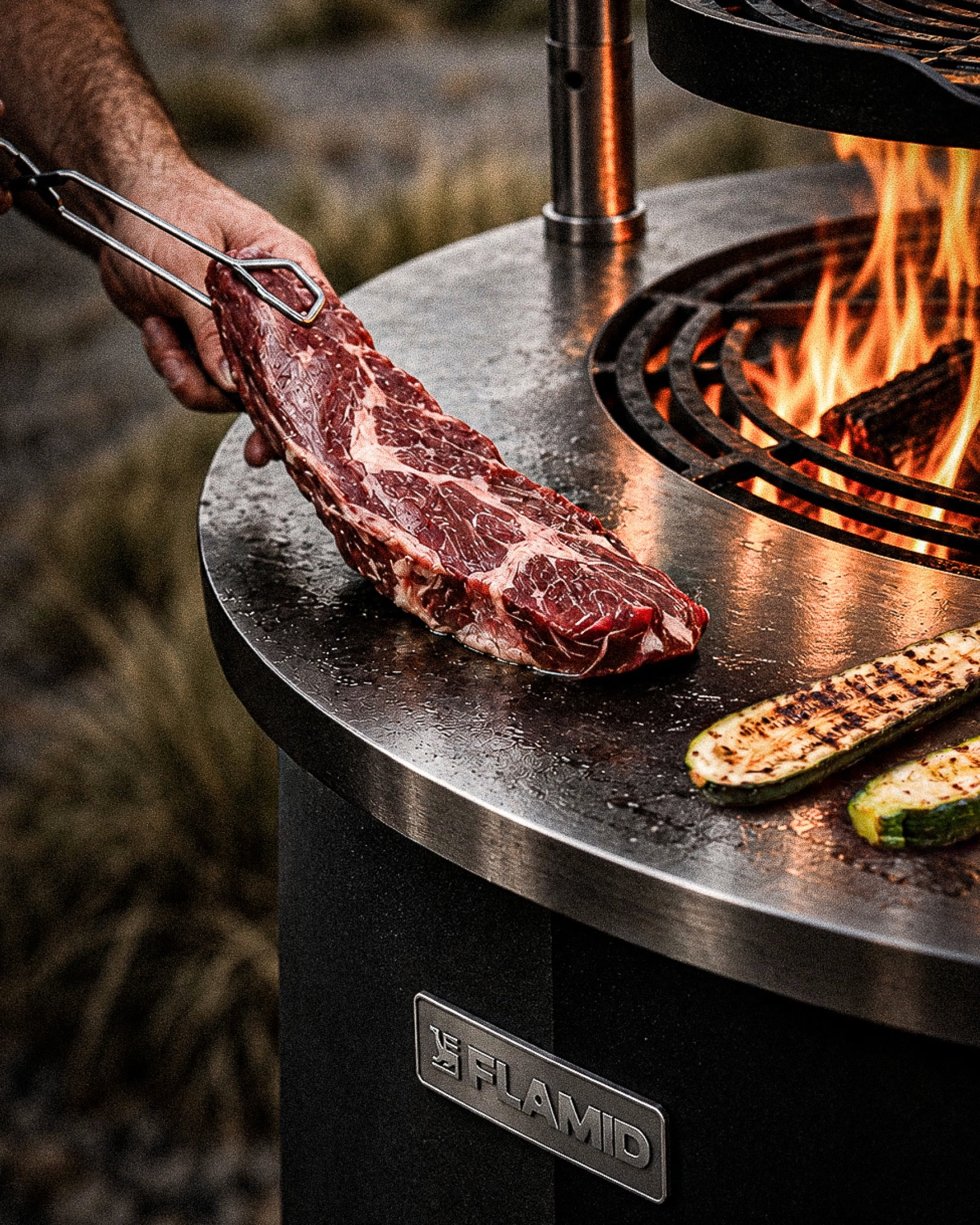
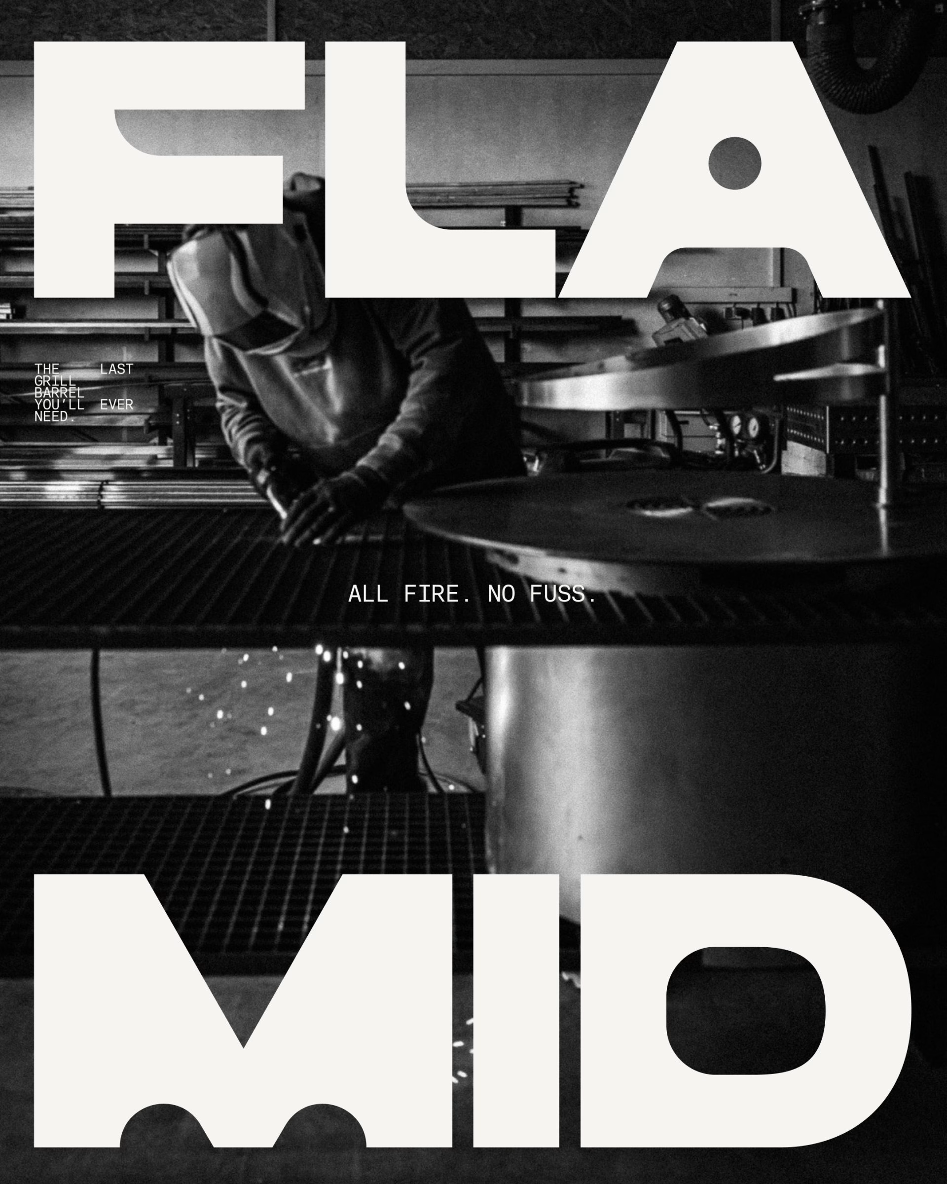
Motion carries the same logic into time. Developed with Brussobaum, the loops let the bird-in-the-F assemble itself along its construction lines, spin the coin-like seal and flicker the flat flame graphic in ember orange against deep green. Each sequence behaves more like a stamp being pressed or a drawing being plotted than like decoration, so even the animated identity still reads as something made.
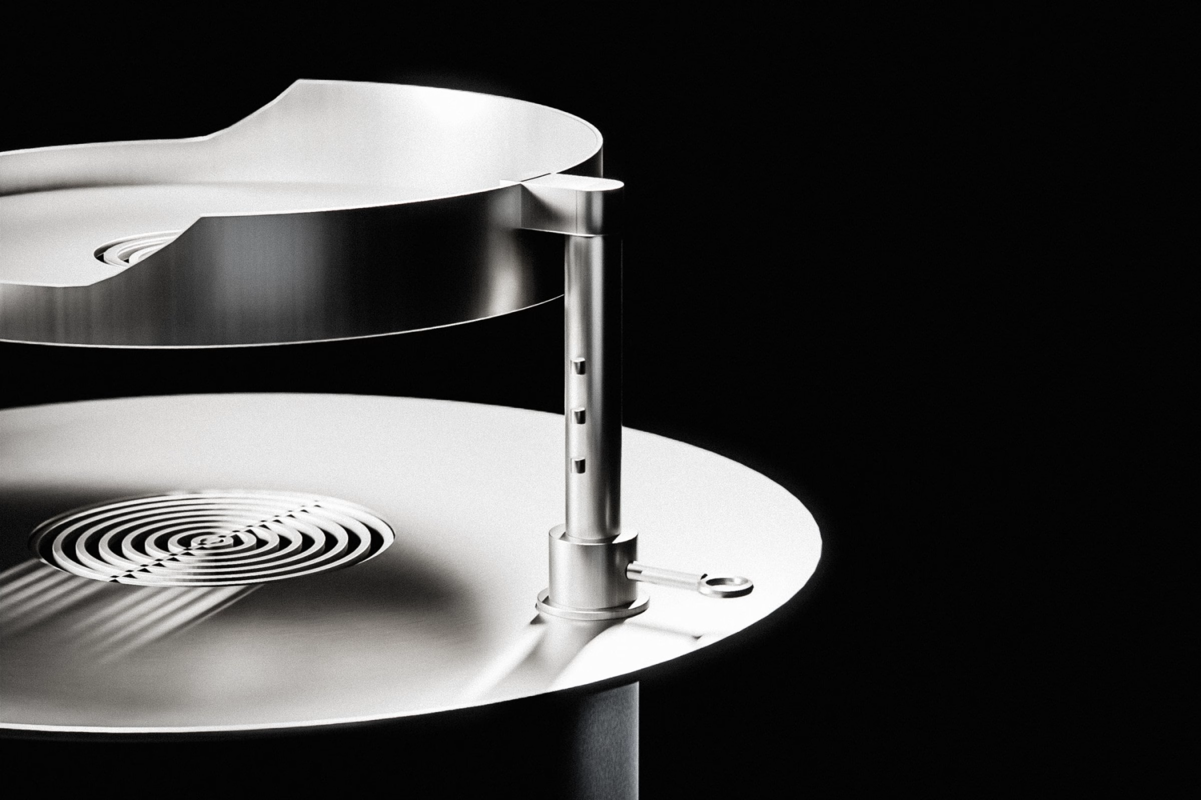
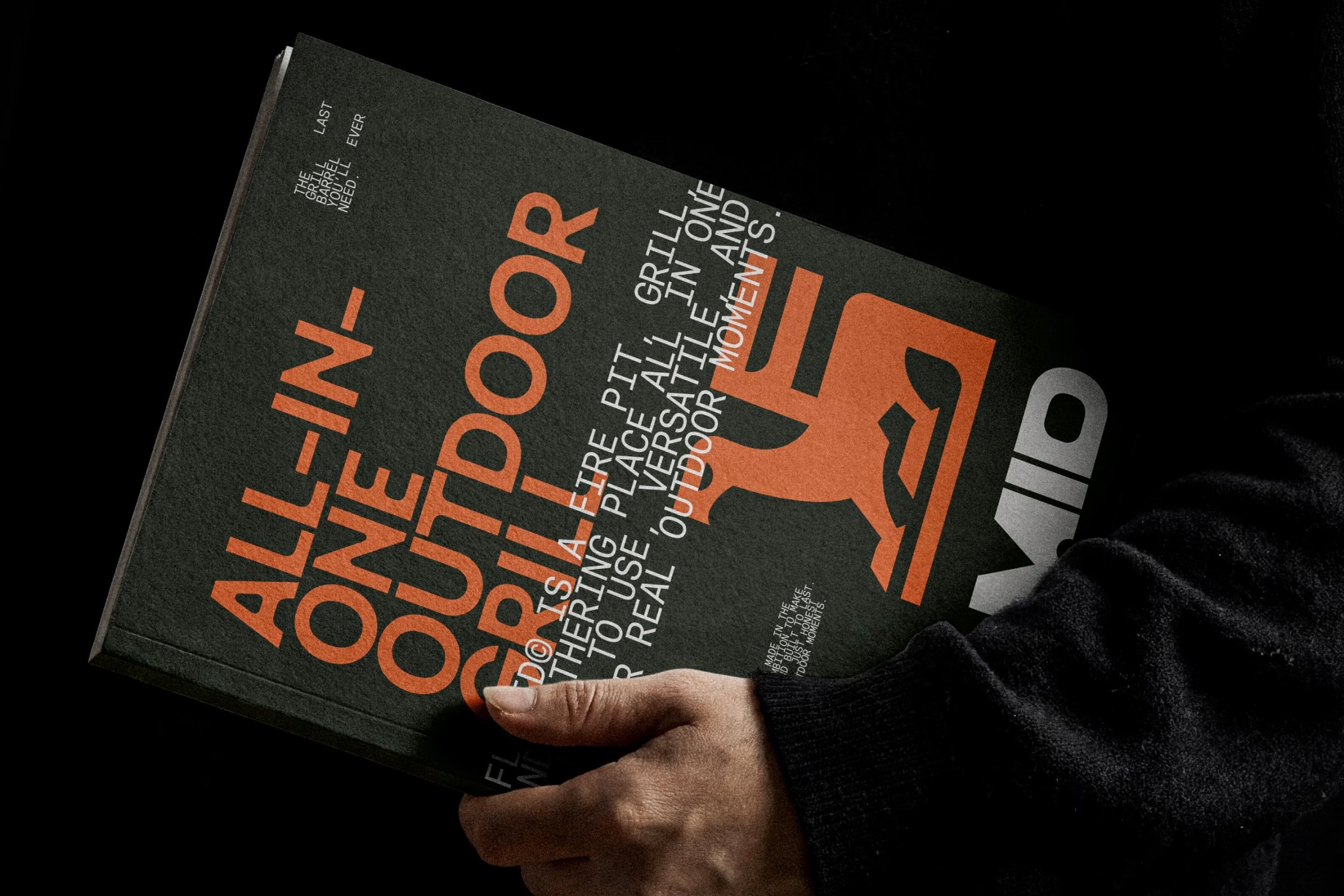
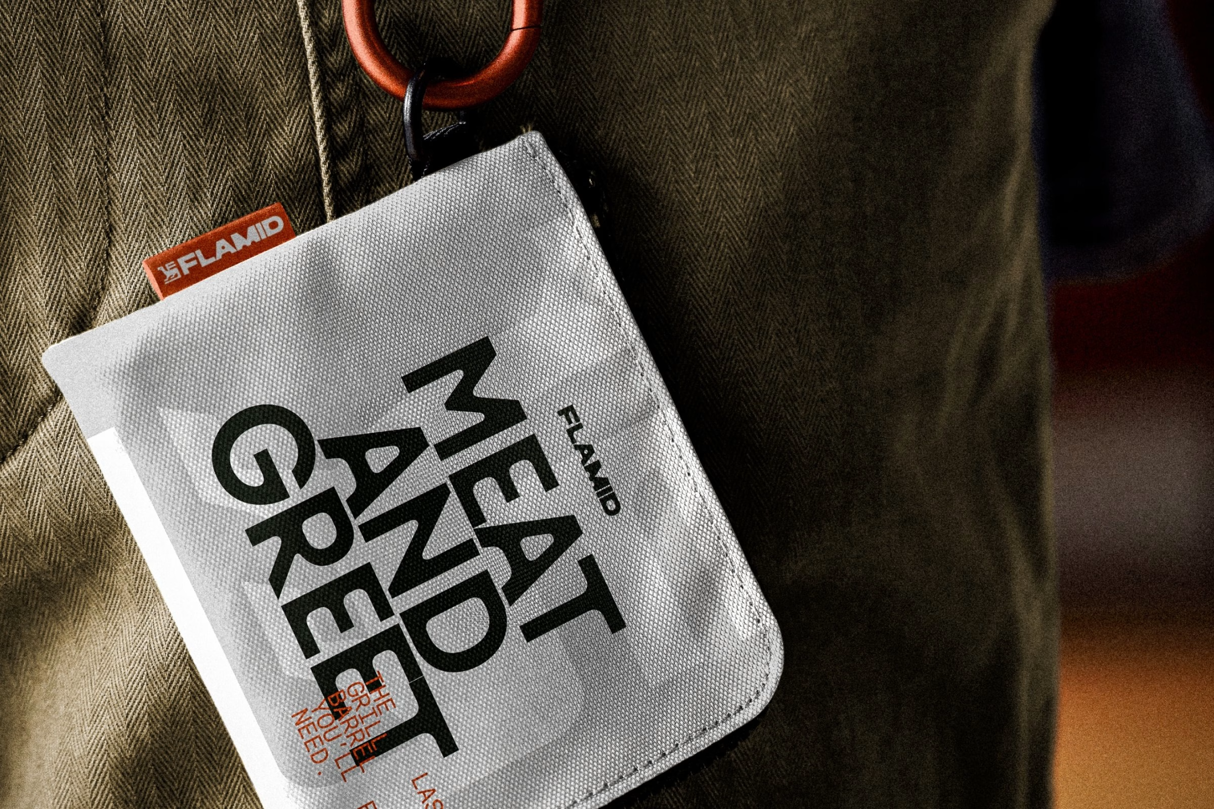
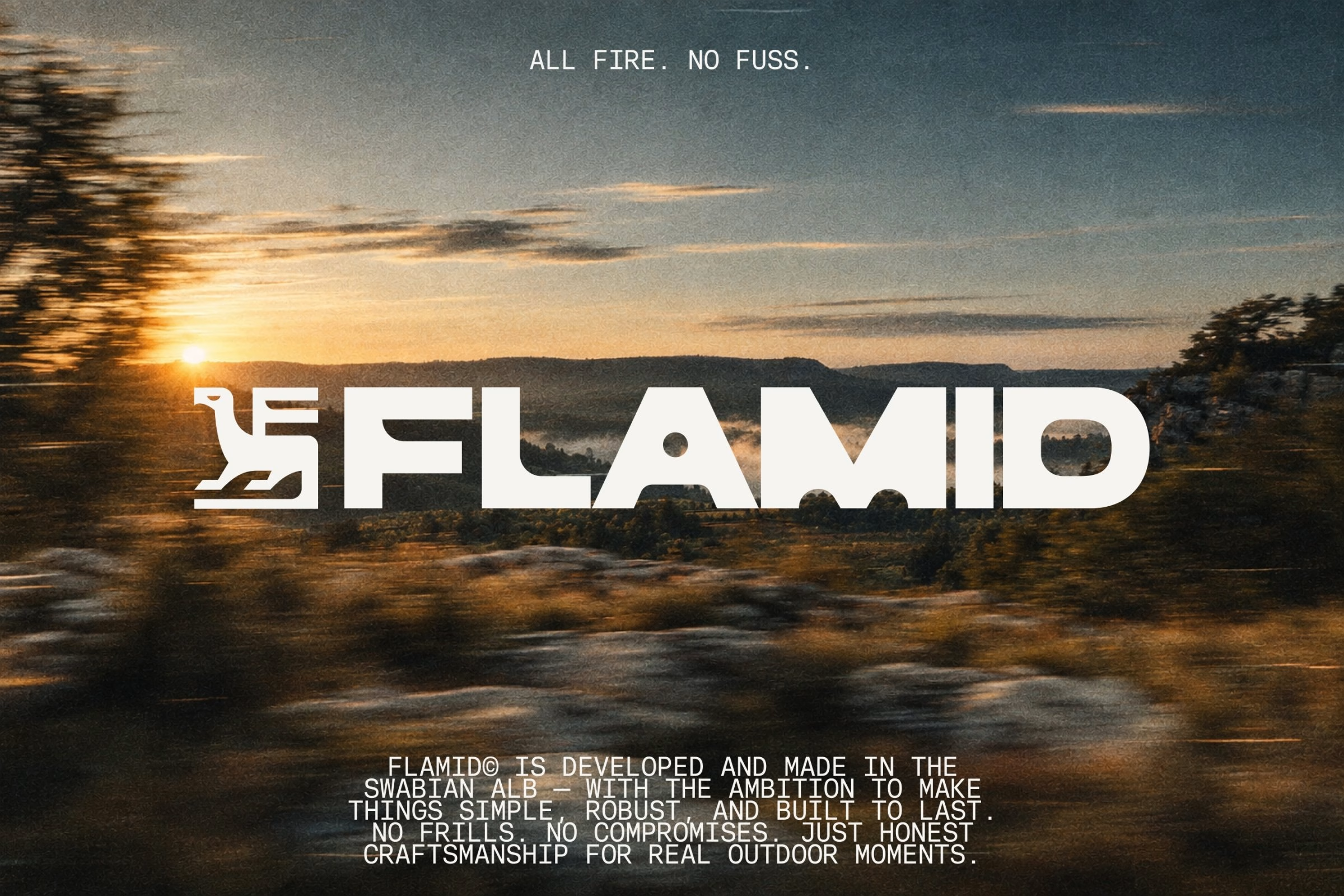
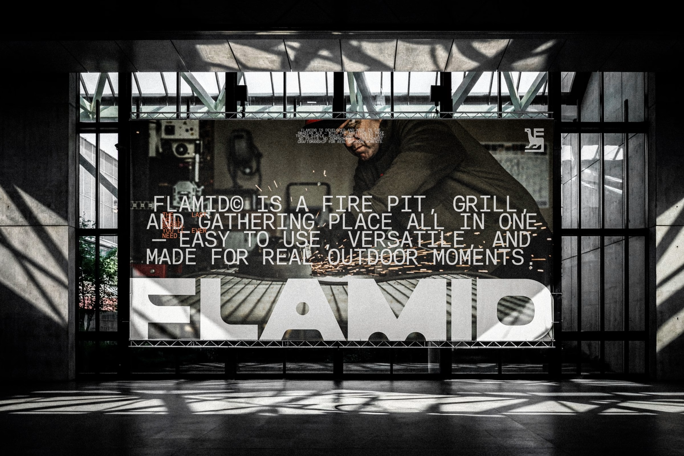
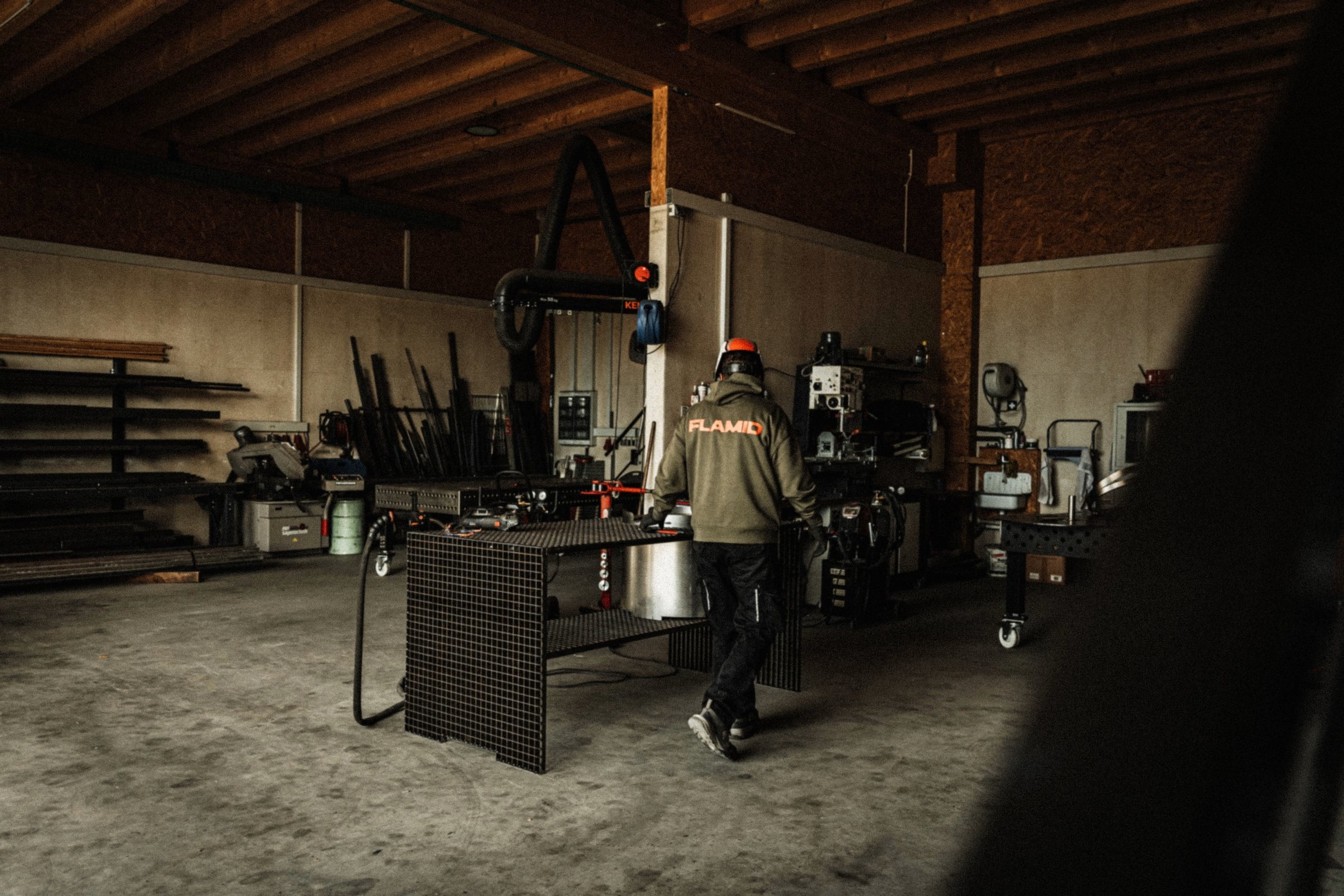
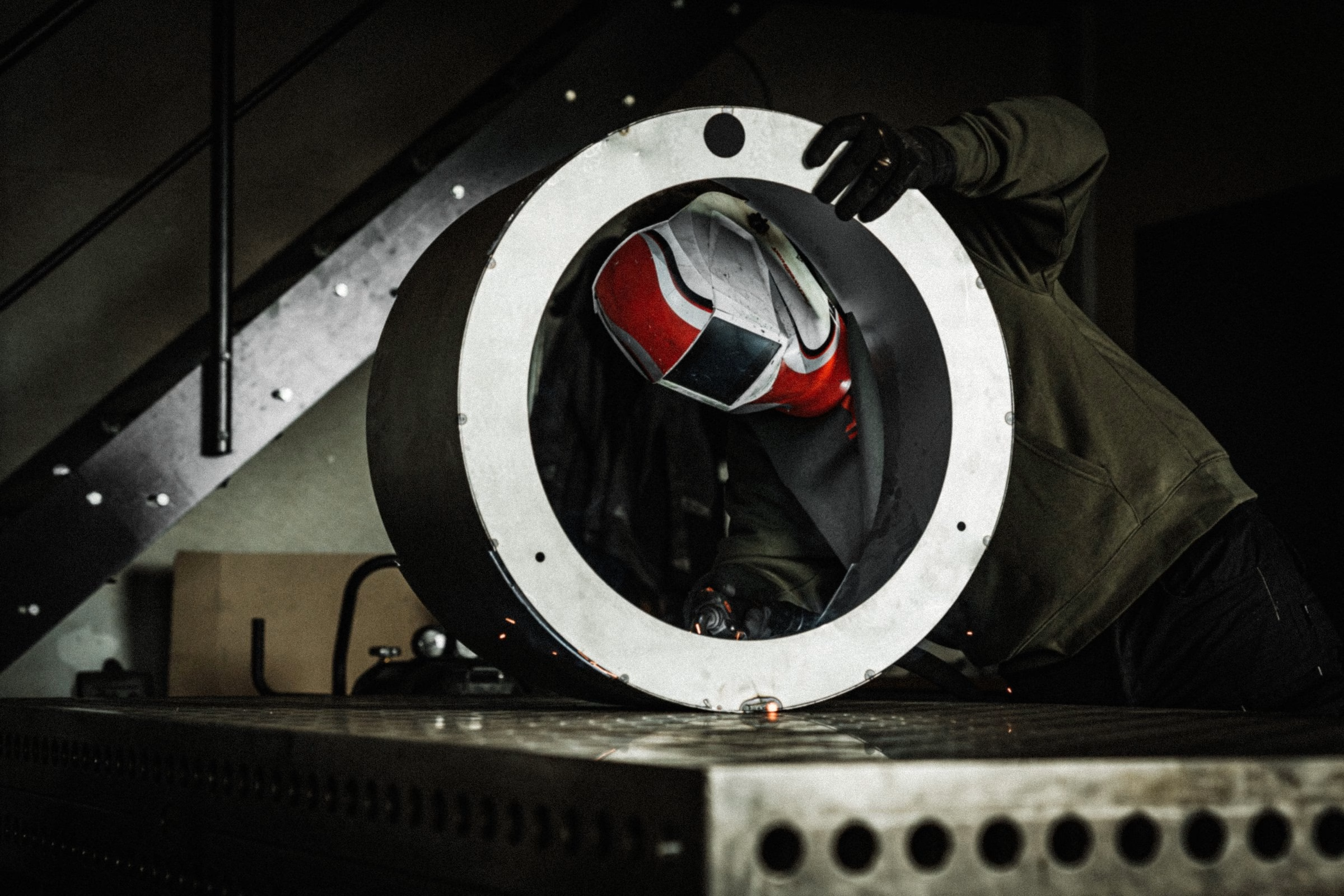
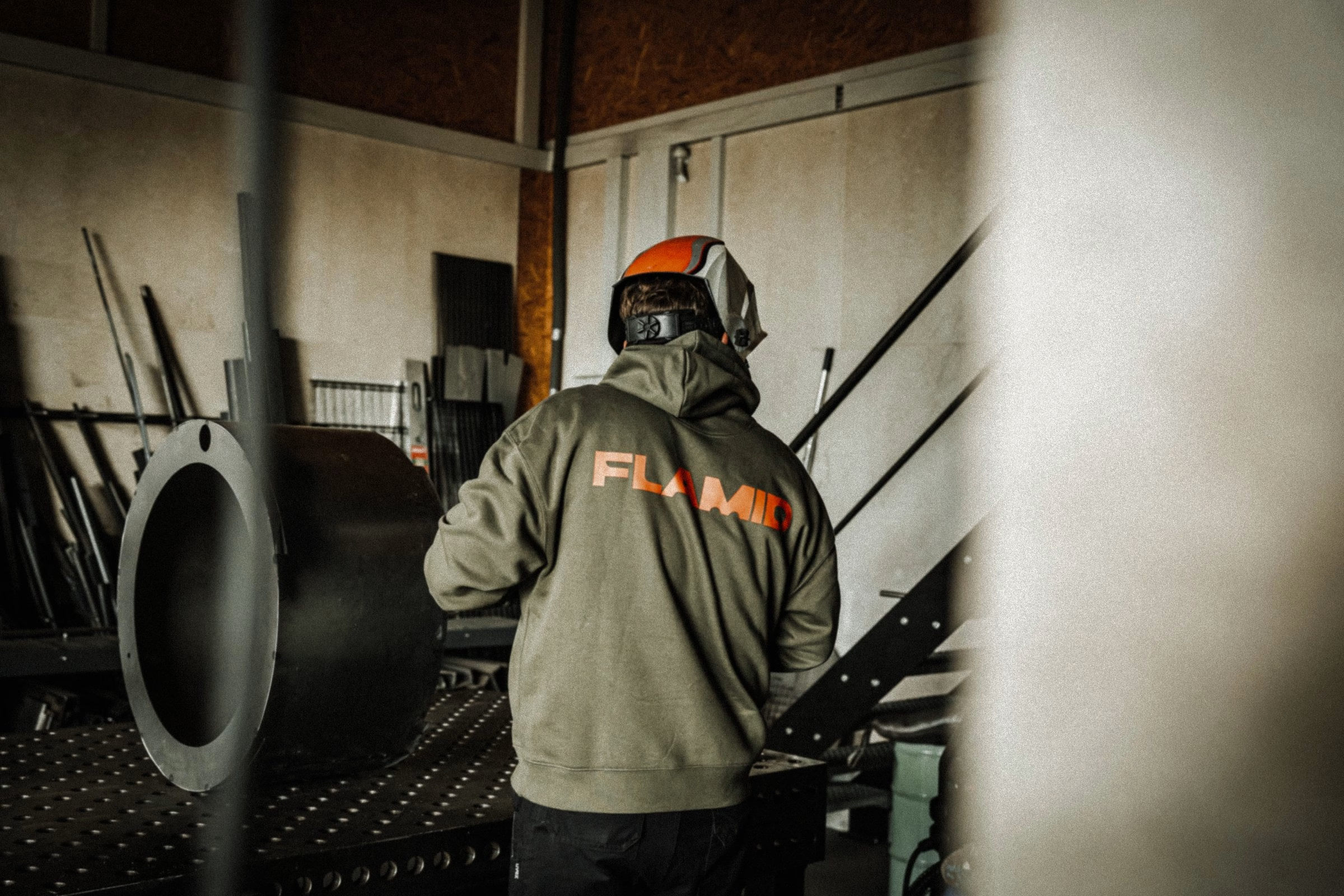
The photography goes back to where every Flamid barrel is built. Shot inside the metalworking workshop on the Swabian Alb, the series follows the work through welding light, grinding sparks and the half-light of the hall, with ember orange appearing on teamwear rather than on staged props. It applies the same evidence-first thinking as the identity itself, documenting the craft instead of romanticising it.
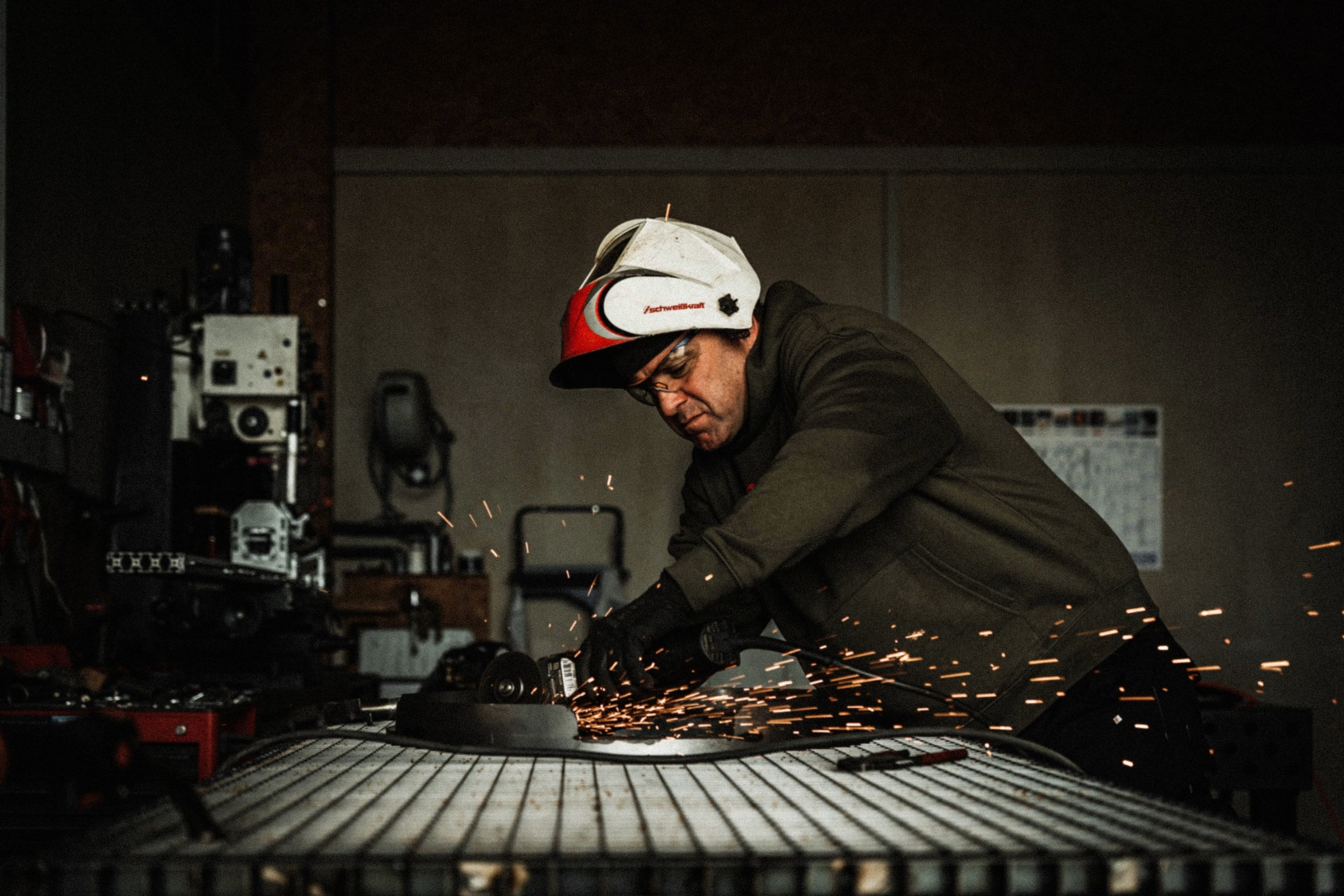
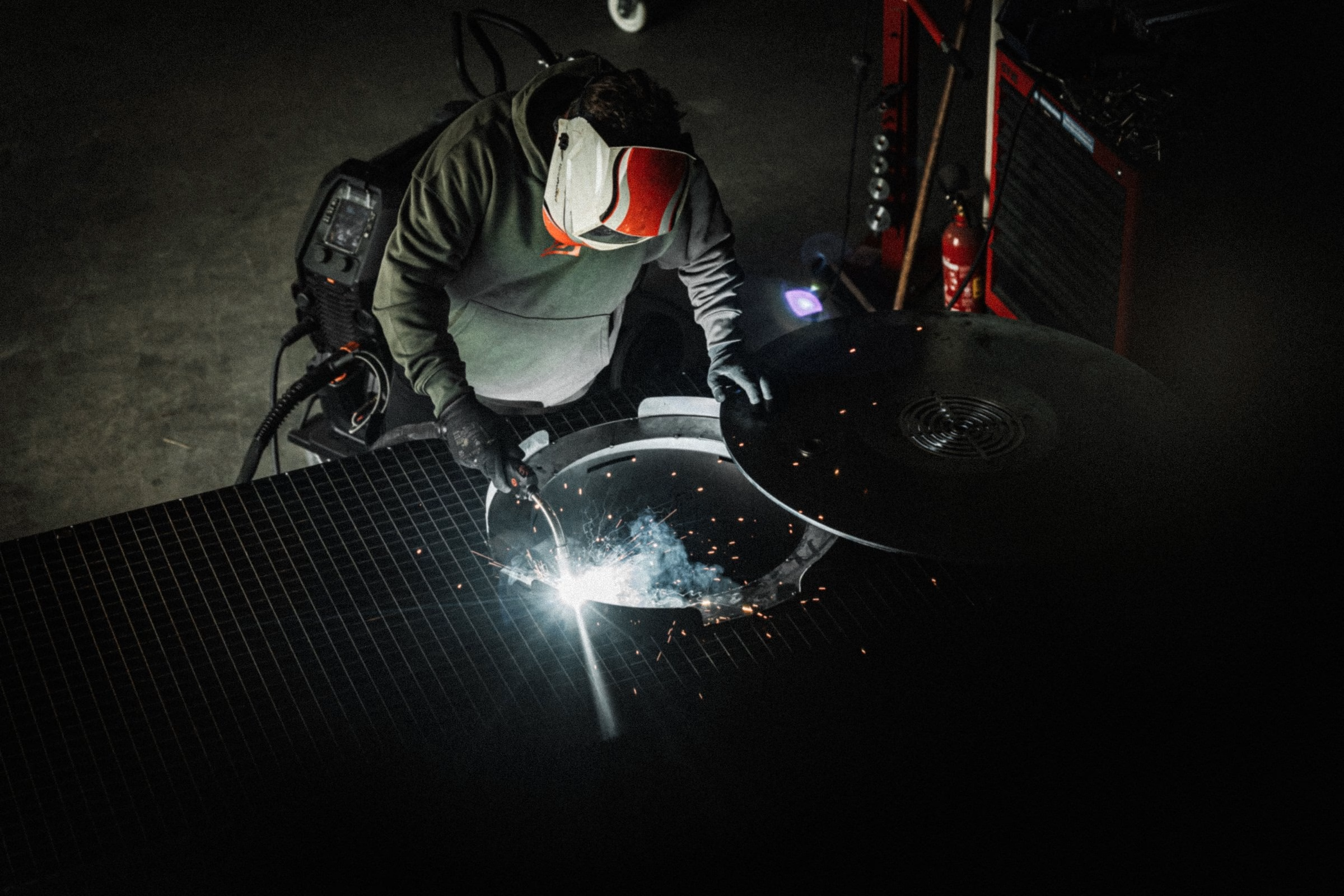
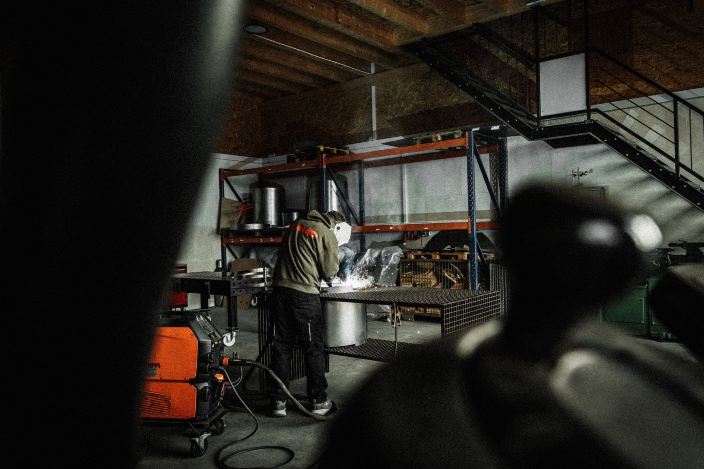
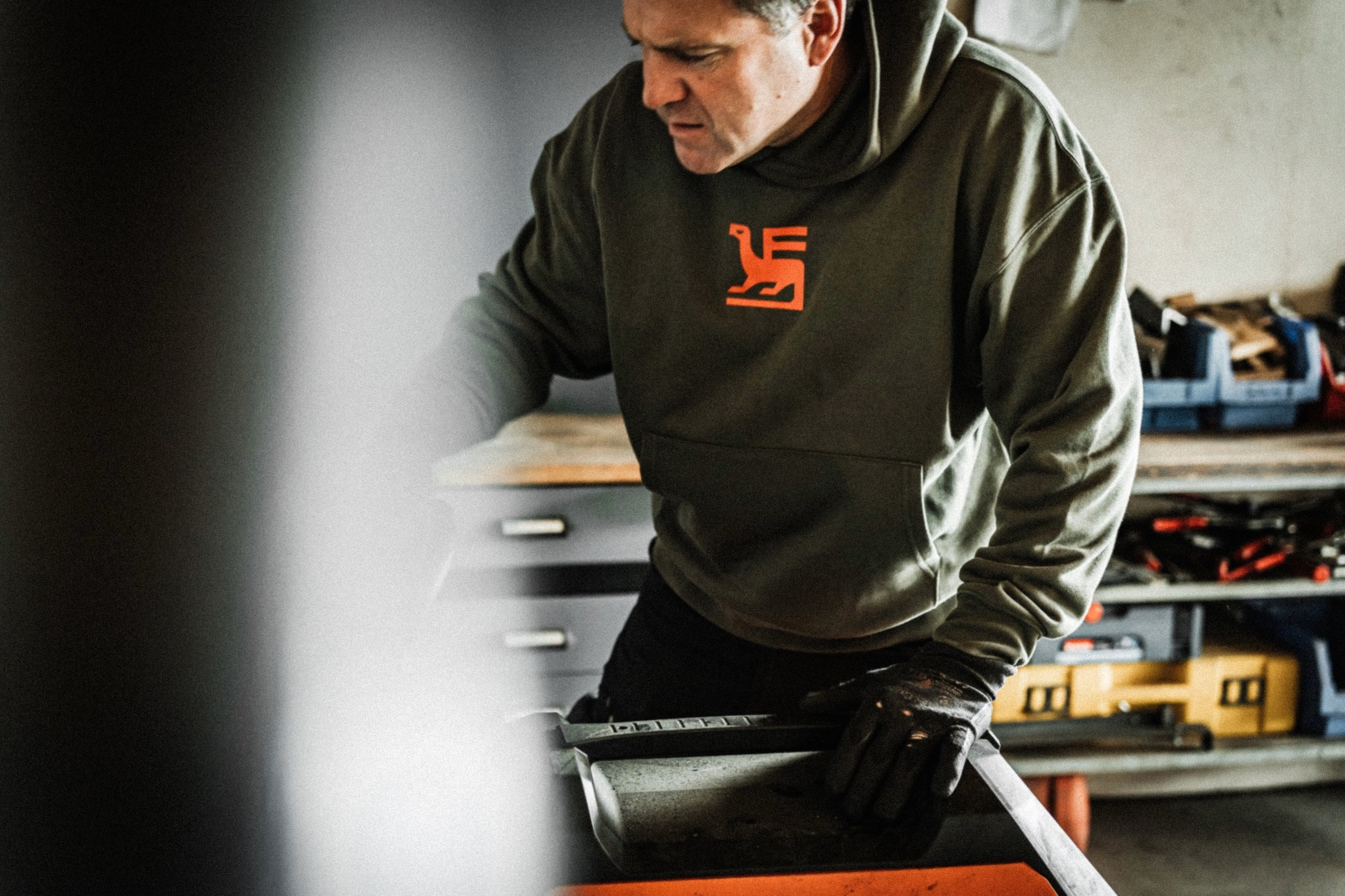
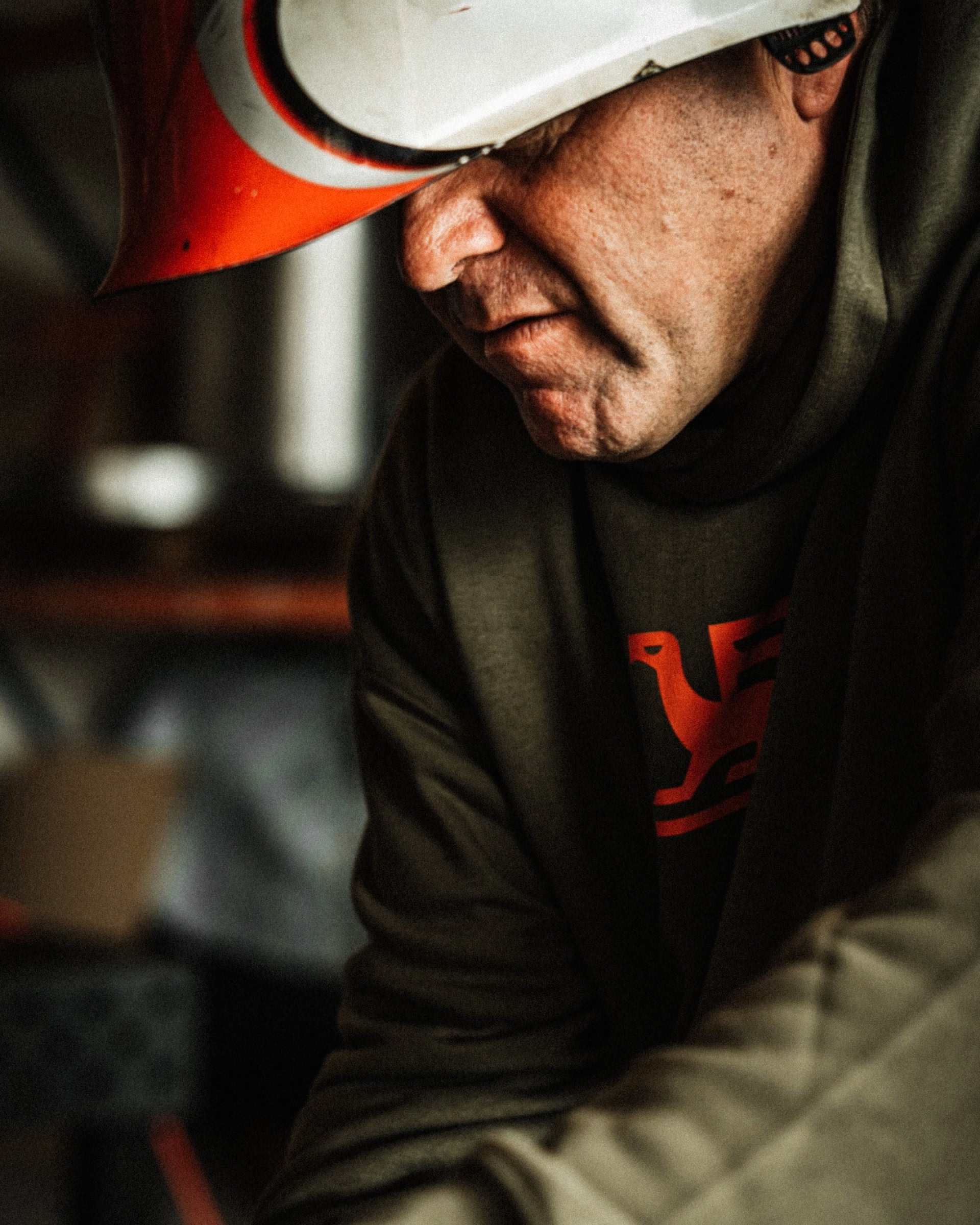
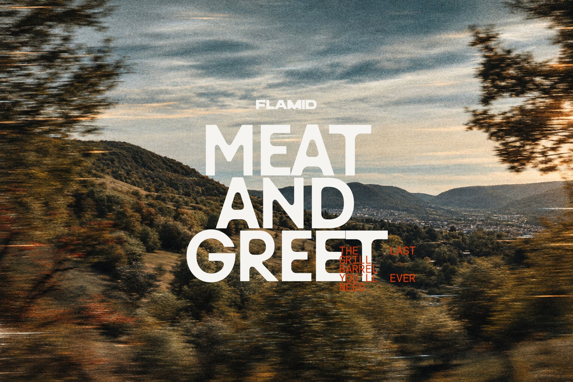
Across the website, posters, teamwear, vehicles, hangtags and live-cooking applications, Flamid becomes a grill brand where craft is not a styling device. Instead, it is visible evidence of how the product is made. The result is an identity that can be pressed into steel, stitched onto workwear and still stay sharp across typography-led digital touchpoints.
Unlock everything with Mindsparkle Mag Plus.
Get exclusive access to Premium features:
Credits: Hochburg Design
Design & Brand Identity: Hochburg Design
Creative Direction: Fabian Schmutzer
Team: Andreas Welter
Team: Benjamin Hanus
Team: Florian Boyd
Team: Slata Schmutzer
Typeface (Install): Arthur Calame
Motion: Brussobaum
More in Brand Identity
Includes freebie bundle, unseen BTS insights and more.