 Plus
Plus

 Menu
Menu



STUDIO HERRSTRÖM
Vienna, AustriaOctober 15, 2026
Mindsparkle Mag


Milkshake was founded in 2019 to give artists a more personal kind of label experience, closer to the full world around the music. Part label and part management company, the Stockholm-based division of Sony Music Entertainment works across left-of-centre pop and alt-pop, with a roster that includes Molly Sandén, Felix Sandman and Dunalia. Its new identity comes from Vienna-based STUDIO HERRSTRÖM, which set out to turn the label's origin story and artist-first mindset into a flexible visual system.
The previous look was recognisable, expressive and colourful, but by 2025 the label had outgrown it. Milkshake needed a clearer brand identity that could reflect a more mature company without losing what made it special. The brief was to help it grow into its next stage while staying artist-first, experimental and undeniably its own.
The visual direction came from a place that had always been part of the story: the car. The name Milkshake was first suggested on a car ride, when someone brought up milkshakes simply because the founding team loved them. Over the years, important milestones kept happening in cars, and new music was literally taken "for a spin" to test it, pitch it and feel it in motion.
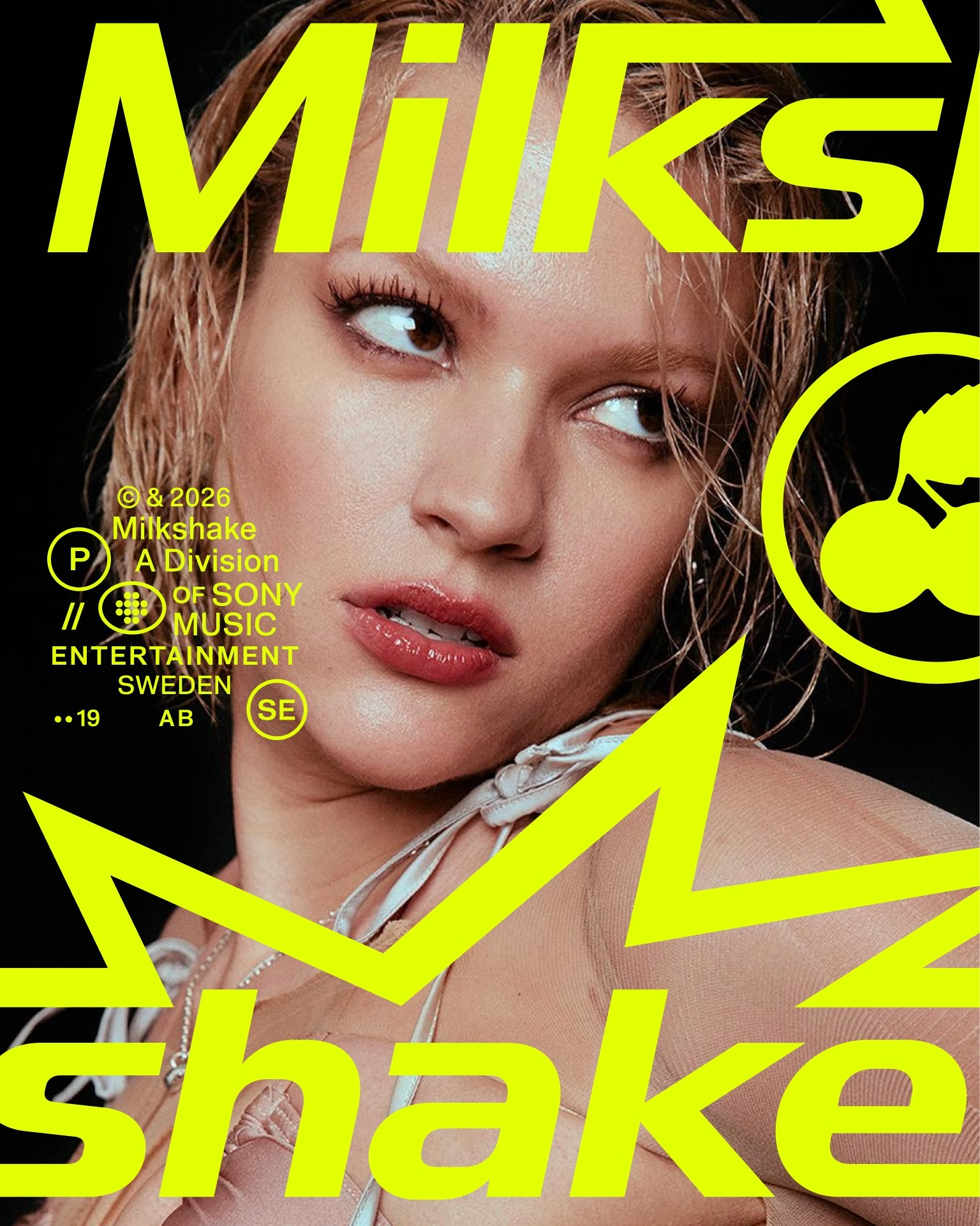
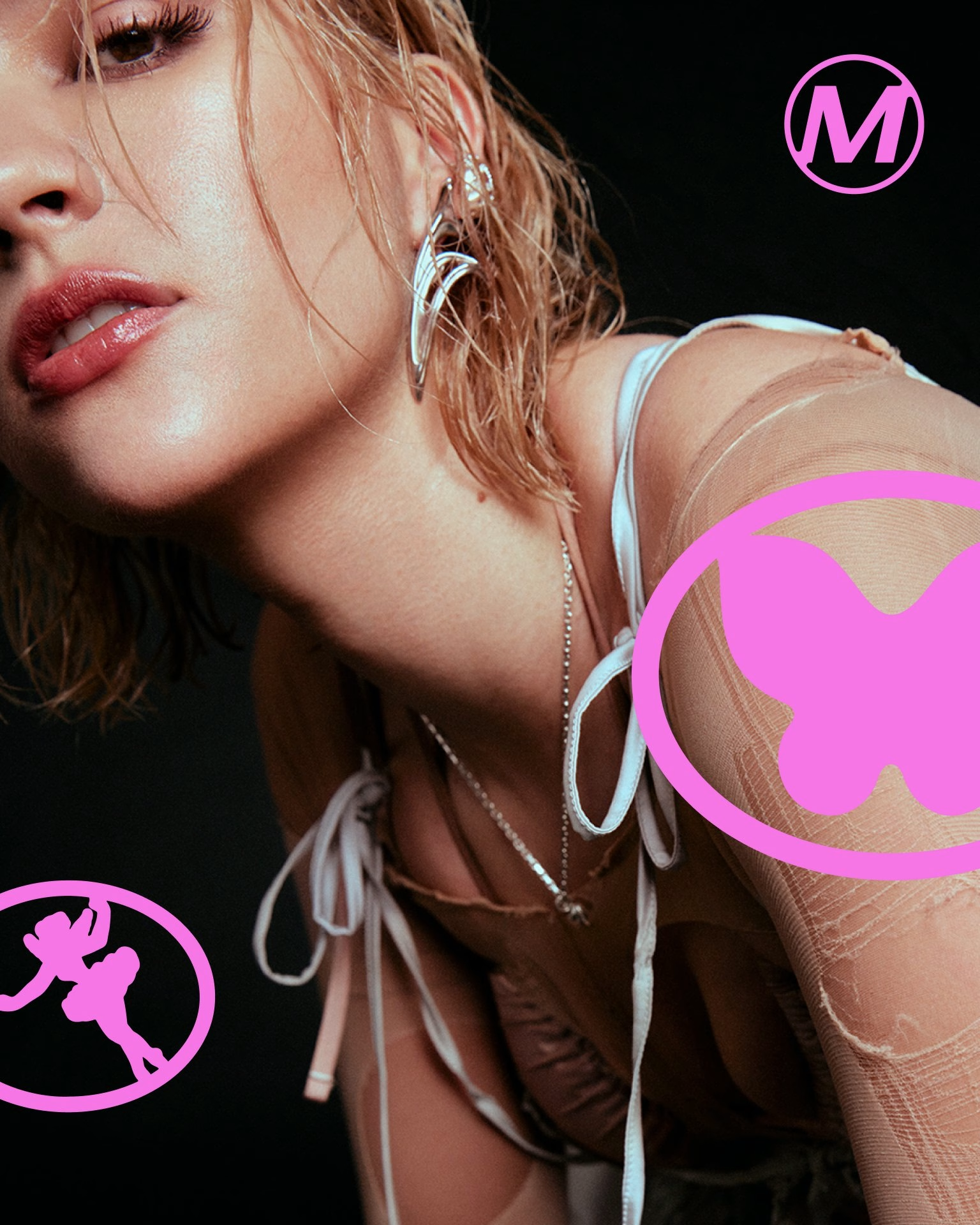
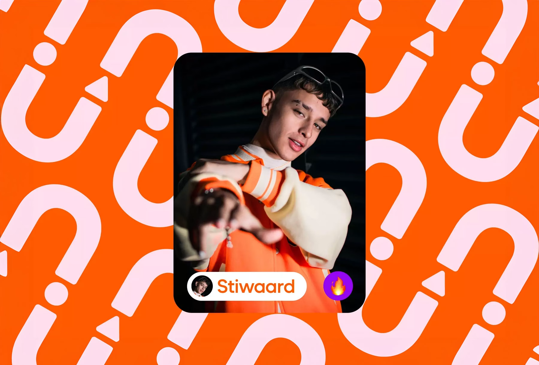
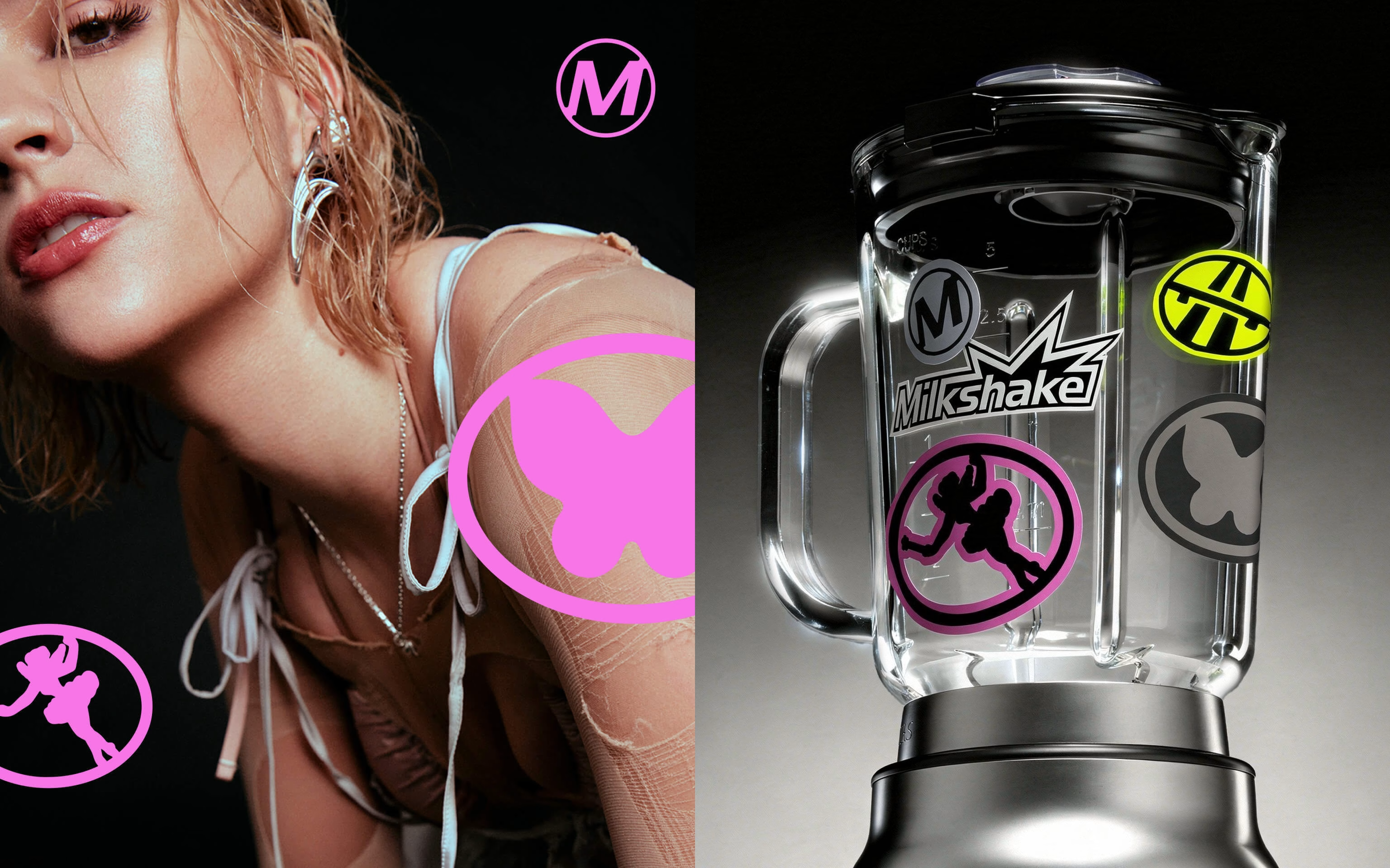
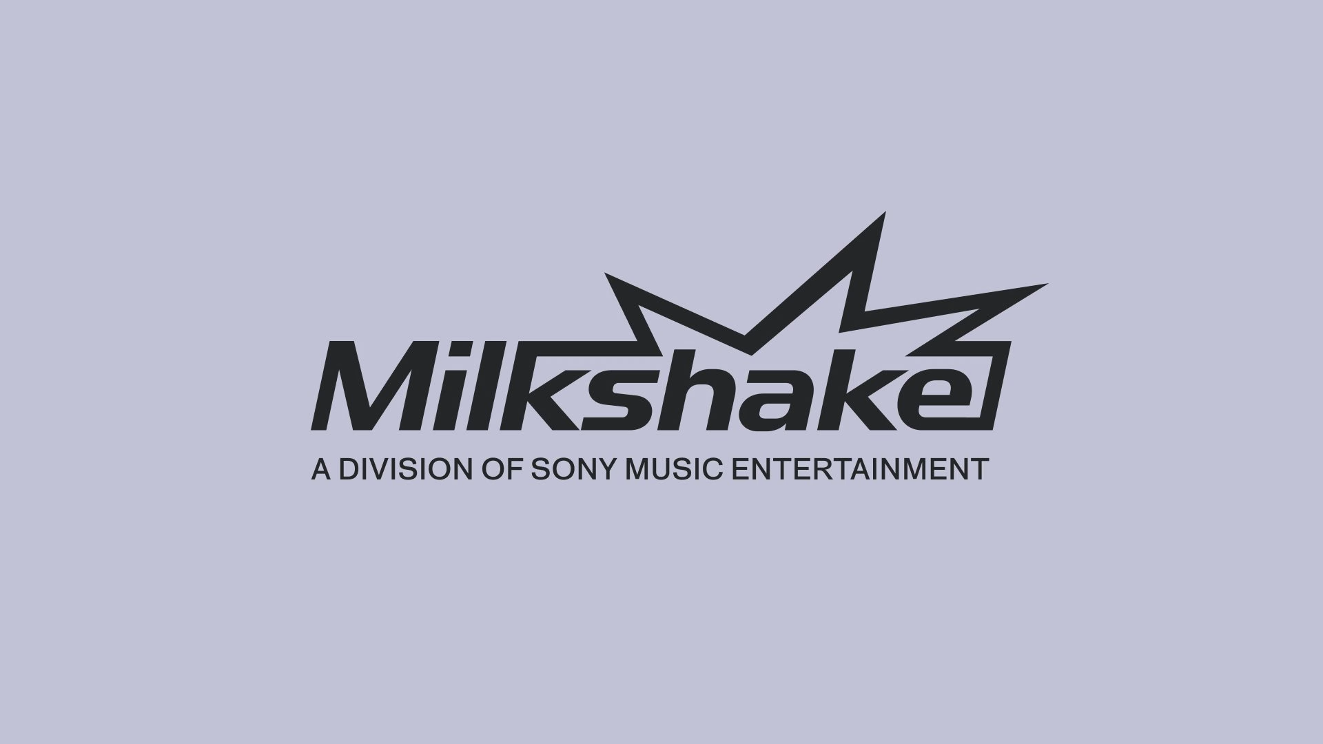
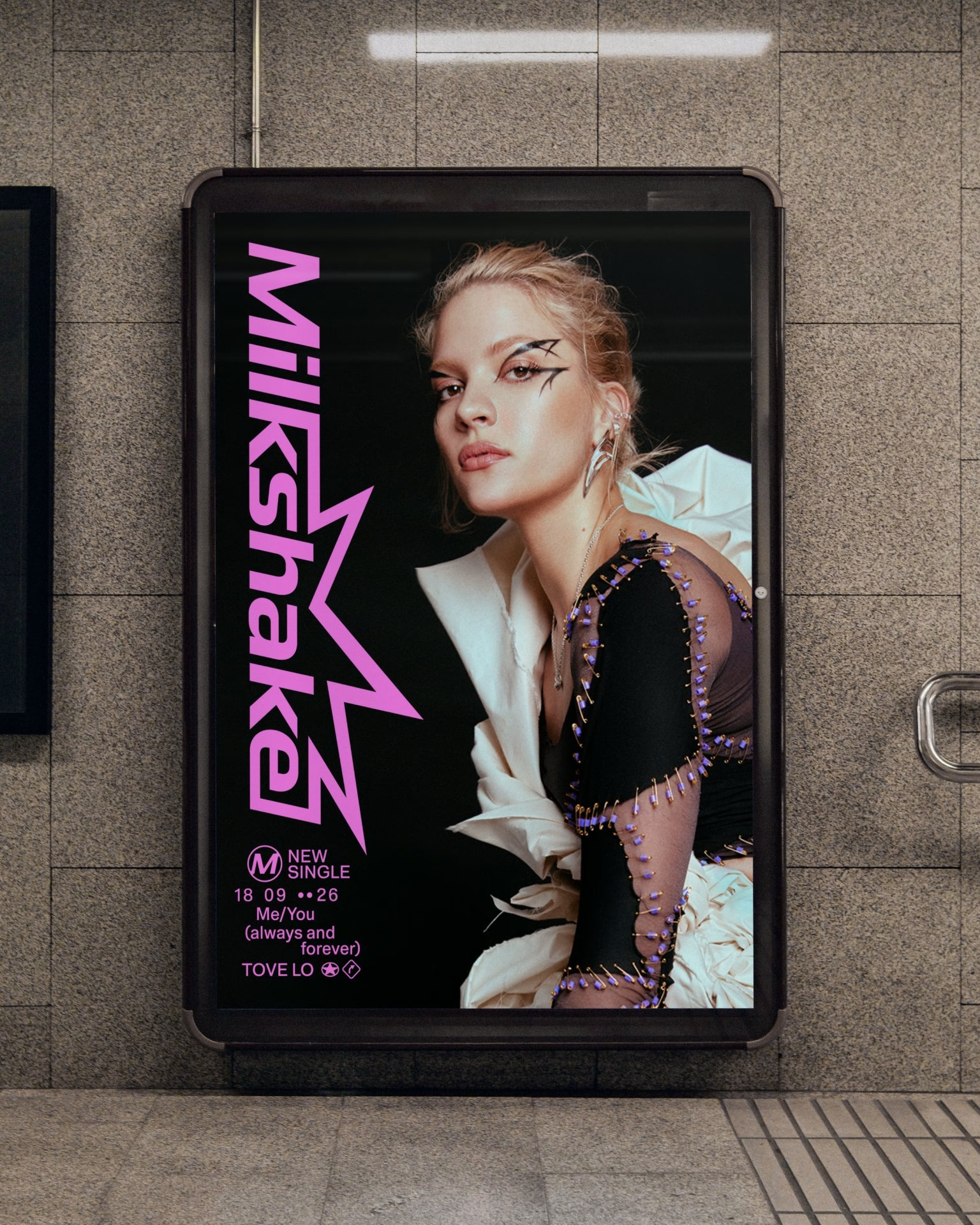
The new logotype builds on the splash energy of the old brand but gives it a more grown-up, focused form. Alongside it, the studio drew a rounded symbol with a blended shape, inspired by the way metal, liquid and surrounding objects seem to merge into one another. The result is a mark that feels both physical and fluid, quick to notice and hard to ignore around a release.
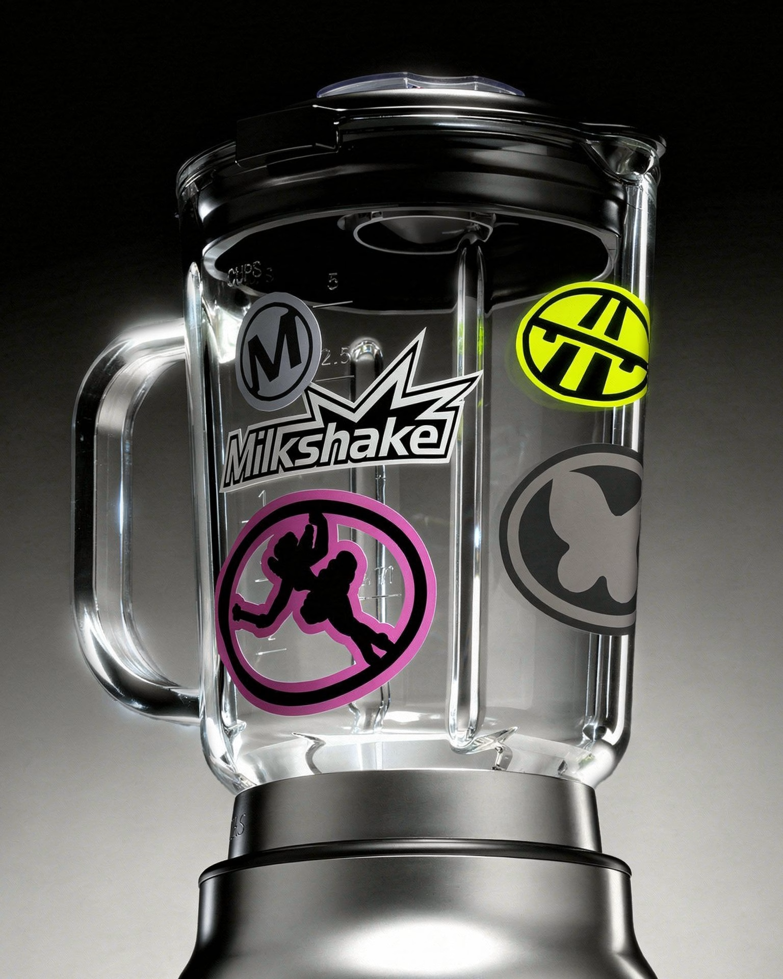
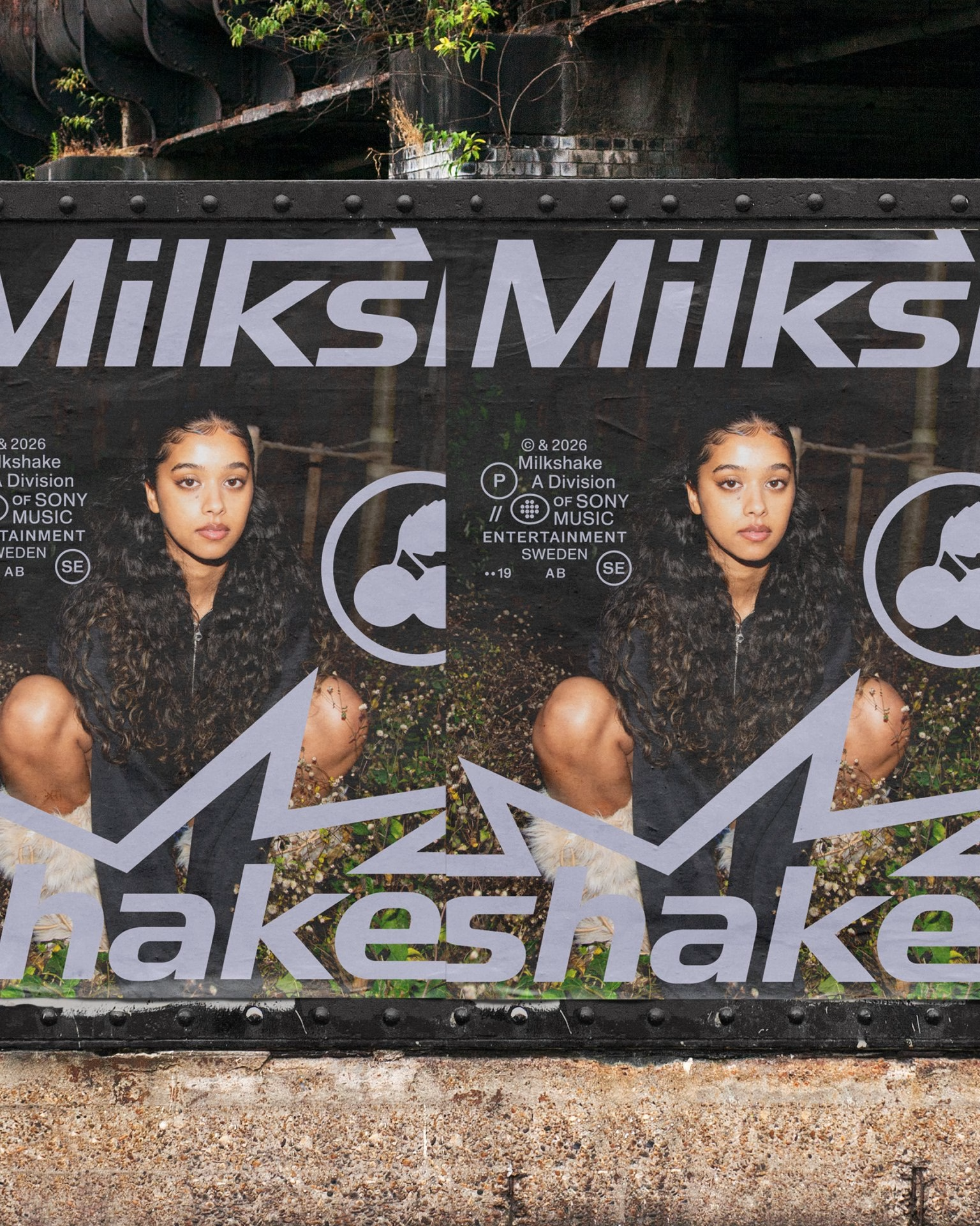
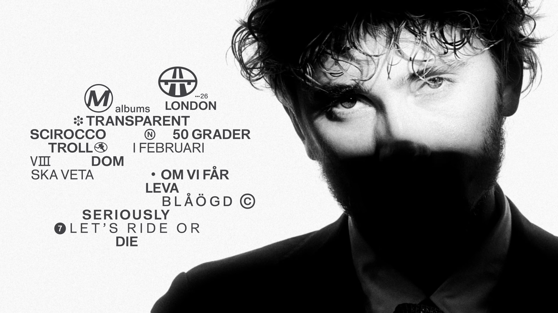
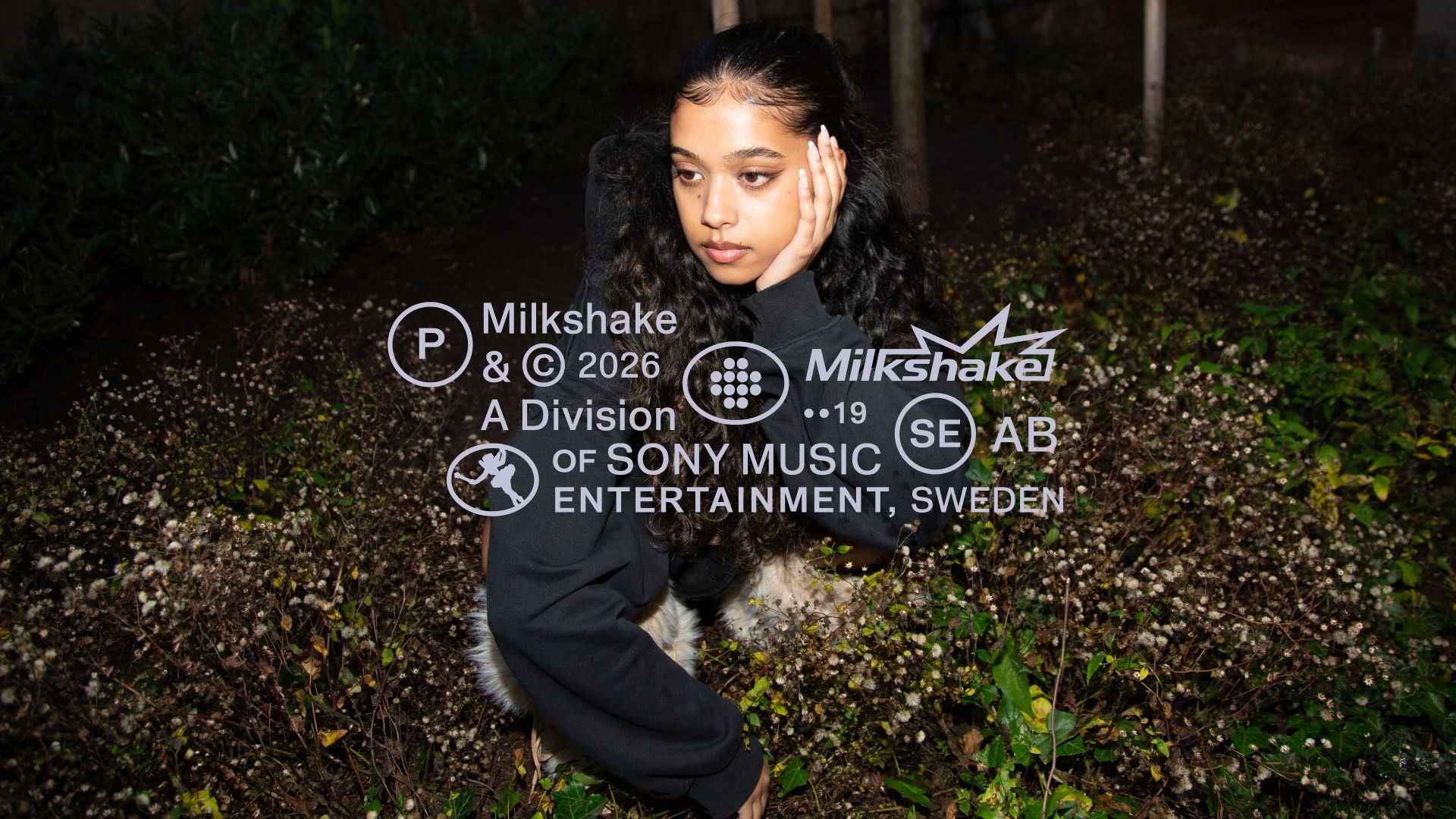
The wider system borrows from road signs, car details, pop culture and shake flavours. Information lockups are modelled on car window stickers and milk carton nutrition labels, giving track names, release dates and even the p-line symbol a natural home. Set in Gates, a neo-grotesque from Context Type, the typography adds a clear editorial structure without ever feeling rigid.
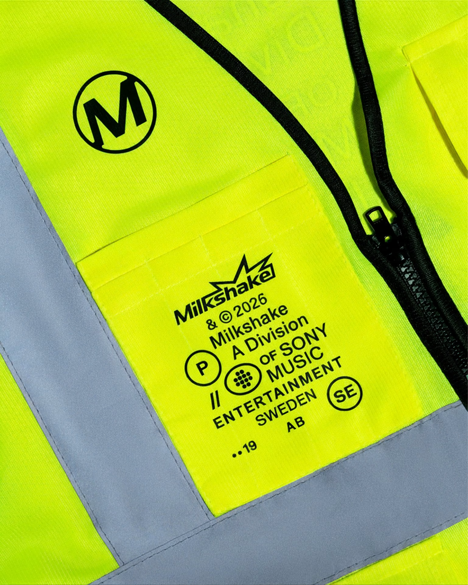
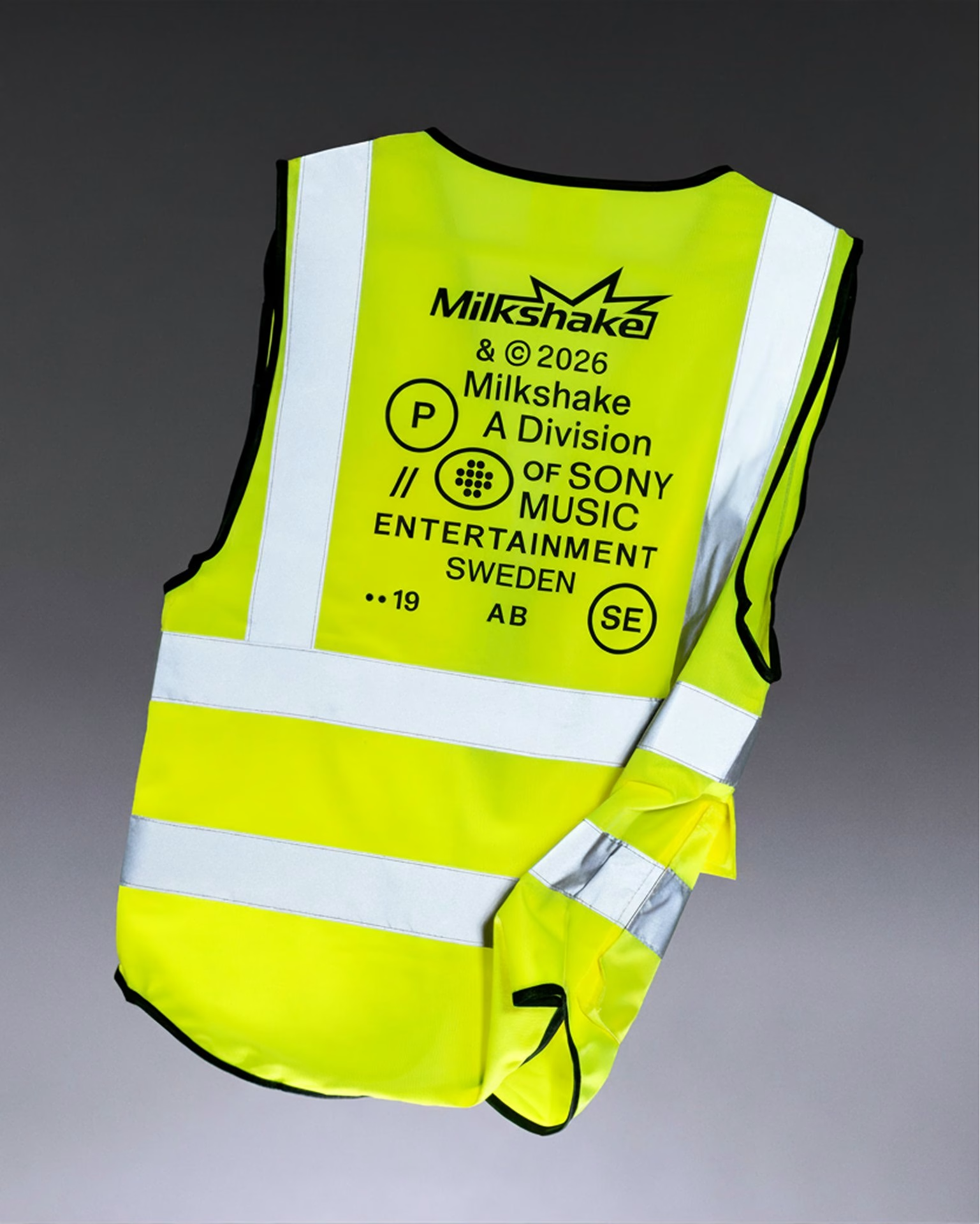
Colour pairs fresh flavour cues with road-inspired tones, and the high contrast keeps Milkshake recognisable across artist campaigns, label communications and digital channels. Iconography adds moments of curiosity, letting the brand shift between structured, playful and experimental expressions. It gives the label enough structure to hold everything together and enough freedom to keep each artist at the centre.
Branding & Visual Identity: STUDIO HERRSTRÖM
Creative Director: Erik Herrström
Design: Kara Griffin Cushman
Design: Martin Carlsson
Design: Matouš Marťák
Design: Lisa Endresz
Design: Marcell Gulyas
Design: Vasco Vicente
Design: Kimelle Fleary
Case Study Photography: Goda Kraštinaitytė
More in Music Branding
Includes freebie bundle, unseen BTS insights and more.