 Plus

 Menu


Anak
October 28, 2026
Mindsparkle Mag


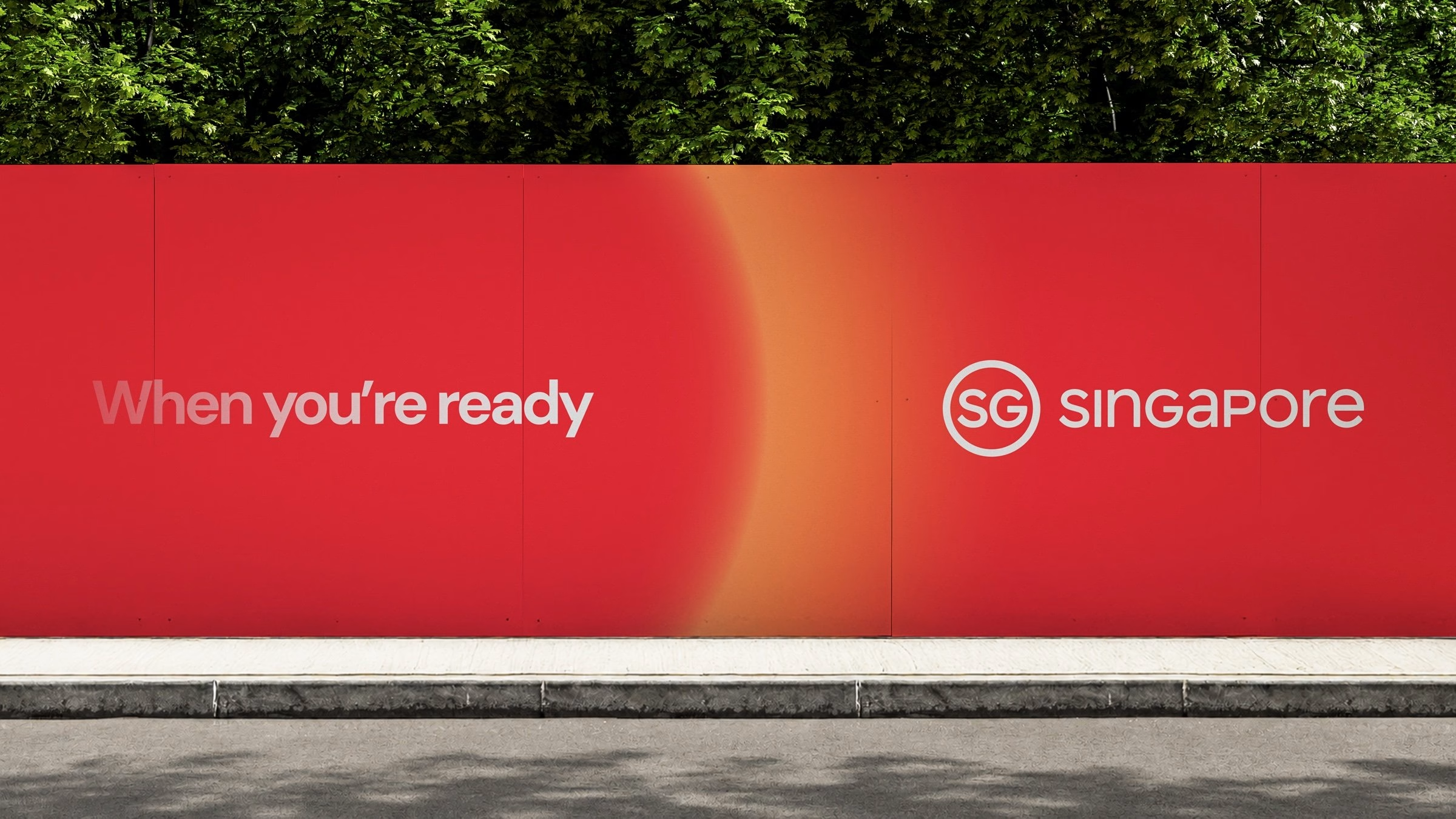
Nearly a decade after it introduced Singapore’s first national brand to the world, Anak has brought the nation’s next chapter to life. Developed with Singapore’s Ministry of Trade and Industry (MTI), the evolved Brand SG world speaks directly to international business. Rather than a polite welcome, it issues a confident summons to the global C-suite under a new master tagline, “When you’re ready”.
The central idea reimagines Singapore’s identity, moving it on from the familiar “Little Red Dot” to a whole new sphere of influence. The SG sphere represents the country’s dynamism and magnetism, radiating energy outwards while drawing the world in at the same time. It positions Singapore as a centre of gravity for the future, a place that attracts global partnerships, nurtures innovation and pulls diverse cultures into a shared orbit.

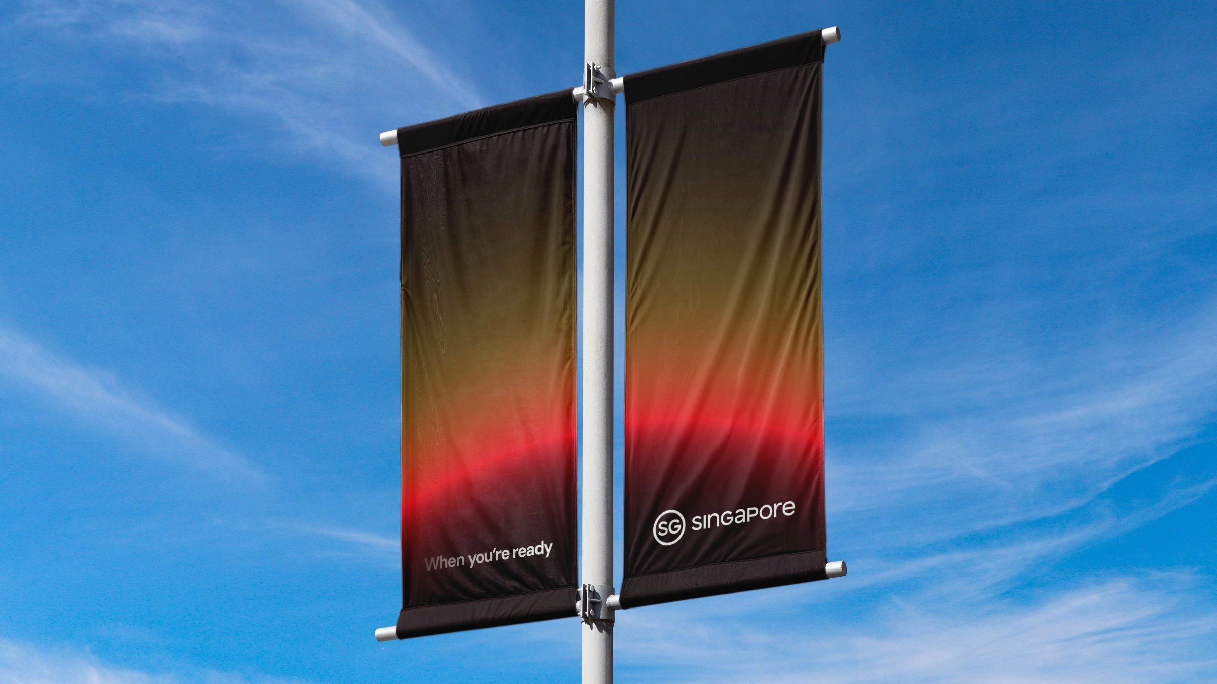
The tagline is carried visually by a warm gradient that runs from deep red into glowing orange. The gradient stands for a nation in motion, never static, and it gives every application a sense of light breaking over a horizon. Across billboards, street banners and hoardings, the sphere and its glow do the heavy lifting, leaving plenty of room for short, assertive lines of copy.

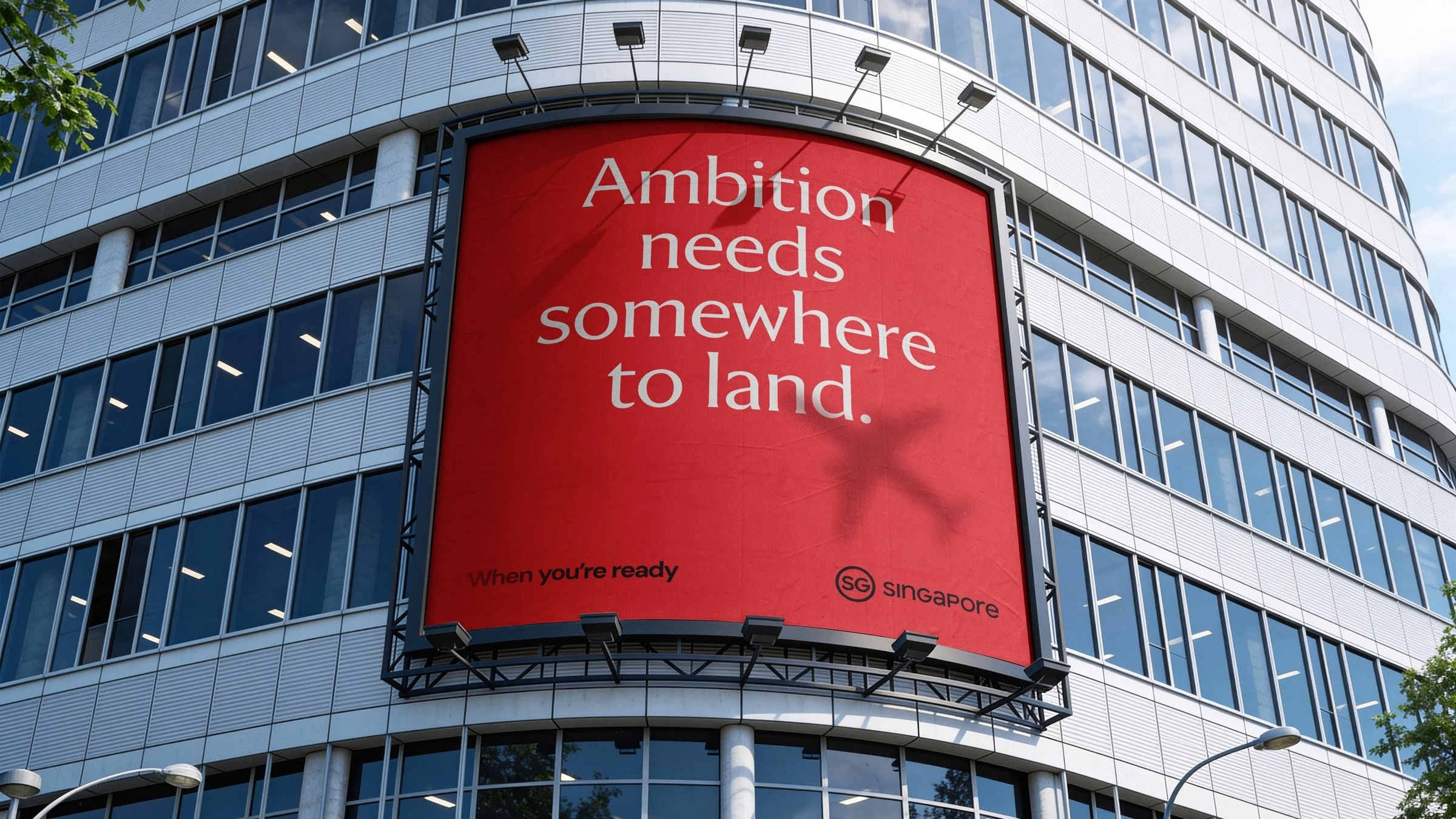
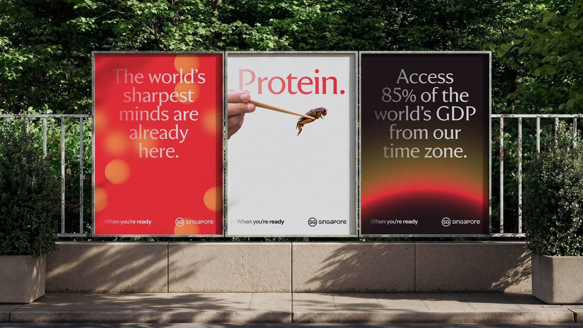
Those lines matter, because the tone of voice has evolved alongside the visuals. The new voice is magnetic and perspective-driven, while staying grounded in clarity and self-assurance. Headlines such as “Ambition needs somewhere to land” and “Turn research into reality” make the case for Singapore in a handful of words, and the same confidence carries through to merchandise and event material.

Anchoring the system is a typography pairing of Viktor and DM Sans, chosen to balance character with clarity. Viktor brings an editorial, high-contrast voice to the big statements, while DM Sans keeps supporting information clean and legible. With a strong emphasis on purposeful copywriting, the type system makes sure information is always delivered with precision and intent.
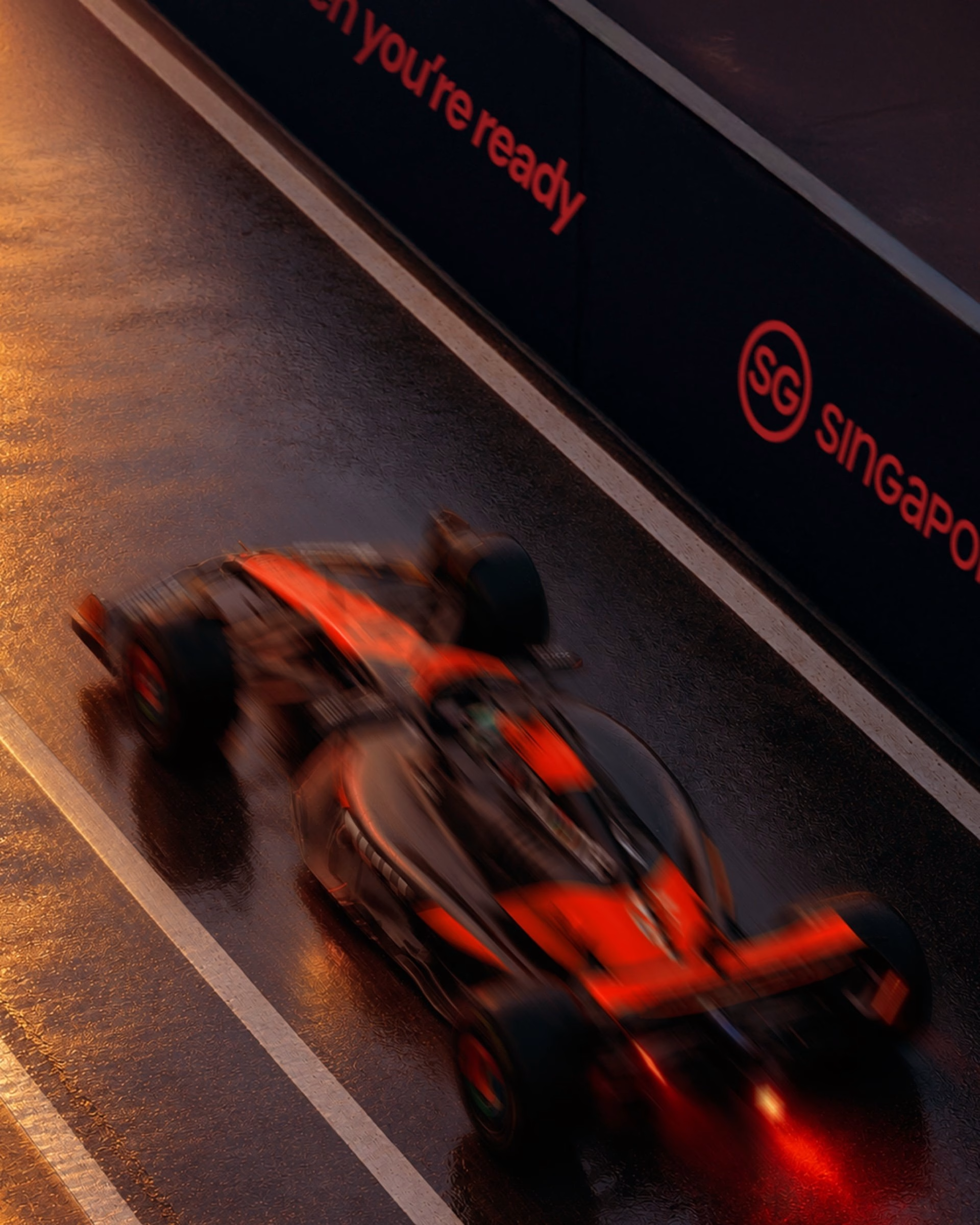
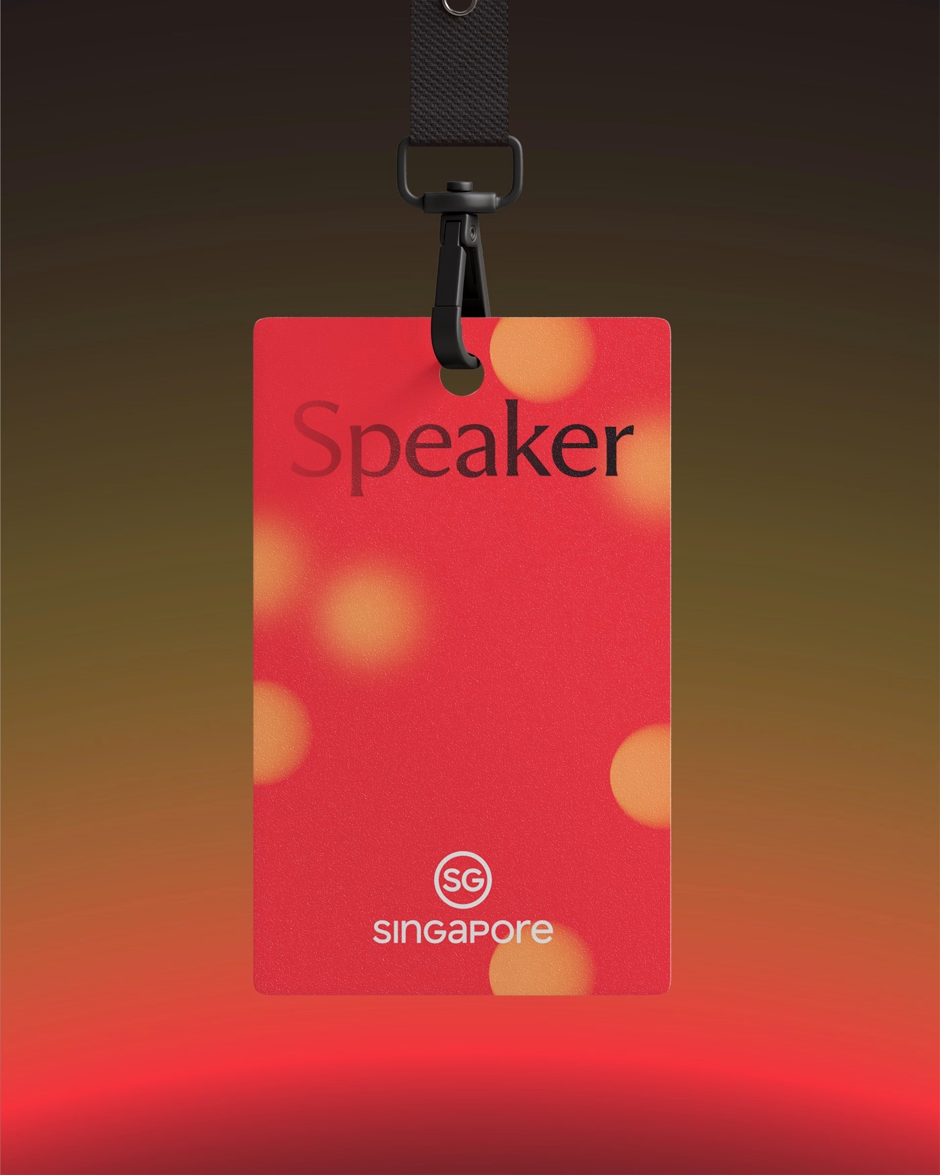
A key part of the new brand is its expressive motion identity, which borrows the qualities of light and shadow. Every transition is designed to move with purpose, so that breakthrough moments are emphasised with illumination and clarity. The sphere rises, glows and recedes like a sun, a behaviour that carries from screen animations all the way to a red glow rising across the façade of the Fullerton Hotel.

The whole brand world comes together in a new Brand SG digital experience. Anak designed it as a living expression of “When you’re ready” and as a gravitational hub that naturally draws the world in. The site, social formats and event material all share the same gradient, type and motion language, giving Singapore one coherent voice wherever global business meets it.
More in Brand Identity
Stay on top of this week's design. Insights, top picks & more.