Plus
Plus

 Menu
Menu


Hochburg Design
September 10, 2026
Mindsparkle Mag


Since 1980, Perkins Park has been part of Stuttgart’s nightlife. In 2026 it becomes PARK — and, more than a rebrand, the new identity marks a fundamental shift in the club itself. House and electronic music move to the centre of the programme, international bookings gain greater prominence, and the club is being reimagined for a younger, more international audience.
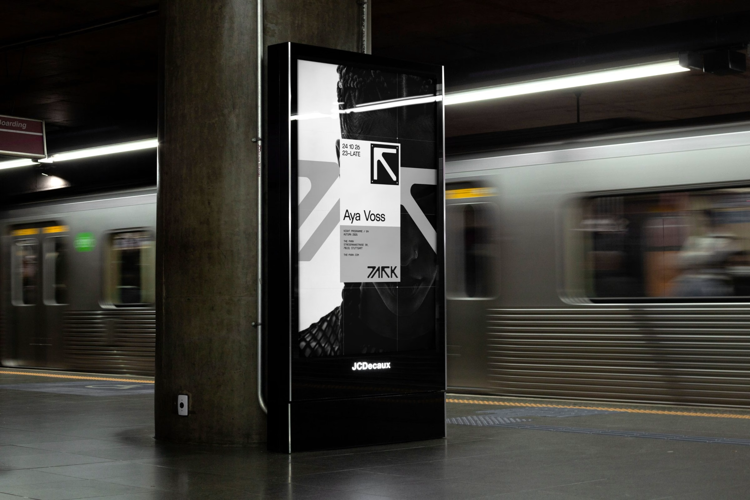
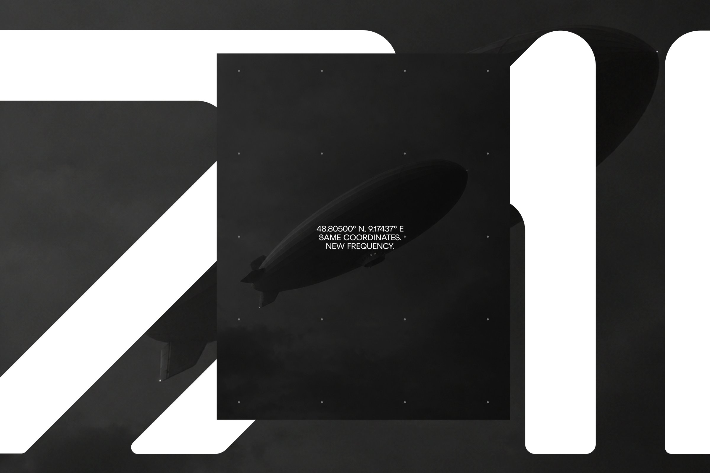
Stuttgart studio Hochburg built the brand identity around the reduction from Perkins Park to PARK. P, A, R and K were compressed into a distinctive silhouette that sits between wordmark and symbol. Built on a tight grid and stripped of traditional typographic information, the mark is designed to be decoded once and recognised thereafter.
The open, linear construction extends into motion, where the mark can fragment, expand and react to sound across the club’s LED surfaces. Black, white and technical greys provide a neutral foundation, while changing colours, artist imagery and visual worlds are absorbed through a flexible system of grids, typography and graphic elements.
Rather than defining one fixed look, the identity creates a recognisable framework that can continuously change with PARK’s programme, artists and nights.






Unlock everything with Mindsparkle Mag Plus.
Get exclusive access to Premium features:
Credits: Hochburg Design
Brand Identity & Design Studio: Hochburg Design
Creative Direction, Motion & AI Art Direction: Florian Boyd
Art Direction: Benjamin Hanus
Design: Andreas Welter
Motion Design & 3D / CGI: Nadine Klump
Video: Marcel Hanke, Hanke Brothers
Project Management: Slata Schmutzer
Client (PARK): Denis Gugac
Arame Typeface: Dimitre Lima
Futurist Typeface: Fuego Fonts
More in Brand Identity
Stay on top of this week's design. Insights, top picks & more.