Plus
Plus

 Menu
Menu


LG2
August 08, 2026
Mindsparkle Mag


To fully immerse yourself in a region is also to embrace what makes it singular. For Tourisme Abitibi-Témiscamingue, lg2 built a brand identity that leans all the way into the Québec territory — a place that is intense, deeply rooted, and unapologetically not for everyone.
At its centre sits a single unifying symbol, in which the A of Abitibi and the T of Témiscamingue merge into one mark. It is carried by a system of patterns drawn from the region’s many lakes and waterways, and anchored by an orange that is impossible to ignore.
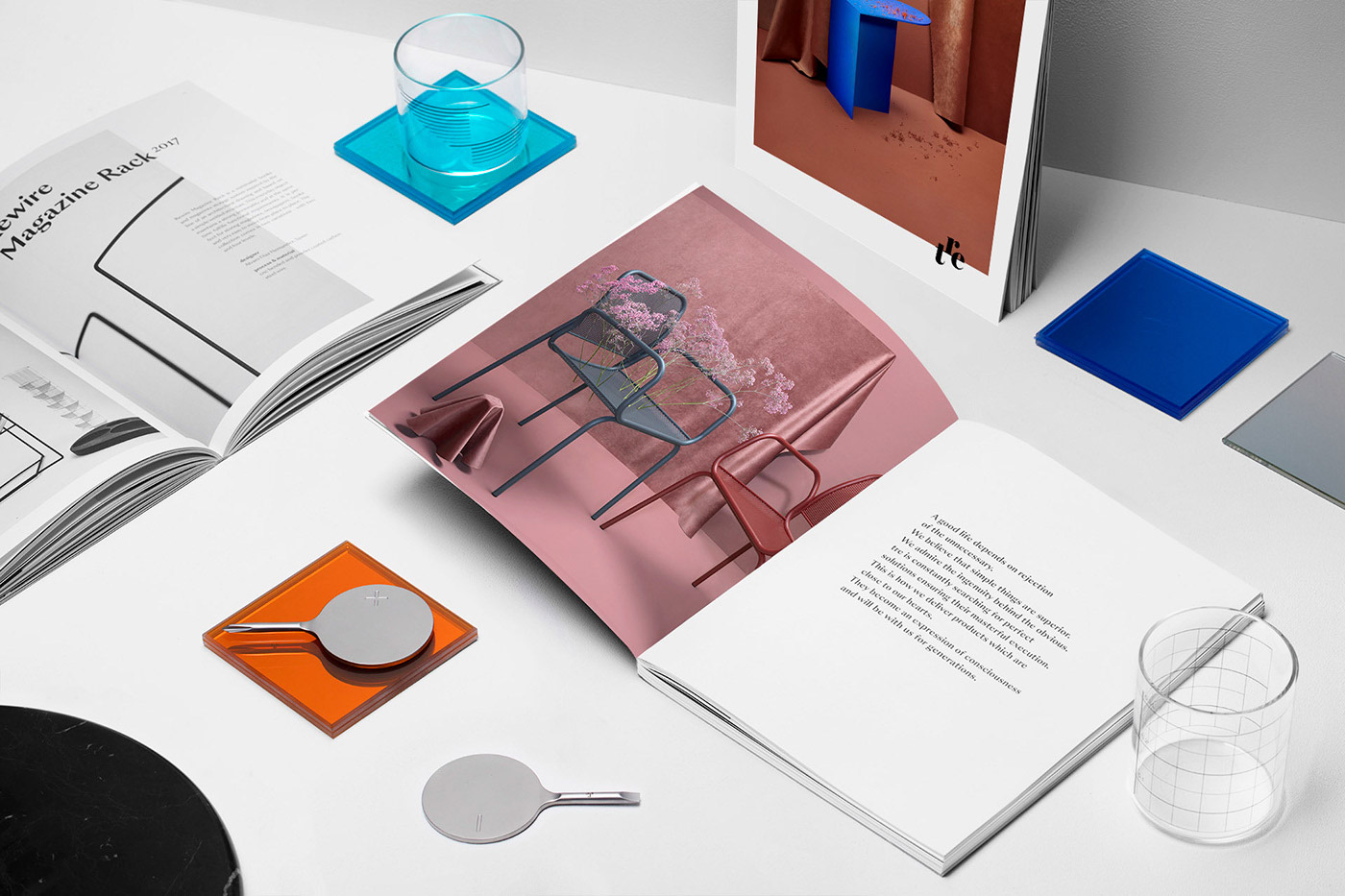
The identity extends across signage, print, merchandise and motion, translating the character of the land into a confident, contemporary visual language that speaks to locals and travellers alike.


More in Brand Identity
Includes freebie bundle, unseen BTS insights and more.