

 Plus

 Menu


Reliquia Studio
November 11, 2026
Mindsparkle Mag


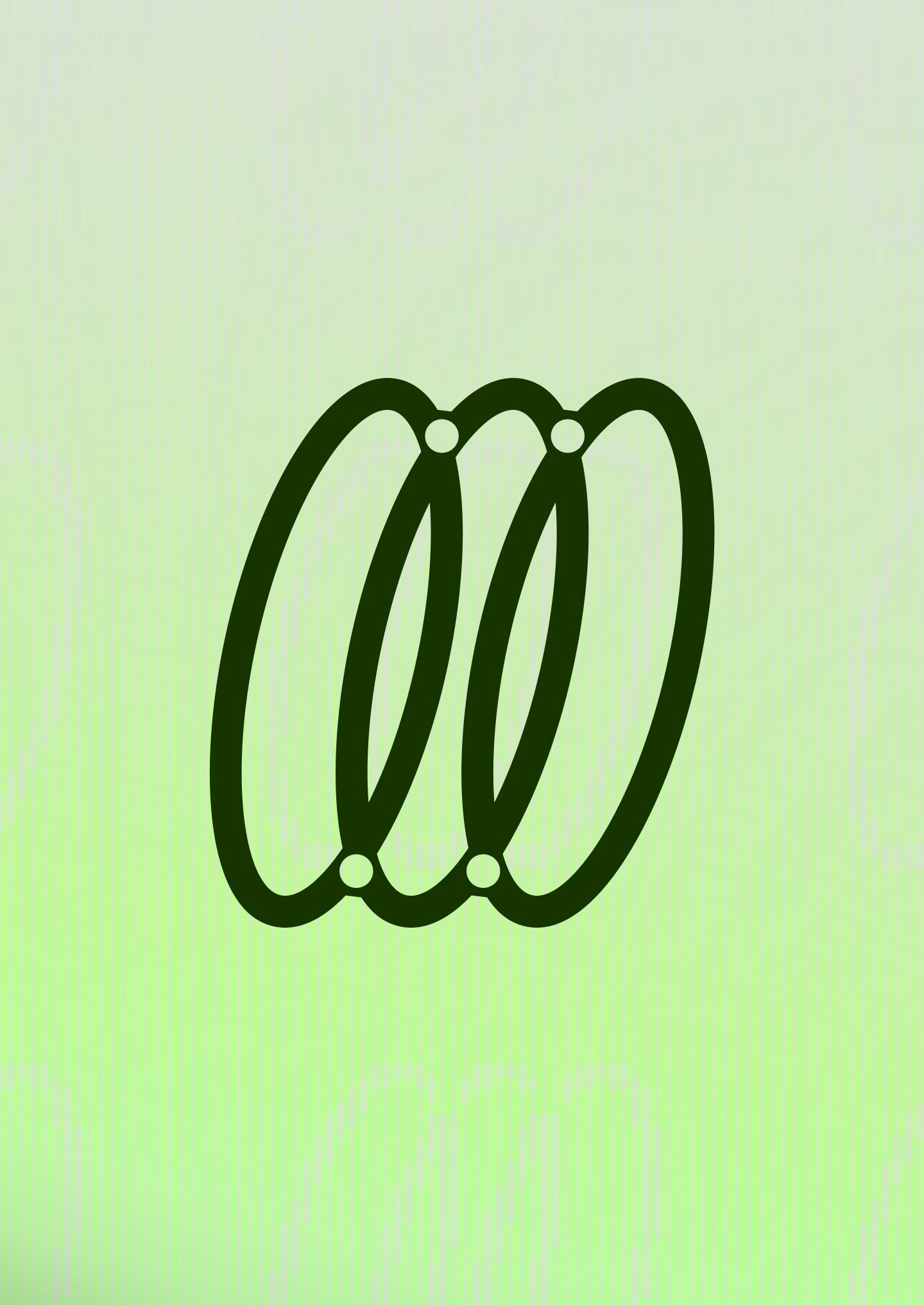
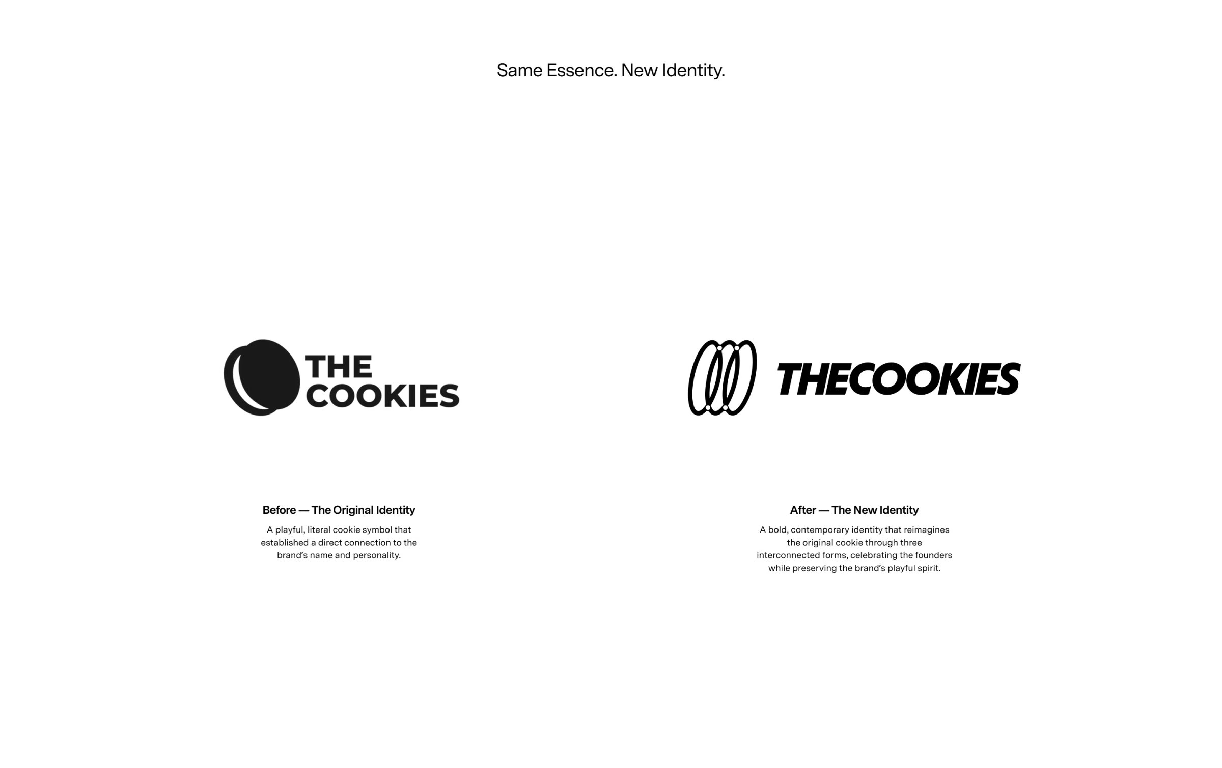
TheCookies is a digital agency from Zaragoza, Spain, that builds custom websites and digital products for businesses that want more than a template. Its old logo was exactly what the name promised: a literal, playful cookie set next to a stacked wordmark. Buenos Aires studio Reliquia Studio, co-founded by Angello Torres and Fifi Lachimia, was asked to grow that mark up without losing the wink. The answer is a new brand identity that keeps the cookie but tells a different story with it.
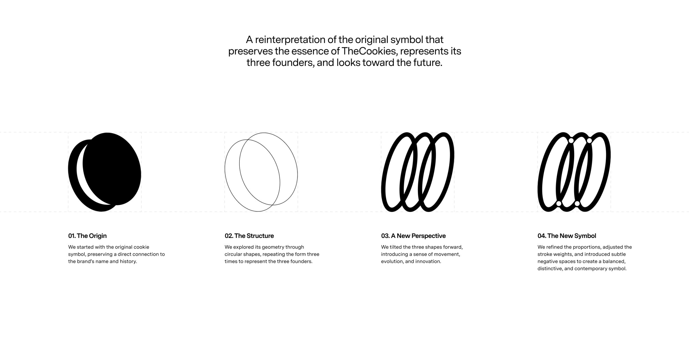
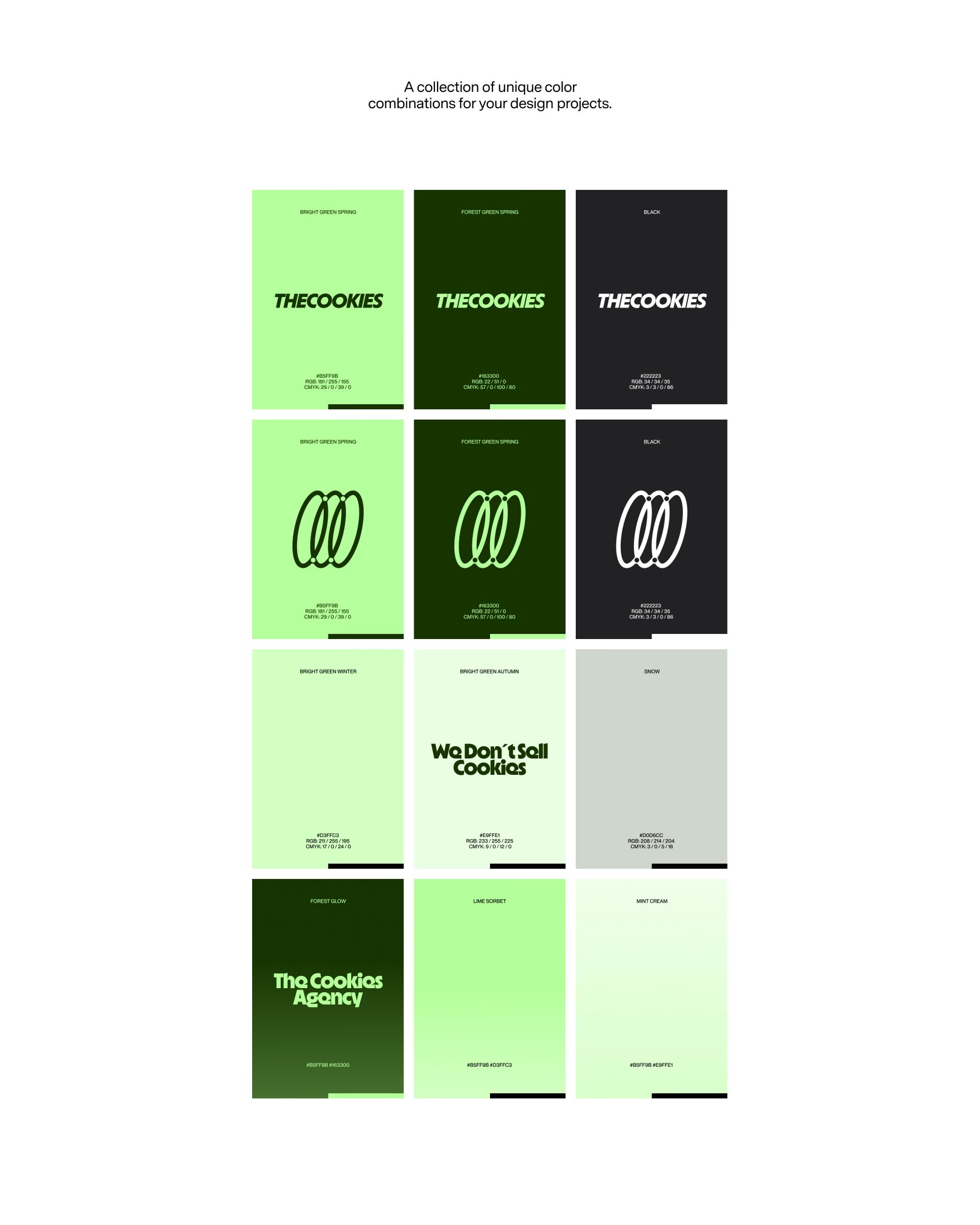
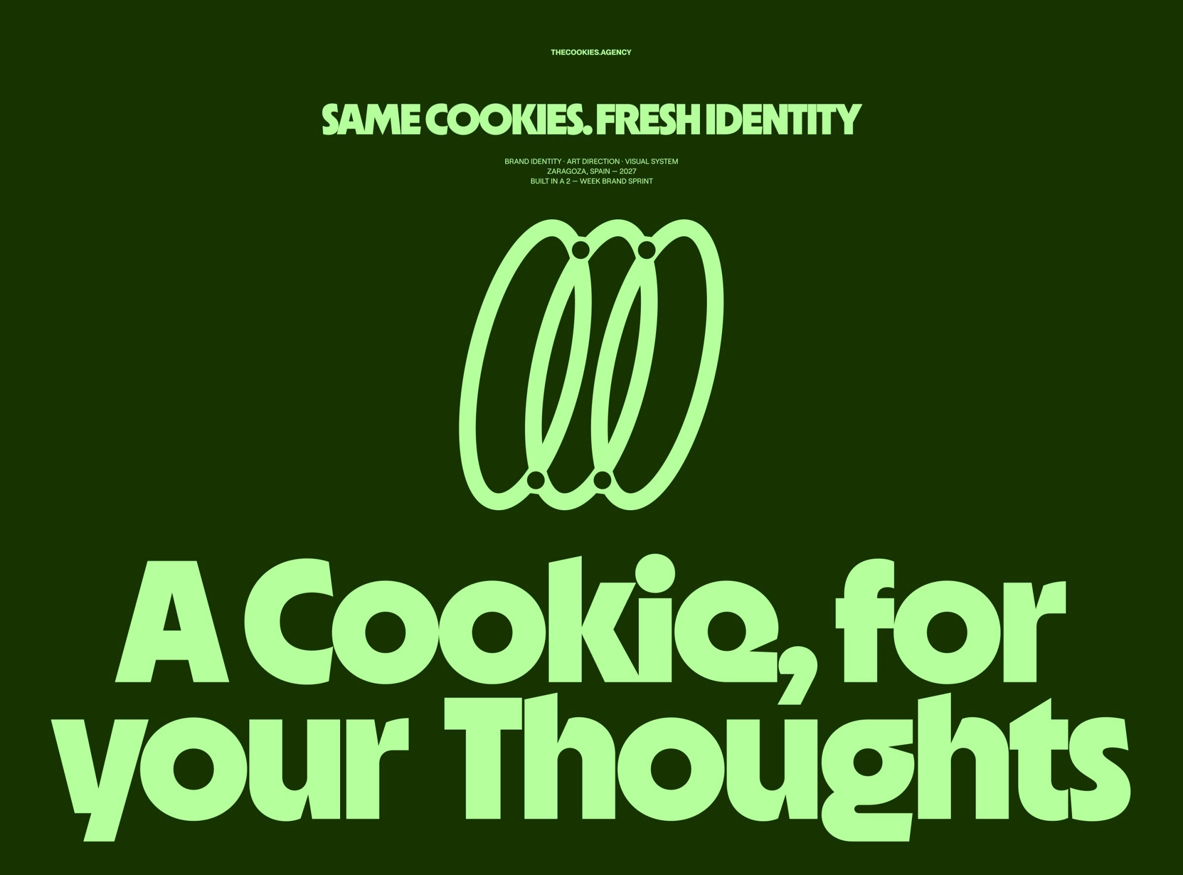
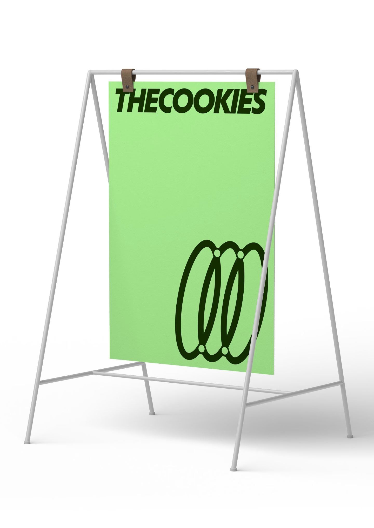
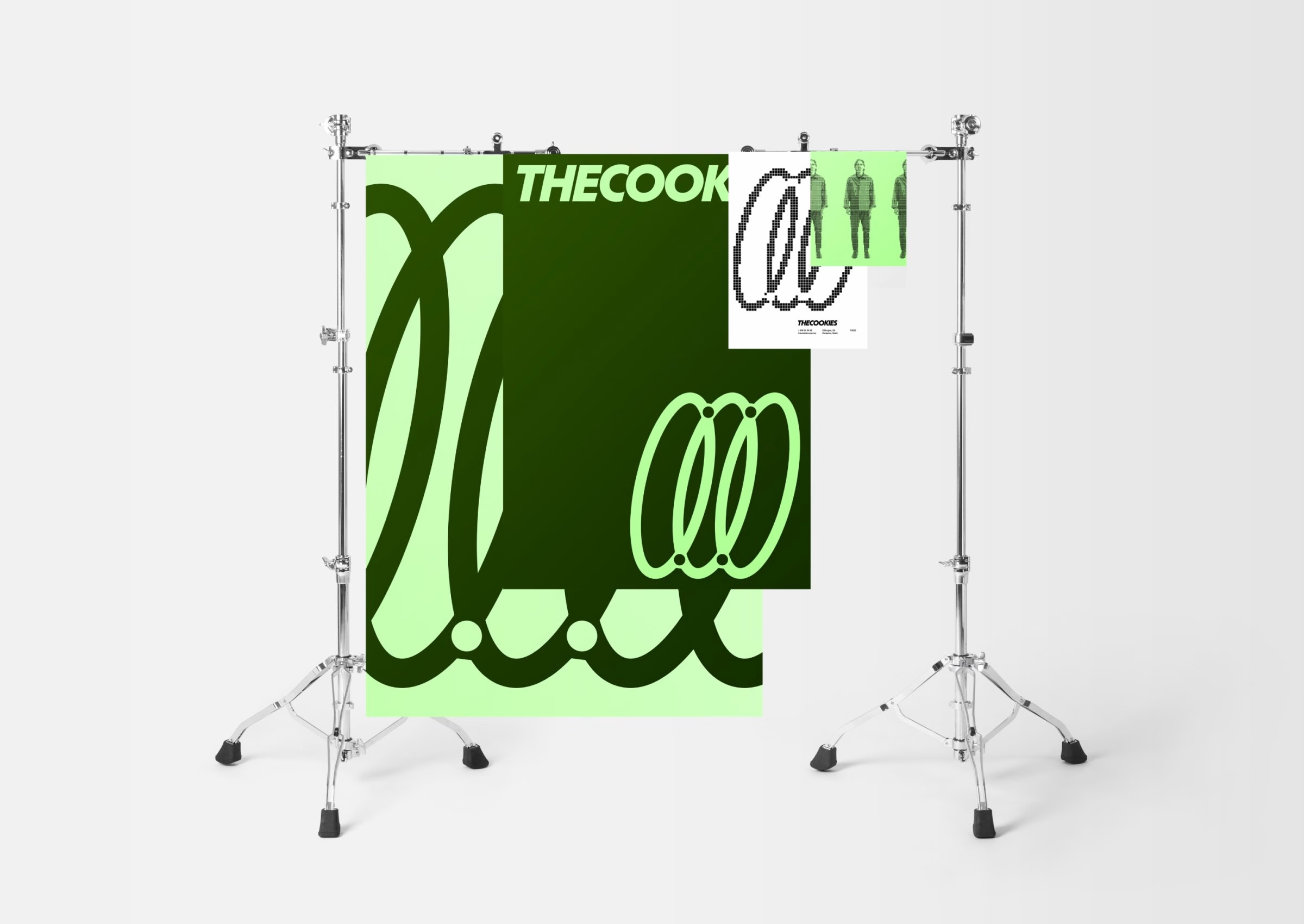
The process started with the original biscuit and broke it down into pure geometry. Reliquia repeated the circular form three times, one ring for each of the agency's three founders, then tilted the shapes forward to suggest movement and progress. In the final step the team refined the proportions, balanced the stroke weights and cut small negative-space dots where the rings cross, so the three loops read as one interlocking symbol. Set next to a tight, italic all-caps THECOOKIES wordmark, the new mark keeps the same essence in a more grown-up form.
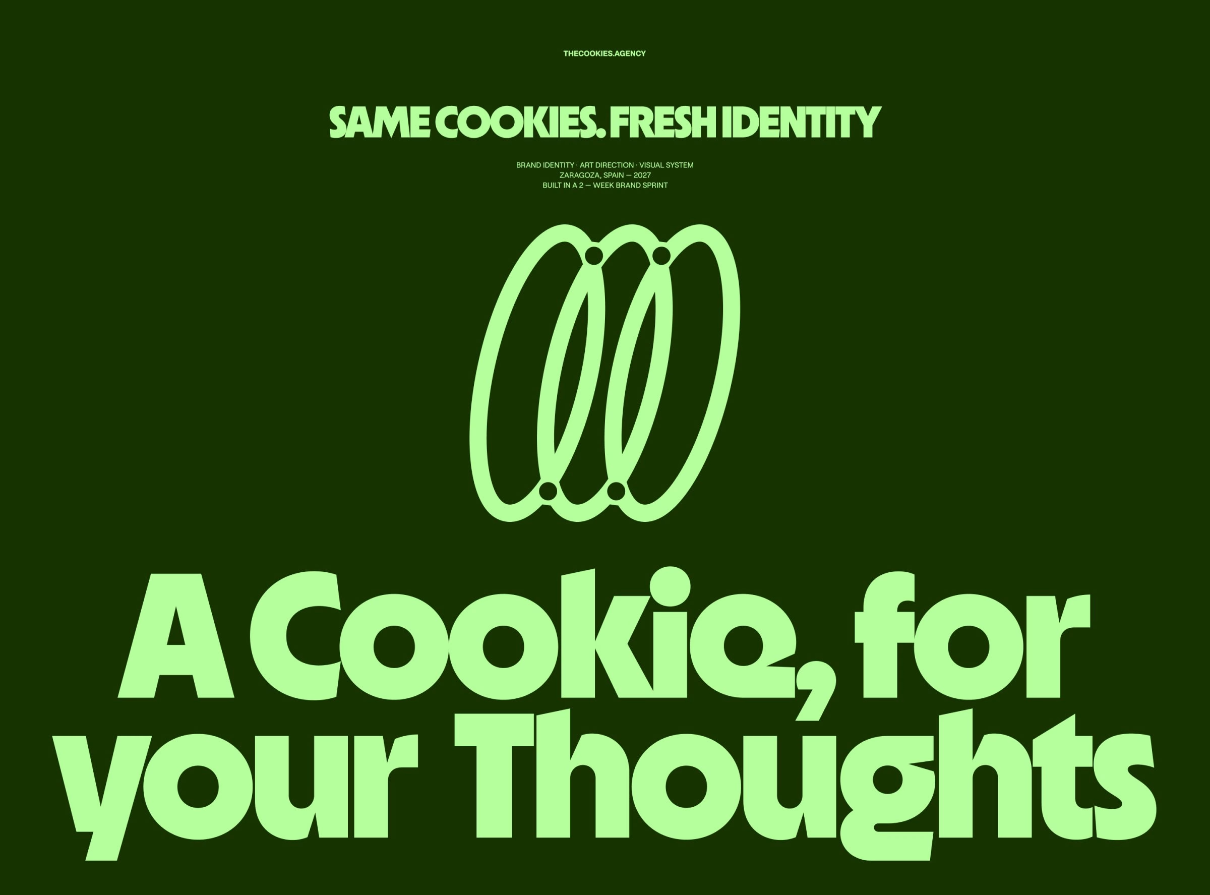
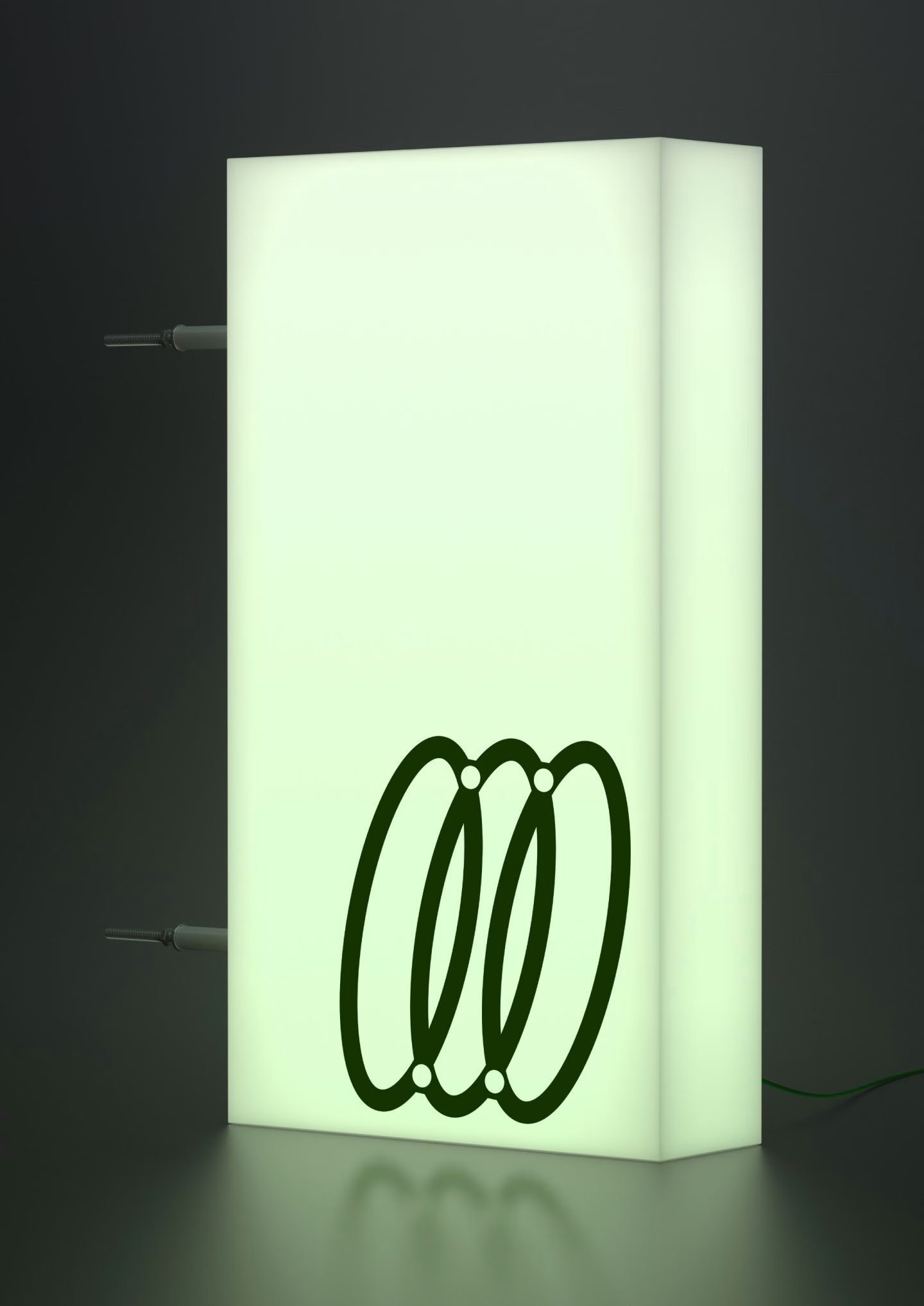
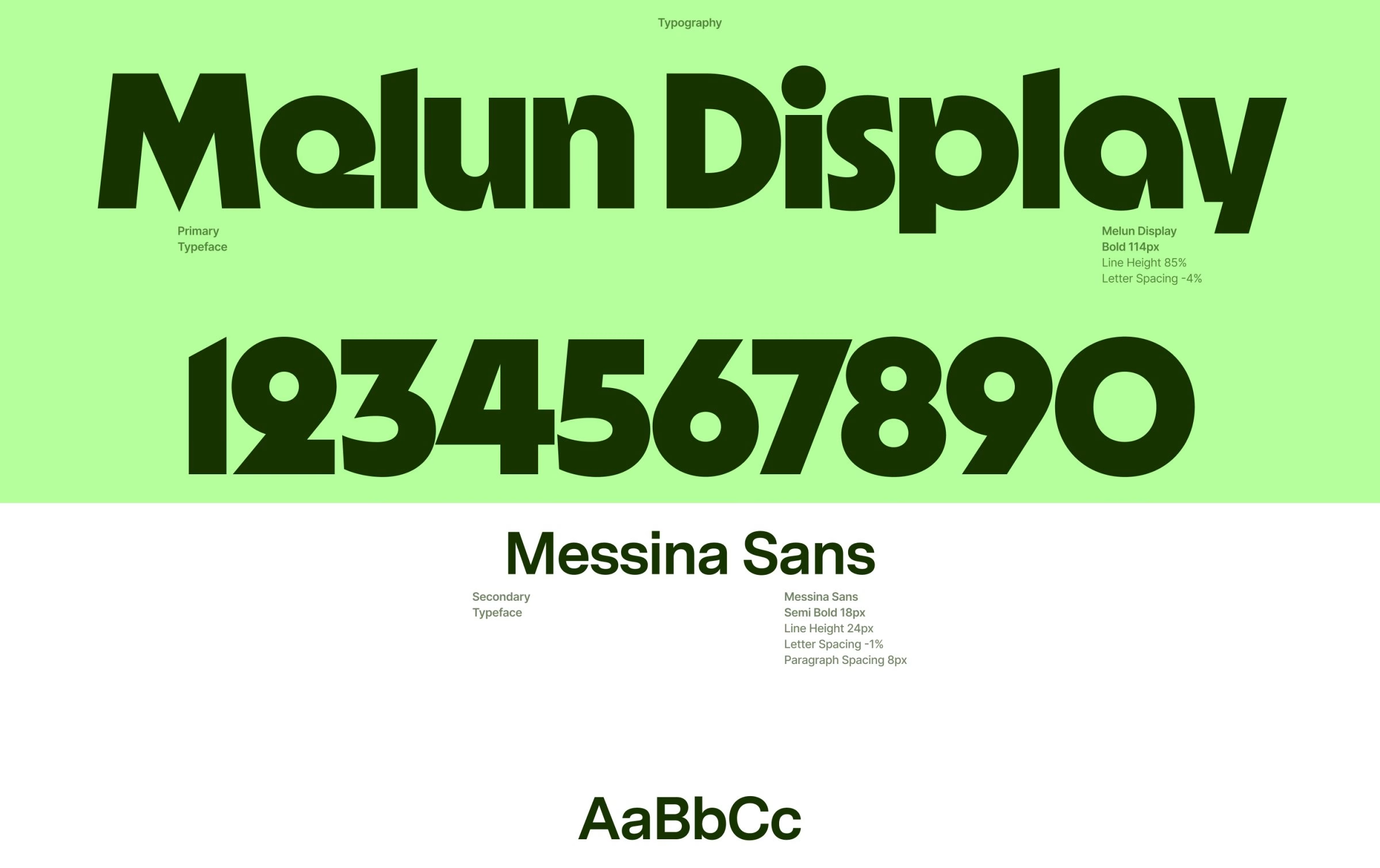
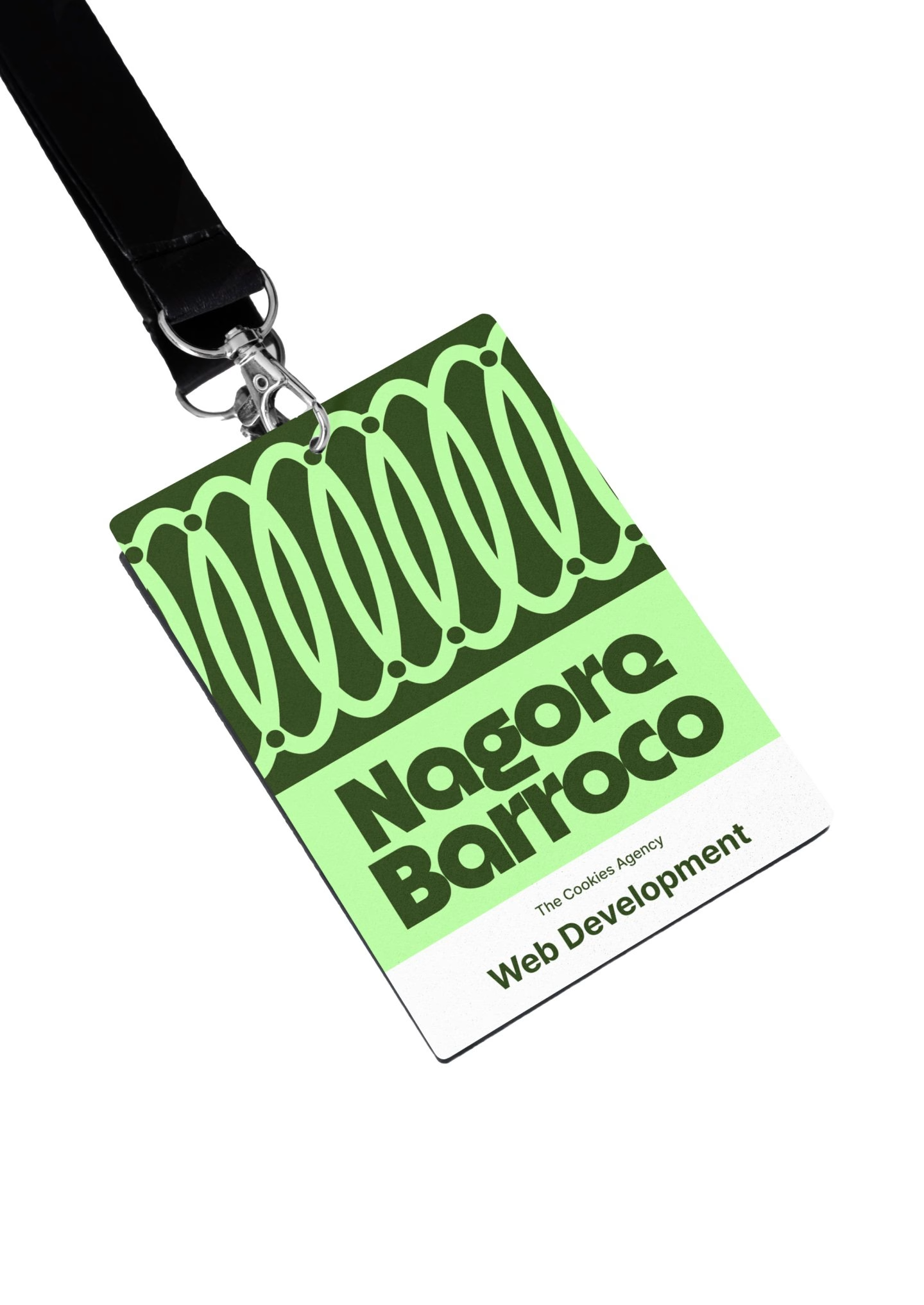
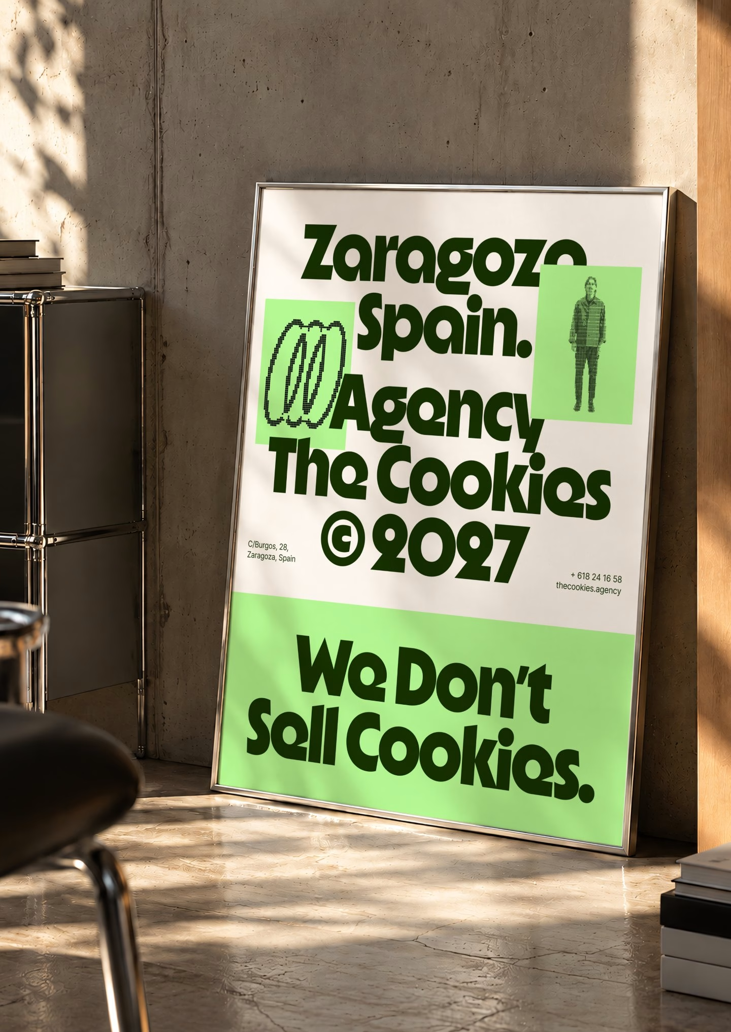
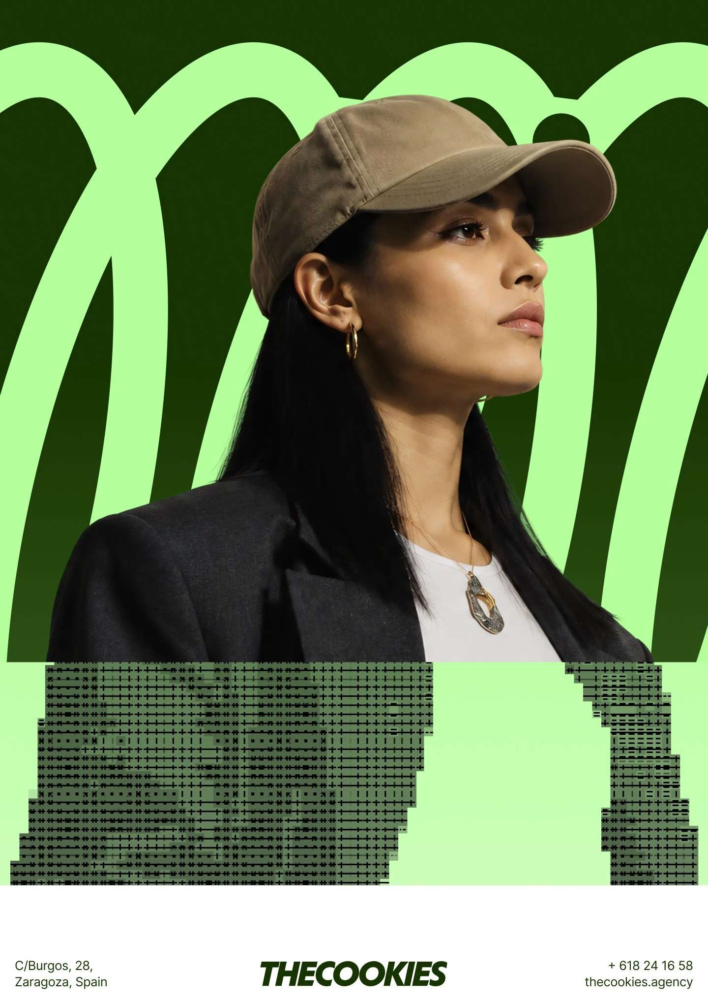
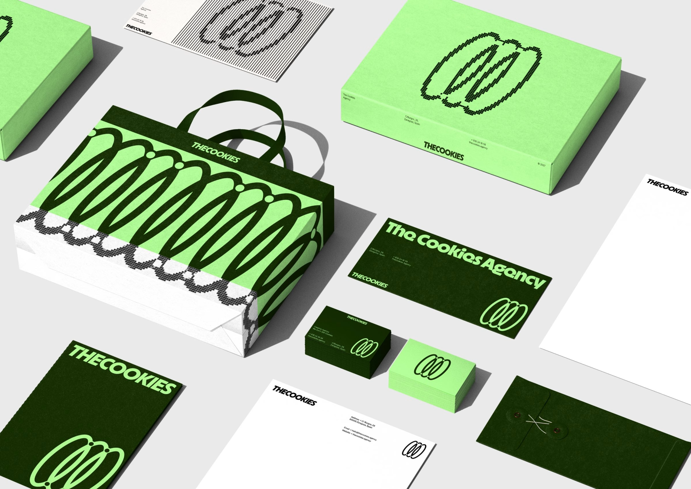
The palette sticks to two greens, a deep forest tone and an acid lime, and the colour combinations flip between dark and light grounds depending on the application. Typography pairs Melun Display, a chunky, soft-cornered display face used for loud statements, with Messina Sans for body copy and interface text. Headlines lean into the agency's sense of humour, with lines like "A Cookie, for your Thoughts" set big enough to fill a whole poster. The symbol itself scales from a tiny browser icon up to a backlit lightbox and a wall-mounted sign without losing its shape.
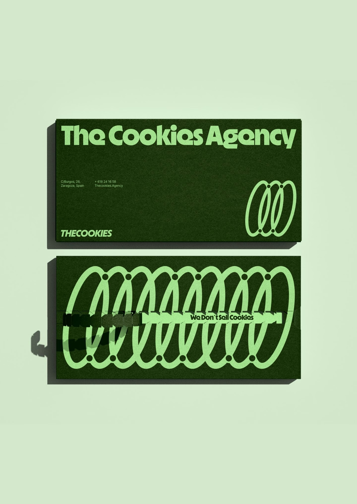
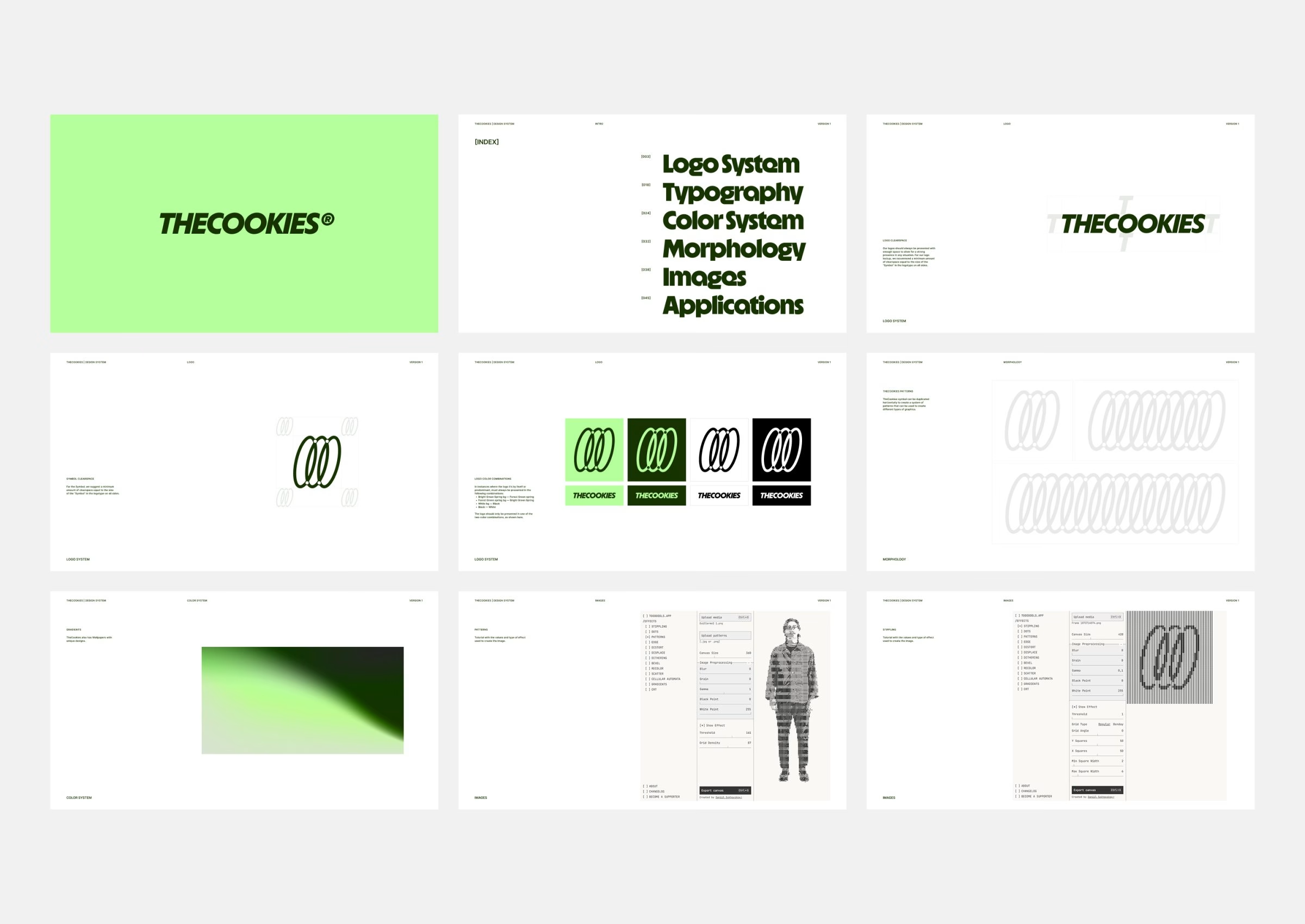
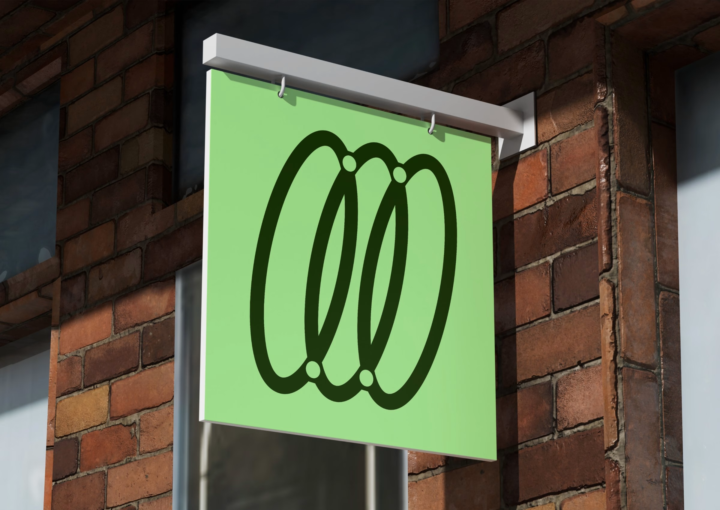
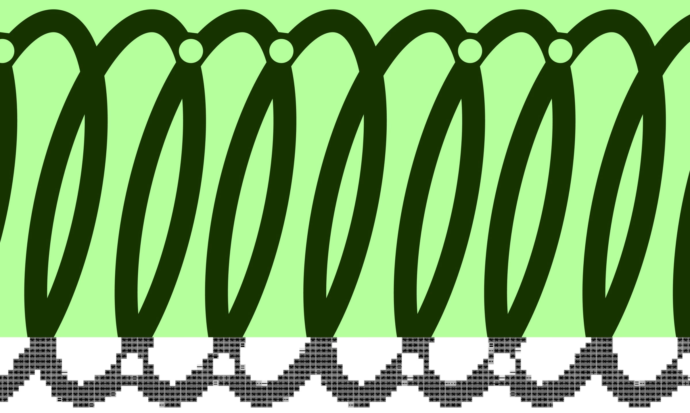
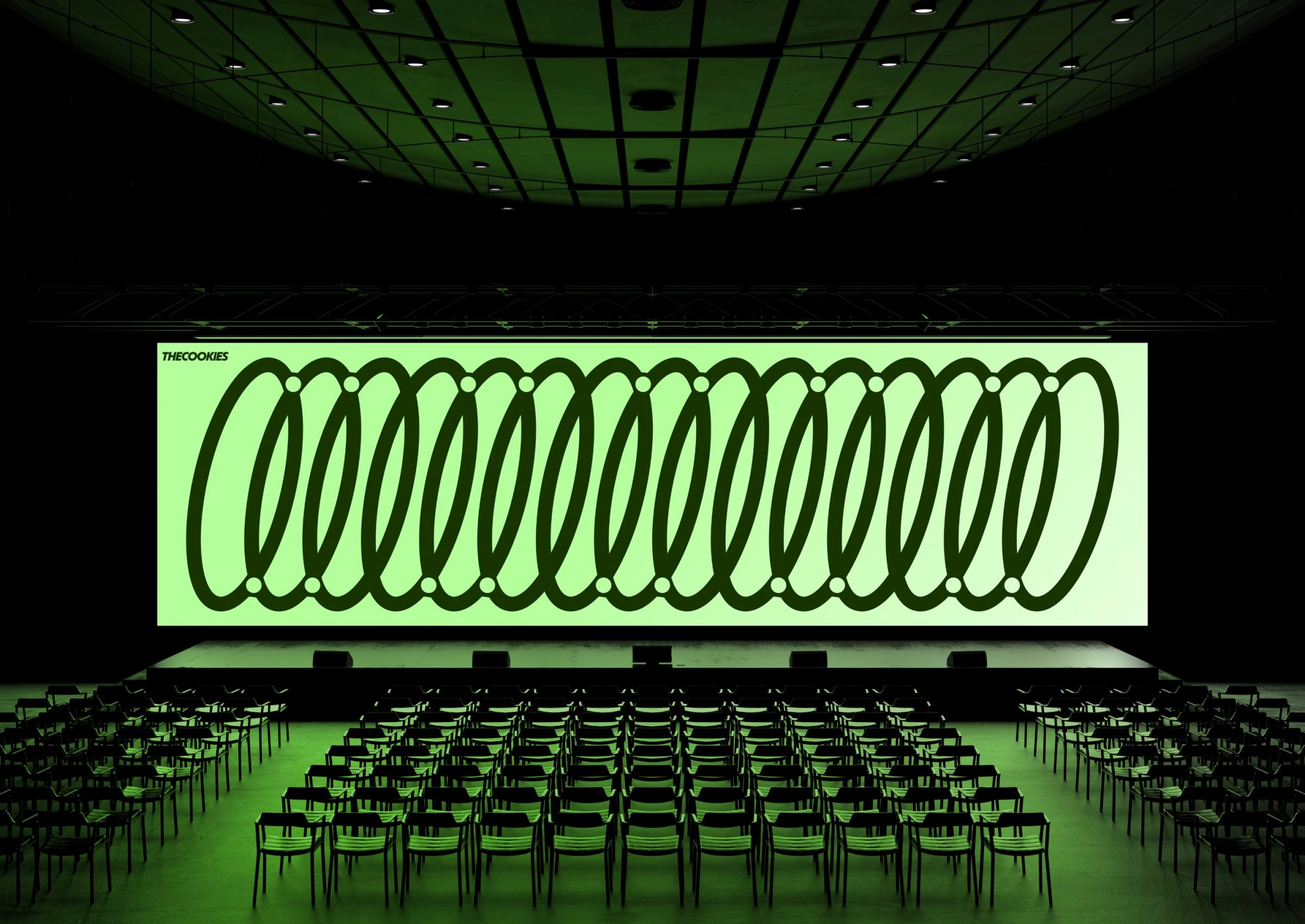
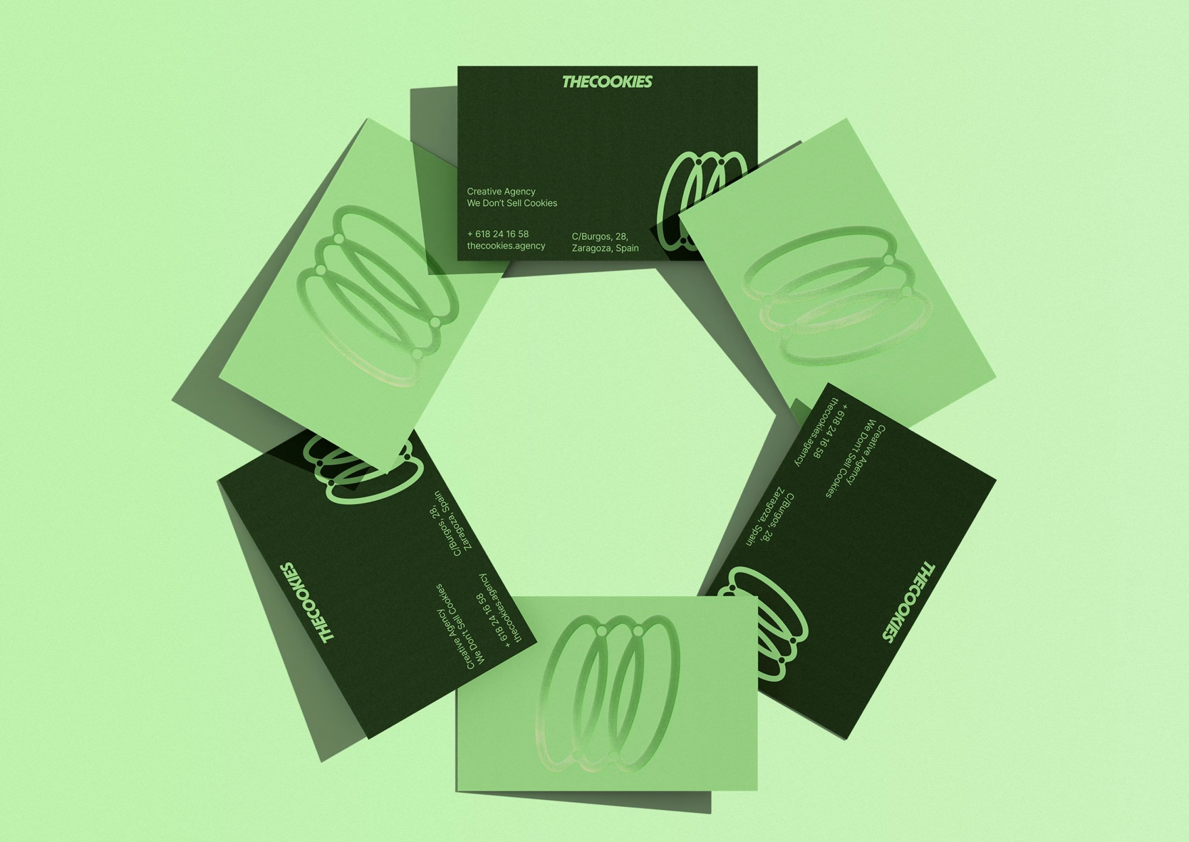
The identity is also built to move. Repeated side by side, the ringed symbol becomes a spring-like coil that runs across banners, business cards and a cinema-sized screen, while a pixelated version of the loop dissolves into halftone patterns. Short animations let the three rings spin, stack and stretch, giving the agency a motion language for its website and social channels. It is a fitting choice for a team whose day job is building interactive experiences.
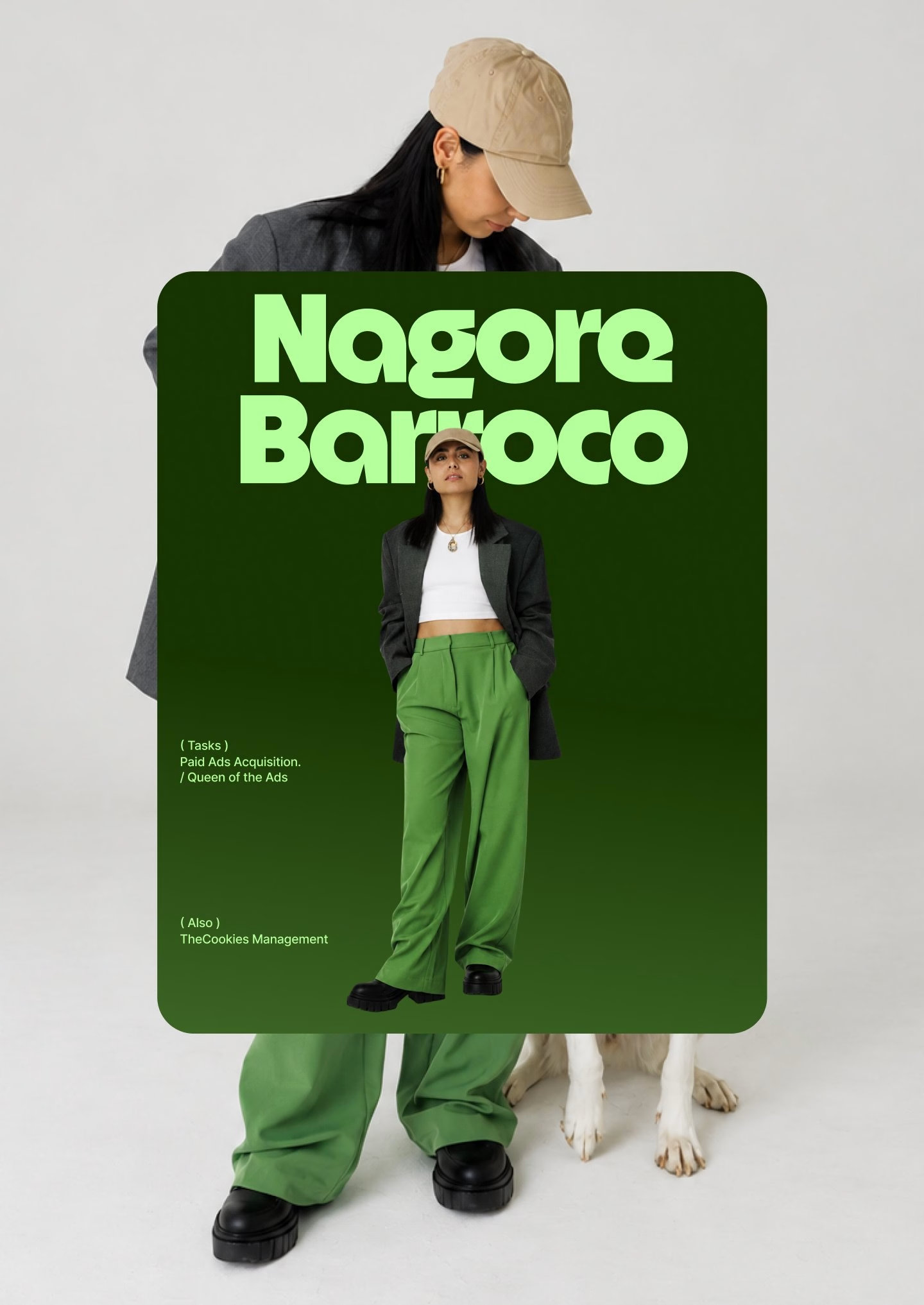
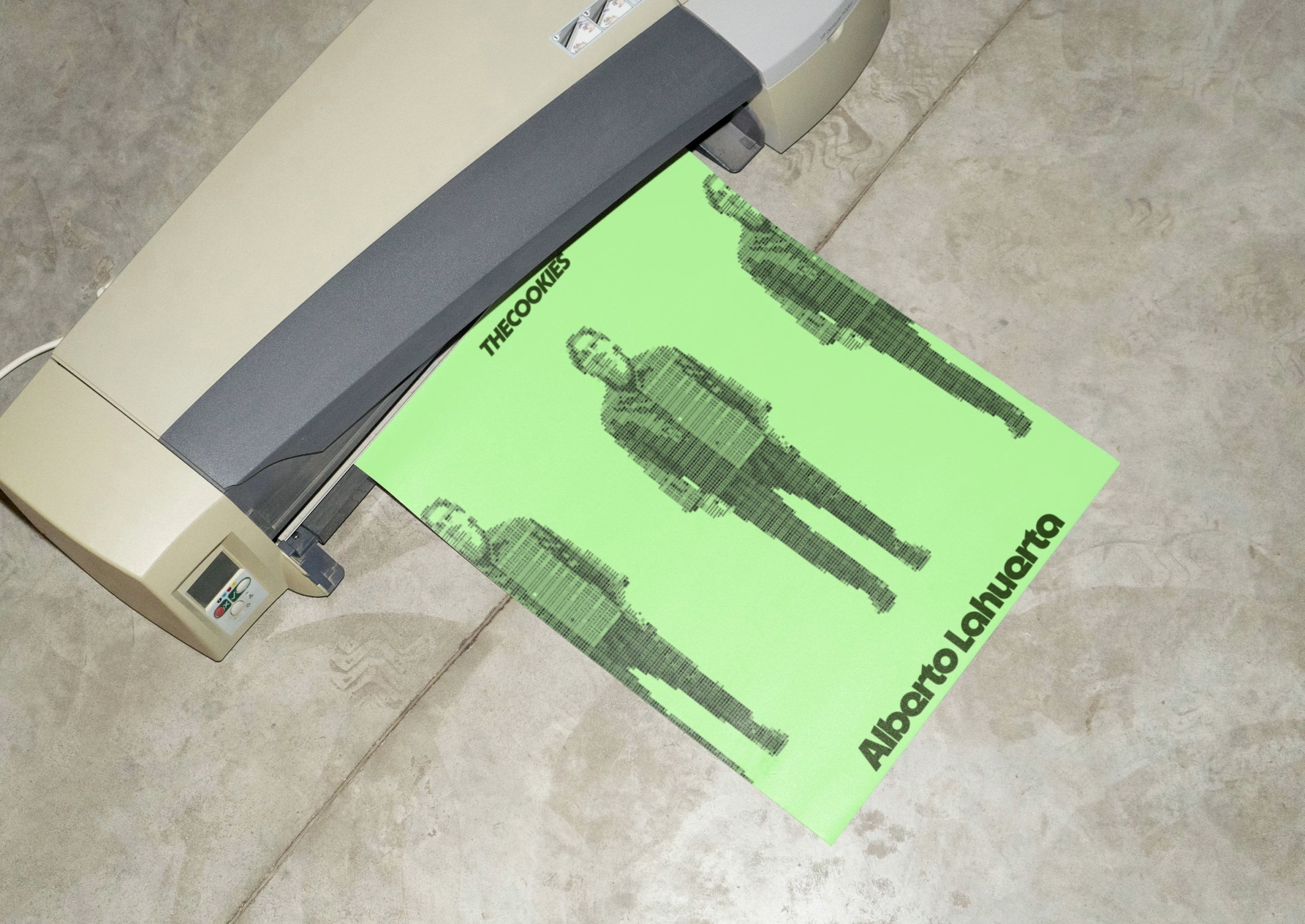
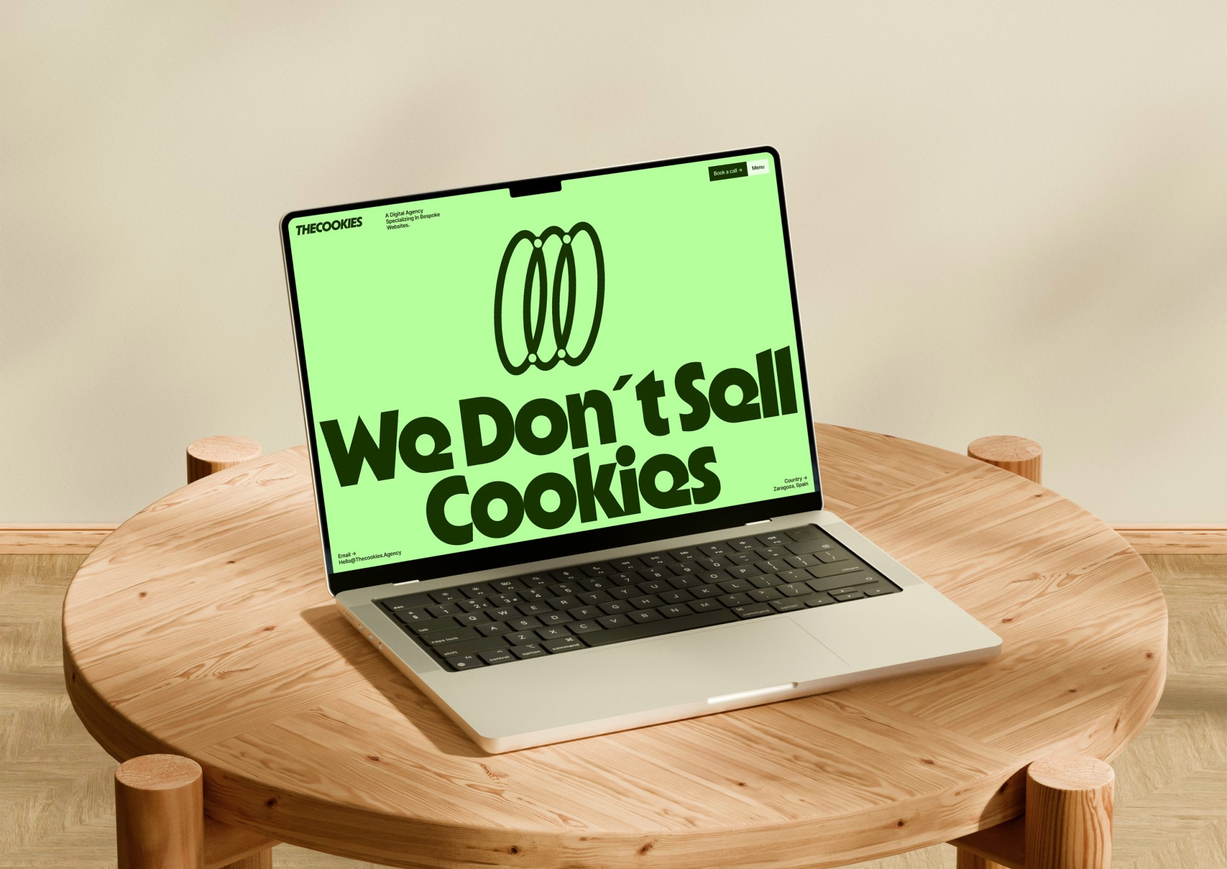
Rather than hiding behind screens full of code, the campaign puts people first, in line with the agency's own motto: technology-driven, human-centred. Team portraits in lime and forest green sit behind giant headlines on posters and ID passes, with the symbol enlarged and cropped into a graphic frame. The poster series carries the brand's voice out onto the street, from an A-frame sign on the pavement to a framed poster announcing the agency in Zaragoza with the line "We Don't Sell Cookies".
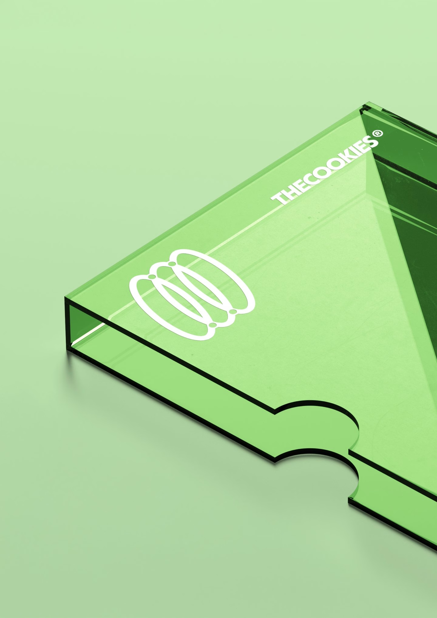
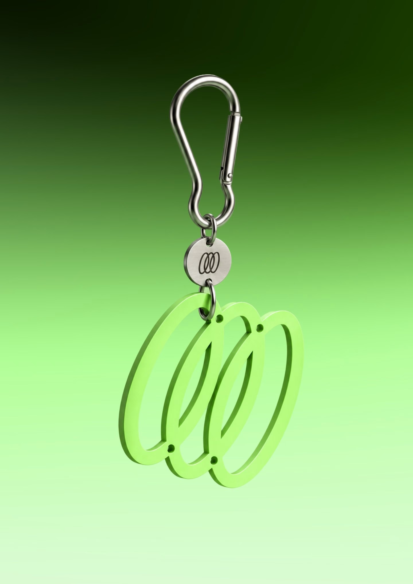
The rollout extends to the objects an agency lives with every day. A translucent green acrylic stand and a carabiner key ring turn the symbol into something you can hold, while stationery, envelopes and printed sheets keep the two greens consistent on paper. On screen, the mark works as a social avatar and a browser tab icon, so the brand looks the same wherever a client first meets it.
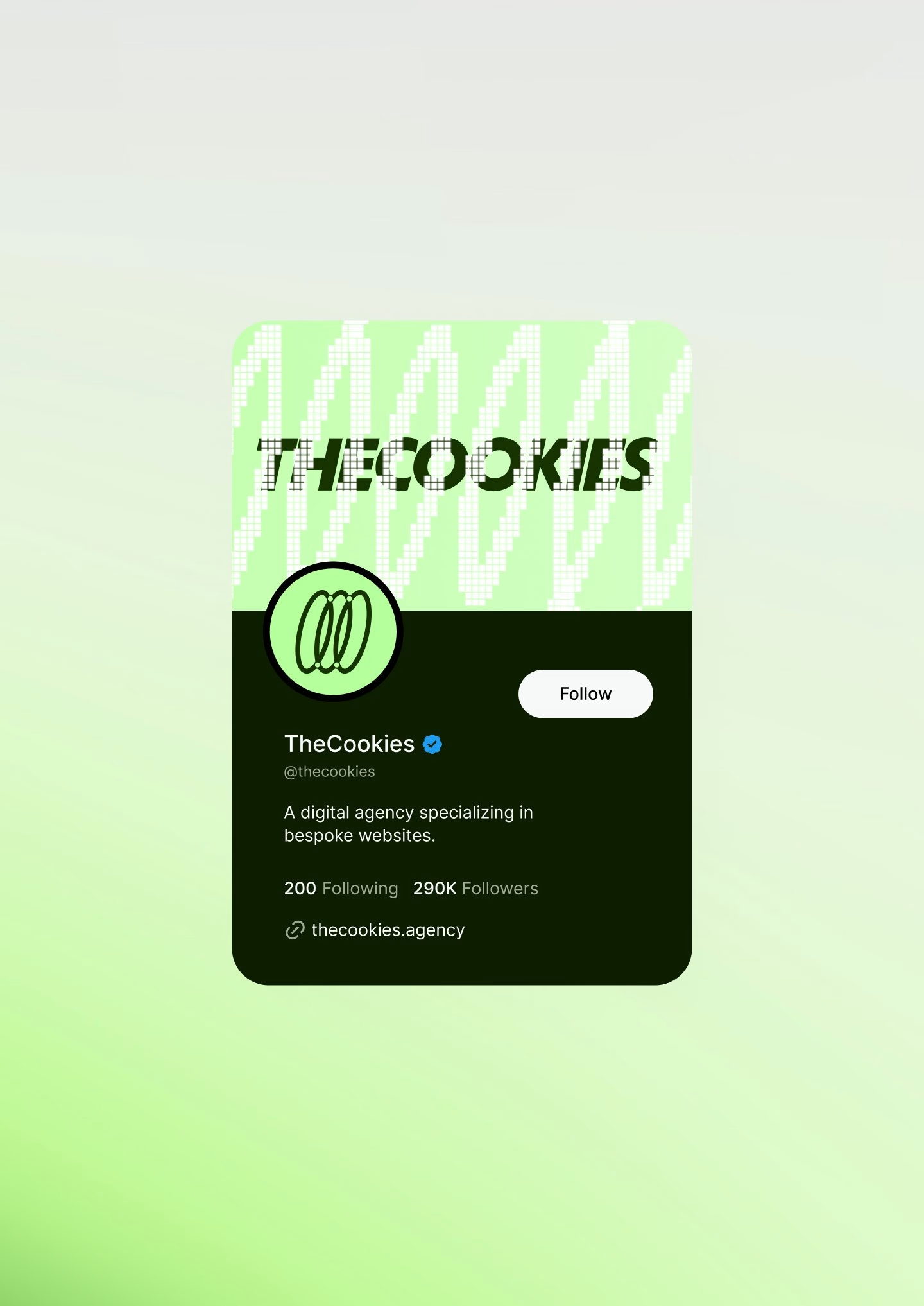
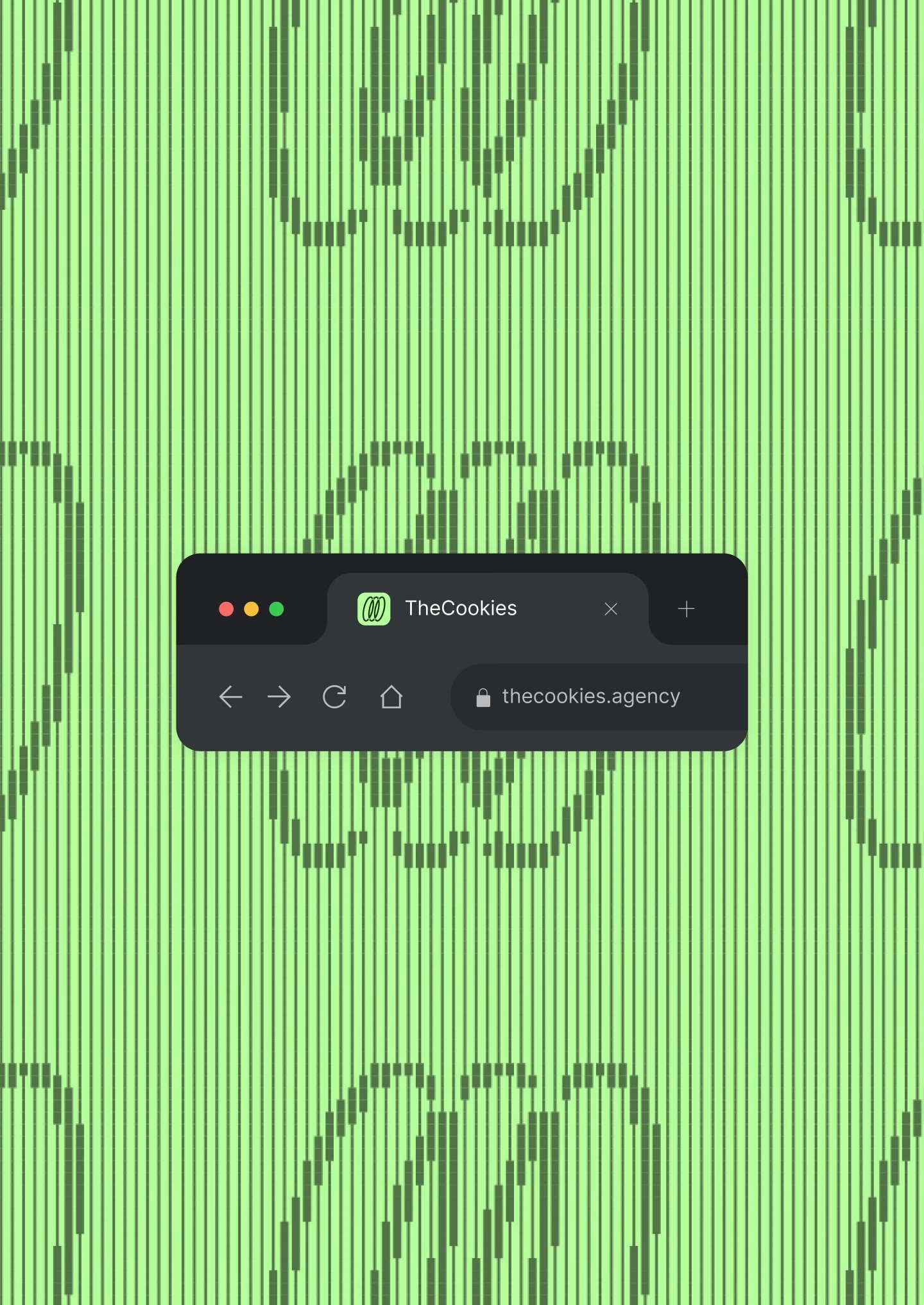
Reliquia works in short, focused brand sprints, and the system it handed over is compact enough to run without a manual open on every desk. For TheCookies, the result keeps the playful spirit of the name while signalling a team that has grown up and knows what it stands for. The cookie is still there; it simply has three founders inside it now.
Credits: Reliquia Studio
Brand Identity & Art Direction: Reliquia Studio
Co-founder & Creative Direction: Angello Torres
Co-founder, Brand Design & Art Direction: Fifi Lachimia
More in Tech & Software Branding
Stay on top of this week's design. Insights, top picks & more.