Plus

 Menu


Darling Visual Communications
November 19, 2026
Mindsparkle Mag


What happens when a vending machine is no longer defined by what it dispenses, but by what it enables? That is the question behind Huxter, a company moving conventional vending towards a connected ecosystem of automated retail. Physical infrastructure, digital intelligence and human interaction converge in its machines, and the brand needed to make that shift visible.
Singapore studio Darling Visual Communications started the visual identity from a simple observation. Vending is fundamentally an exchange, a sequence of actions that moves from selection to access and, ultimately, fulfilment. That idea of movement became the foundation of the whole visual language.
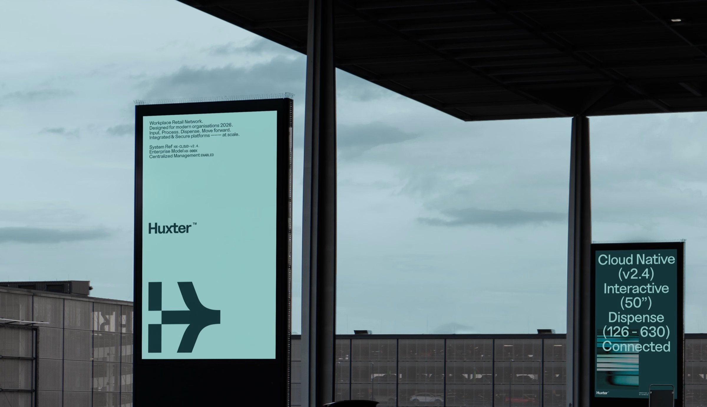
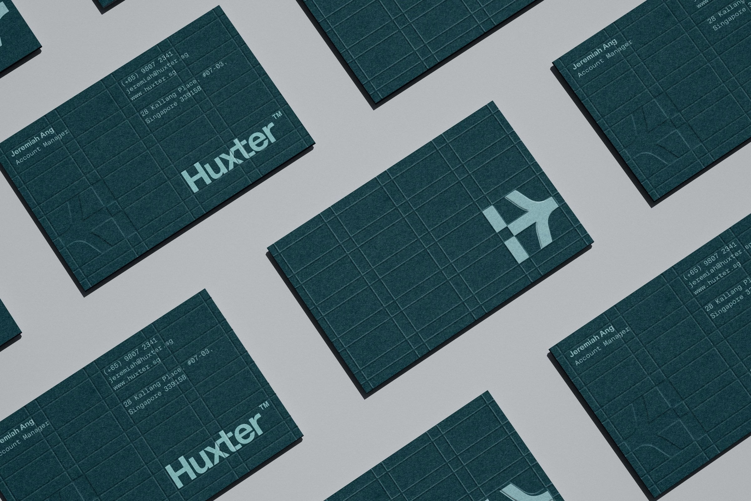
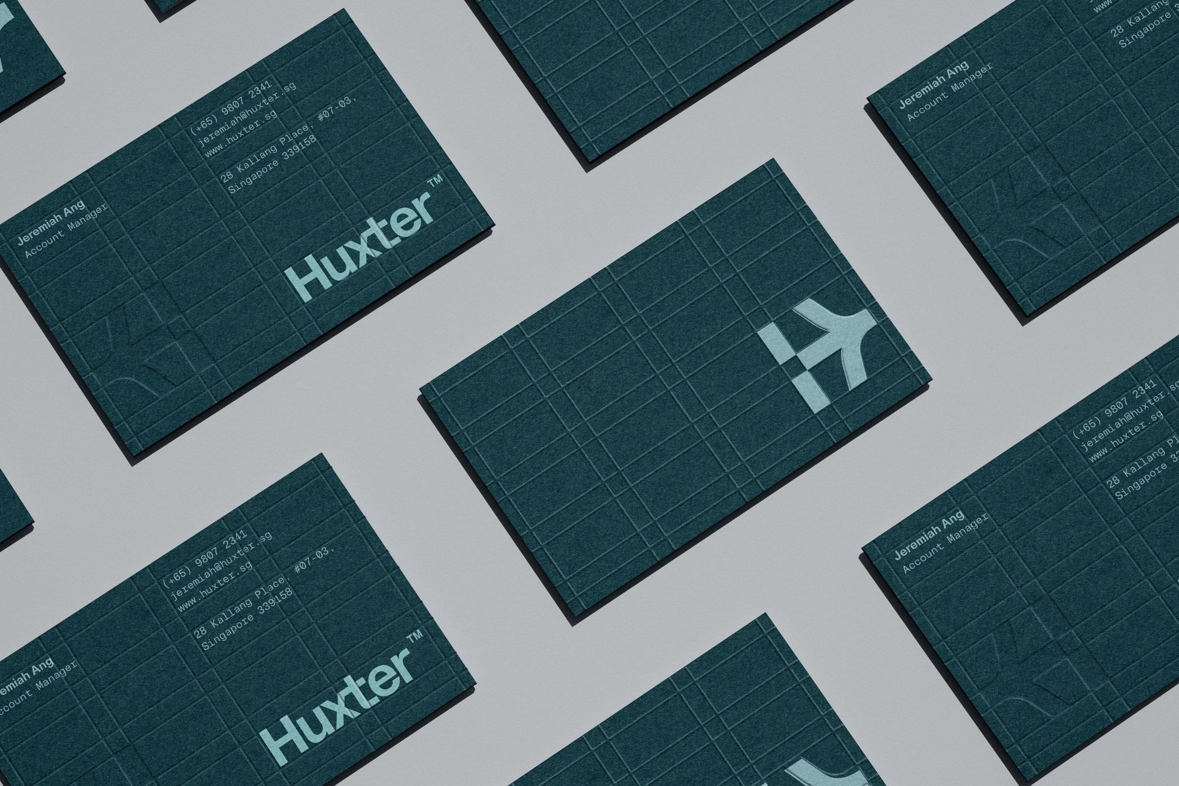
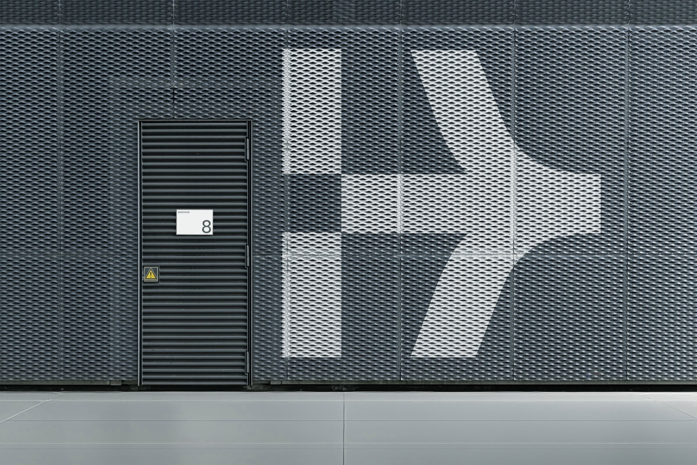
At its centre sits a directional symbol derived from the Huxter letterform. It captures both the physical act of dispensing and the broader notion of progress, pointing forward wherever it appears. More than a graphic signature, it sets a visual principle that runs through the identity, bringing direction, continuity and a sense of possibility.

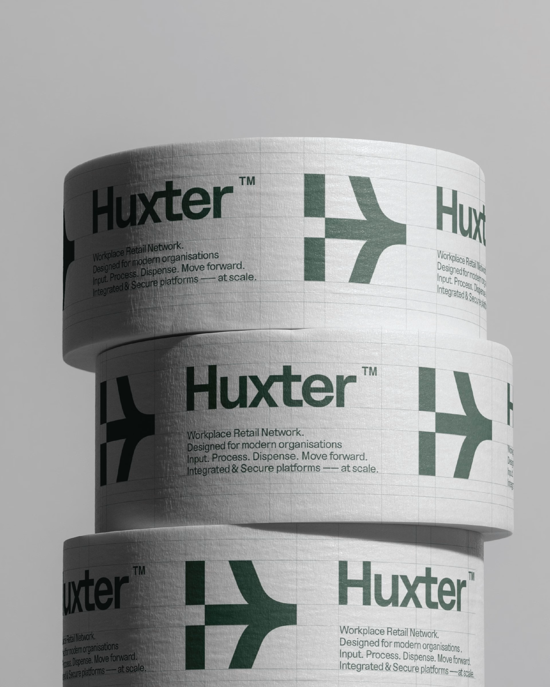
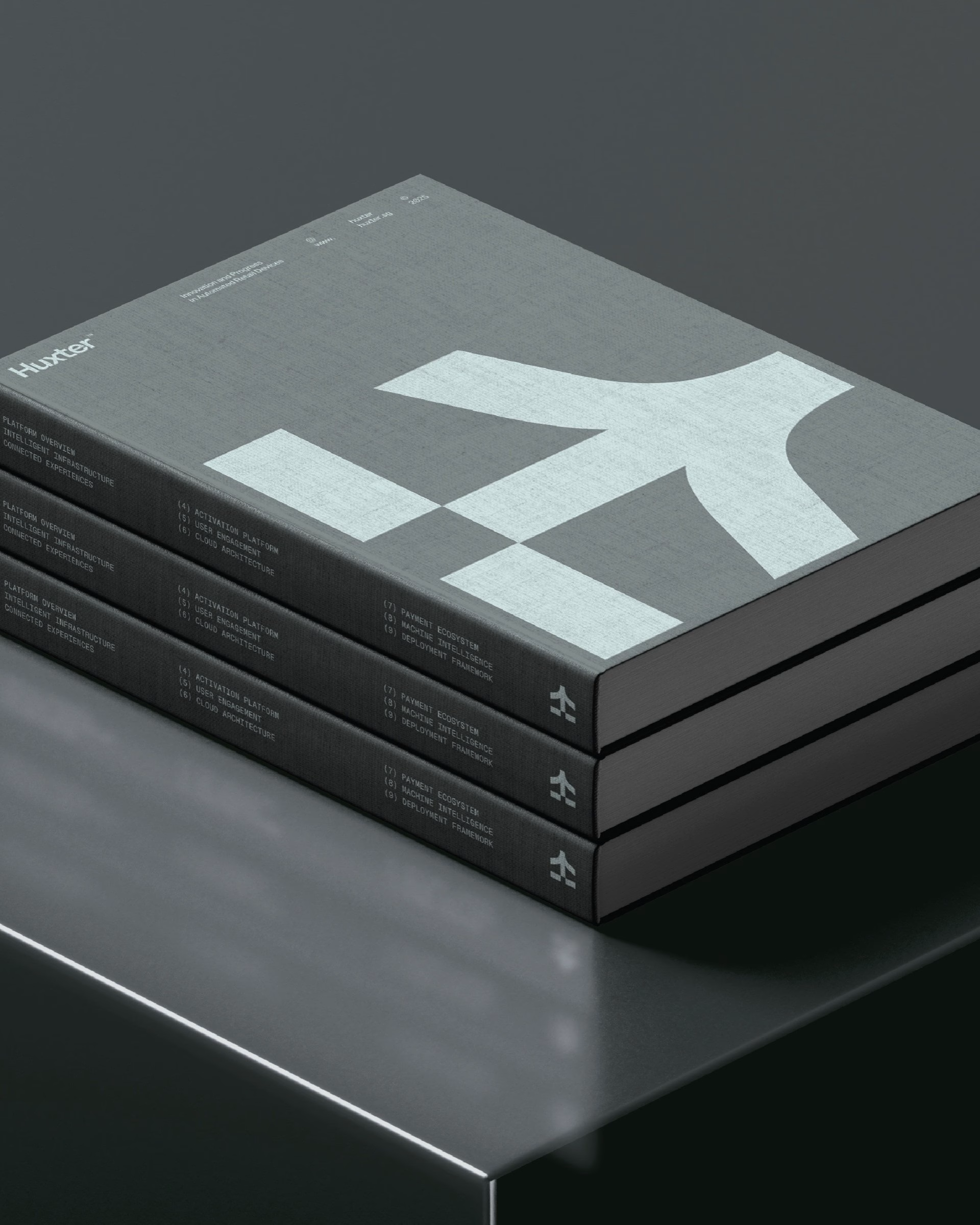
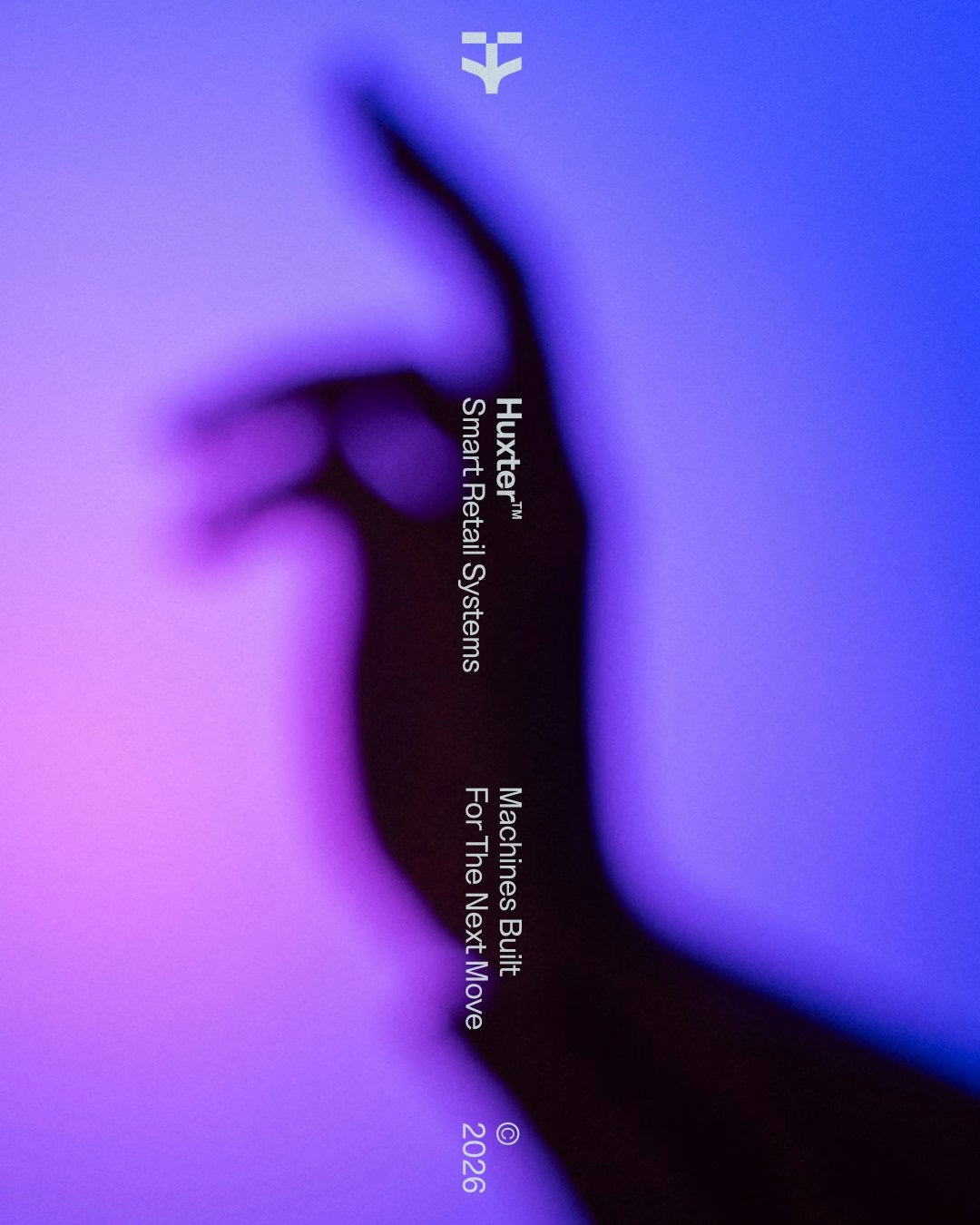
Industrial-influenced typography, set in NT Bau, gives the system its precision and engineered functionality. A considered palette of contemporary teals and greys, paired with expressive violet imagery, adds a more human and progressive dimension. The contrast between technical rigour and visual expression reflects Huxter's ambition to operate beyond the conventions of its category.
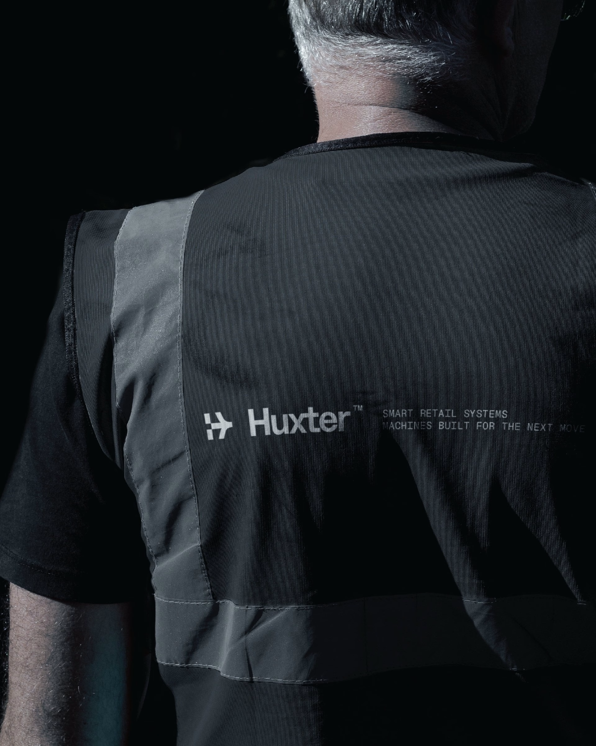
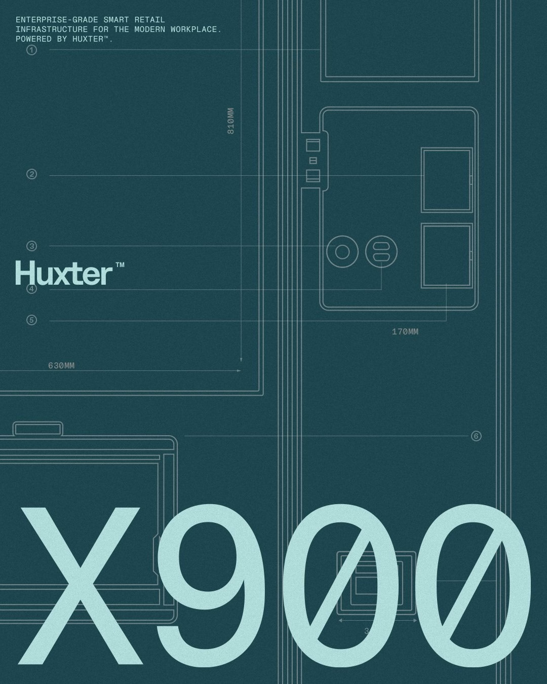
The identity is designed to move between hardware, digital interfaces, corporate environments and experiential activations. Rather than a fixed set of applications, Darling built it as an adaptable system, so the symbol works as well on a lanyard badge as on a technician's vest or a delivery truck. Product documentation for machines like the NUX900 carries the same blueprint-like grids that run through the posters.
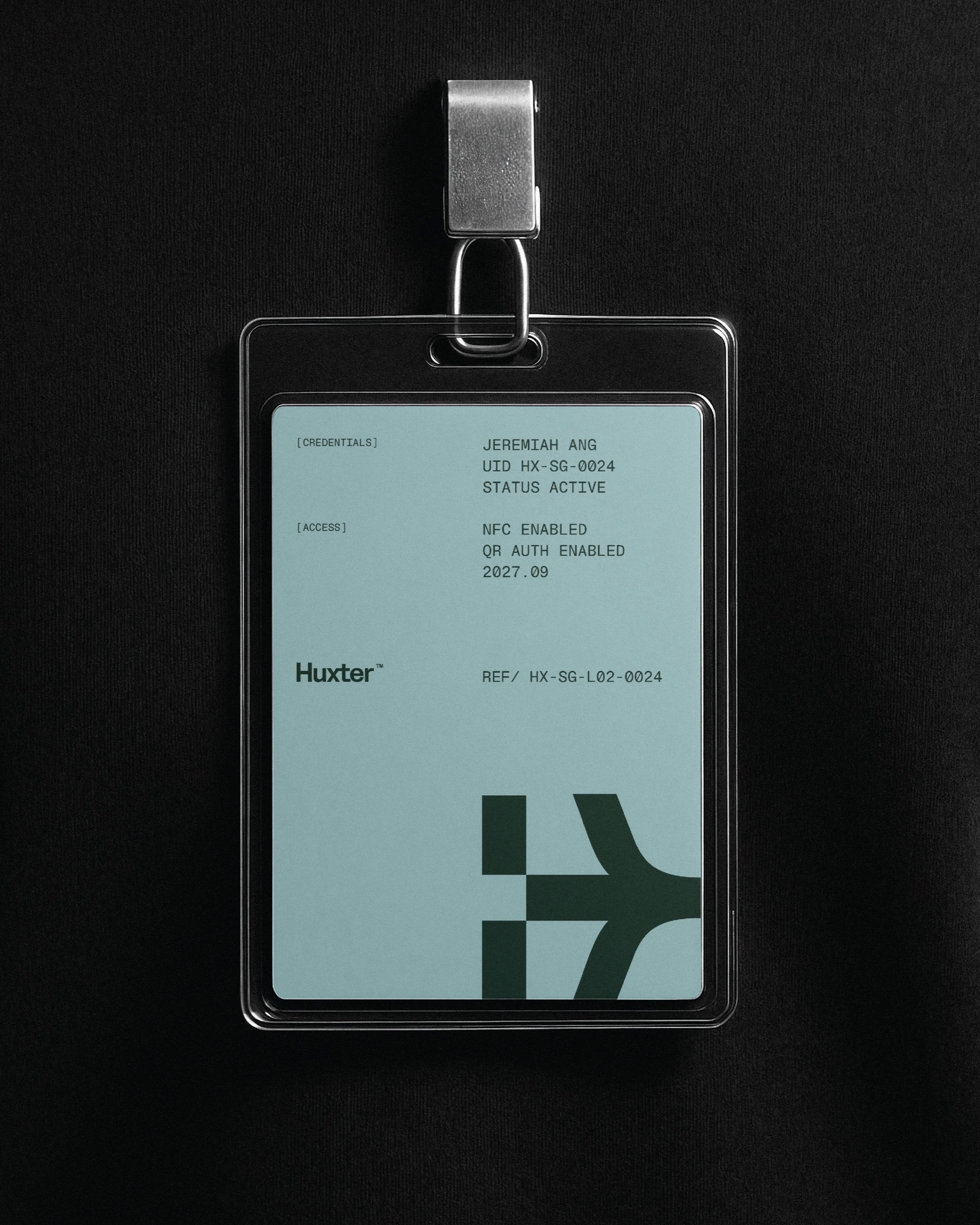

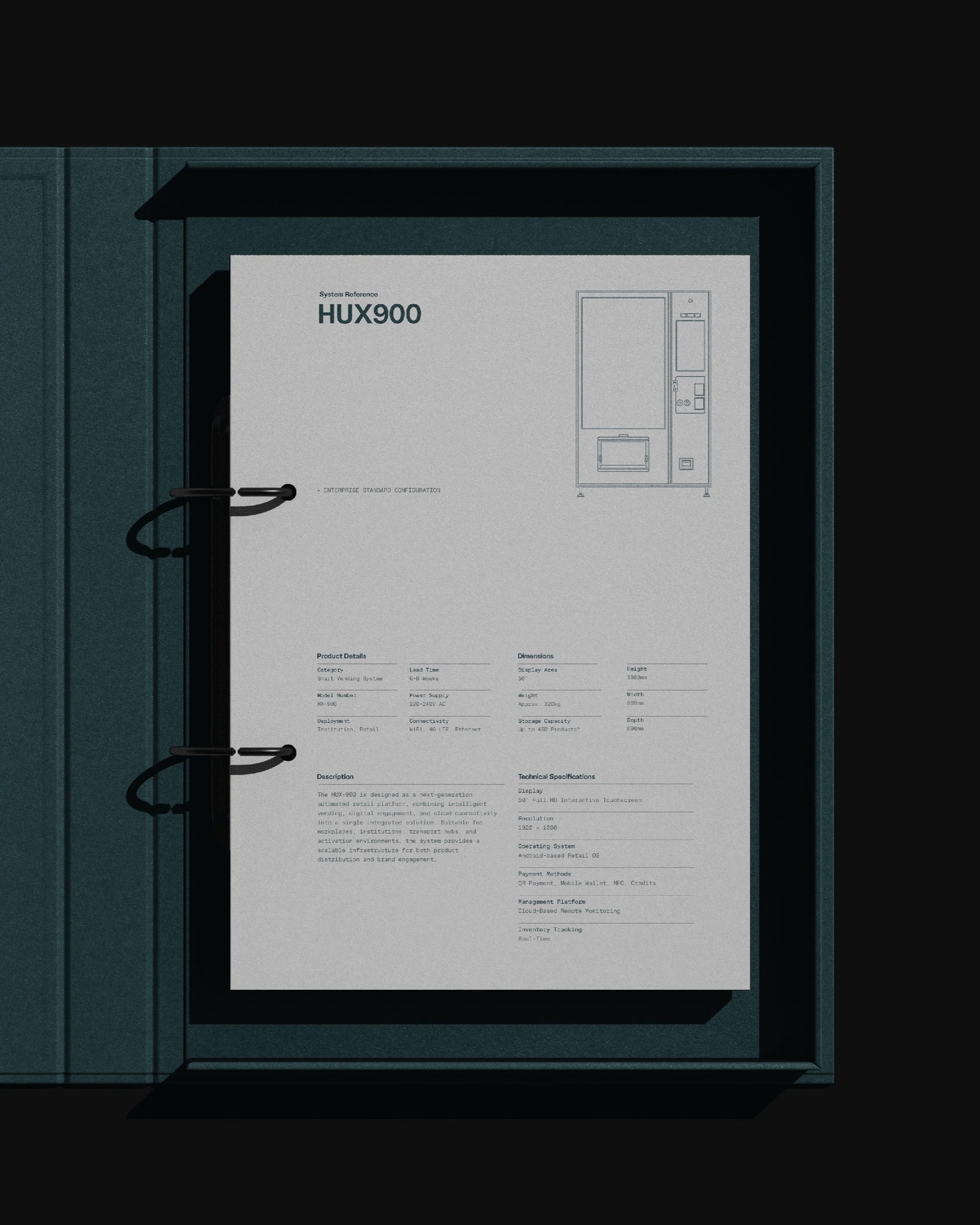
Across posters, screens and print, the symbol acts as a recurring device rather than an isolated logo, shaping compositions and layouts throughout. Large-scale applications, from building facades down to business cards, show how far a single directional mark can stretch. The result is a visual language that reflects not only what Huxter does today, but what comes next.
Unlock everything with Mindsparkle Mag Plus.
Get exclusive access to Premium features:
Credits: Darling Visual Communications
Brand Strategy & Visual Identity: Darling Visual Communications
More in Tech & Software Branding
Stay on top of this week's design. Insights, top picks & more.