


 Plus

 Menu


Studio Chapeaux
November 17, 2026
Mindsparkle Mag


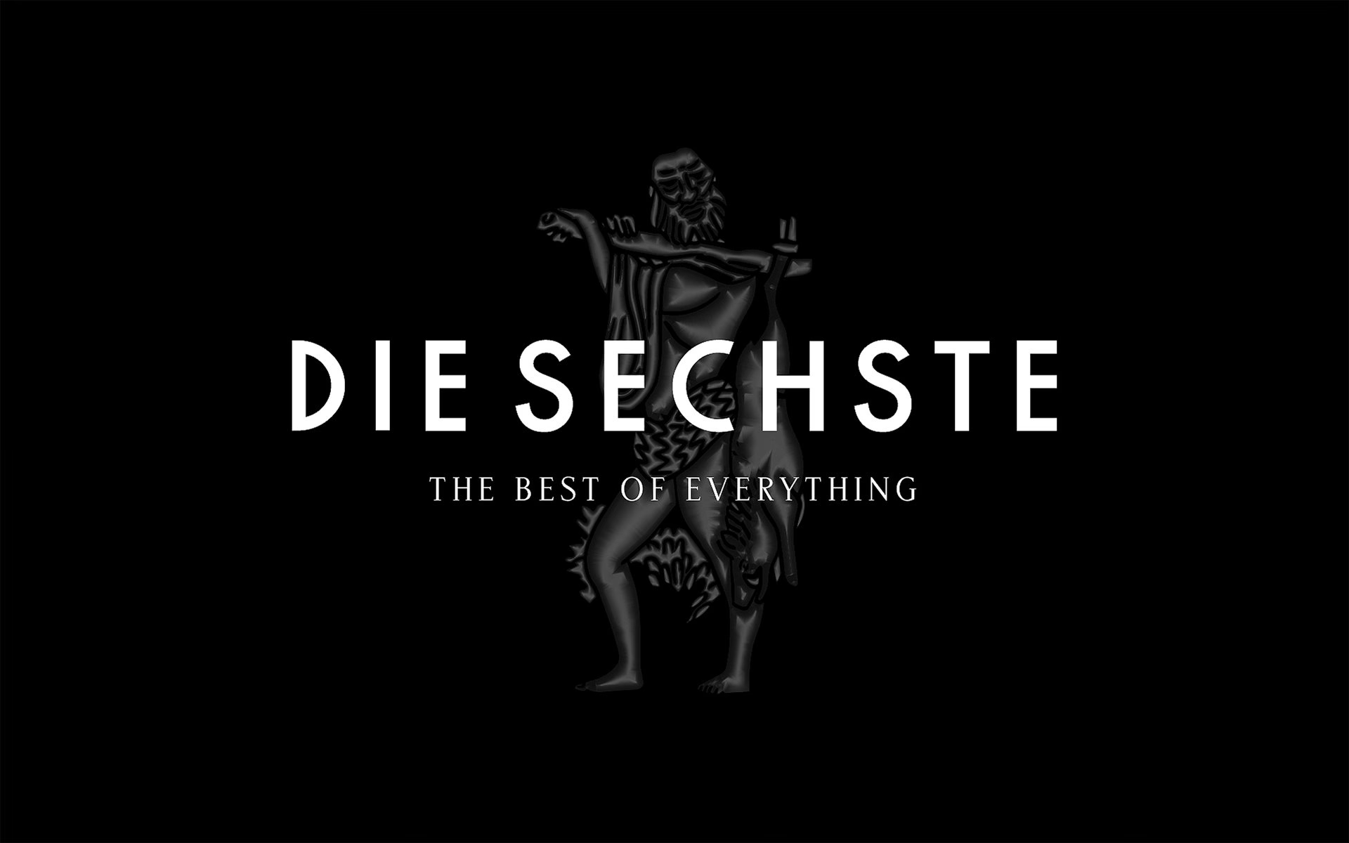
KaDeWe, the Berlin department store that has stood for the best of everything since 1907, now sells food under its own name. Hamburg-based Studio Chapeaux built the identity and packaging design for the new KaDeWe private label from the ground up. The range was created for Die Sechste, the legendary food hall on the sixth floor of the Kaufhaus des Westens.
For more than a century, every Berlin story has passed through KaDeWe at some point. The new label had to carry that legacy onto shelves already crowded with the world’s best luxury brands. Studio Chapeaux defined the visual language, the structure and the design system of the label, and drew every element from the house itself.
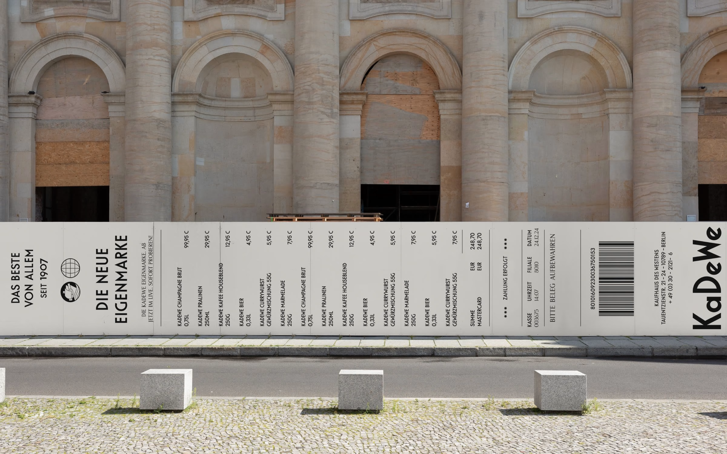
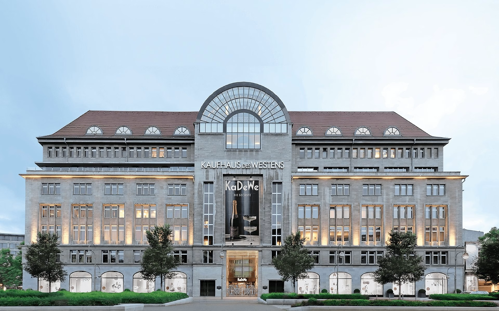
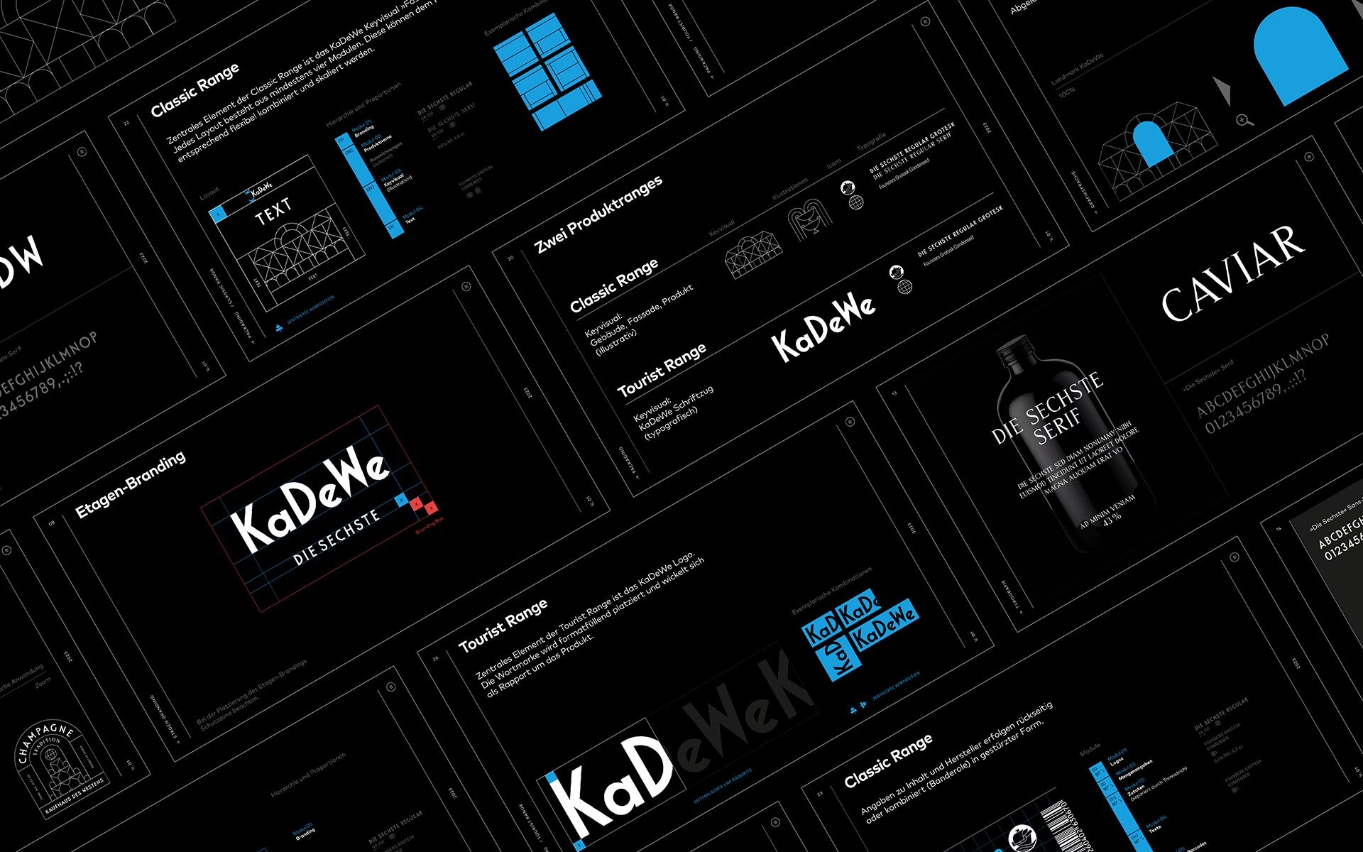
The building’s famous façade becomes the key visual and the central image of the whole brand. Its architecture turns into a graphic grid that organises labels and layouts across the range, visible in the fine line drawings on the gin and crémant bottles. The same arched geometry frames the champagne and the Cuvée Rouge, so even the darkest bottles read as one family.
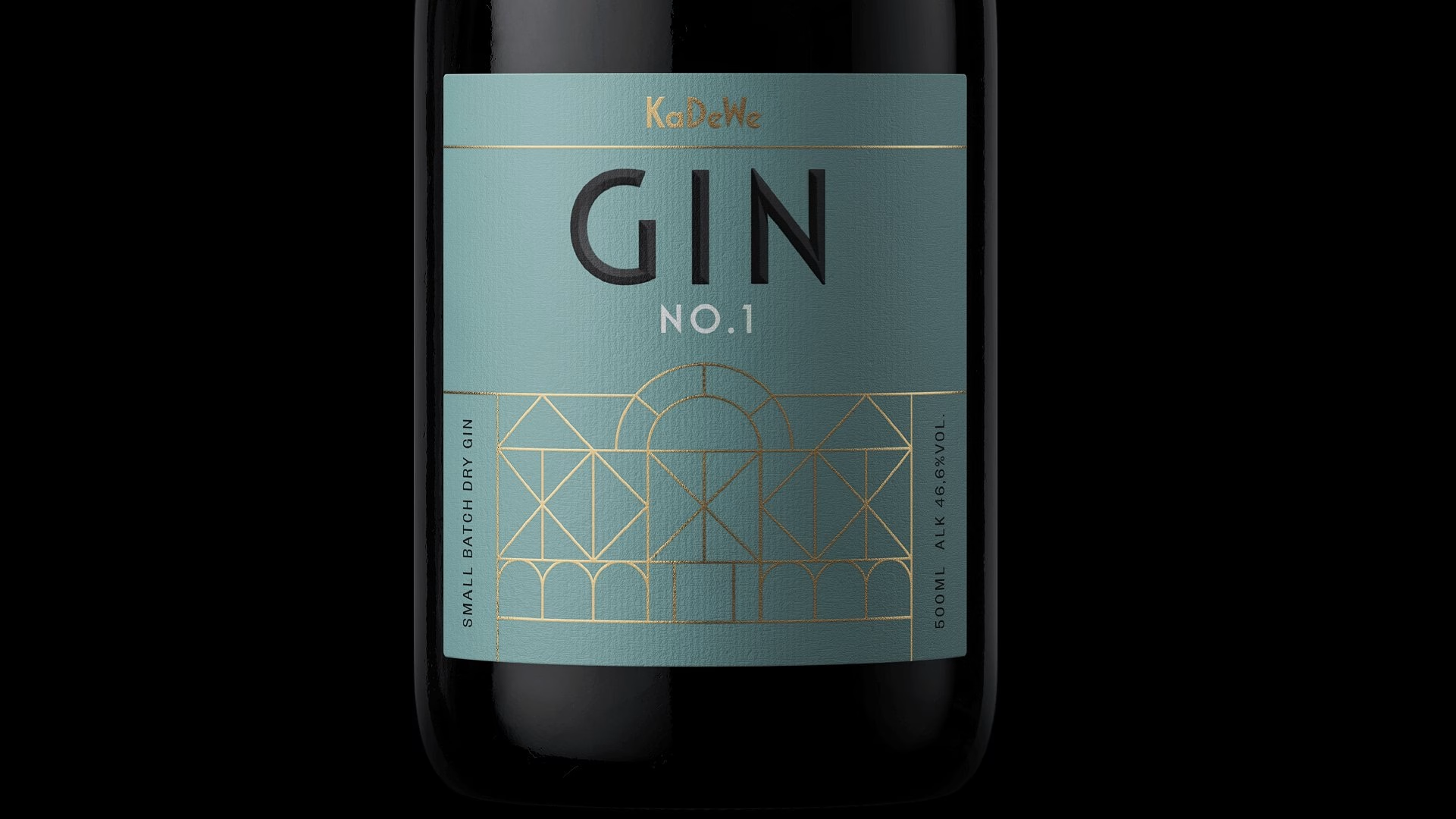
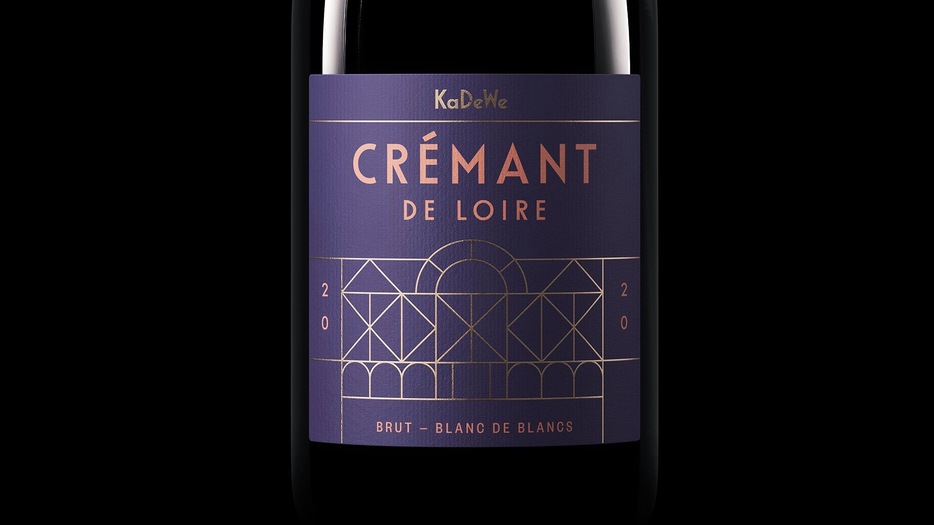
The wordmark does the rest of the work. Studio Chapeaux drew two custom typefaces from the letterforms of the KaDeWe logo, treating six familiar letters as the seed of an entire alphabet. In motion the letters grow out of a single K, and on the beer and wine labels the wordmark runs vertically, either set small beside the façade grid or blown up in bold red.
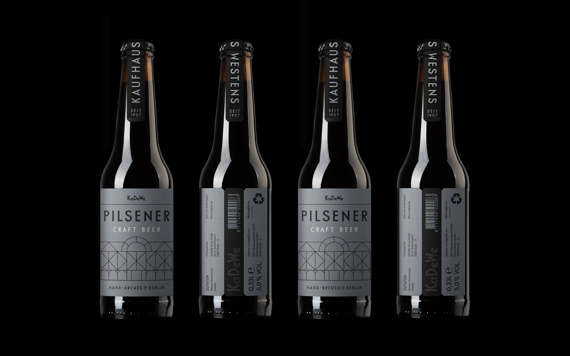
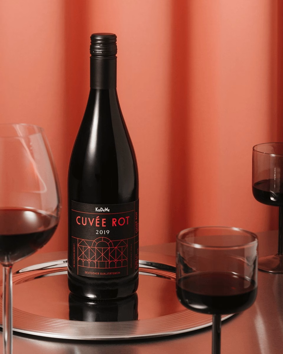
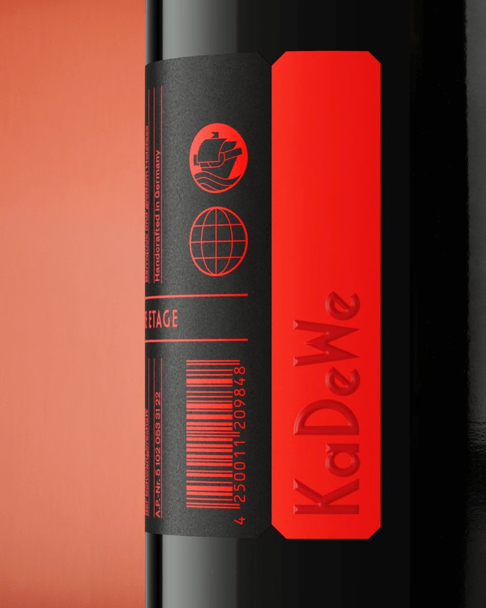
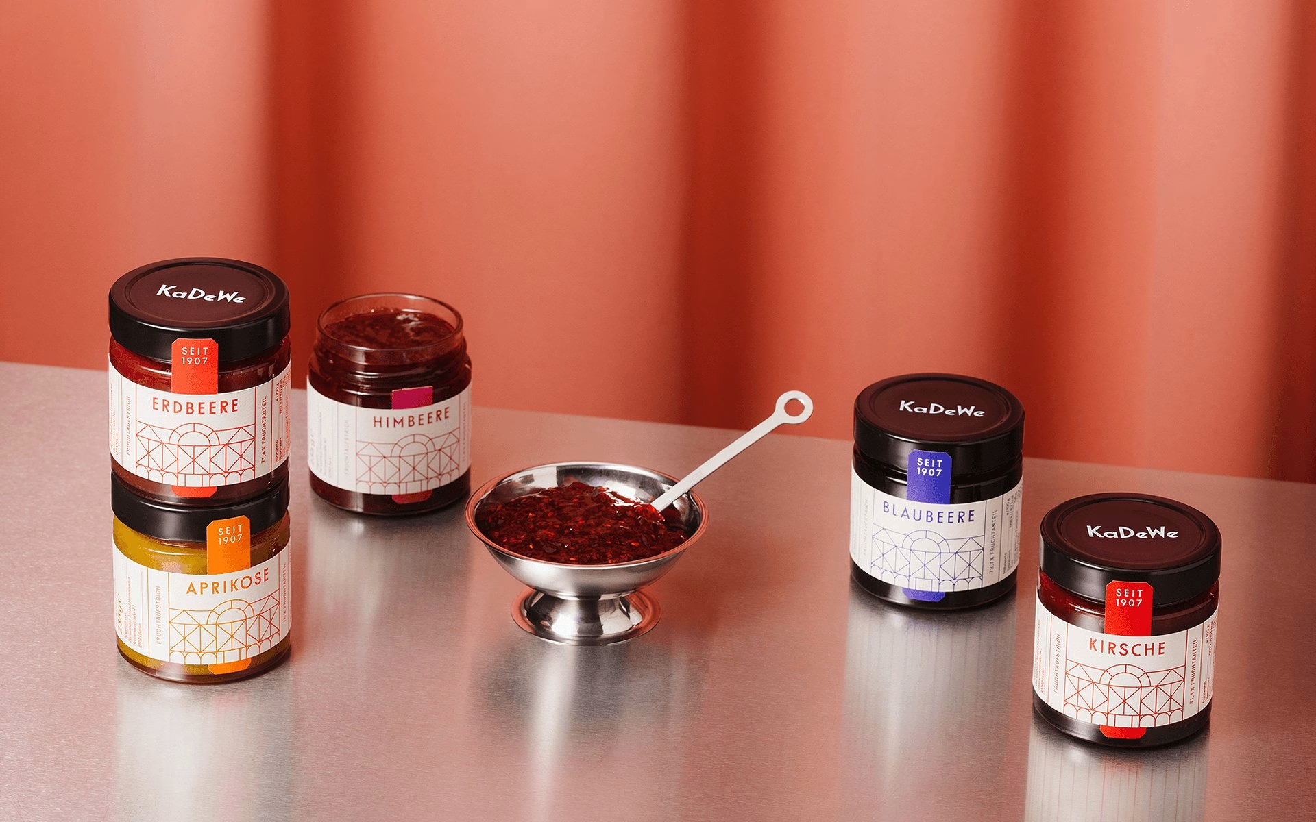
One system has to hold two quite different lines. The Classic Range expresses gourmet expertise, while the Tourist Range brings gift-style products in brighter colours, from the orange truffle tin to the jars of fruit spread. Both stay coherent from champagne all the way to mineral water, because the grid and the letterforms stay constant while the palette shifts.
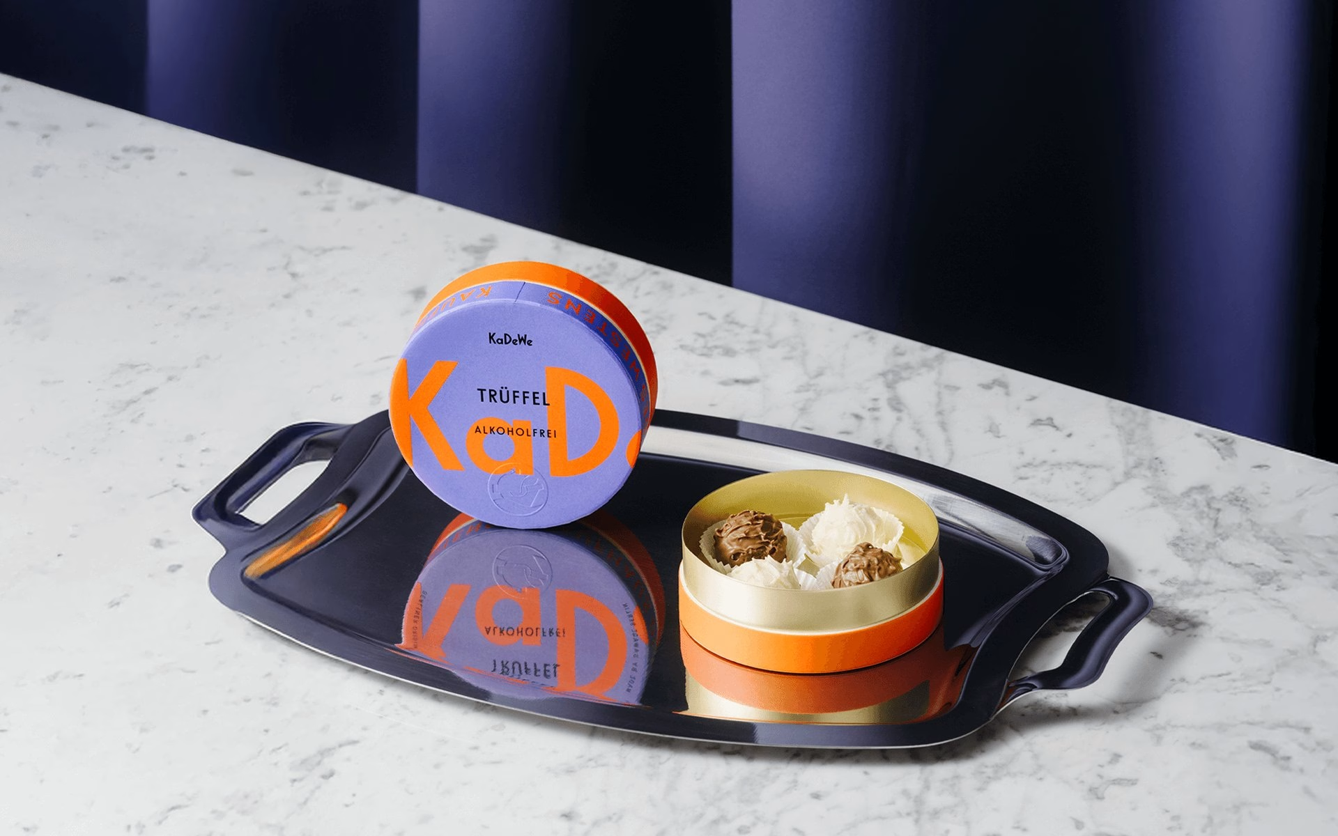
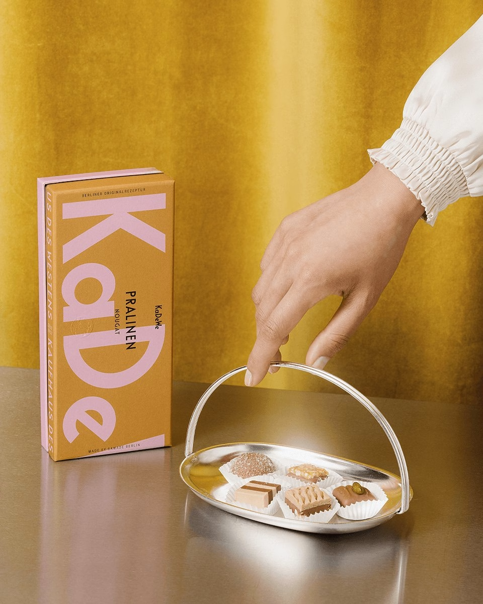
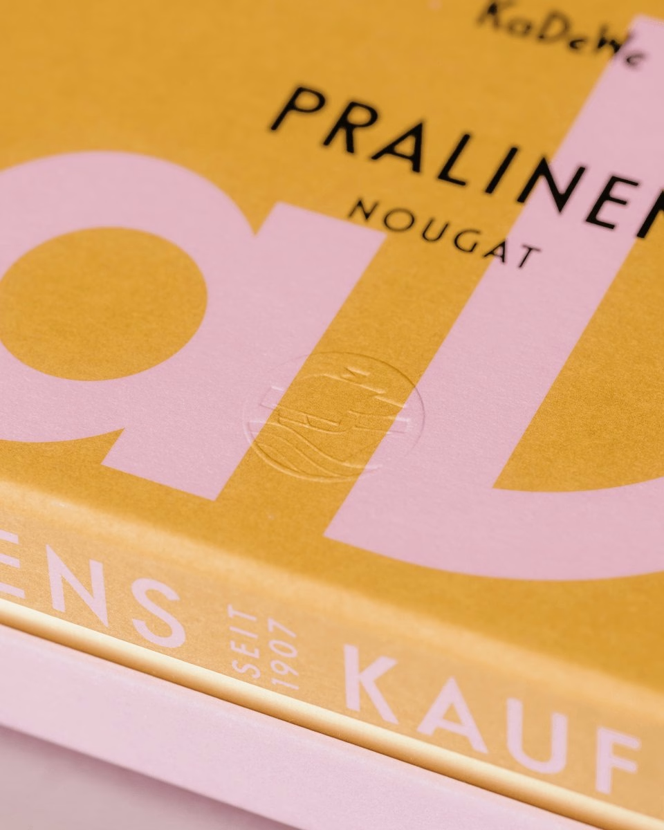
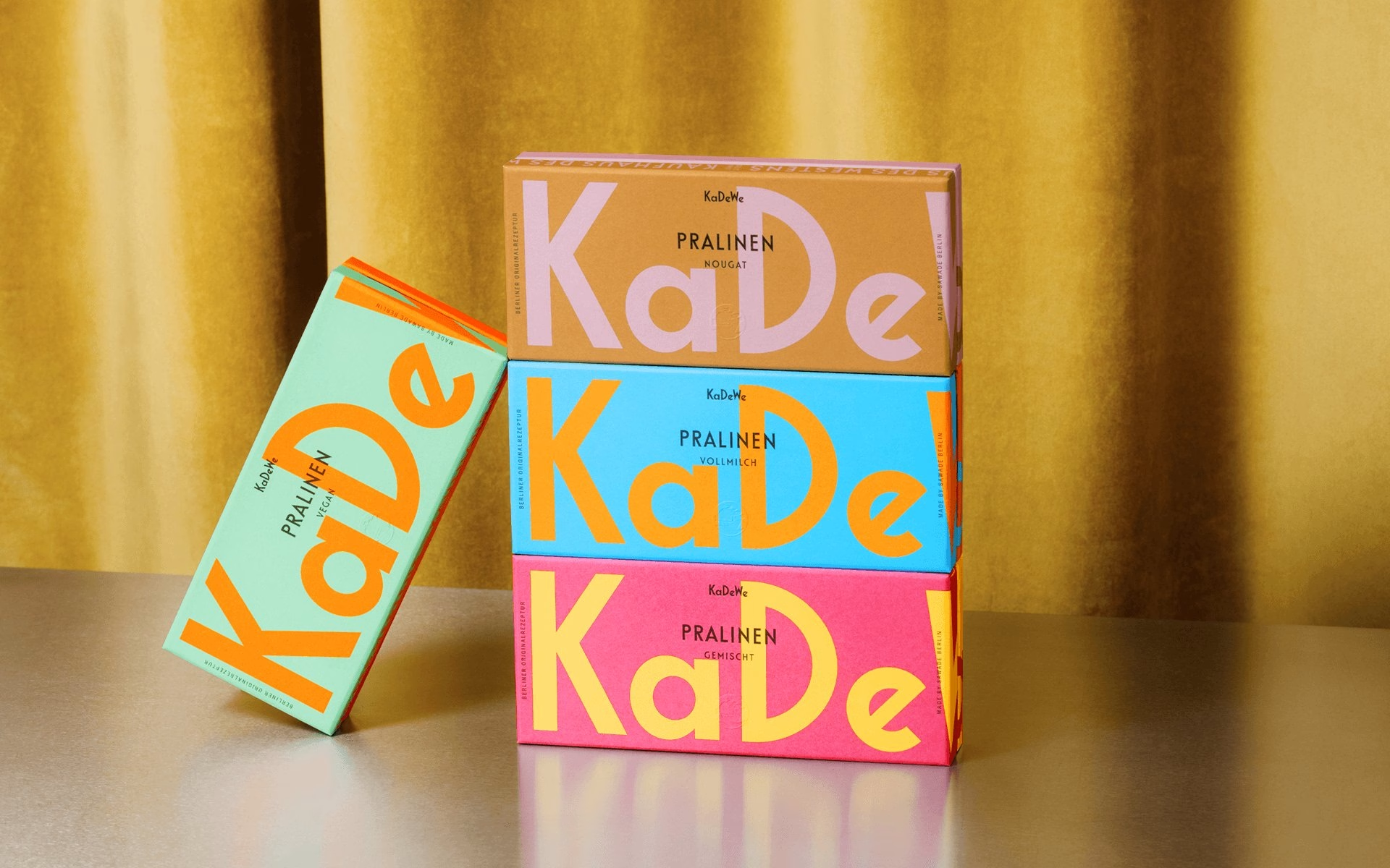
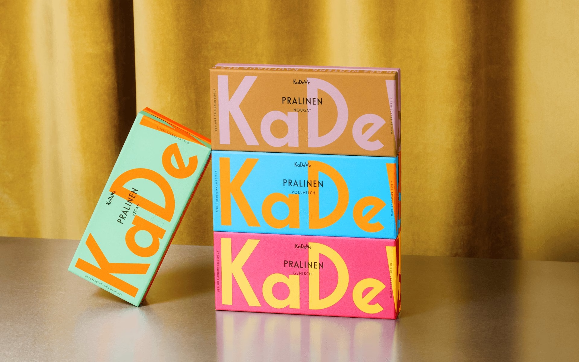
The pralines show the playful end of the system at its boldest. Oversized fragments of the custom letters wrap around the boxes in pink, cyan and orange, yet every box still reads unmistakably as KaDeWe. The result is a packaging and identity system that is minimal, iconic and built entirely from what the house already owned.
Unlock everything with Mindsparkle Mag Plus.
Get exclusive access to Premium features:
Credits: Studio Chapeaux
Brand Identity & Packaging Design: Studio Chapeaux
Creative Director: Axel Domke
More in Food & Beverage Branding
Stay on top of this week's design. Insights, top picks & more.