 Plus
Plus

 Menu
Menu


Substance
October 08, 2026
Mindsparkle Mag


Some of Belgium's best white wine comes from Domaine La Falize, a 400-year-old estate near Namur that has farmed organically since 2000. When the family decided to grow soybeans on its own fields and ferment them into soy sauce, it had a product with no real precedent in the country. Oraio is the result: a soy sauce made from estate-grown soy and wheat, water from the domaine's artesian well, and at least two years of slow fermentation in oak.
Brussels studio Substance was brought in to build a world around that idea. The studio shaped the narrative, named the product and designed the visual identity, packaging and website, and Rob Denys shot the photography and film. The name comes from the Greek "horaios", which describes something at the peak of its ripeness, a fitting word for a sauce whose secret ingredient is time.
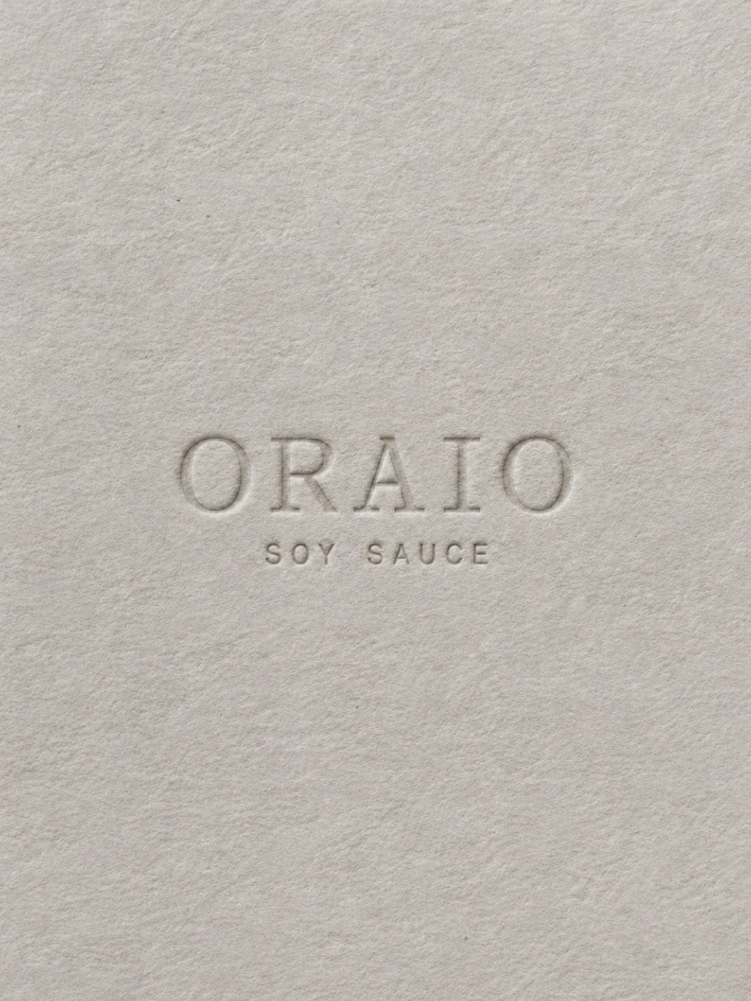

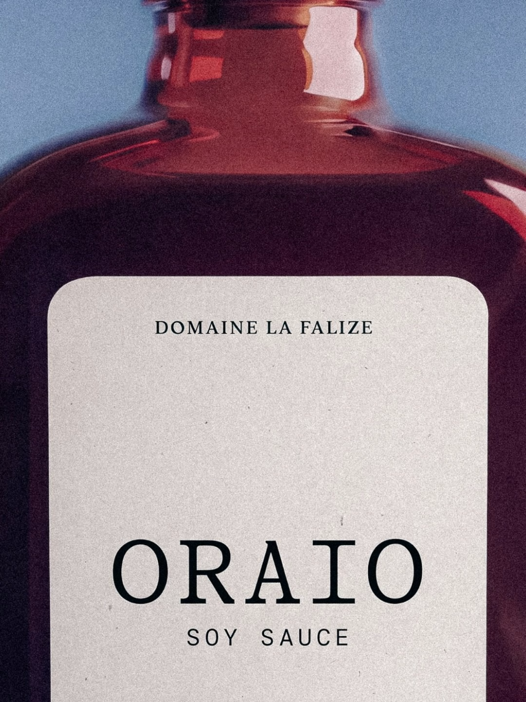
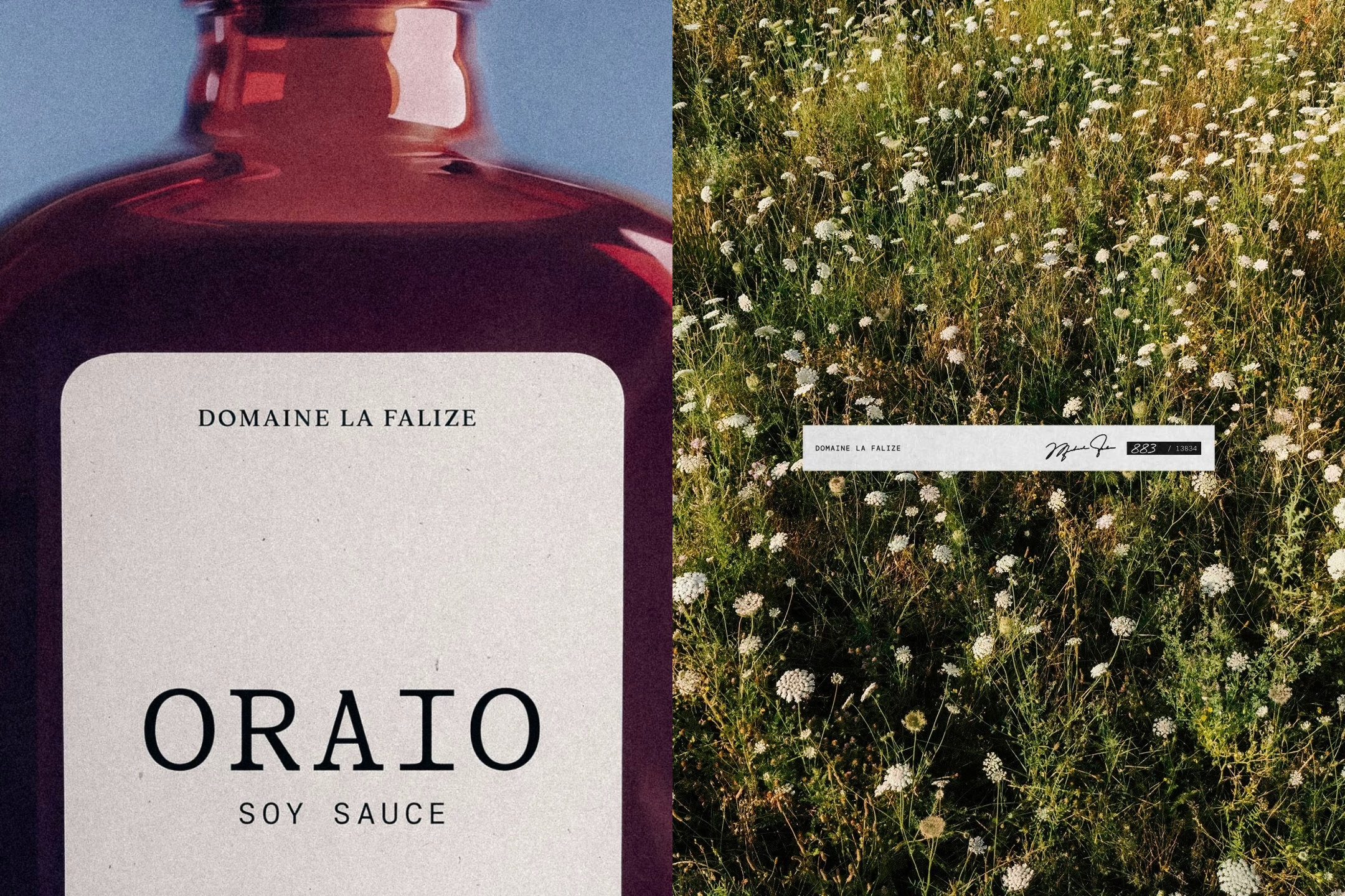
The bottle borrows its manners from the wine cellar rather than the supermarket condiment aisle. A squat, rounded flask in deep brown glass carries a pale paper label with the estate's name set small above a wide, evenly spaced ORAIO wordmark. Small accents of colour on the label separate the Original from the Sweet & Spicy, while the rest of the system stays quiet and confident.
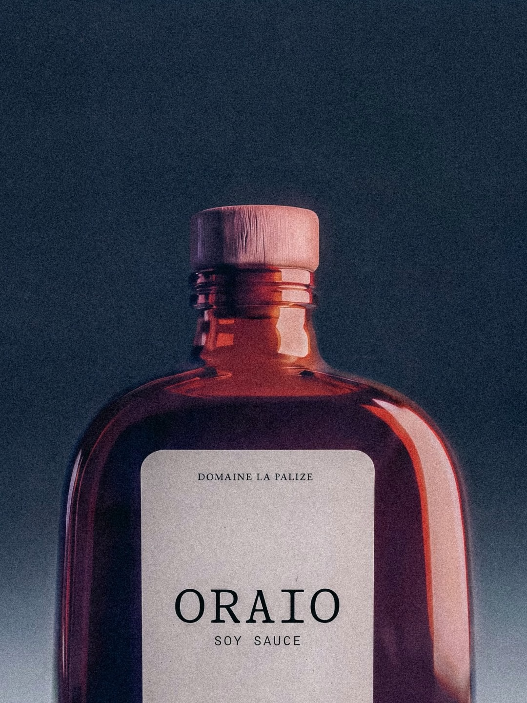
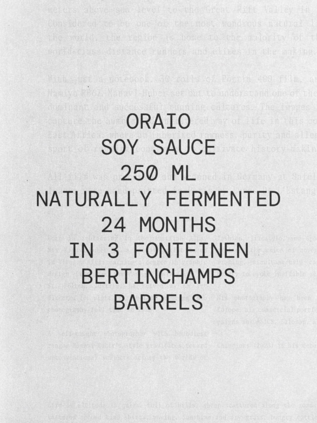
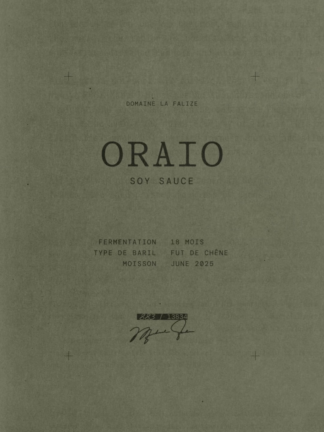
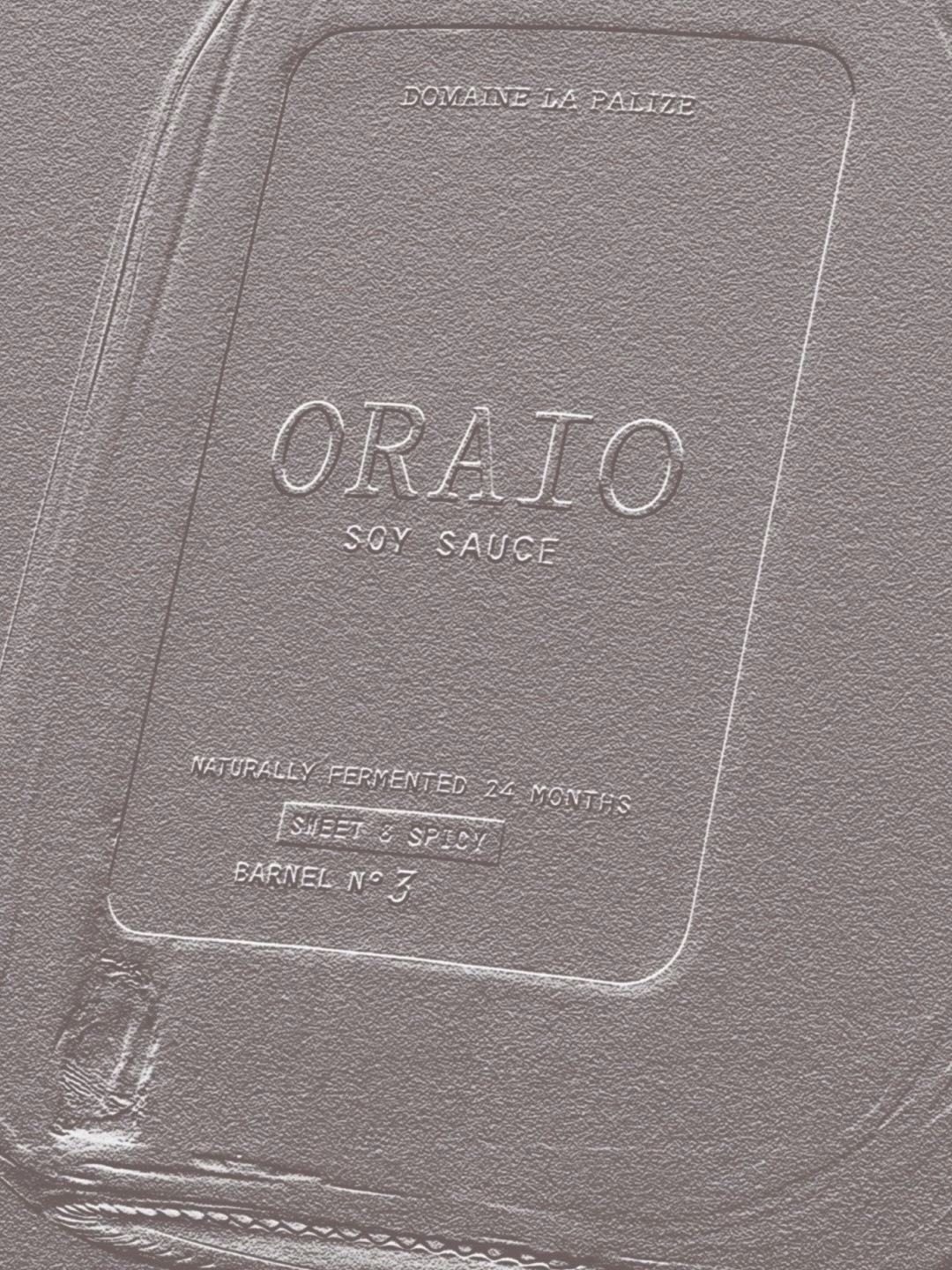
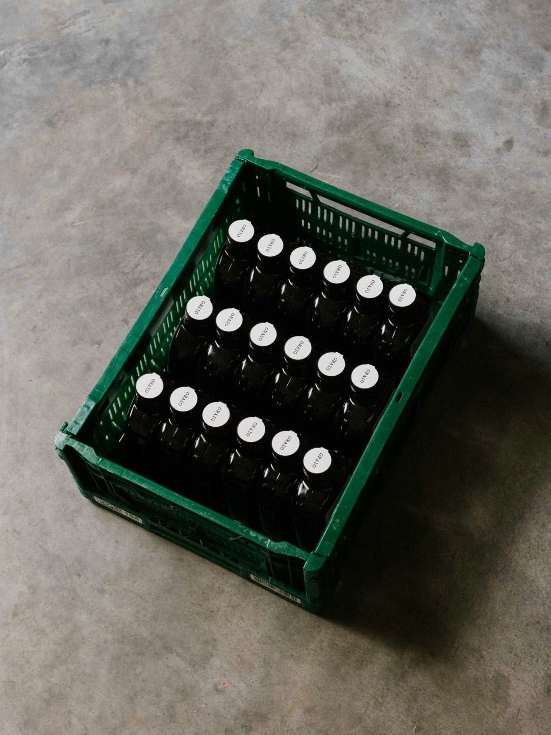
Print does much of the storytelling. Blind-debossed wordmarks, embossed lids and stacked logo sheets give the identity a tactile, almost archival feel, and the secondary typography reads like a typewritten cellar record. One card simply lists the facts: 250 ml, naturally fermented, 24 months in 3 Fonteinen and Bertinchamps barrels, a detail that would usually sit on a wine label rather than a soy sauce bottle.
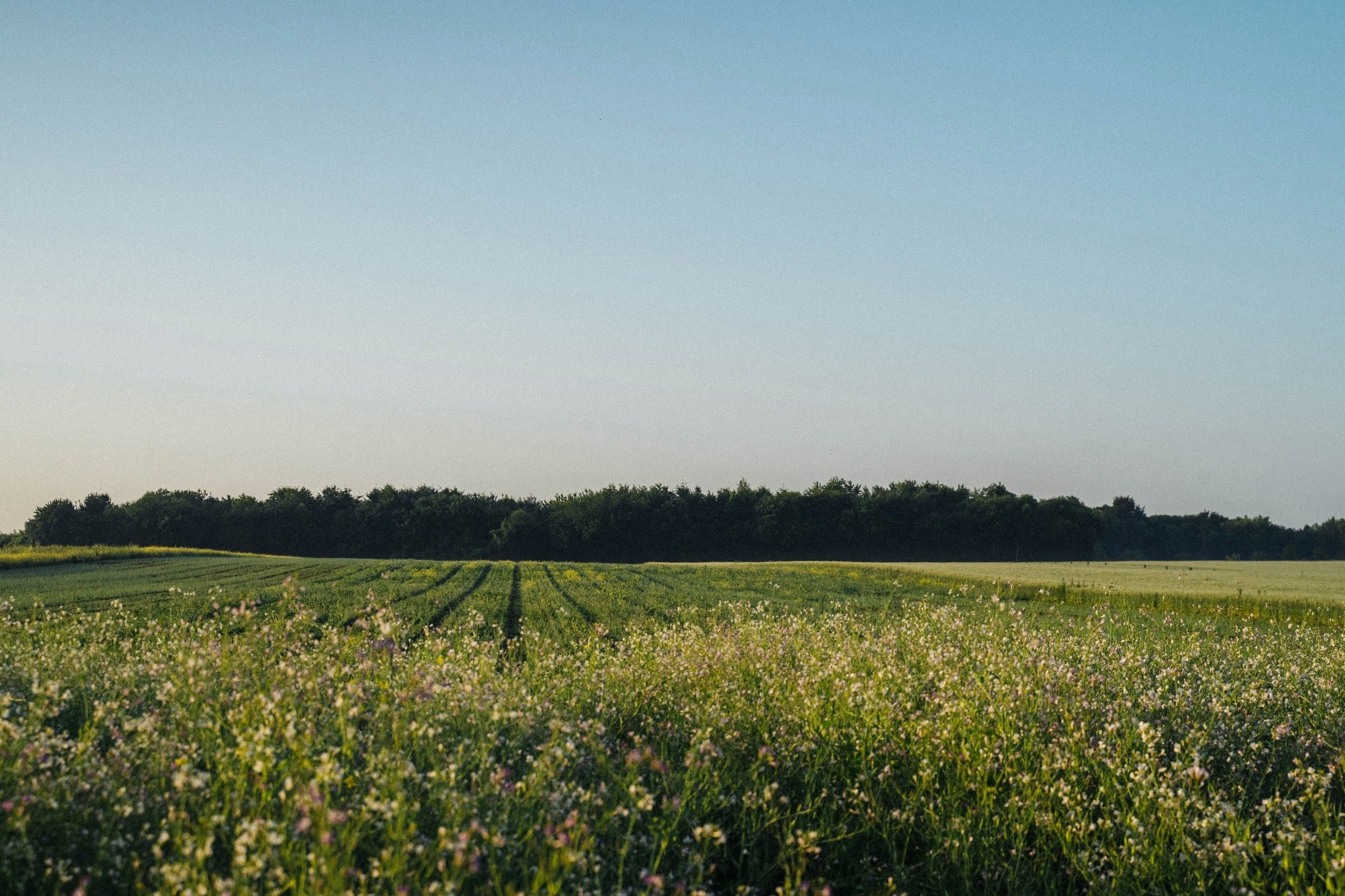
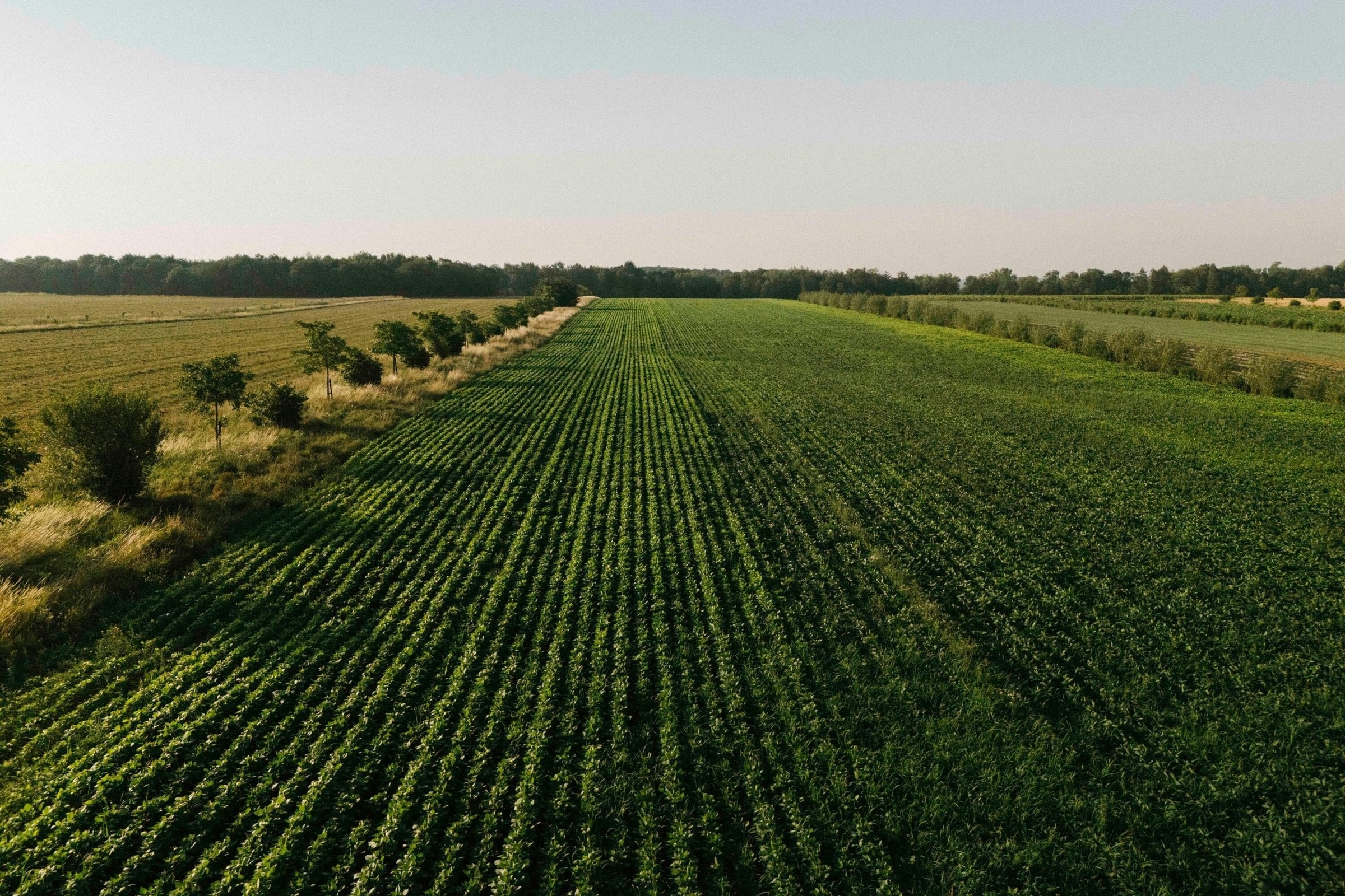
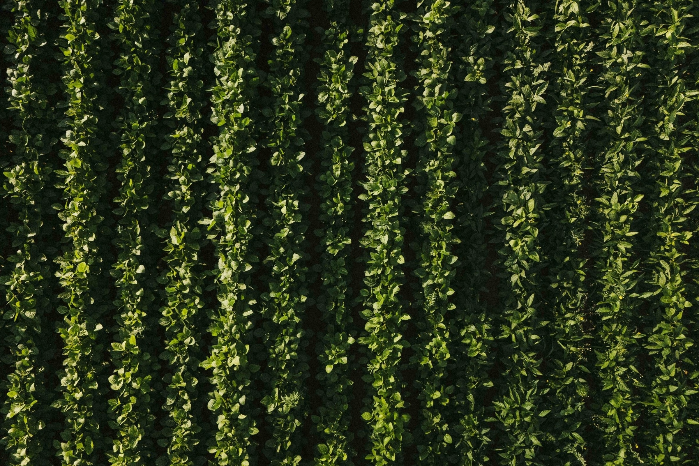
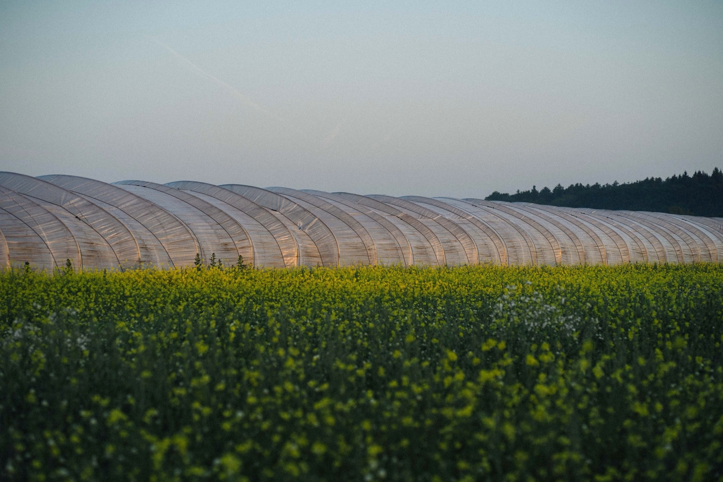
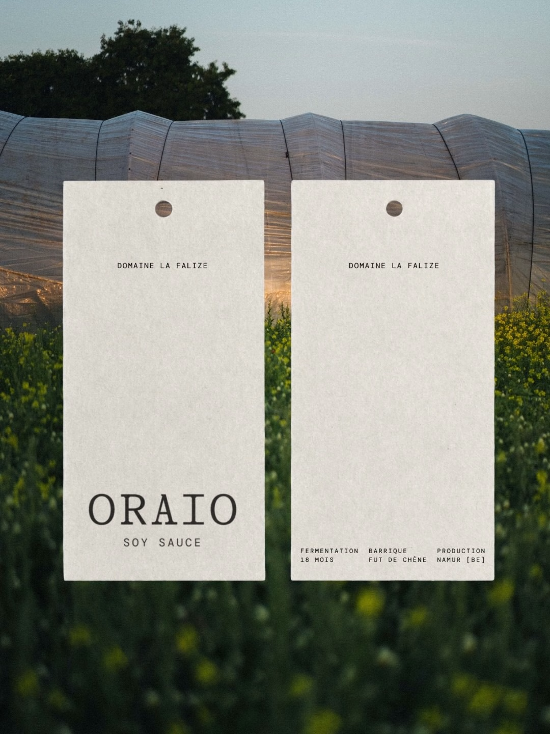
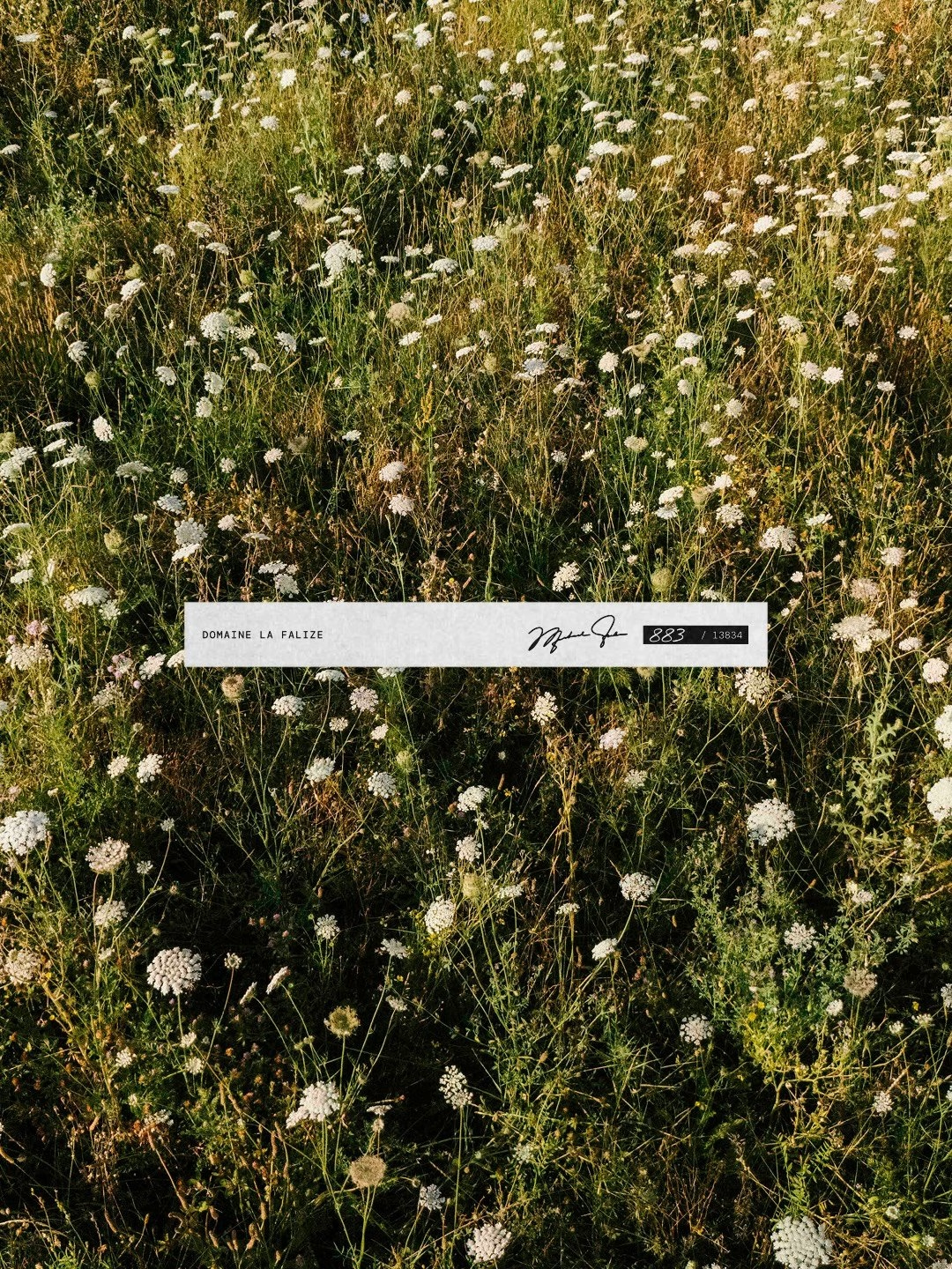
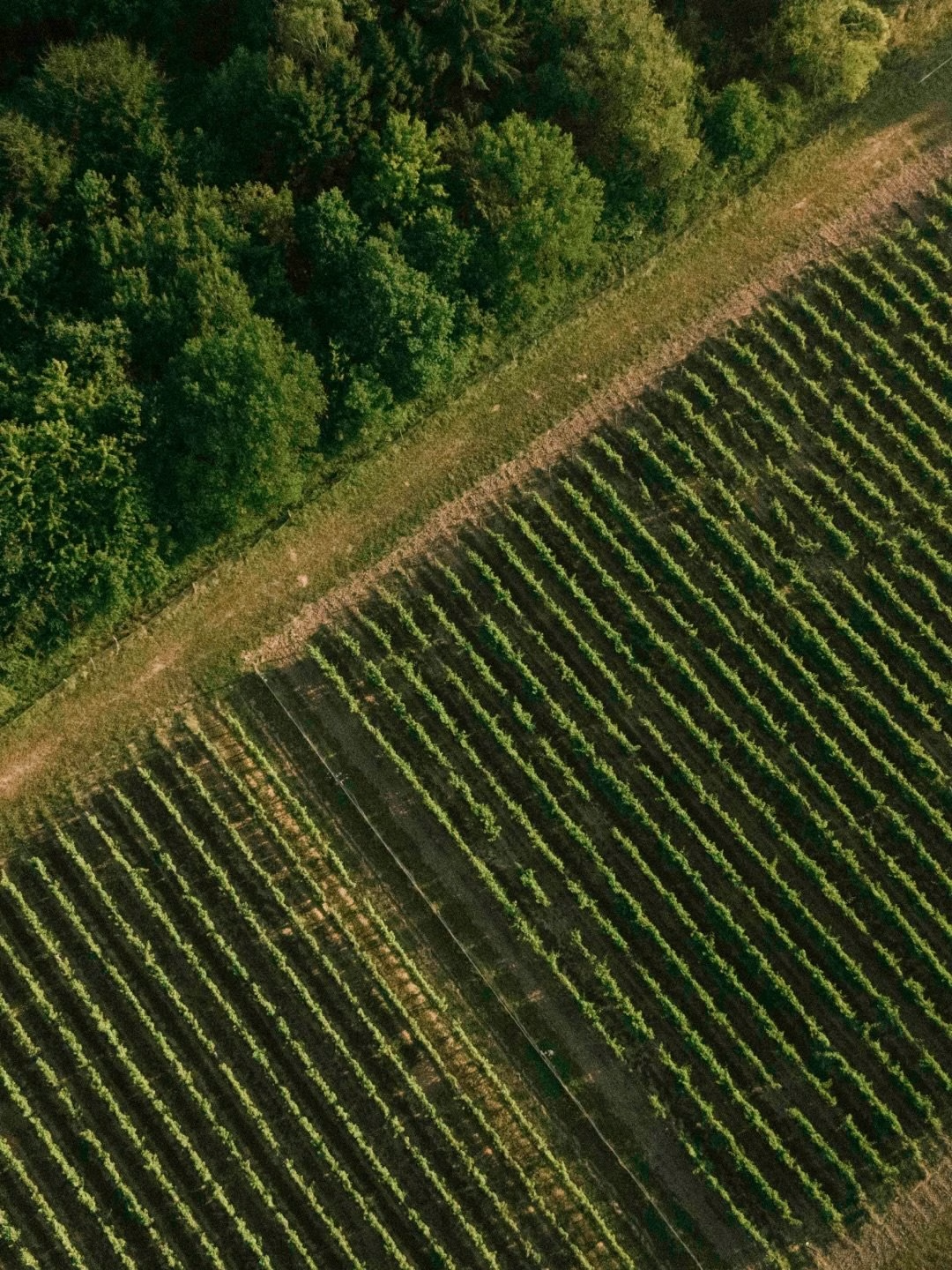
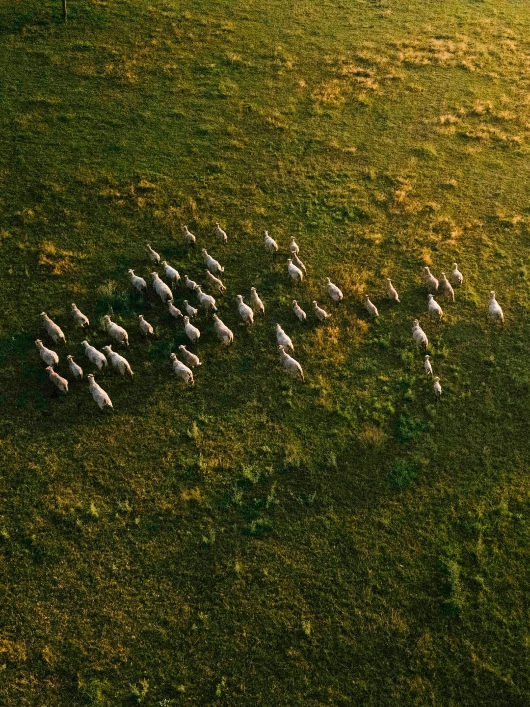
The estate itself is the brand's strongest asset, and the imagery treats it that way. Wide shots of the soy fields, aerial rows of crops and vines, a flock of sheep and greenhouse tunnels set the product firmly in its landscape. Hangtags photographed among the crops make the link between field and bottle literal, and Rob Denys' film moves from the land to the barrels to the finished flask in one continuous rhythm.
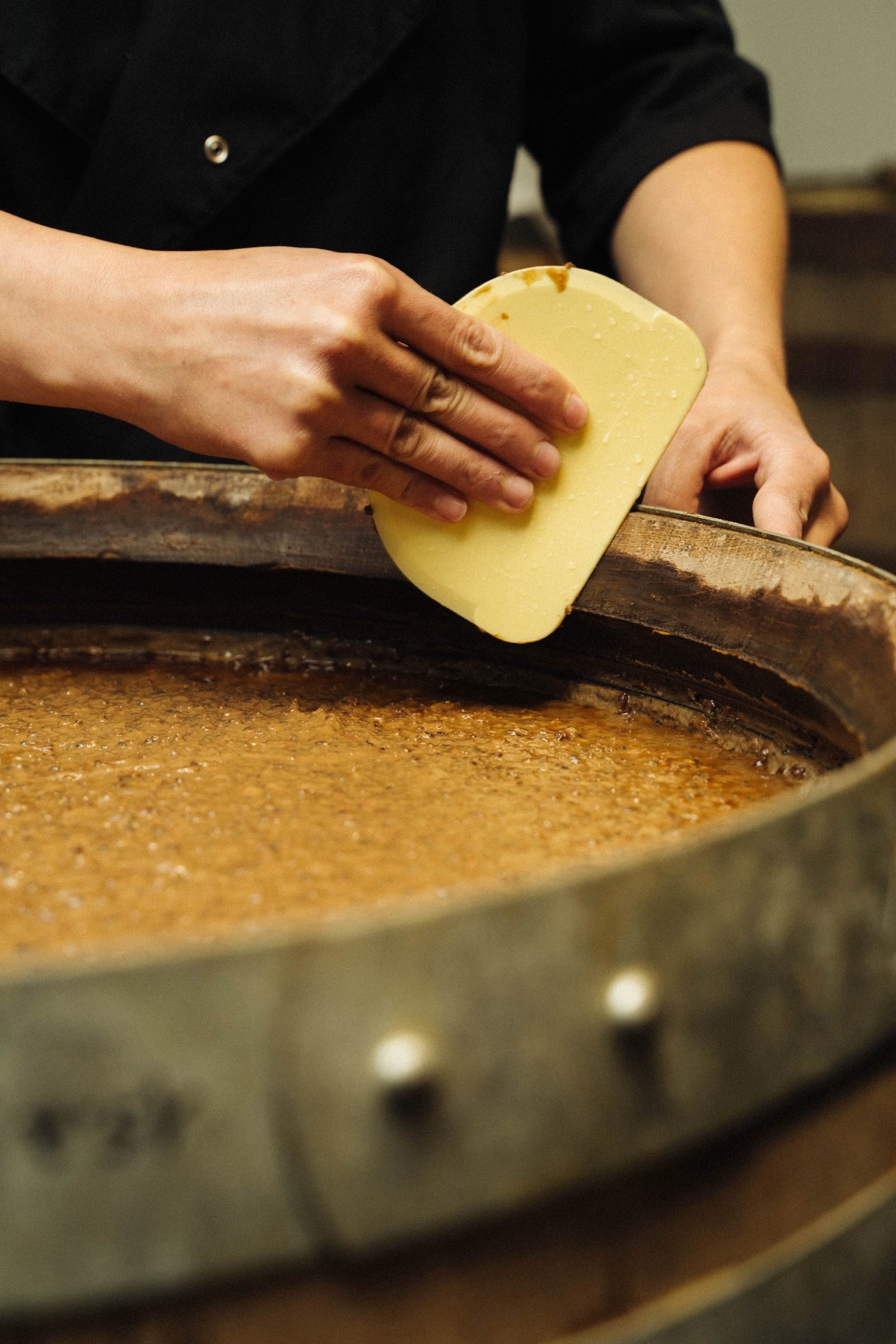
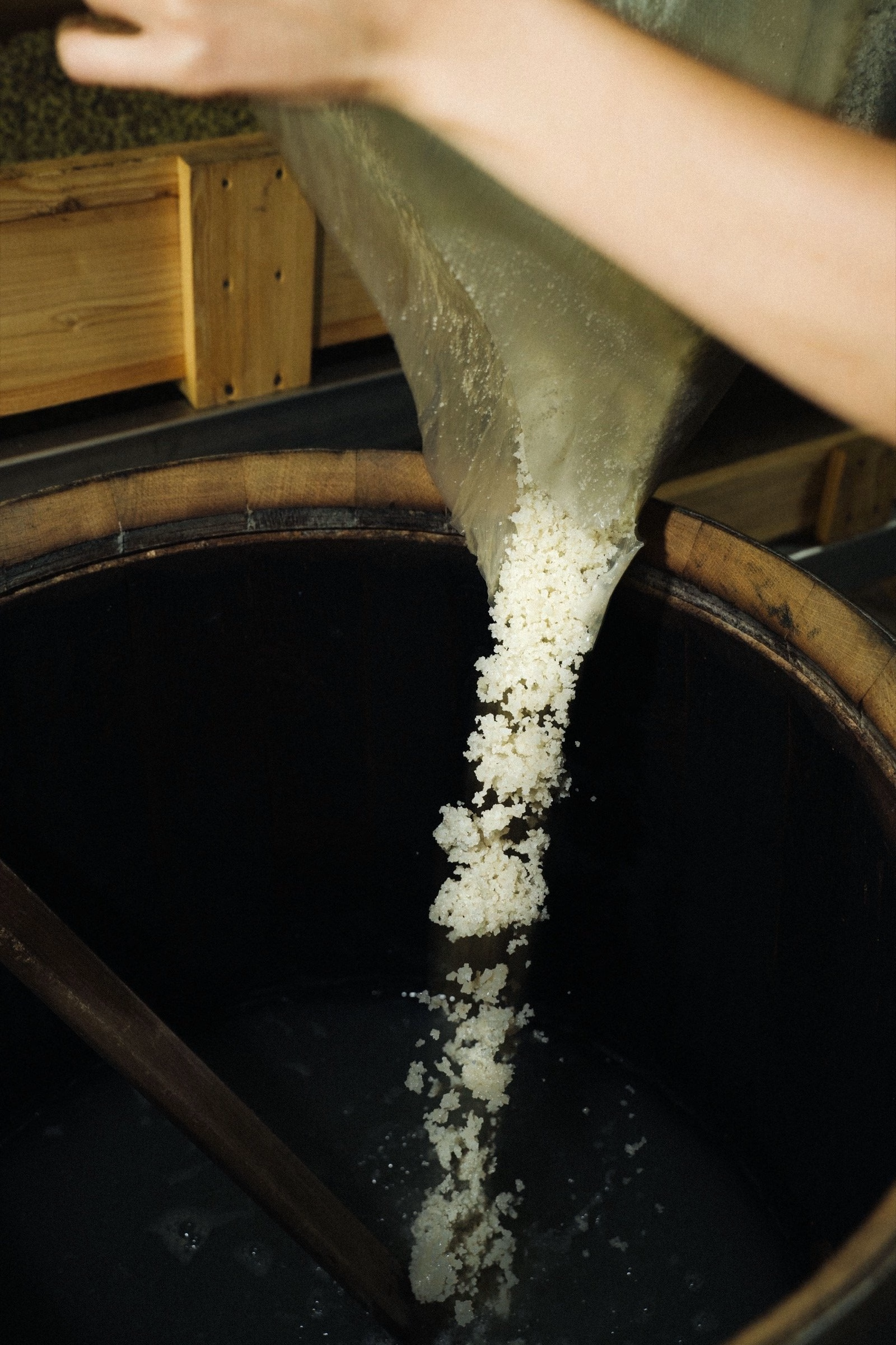
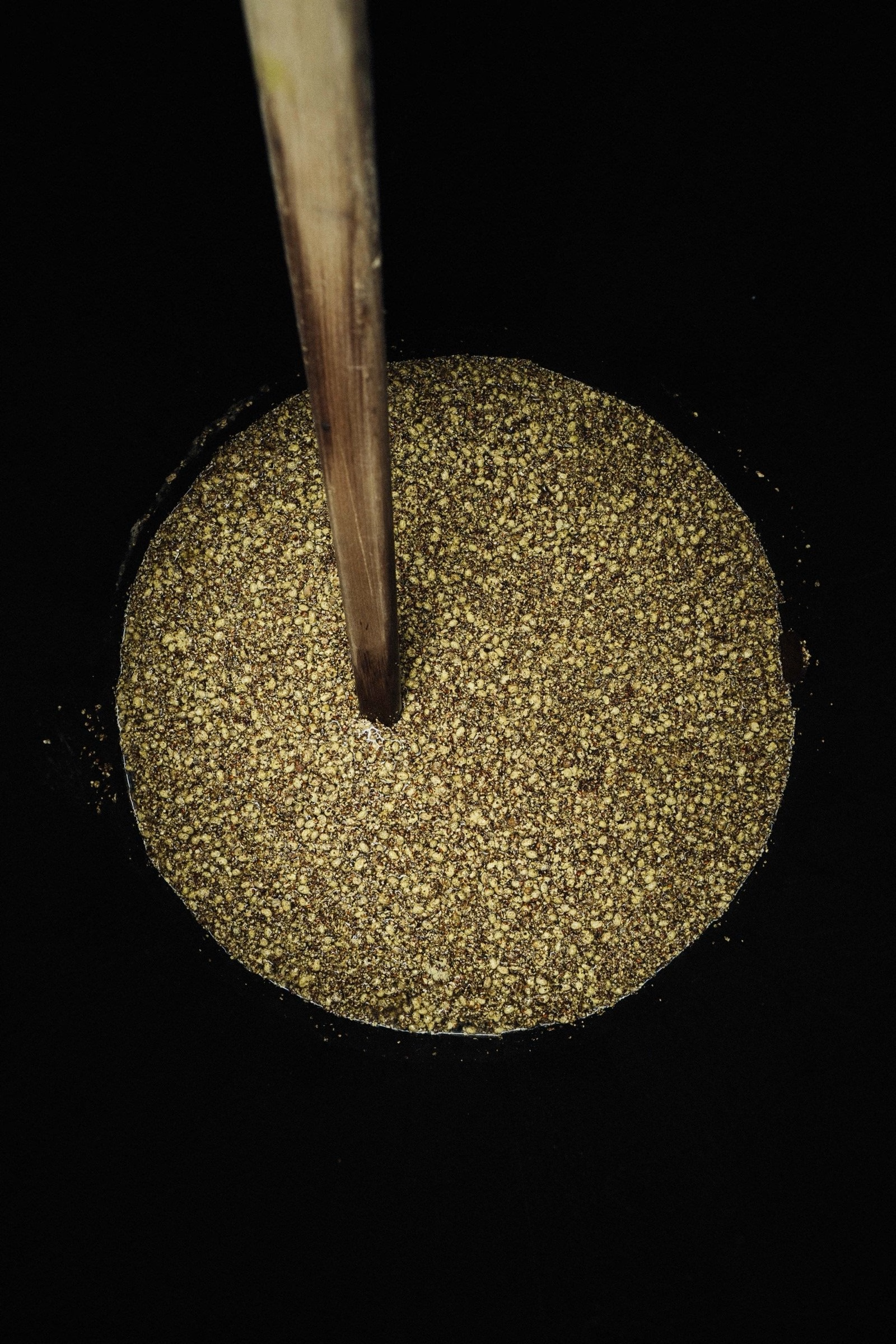
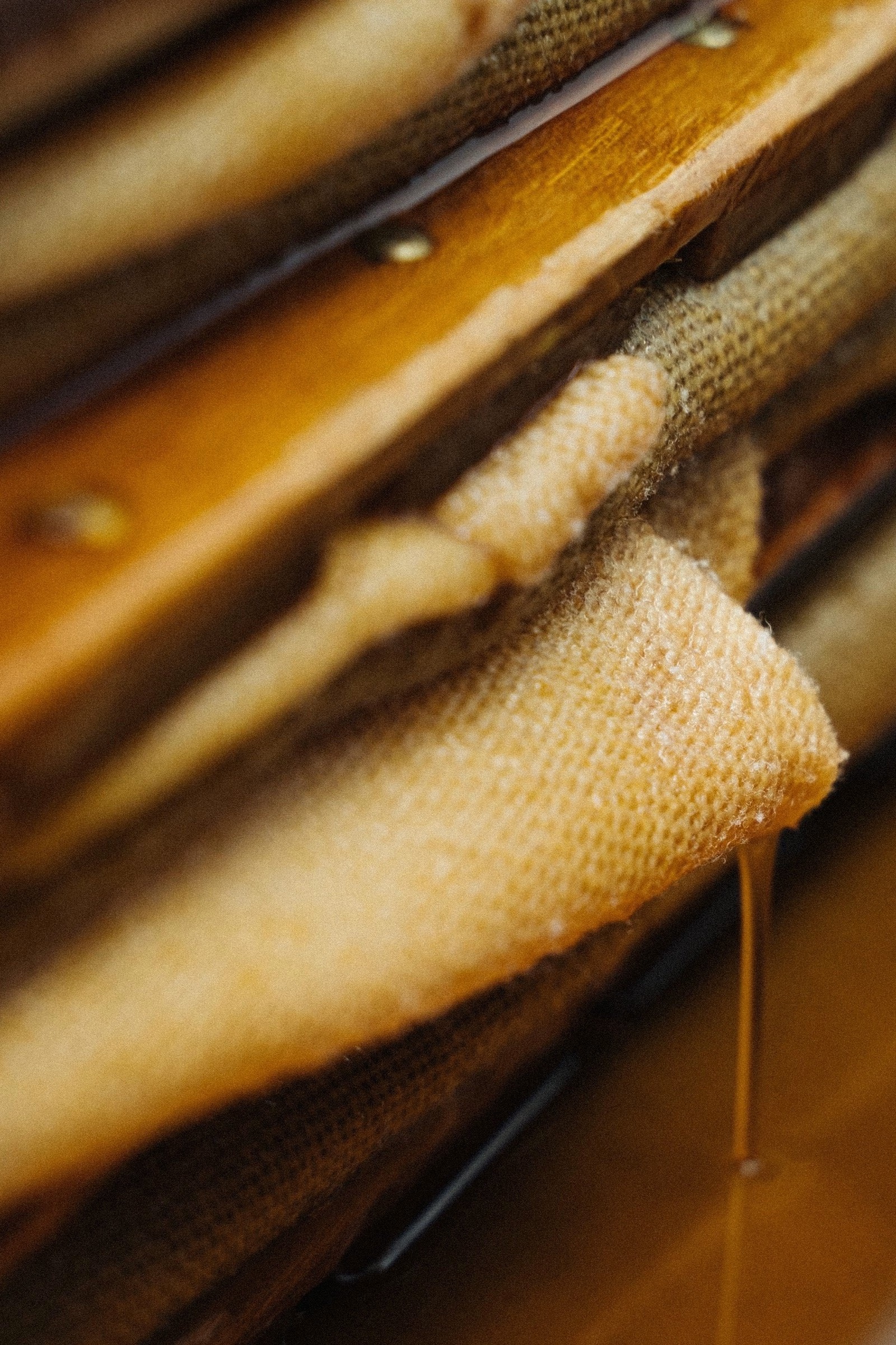
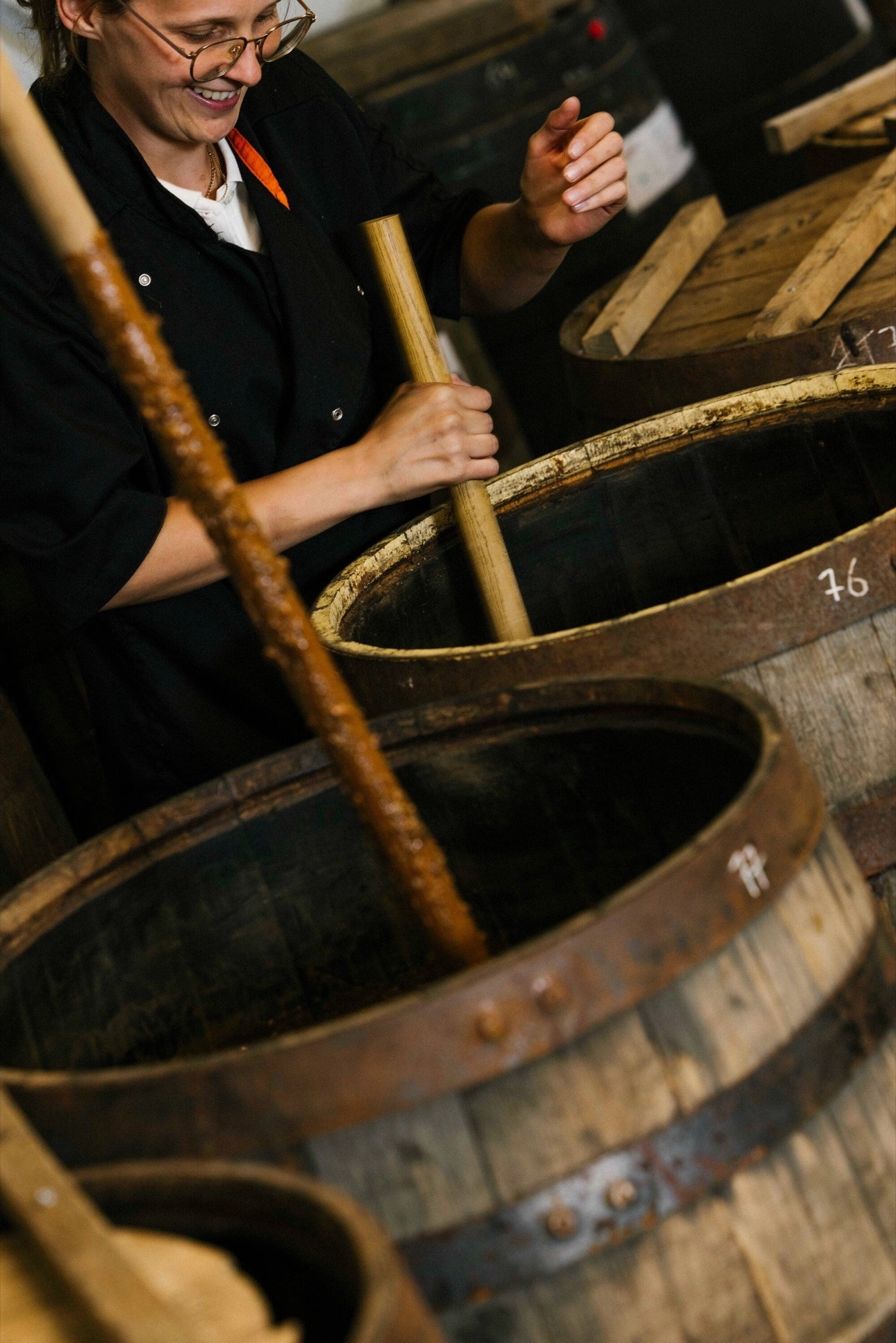
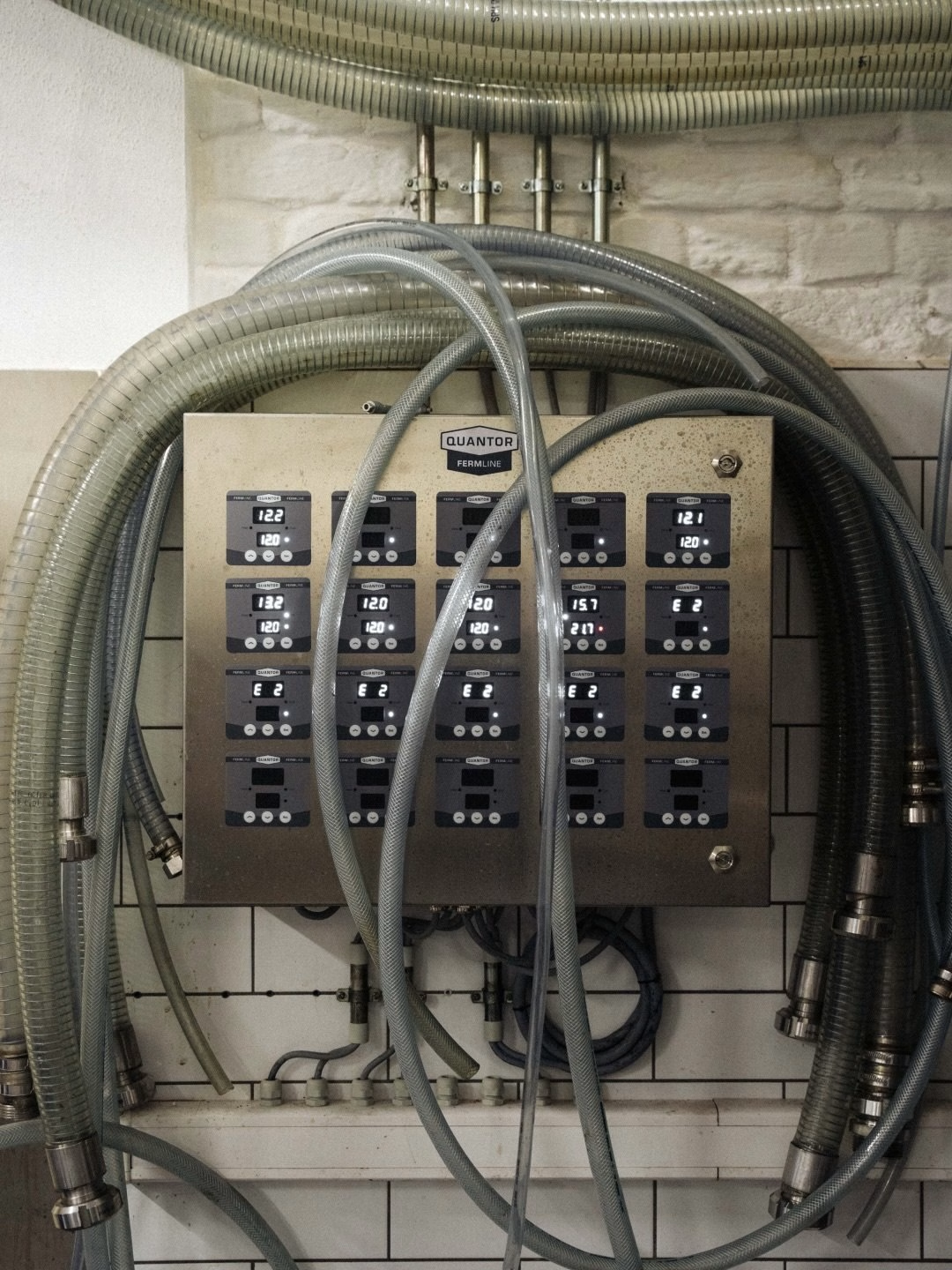
Inside the cellar, the photography stays close to the process. The sauce ferments in old barrels sourced from La Falize's own winery and from Belgian beer and spirit producers, then is pressed over several days and bottled without pasteurisation. Grain spilling into barrels, cloth-pressed mash and the dark liquid pouring out of the press show a craft that runs at the pace of the seasons.
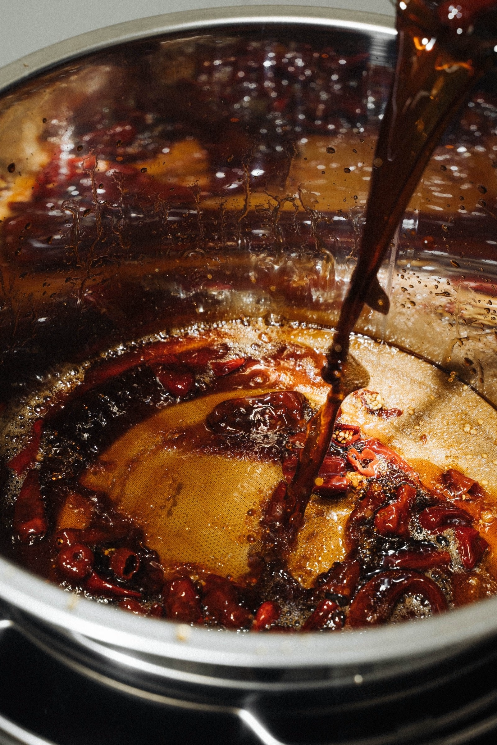
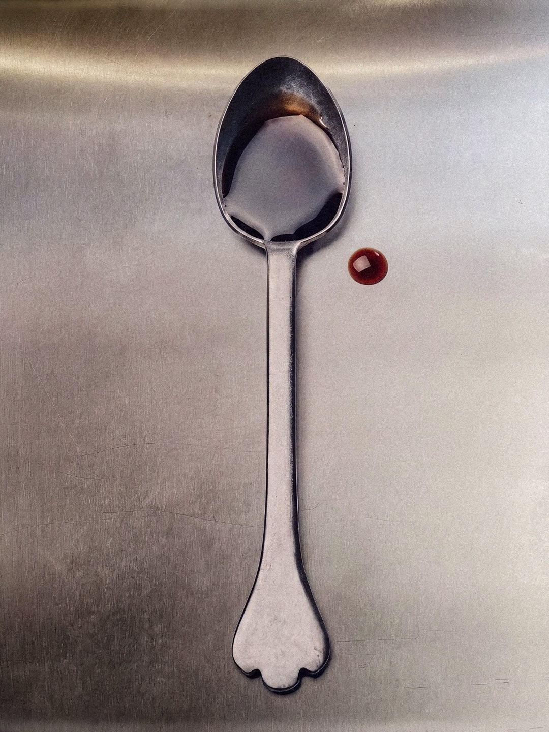
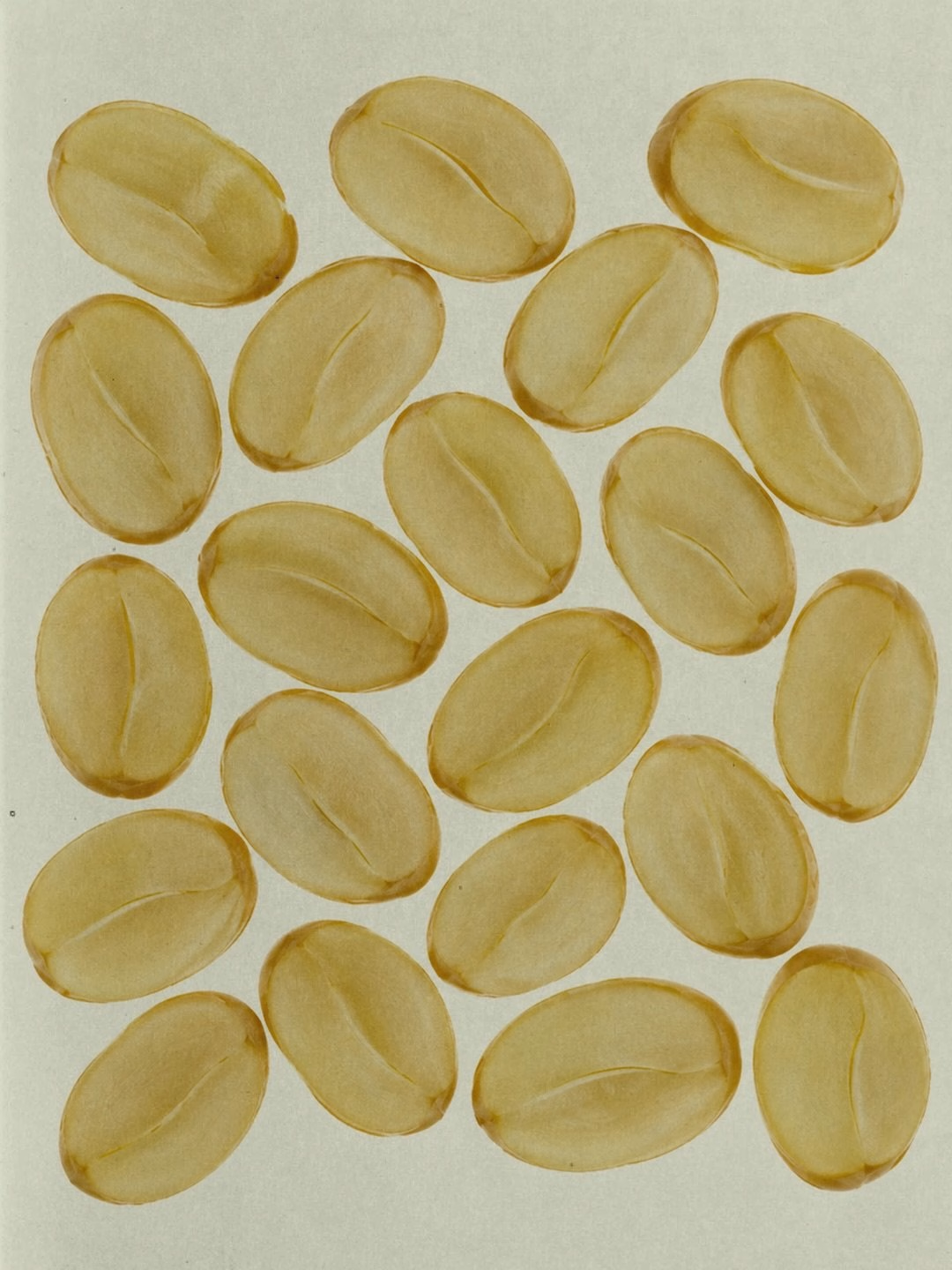
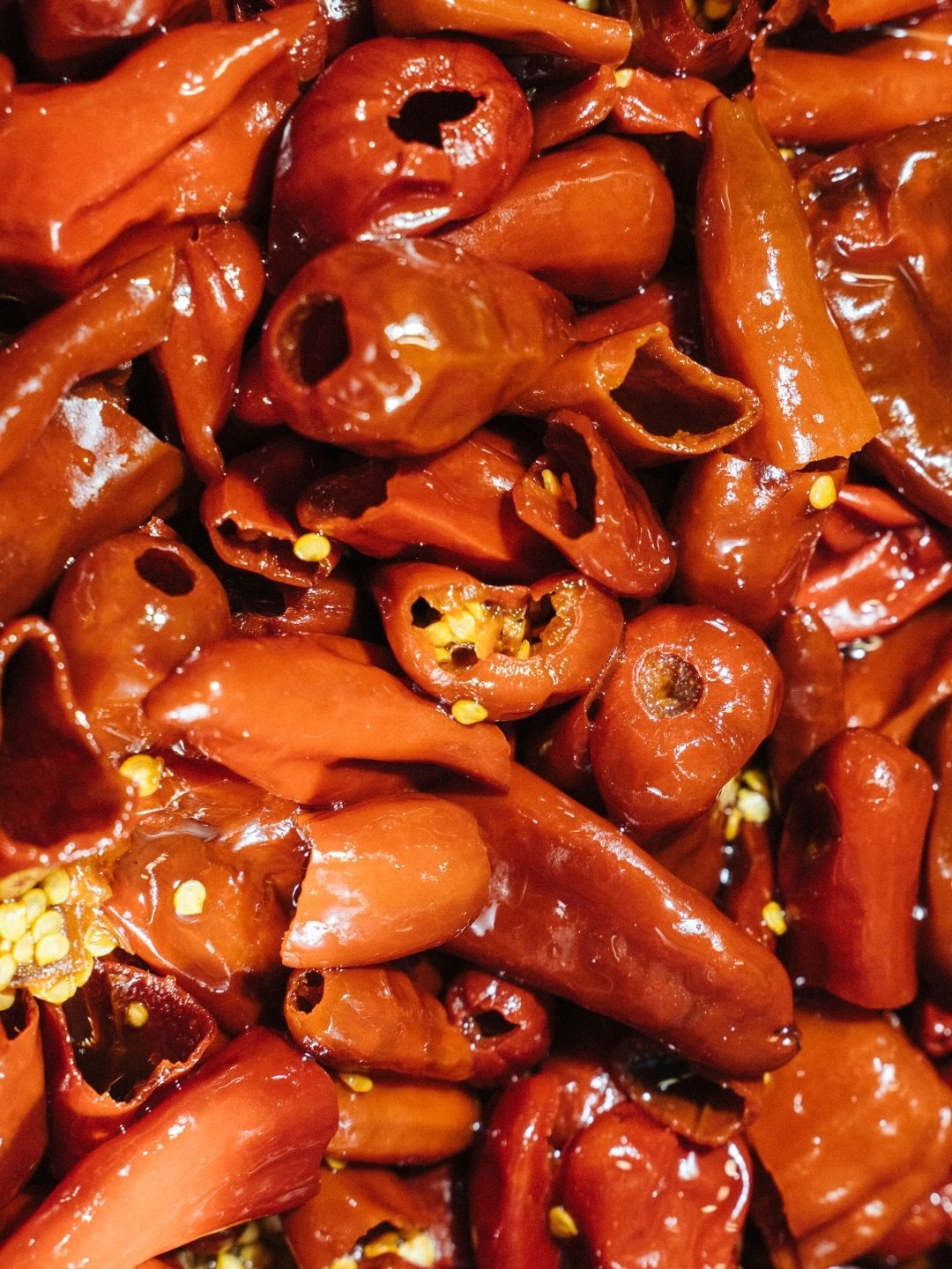
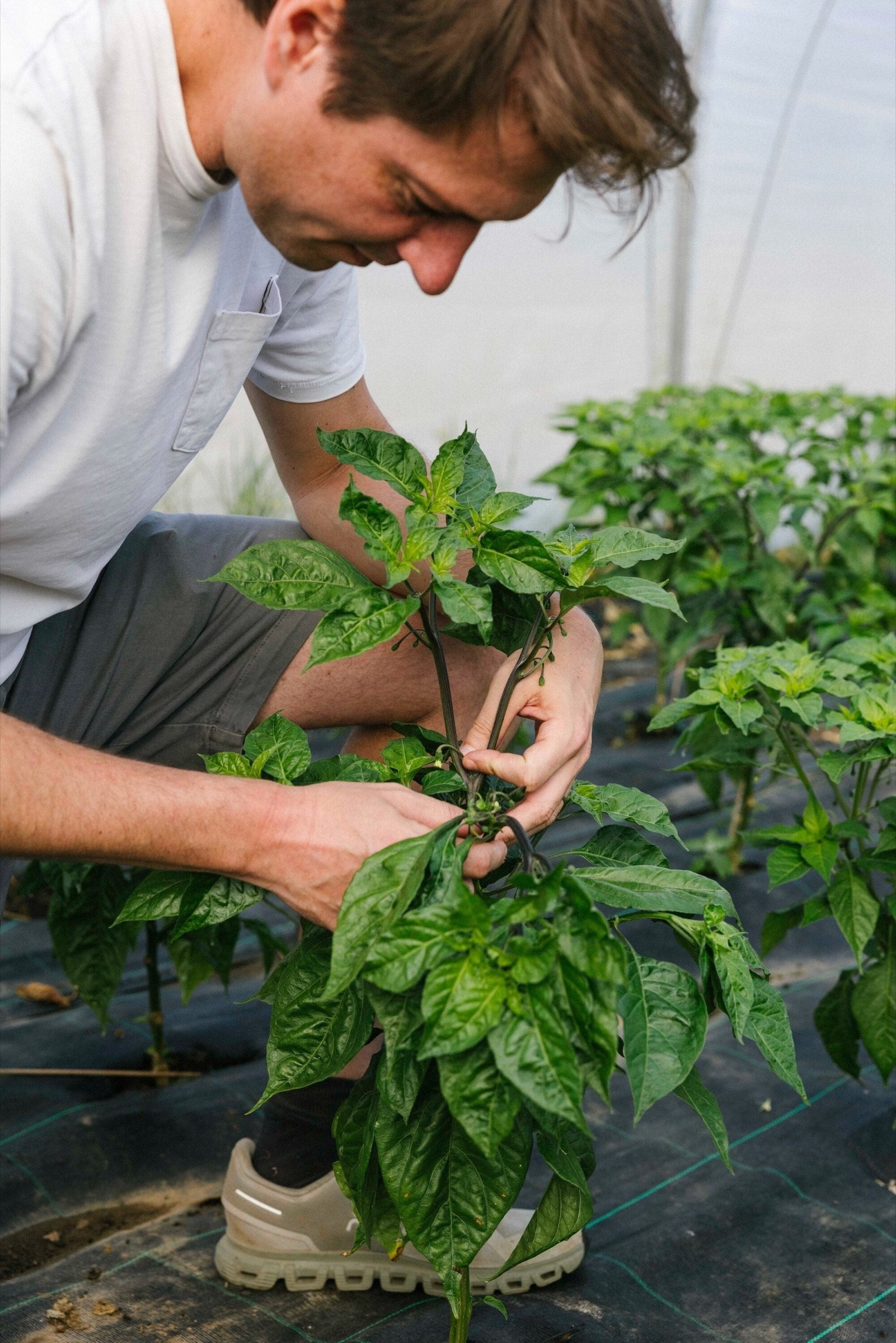
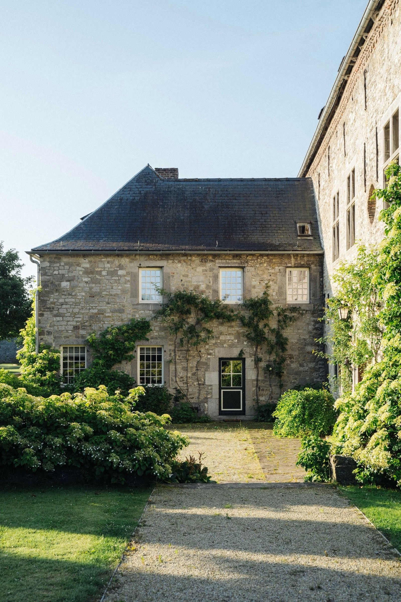
Still lifes round out the system with a calm, graphic eye. A single drop beside a polished spoon, scattered soybeans on paper and a heap of glossy chillies for the Sweet & Spicy edition each isolate one ingredient or gesture. Together with portraits of the chilli grower and the château grounds, they build the kind of world Substance set out to make, one that lives up to an unusually good idea: a world-class soy sauce grown, fermented and bottled in Belgium.
Credits: Substance
Brand Strategy, Naming, Identity, Packaging & Website: Substance
Co-founder, Substance: Pierre Hubin
Co-founder, Substance: Max Van Santen
Design: Corentin Billot
Photography & Film: Robin De Nys
Client: Domaine La Falize
More in Food & Beverage Branding
Stay on top of this week's design. Insights, top picks & more.