

 Plus

 Menu


Another Collective
November 12, 2026
Mindsparkle Mag


Emiglia makes fresh pasta in Porto, and it does so in two places at once: a small factory that produces pasta, sauces, ready meals and kits, and a pasta bar where the same food is cooked and served. The family recipes behind it have been passed down for generations, and so has the name. Porto and Madrid agency Another Collective was asked to bring both sides of the business under one roof. Its rebrand gives the factory and the bar a single, confident identity without sanding off the human character that made Emiglia worth visiting in the first place.
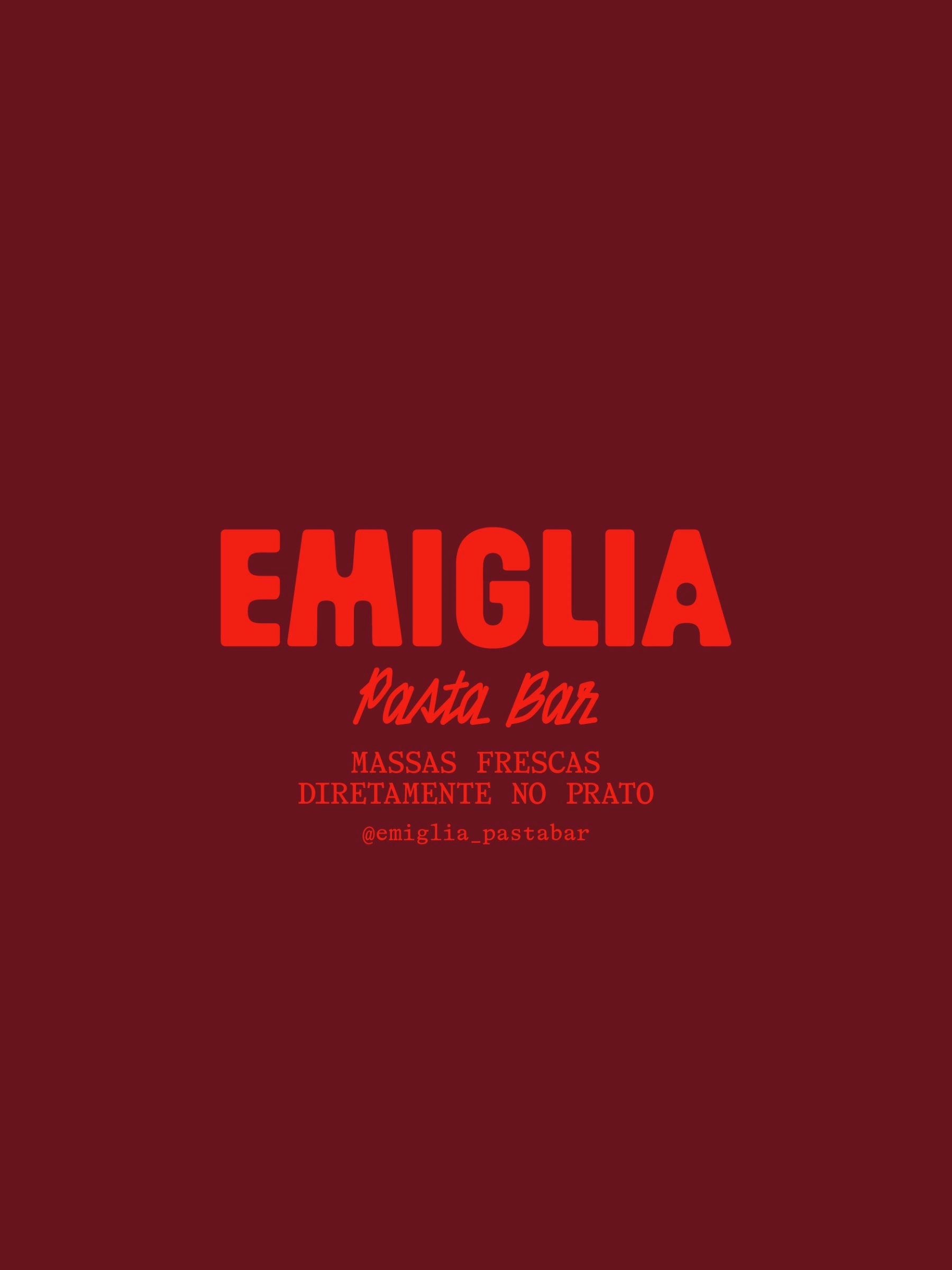
Rather than starting over, the studio kept what already worked. The brand's existing illustrations, drawn by Studio Rana, stay an integral part of the system, and a new typographic approach now sits alongside them with more personality. The result is a brand identity that brings tradition and contemporary expression together with greater confidence. Short motion pieces show the wordmark settling into place in Emiglia's signature red.
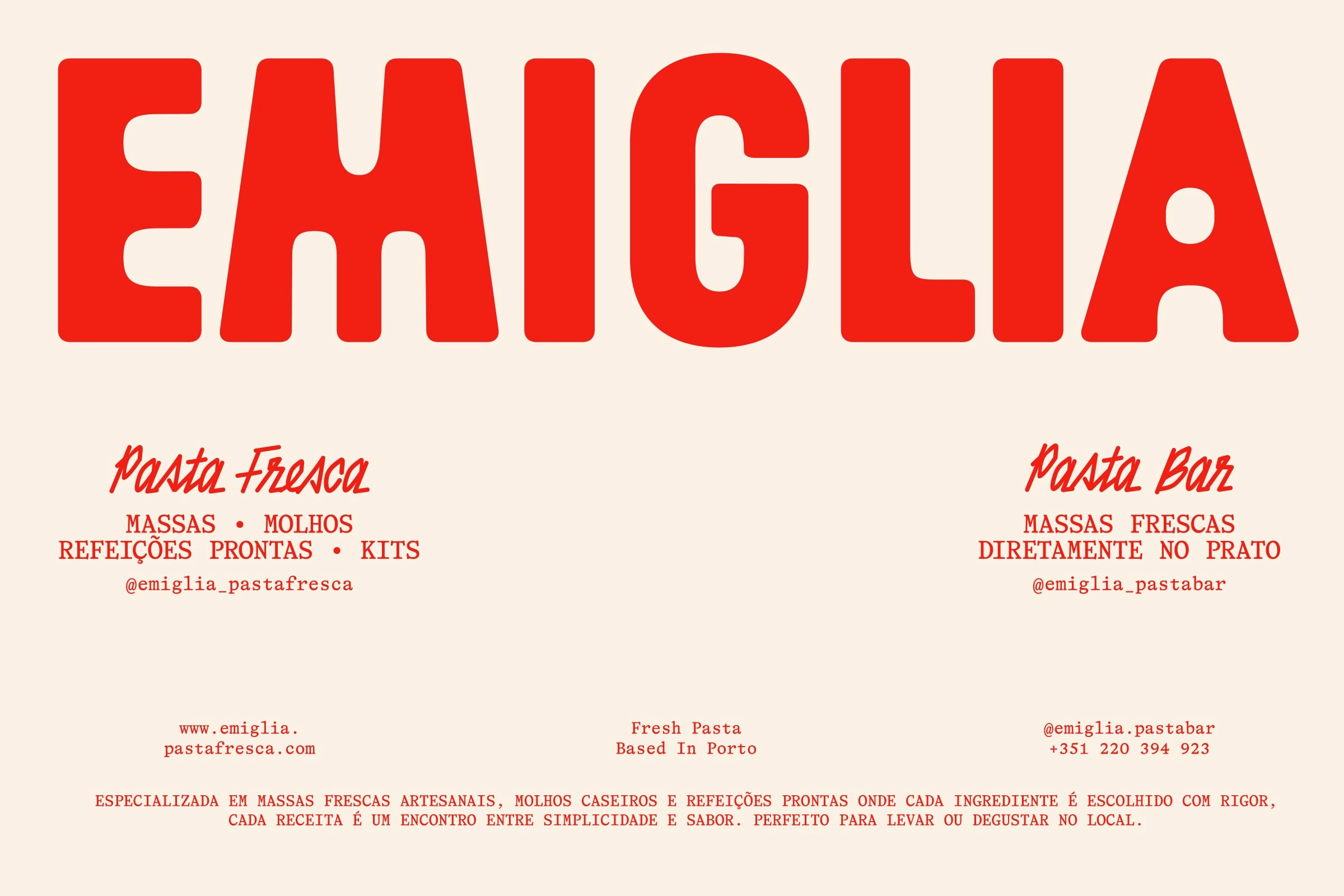
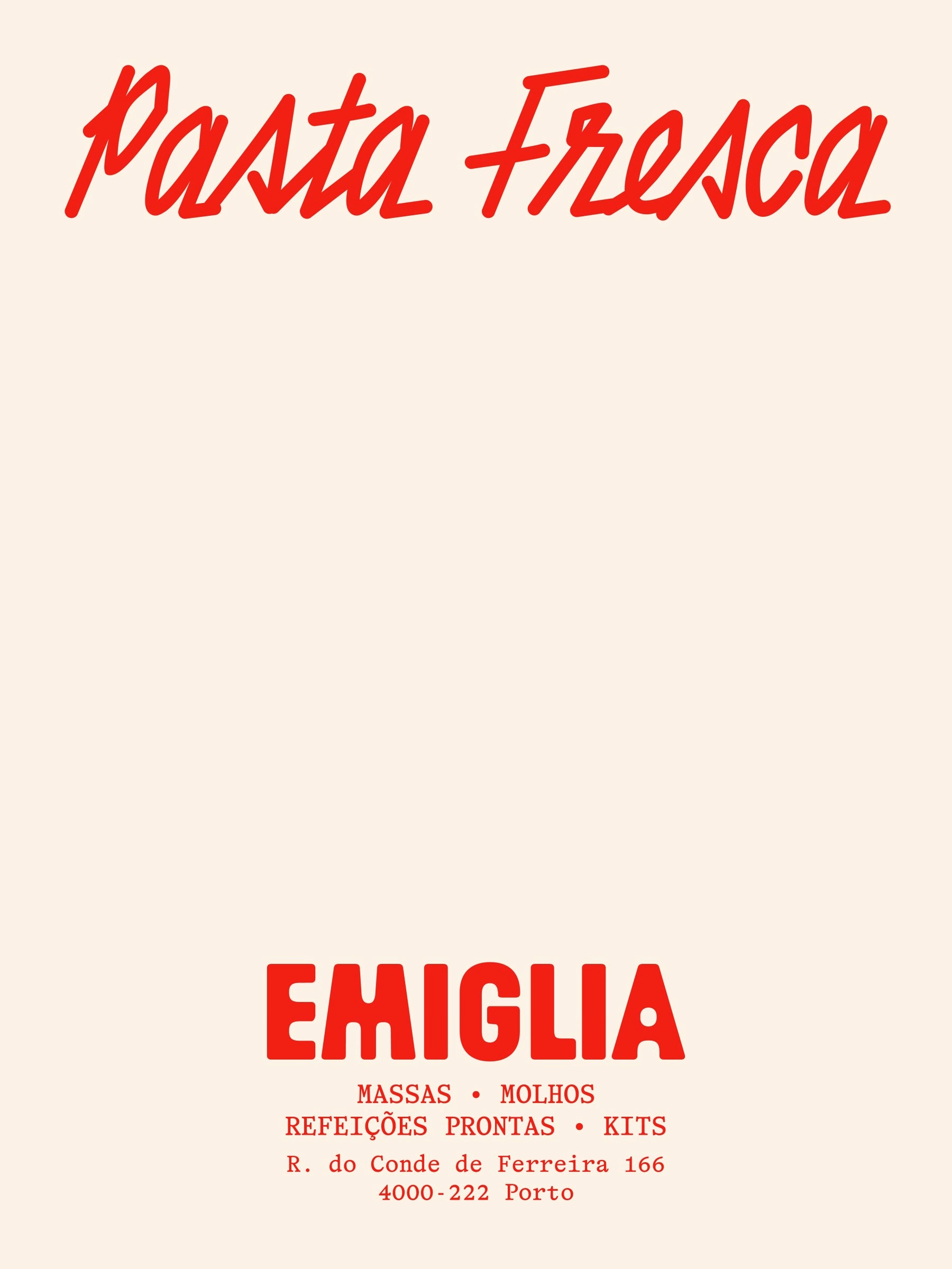
The logotype is the clearest sign of that evolution. A warm, heavy red wordmark with slightly irregular, hand-cut letterforms replaces the previous mark, and a flowing script carries the "Pasta Fresca" and "Pasta Bar" descriptors underneath. Small typewriter-style lines list what each side of the business sells, from fresh pasta and sauces to ready meals delivered straight to the plate. Cream and deep burgundy grounds let the red do the talking on posters and cards.
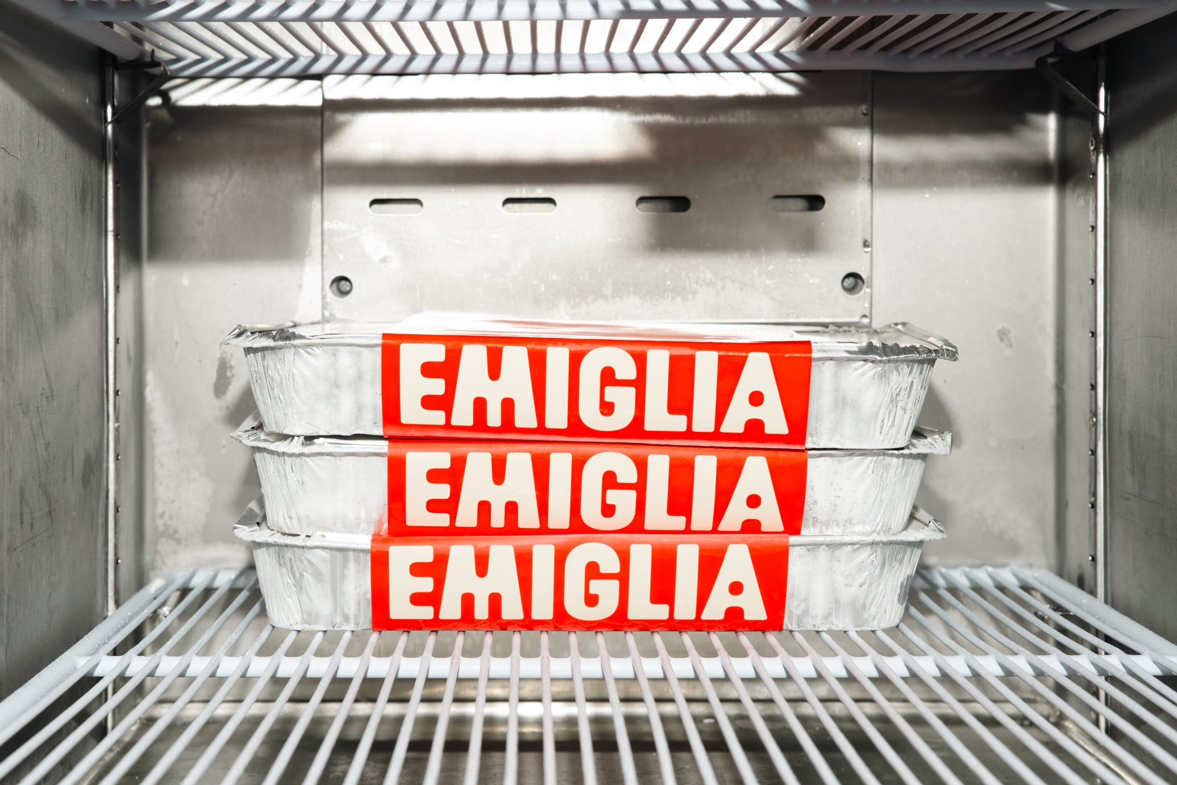
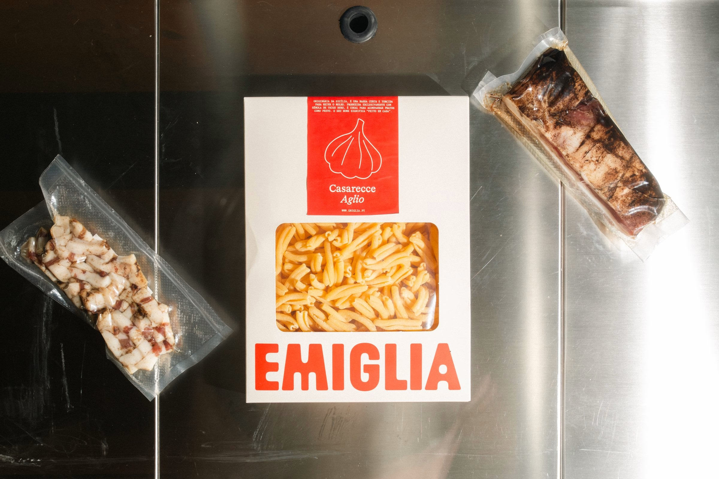
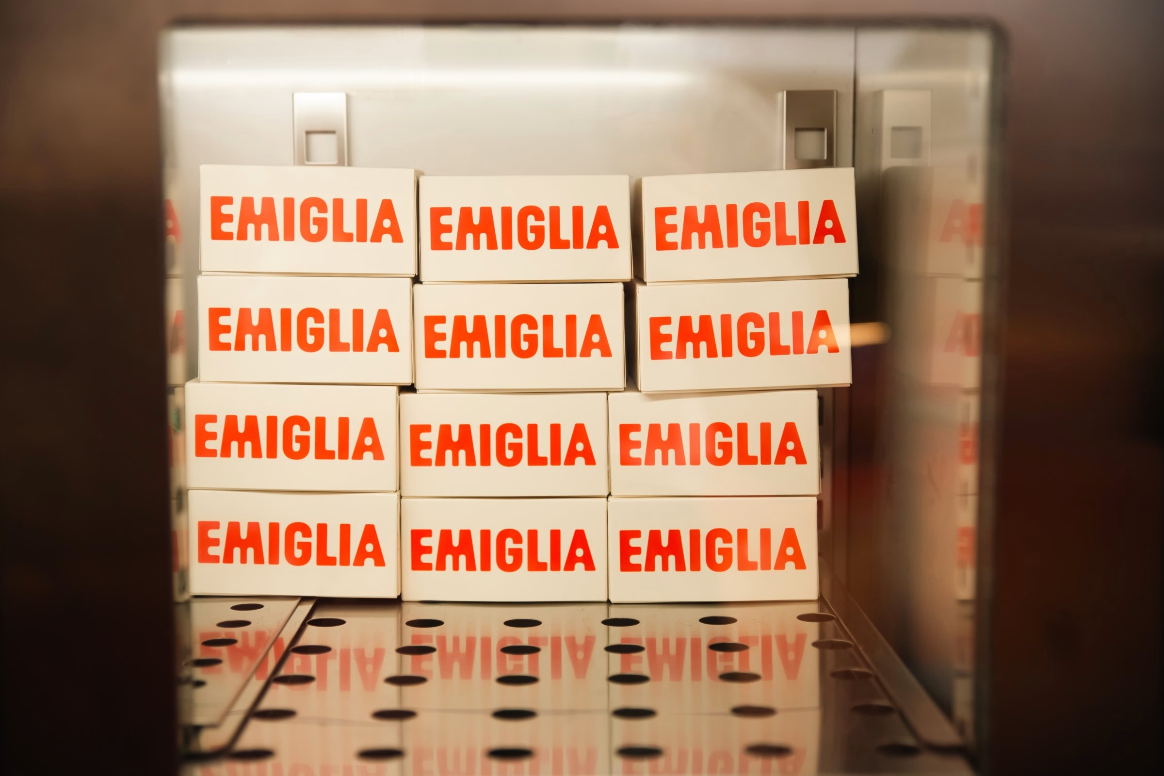
At the factory, the identity has to work on the shelf and in the fridge. Red cardboard boxes with cut-out windows show off the dried pasta inside, while ready meals sit in foil trays wrapped in bold red sleeves that stack into a wall of repeated wordmarks. Paper carrier bags bring back the illustrated cook, so the drawings from the old brand travel home with every order. Even the fridge shelves become a display, with rows of trays and boxes turning repetition into branding.
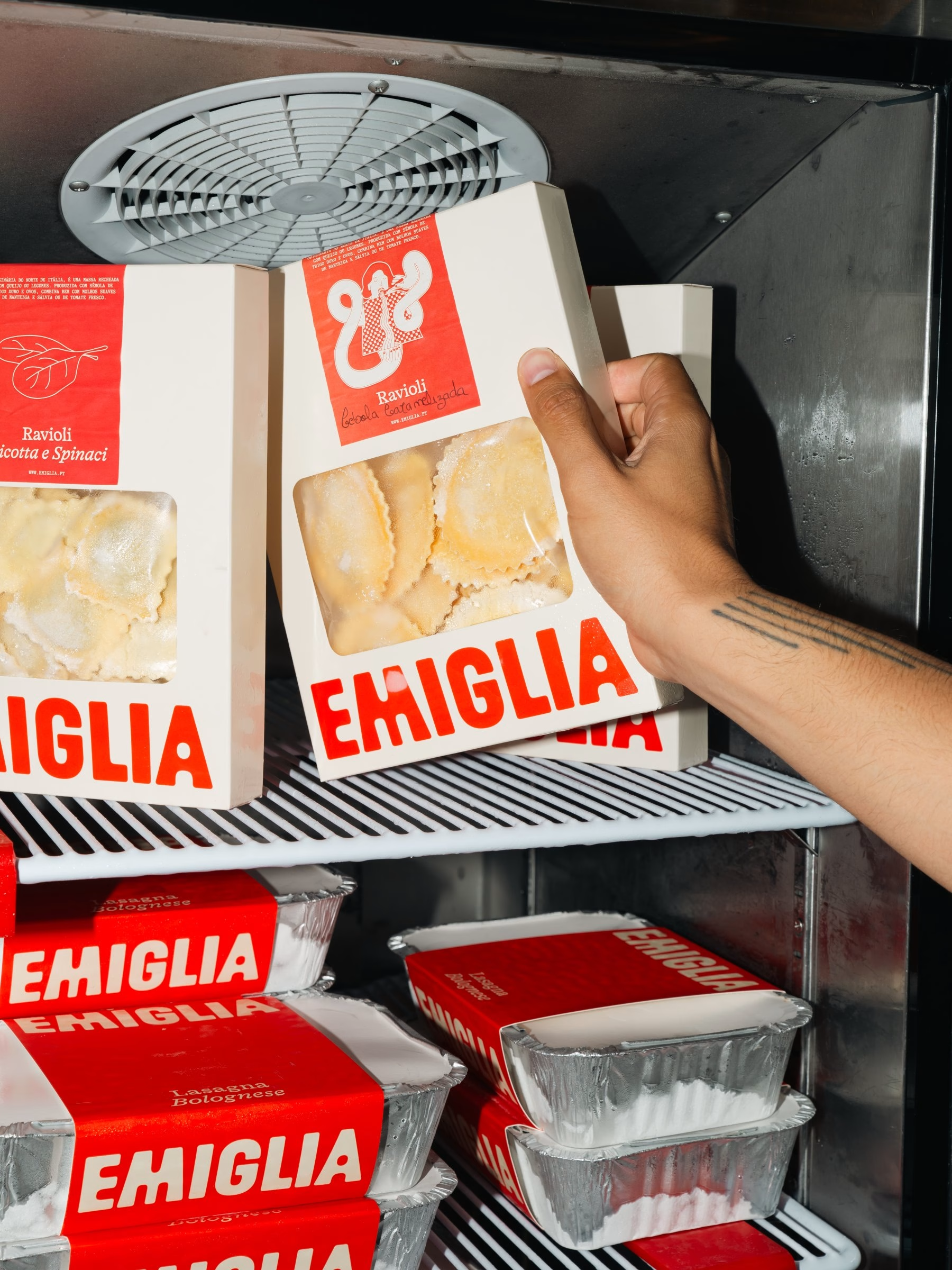
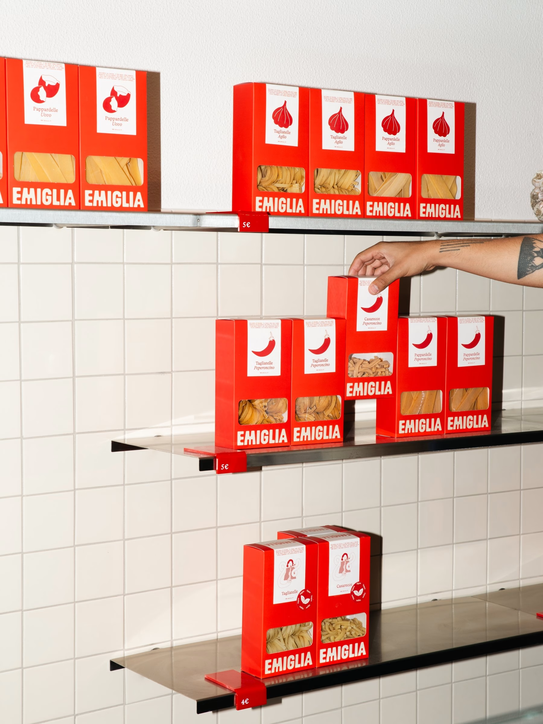
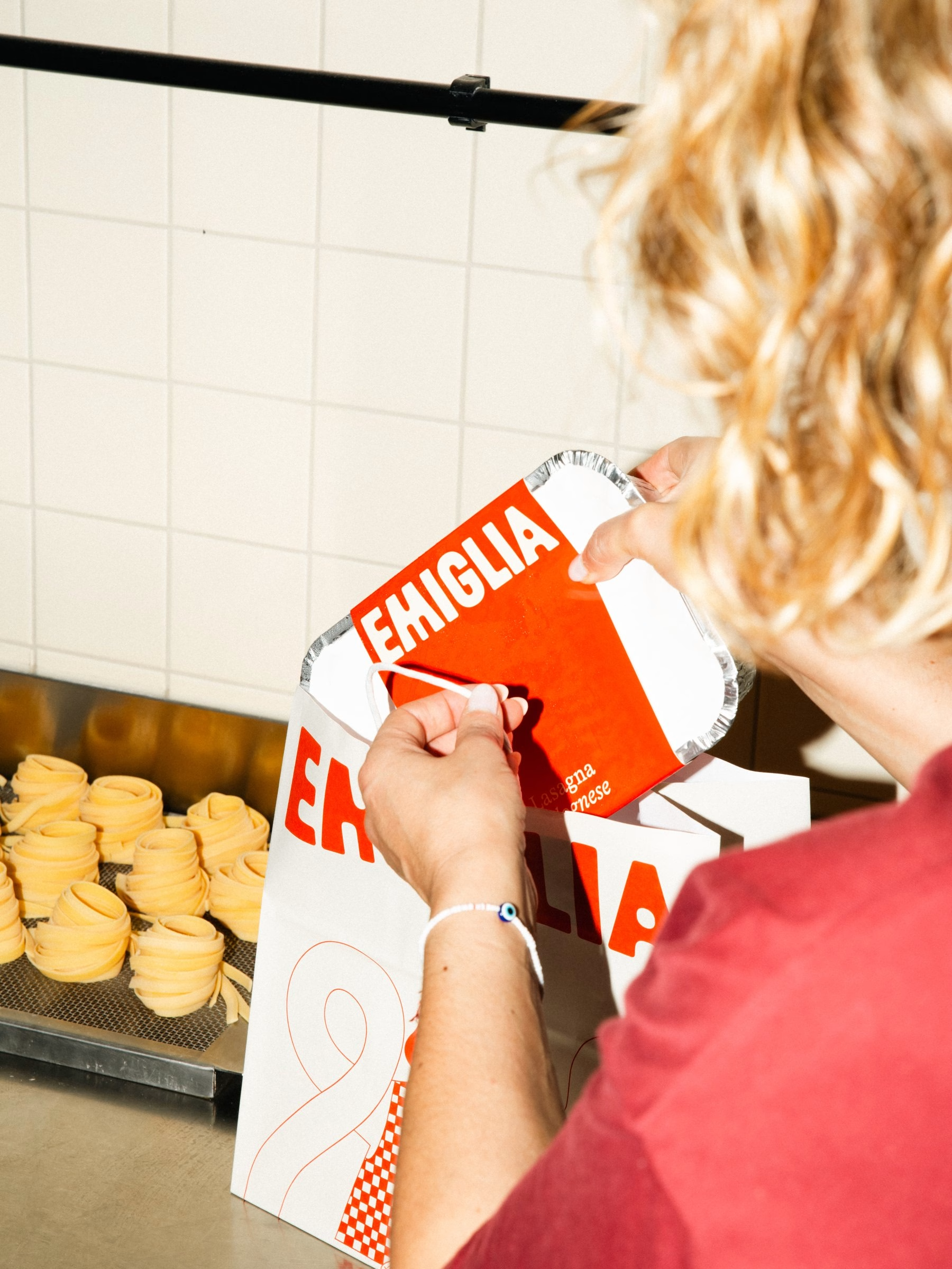
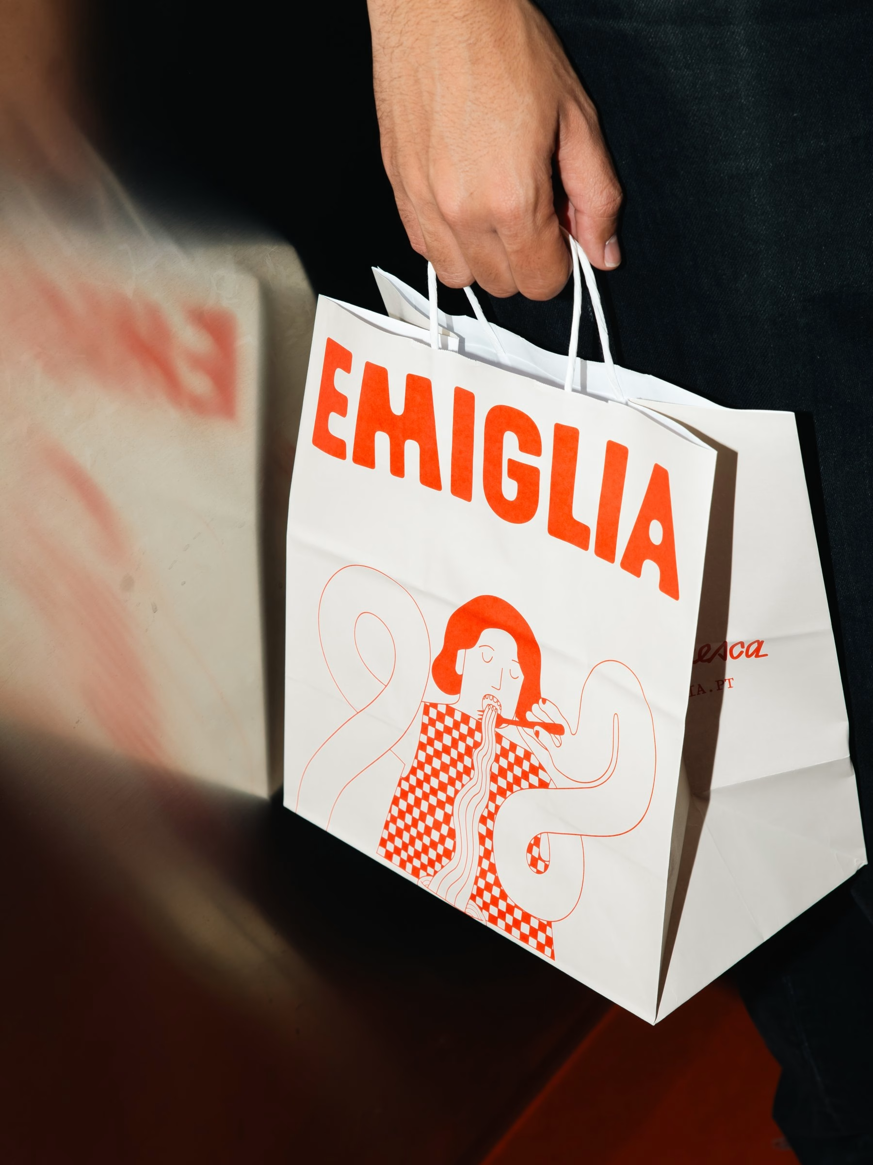
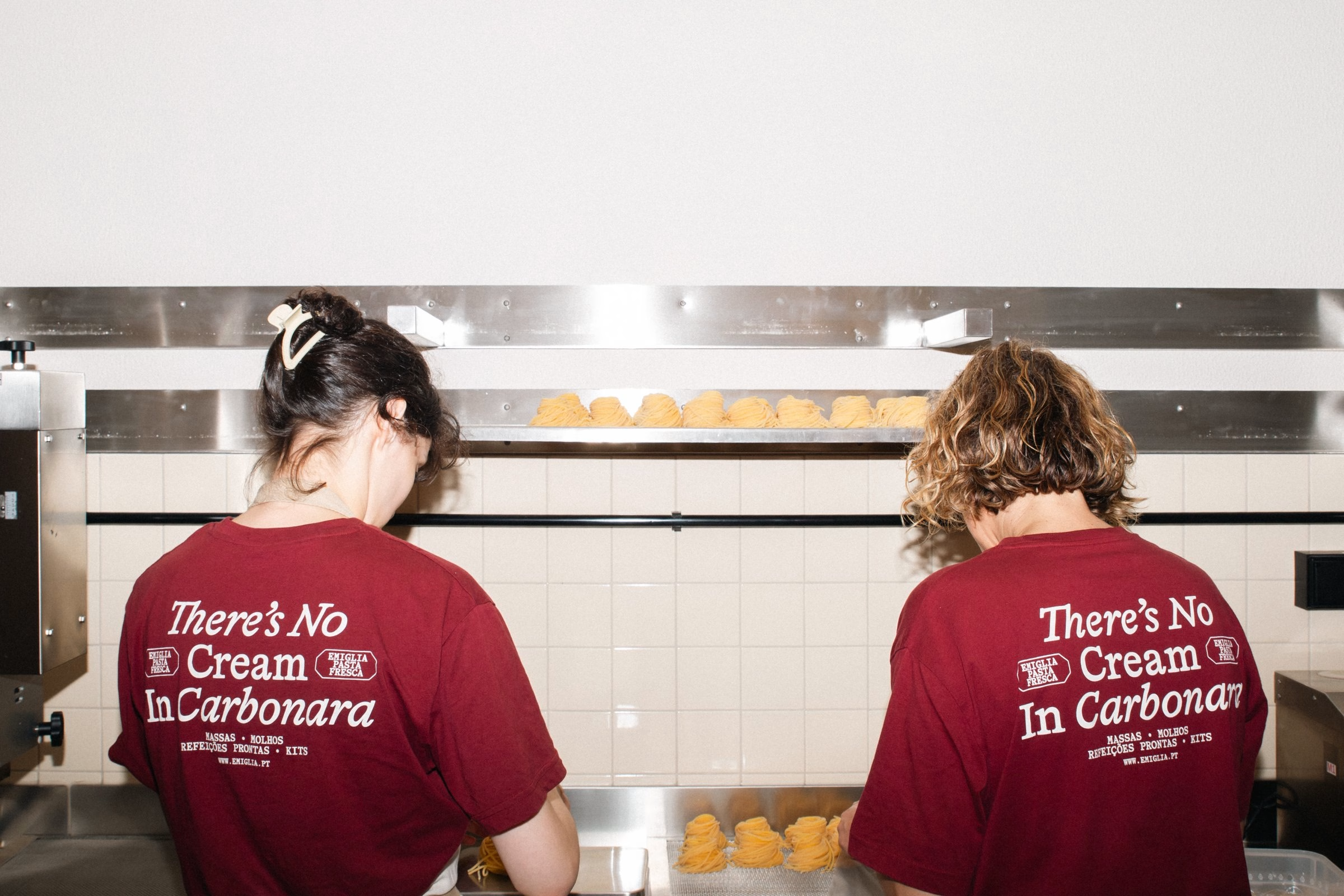
Photography by Eduardo Rodrigues and João Randmer, who also designed the system with the studio, stays close to the hands that make the pasta. Dough is rolled, cut and pushed through a brass extrusion die, and fresh nests of tagliatelle dry on steel racks before they are packed. Branded aprons and burgundy tees keep the identity on the people as well as the product. Craftsmanship is shown here not as nostalgia but as a deliberate way of making things.
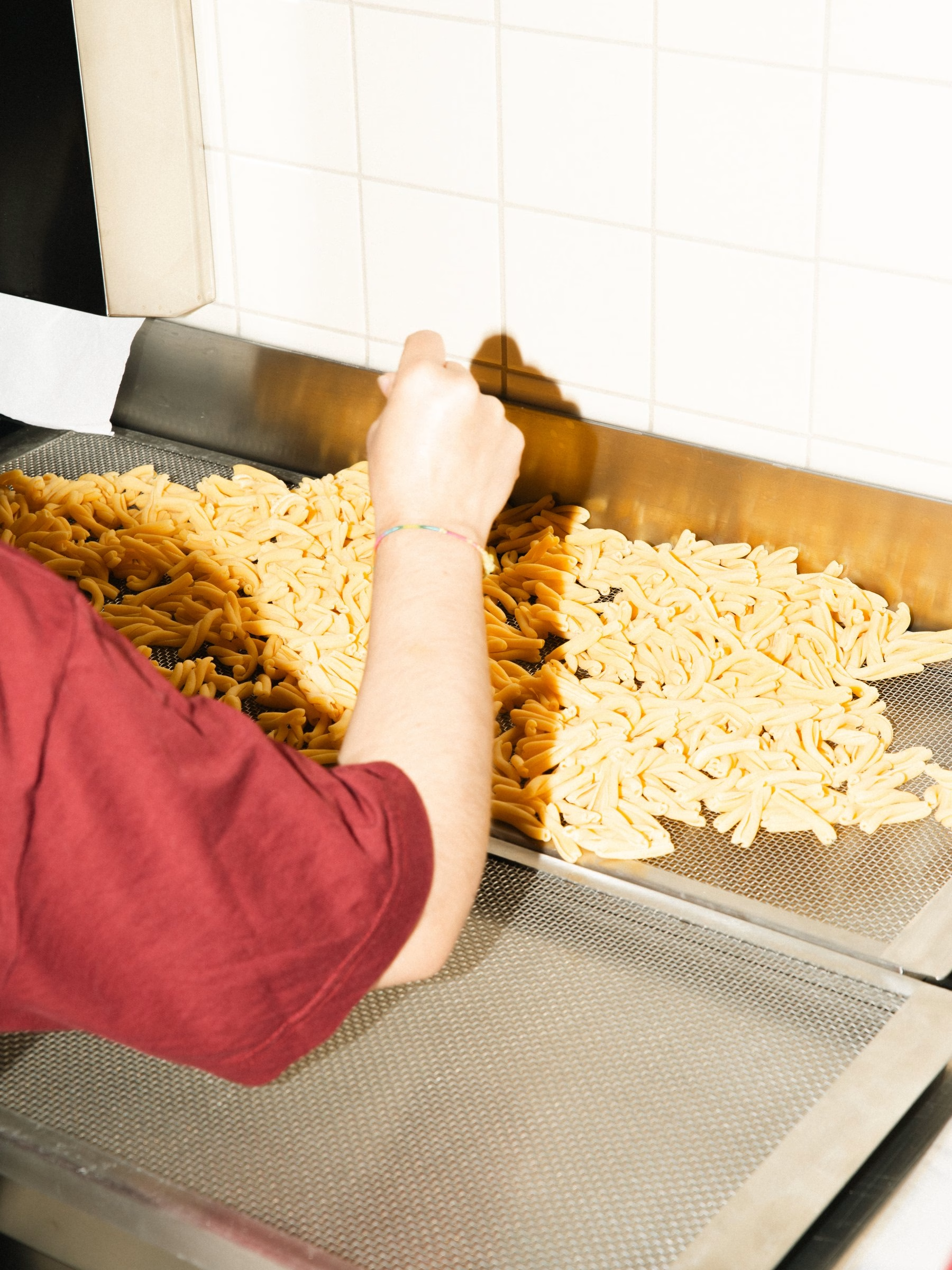
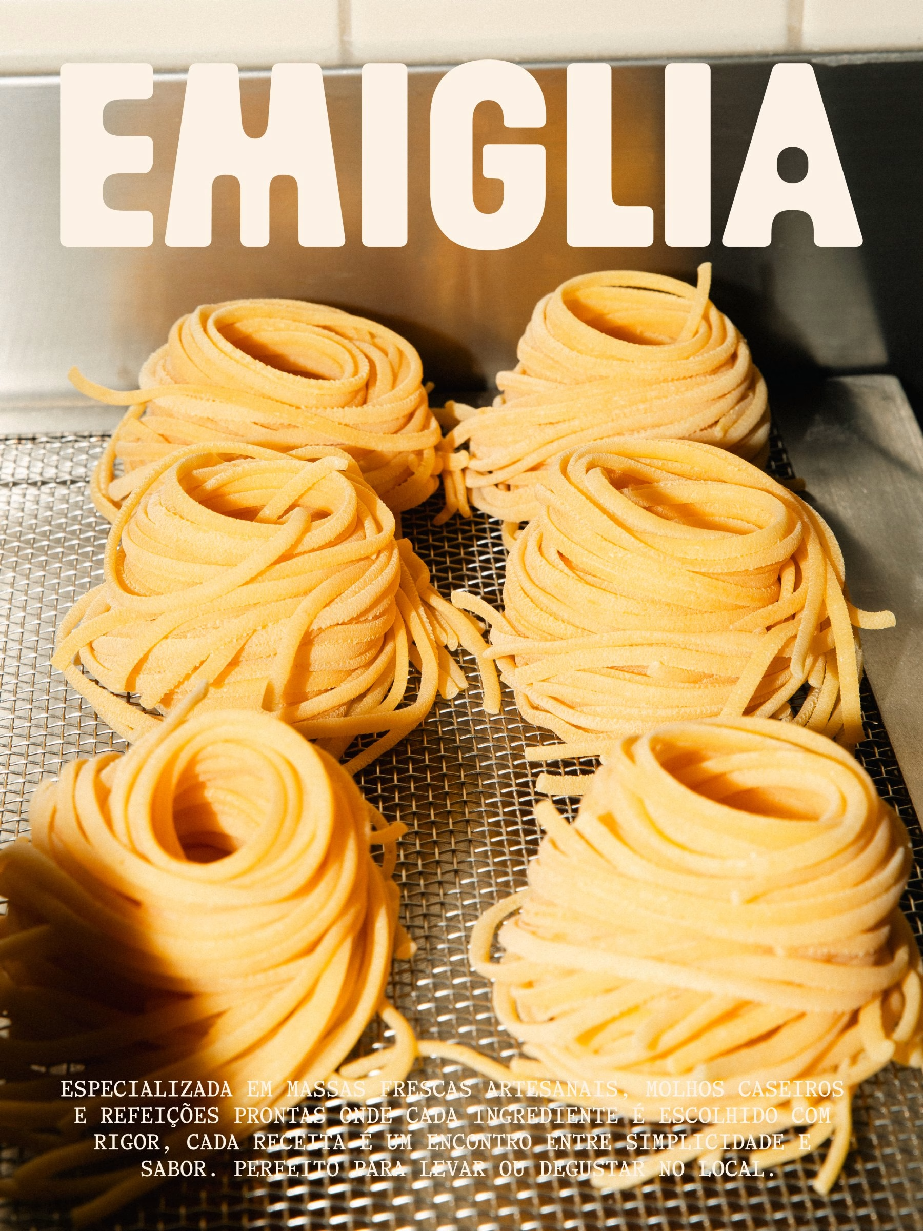
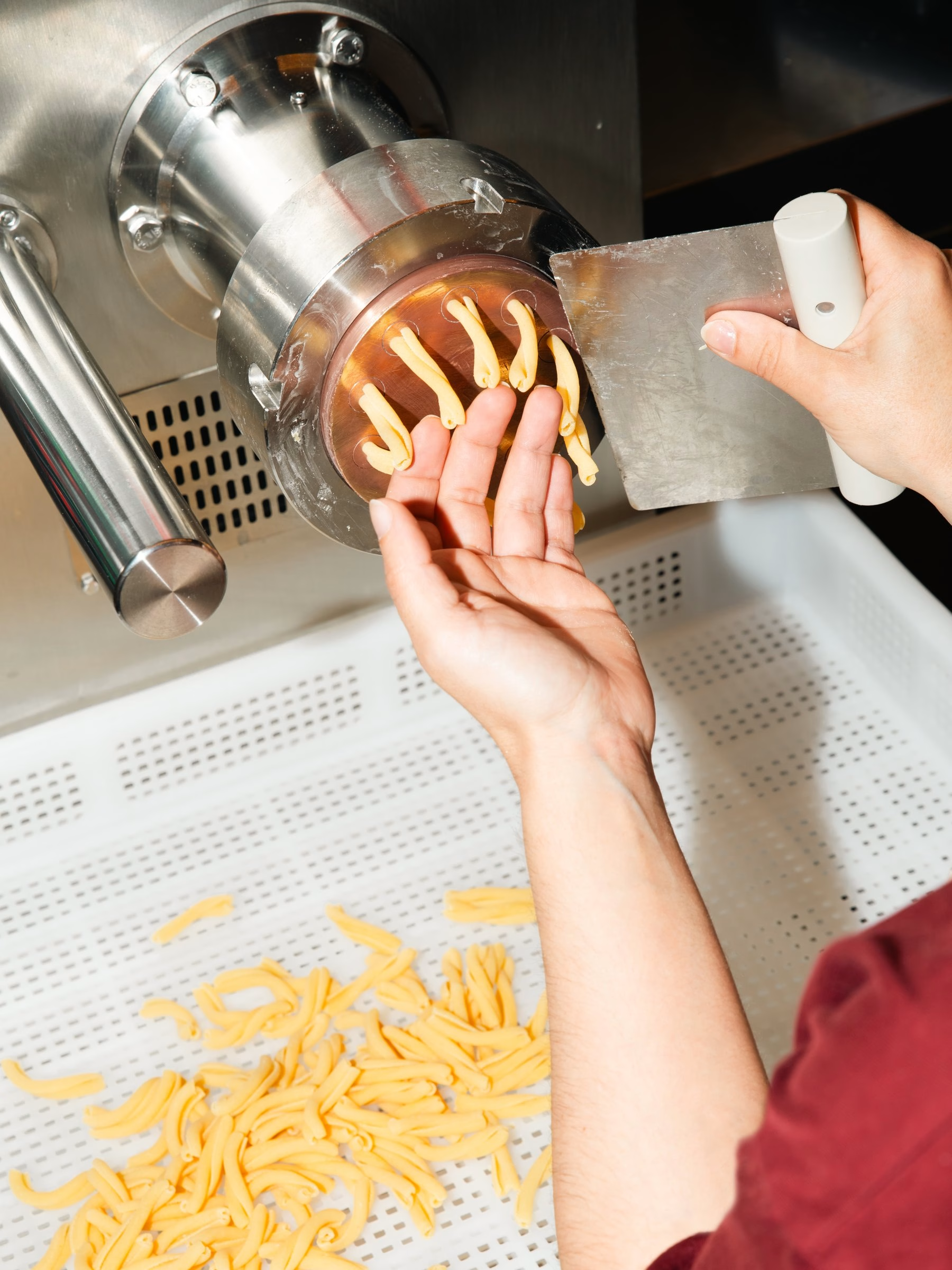
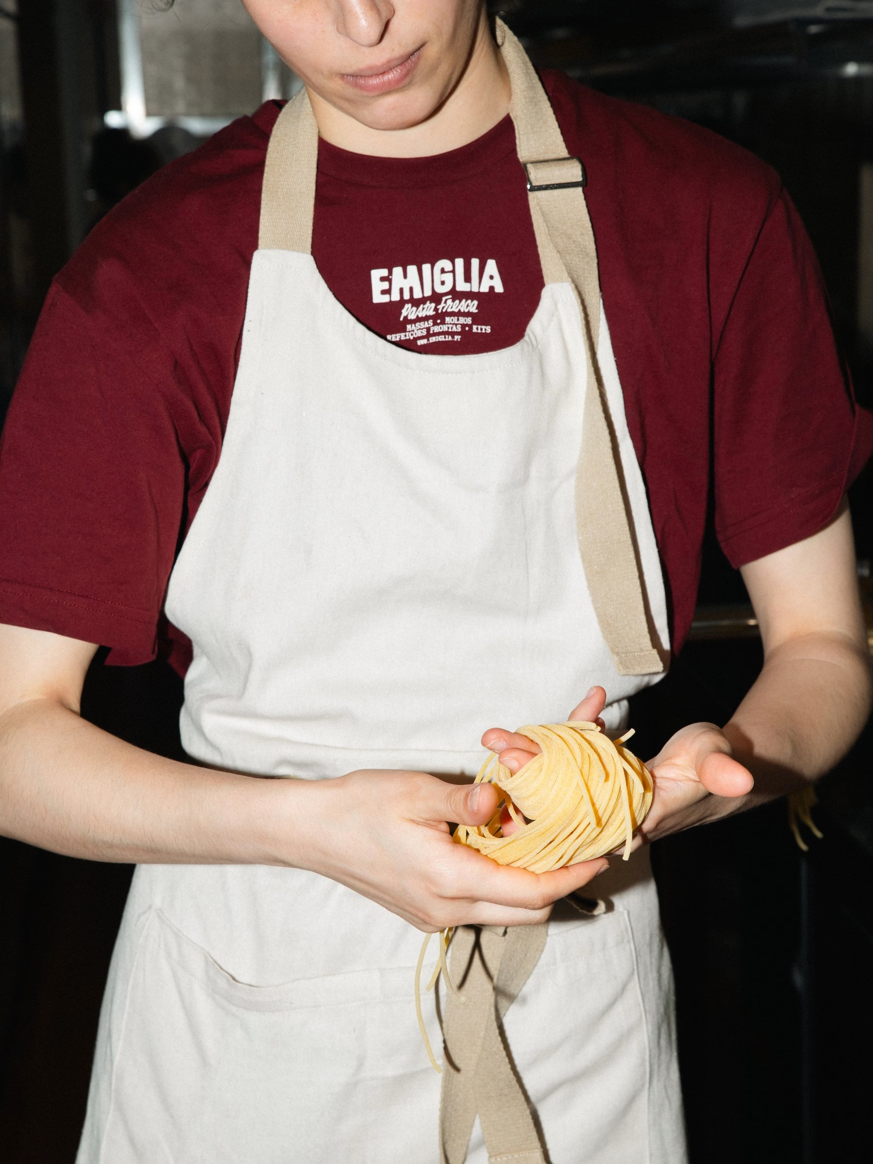
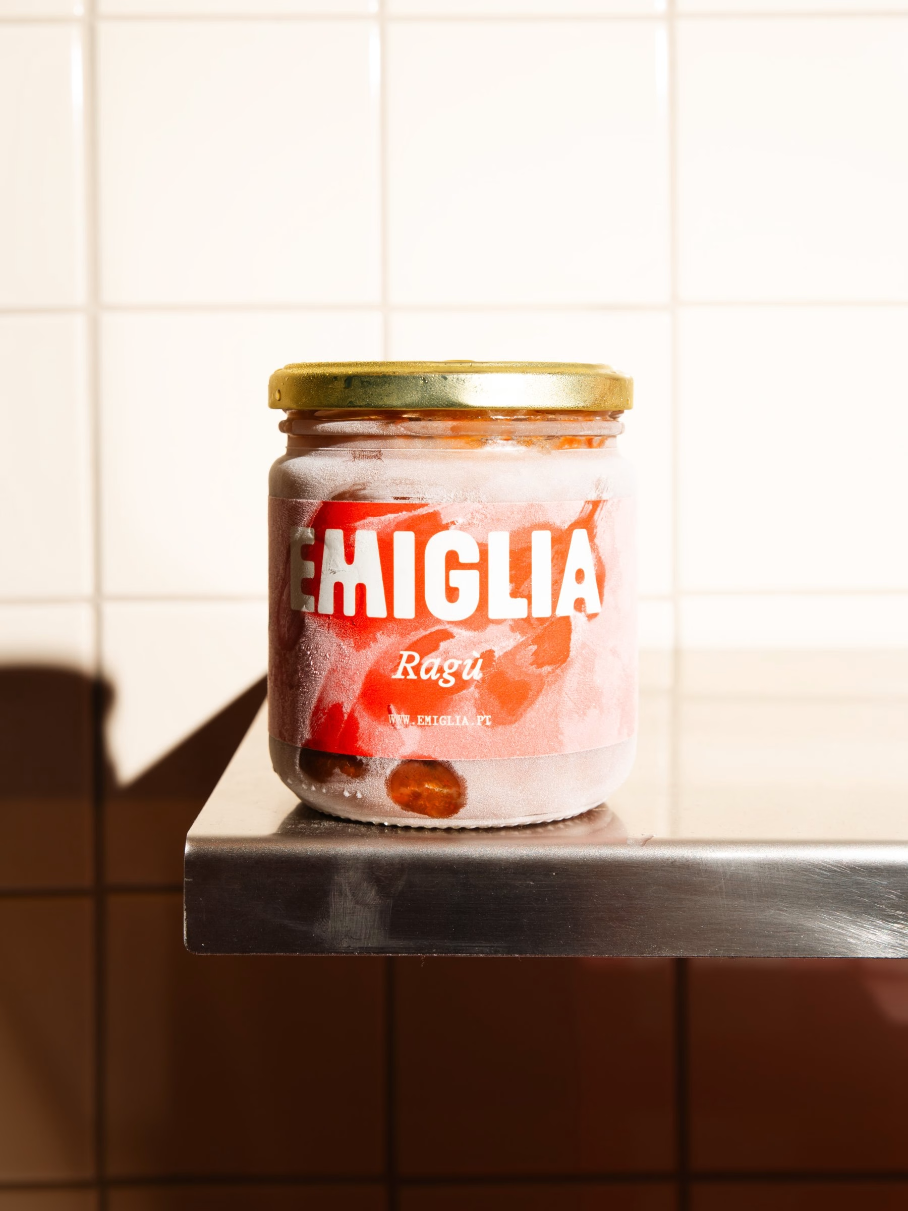
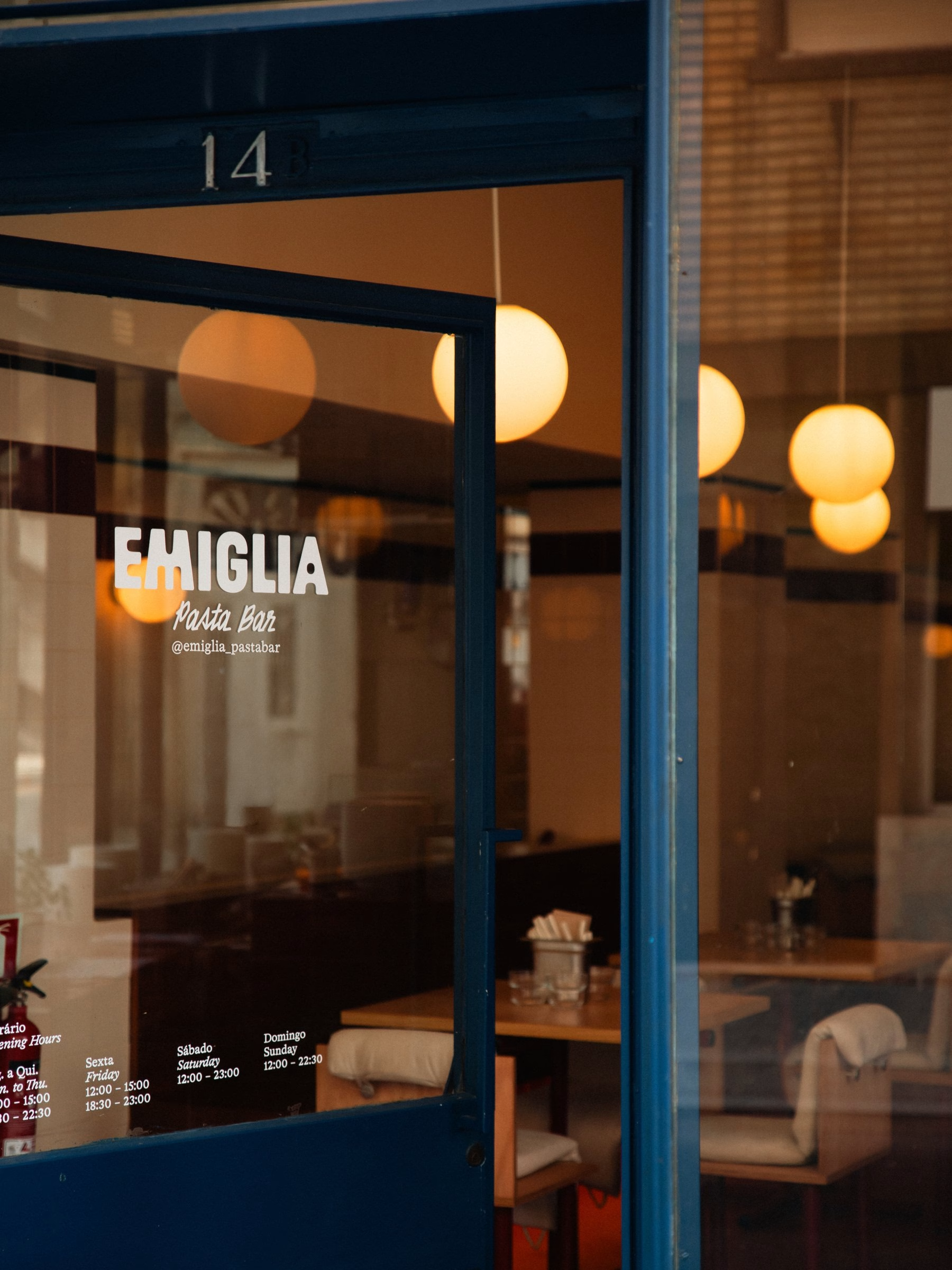
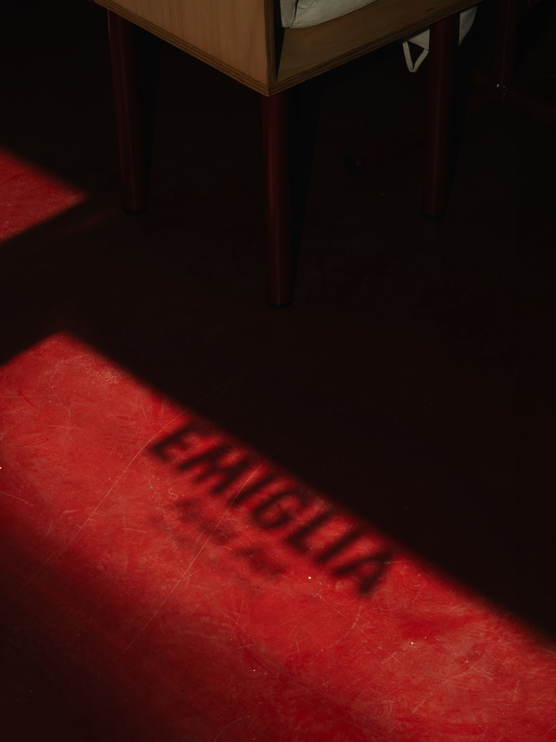
The pasta bar picks up the same language at street level. The logo is painted across the shopfront glass and even casts its shape onto the floor as a shadow, while menus slide into steel holders on wooden tables. Staff tees carry the line "There's No Cream in Carbonara", a small piece of Italian kitchen wisdom turned into a uniform. Red-rimmed plates printed with the wordmark finish the setting, so the brand is present from the door to the last bite.
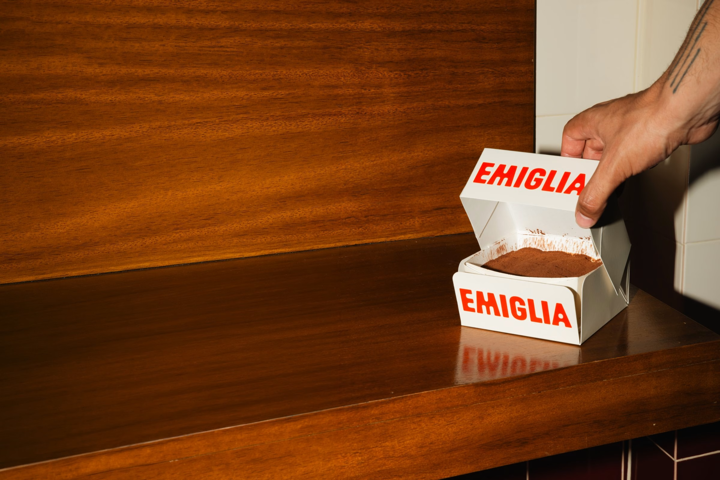
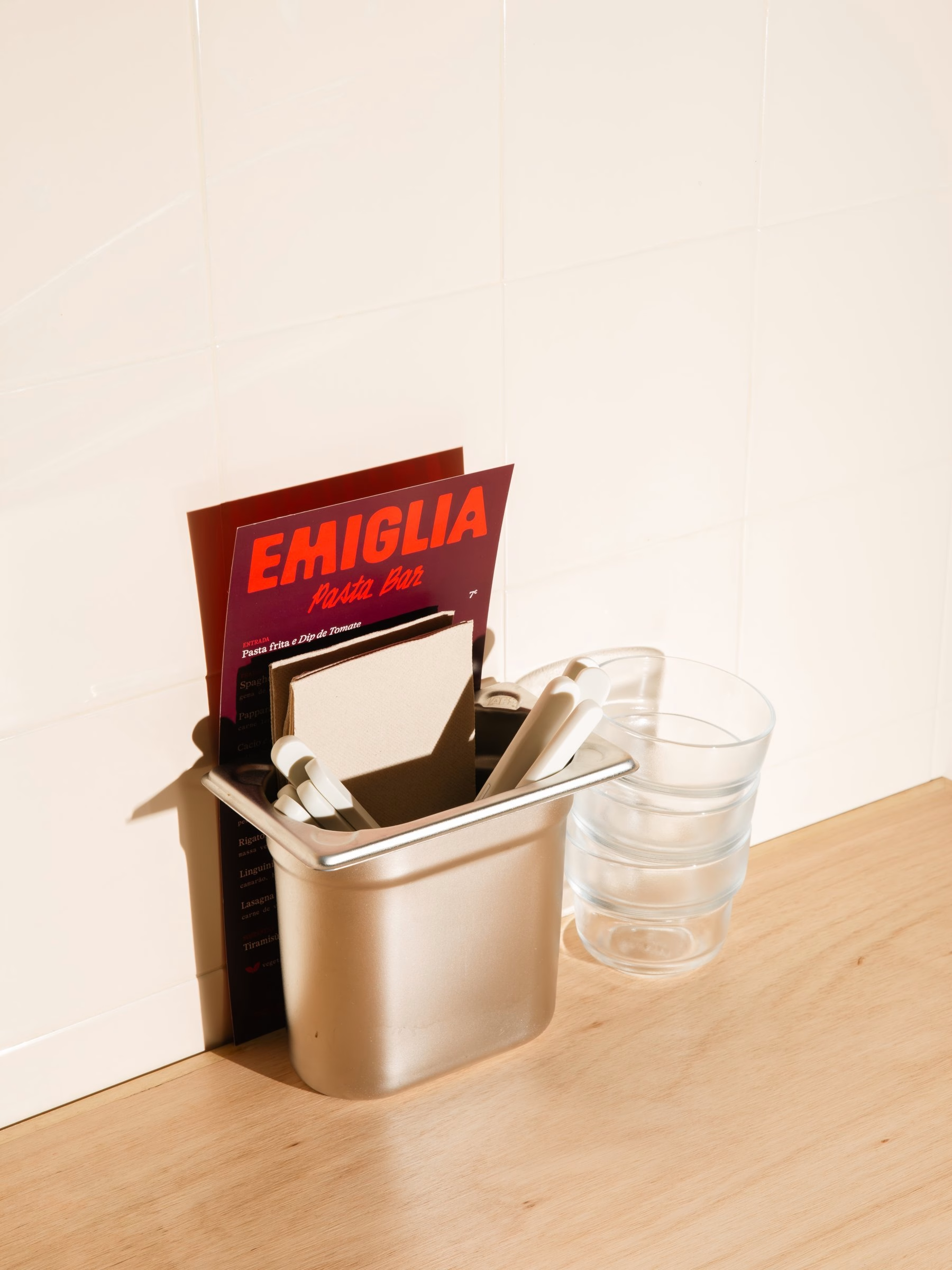
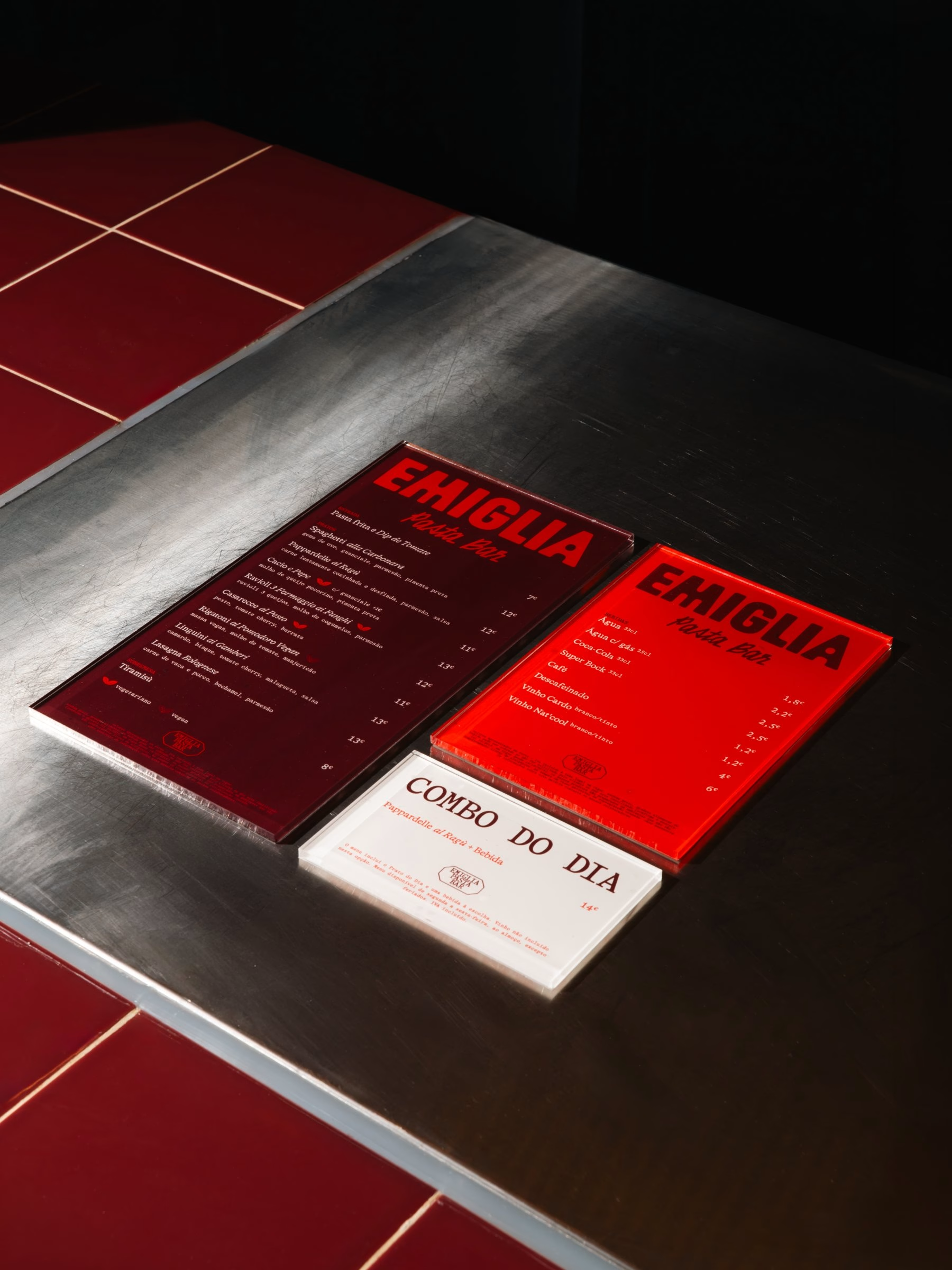
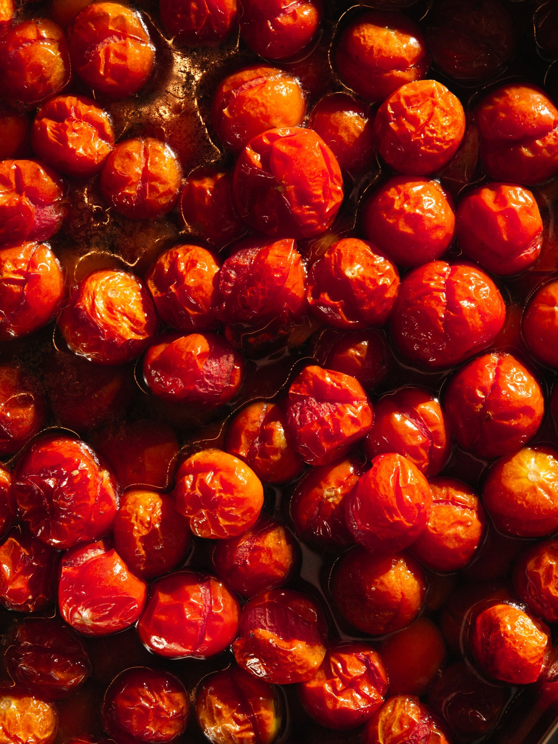
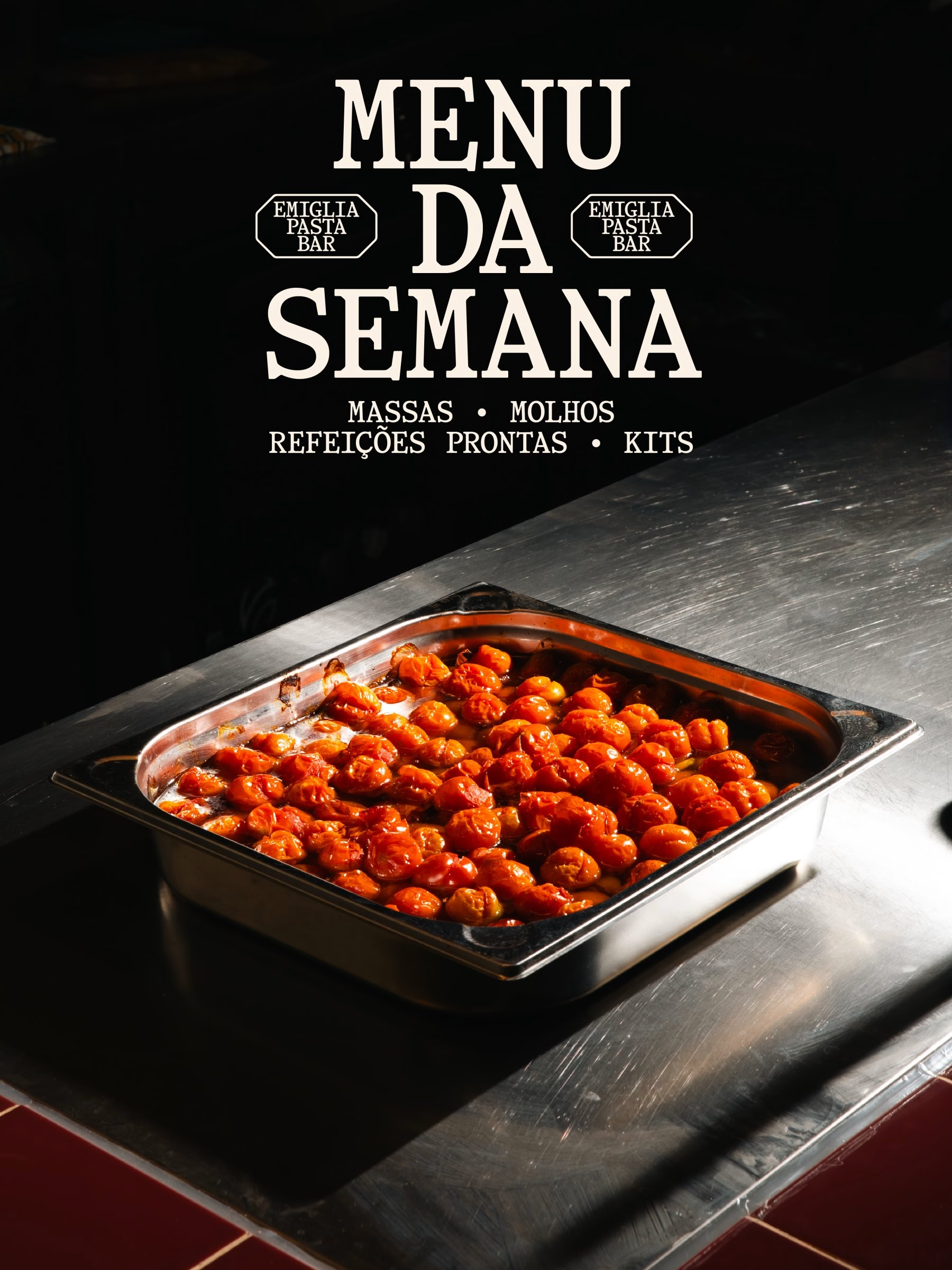
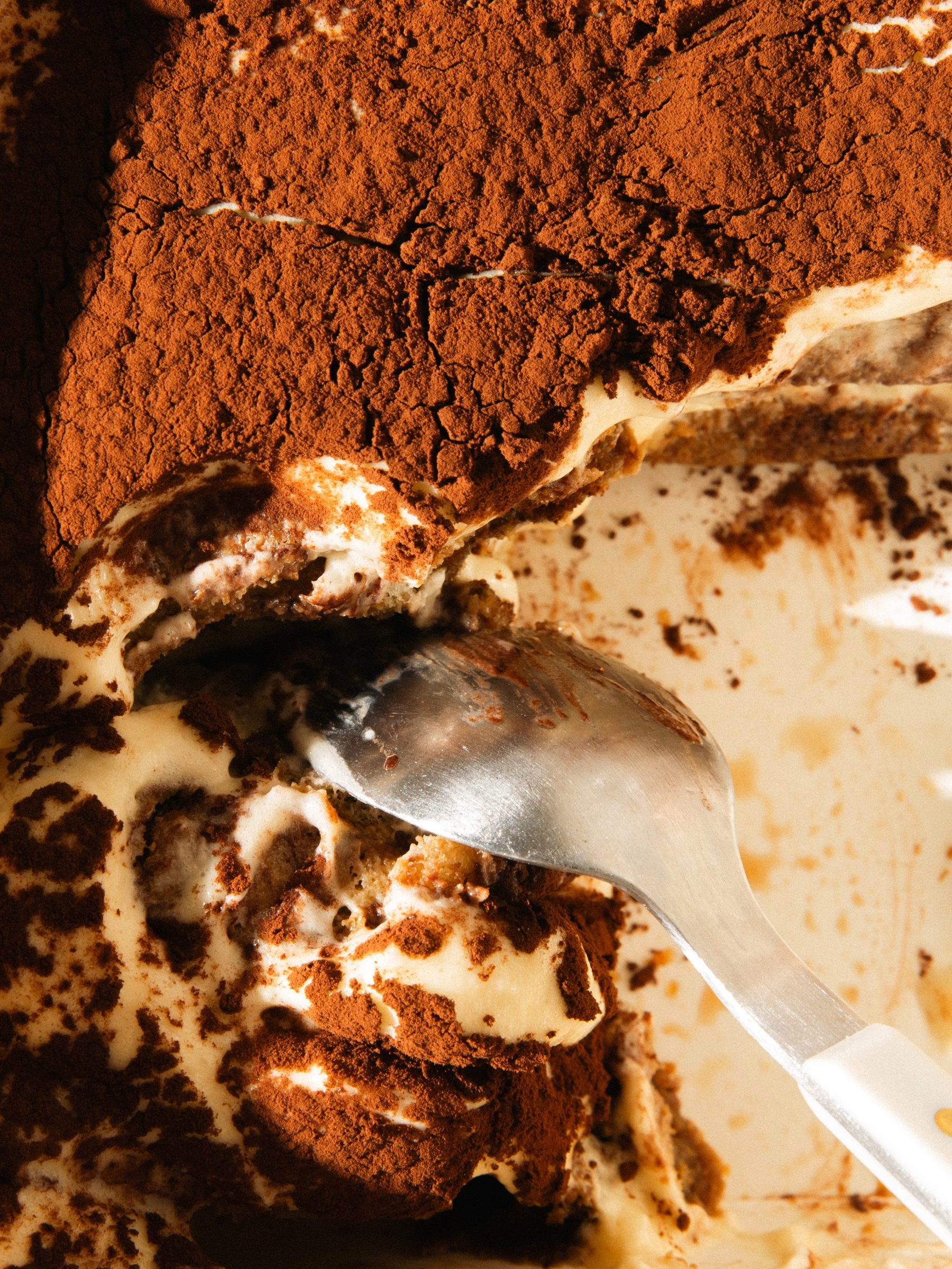
Weekly specials get their own graphic voice, with a "Menu da Semana" sign in black and cream set above trays of roasted tomatoes. The food photography is close, warm and a little messy, from a fork twisting through pesto to a spoon digging into tiramisu. It is an identity that preserves what matters to the family business while finding a new way to say it, from packaging and signage to the menus on every table.
Credits: Another Collective
Creative Direction, Visual Identity & Packaging: Another Collective
Creative Direction: Bruno Soares
Creative Direction, Design, Photography & Video: Eduardo Rodrigues
Design, Photography, Video & Motion Graphics: João Randmer
Illustrations: Studio Rana
More in Food & Beverage Branding
Stay on top of this week's design. Insights, top picks & more.