 Plus

 Menu



Abmo
Bordeaux, FranceOctober 29, 2026
Mindsparkle Mag


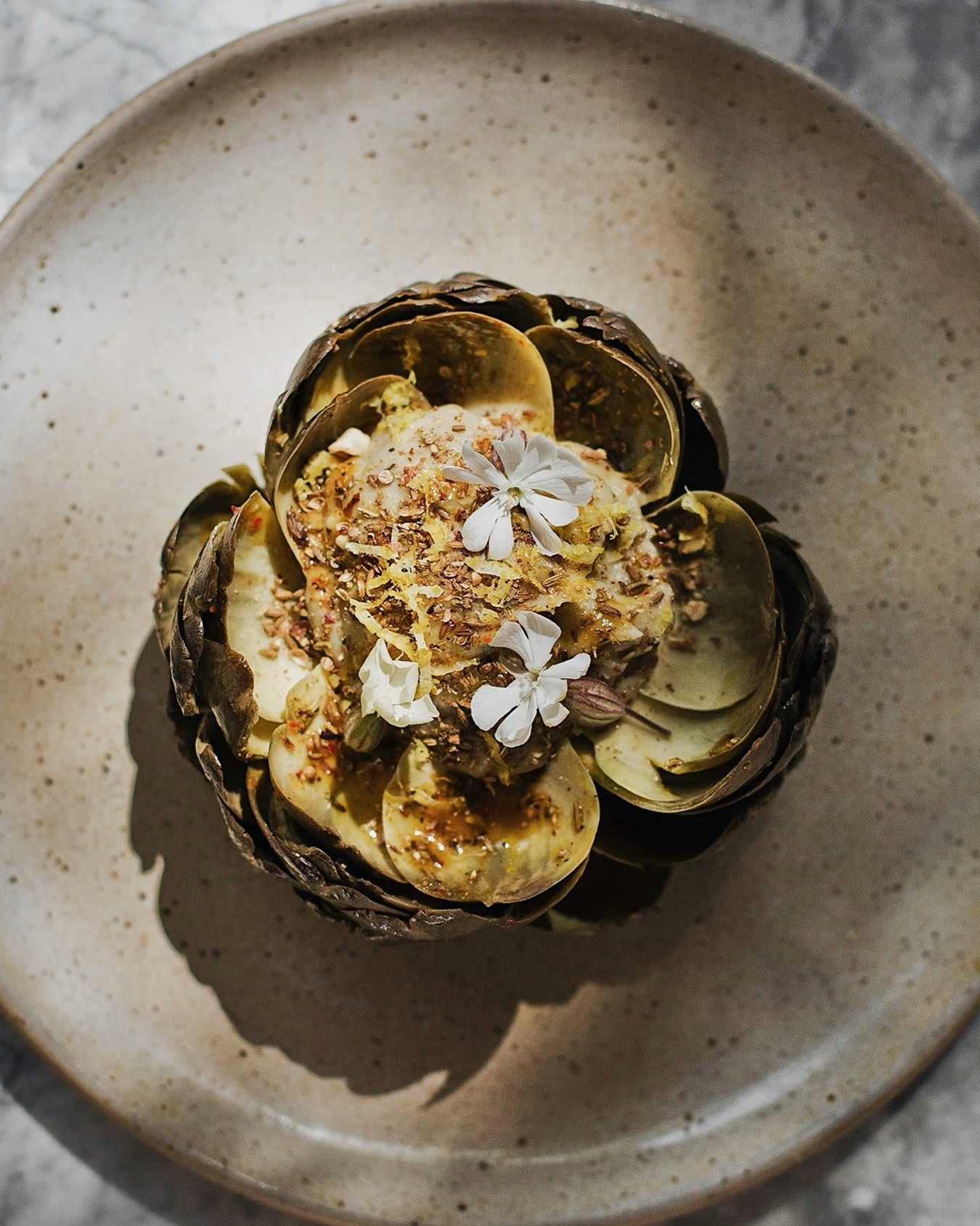
Outside Fontvieille, among ancient olive trees, Relais du Castelet is a Provençal table d’hôtes run by self-taught chef Jean-Baptiste Bert and his partner Fanny Martin. Vegetables are harvested a few steps from the kitchen, and Fanny brings a family legacy of regional food preserves to the table. When the house decided to launch its own line of artisanal groceries, it turned to Paris and Bordeaux-based studio Abmo to shape an identity for both the estate and its products.
Abmo framed the brief as one identity with two lives: a place people visit and a range they take home. The visual identity had to feel as natural on a restaurant menu as on a jar of lavender honey sitting on a shelf. Rather than splitting the system in two, the studio built a single toolkit of mark, type and texture that moves freely between the dining room and the grocery range.
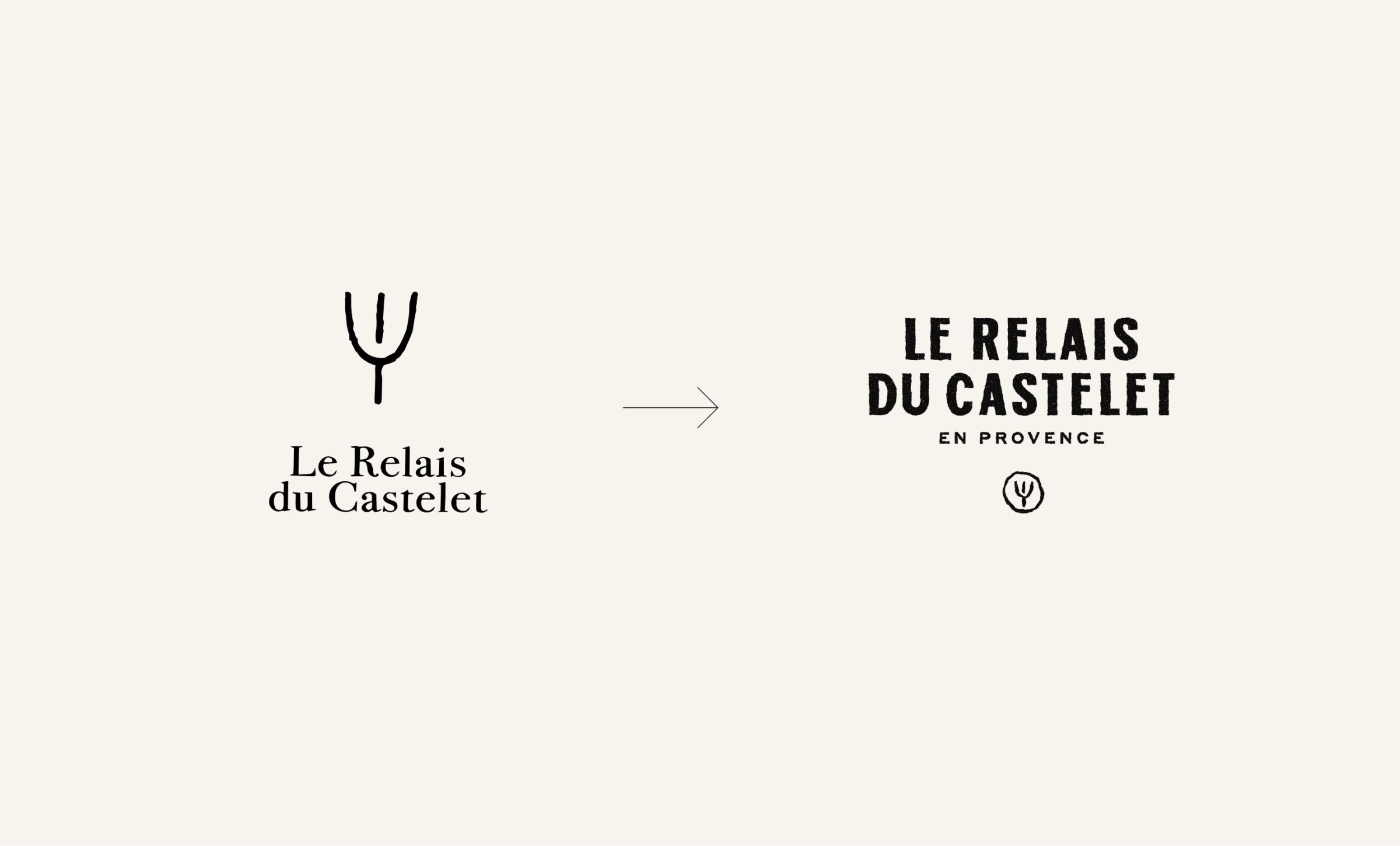
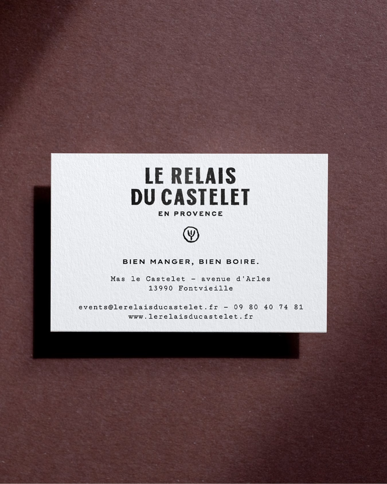
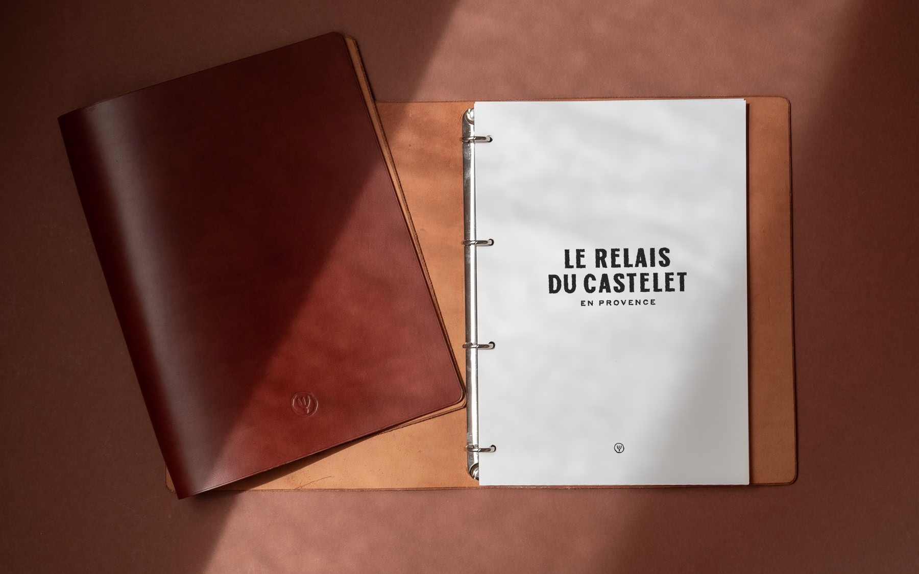
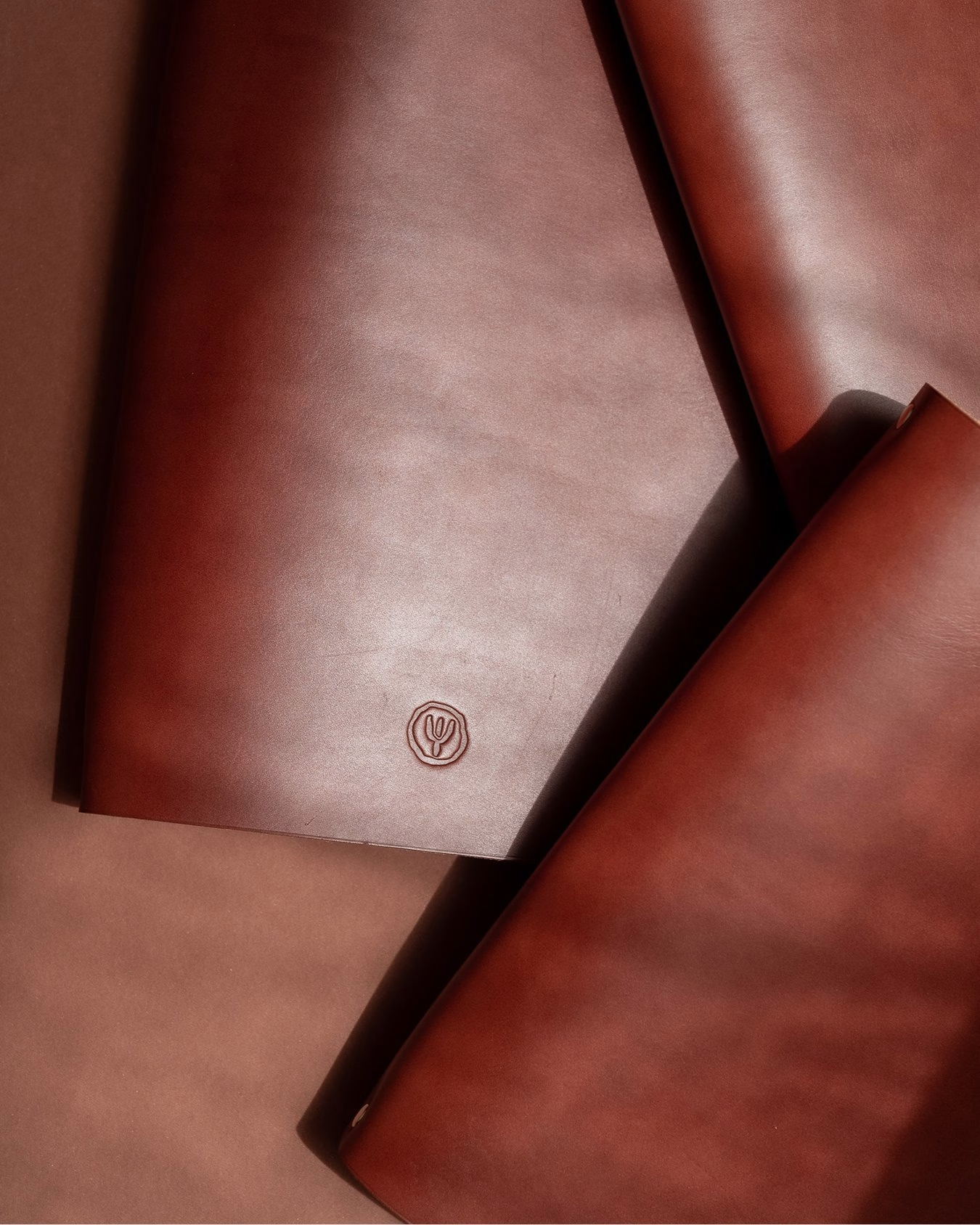
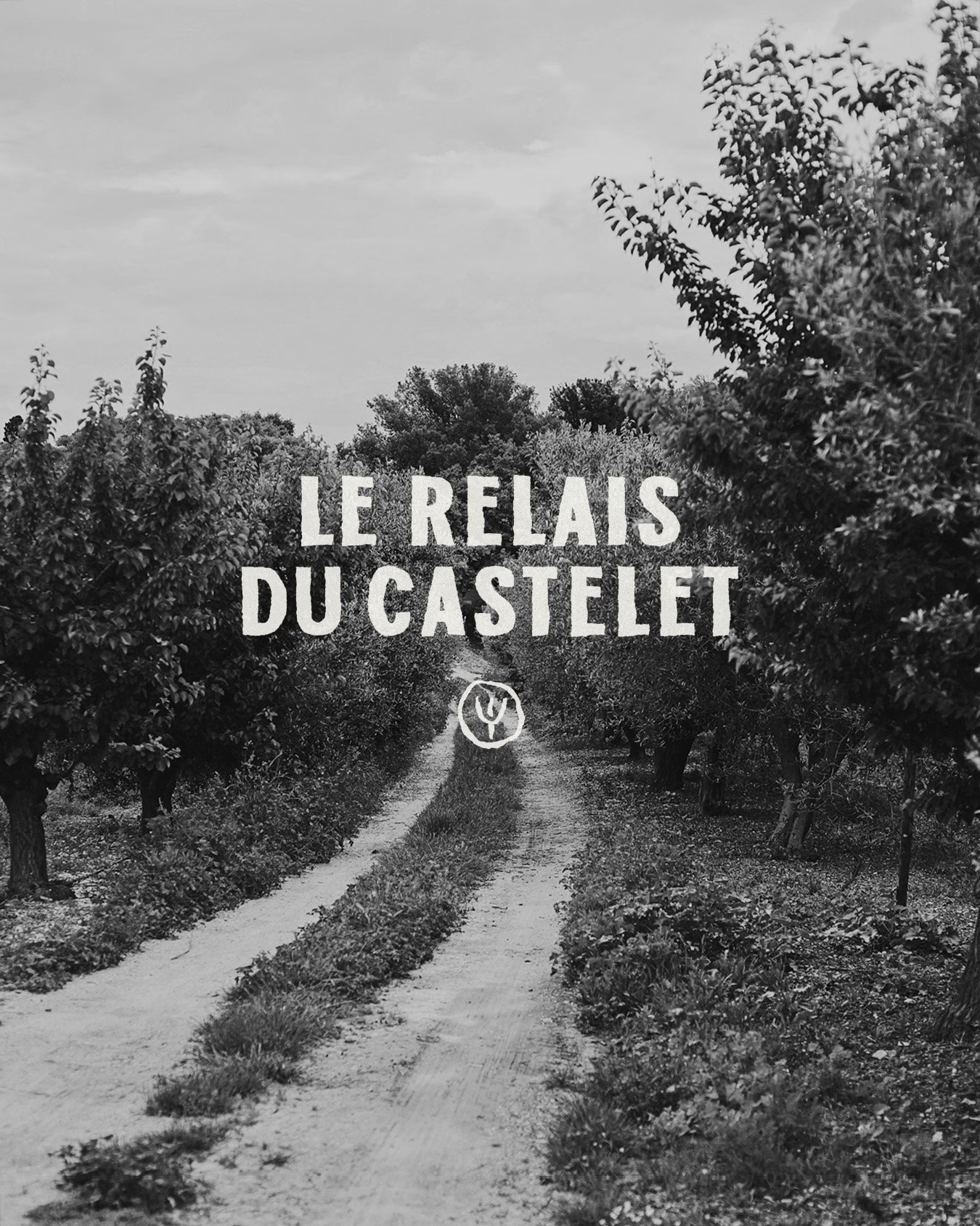
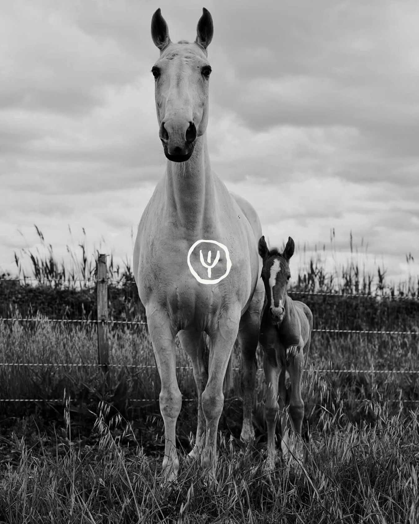
Instead of inventing a new icon, Abmo looked to the property itself. An ancient symbol carved into a rock on the estate, read as a fertility motif, was redrawn into a hand-stamped seal. The mark carries the history of the land into every application, from debossed leather to the corner of a business card.
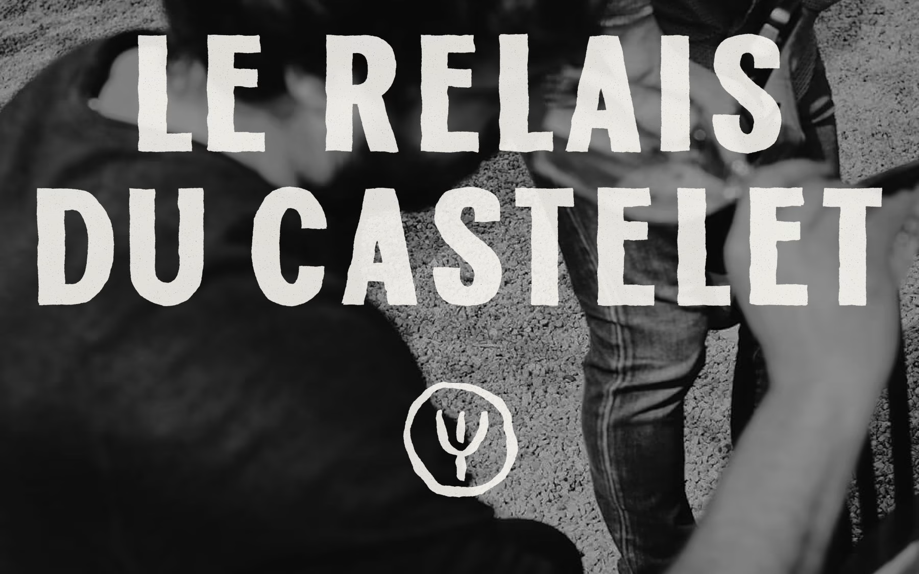
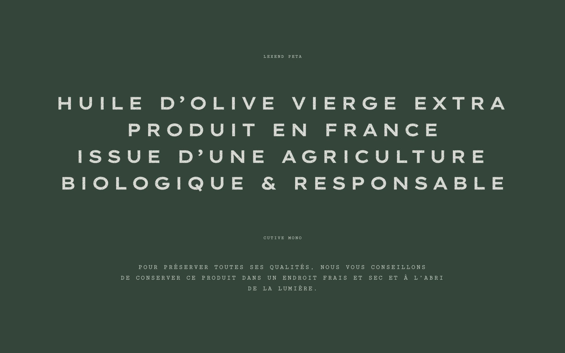
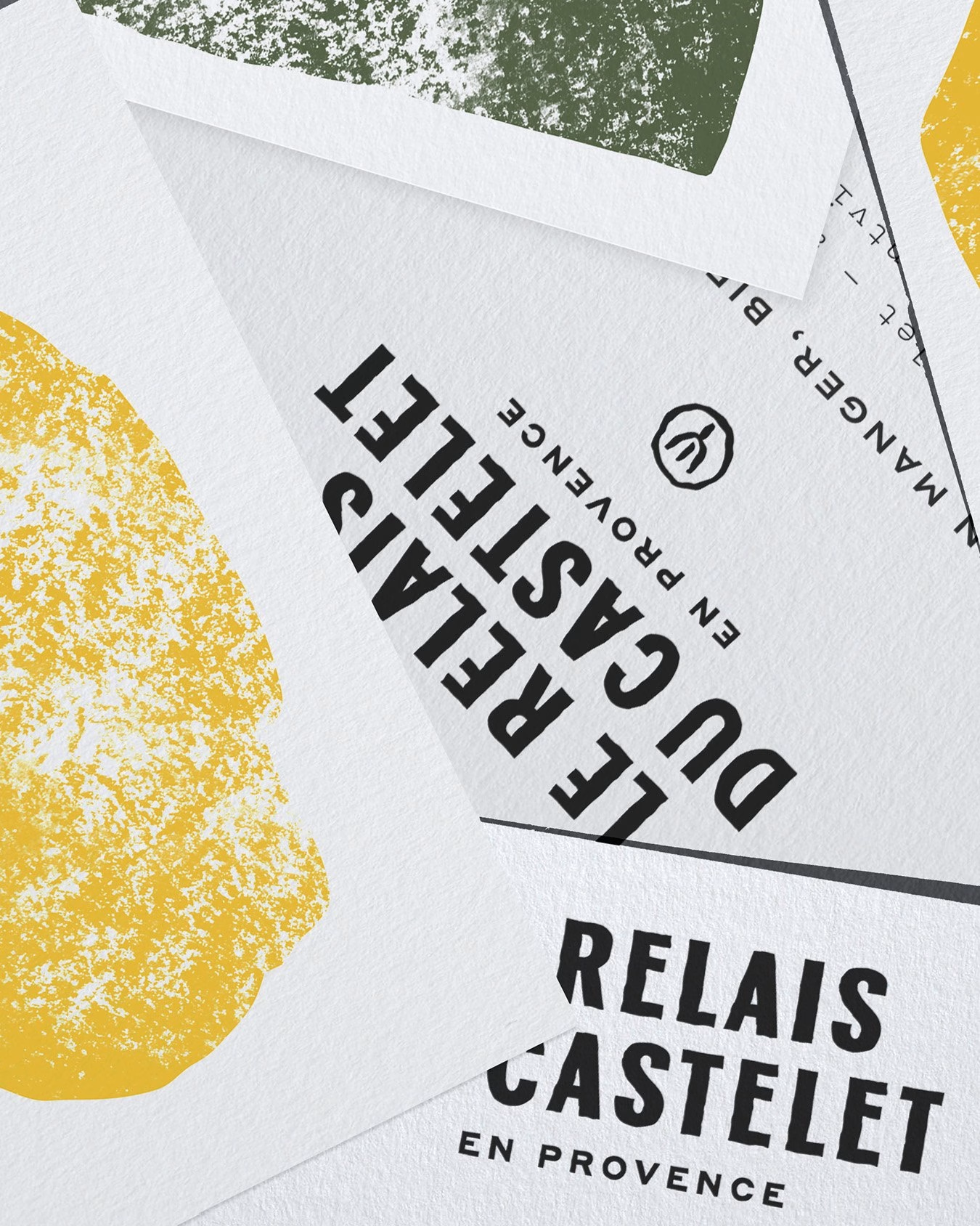
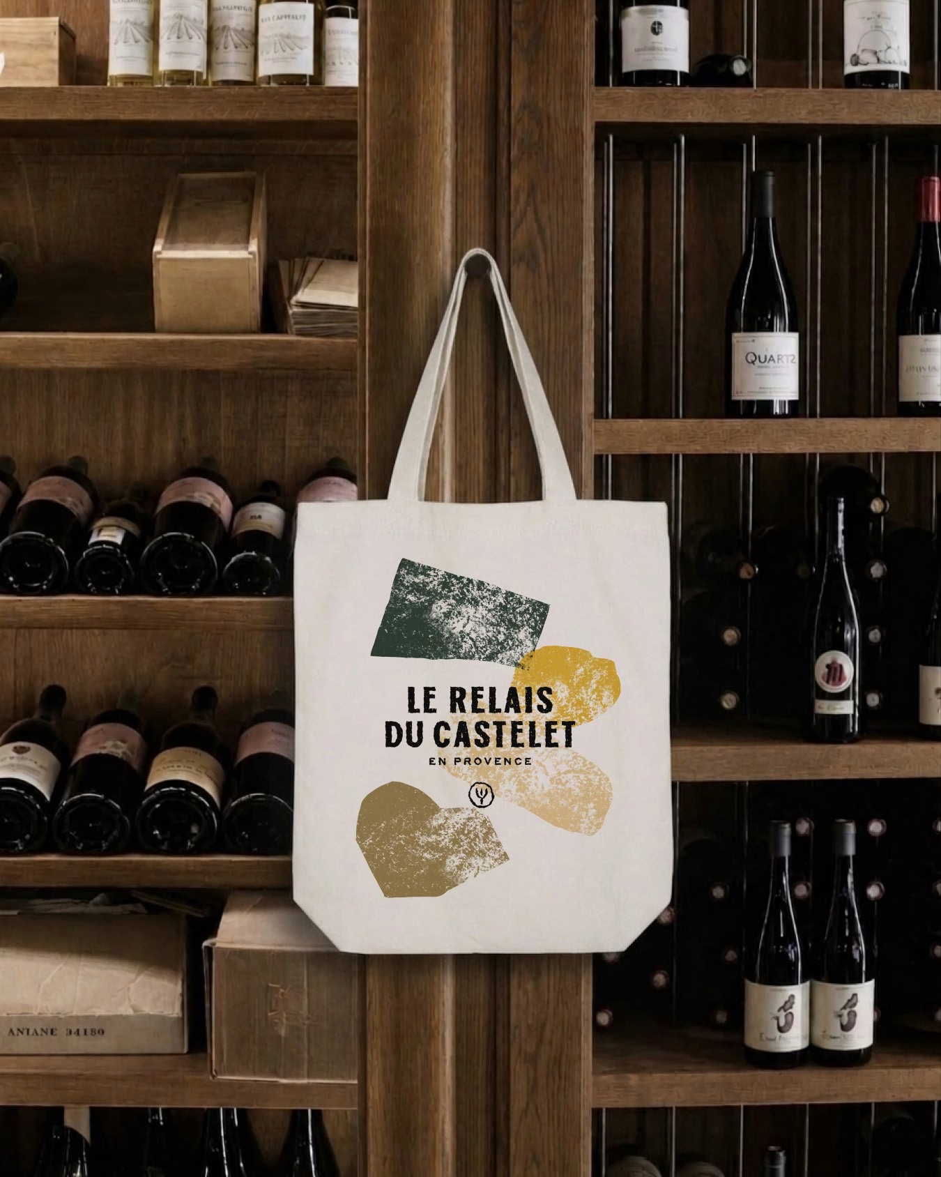
The typography sets the tone just as firmly. In place of the polite serifs that usually signal Provençal hospitality, the studio drew condensed capitals by hand and left their edges intentionally worn. The result evokes woodblock printing and gives the wordmark enough weight to hold its own over full-bleed photography, in colour and in black and white.
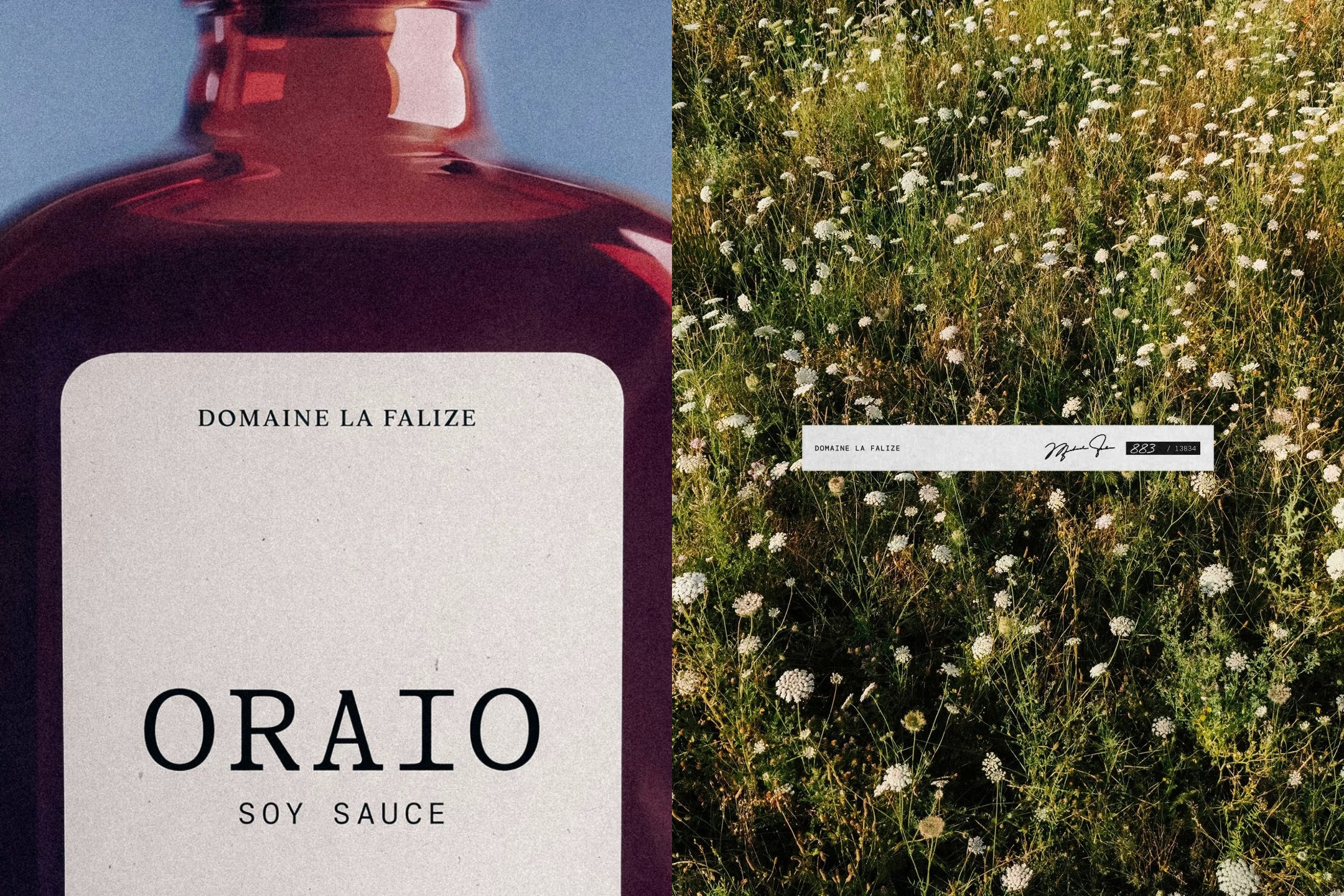
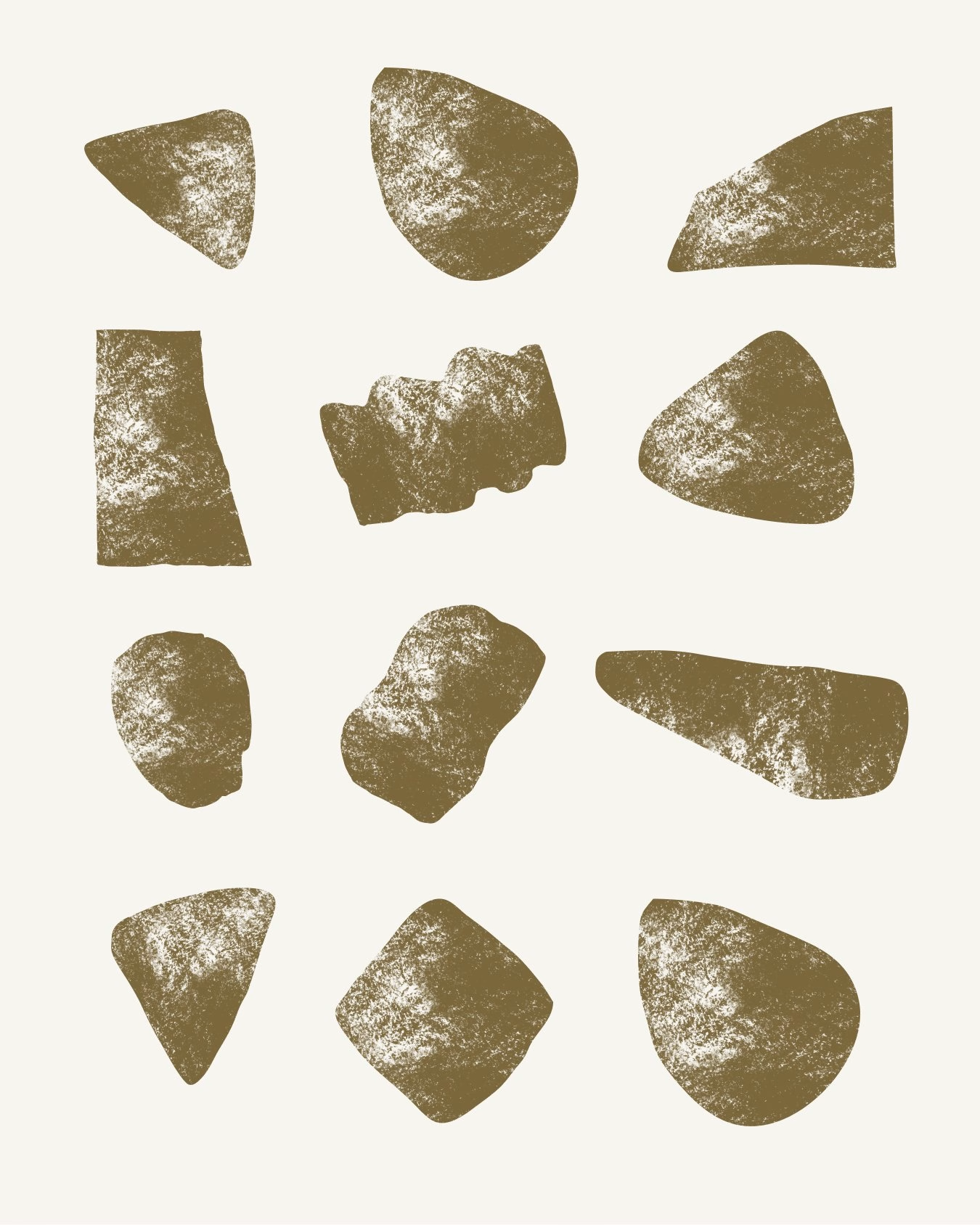
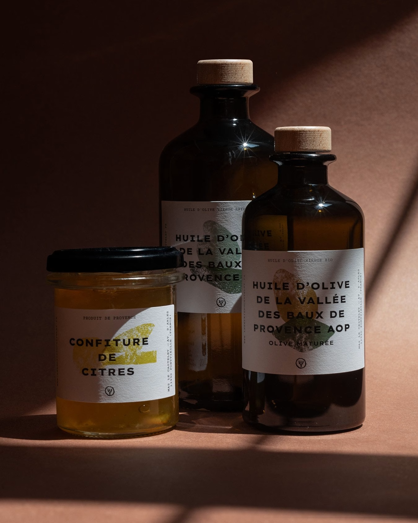
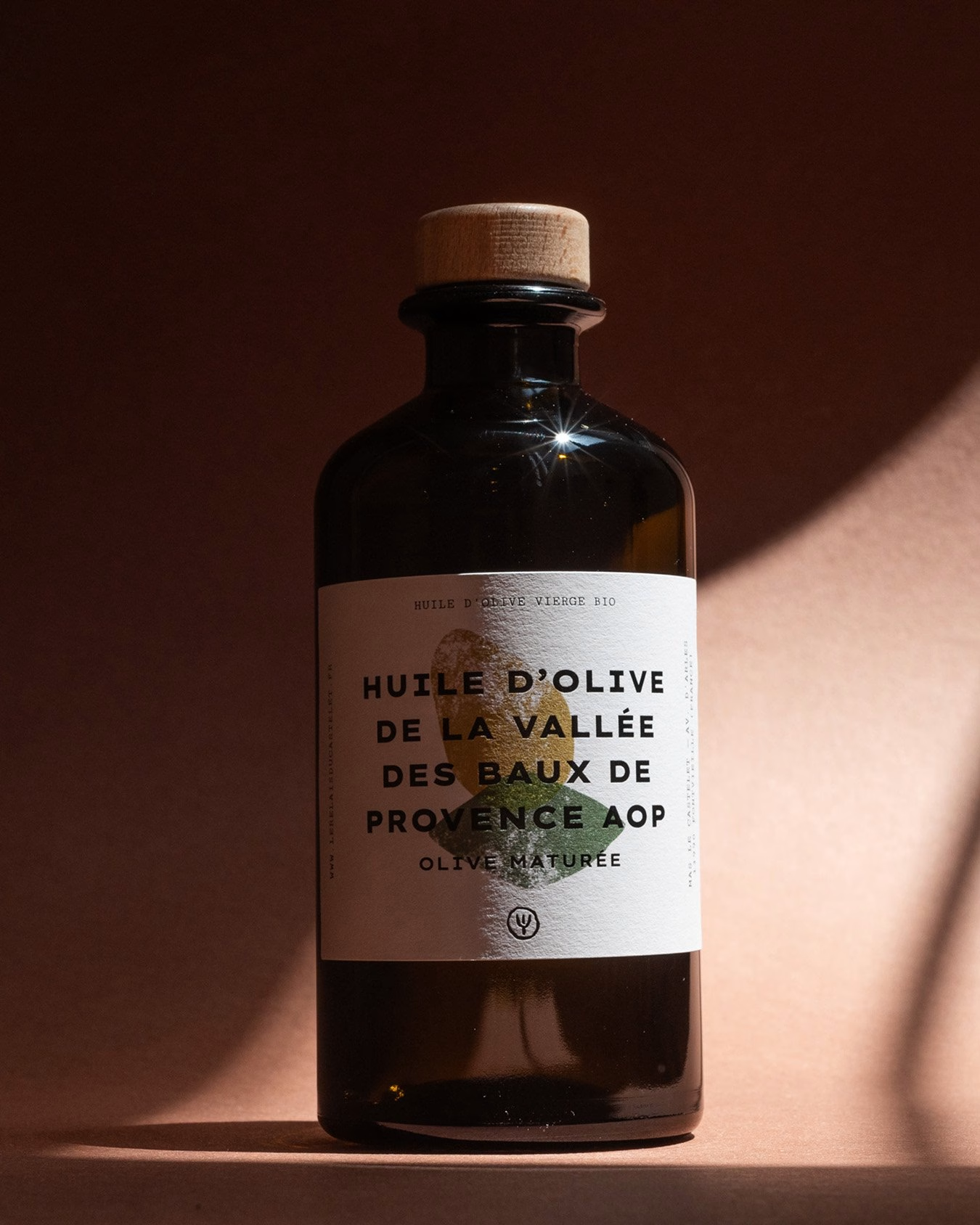
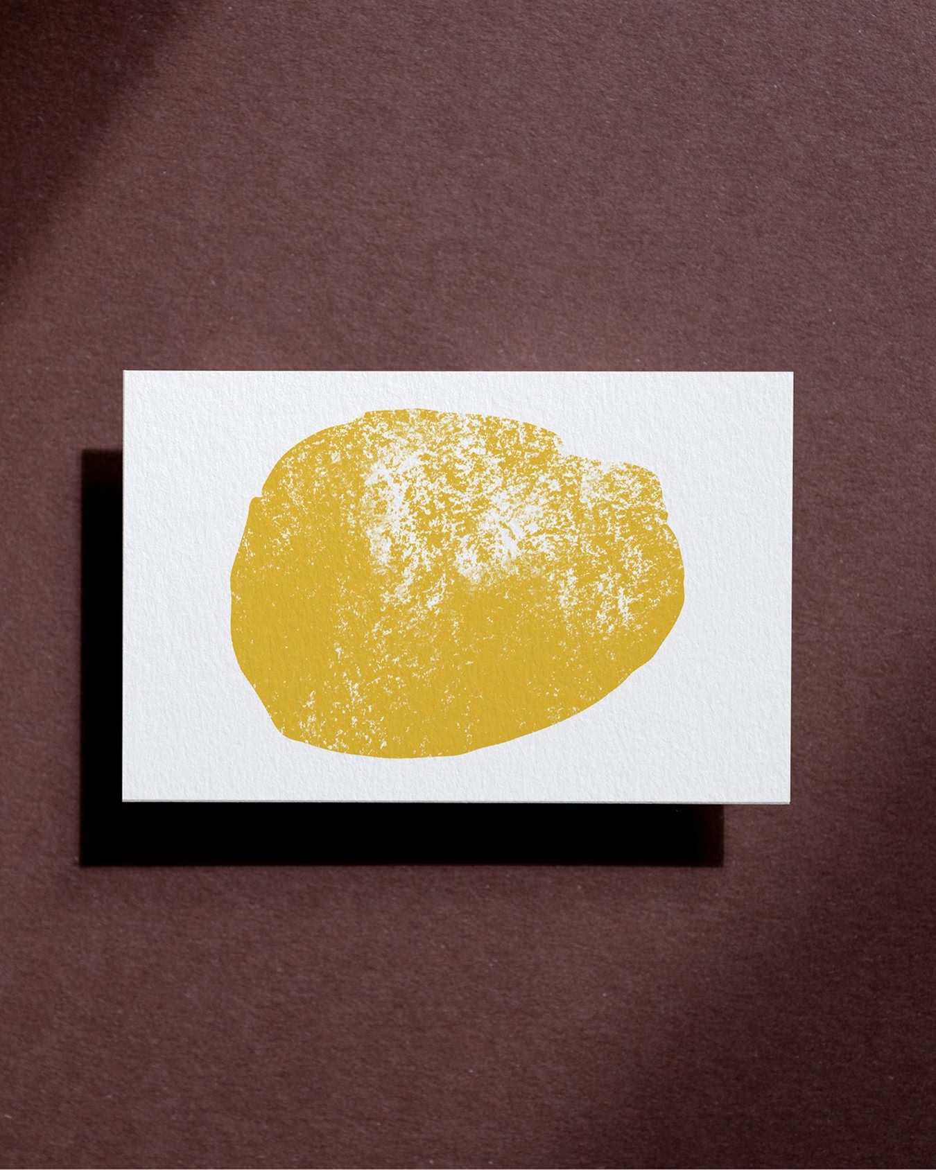
The new epicurean range of olive oil, honey and preserves is where the system becomes tactile. Paper labels with raw textures and ink-stamped shapes reflect the honesty of the ingredients inside each bottle and jar. Every product gets its own colour and stamped form, while the shared typography keeps the line recognisable as one family on the shelf.
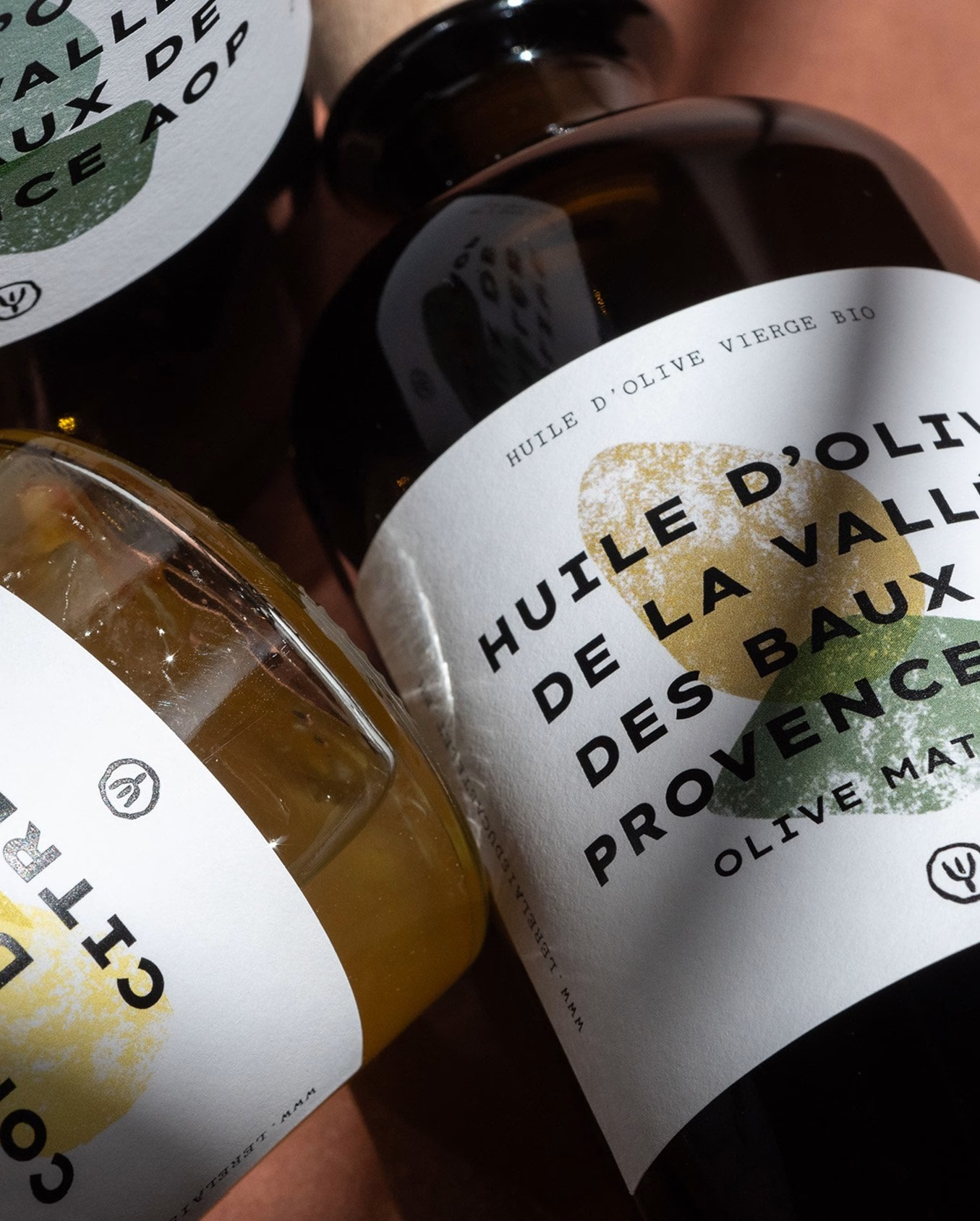
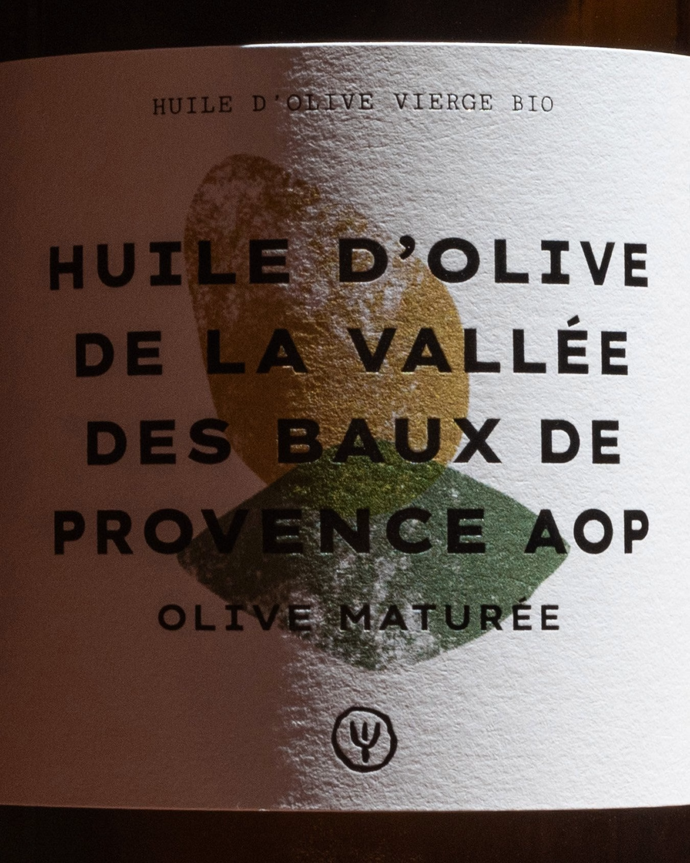
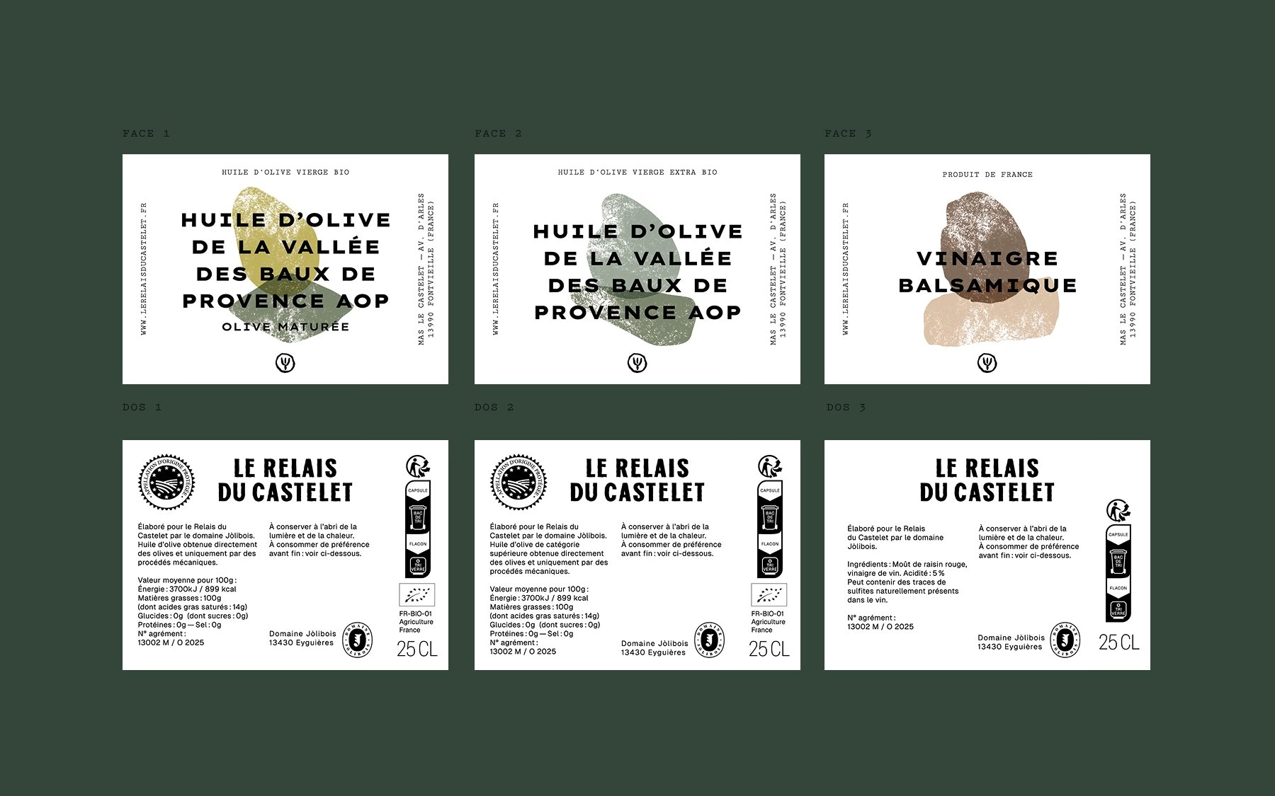
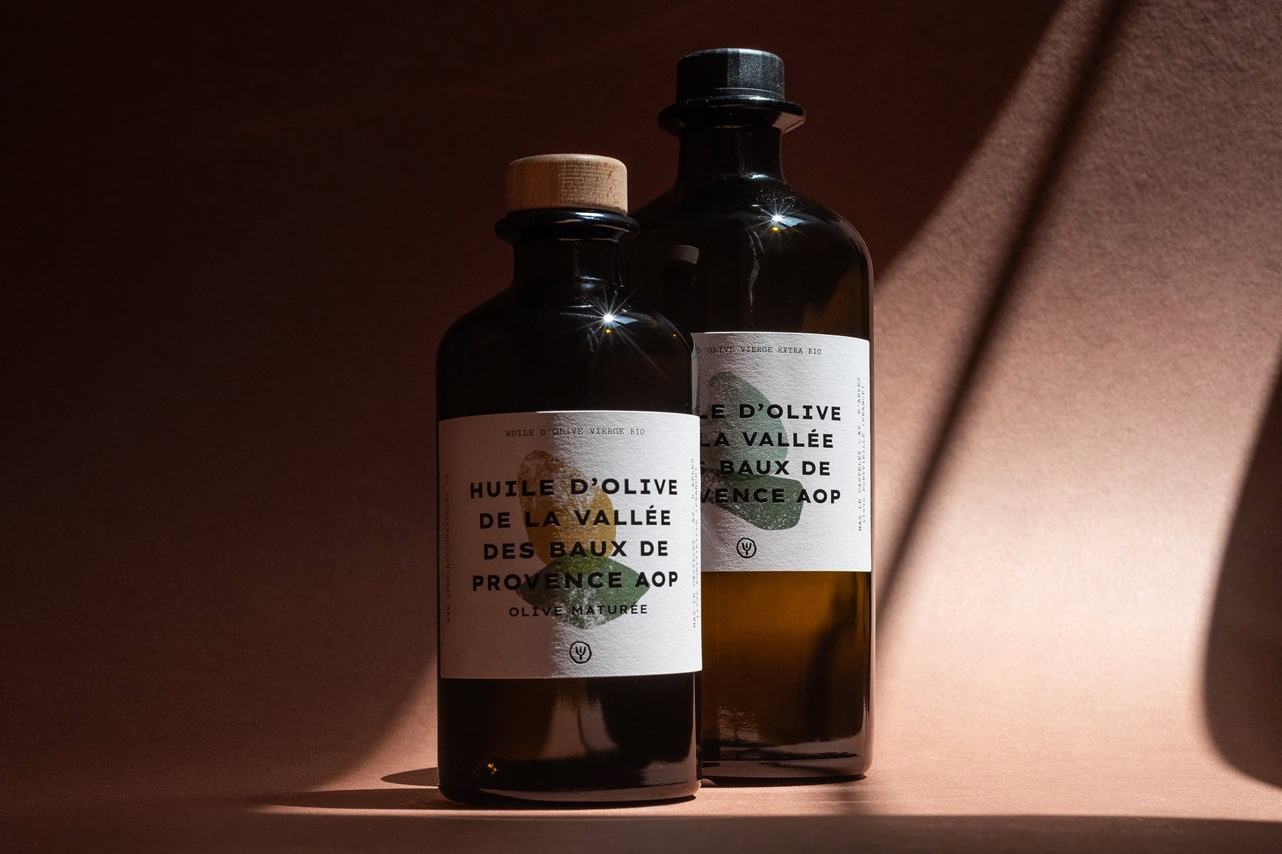
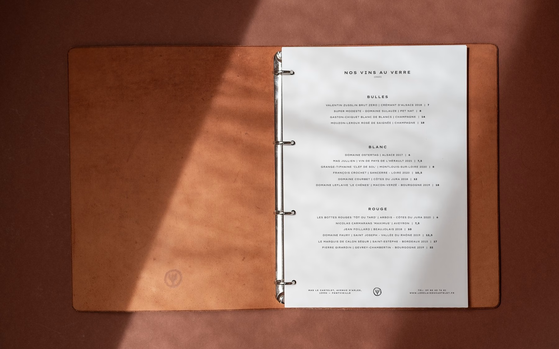
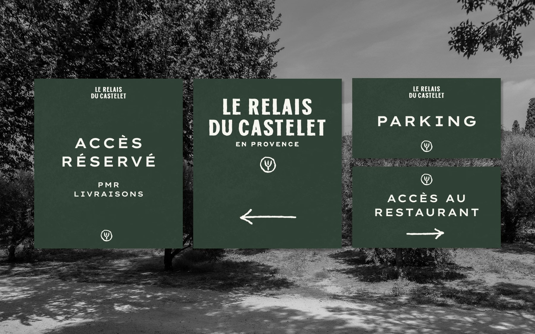
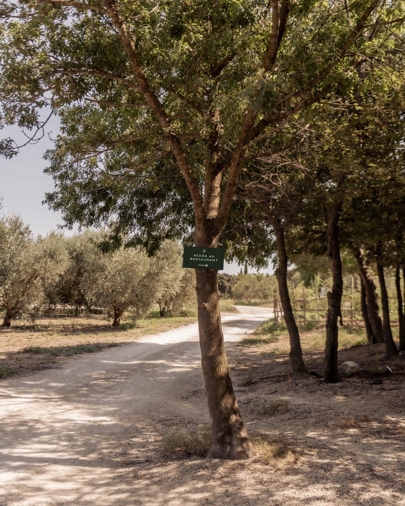
Beyond the shelf, the identity extends across everything guests touch at the table d’hôtes. Leather menu folders carry a debossed seal, business cards pair the wordmark with the stamped textures, and signage guides visitors through the olive grove to the restaurant. The same restraint runs through each piece, so the estate and its products read as a single, coherent world.
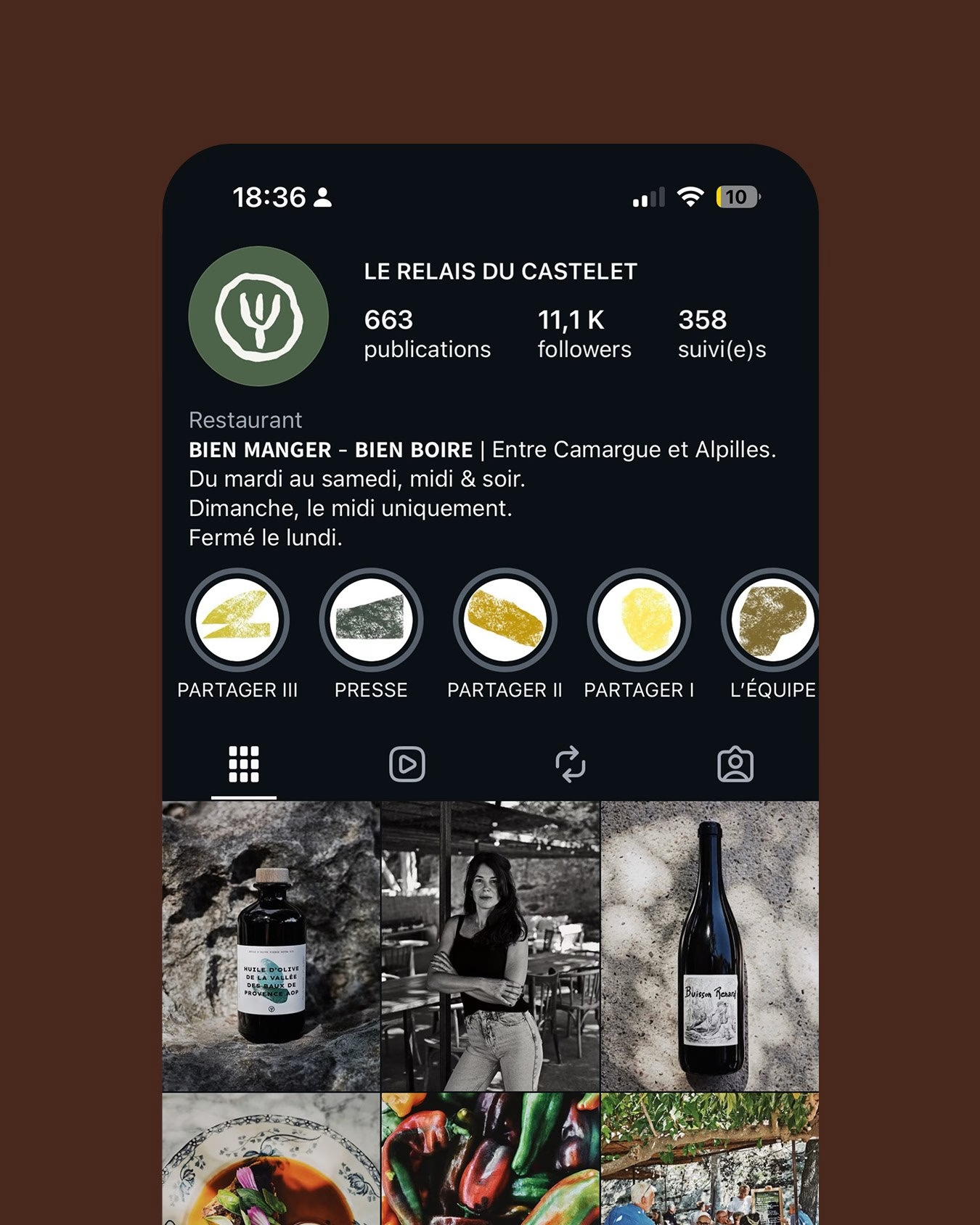
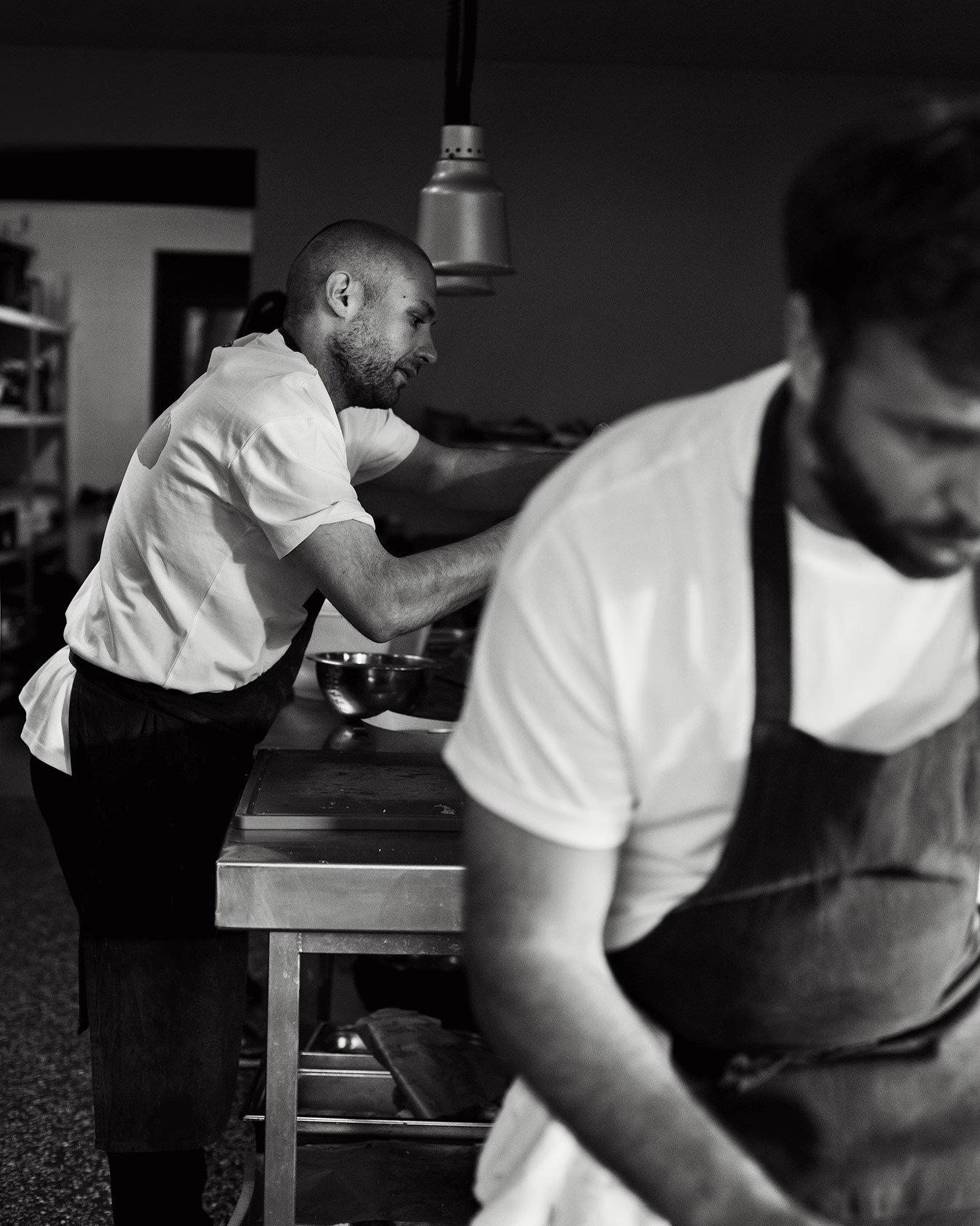
Photography by Anne-Cécile Granone rounds out the story, putting the team, the land and the food at the centre. The team appears in branded tees, while the estate’s horses, trees and dirt tracks carry the seal into the landscape. Through careful typography and narrative craft, Abmo turns the culinary heritage of Relais du Castelet into a timeless visual statement.

Brand Identity & Packaging Design: Abmo
Graphic & Type Design: Arthur Alazard
Printer: Print System
Photography: Anne-Cécile Granone
More in Restaurant Branding
Includes freebie bundle, unseen BTS insights and more.
 Available
Profile