

 Plus

 Menu


Hochburg Design
November 02, 2026
Mindsparkle Mag


No two pizzas at L’Artista look exactly alike. Dough develops its own volume, the crust blisters, and the oven leaves its marks across the surface, while the commitment to flavour stays constant. For Stuttgart studio Hochburg Design, that relationship between living form and dependable quality became the starting point for the pizzeria’s identity.
Nico Zingariello had a clear vision for L’Artista long before opening his second restaurant in the heart of Stuttgart. Back in 2022, he was still running the concept inside his family’s restaurant in Stuttgart-Plieningen, with the name, the pizza and his unmistakable personality already in place. Hochburg’s task was to give that character a visual identity that could grow with his ambition.
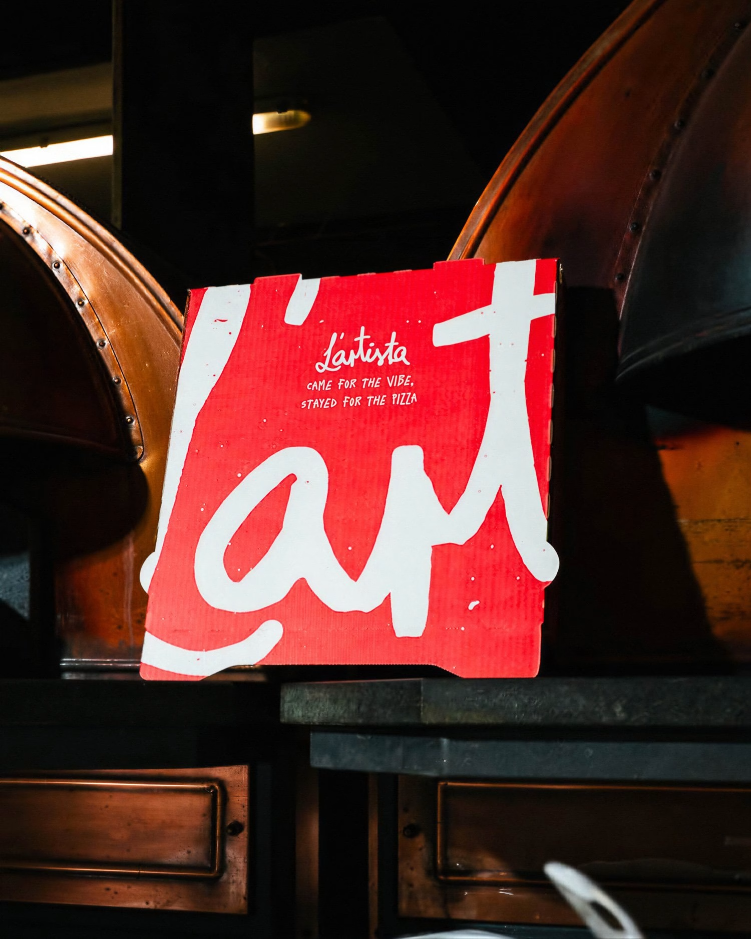
At the centre of the visual identity is a bold, deliberately scrawled wordmark, drawn by hand in Adobe Illustrator in several slightly different versions. Its irregular contours mirror the product itself: no two pizzas are identical, yet every one carries the same signature. Enlarged, cropped, fragmented or animated, the lettering becomes a graphic element in its own right, so recognition comes from character rather than rigid consistency.
The visual language draws on the raw energy of Manhattan backstreets, hip-hop culture and old MTV graphics, influences that were already part of Nico’s personality and of the early conversations with the studio. Instead of familiar trattoria nostalgia, the identity pairs Neapolitan craftsmanship with an unapologetically urban attitude. Wide, expressive typography set in Rekind Expanded and Ivar Mono, oversized compositions and rough-edged graphics meet appetising product imagery.
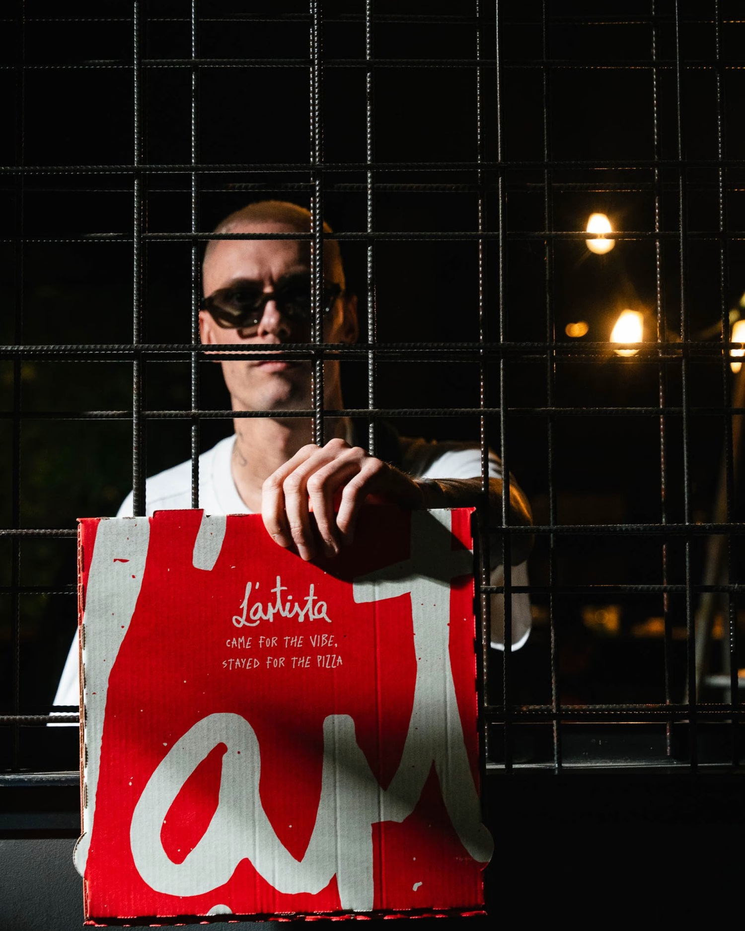
What makes L’Artista particularly interesting is how the identity has evolved over time. The original visual foundation was created in 2022, long before every application could become reality, because custom packaging, signage and merchandise are significant investments for an independent restaurateur. When Nico opened a second location in central Stuttgart in 2025, Hochburg refined and expanded the existing system rather than reinventing it, adding new typographic elements and a wider range of physical applications.
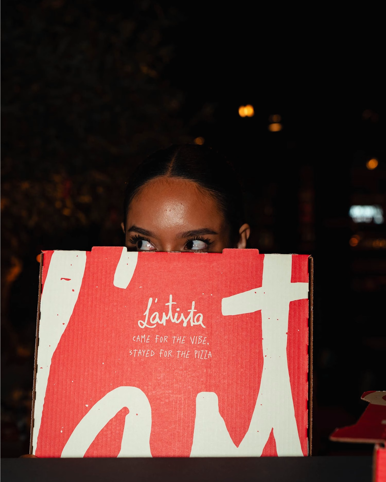
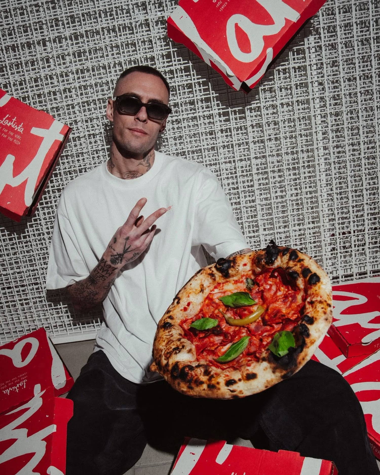
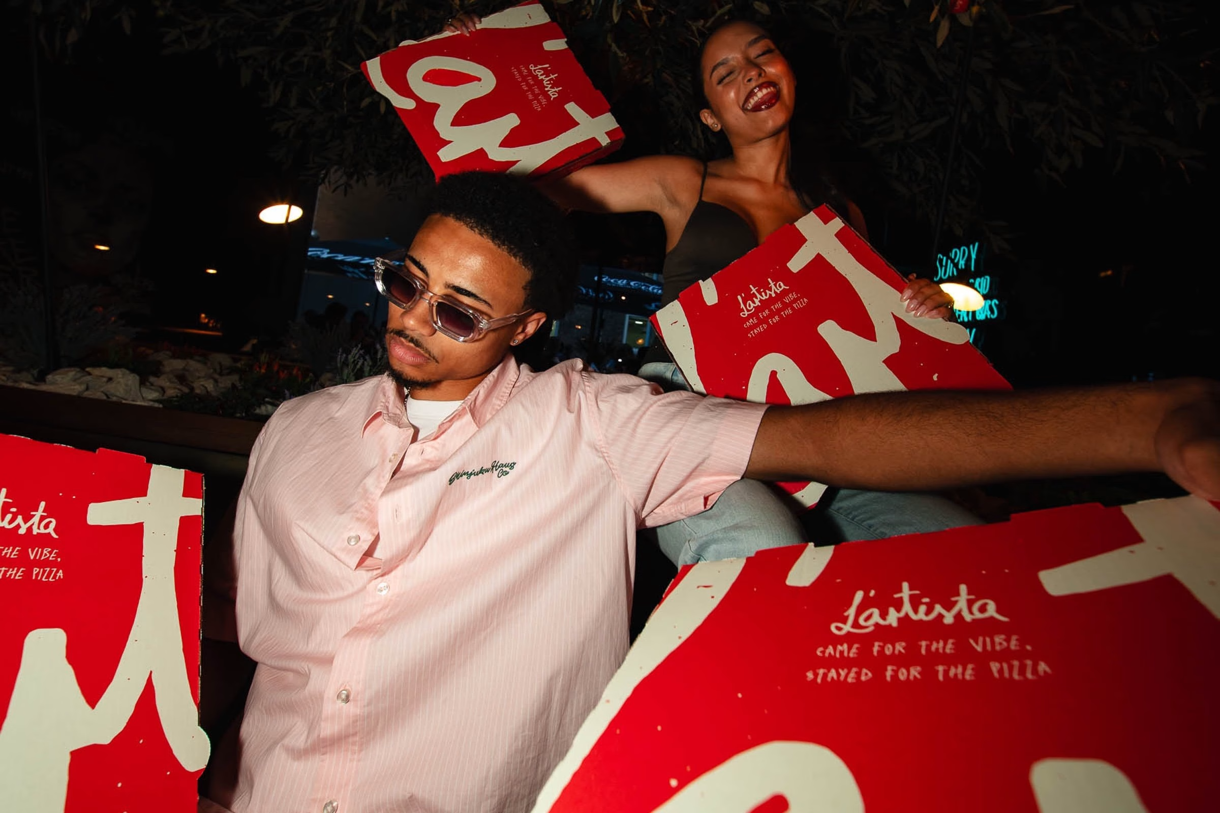
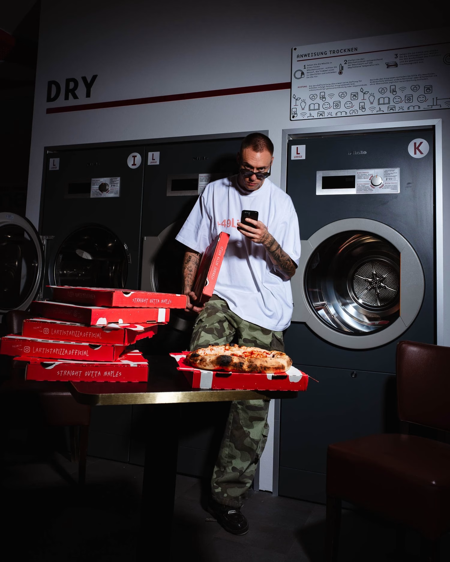
The pizza box is perhaps the clearest example of that growth. With the oversized wordmark running across its surface and disappearing beyond the edges, it becomes more than packaging, carrying L’Artista through the streets of Stuttgart almost like a shopping bag from a fashion label. Inside the restaurant, the identity extends through signage, oversized menus, clothing and merchandise, creating an atmosphere that sometimes feels more like an independent hip-hop label than a traditional pizzeria.
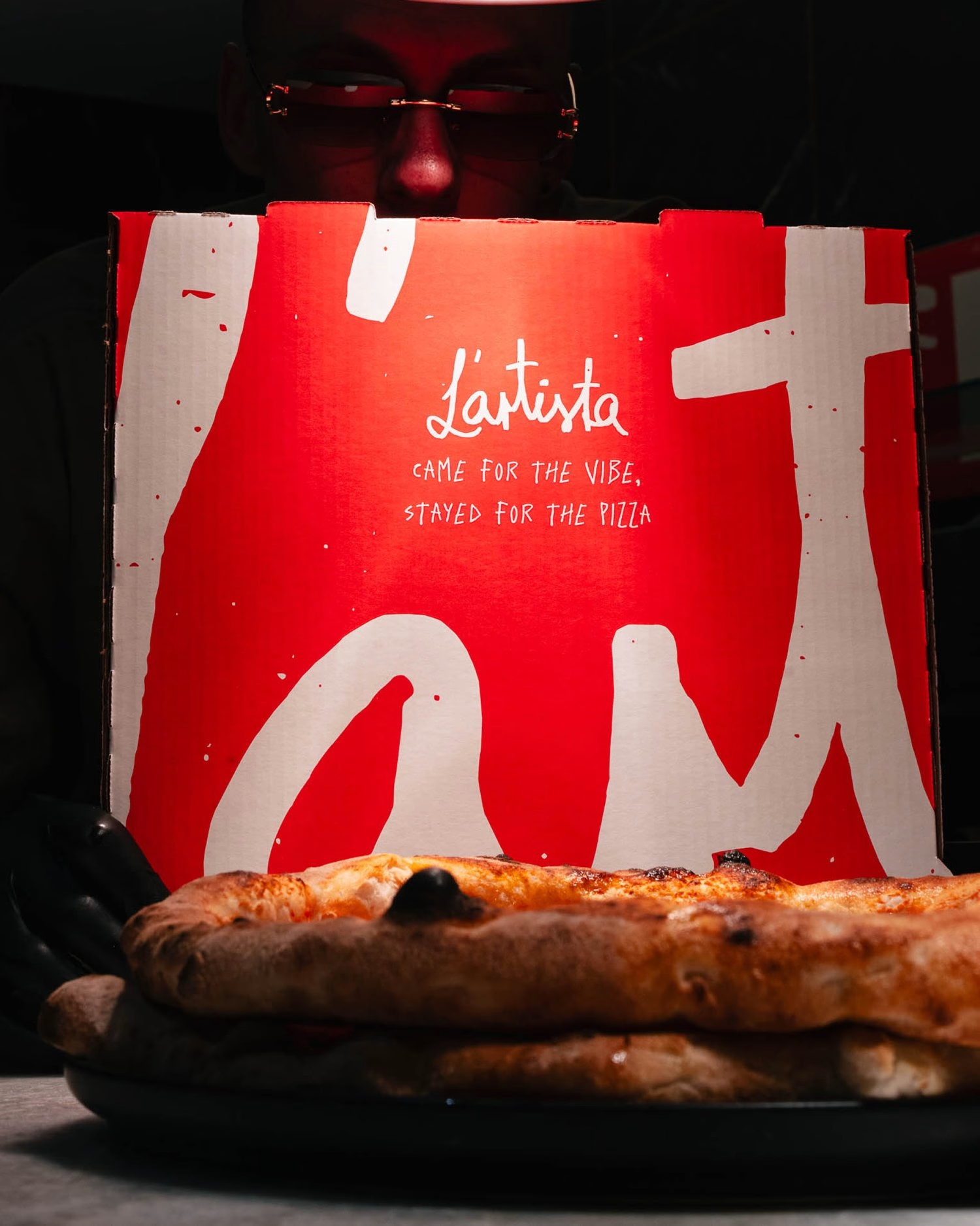
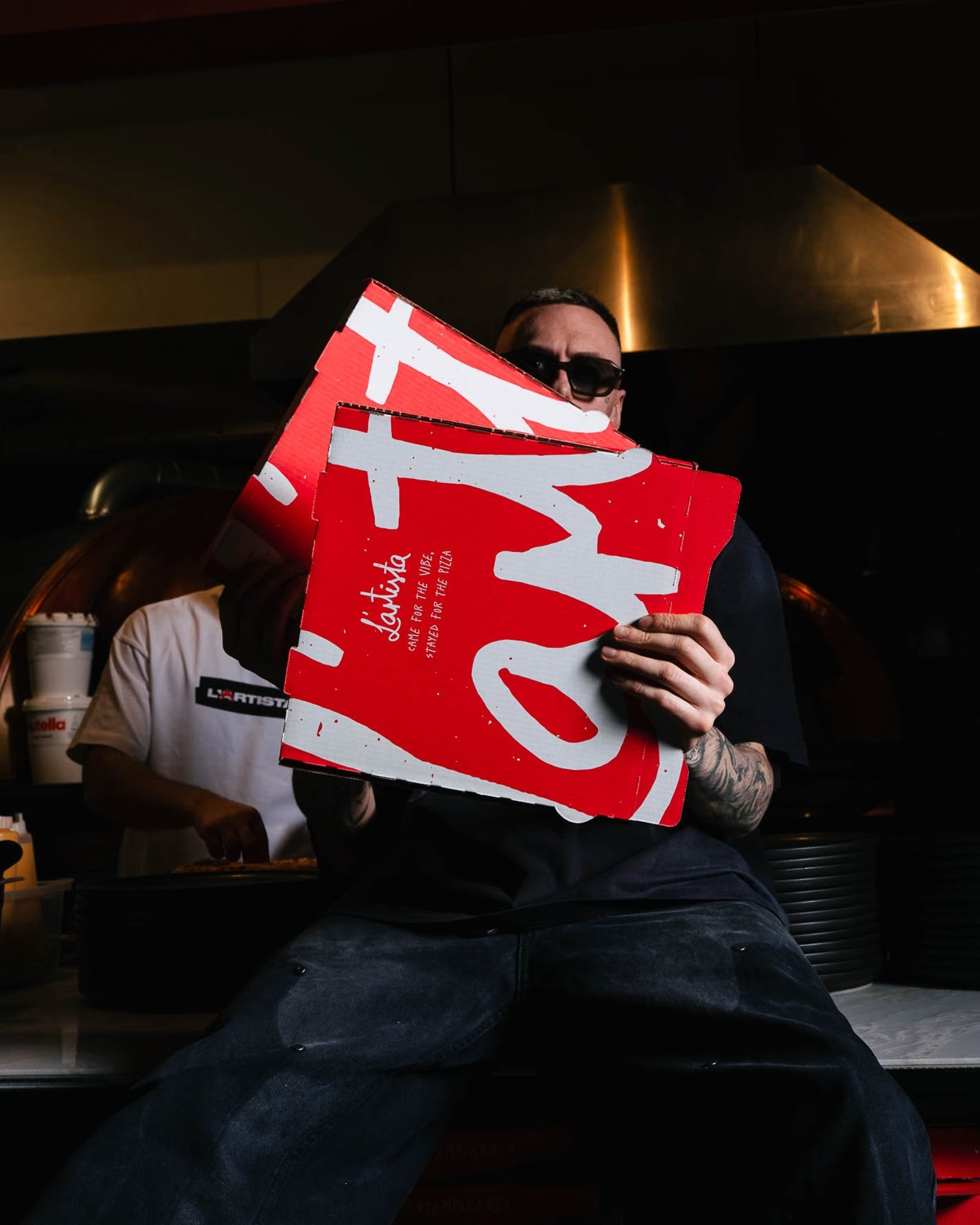
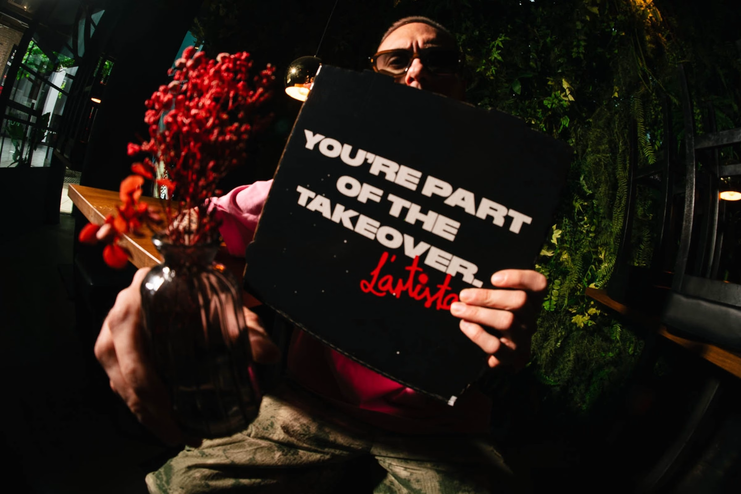
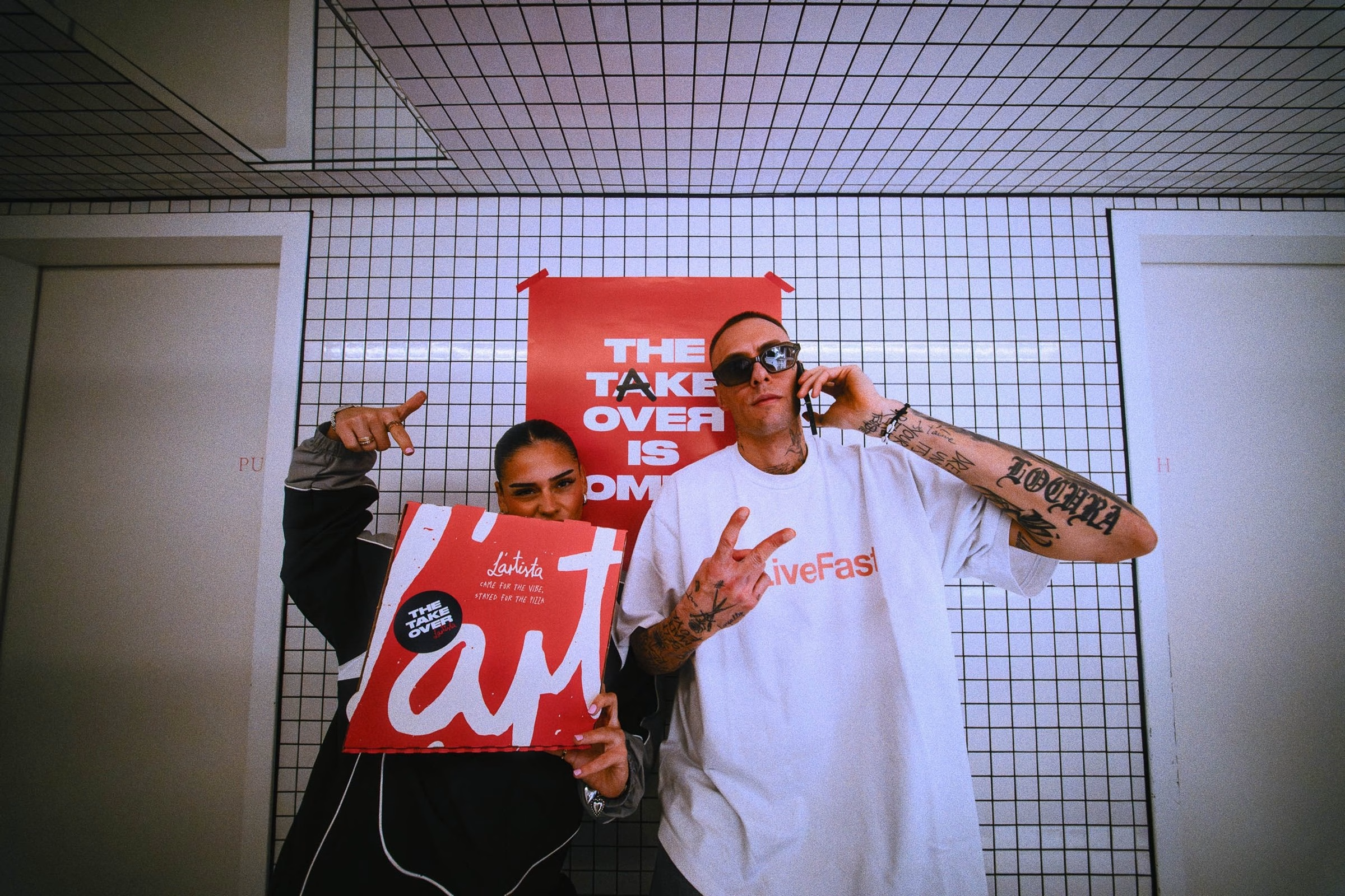
Photography and video by Felix Schlenker capture Nico and the streets surrounding the new restaurant, from glowing late-night shopfronts to the laundromat around the corner. Motion designer Nadine Klumpp took the rough stop-motion GIF that Hochburg first assembled from the hand-drawn variations and developed it into the animated system seen across the brand. Together, these elements bring the identity into a living, constantly evolving visual world.
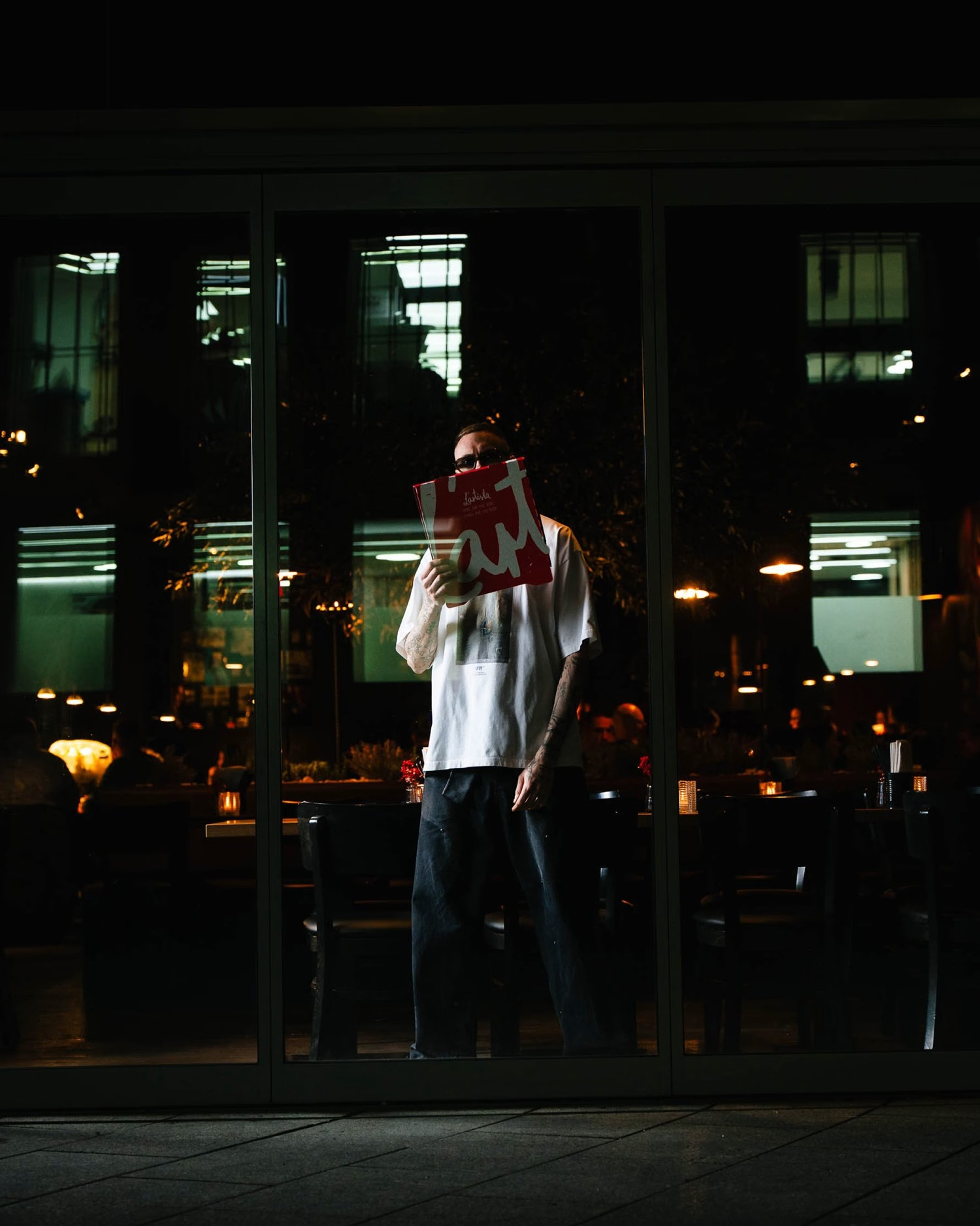
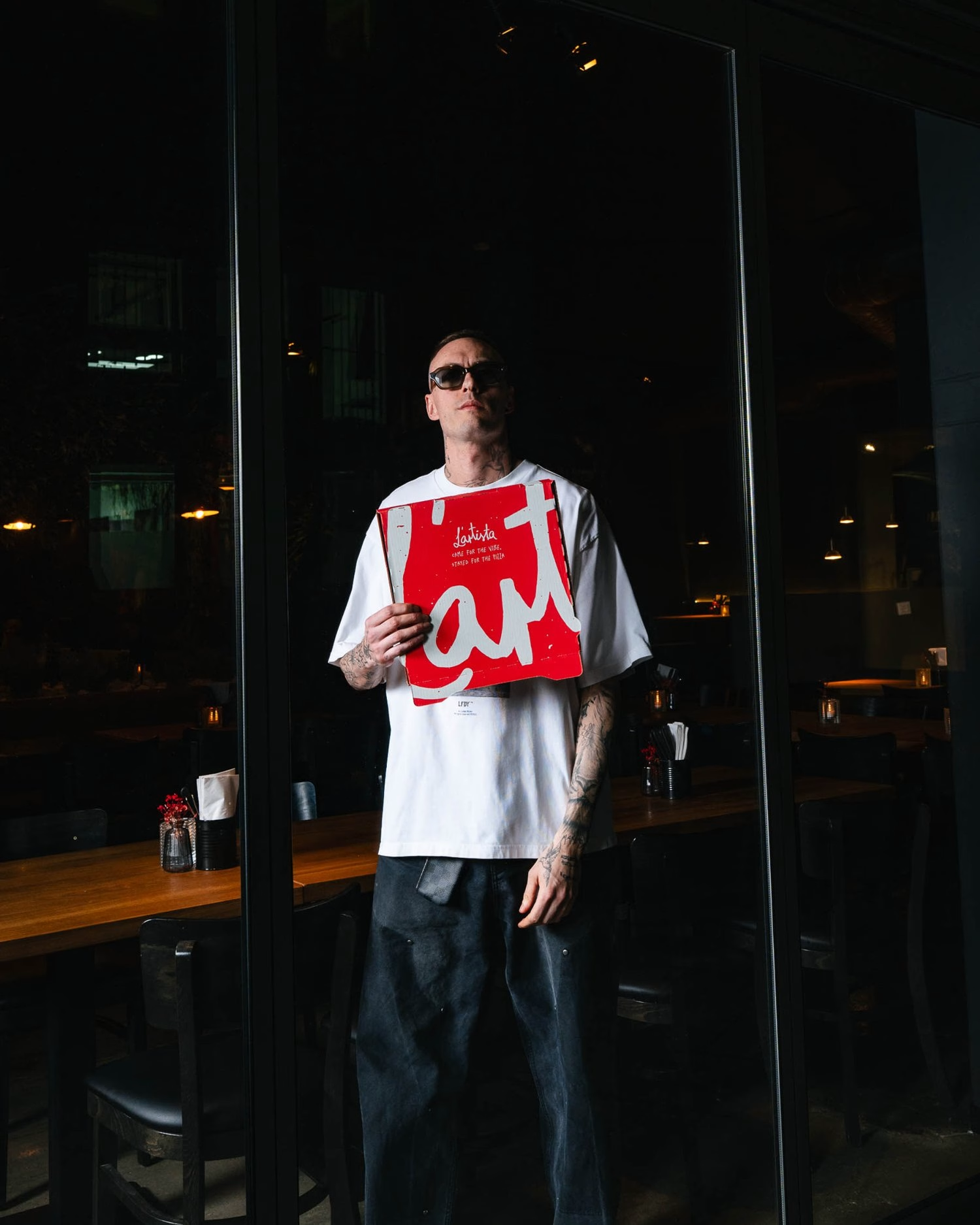
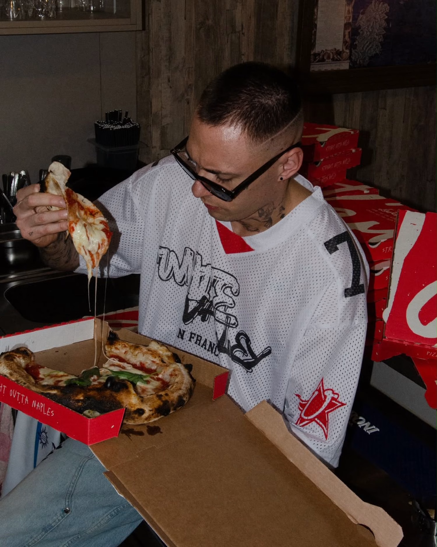
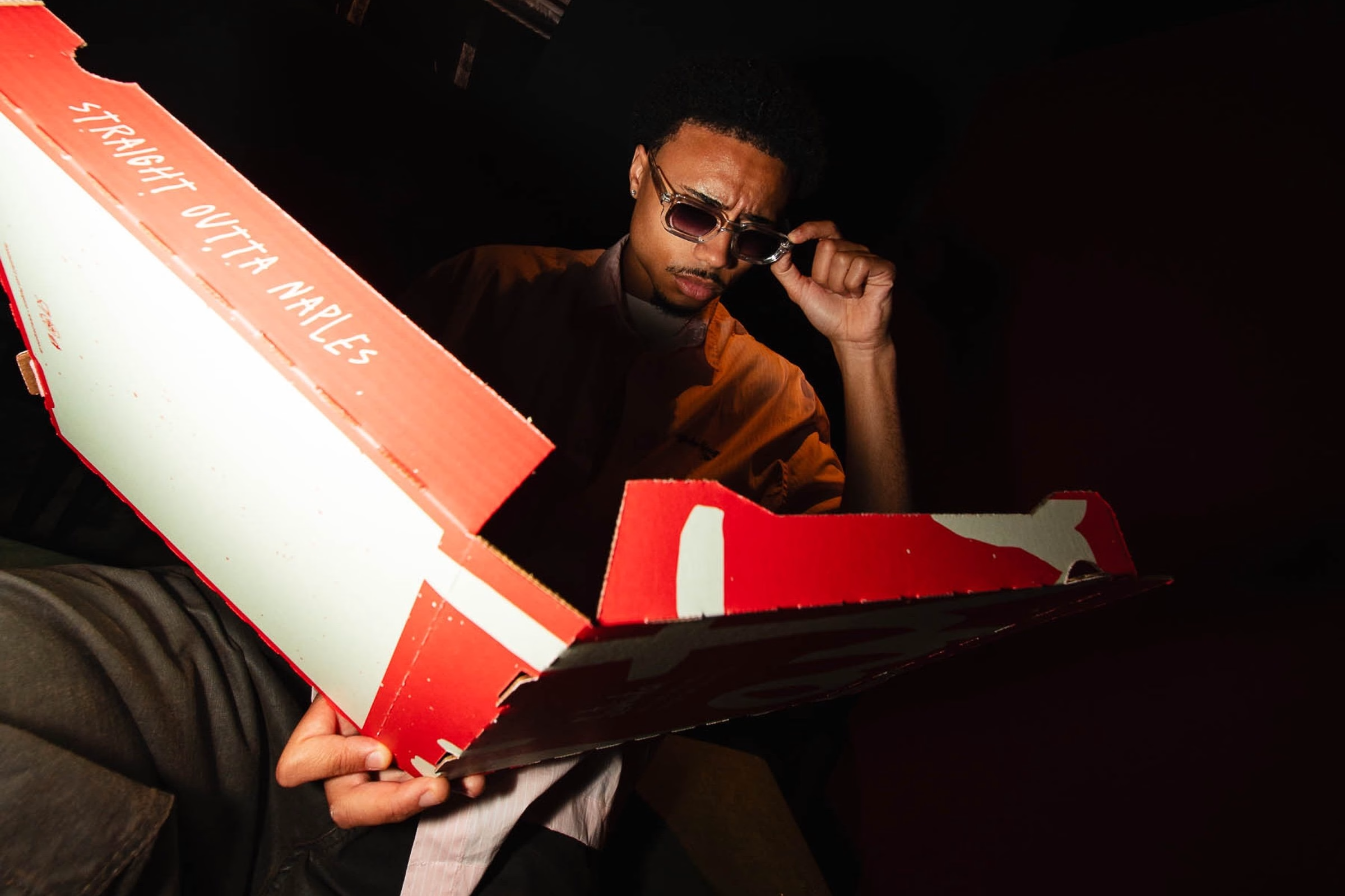
What began as a graphic foundation in 2022 has grown alongside the business, and the original hand-drawn wordmark is still at its heart. The idea stayed the same while the possibilities got bigger, stretching from a family restaurant on the edge of the city to a second location with its own packaging, signage and merchandise. Much like a good pizza dough, sometimes a brand simply needs time to develop.
Unlock everything with Mindsparkle Mag Plus.
Get exclusive access to Premium features:
Credits: Hochburg Design
Brand Identity Studio: Hochburg Design
Creative Direction & Wordmark: Florian Boyd
Art Direction: Andreas Welter
Motion Design: Nadine Klumpp
Photography & Video: Felix Schlenker
Client & Pizza Artist: Nico Zingariello
Typeface (Ivar Mono): Letters from Sweden
Typeface (Rekind Expanded): Multype Studio
More in Restaurant Branding
Stay on top of this week's design. Insights, top picks & more.