Plus

 Menu


Rabbithole
November 20, 2026
Mindsparkle Mag


London Film School is the UK's oldest film school, founded in 1956 from anti-establishment roots in a Brixton butcher's shop. According to the Hollywood Reporter it now ranks among the world's top 15 film schools, yet for years its visual identity lagged behind that reputation and told a duller story. The school turned to long-standing partner Rabbithole to close the gap with a new brand identity, website and suite of marketing materials.
The brief was to reinforce the school's standing as a leading global film school, strengthen its industry connections and celebrate its illustrious alumni. The identity also had to root itself in seventy years of heritage while signalling a progressive evolution. LFS is mid-transformation, with a new CEO, new courses, a move to new premises in Covent Garden, more affordable Master's programmes and the launch of a short-course school, London Film Works.
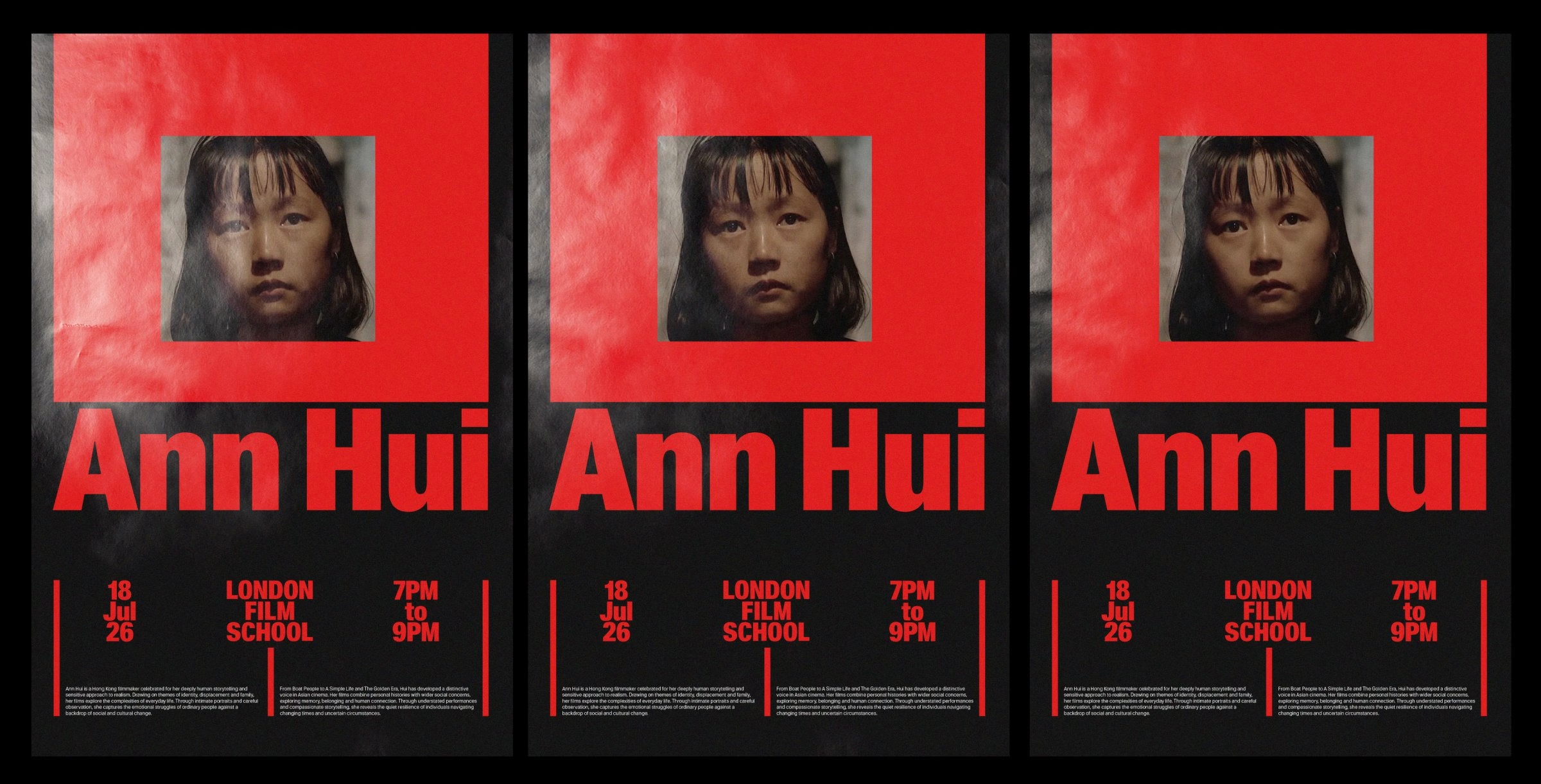
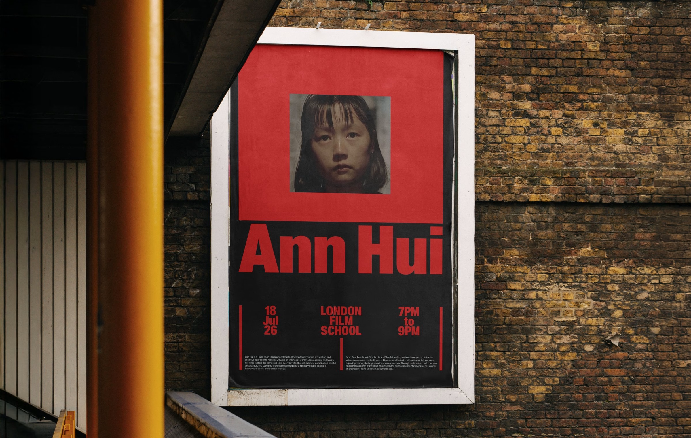
Rabbithole's communication strategy starts from the rebellious, artistic spirit that had quietly disappeared from the brand. The new voice projects confidence and authority as a global leader while reconnecting the school with its spiky, punk-edged DNA. Lines such as “A school of heretics & vulgarians” and blunt statement posters carry that attitude onto the street and into the school's social channels.
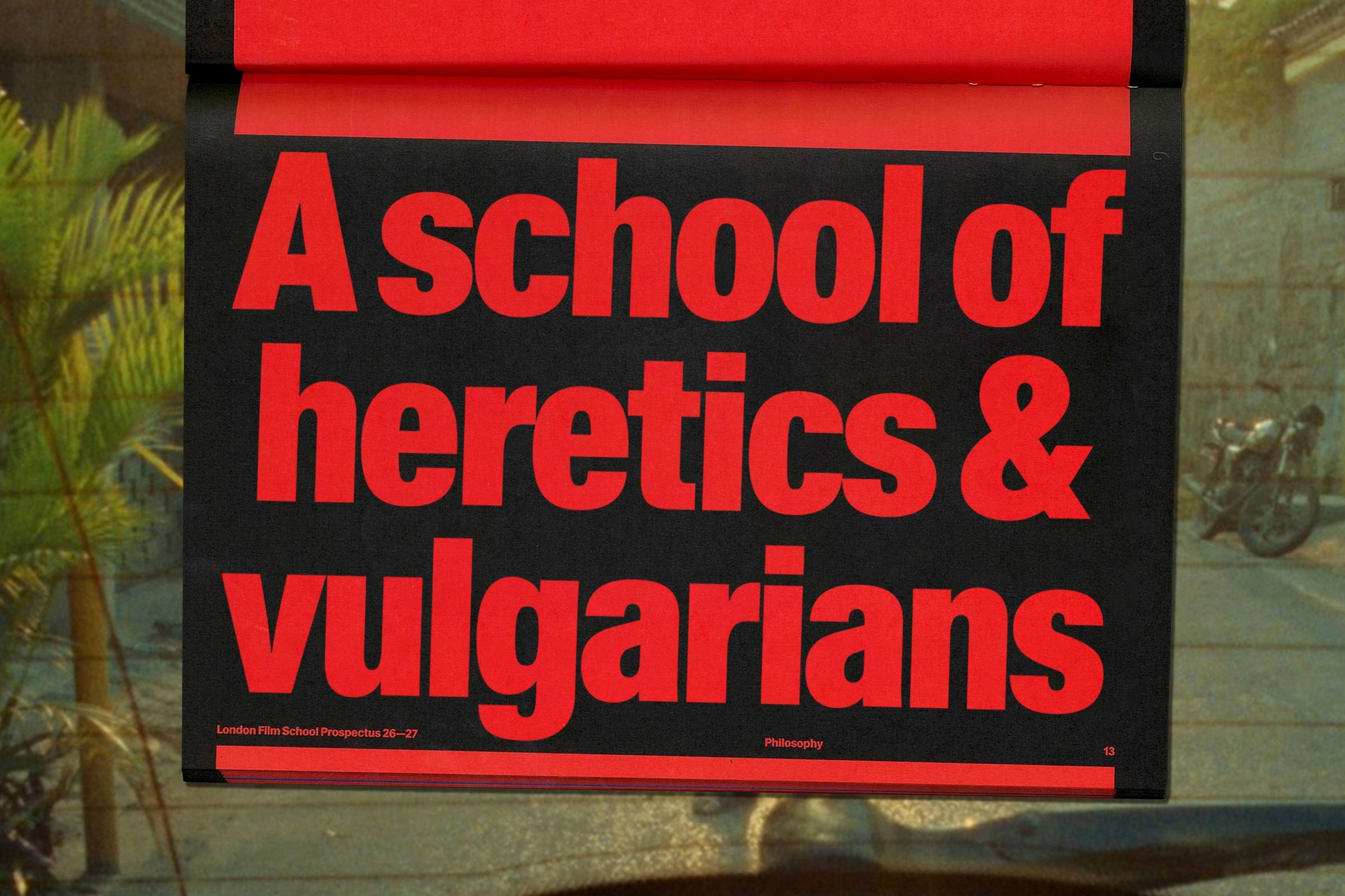
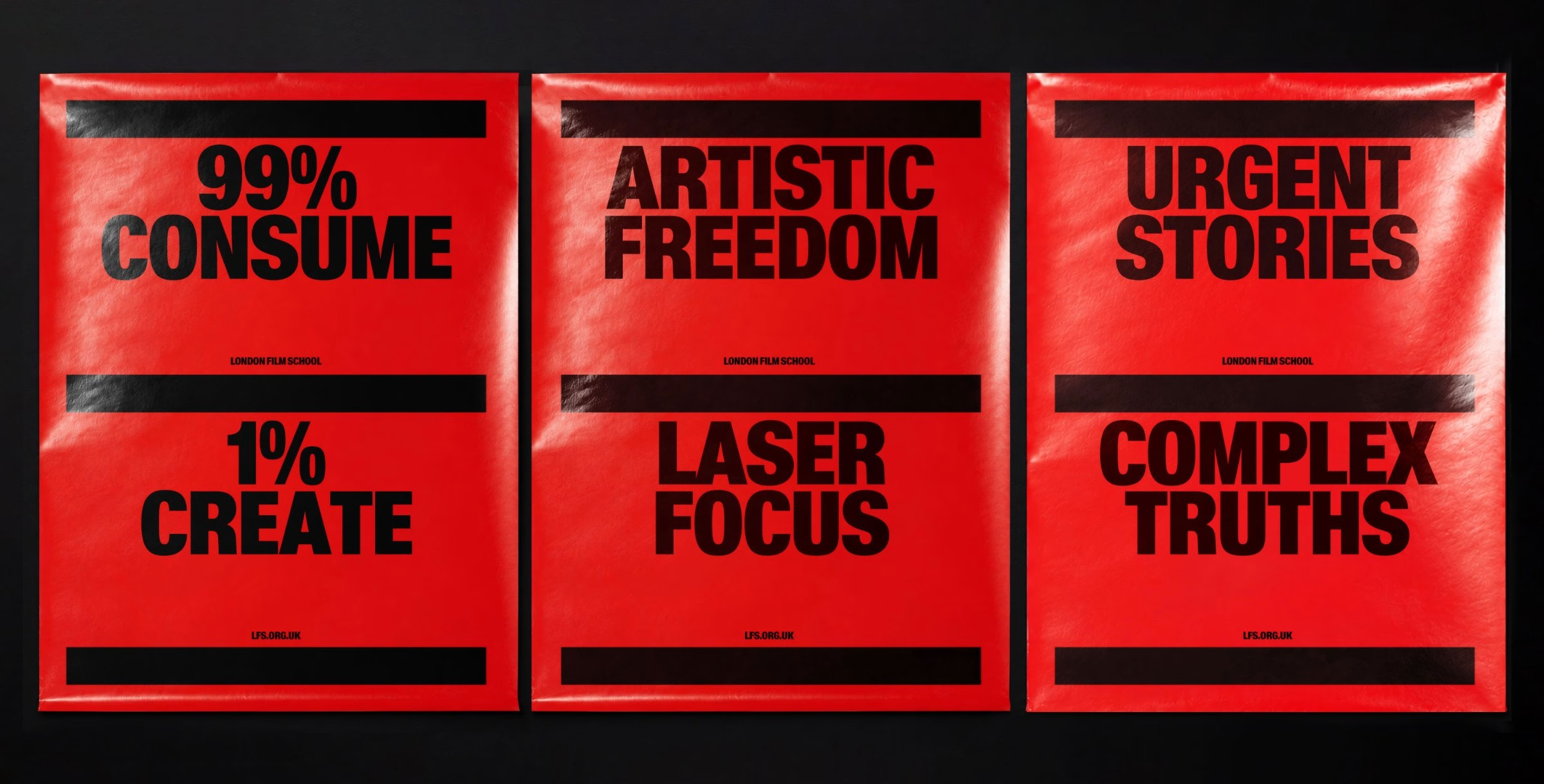
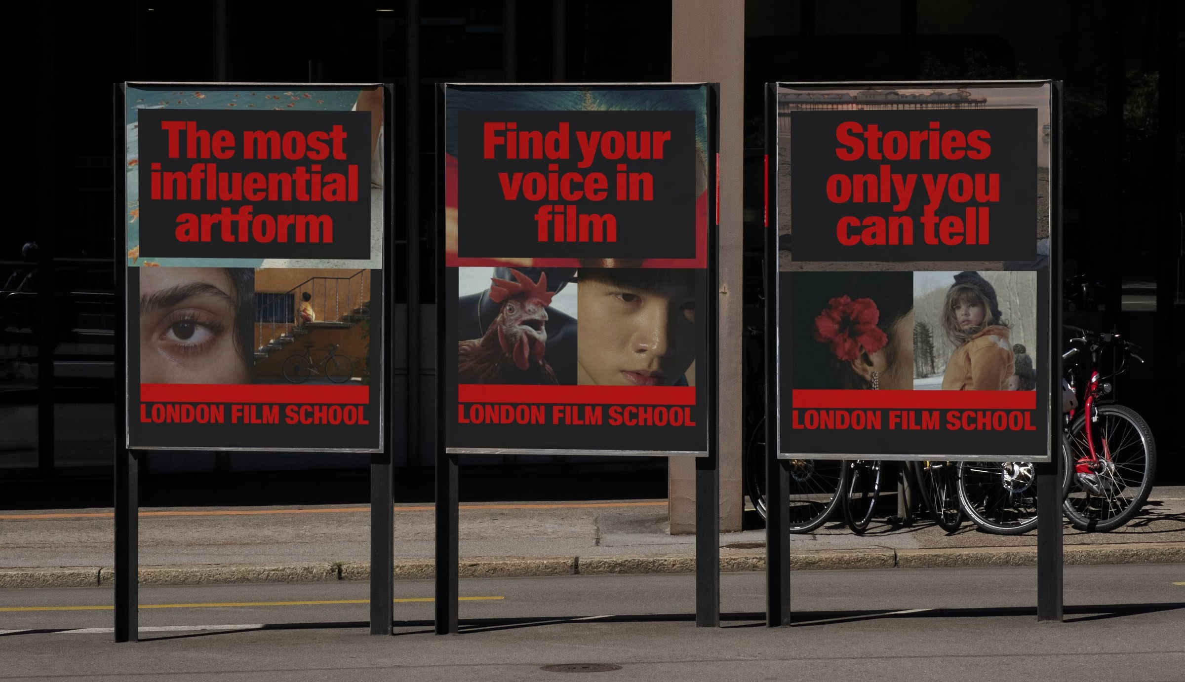
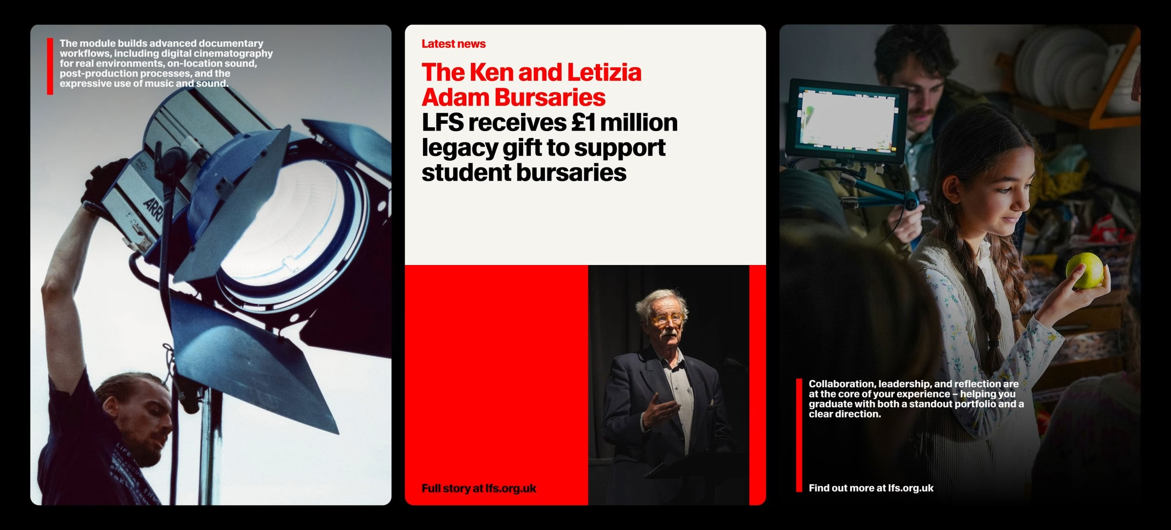
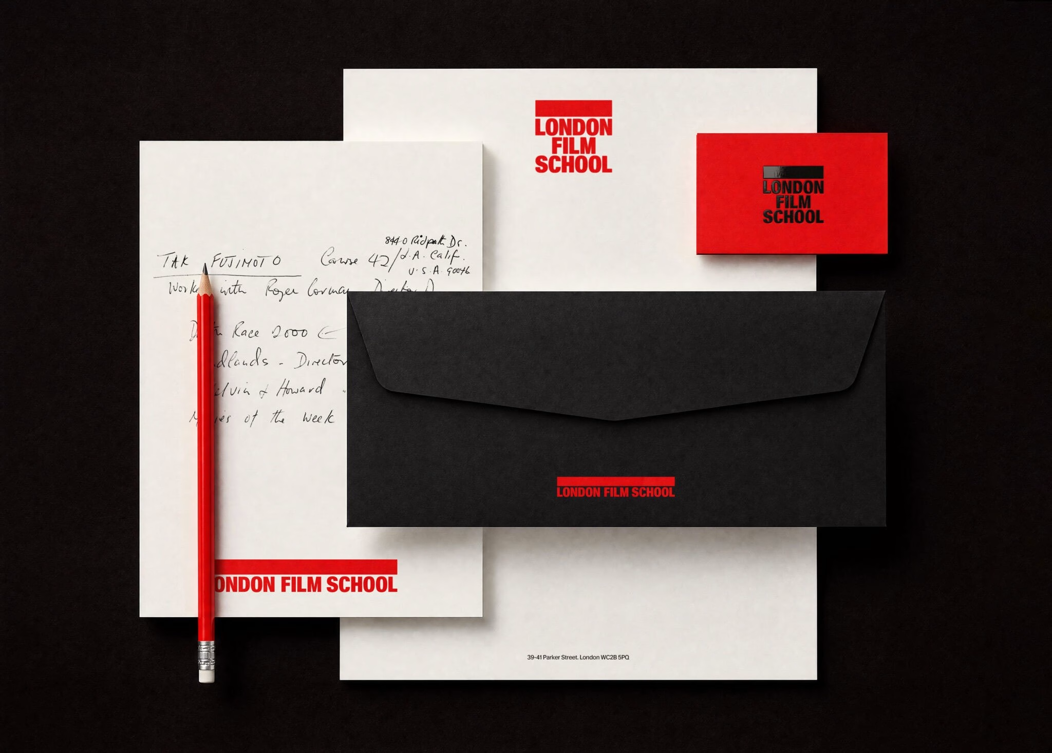
The type system is set in Waldenburg by Kimera, a direct and robust typeface that gives the identity confidence, clarity and authority. Its condensed weight scales boldly across digital and print, yet sits back comfortably at understated sizes. The same system drives a set of short idents, extending the identity into motion design for screens, films and alumni stories.
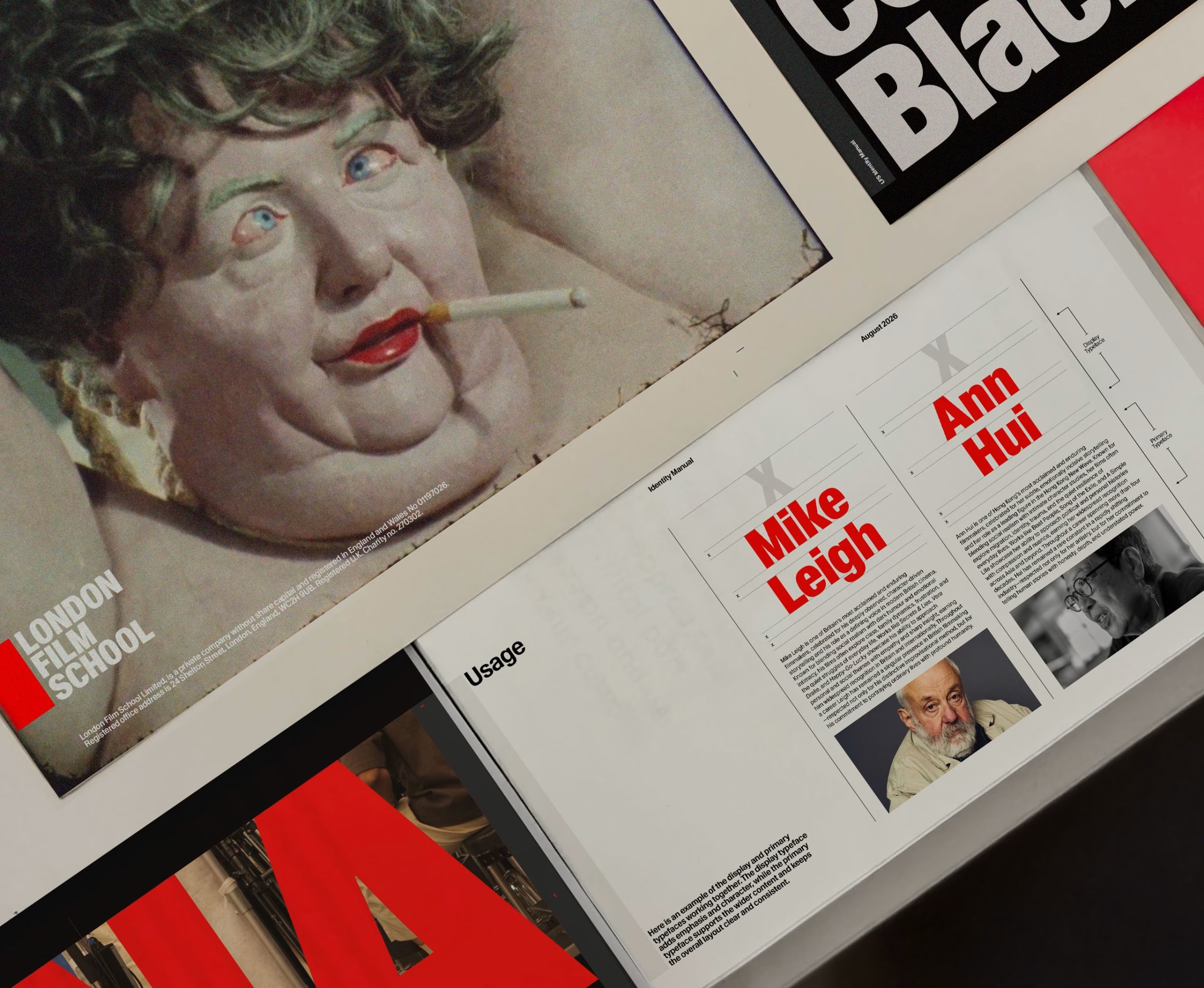
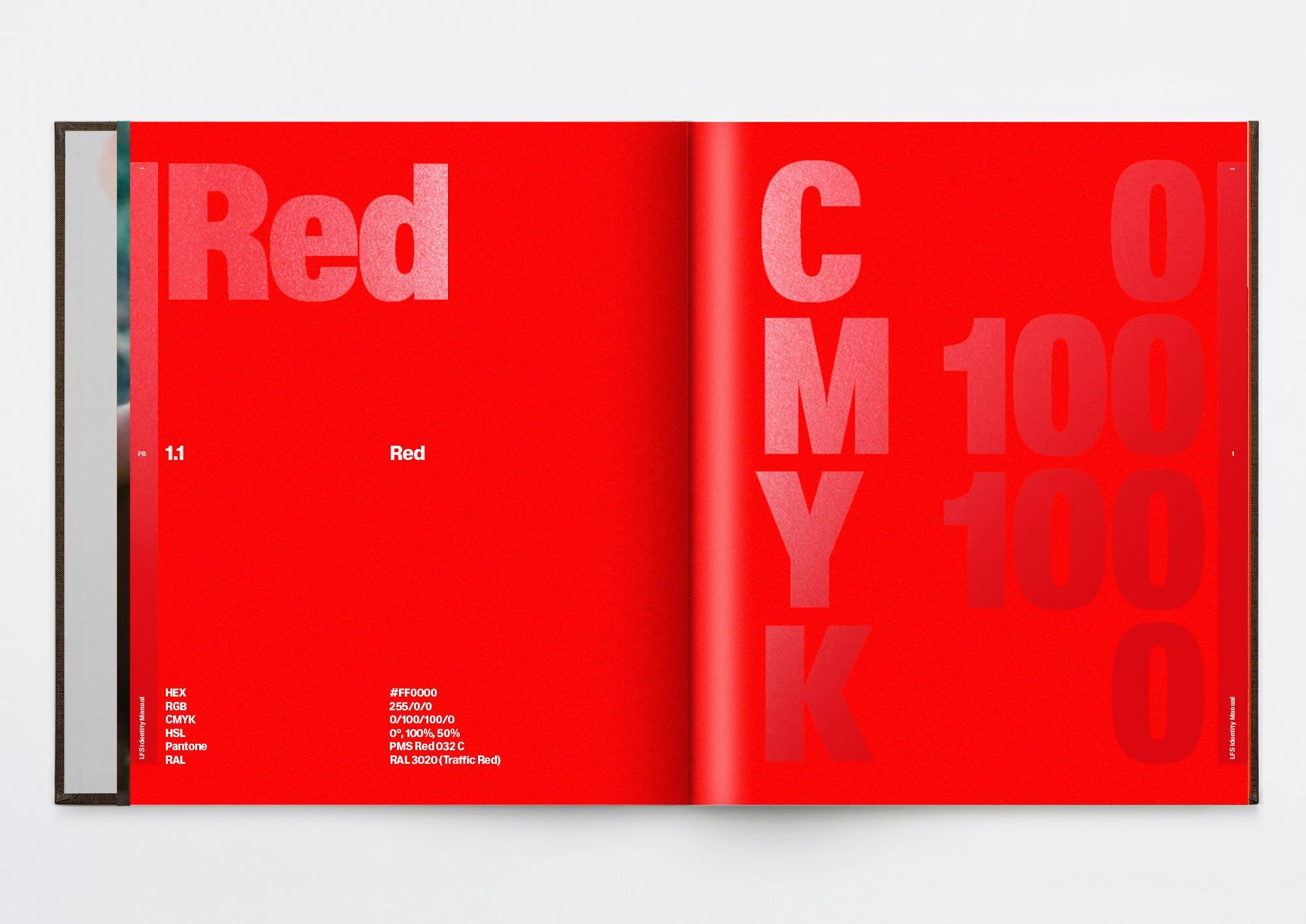
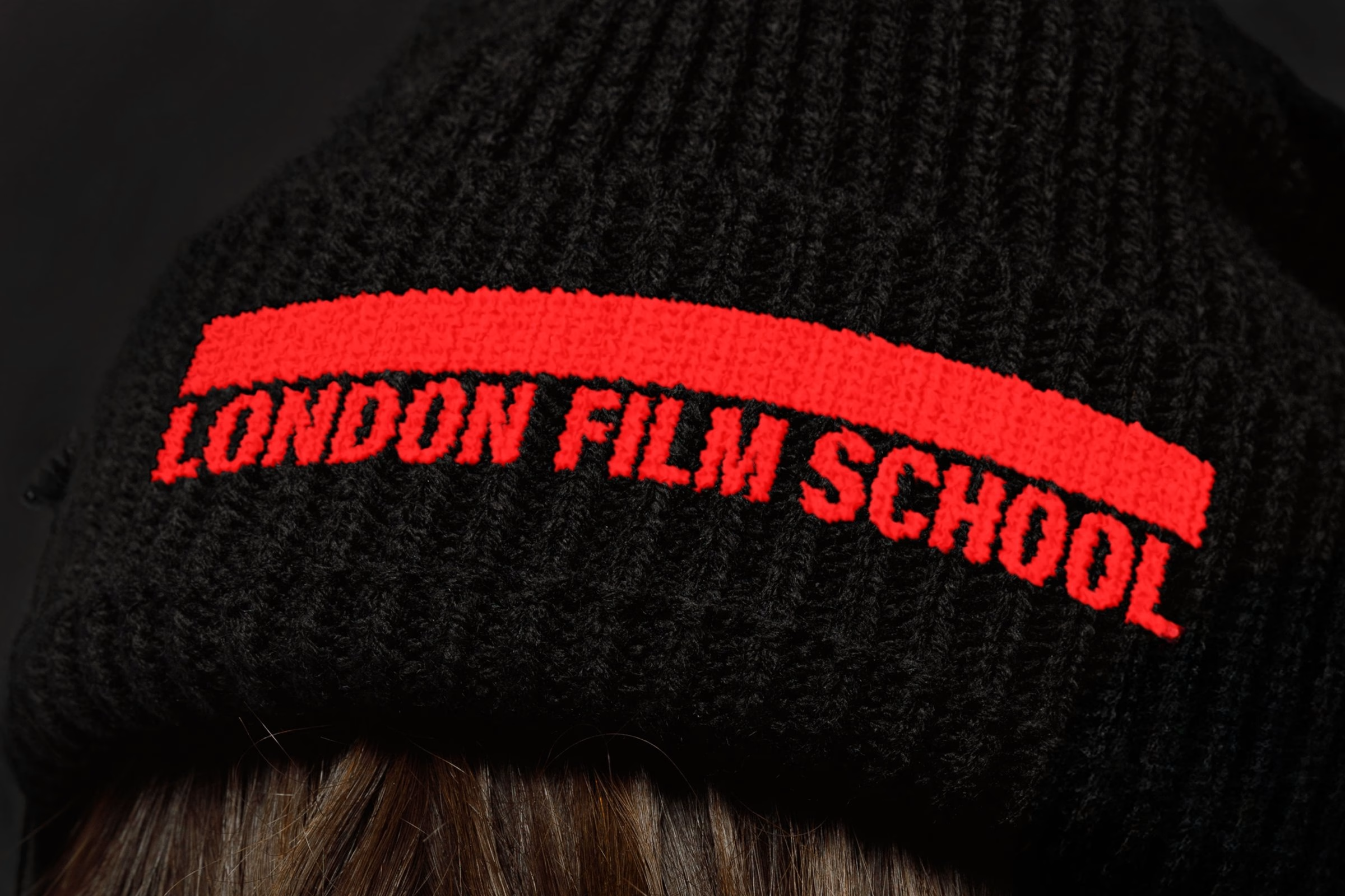
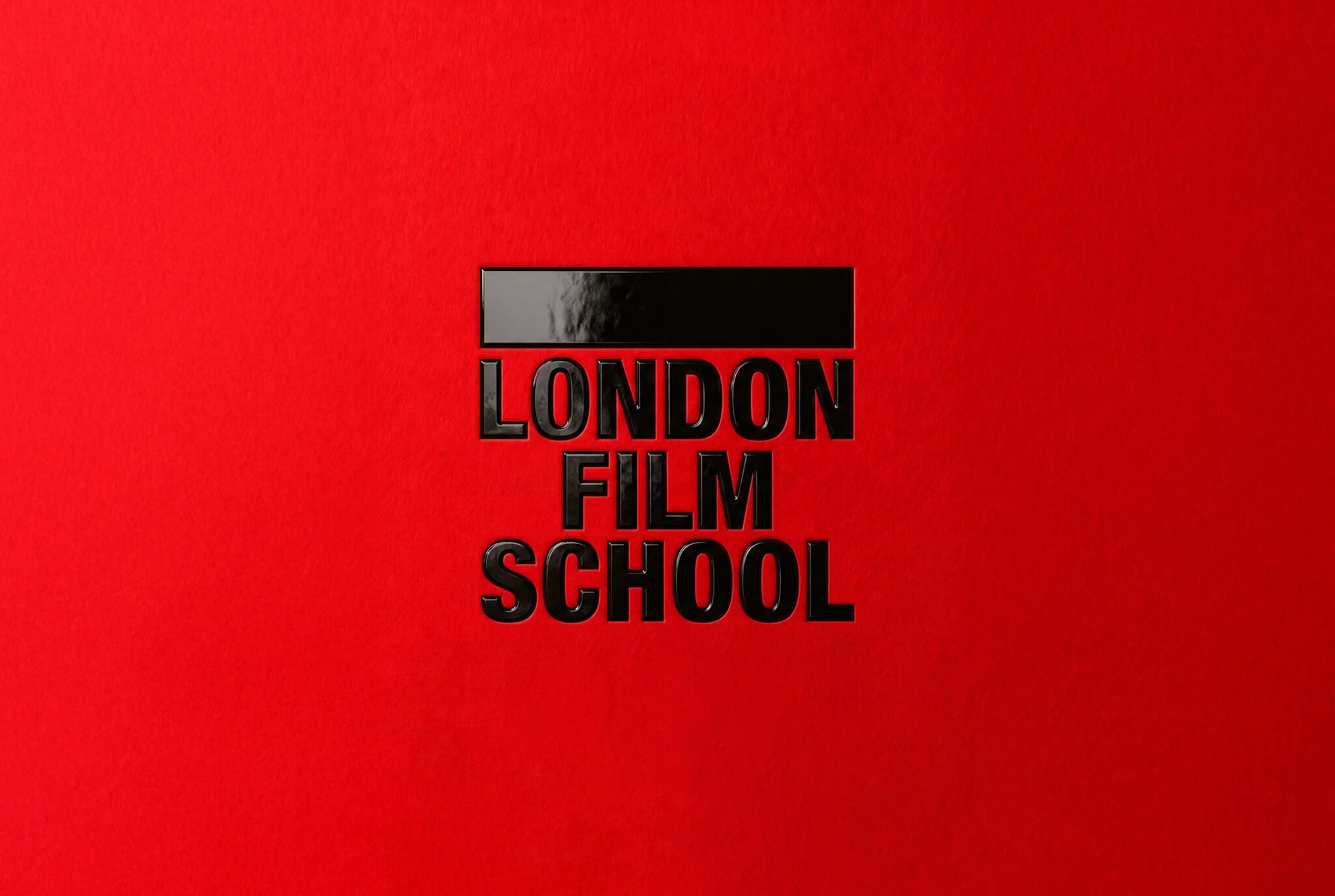
Rabbithole refined the LFS red into a brighter, digital-ready tone and resisted adding any new colours. The school has anchored its identity in red since the 1960s, most visibly in its iconic red entrance doors, so the monochromatic approach stays. Red blocks and framing give the system its structural clarity: the red frame placed outside and above the logotype mirrors the way filmmakers choose a perspective, standing for the creative decisions students must make to find their own voice.
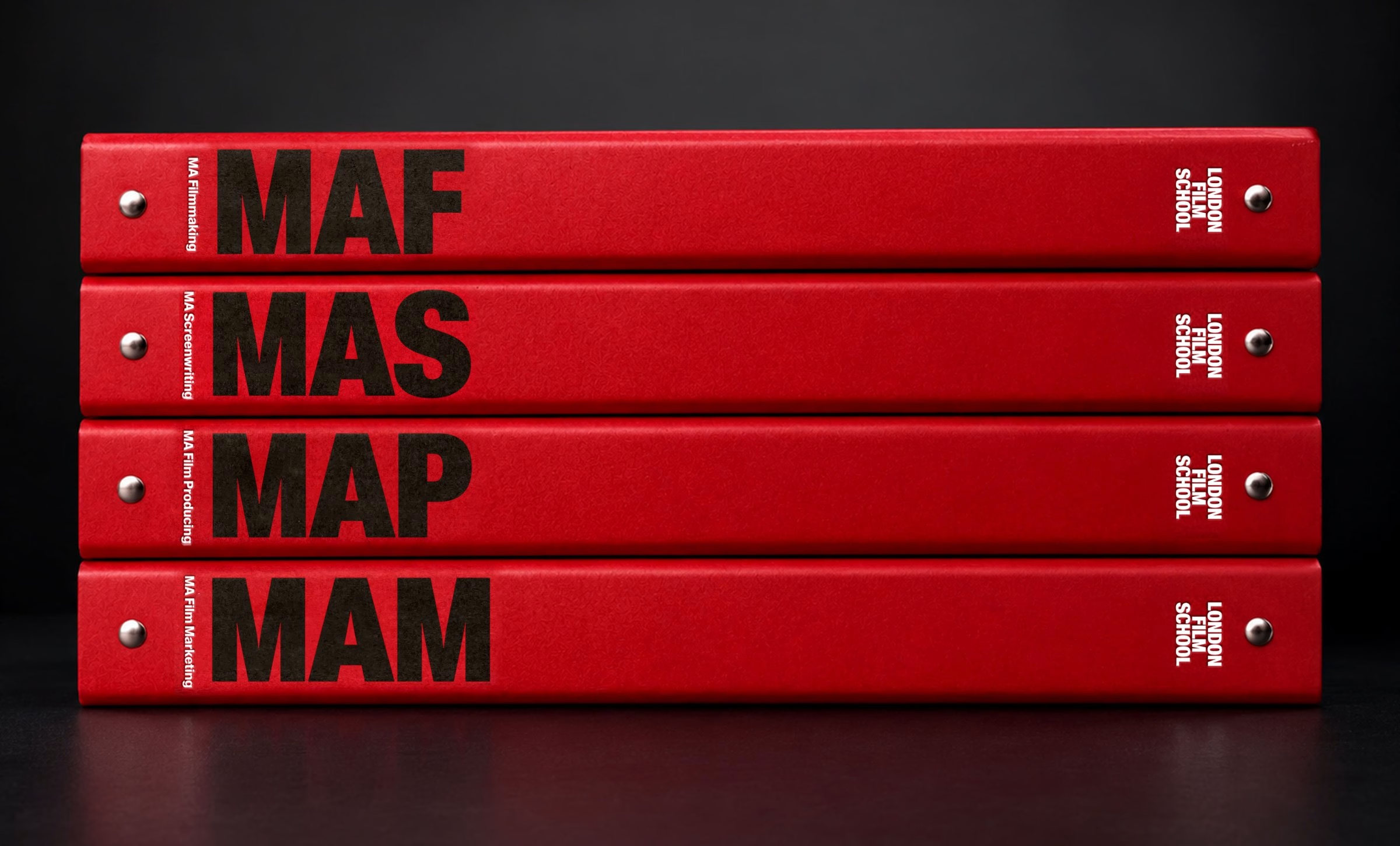
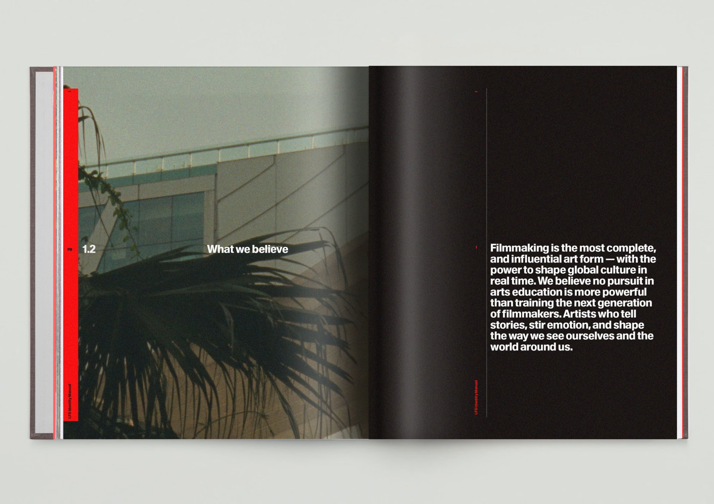
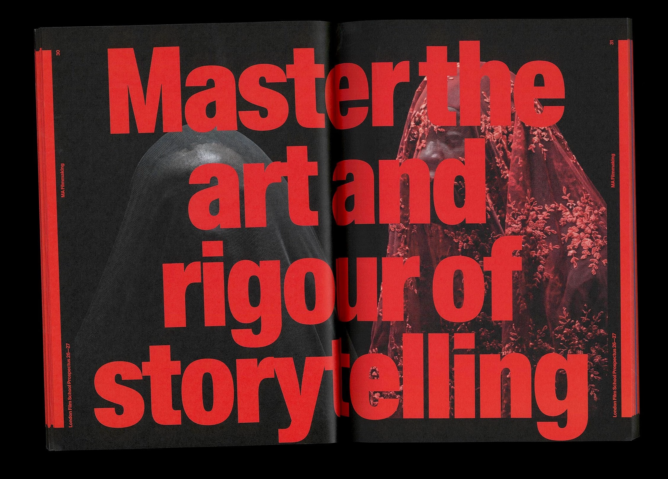
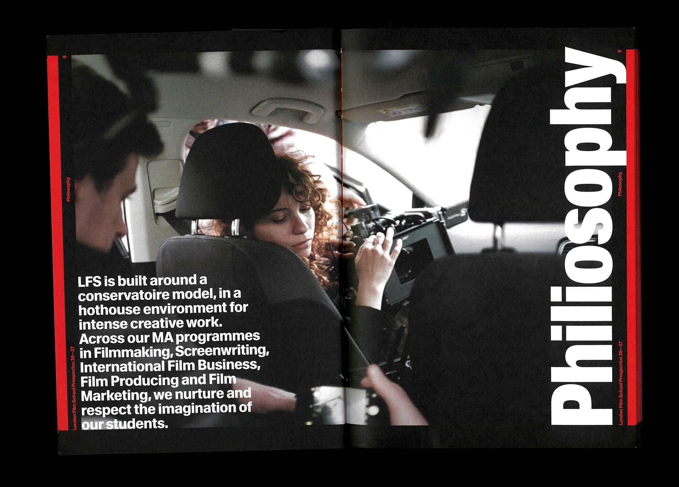
The 2026–27 prospectus pushes the system furthest, pairing oversized Waldenburg headlines with student film stills on deep black spreads. Statements such as “Master the art and rigour of storytelling” and “There's no audience without marketing” read like title cards. A gradient spread repeats the London Film Works name in shifting colour, introducing the new short-course school.
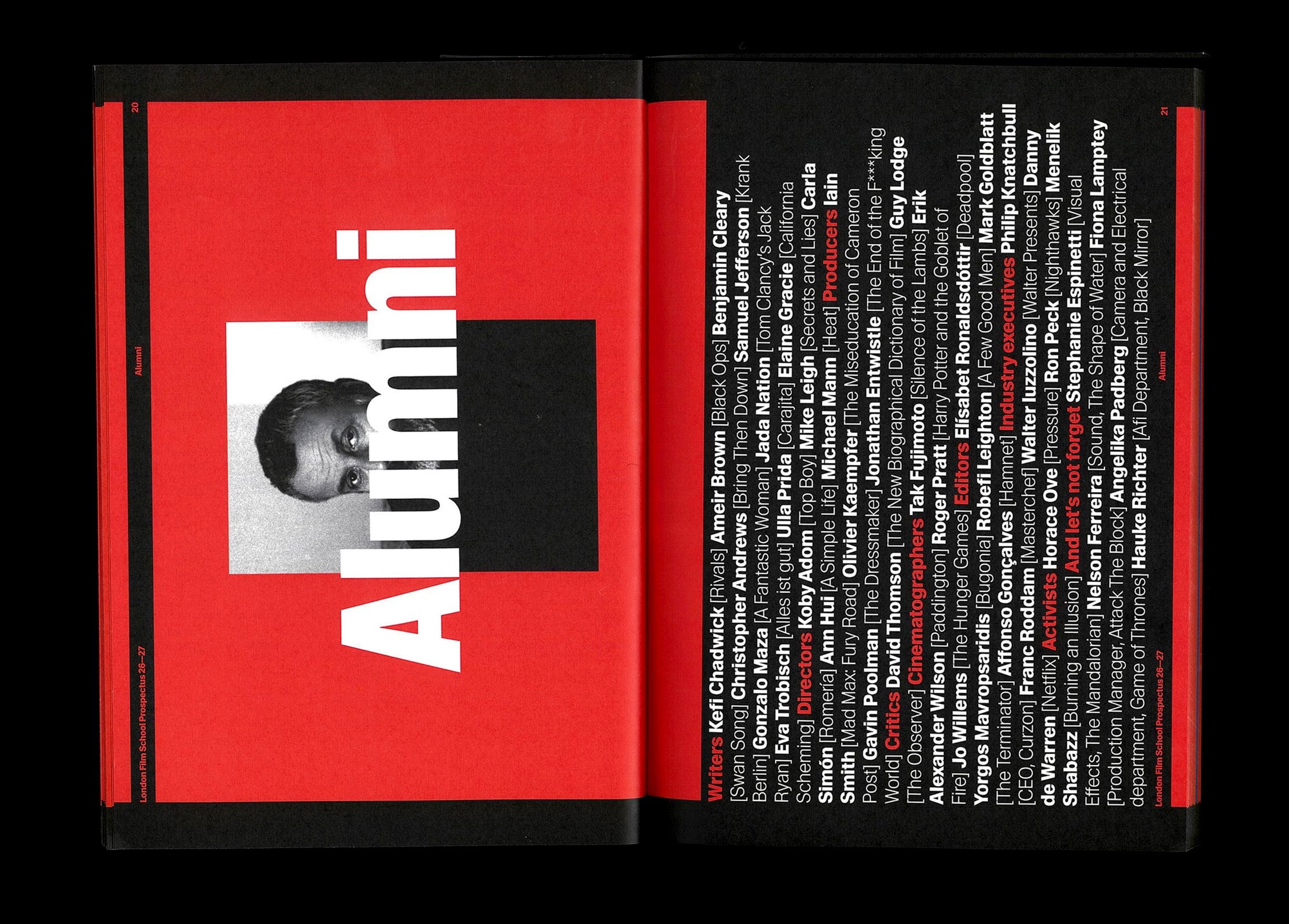
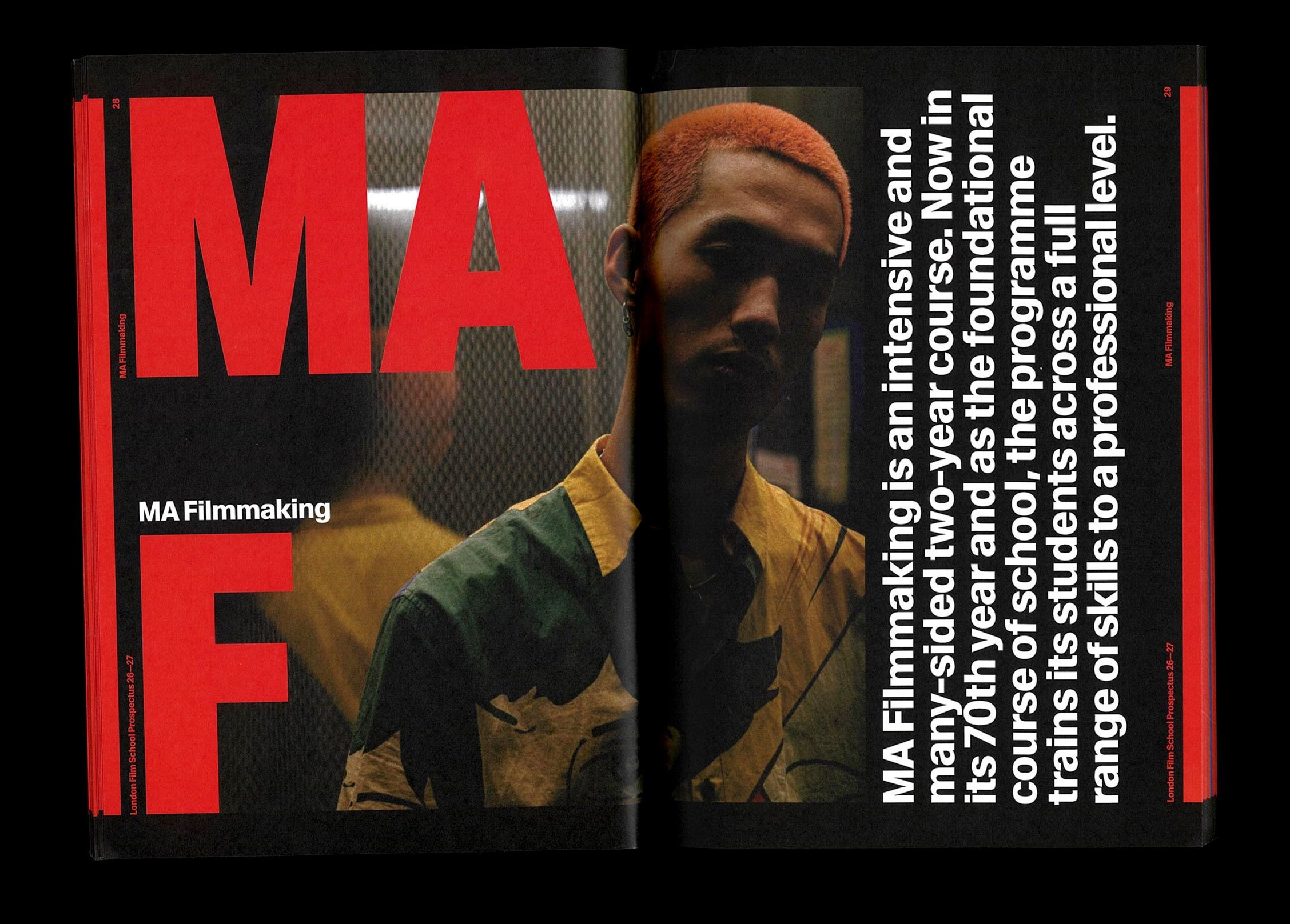
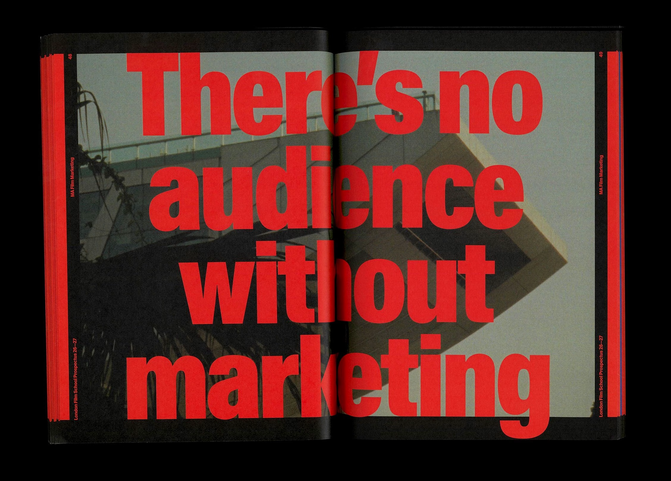
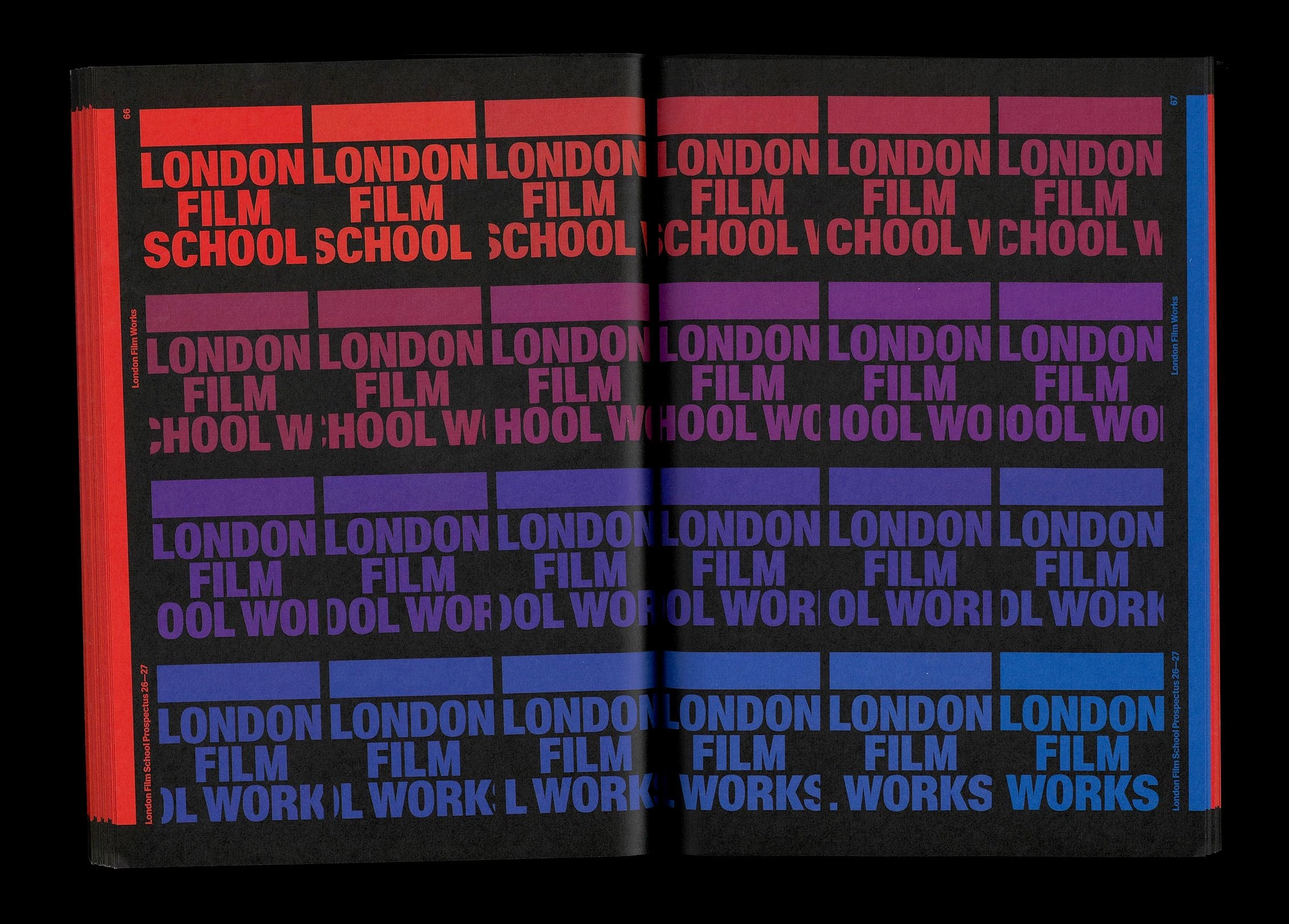
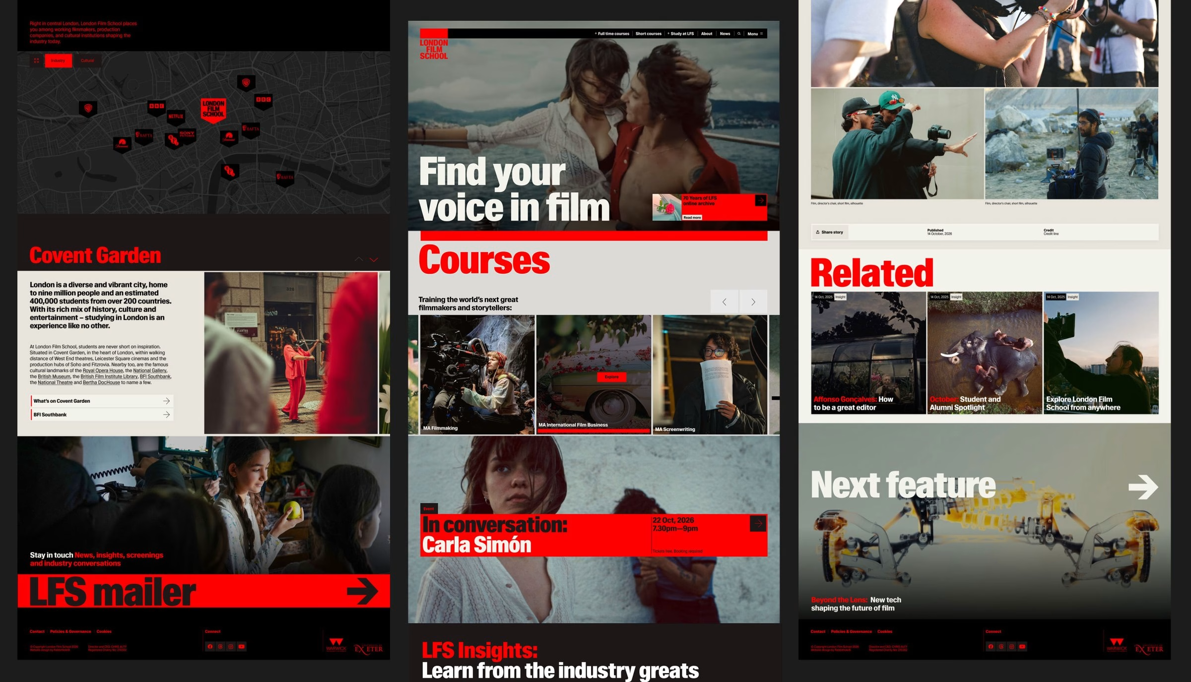
The LFS website had become a barrier to attracting talent and applications. As the primary touchpoint for prospective students worldwide, the outdated, cluttered site was undermining the school's reputation. Redesigned and built in-house at Rabbithole, the new site puts courses, student work and alumni front and centre on desktop and mobile, positioning LFS as a world-leading school for the next generation of filmmakers and storytellers.
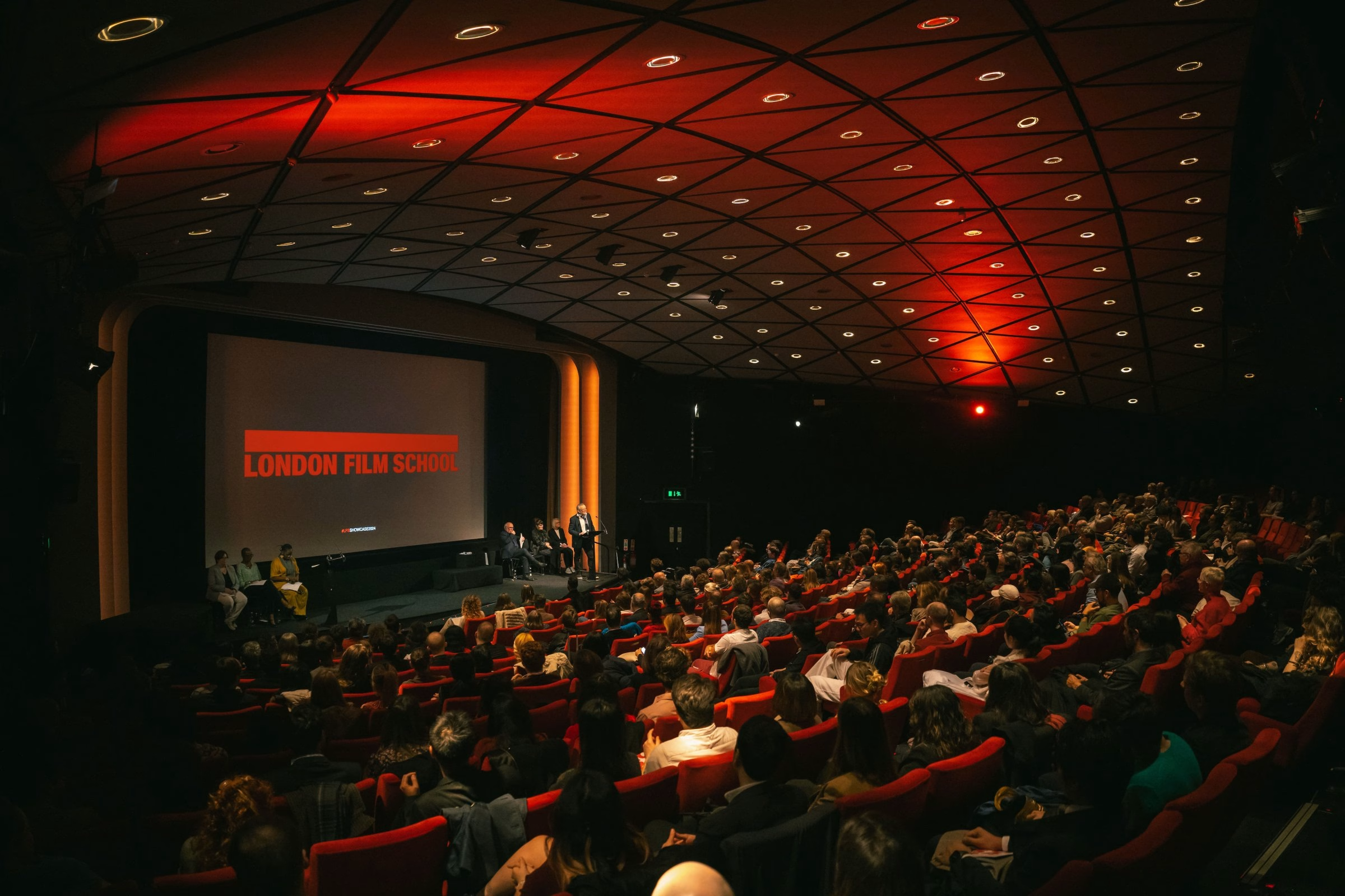
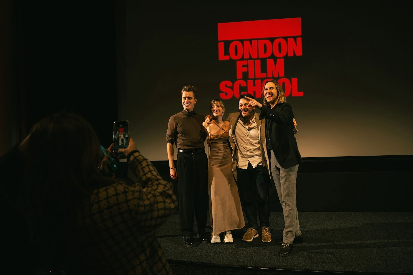
The identity is already at work inside the school's own cinema, where the red-framed logotype fills the screen ahead of screenings and on-stage events. For Holly Blake, Head of Marketing at London Film School, the outcome feels both forward-facing and true to the institution's heritage. She credits Rabbithole's care, curiosity and consistent, transparent communication for making a complex project feel manageable and fun.
Credits: Rabbithole
Brand Identity, Website & Marketing Design: Rabbithole
More in Brand Identity
Stay on top of this week's design. Insights, top picks & more.