Plus

 Menu


Never Thought Studio
October 22, 2026
Mindsparkle Mag


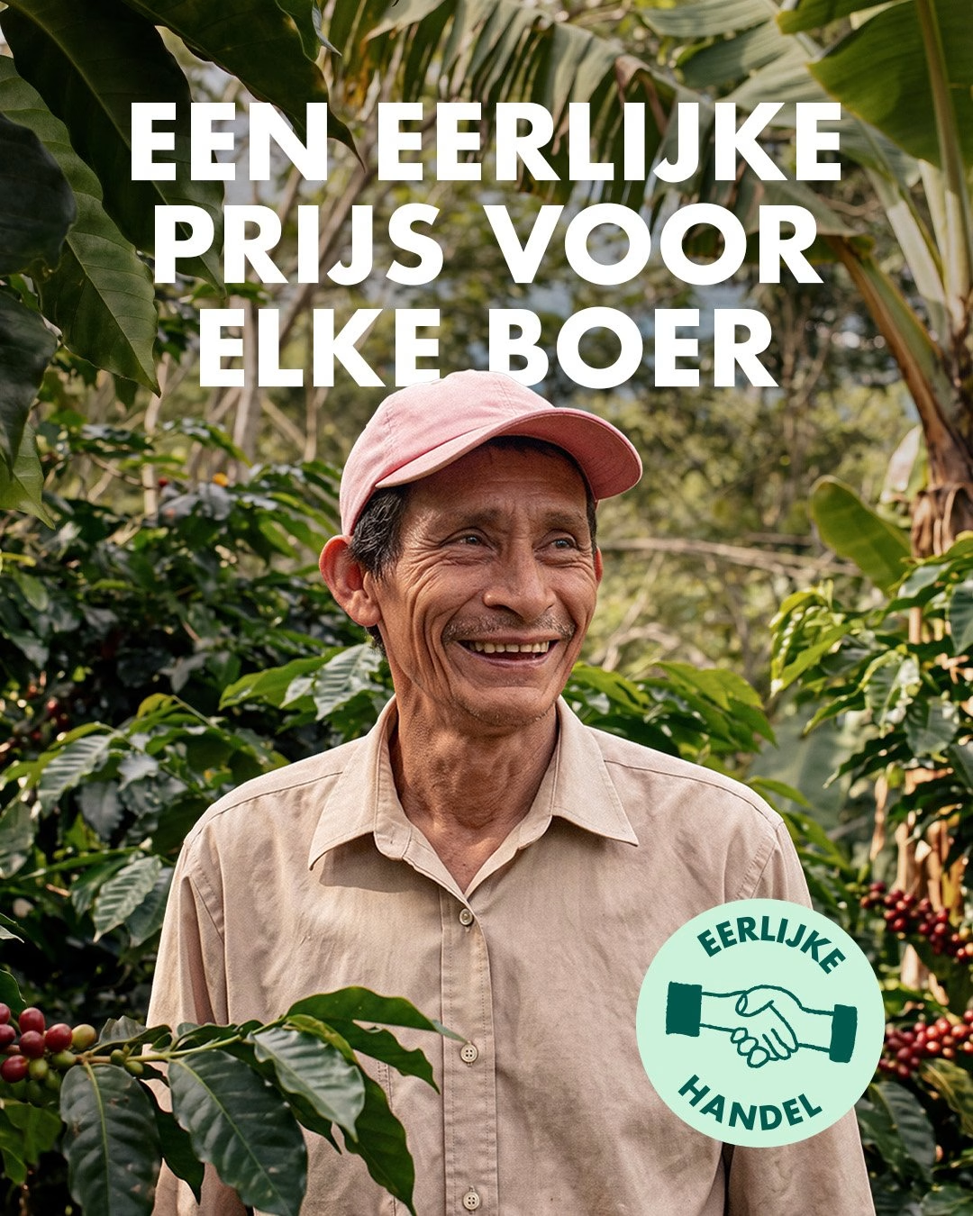
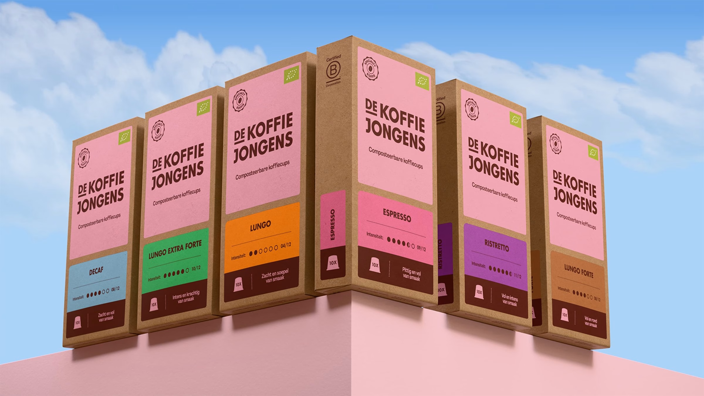
De Koffiejongens built its name online, delivering organic coffee in fully compostable capsules to subscribers' doormats across the Netherlands. The Dutch scale-up buys its specialty coffee directly from farmers it knows personally in Africa, Asia and South America, where the beans grow between avocado and banana plants. When the brand moved into retail in 2025, Amsterdam-based Never Thought Studio was brought in to refresh the packaging, and the job grew into a full rebrand that launched in more than 900 Albert Heijn stores in September 2026.
On the shelf, the original identity struggled to hold attention. Its soft pastels and kraft paper had made the brand recognisable online, but next to darker competitors fighting for the same three seconds, the packs faded away, with small type, lots of white space and almost no branded elements. The brief came with one firm condition: the loyal customer base, mostly in their fifties and many of them won through newspaper ads, could not be lost, so the new look had to read as an evolution rather than a new brand.
The studio started with the logo, redrawing it on the structure of the old one while correcting its alignment and modernising the lettering on the basis of Futura. Because Futura was already the brand's main typeface, the founders recognised it instantly, and a German version of the wordmark followed the same rules for the brand's launch in Germany. Futura stays as the headline face, now set only in bold capitals, while Agrandir Narrow adds contrast, playfulness and character further down the hierarchy.
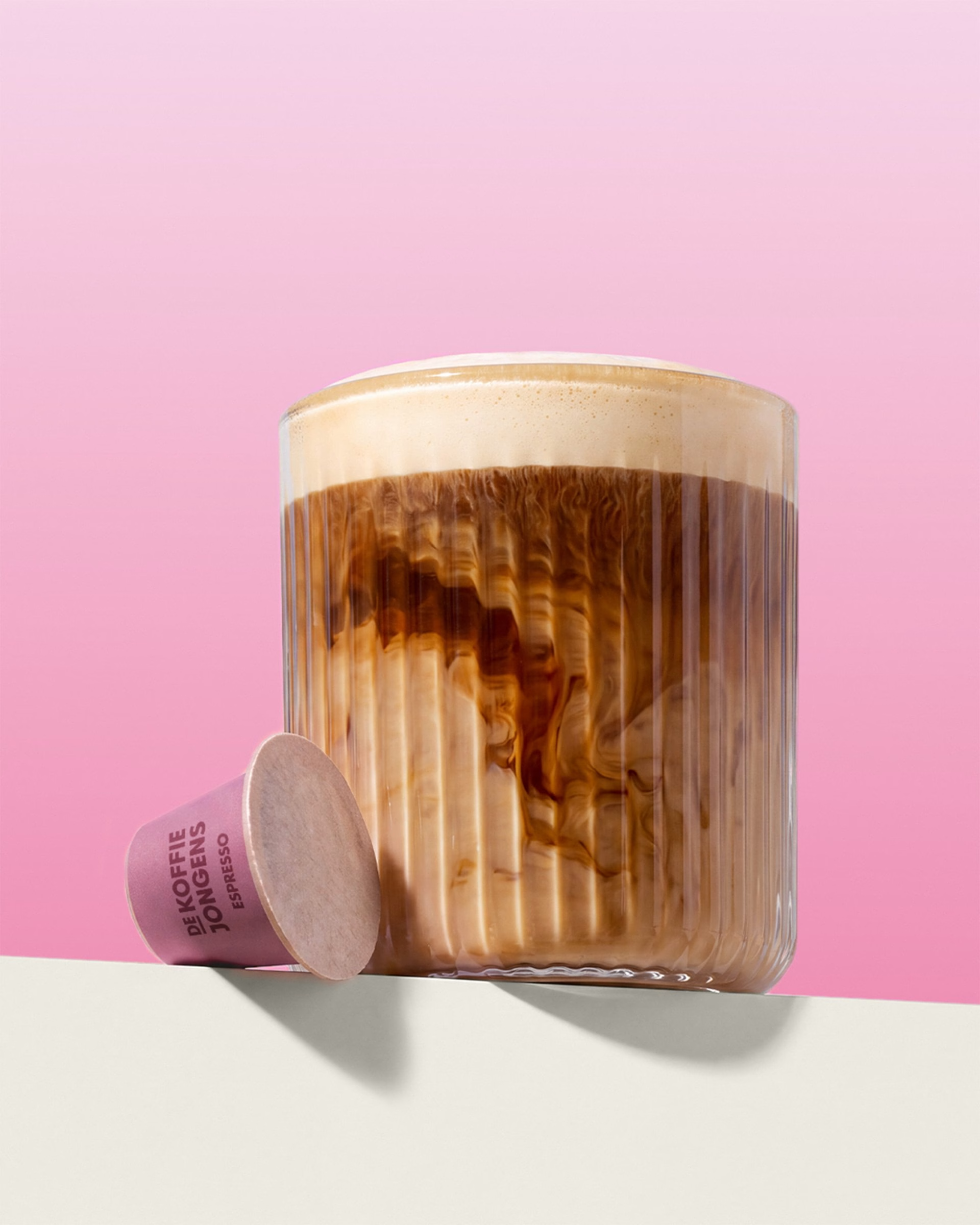
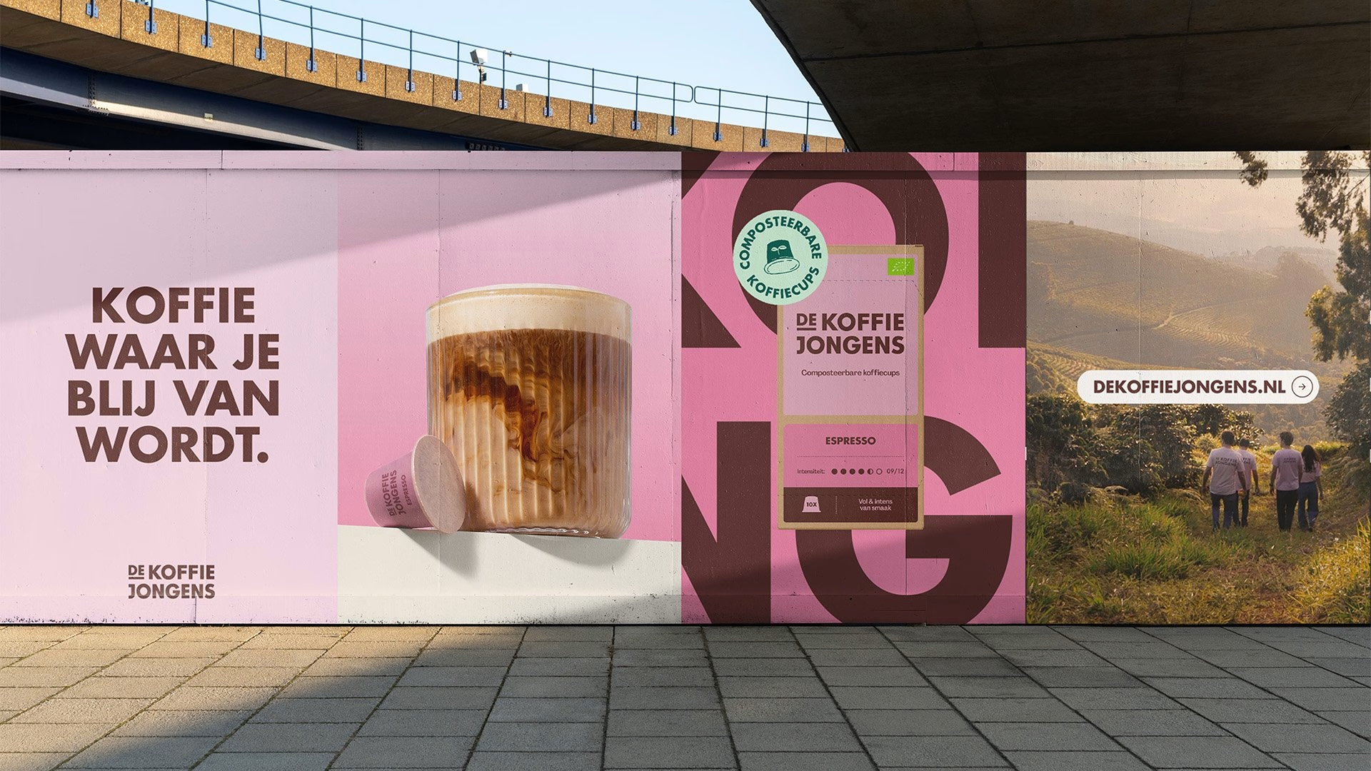
Colour remains the way to tell the flavours apart, but the faded hues were pushed to a more vibrant level and the signature pink moved to the centre of the brand. Harsh black was swapped for a roasted coffee bean brown that ties the palette back to the product itself. The new packaging system splits the front of every pack along Fibonacci ratios: a pink top section carries the logo, the specialty coffee label and the organic certification, while the lower section belongs to the flavour.
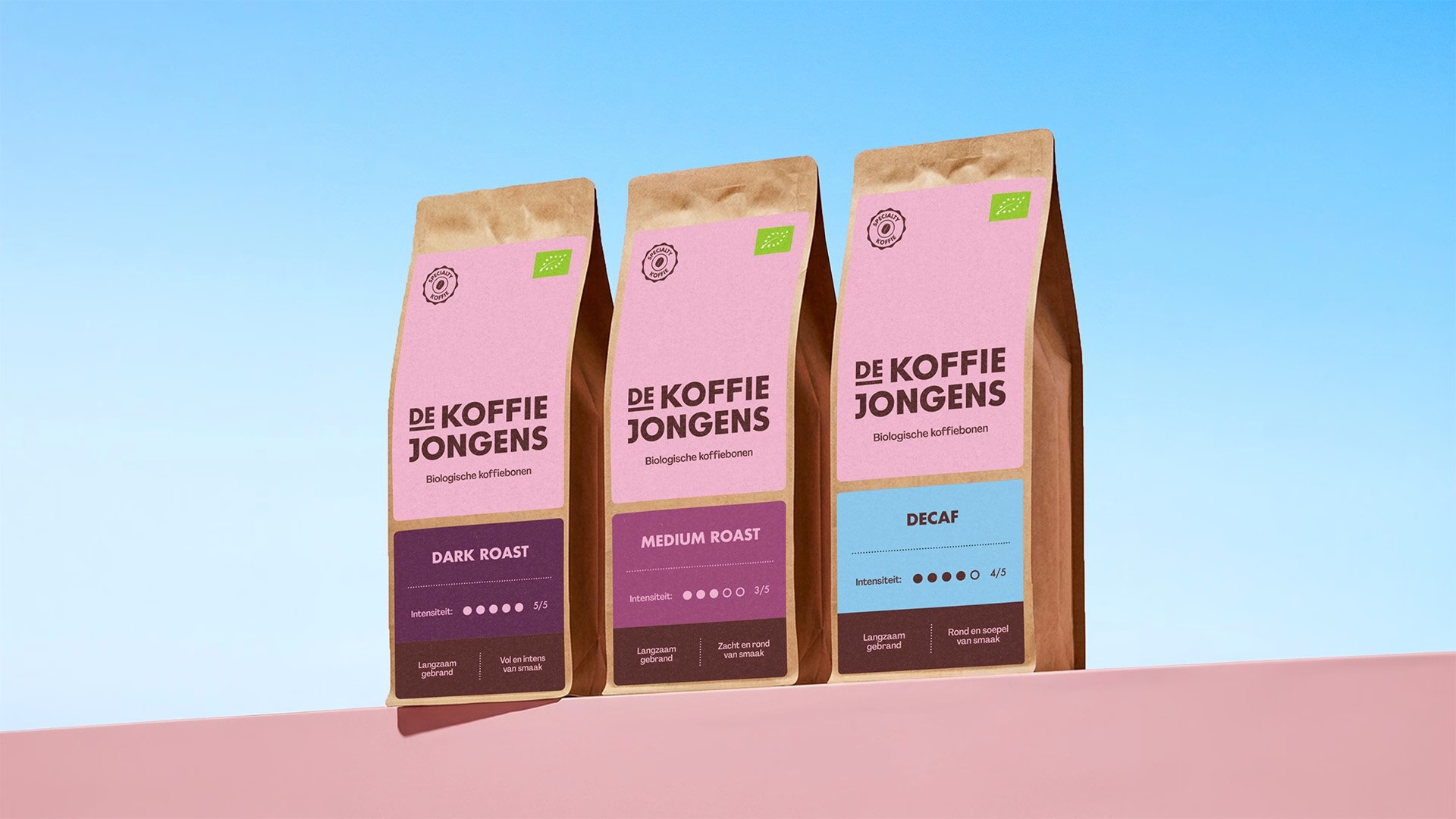
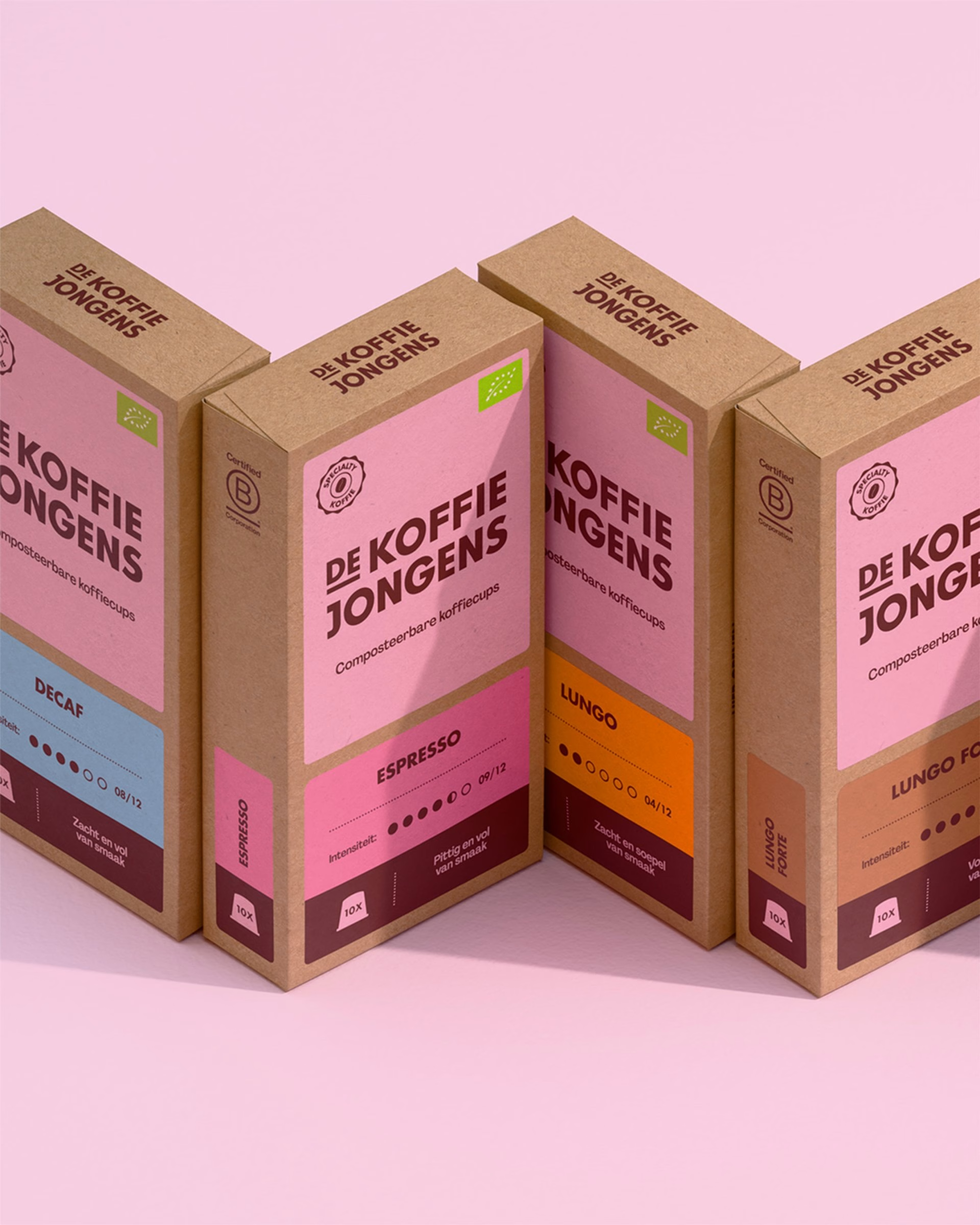
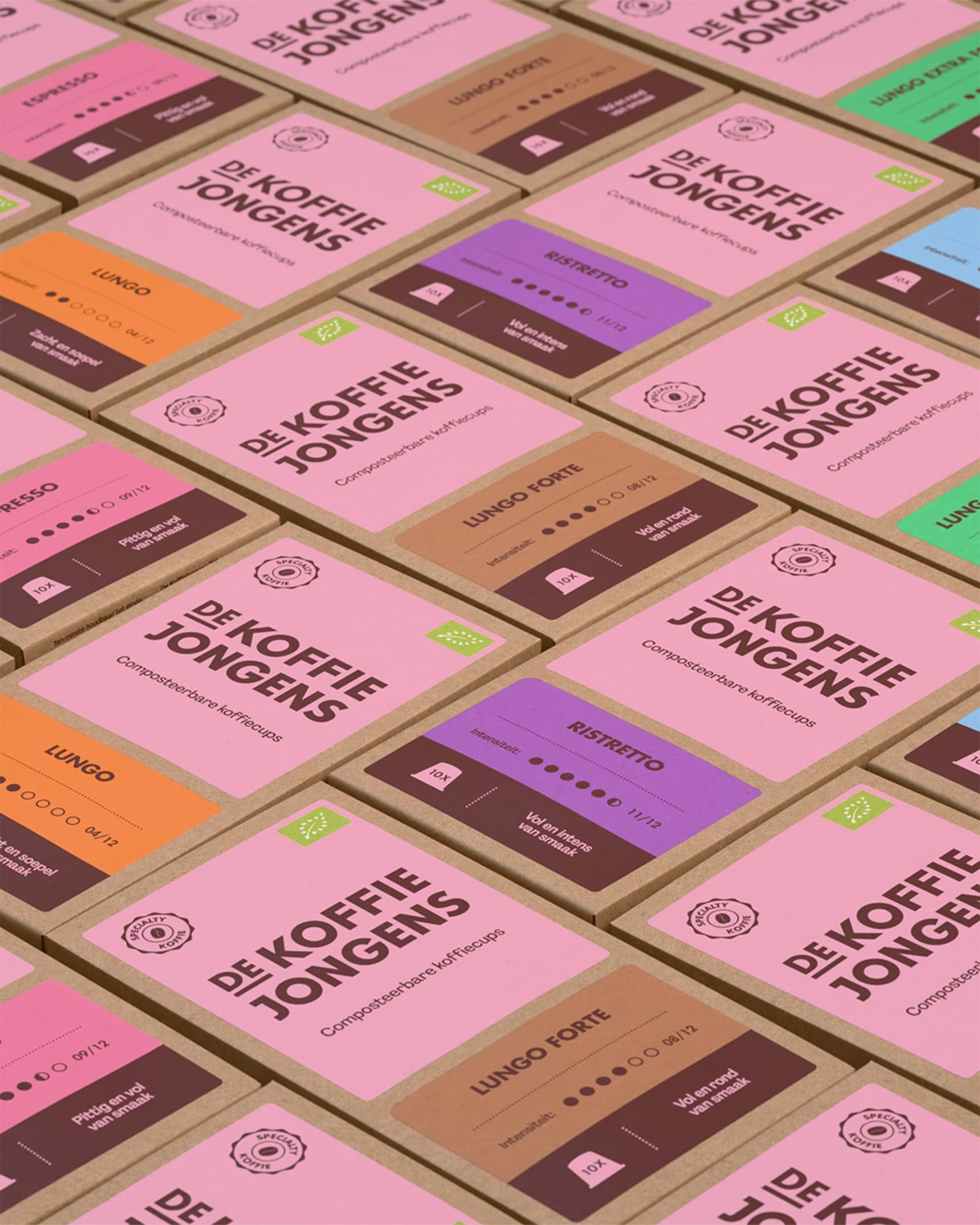
At the bottom of each flavour block sits that coffee bean brown, standing in for the soil where the coffee grows and where the compostable capsule eventually returns. To tell the rest of that story, Never Thought Studio drew the coffee's journey by hand, from the bean in the jungle to the cup, in a style that matches the brand's warmth. The system is responsive enough that the whole bean bags slot into the range as a distinct product while still clearly belonging to the same family.
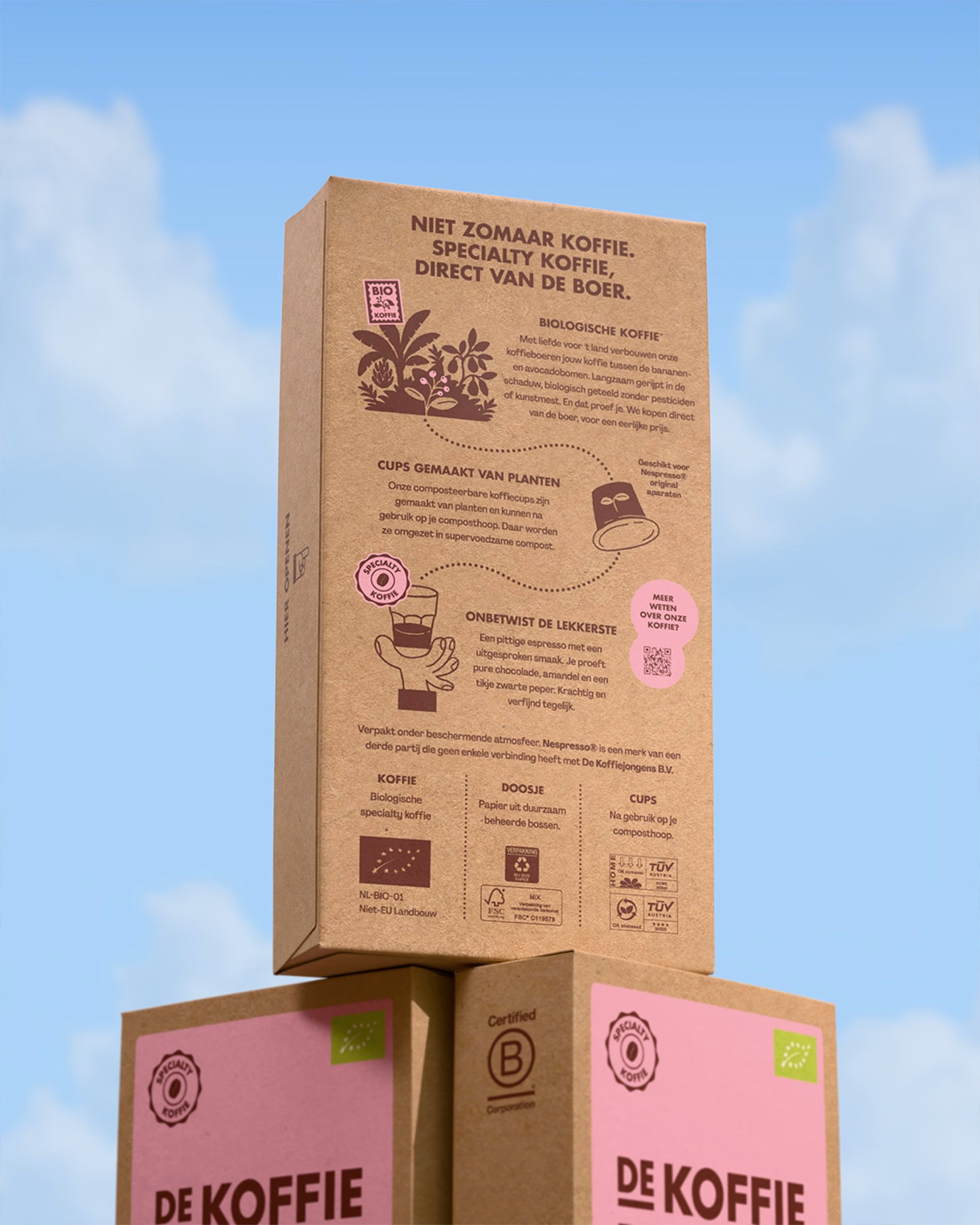
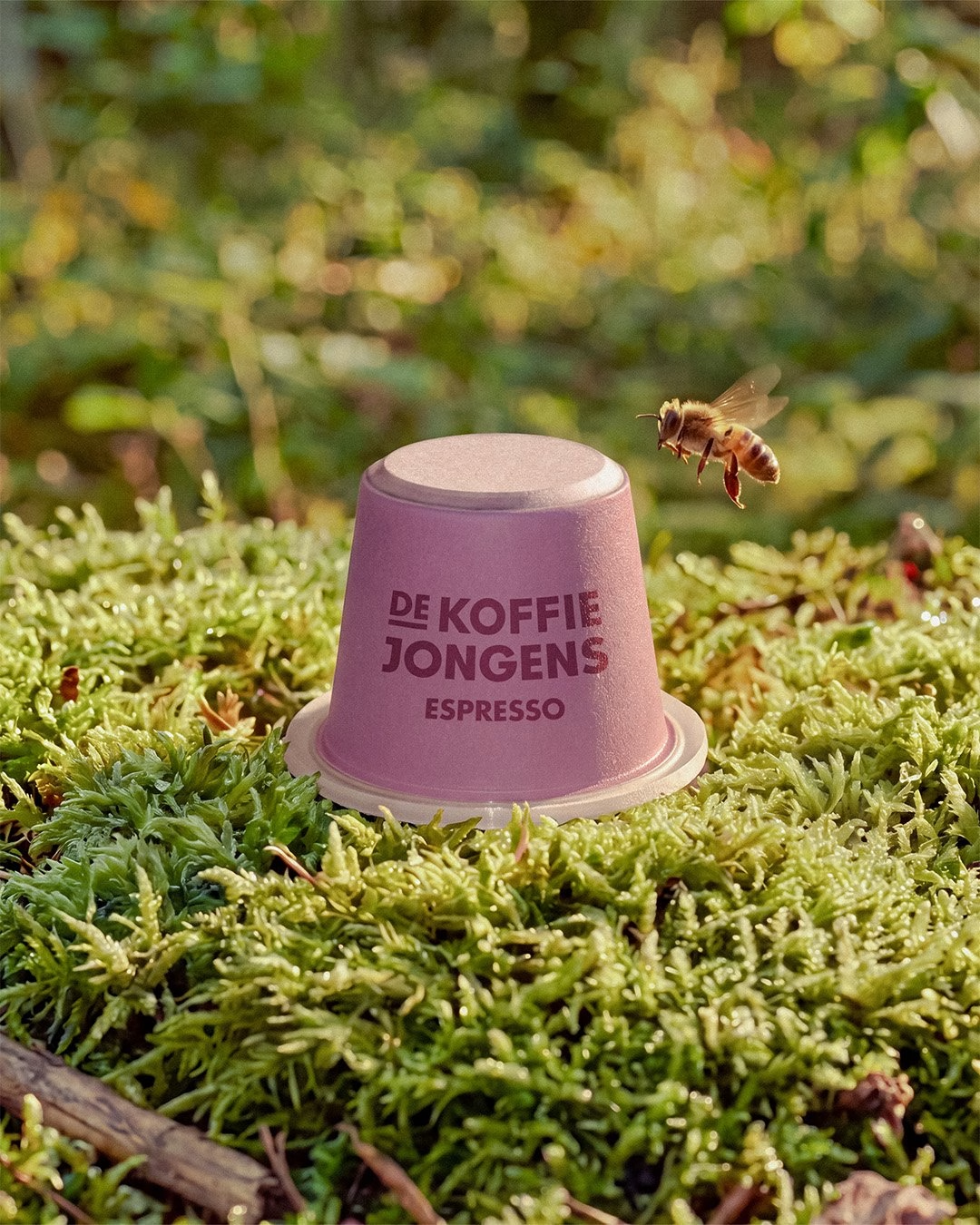
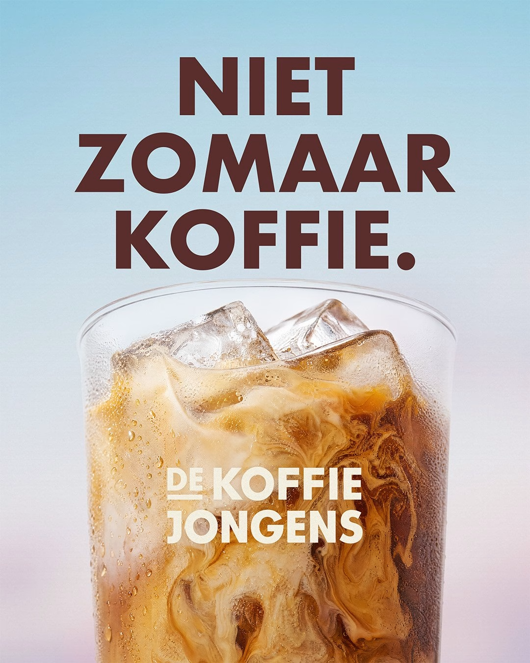
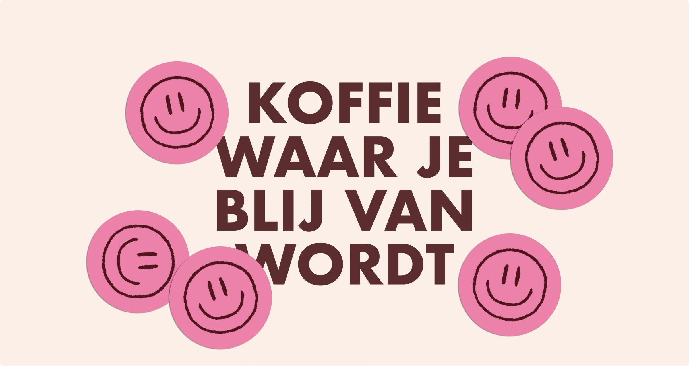
Beyond the shelf, the identity stretches across digital ads, outdoor campaigns, merchandise and social media, with each communication topic given its own use of colour and a supporting label. The art direction pairs vibrant studio photography of the product with documentary images of the farmers and the process behind the coffee. Together with the familiar pink and the bold Futura headlines, the result is a brand that holds its own in the coffee aisle and still feels unmistakably like De Koffiejongens.
Unlock everything with Mindsparkle Mag Plus.
Get exclusive access to Premium features:
Credits: Never Thought Studio
Brand Identity & Packaging Design: Never Thought Studio
3D Renders: Jasper van Doorn
More in Coffee Branding
Includes freebie bundle, unseen BTS insights and more.