Plus

 Menu


Area.Studio
October 30, 2026
Mindsparkle Mag


LOVO is the new consumer brand of Nutri, an egg producer rooted in a collective of farming families. Area.Studio developed its visual identity and packaging concept, supporting the company's move from a producer name to a brand that speaks to shoppers directly. The transition from Nutri to LOVO set out to build a closer connection with consumers, change how they see an everyday staple and leave room for new products.
Eggs sit in an aisle dominated by private labels, where cartons look alike and price usually decides. The ambition was to give people a fresh reason to choose the brand without losing the trust and simplicity shoppers expect from a staple. The new visual identity had to catch the eye on the shelf while tying the whole range together through one recognisable visual language.
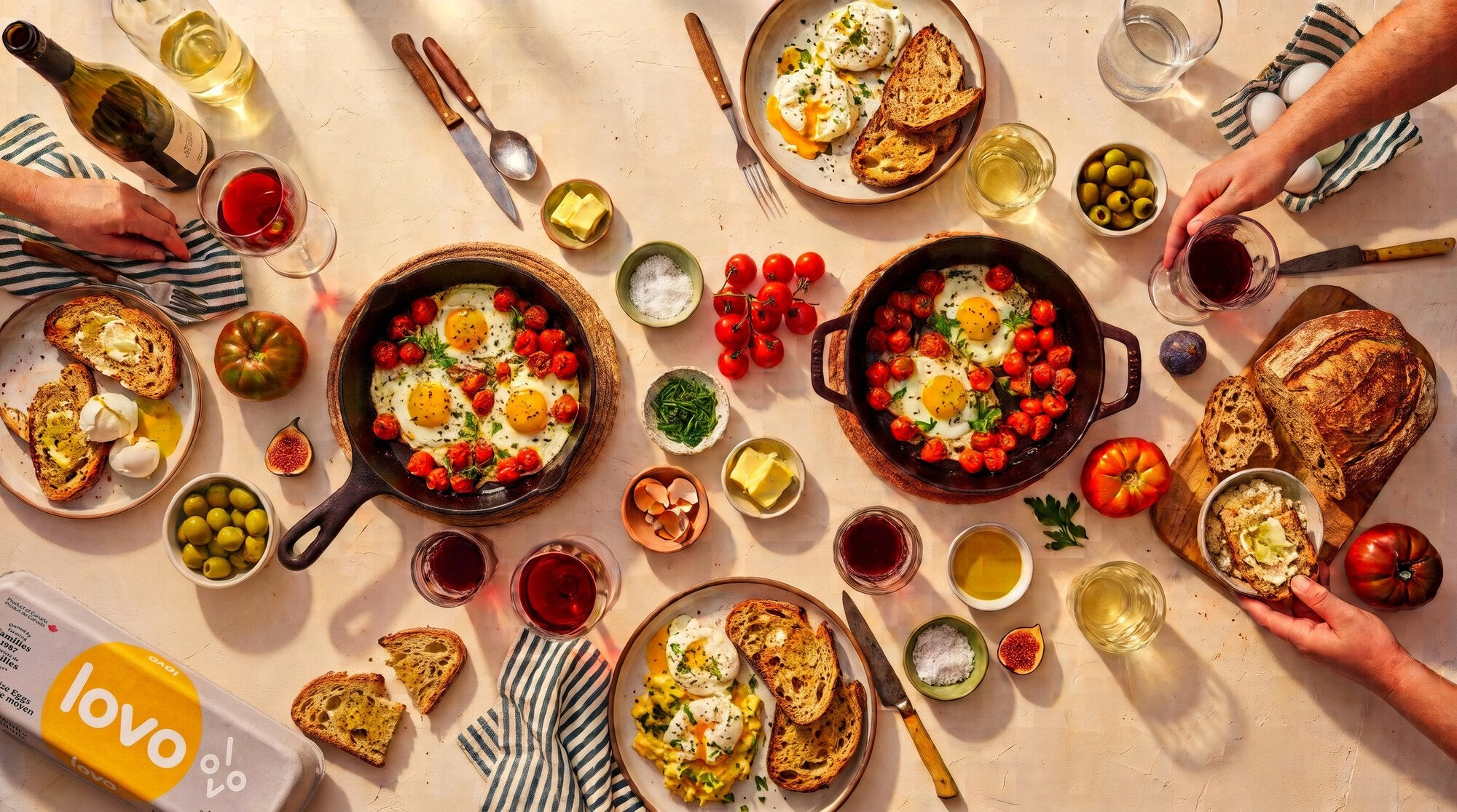
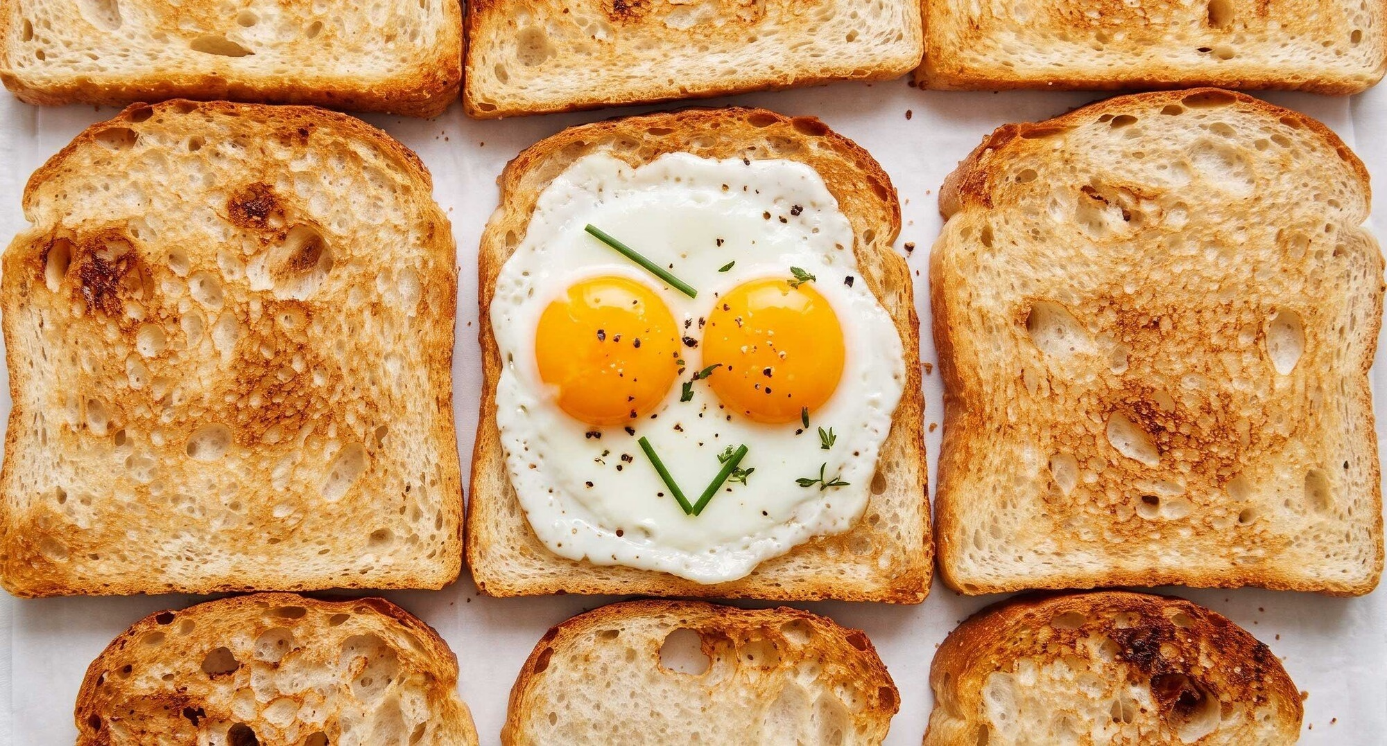
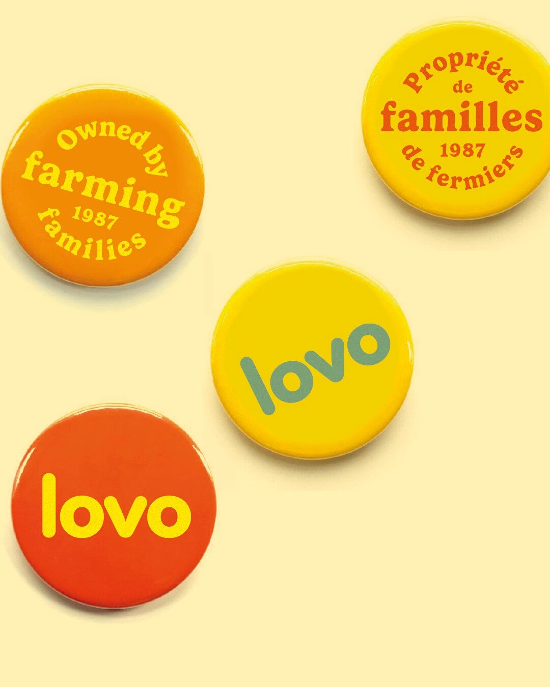
At the centre of the system sits a playful logo that became the thread tying everything else together. It comes alive through a logo animation system, while a rolling-egg motion piece turns the product's own shape into the brand's signature movement. A warm, bold colour palette carries across every format, with Gelica setting a friendly tone next to the more neutral Inter.
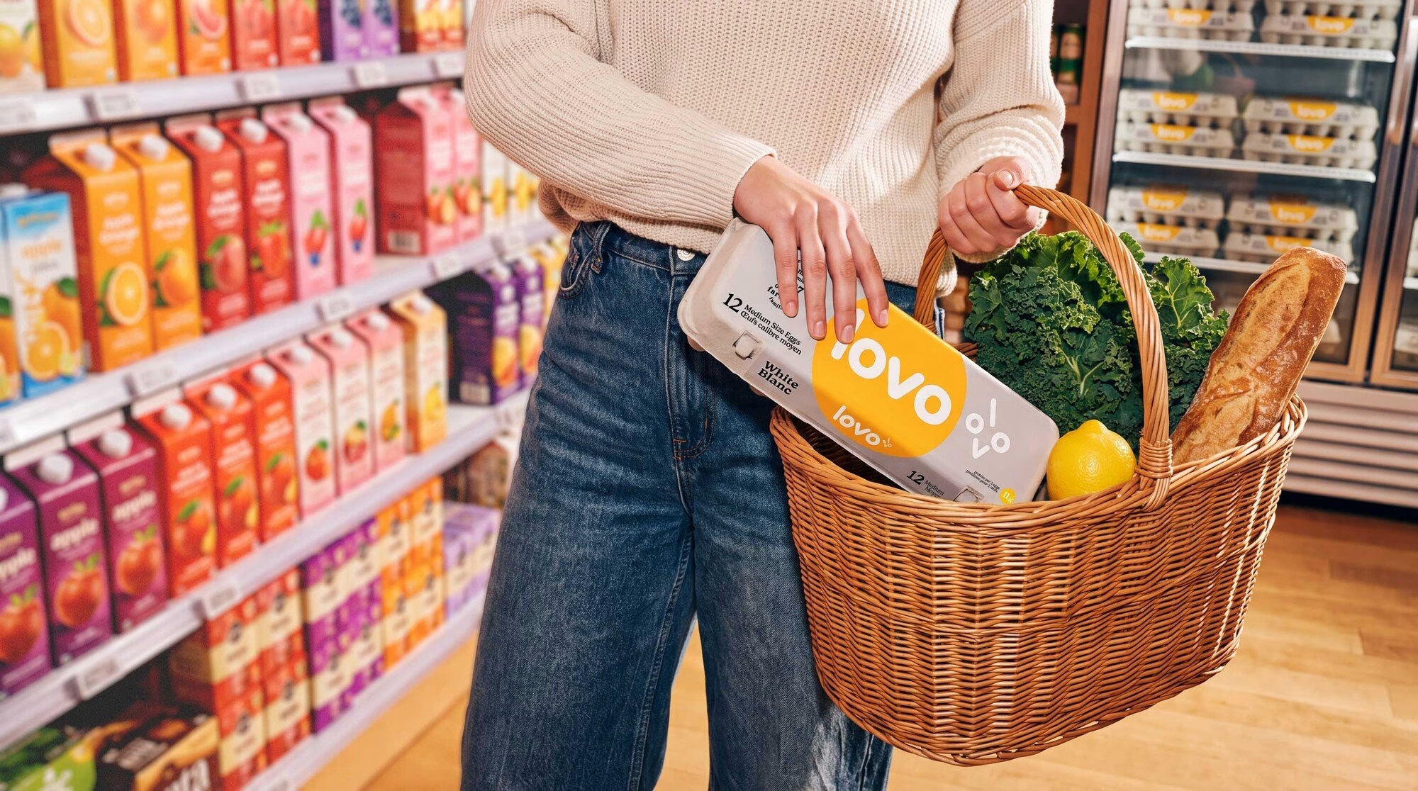
On the shelf, the packaging concept gives LOVO a presence of its own in the egg aisle. The cartons bring continuity across the range while staying clear and familiar for customers who knew the product under the Nutri name. Brand guidelines and digital loops then set out how the system flexes, so it can stretch into new products without losing its character.
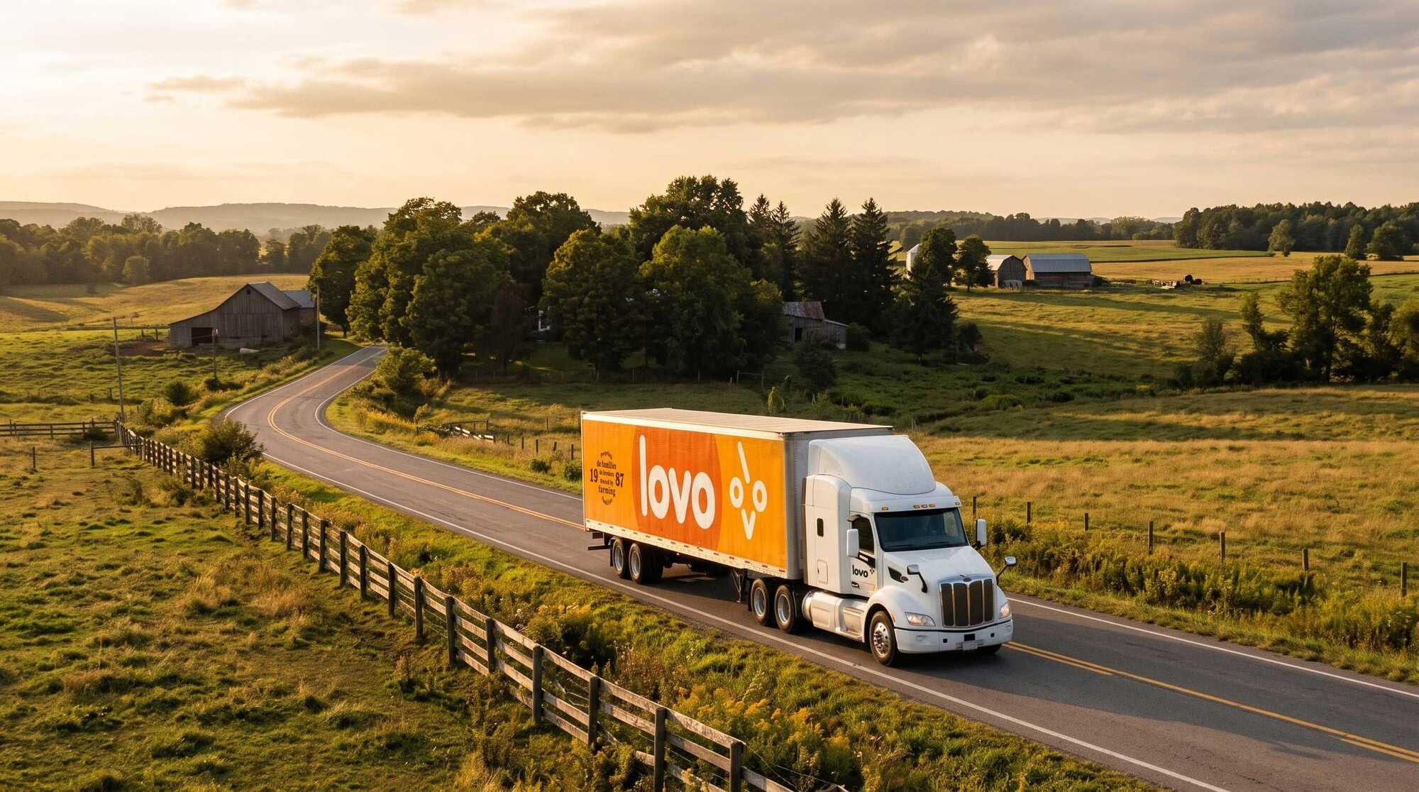
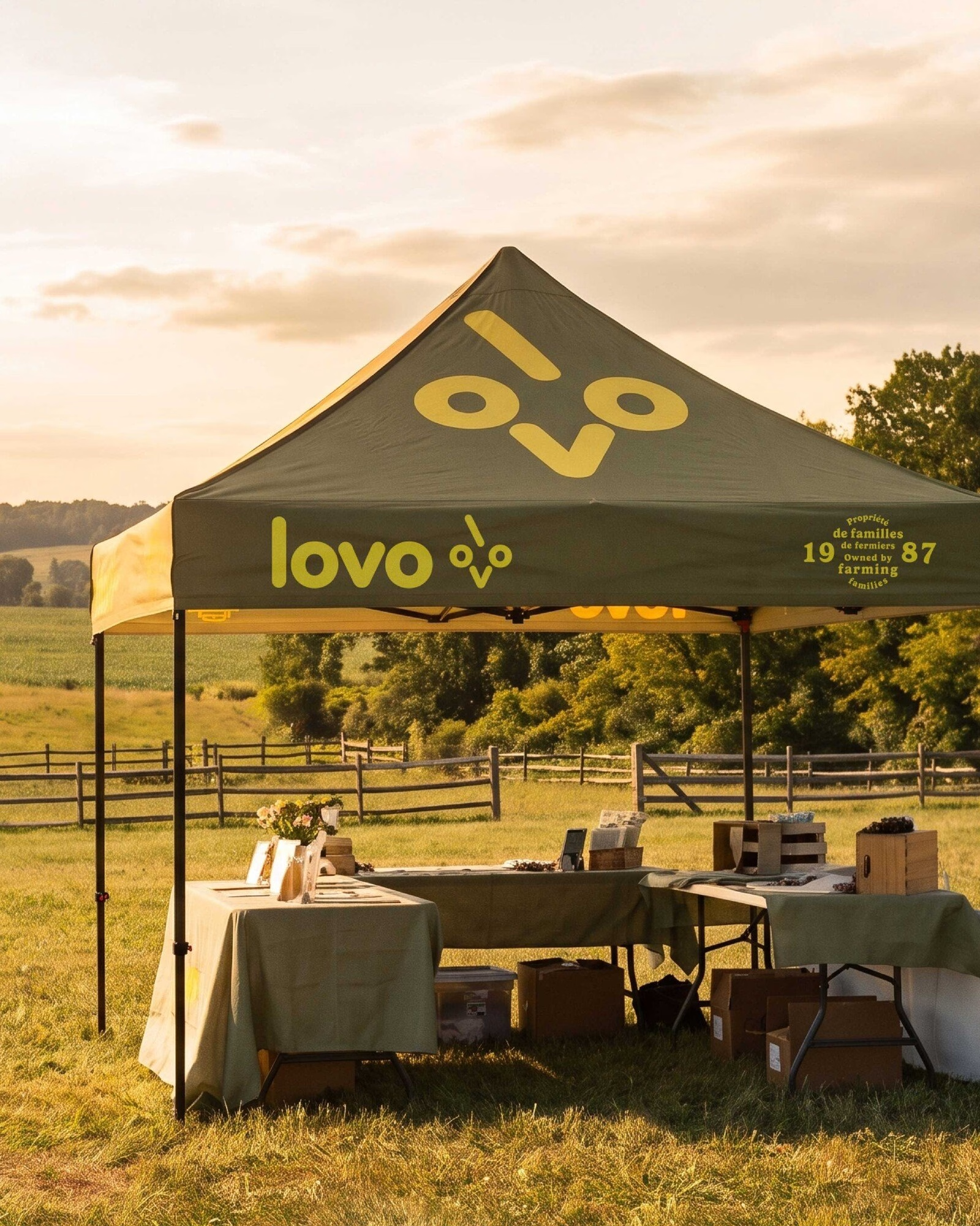
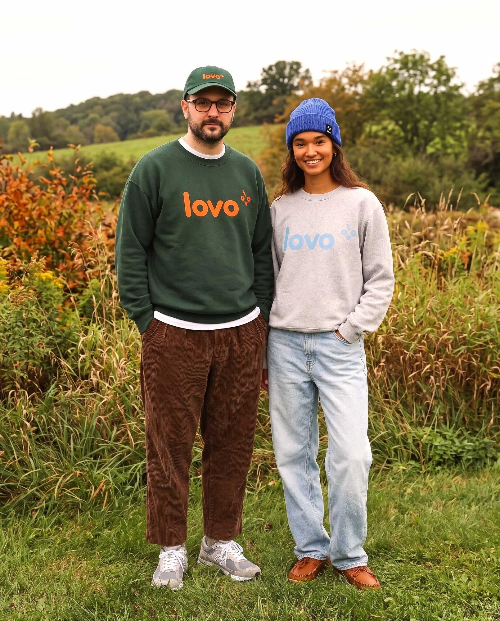
Beyond packaging, the identity extends into communication materials, apparel, promotional items, warehouse signage and a delivery truck. Each application carries the brand into a different context, from a promotional tent and aprons to clothing worn out in the field. Together they connect what consumers see in the store with the spaces and materials used by the teams behind the eggs.

On social, the same visual language runs through carousels and food photography that put eggs back at the centre of the table. The result is a visual transformation that brings LOVO closer to consumers and gives an everyday product a more engaging presence. It also leaves the brand plenty of room to grow as the range expands.
Unlock everything with Mindsparkle Mag Plus.
Get exclusive access to Premium features:
Credits: Area.Studio
Brand Identity & Packaging Concept: Area.Studio
Creative Direction, Brand Identity & Packaging Concept: Barbara Jacques
Creative Direction & Packaging Concept: Louis Chapdelaine
Packaging Adaptation: Pigeon
Copywriting & Naming: Amandine Léveillé
Copywriting & Naming: David Purkis
Strategy: Nathalie Houle
VP Corporate Strategy & Development, LOVO: Benoît Bessette
More in Food & Beverage Branding
Stay on top of this week's design. Insights, top picks & more.