 Plus
Plus

 Menu
Menu


Mindsparkle Mag
October 08, 2026
Mindsparkle Mag


A festival brand identity has to make sound visible months before a single note is played. It shows up first on a line-up poster, then on tickets, wristbands, stage screens, flags and the merch people take home, so it carries the whole promise of the weekend long before anyone arrives. The best ones do more than decorate a date and a list of names: they turn the music itself into a system that can move, grow and come back every year without getting stale.
This edition of the Top 10 series looks for exactly that. Every project below is built on one clear idea that comes from the festival's music, its place or its name, and every one is shown working across real applications, from code-driven type and 3D emblems to letters the size of buildings. The selection mixes identities from across the music and festival branding collection on Mindsparkle Mag with standout work from studios in Rotterdam, London, Montréal, Brisbane, Istanbul and beyond.
Each entry opens with the strongest piece of the system, followed by three more views of how it behaves in the wild. Read them in order as a ranking, or skip to the festivals you know and see how their designers solved the same problem in very different ways.
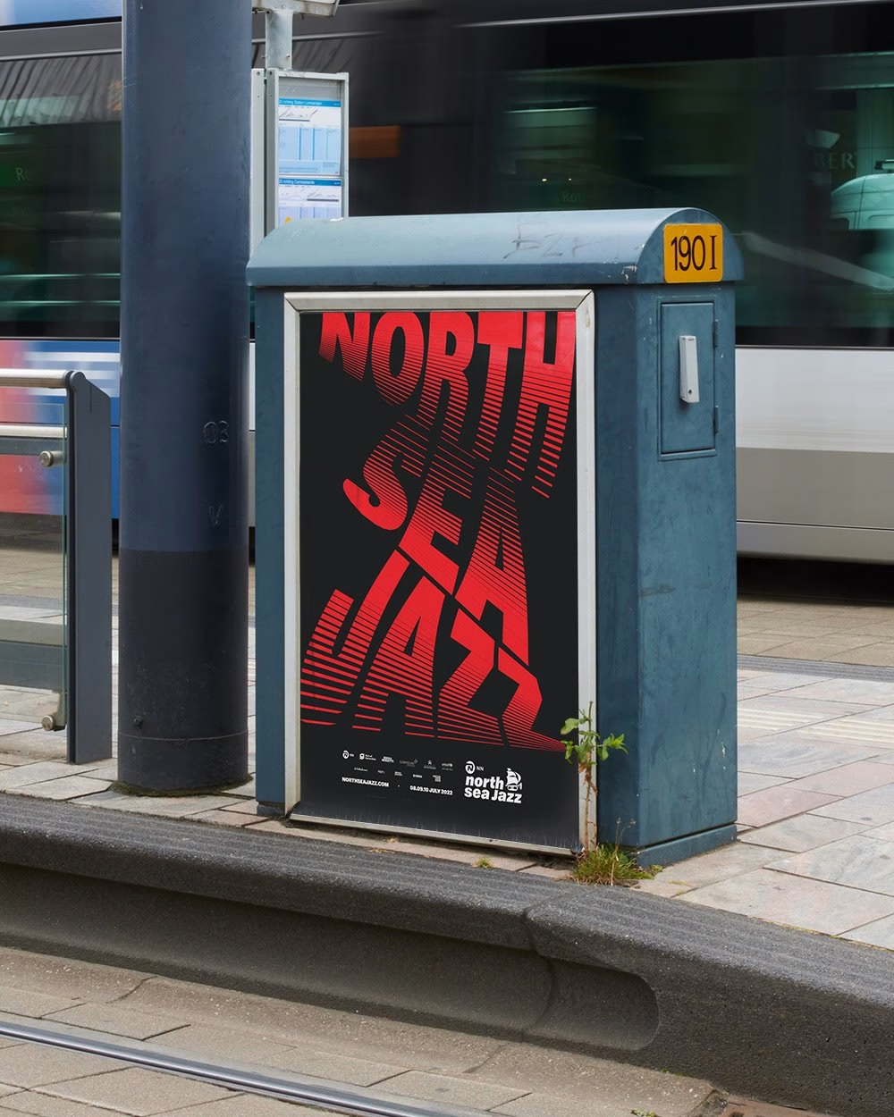
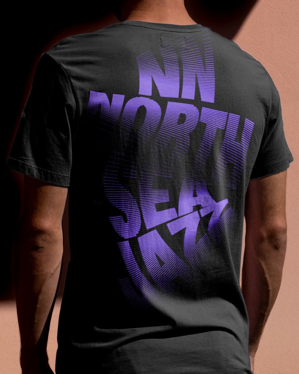
NN North Sea Jazz came out of the pandemic with a far broader programme than its name suggests, spanning jazz, fusion, hip hop, world music and R&B, and it needed an identity that could welcome new audiences without losing loyal ones. Studio Dumbar/DEPT® answered with a system built on rhythm and movement, writing custom code that makes line-ups, dates and venue details twist, flex and stretch like a soundwave. The same animations are frozen into still frames for posters, flags, brochures and T-shirts, so print carries the feeling of a live set.
The festival's famous green swash stays at the centre as the anchor, joined by high-contrast accents in red, electric blue and purple that signal a festival still evolving. Because the typography does all the work, artist names themselves become the image, and no illustrated world is needed around them. The Rotterdam identity has since been extended for the festival's 50th anniversary, which says a lot about how well a motion-first idea can age.
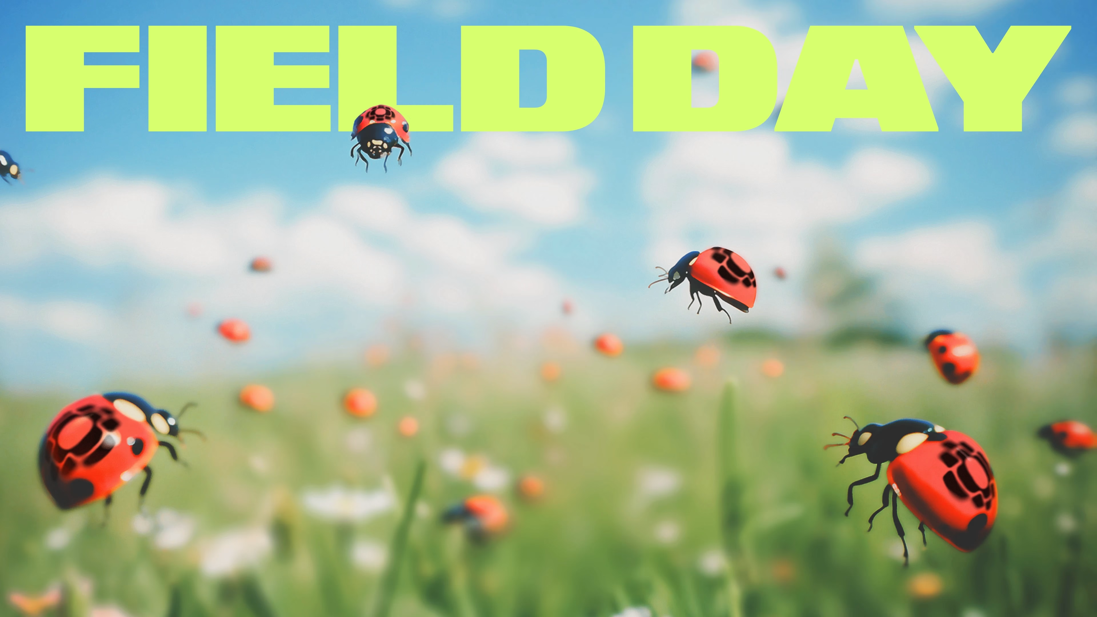
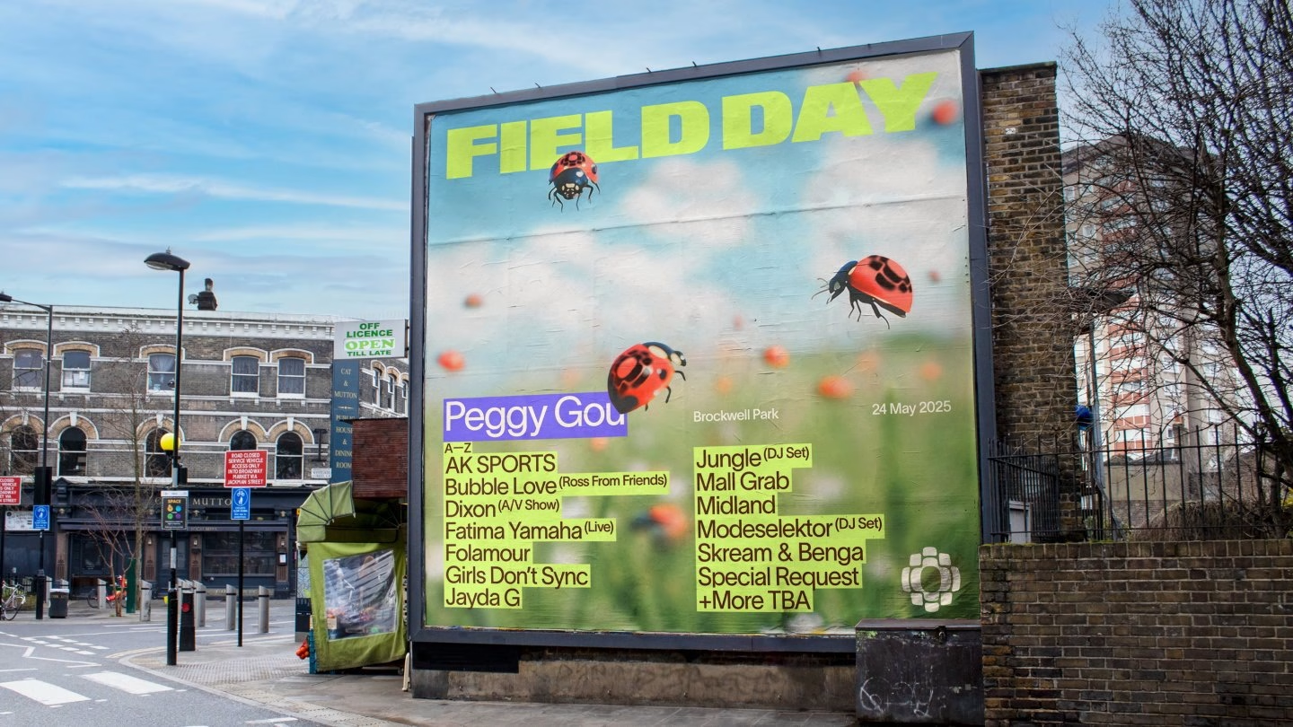
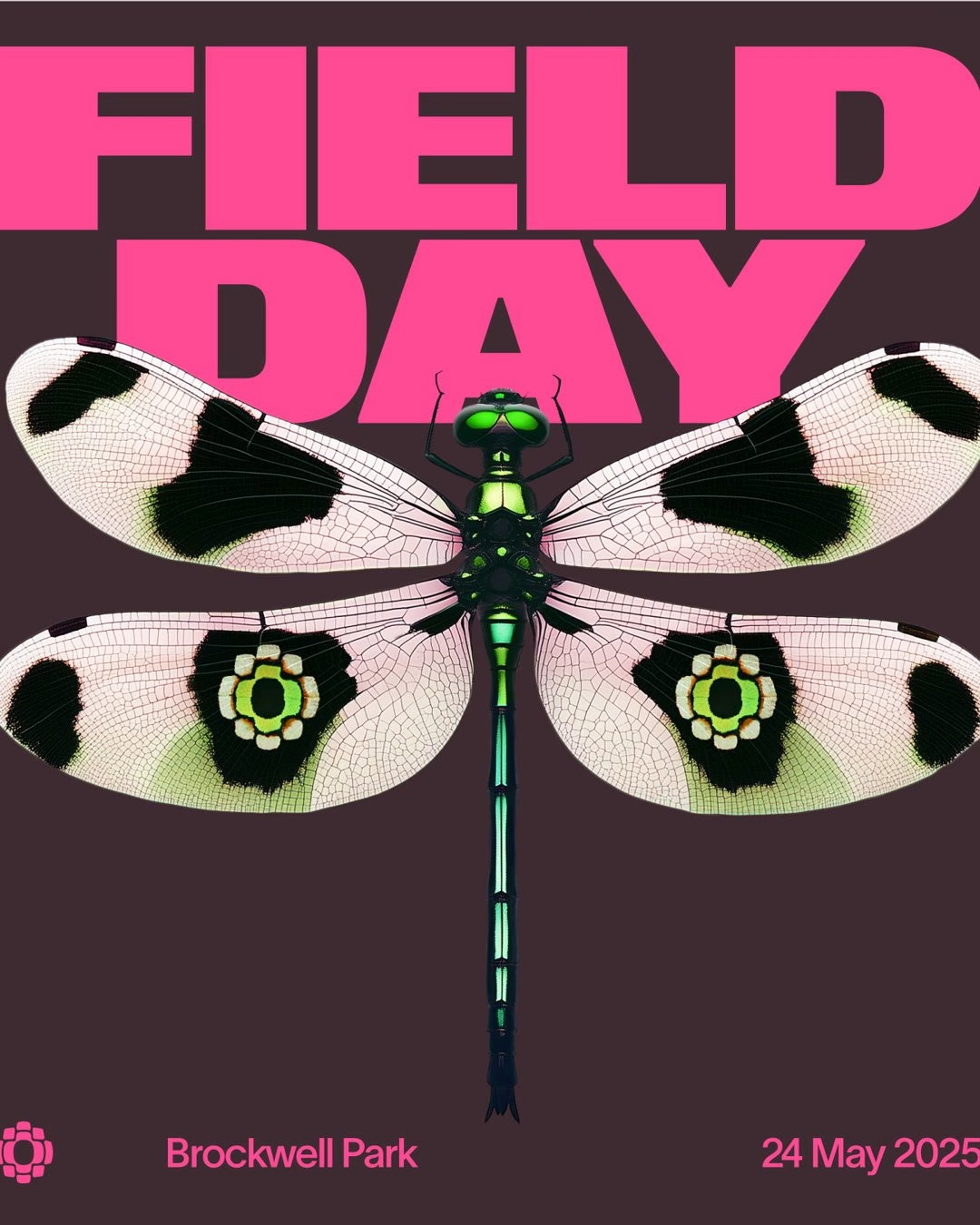
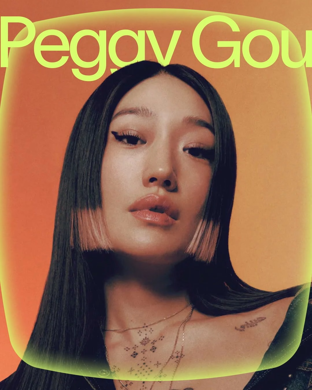
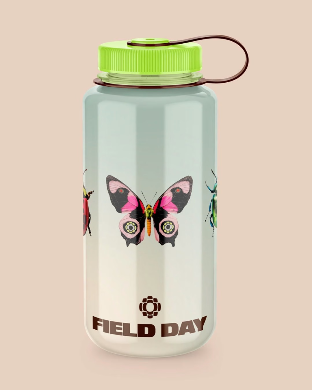
Field Day marked its 15th year and its move to Brockwell Park with a full rethink by Studio NARI, and the London electronic festival got a central marque for the very first time. The studio built the identity around an idea it calls Reactive Future, where the wordmark stays fixed while the visual world around it changes with each edition. That gives the festival something it never had before, a constant to recognise, plus permission to reinvent itself every summer.
For 2025 the marque was fused onto insect-like creatures that seem to live in the park's undergrowth, a direct way of announcing the new location. Soft gradients suggest a fresh start, while hyper-bright accents echo the fast tempo of the music on stage. Modular platforms that range from single furniture-like pieces to stage-sized blocks carry the system across the site, so the identity reads as a place as much as a poster.
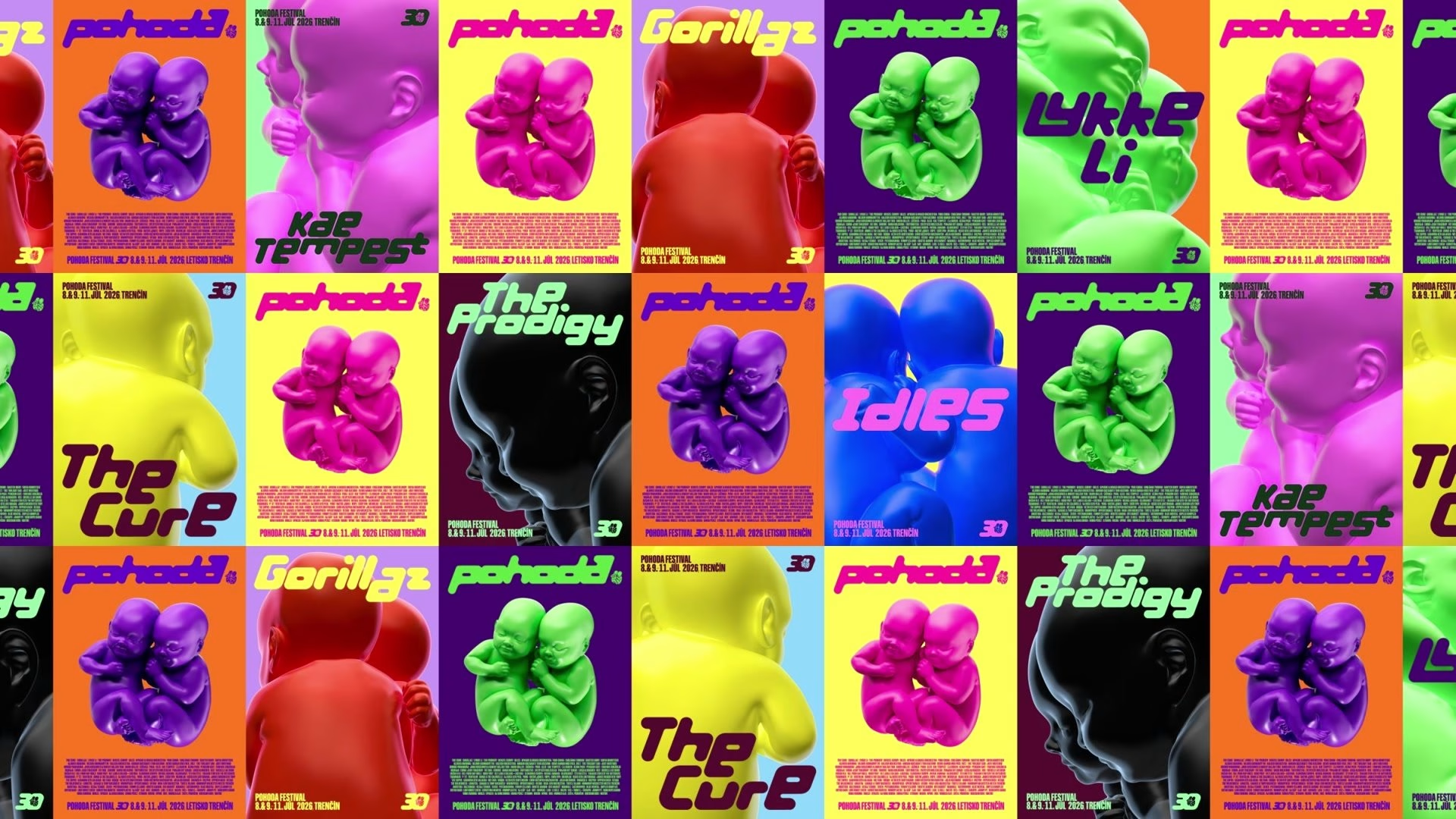
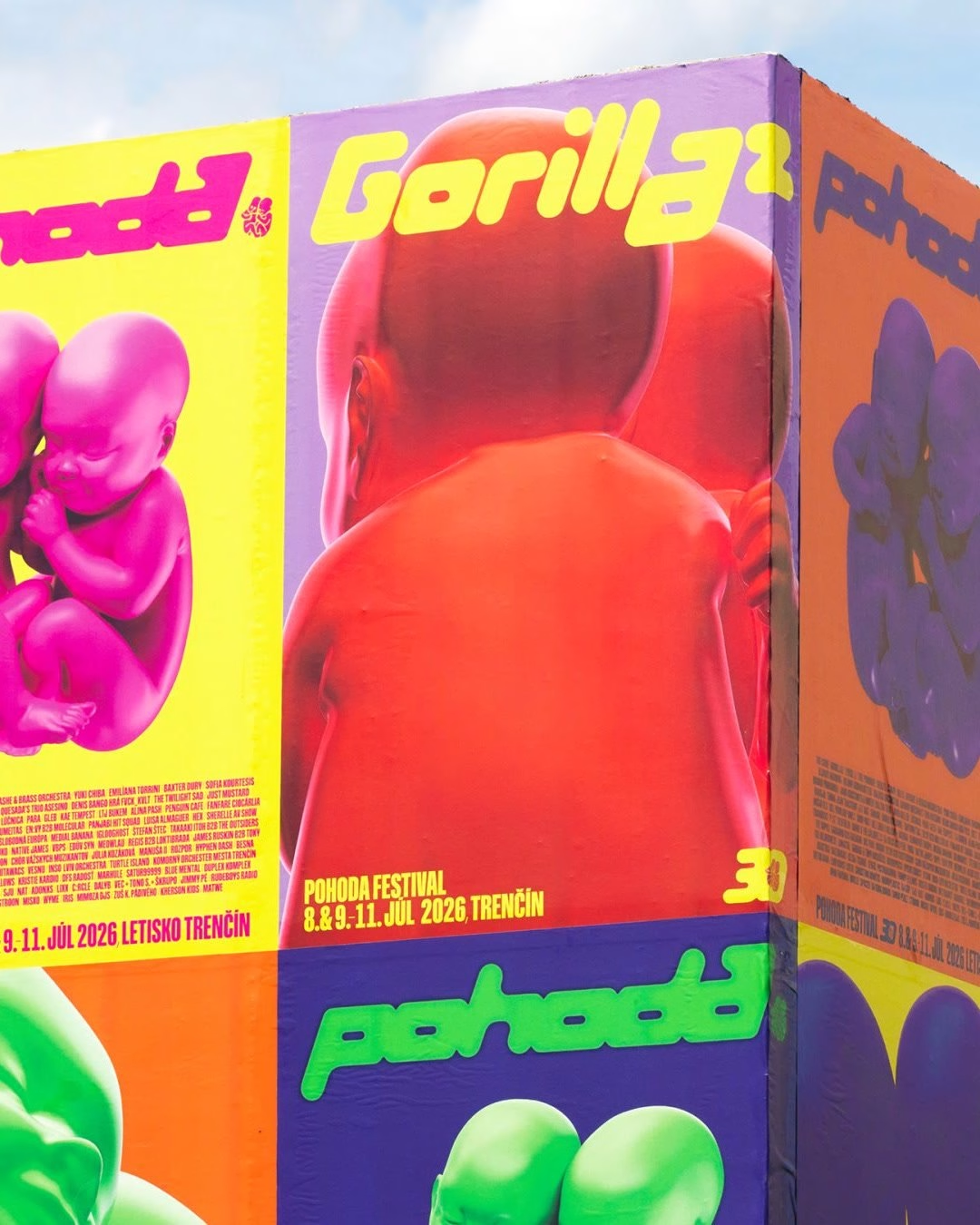
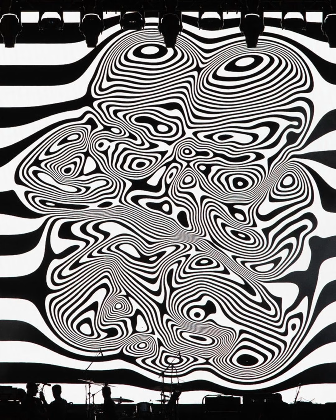
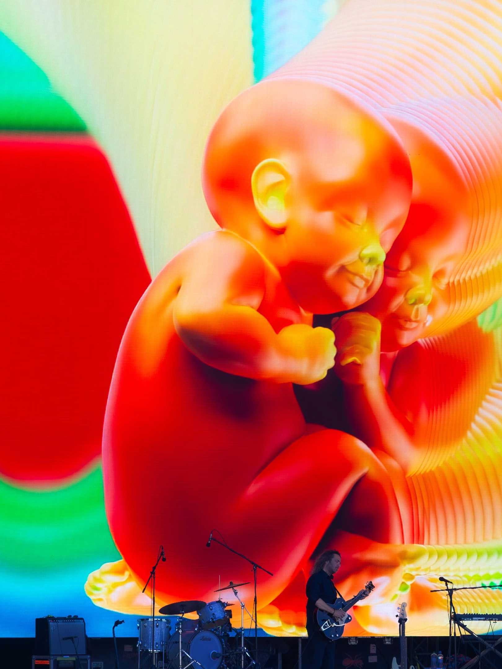
Pohoda Festival has used the same emblem for almost three decades: two babies resting side by side, a picture of the Slovak word pohoda, a feeling of ease and togetherness. For the 30th edition of the Trenčín festival, Andrej & Andrej went back to the 1997 poster photograph that started it all and rebuilt the pair as a 3D model, giving volume to a mark that had only ever been a silhouette. It is a rare case of a heritage symbol becoming more flexible with age instead of more fragile.
In use the babies keep changing material, colour, texture and level of abstraction, so one logo can speak for music, literature, dance, film, theatre and visual art at once. A custom display typeface revisits lettering from earlier editions and ties the new work back to the festival's own history. A giant inflatable version of the emblem on site closed the loop in physical form, turning the logo into a meeting point for the crowd.
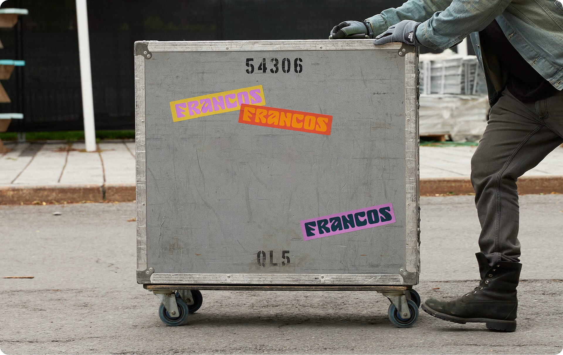
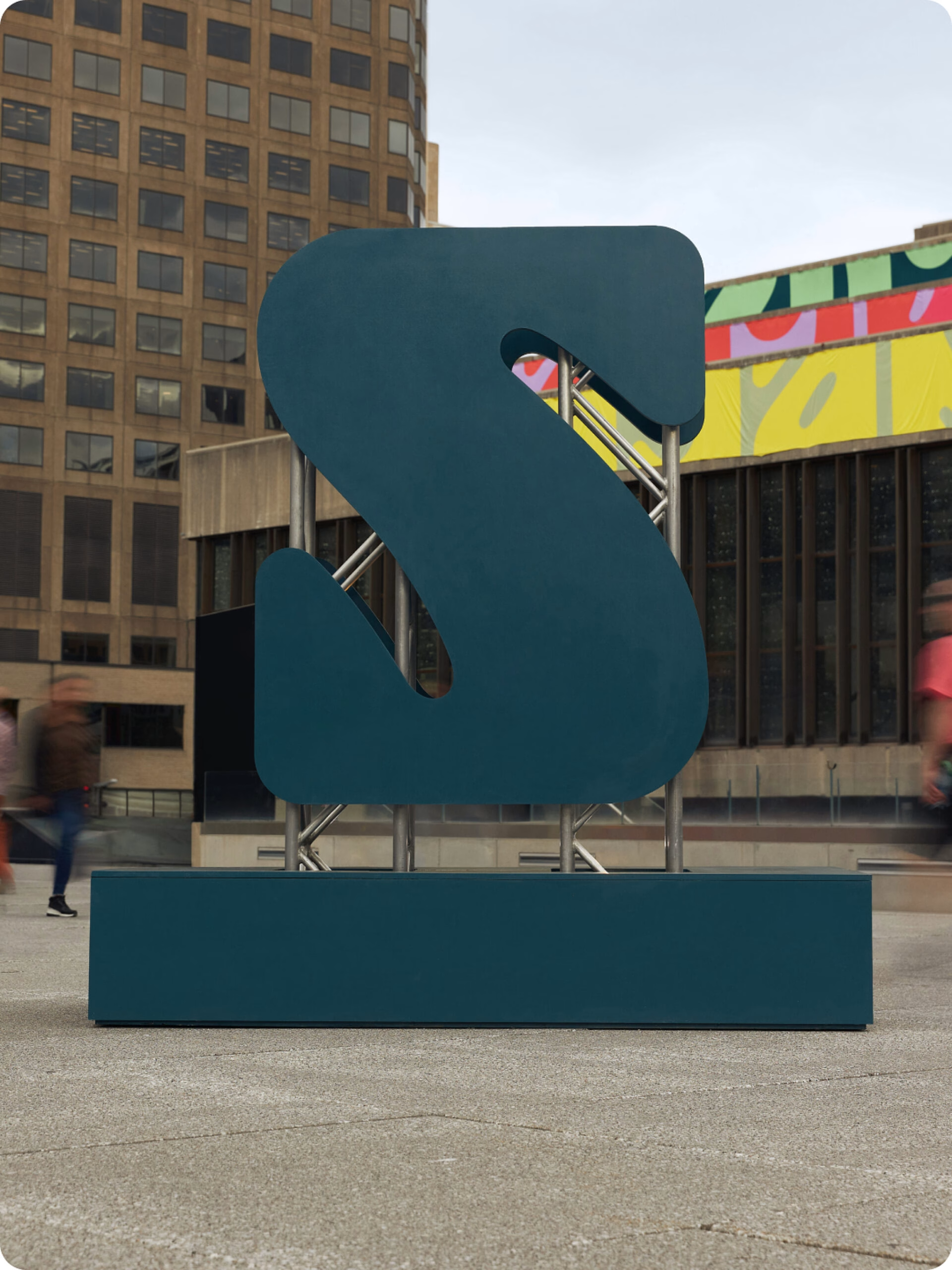
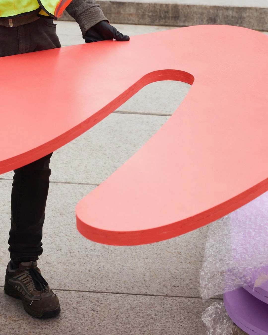

Francos de Montréal celebrates French-language music, and LG2 built its identity on the one word everyone already uses for it. Each of the seven letters in FRANCOS was drawn as its own abstract shape and given its own spring-inspired colour, so the name works as a word and a set of symbols at the same time. A classic serif sits beside the playful logotype, and the system freely crops, splits and abbreviates the mark across layouts.
The real payoff comes on site. Oversized letters are placed in unexpected spots around the Quartier des Spectacles, with their structural frames left exposed in a deliberately street-like way, and colour, light and scale keep the space lively day and night. Because the letters can be rearranged every year, the installations double as a lasting experiential signature that cuts down on reprinting, which earned the work recognition at the Grands Prix du Design.
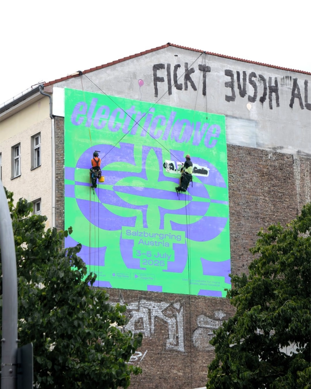
Electric Love Festival is a three-day electronic music festival at the Salzburgring in Austria, spread across up to seven stages, and its old look no longer matched the energy of the crowd. moodley redesigned it as an immersive brand experience that reaches beyond the stages, with brand story, claim, verbal identity and motion developed together. The idea is simple to say and hard to do: make every beat tangible, so the identity feels like the music sounds.
A pulsing heart acts as the key visual across every platform, its concentric outlines throbbing in pink against deep wine and chestnut tones. Behind it sits a creative coding tool that shifts colour, scale and rotation in time with the beat, generating motion for screens, socials and stages from one system. The lowercase electriclove wordmark, often given a psychedelic treatment, ties together posters, tickets, hoodies, packaging and merch, and shows how a large commercial festival can use generative tools to stay distinctive.
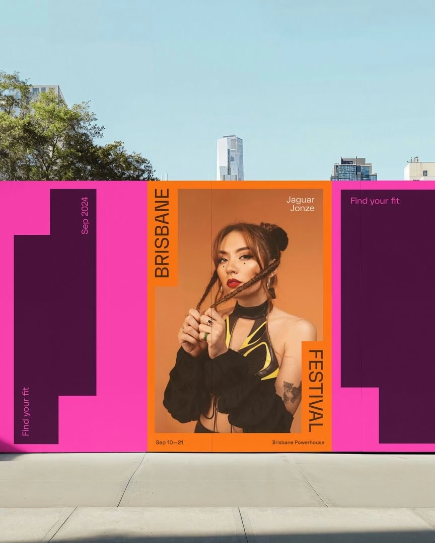
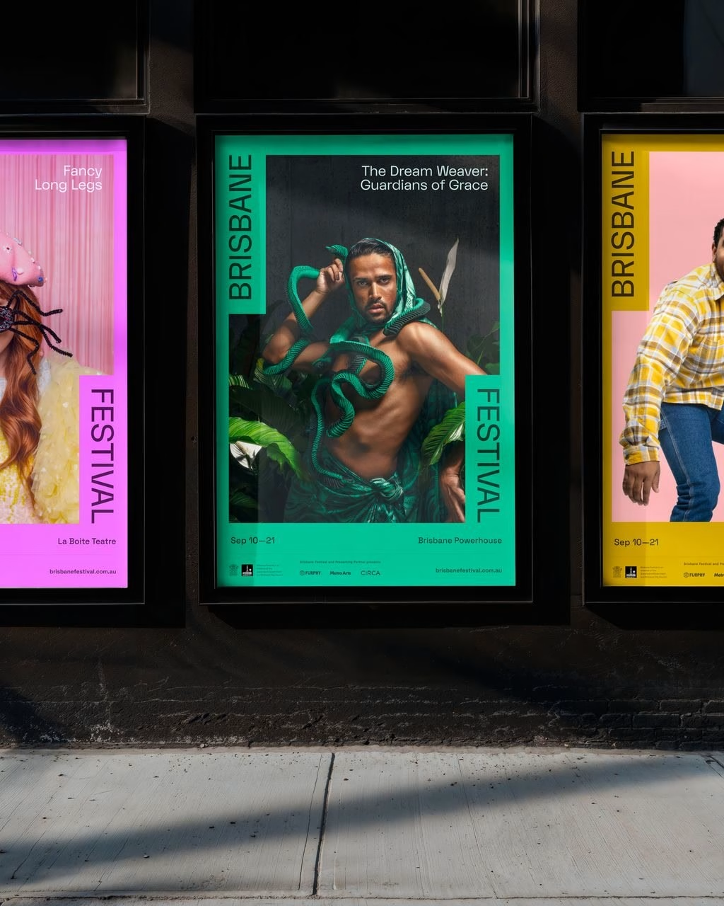
Brisbane Festival had already been through an energetic relaunch in 2022 and 2023, and for 2024 Bigfish chose confidence over more noise. The studio stripped out illustrative and textural layers so the primary brand could lead, building toward a lasting master brand for the city's biggest arts festival under the theme Find your fit. The 2022 logo returned to the centre, and its silhouette became the main graphic element of the whole campaign.
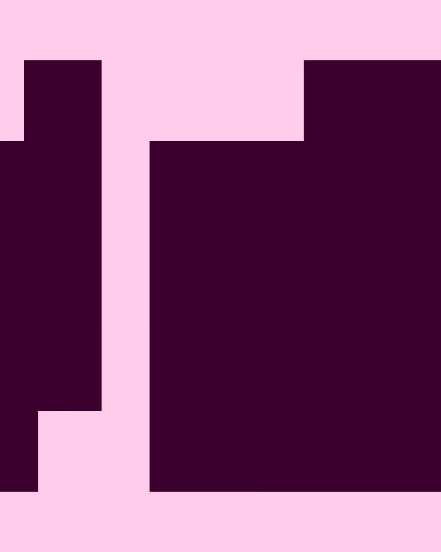
A bold, adaptable device called the Modular Block does the heavy lifting across formats, framing images, artist names and programme details in a consistent but endlessly variable way. It scales from billboards, posters and streetlight banners down to phone screens, a printed programme book, a tote bag and a T-shirt. Motion work and a dark-mode website round out a system that proves restraint can be just as festive as excess.
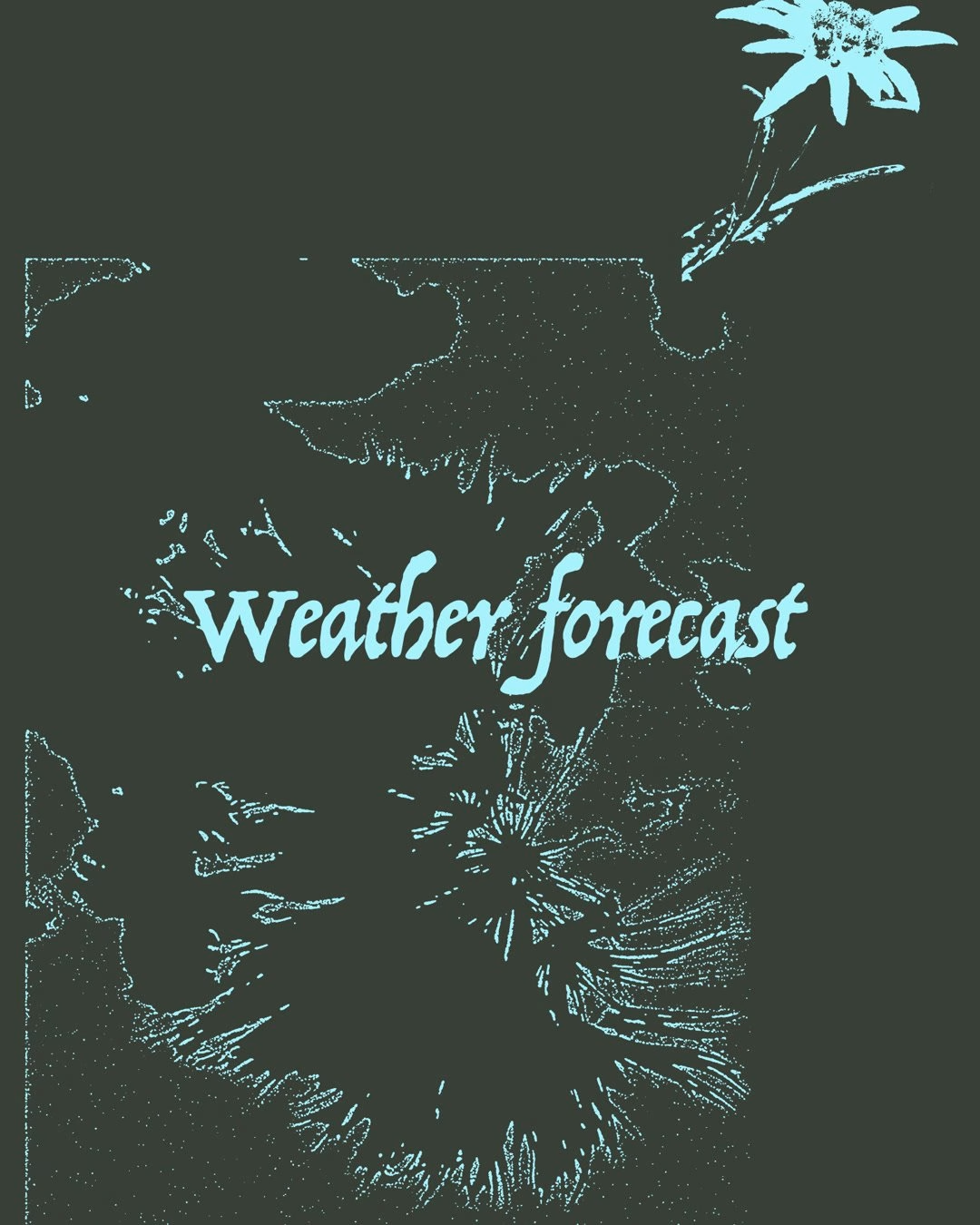
Gabonsa is a new electronic music and culture festival in Innsbruck, set among mountains, quarry ponds and open sky, and its brief was to connect contemporary club culture with nature. Vrints-Kolsteren responded with expressive custom lettering layered with scans and drawings of plants from the festival's Alpine surroundings. The result feels tactile and local, a world away from the chrome and neon that usually signal electronic music.
The studio built the identity as a layering system, so textures, letterforms and imagery can swap positions from one poster or social post to the next while still reading as one family. That flexibility carries into motion, line-up posters, record-sleeve graphics and digital screens, all built from the same loose G and the same botanical line work. For a first-edition festival, it is a confident way to own a look from day one and root it firmly in place.
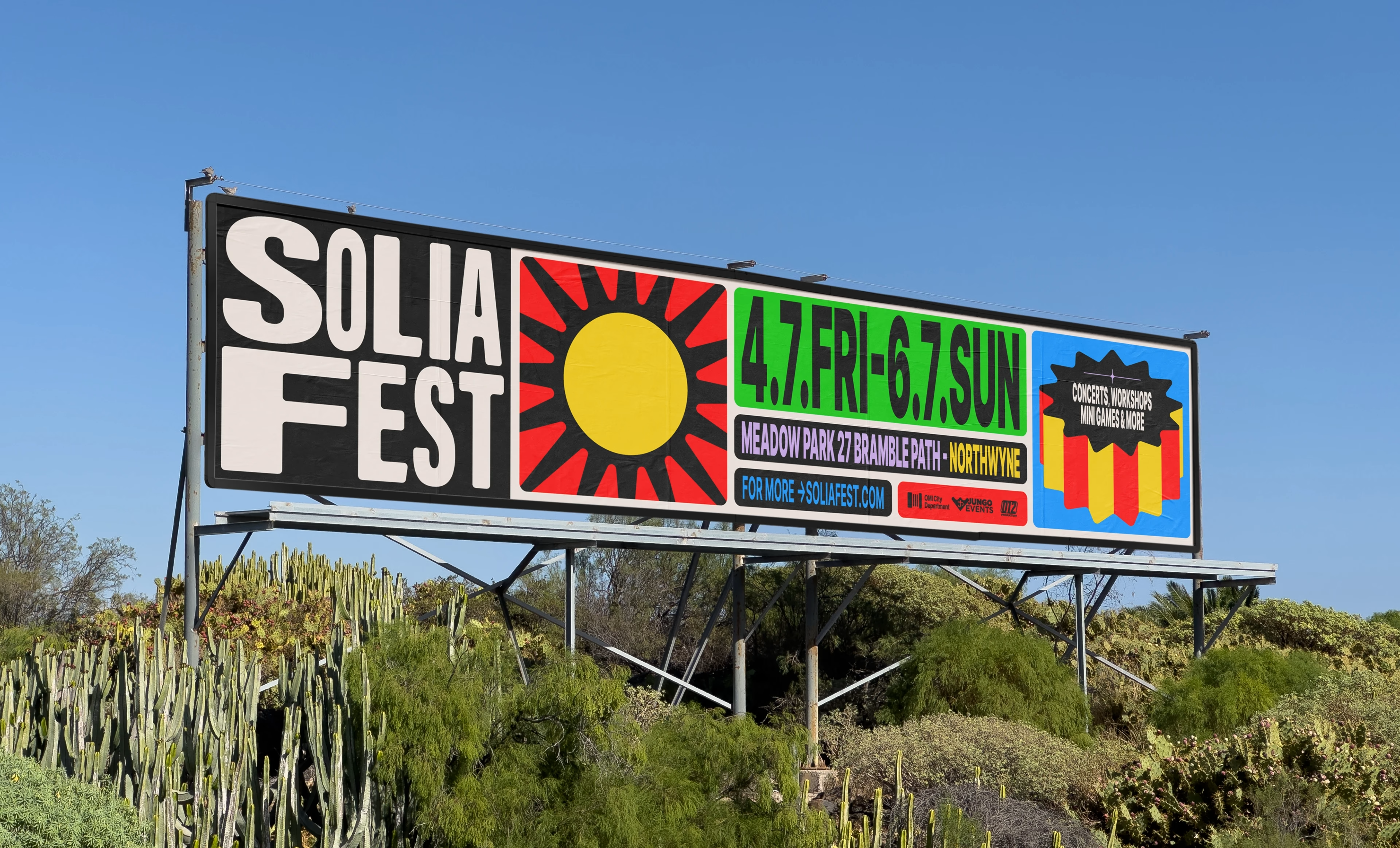
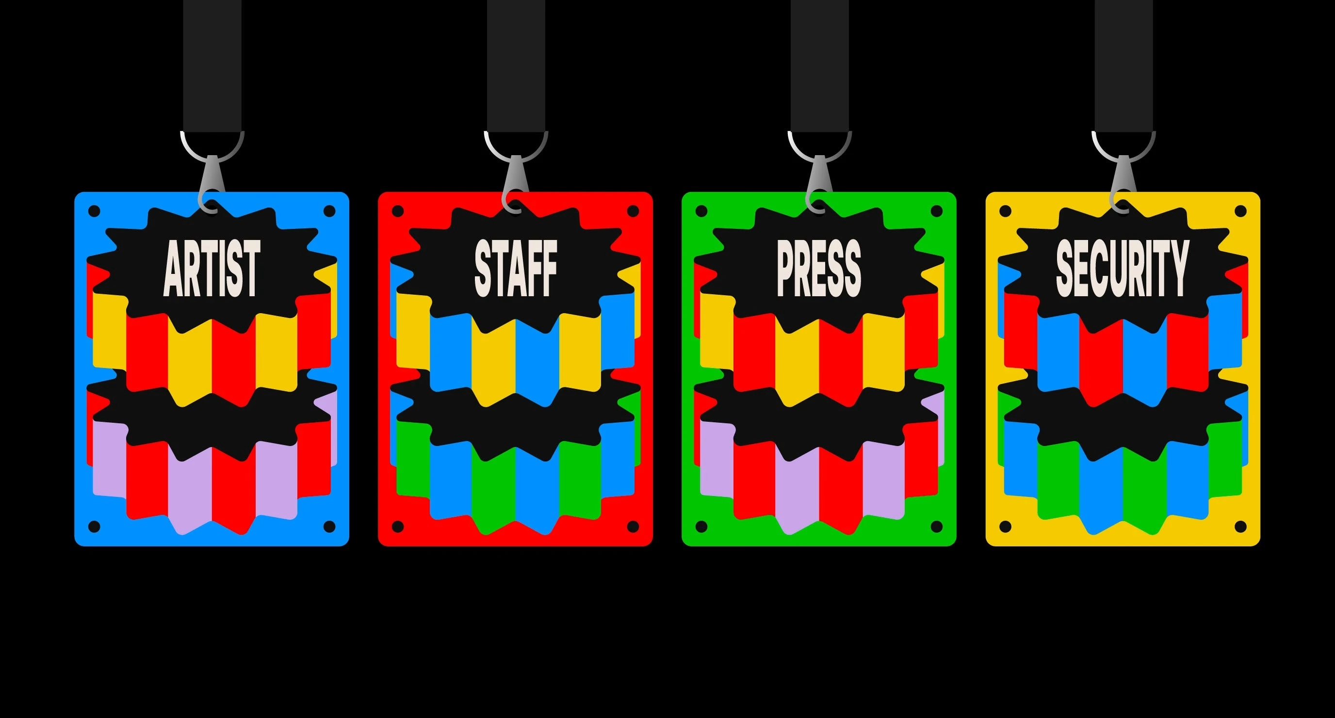
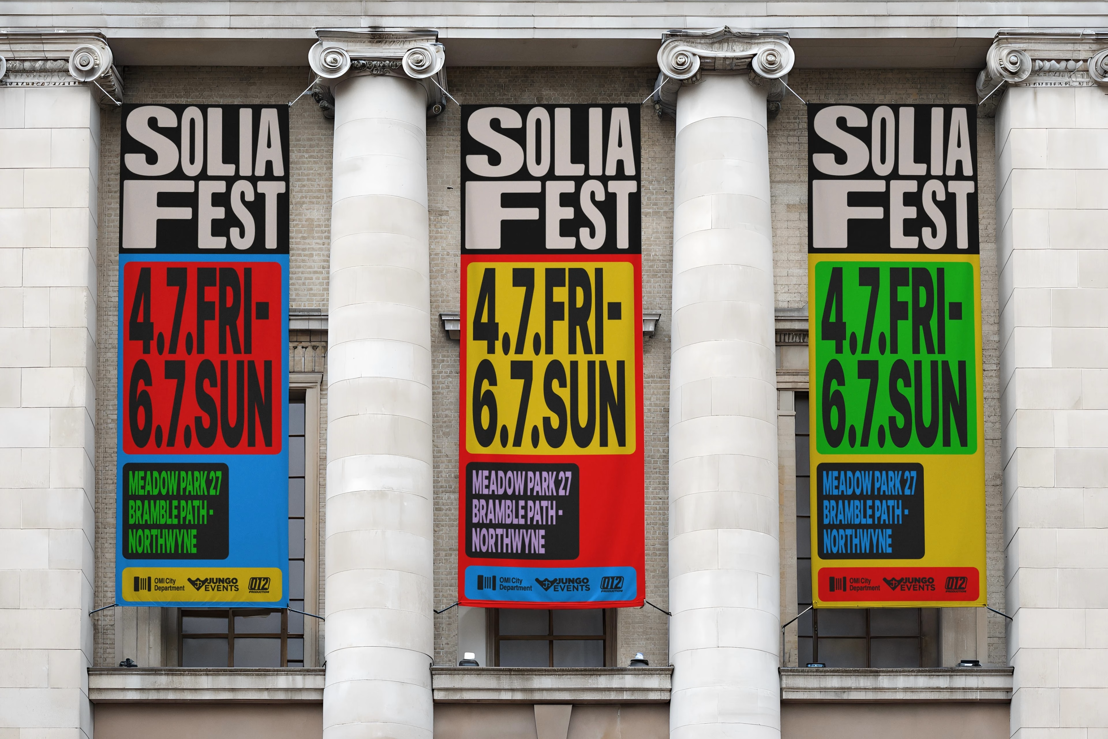
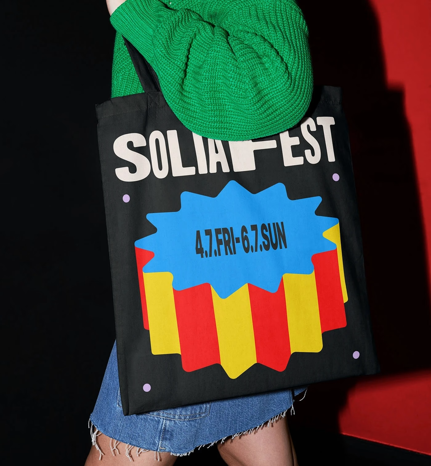
SOLIAFEST takes its name from Solia, a word inspired by the sun, and Studio Tasch, led by Istanbul designer Berkay Taş, made sunlight the engine of the whole identity. Abstract floral and solar motifs bloom across every layout, set against a vivid palette of red, blue, green, pink and yellow that captures the mood of a summer festival. The tone is bold and youthful, built to stand out on a crowded social feed as much as on a fence banner.
The system moves between print and digital with ease, from outdoor festival signage and wayfinding to animated social visuals and posters. Simple shapes are repeated, rotated and recoloured to generate endless variations without losing the core sun motif. It is a good reminder that a festival identity does not need complex technology to feel alive, only one strong idea applied with discipline.
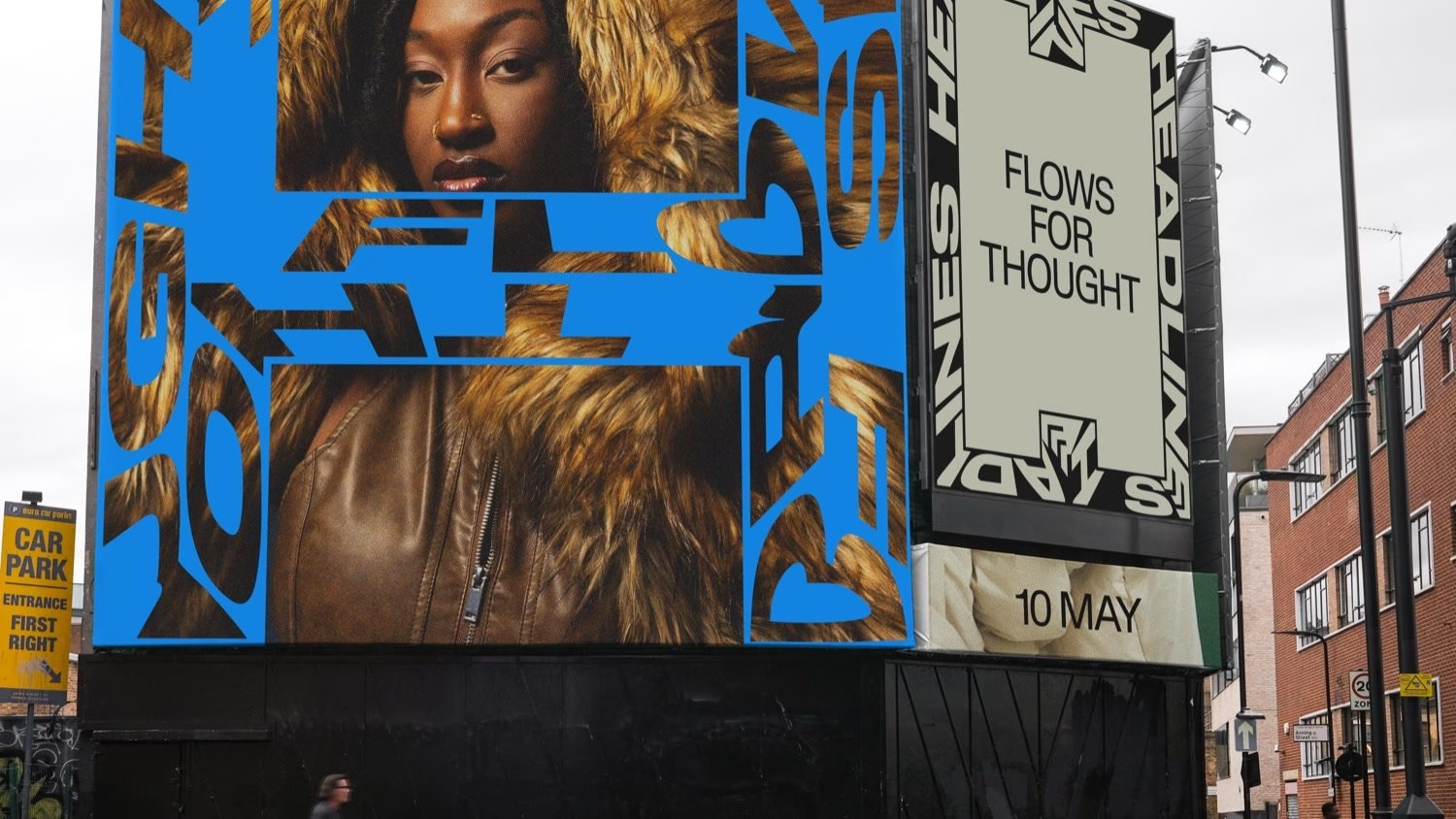
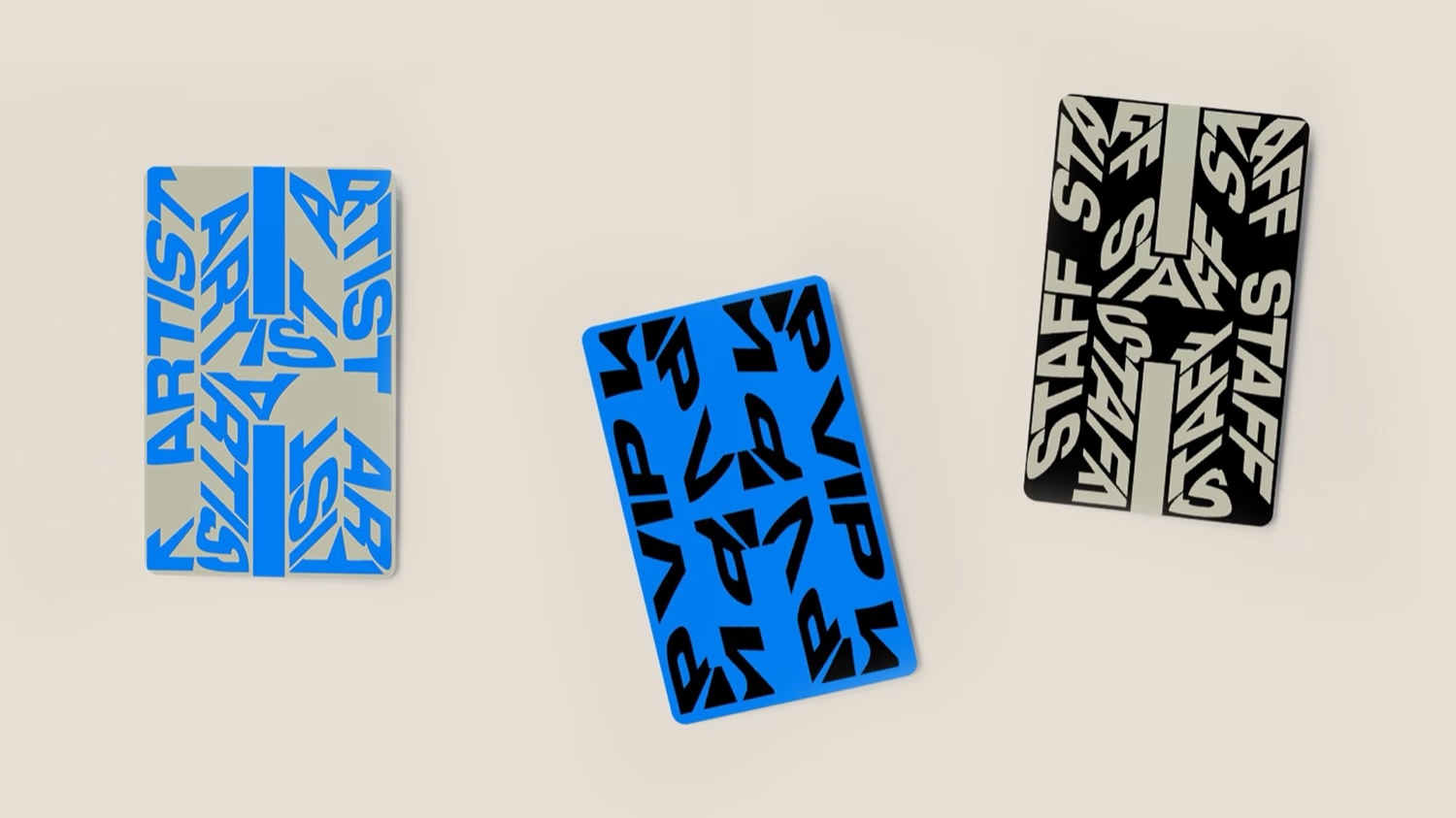
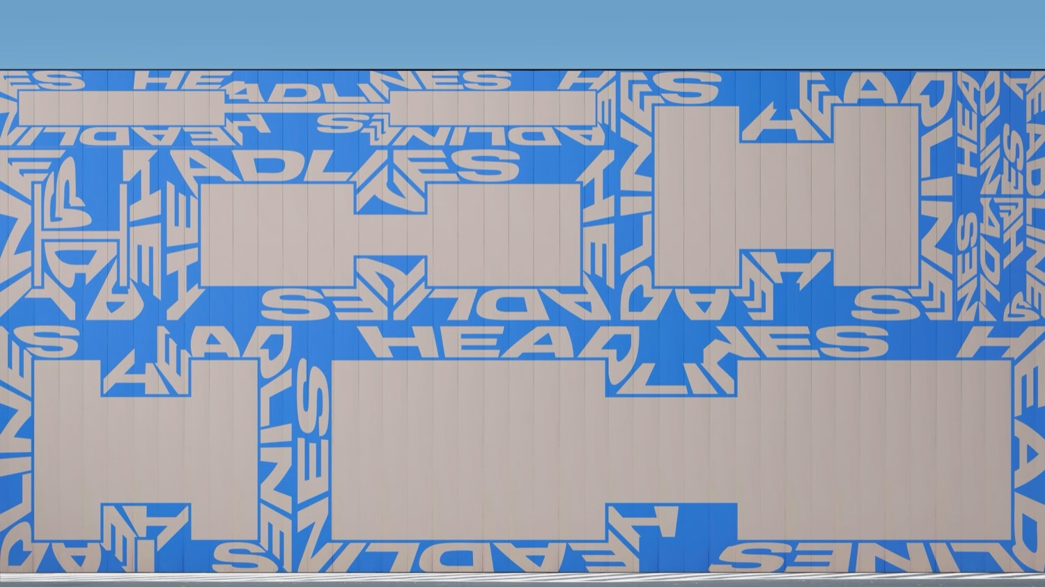
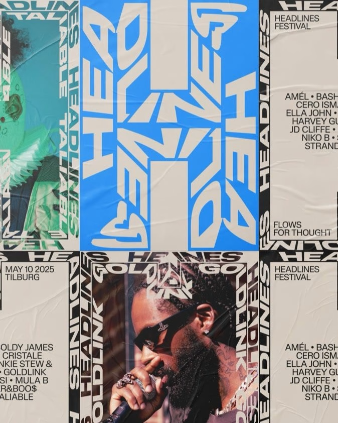
Headlines Festival is a hip-hop festival launched in May 2025 to celebrate the alternative, lyric-driven side of the genre, and Lava shaped its brand from the ground up. Flowing lines run through every application, echoing the rhythm of a verse and giving visual space to thought, language and delivery. It is a rare festival identity that takes its cue from words rather than sound, and the restraint makes it feel timeless instead of trend-bound.
The lines act as both decoration and structure, guiding the eye through line-ups, timetables and social posts the way a flow carries a listener through a track. Typography stays clean and confident so the words themselves remain the stars. For a brand-new festival, it is a smart way to claim a clear position inside a crowded genre.
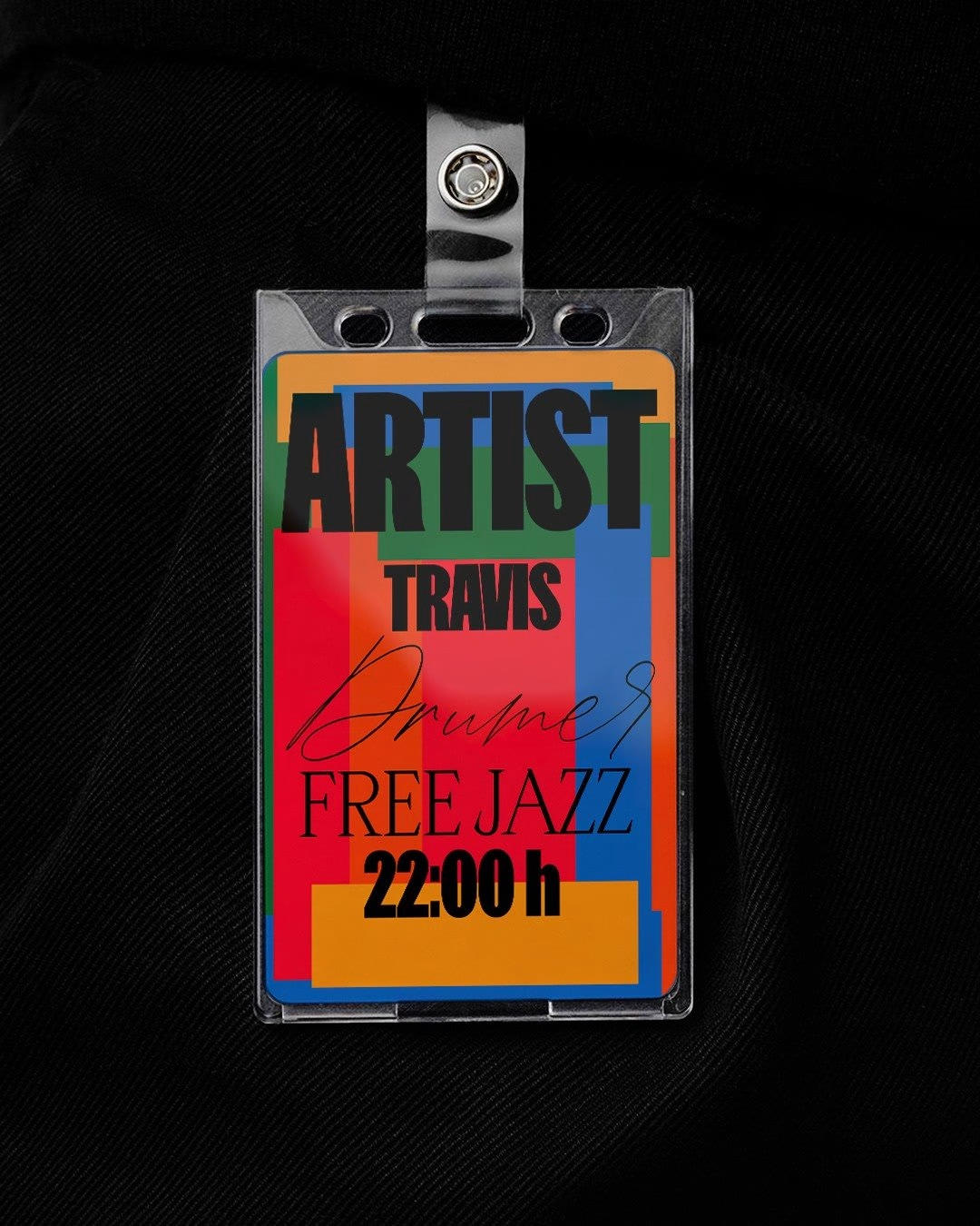
JAM JAM FEST is a self-initiated identity by Barcelona art director Gonzalo Rodríguez for an imagined live music festival devoted to improvisation, and it is the one concept project on this list. The idea is disarmingly simple: the word JAM is stacked in a tall, condensed grotesque, and hand-drawn instruments such as a cymbal, a drumstick and a pair of maracas are dropped straight over it. Each poster pairs a single flat colour, green, orange or electric blue, with that one instrument, so the series reads like a set of different players joining the same jam.
A long list of genres, from cumbia, batucada and afrobeat to kuduro, soca and post rock, is set in a soft serif that contrasts with the hard headline type. The system was shown across posters, phone screens and motion pieces, where the instruments bounce and swing in time. It earns its place for showing how far one clear graphic idea can go, and it would not take much for a real festival to adopt it.
Taken together, these ten identities point to where festival branding is heading. Motion is no longer an add-on but often the starting point, as North Sea Jazz and Electric Love show with type and colour driven by code. Place matters more than ever, from Field Day's park insects to Gabonsa's Alpine flora, and the strongest systems are built to change every edition while keeping one anchor fixed, whether that is a green swash, a pair of babies or seven letters.
For more identities like these, browse the full music and festival branding collection on Mindsparkle Mag, which gathers festivals, venues, labels and album projects from studios around the world. Designers with a festival, venue or label identity of their own can submit it for a feature, and the strongest work may land in the next edition of the Top 10 series.
Credits: Mindsparkle Mag
More in Music Branding
Stay on top of this week's design. Insights, top picks & more.