
 Plus
Plus

 Menu
Menu


Andrej & Andrej
September 08, 2026
Mindsparkle Mag


For its 30th edition, Slovak design studio Andrej & Andrej was asked to mark an anniversary without unsettling the thing people love most about Pohoda. One of Europe’s leading festivals — based in Trenčín, Slovakia, with a 33,000 capacity and two Best Medium-Sized European Festival wins — Pohoda has kept the same emblem for almost three decades: two babies resting side by side, a mark that captures the Slovak word pohoda, a feeling of ease, closeness and togetherness.
The motif first appeared on the festival’s 1997 poster as a photograph, and was later flattened into a simple two-dimensional mark that has stayed unchanged ever since. Rather than redraw it, Andrej & Andrej returned to its origin and rebuilt the pair as a 3D model, giving physical volume back to a symbol that had only ever existed as a silhouette. That model becomes the core of a visual identity that never settles on one look.


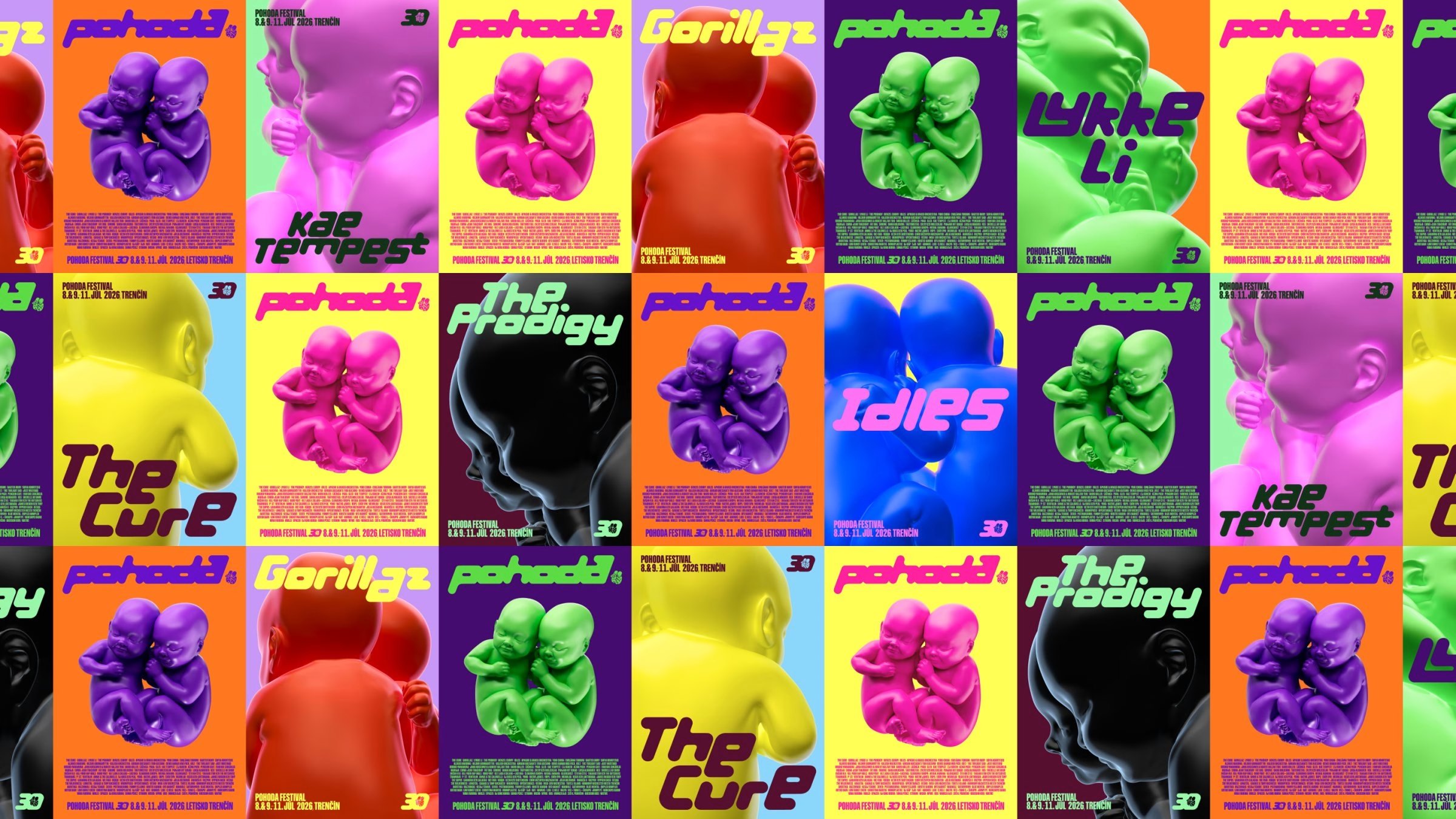

In use, the 3D babies shift constantly — in material, colour, texture, rendering and level of abstraction. At times the symbol is sculptural and glossy; elsewhere it collapses into lines, dots or flat fields of colour. One logo is asked to stand for many visual worlds at once, echoing a festival that runs across music, literature, dance, film, theatre and visual art. The high point was physical: a large inflatable version of the babies, planted in the middle of the site, closing a loop that began with a photograph in 1997.


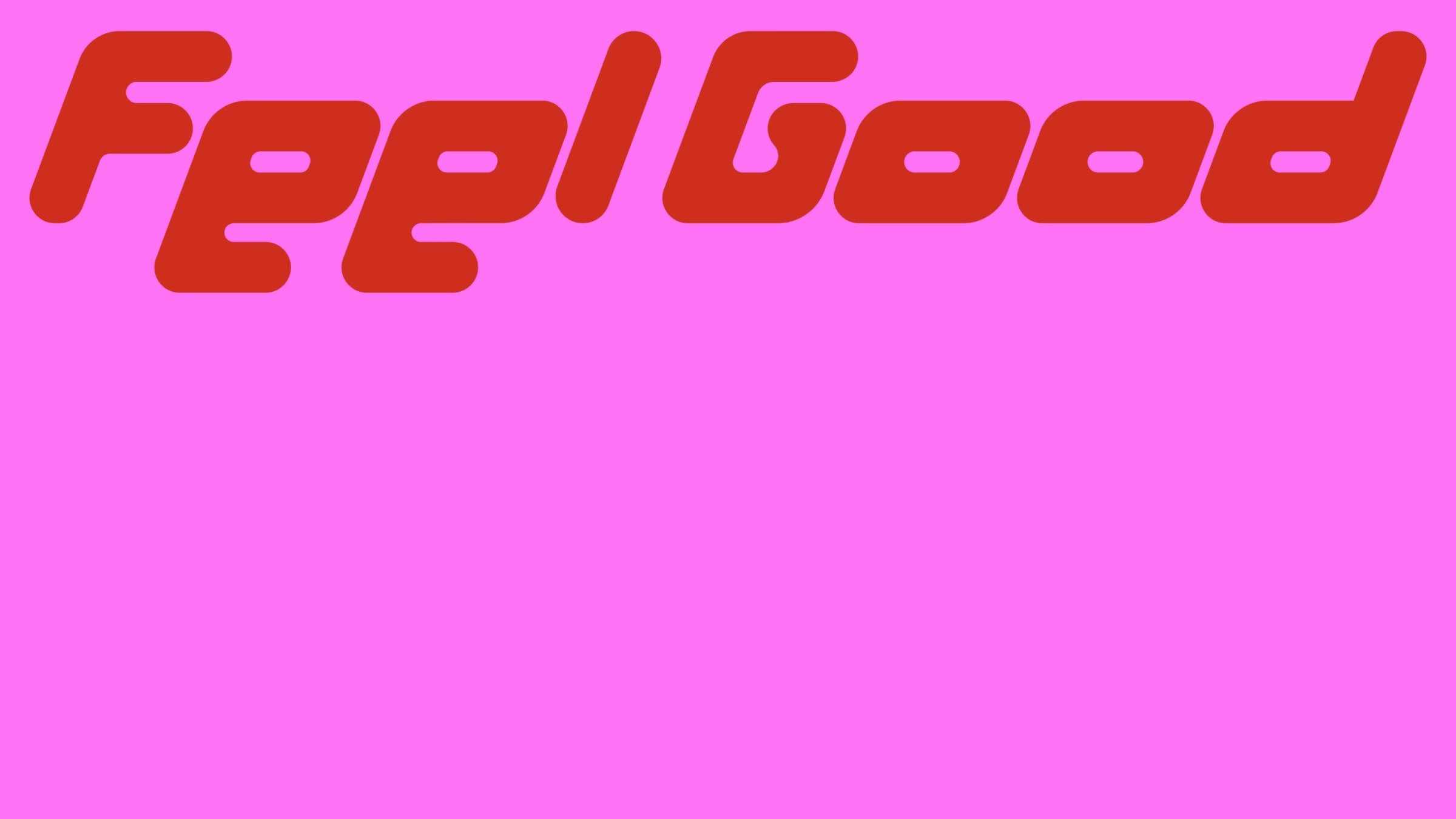
The second half of the system is a custom display typeface, drawn from the lettering Pohoda used in its communication until 2010. Andrej & Andrej reinterpreted it with geometric construction and rounded forms, then extended it into a full character set built mainly for artist announcements. Its defining move is the lowercase a, e and s: they rise to cap height and can lock to either the top or the bottom of the line, so each artist name becomes a small piece of lettering with its own rhythm rather than a plain typeset word.




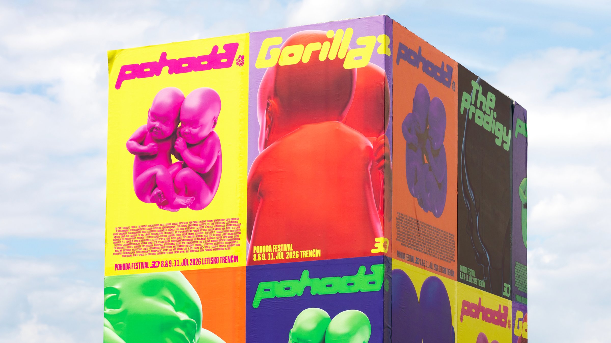
The identity carries through to a merch line produced at a GOTS-certified factory in Portugal, with bespoke cuts and fabrics that pull on the lettering, the typography and the 3D symbol in turn. Across posters, screens, print and the festival site itself, the result is less a fixed key visual than a language that keeps rearranging itself.
Unlock everything with Mindsparkle Mag Plus.
Get exclusive access to Premium features:
Credits: Andrej & Andrej
Creative Direction & Design: Andrej & Andrej
Creative Direction: Andrej Barčák
Creative Direction: Andrej Čanecký
Design: Lukáš Kollar
CGI Direction: Matej Martinec
3D Model: Adéla Štruncová
Product Development & Production: Linda Straková
Photography: Jonáš Verešpej
Photography: Richard Raymann
Photography: Michal Patycki
More in Music Branding
Includes freebie bundle, unseen BTS insights and more.