 Plus

 Menu


Domingo
October 31, 2026
Mindsparkle Mag


Black Paper is a print house, and its new identity treats that fact as the whole brief. The stationery, signage and merchandise are built almost entirely from grey board, black stock, translucent glassine and the occasional brass fixing. Colour is removed from the system altogether, so every impression depends on texture, relief and the way light falls across a surface.
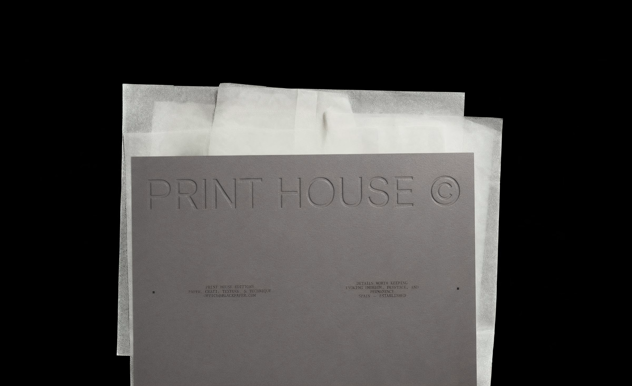
Barcelona studio DOMINGO. developed the brand identity around tone-on-tone marks that look pressed into the paper rather than printed on top of it. A large PRINT HOUSE © wordmark sits grey on grey, almost disappearing until the card is tilted toward the light. Typewriter-style lettering carries addresses and service notes, which gives the whole system the feel of a working order slip.
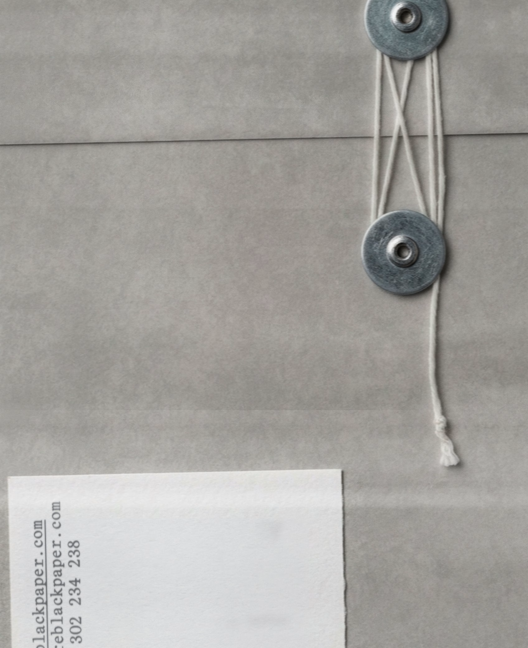
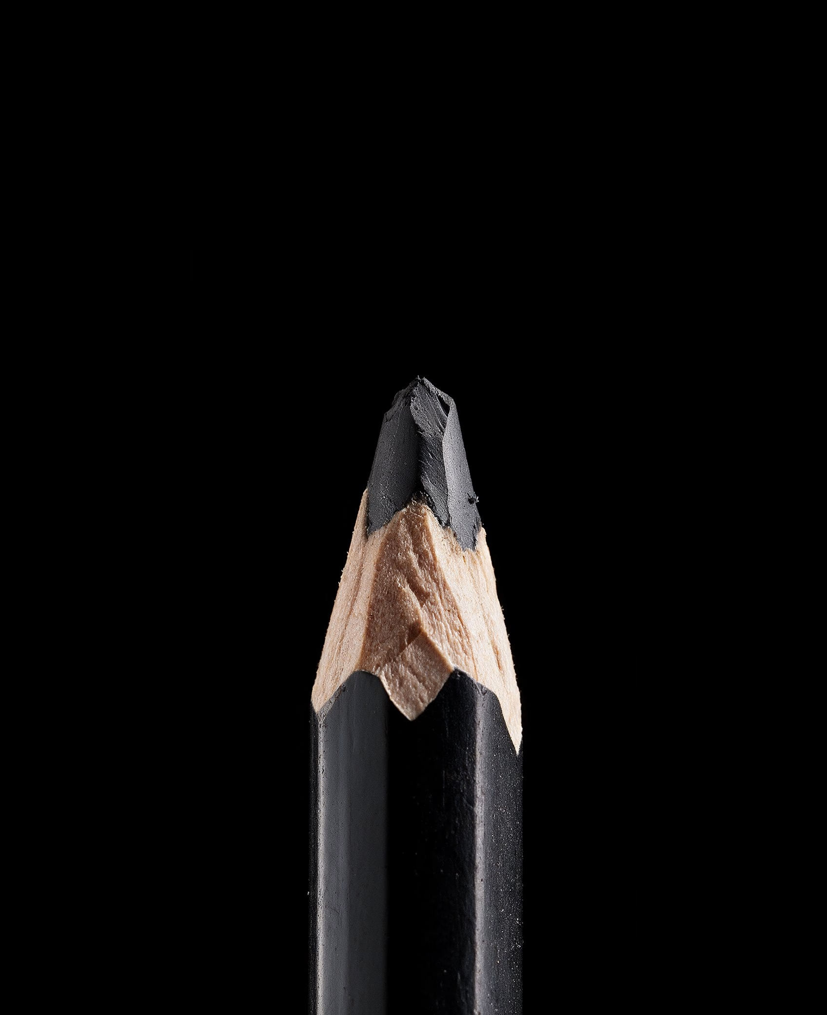
Small objects from the trade carry the identity as much as the logo does. A sharpened black pencil, string-and-washer envelope closures and a narrow vertical BLACK PAPER® wordmark all point back to the physical work of making print. The vertical lockup, shown inside its construction grid, suits spines, labels and the edges of a stack of sheets.
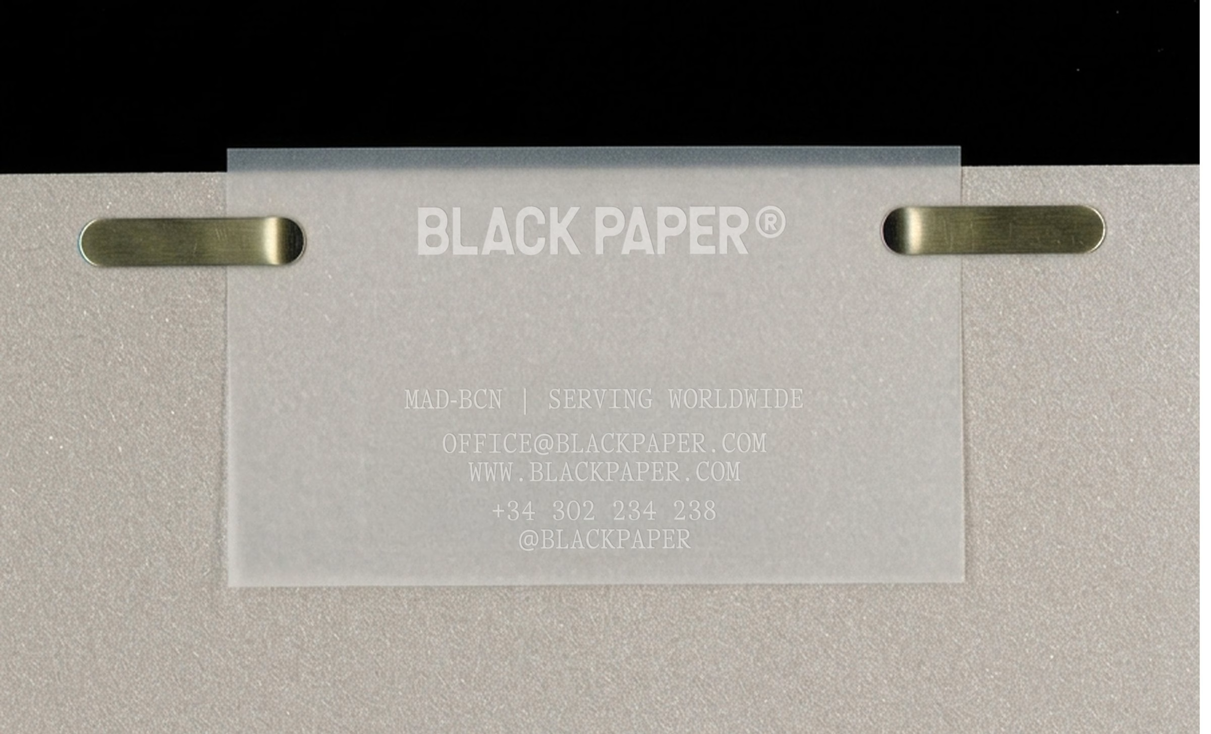
The motion pieces start on the press floor. Close, monochrome footage of a printing machine working over stacked sheets sets the tone, with the brand sitting quietly beside the process rather than in front of it. The business card follows the same logic, printed on a frosted translucent sheet and held to grey board by two brass clips.
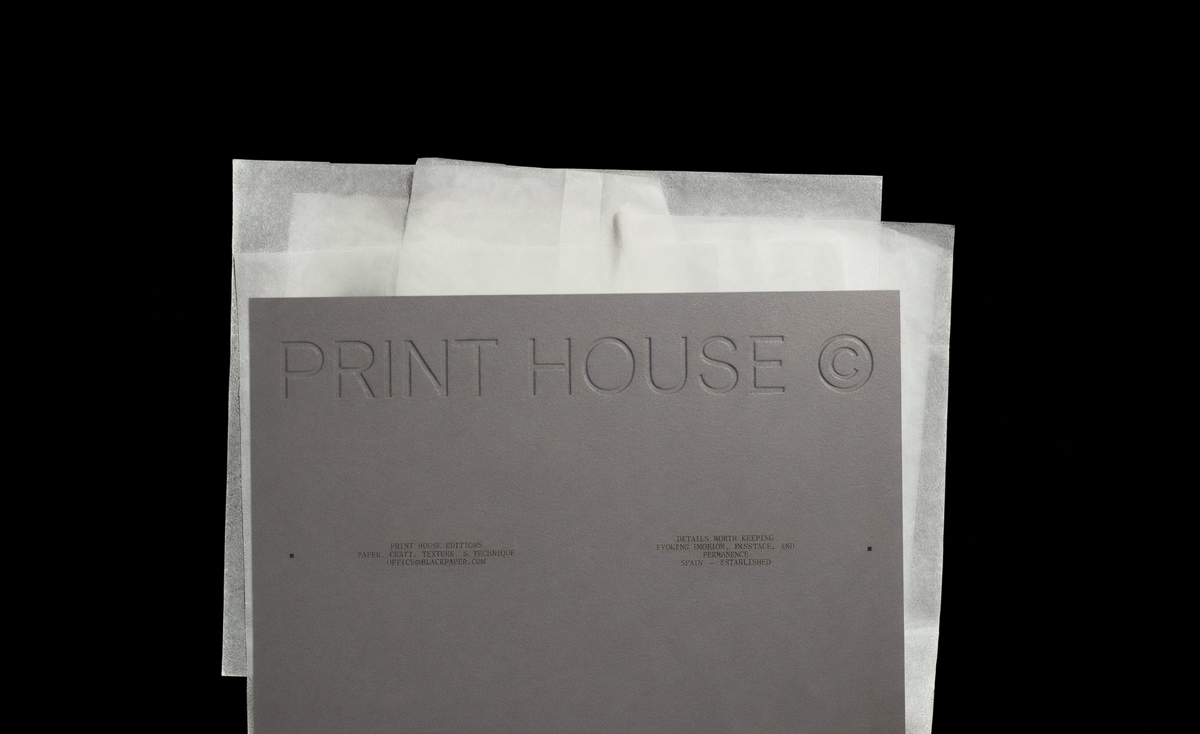
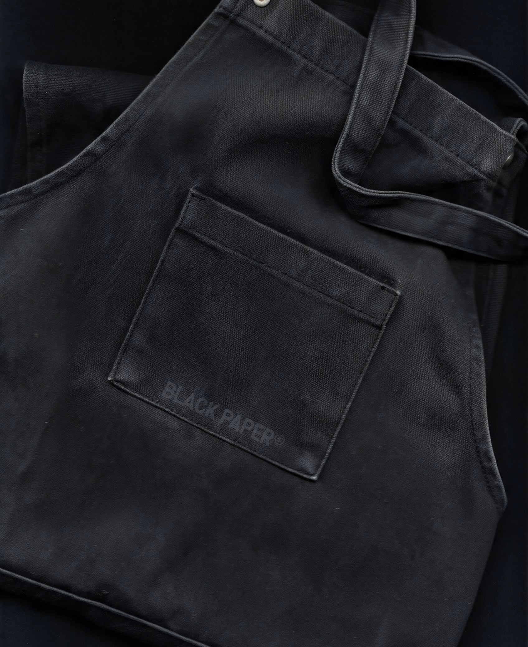
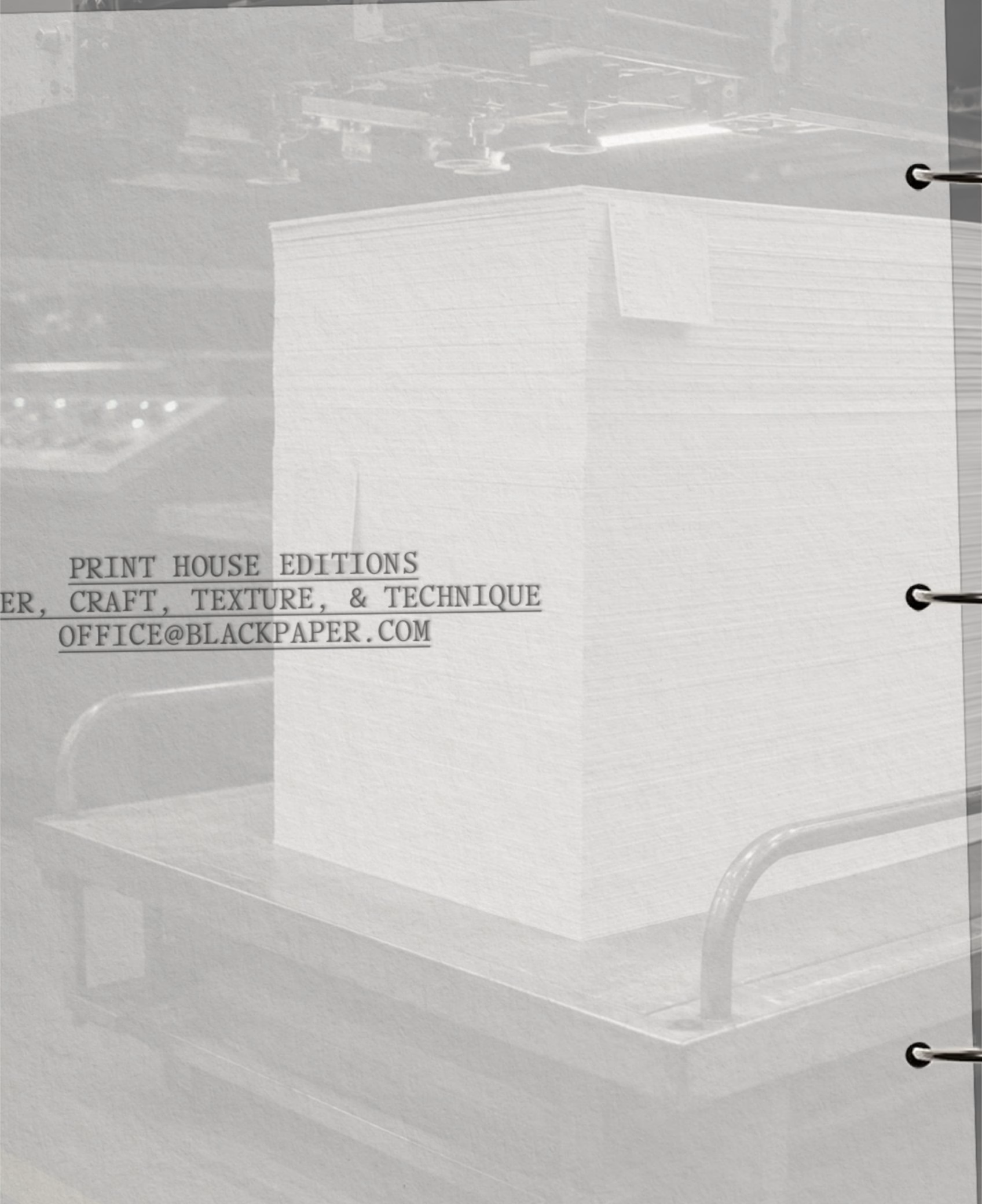
Workwear and carry goods take the system into the shop. A black apron carries a tone-on-tone BLACK PAPER® mark on its pocket, while a translucent tote hangs the bold BLACK wordmark against a dark wall. A stack of white sheets on a trolley is labelled Print House Editions, with a line about paper, craft, texture and technique that sums up what the print house sells.
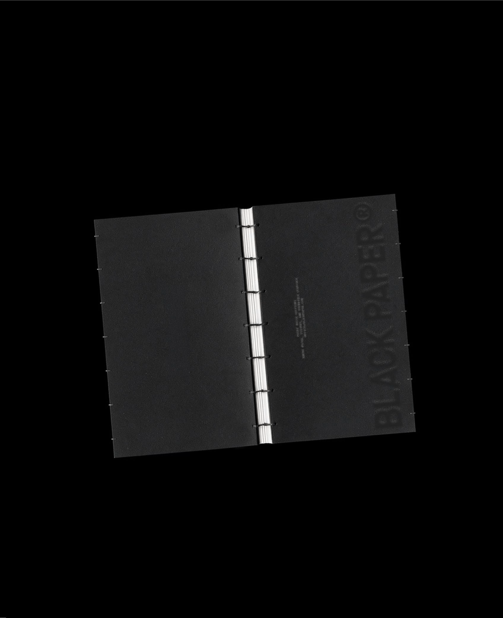
Even the service list is set like a production schedule. Numbered steps run from scheduling a call through material direction, sampling and proofing, in-house production, and logistics and warehousing, each one typed rather than designed. A black bound document with an exposed white binding closes the series, and the identity stays as restrained at the end as it is at the start.
More in Minimal Branding
Includes freebie bundle, unseen BTS insights and more.