 Plus

 Menu


Ashfall Studio
October 19, 2026
Mindsparkle Mag


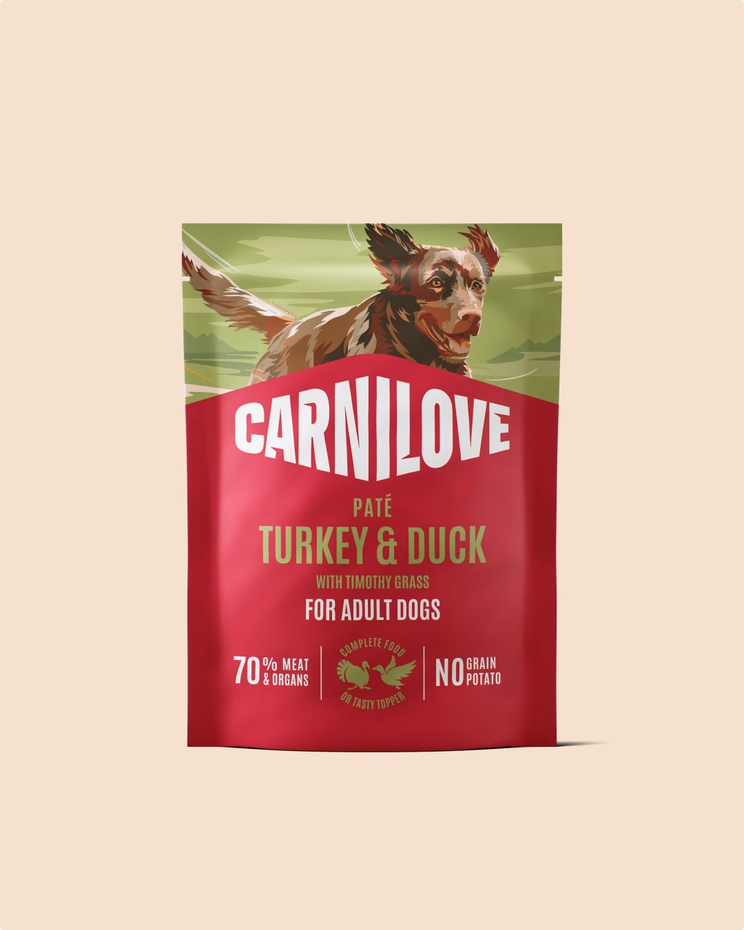
Carnilove is a premium pet food brand sold in more than 80 markets, often through local distributors who have no designer on staff. Over 18 months, Ashfall Studio took the core identity created by Design Bridge and expanded it into a complete brand system that could travel that far. The work covered typography, colour and composition systems, icon libraries, a motion system built from scratch, campaigns and the brand's e-commerce flagship.
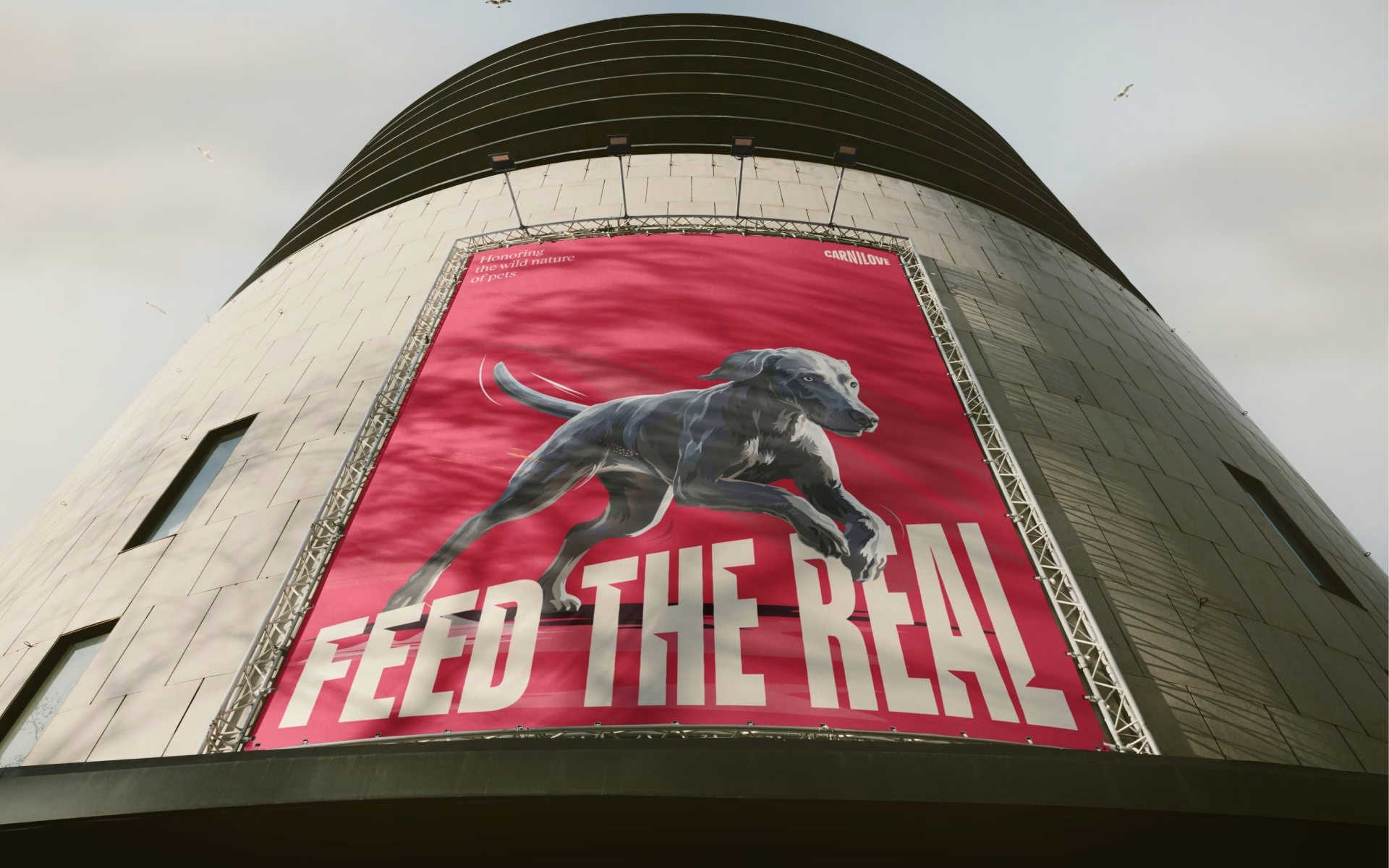
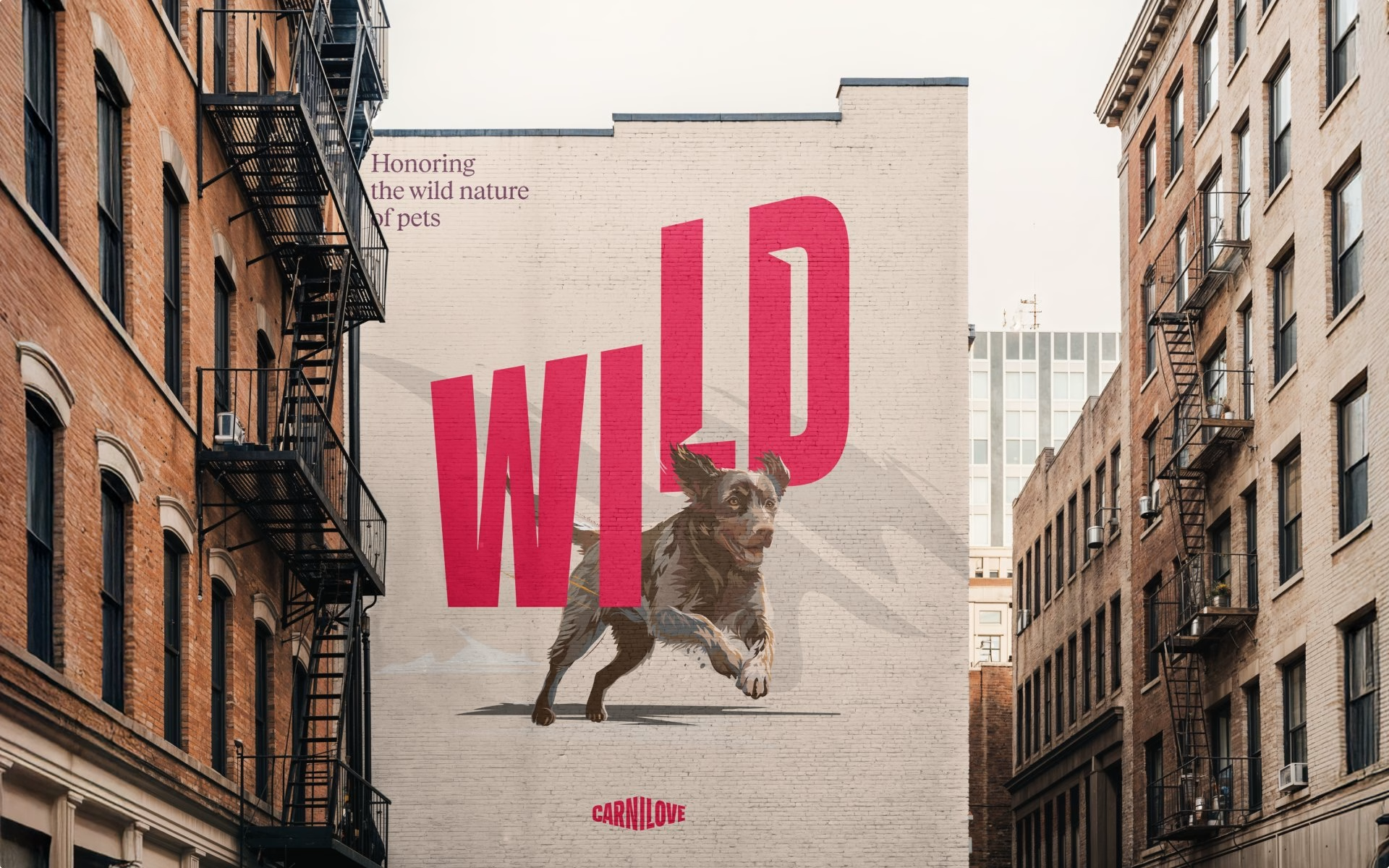
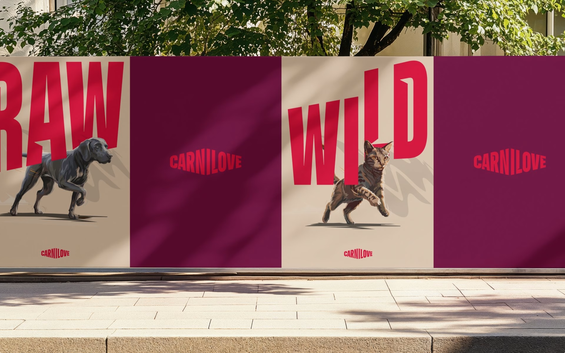
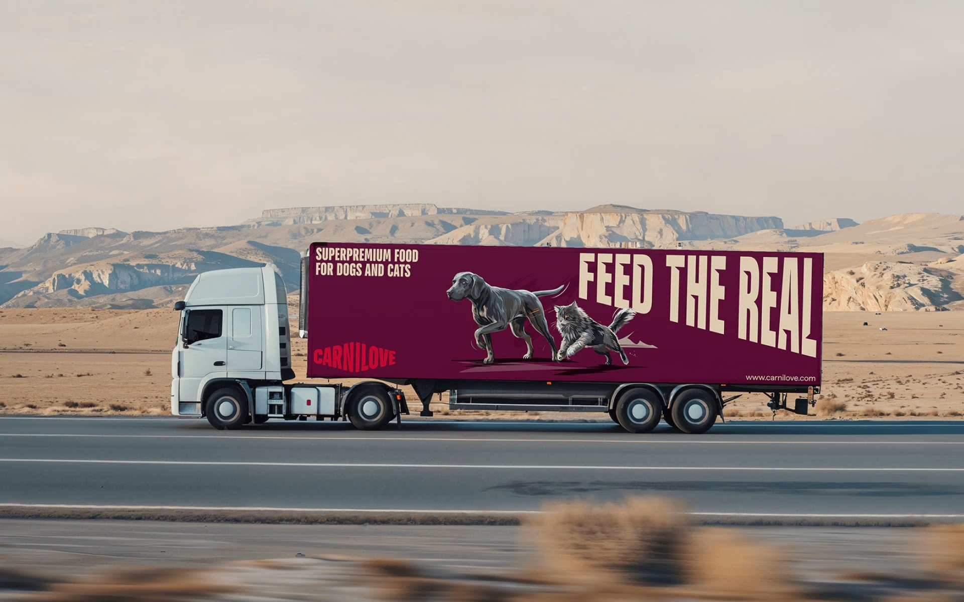
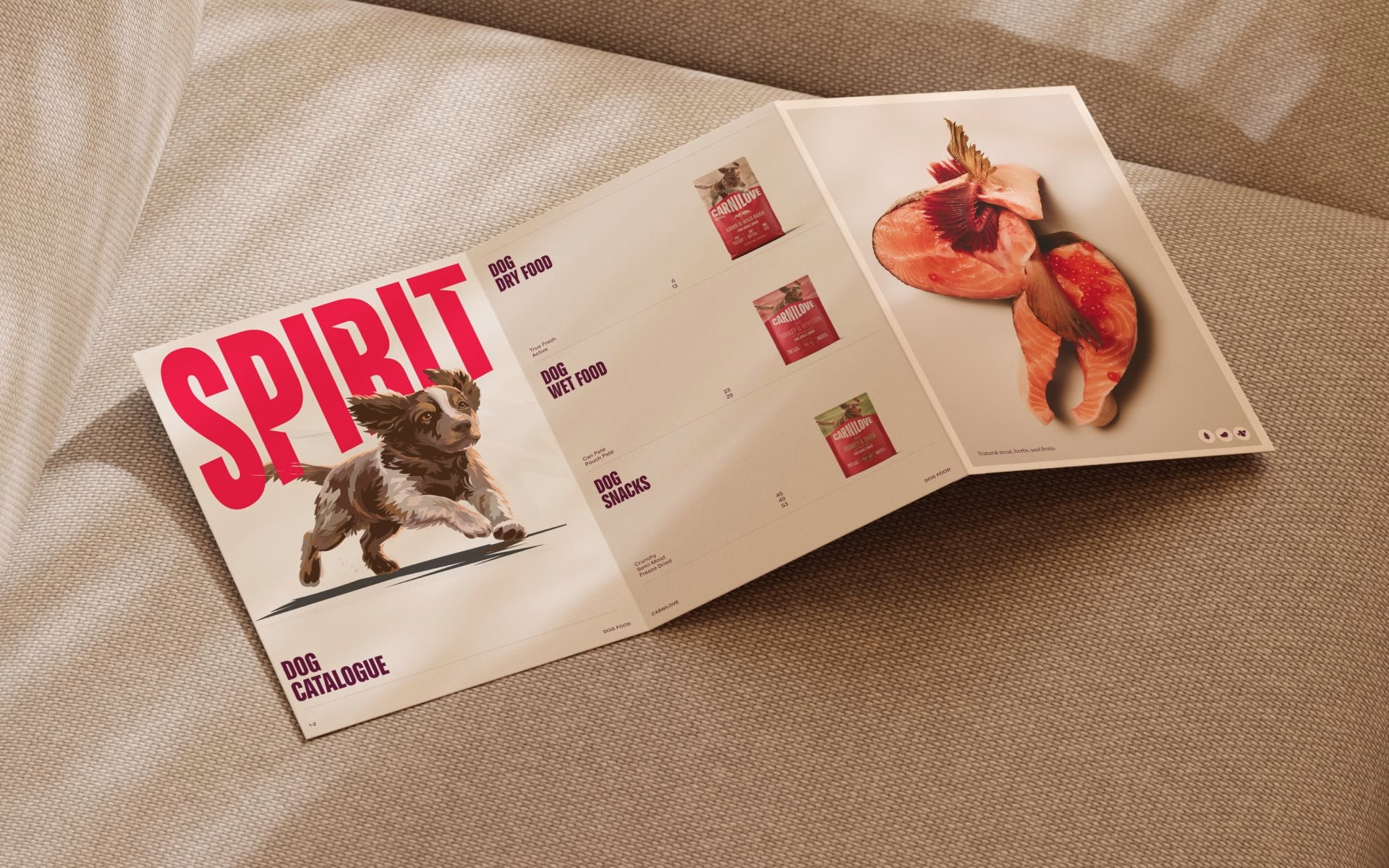
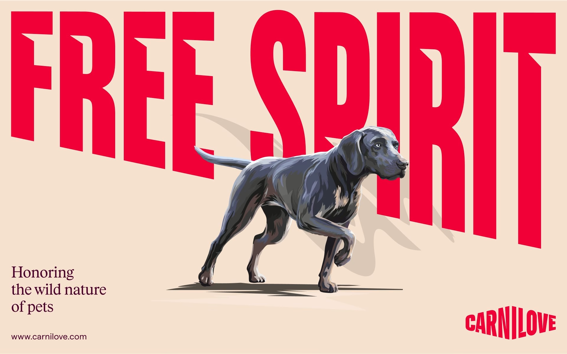
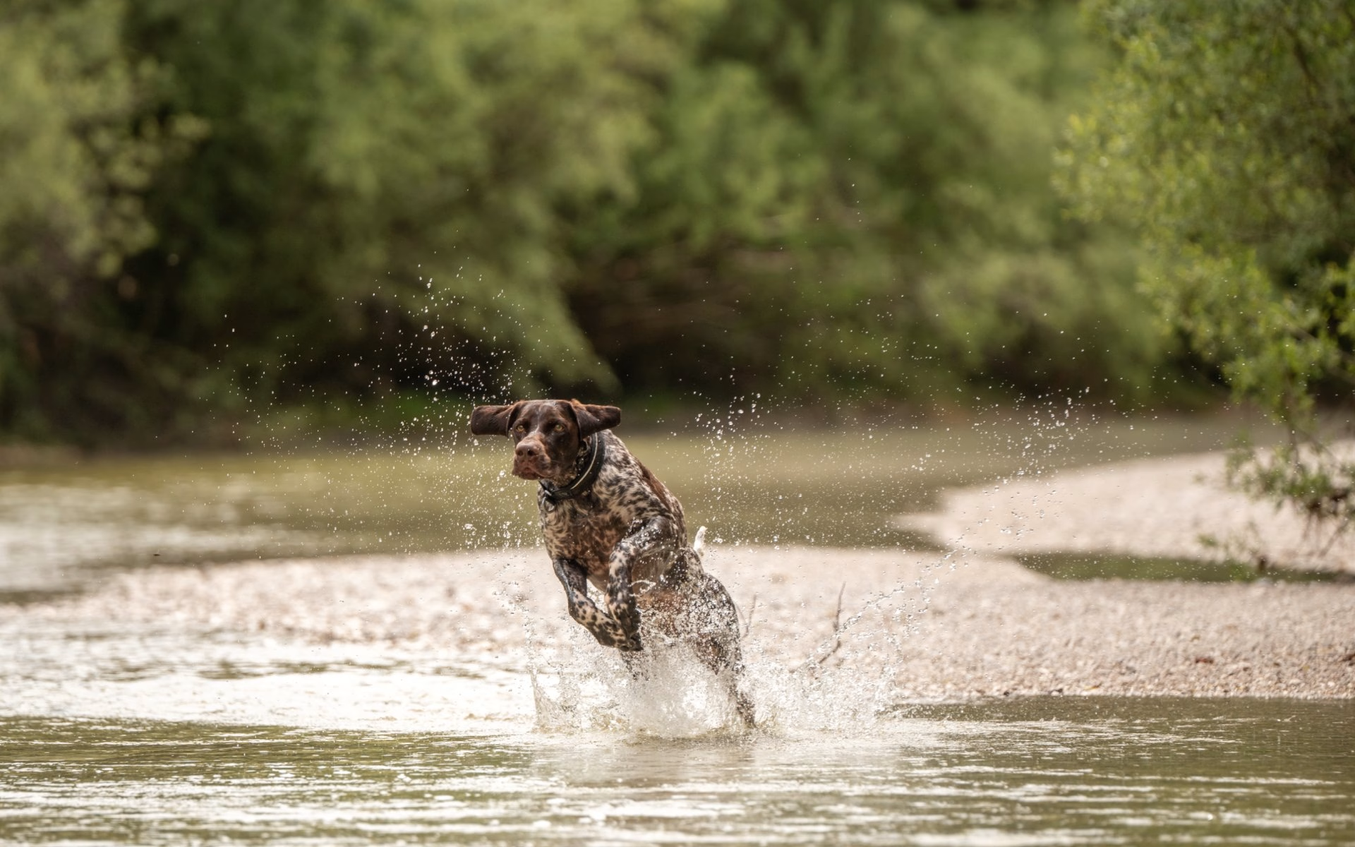
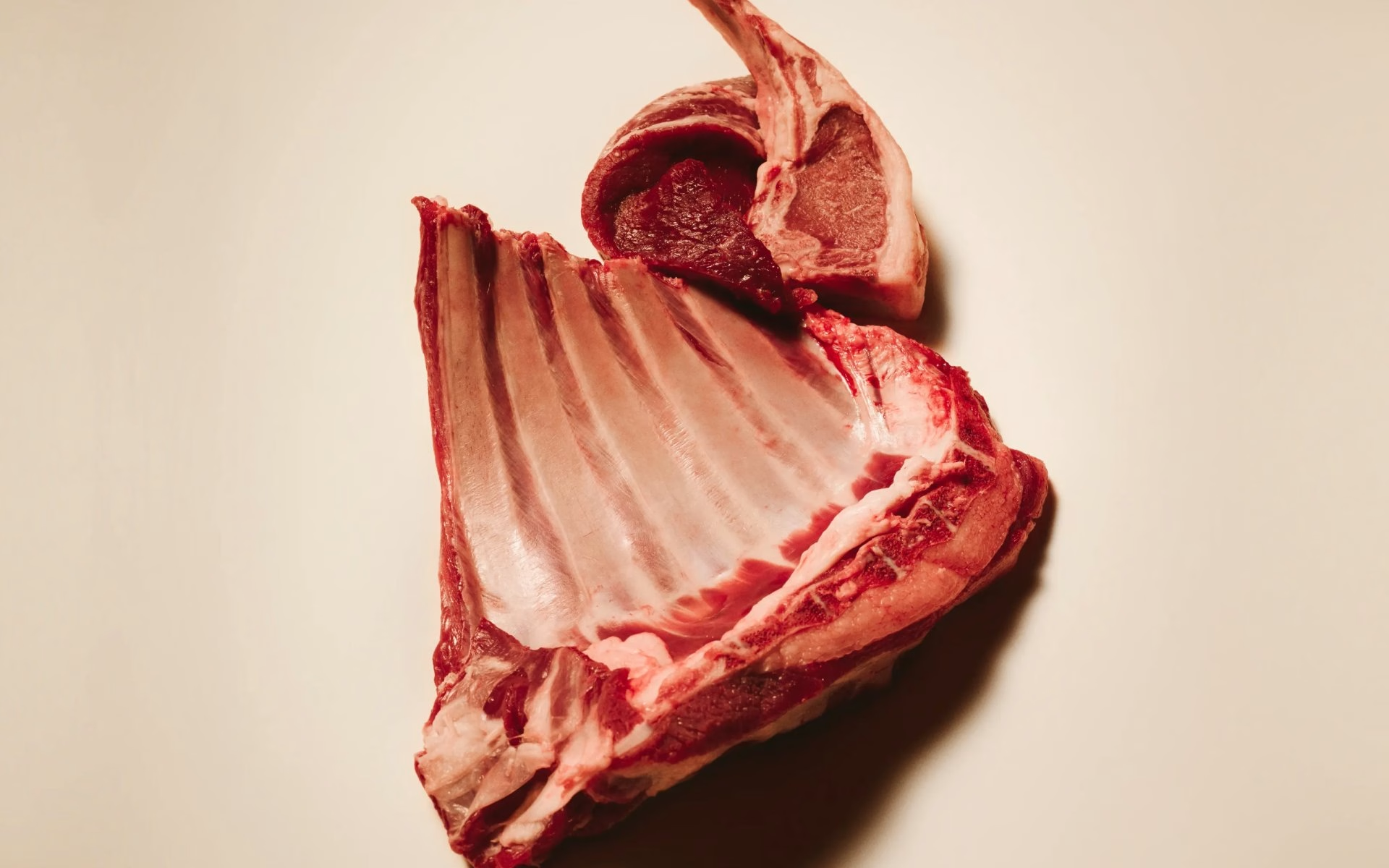
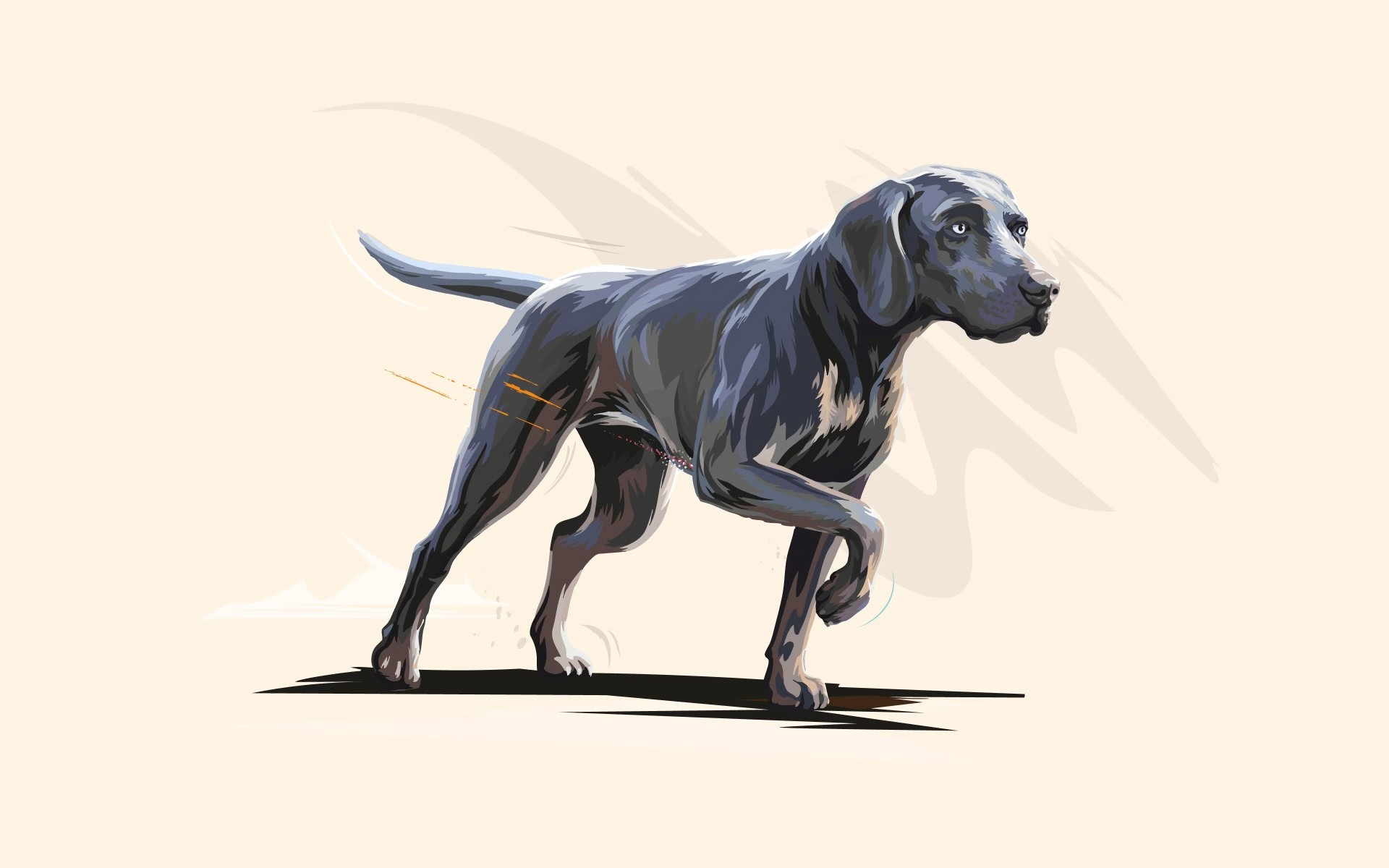
The starting point was a bold direction rather than a finished system: a custom typeface, distinctive packaging and a raw, maverick attitude that deliberately avoids the paw prints and rustic textures of typical pet food. Ashfall's task was to make that energy hold up everywhere, from prime-time TV ads to distributor websites outside the head office's control. Brand photography of dogs mid-leap and raw ingredients shot against warm neutrals sets the tone the rest of the system builds on.
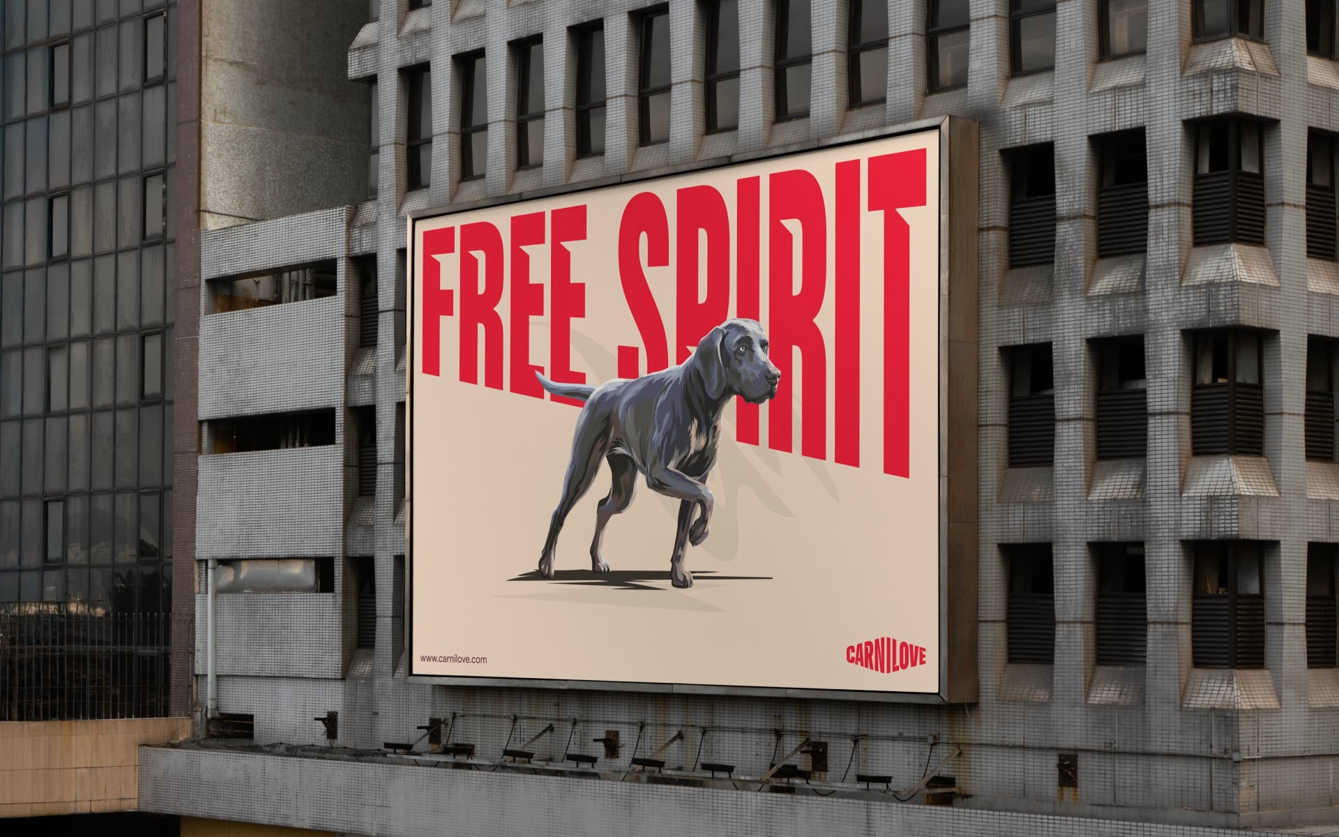
The wordmark and its 13-degree angle became the backbone of the identity. That angle drives the brand's expressive typography, where words like WILD, RAW and SPIRIT stretch and tilt across the layout, framed by a deep burgundy and signal red palette. A modular grid keeps those compositions consistent, whether they run on a poster, a social tile or a product card.
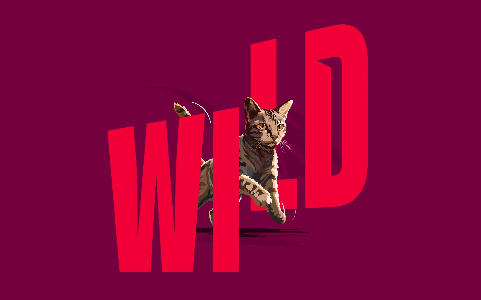
The piece Ashfall is proudest of is a custom type generator. Before it existed, setting Carnilove's angled, expressive headlines took an experienced designer working in Illustrator. Now anyone on the brand team, or at a distributor in any of those 80 markets, can produce on-brand typography themselves, which turns the guidelines into a working tool rather than a rulebook.
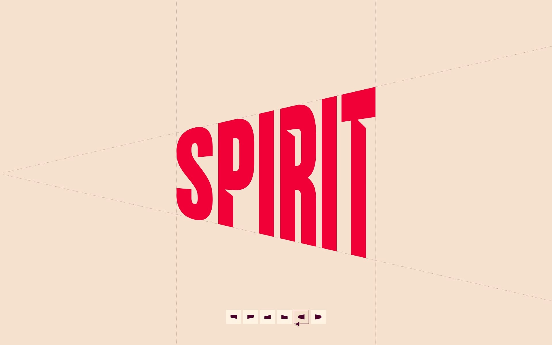
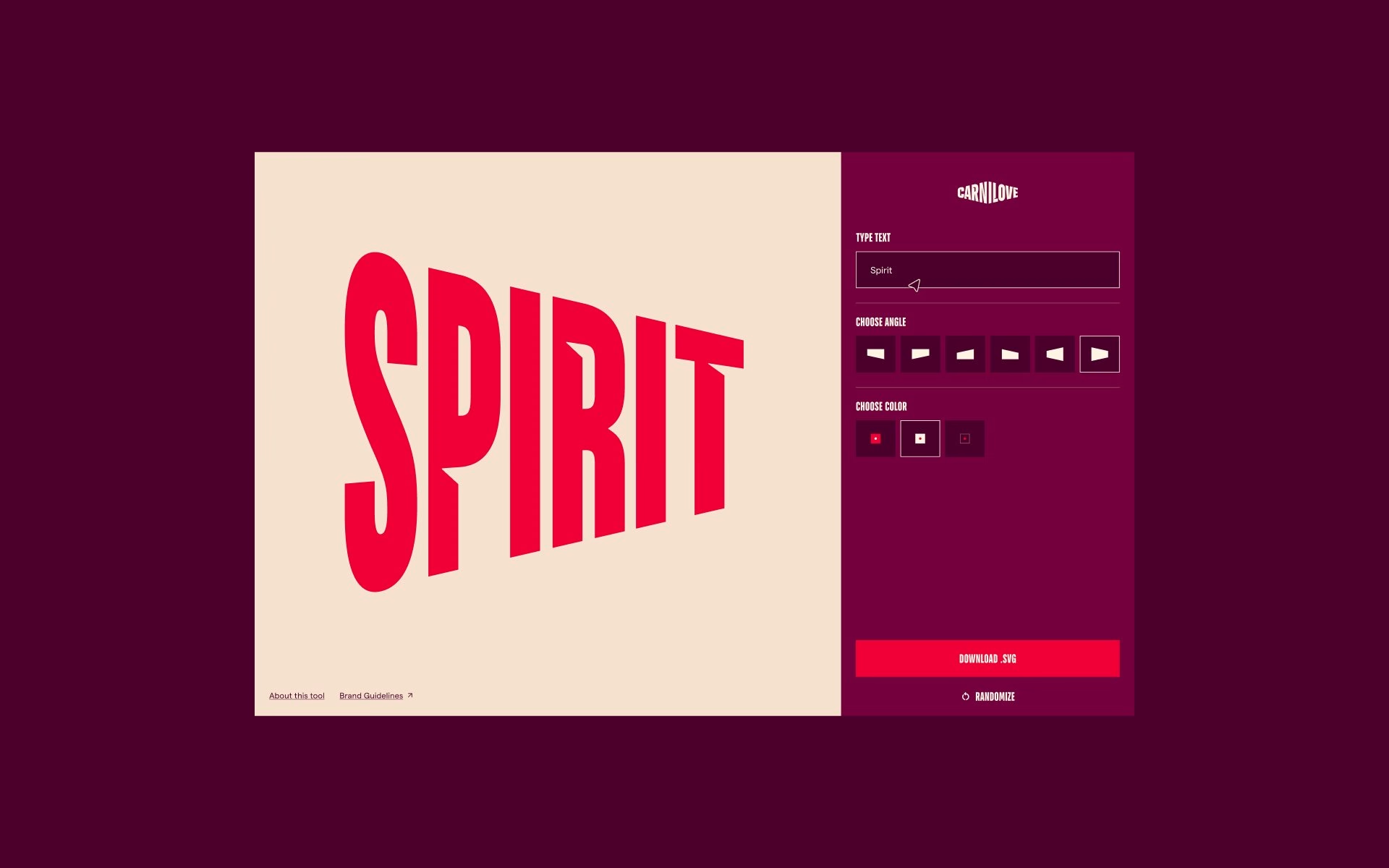
Motion was built from scratch and now runs in TV ads across dozens of countries. A set of motion principles defines how type, icons and imagery enter and leave the frame, and the same rules power plug-and-play social and motion templates for local teams. Icon libraries for print and interface use follow the same construction logic, so the system feels like one brand whether it moves or stands still.
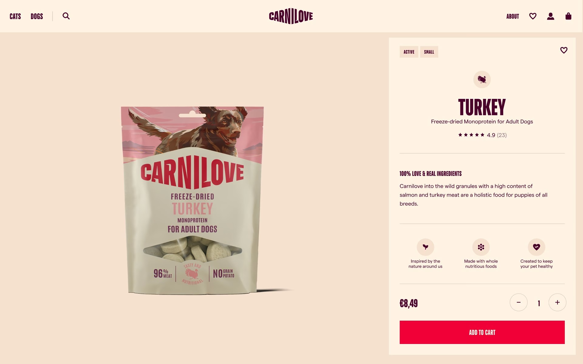
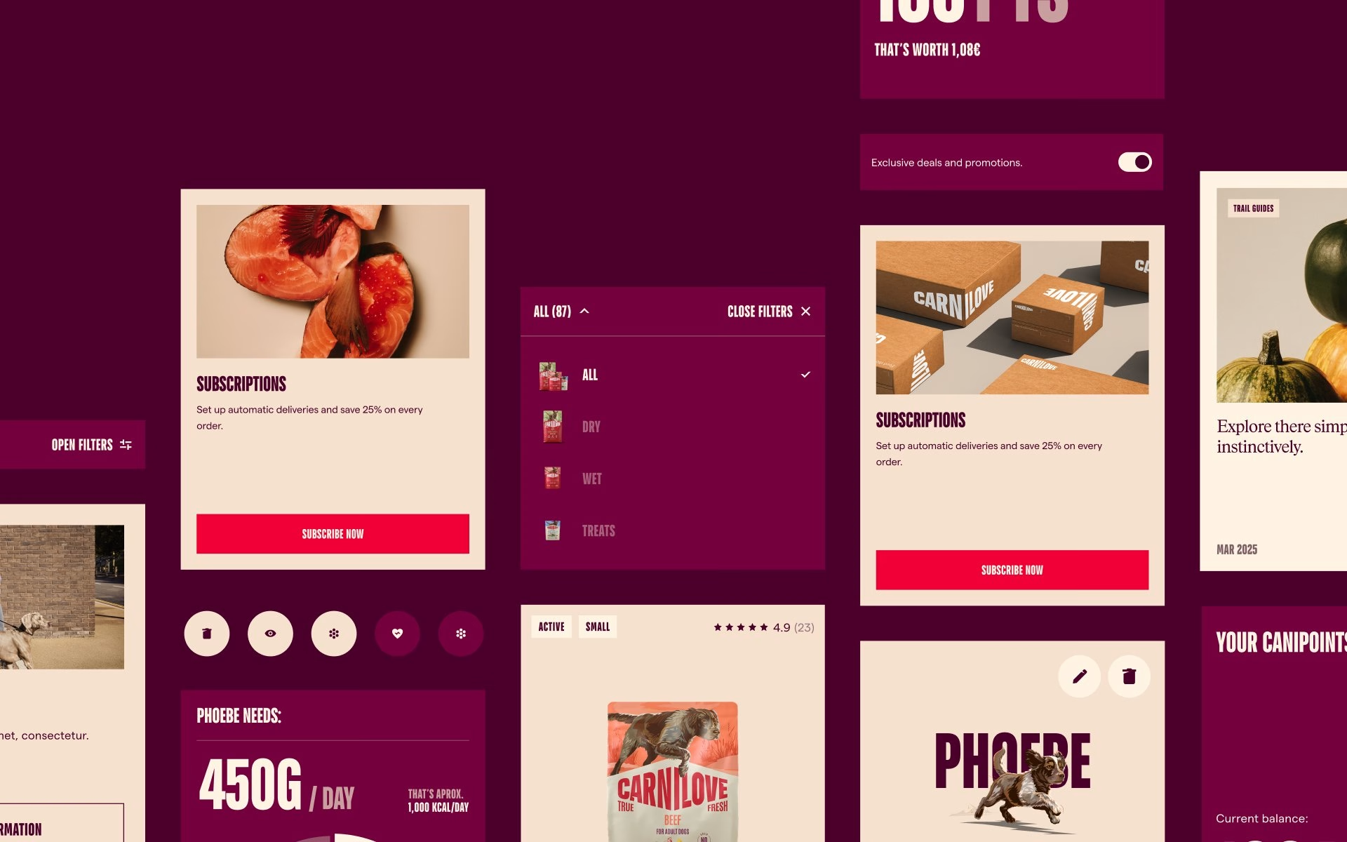
On the digital side, the studio designed the e-commerce flagship on an atomic design system. Product cards, filters and interface components share the brand's colours and angled typography without getting in the way of what the store has to do, which is sell. The result looks unmistakably like Carnilove on desktop and mobile while staying practical for everyday shopping.
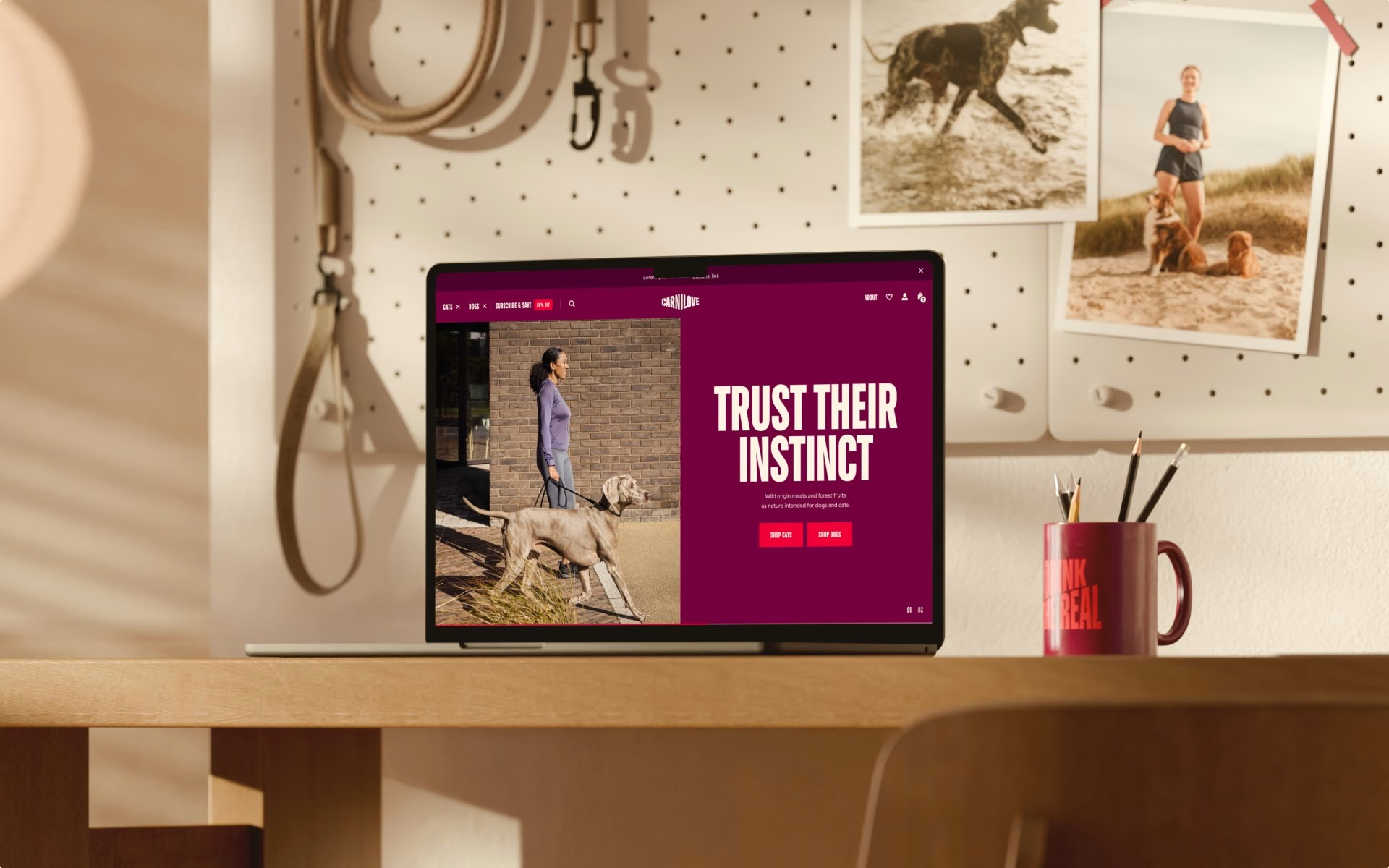
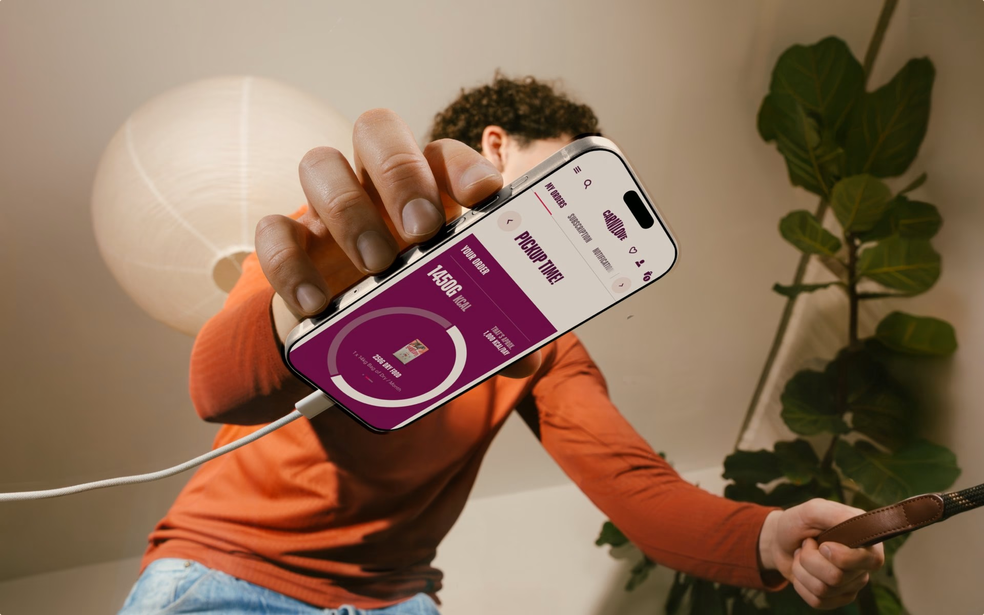
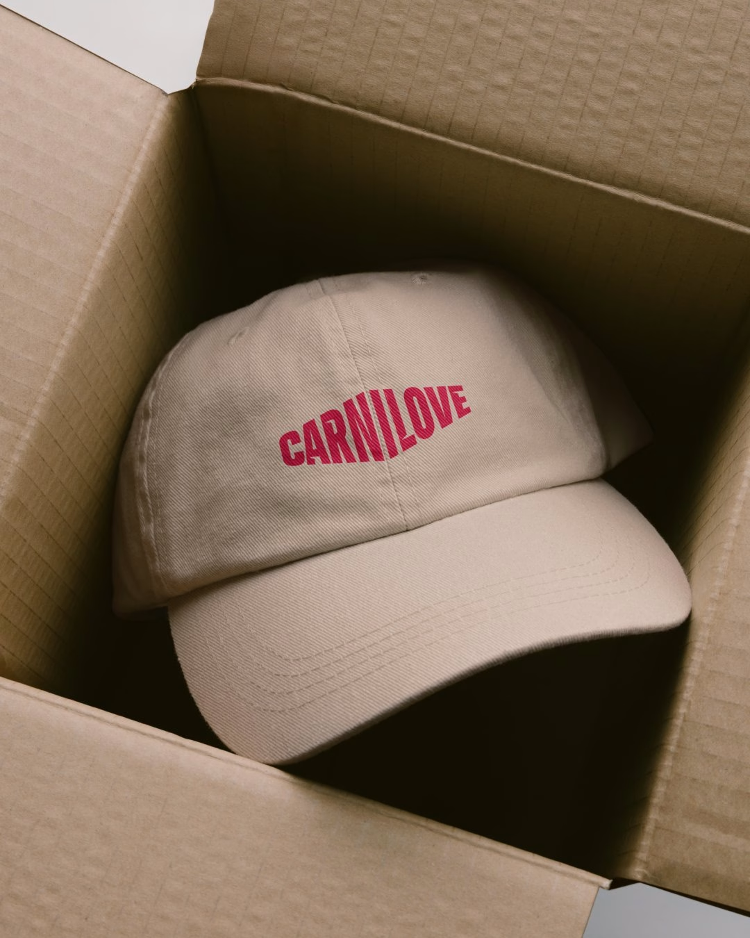
Out in the world, the identity scales up to billboards, murals, hoardings and a full truck livery carrying the "Feed the Real" line. Printed catalogues, packaging and merchandise take the same visual language into stores and partner meetings. The new brand was introduced to more than 100 international partners at a launch event, the moment the system was handed over to the people who now use it every day.
Unlock everything with Mindsparkle Mag Plus.
Get exclusive access to Premium features:
Credits: Ashfall Studio
Brand System, Motion & Digital: Ashfall Studio
Core Brand Identity: Design Bridge
Design Director: Martin Ehrlich
Senior Producer: Alex Predusel
Senior Strategist: Tom Hodboď
Senior Brand Designer: Petr Mazoch
Digital Design Lead: Vitor Cardoso
Technical Lead: Thomas Aufresne
3D: Punctum Images
E-commerce Development: VAFO Digital
More in Brand Identity
Includes freebie bundle, unseen BTS insights and more.