Plus
Plus

 Menu
Menu


Jean-Michel Mercier
September 25, 2026
Mindsparkle Mag


Berto opened in May 2026 on a corner in Villeray, Montreal, as the osteria the neighbourhood had been missing. It comes from chef Riccardo Bertolino, formerly of Maison Boulud, and sommelier Isabel Bordeleau, and it takes the Italian osteria seriously enough to keep a batteria of six balsamic casks from Modena at the centre of the room. The identity had to carry that conviction without dressing the place up in costume.
Jean-Michel Mercier designed the brand identity as a freelance project, working alongside Mise à jour on the interior architecture. He drew on the familiar codes of the osteria — conviviality, simplicity, the pleasure of eating well — and reinterpreted them in a contemporary register. The result is warm rather than nostalgic, and it runs on three colours: deep oxblood, soft cream and a flat cobalt blue.


The line that anchors everything is a motto rather than a tagline: il piacere di mangiare bene, set small and centred on a field of oxblood. Around it sits a cursive wordmark that looks written rather than drawn, with a long entry stroke and a tail that runs out past the final letter. Alexandre Saumier refined the logo, and the care shows in how evenly the script holds together at the small sizes it has to survive.
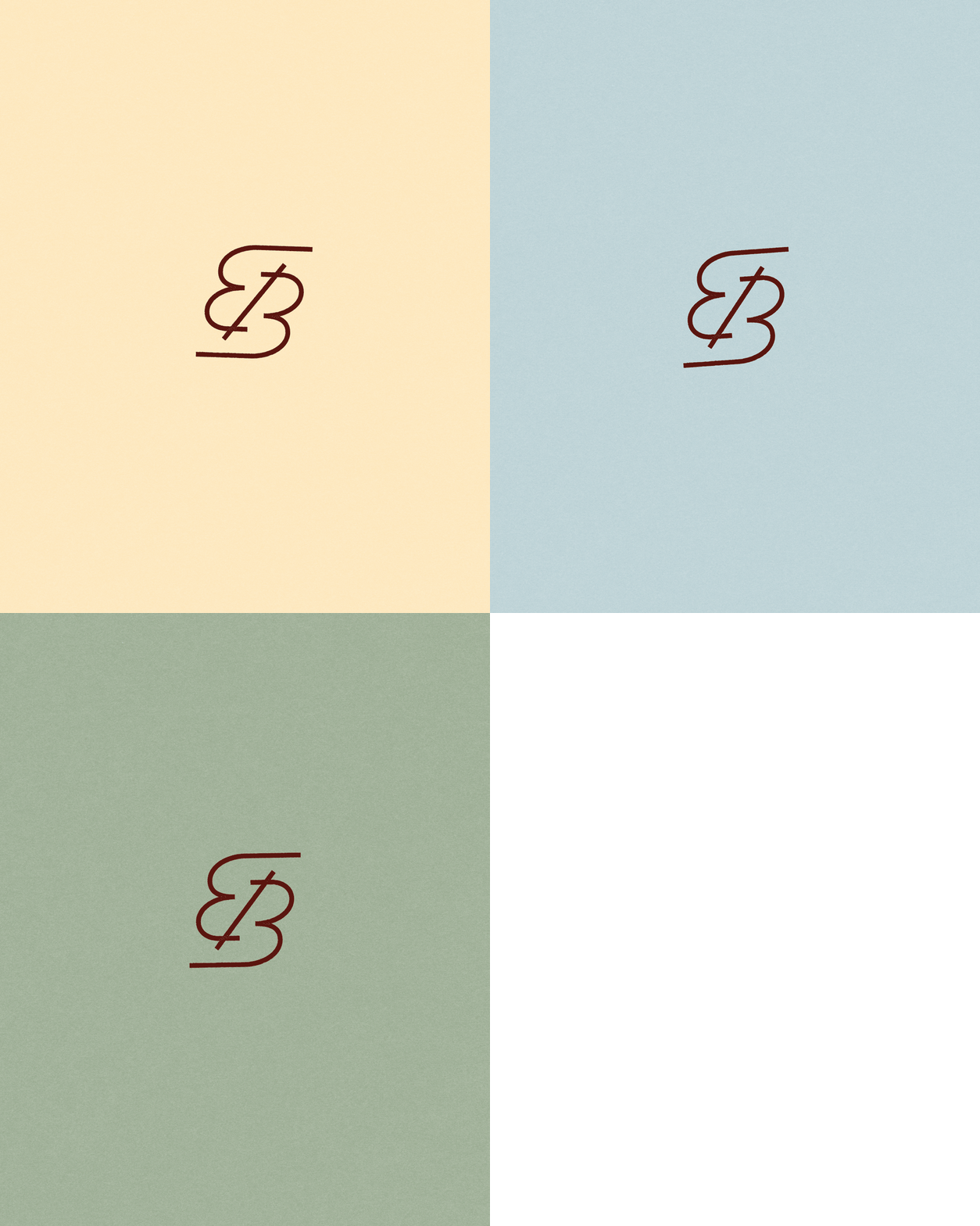
The wordmark folds down into an EB monogram where the E and the B share a single continuous stroke. Mercier shows the logotype in three weights of resolution on cream, which reads like a page from the working file rather than a finished lockup. The monogram also animates, unspooling and resolving in a way that suits a mark built from one line.


Print is where the palette does the heavy lifting. Menu cards sit on a mirrored counter in pale grey with the script in blue, while the wine list is a solid oxblood board with the name blocked into the surface. The matchbooks are the piece people will pocket: cobalt covers, the script on the front, and a small line inside that reads a presto amici.


Colour is treated as a material decision rather than a swatch. Pantone chips are pinned above a set table so the blues and oxbloods can be judged against terracotta, glass and linen in the room itself. The same logic carries to the coaster, a plain circle that pairs the monogram with the word benvenuto and nothing else.


On the floor the identity is quiet and physical. Servers wear oxblood aprons with the monogram embroidered at the hip, and the same mark is thrown on a glazed ceramic vase in terracotta. Window vinyl spells OSTERIA in oxblood across the glass, and outside, a small hanging sign in the script marks the corner from the far end of the street.


The typographic system stretches when it needs to. PIATTO runs across a pale blue card at poster scale with the dish description dropped into the corner in a few lines of type. Mercier closes the case study with a contact sheet of the content photography by Eliane Cadieux, which is a fair summary of the project: a restaurant identity assembled from ordinary things, handled well.


Credits: Jean-Michel Mercier
Brand Identity & Art Direction: Jean-Michel Mercier
Interior Architecture: Mise à jour
Logo Refinements: Alexandre Saumier
Content Photography: Eliane Cadieux
More in Restaurant Branding
Stay on top of this week's design. Insights, top picks & more.