


Lyon & Lyon
April 29, 2019
Mindsparkle Mag


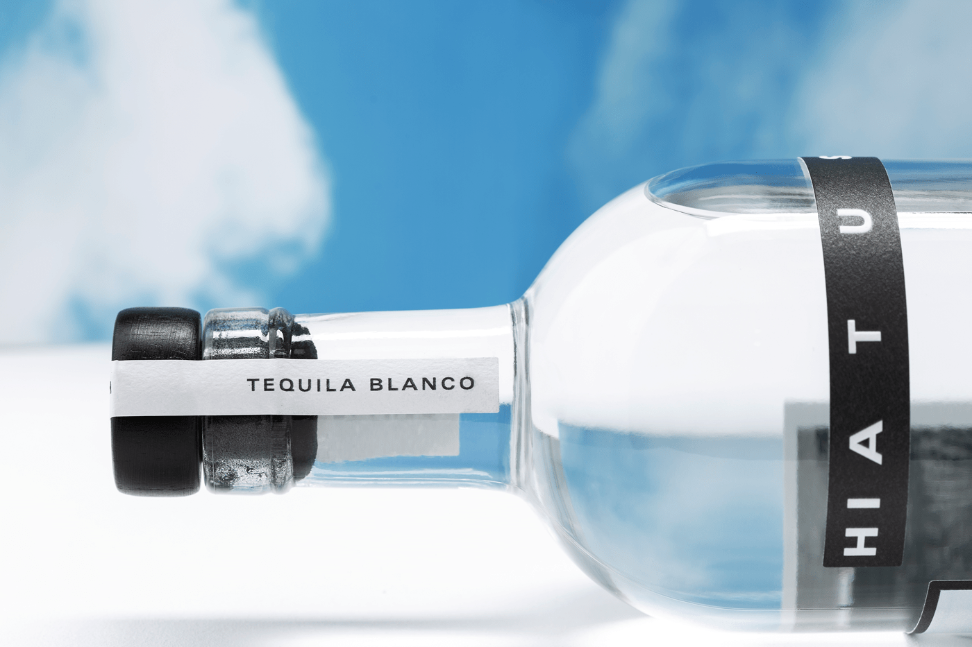
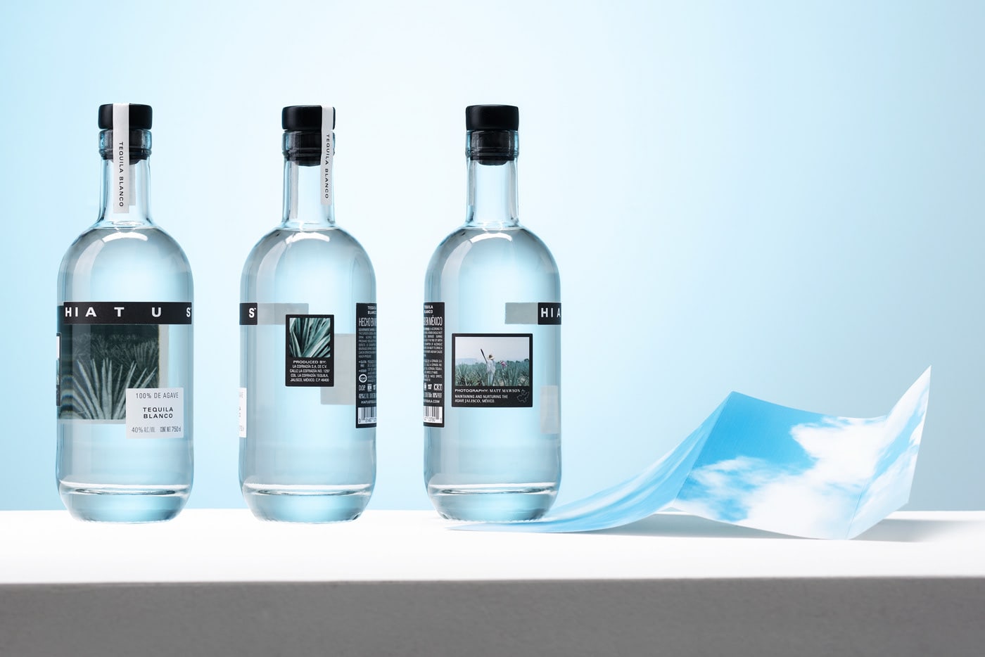
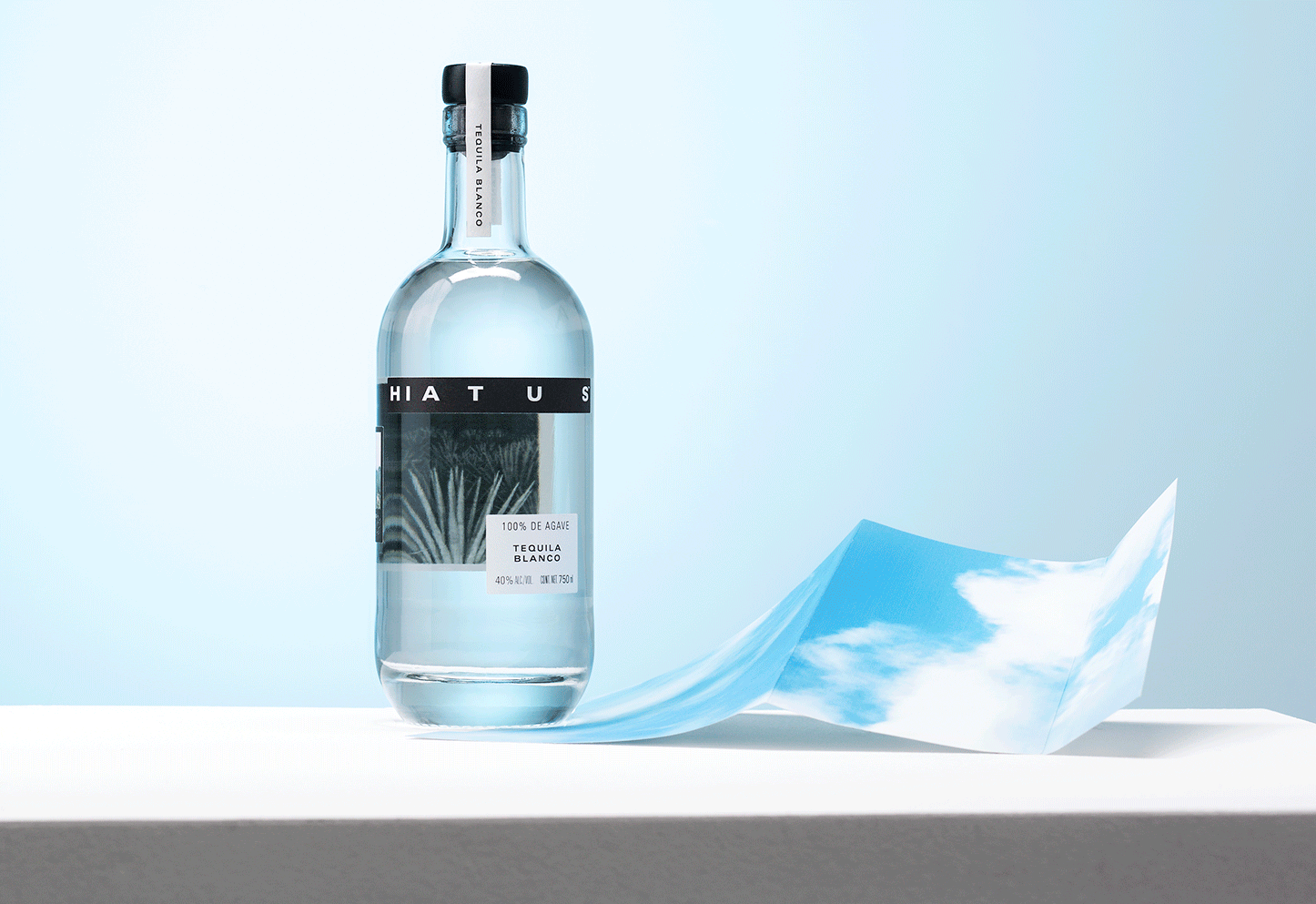
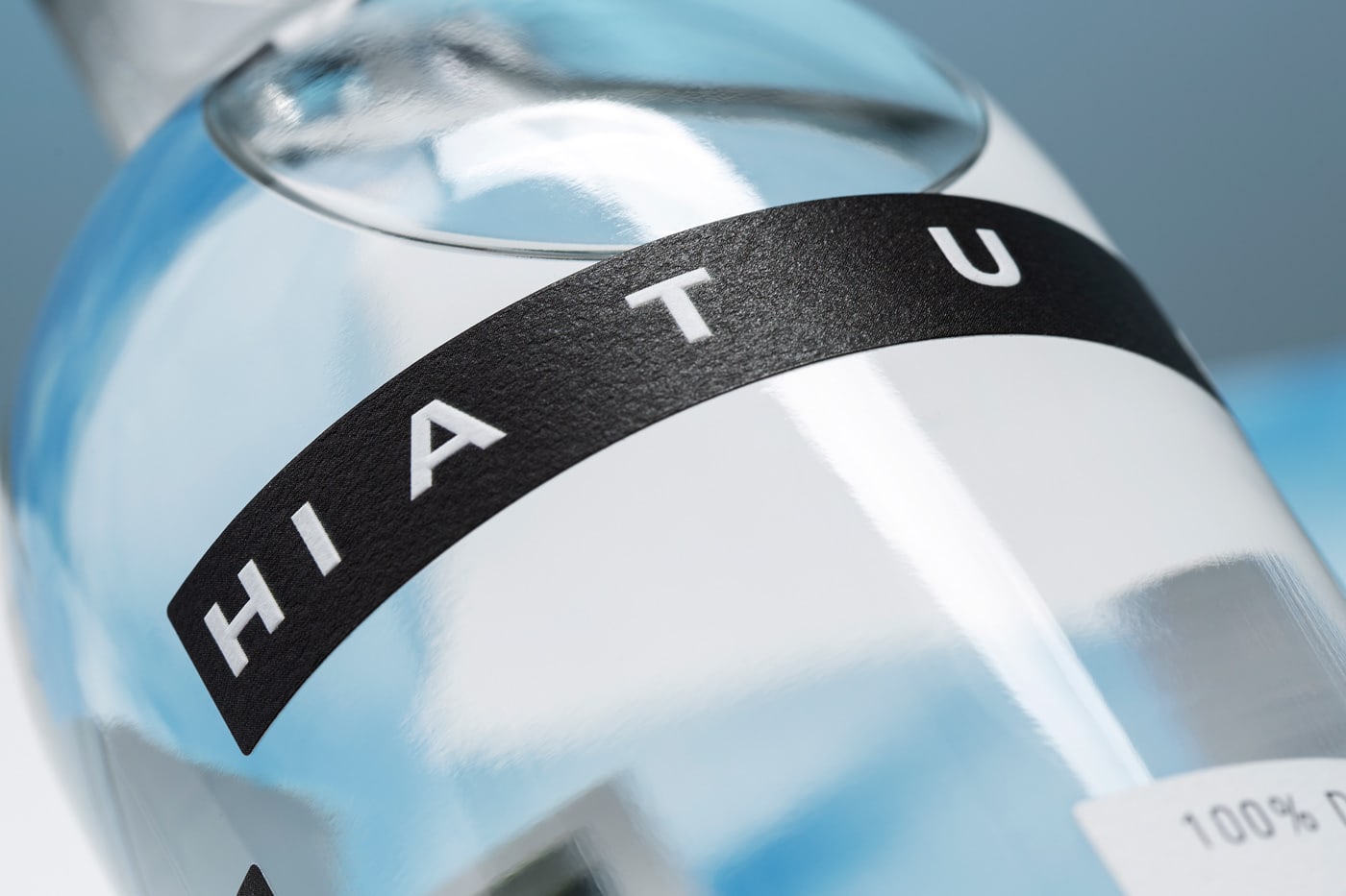
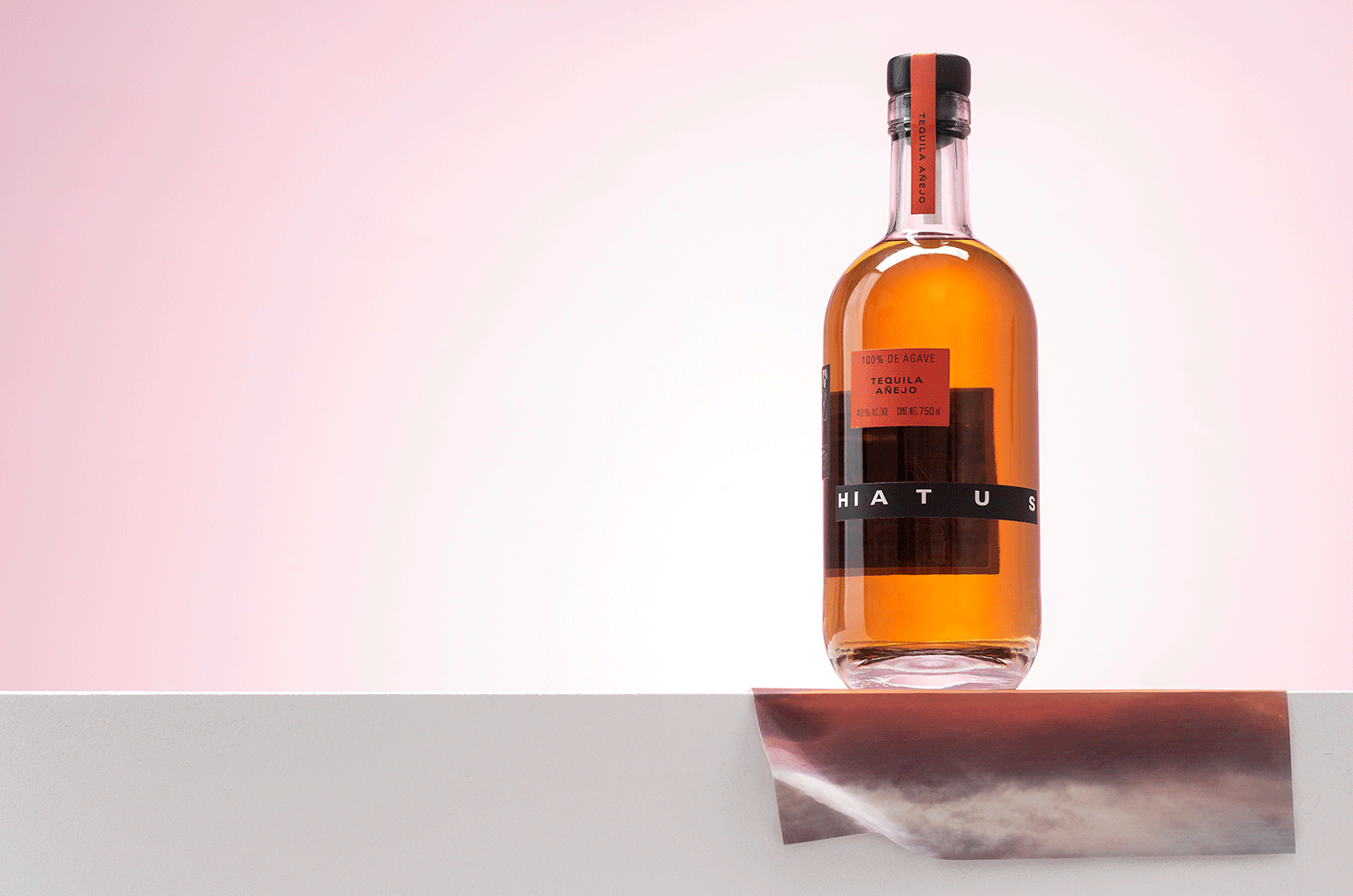
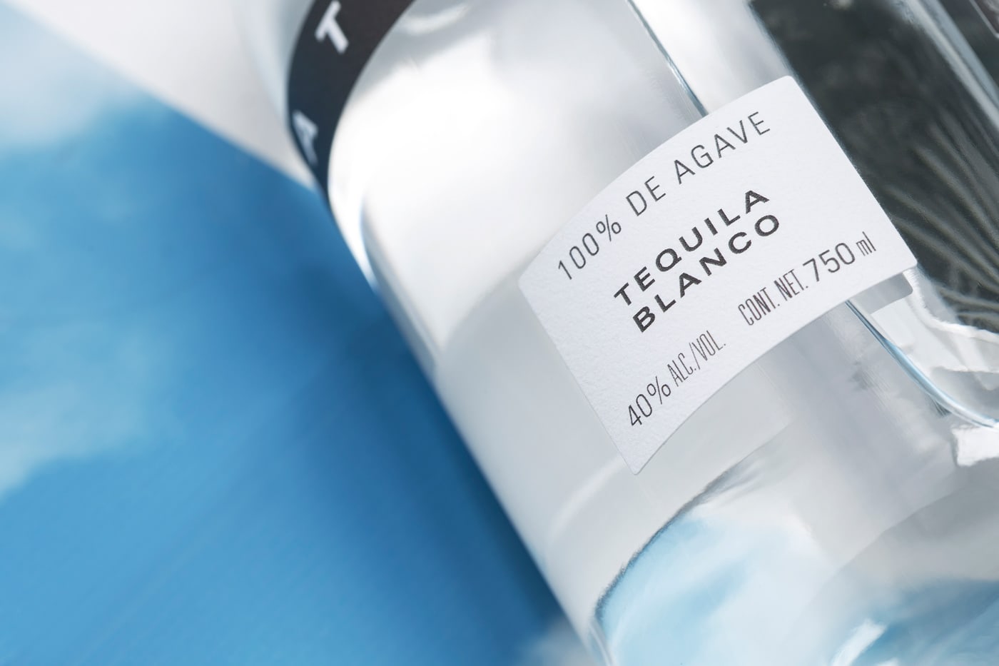
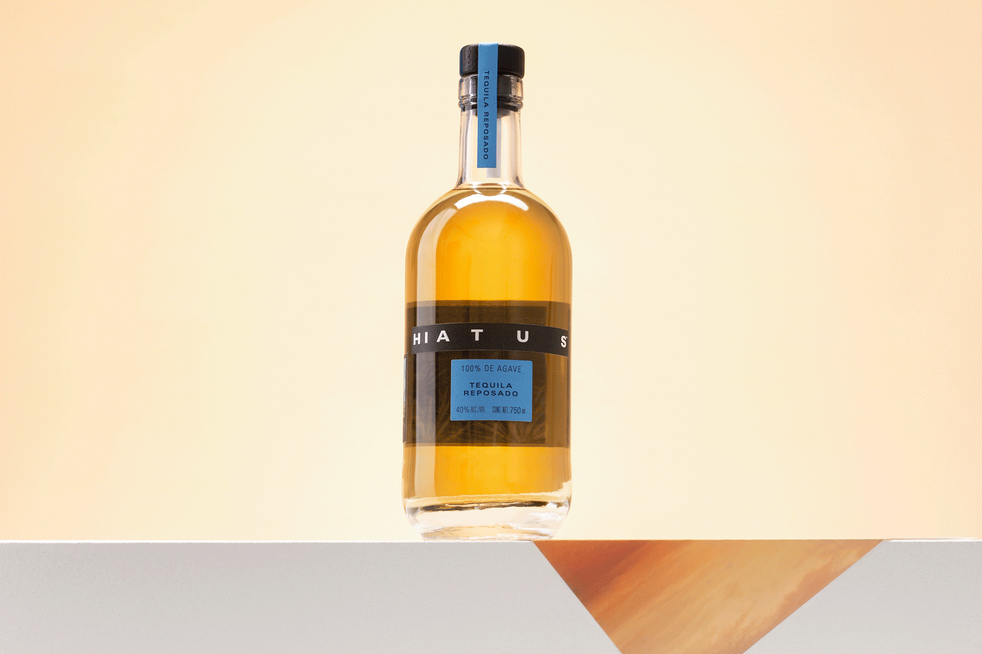
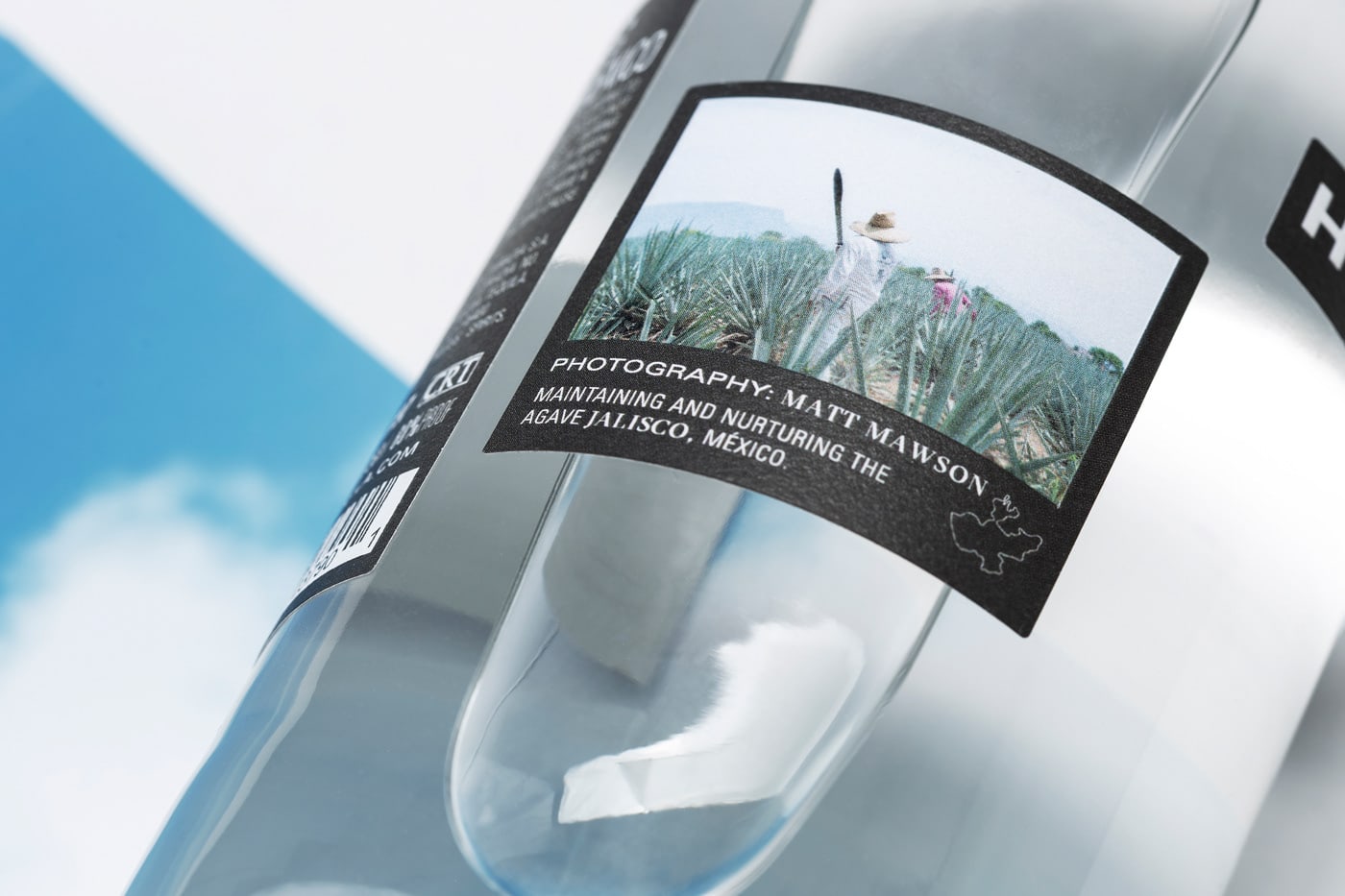
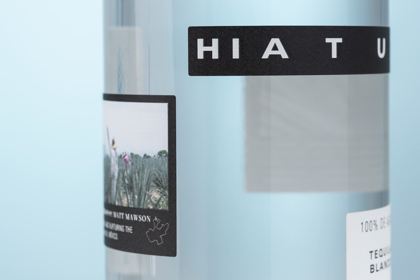
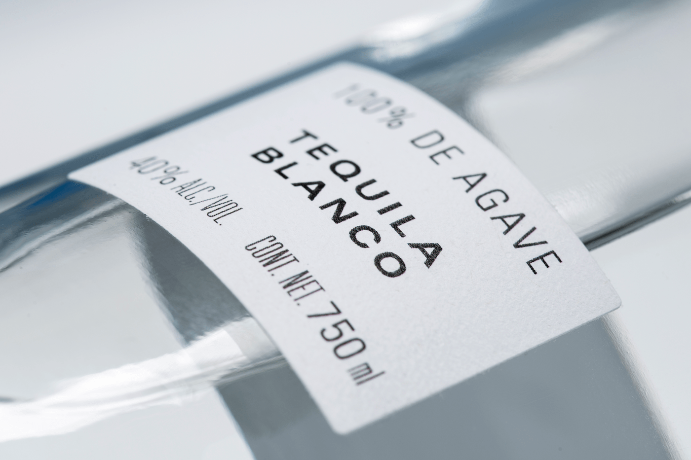
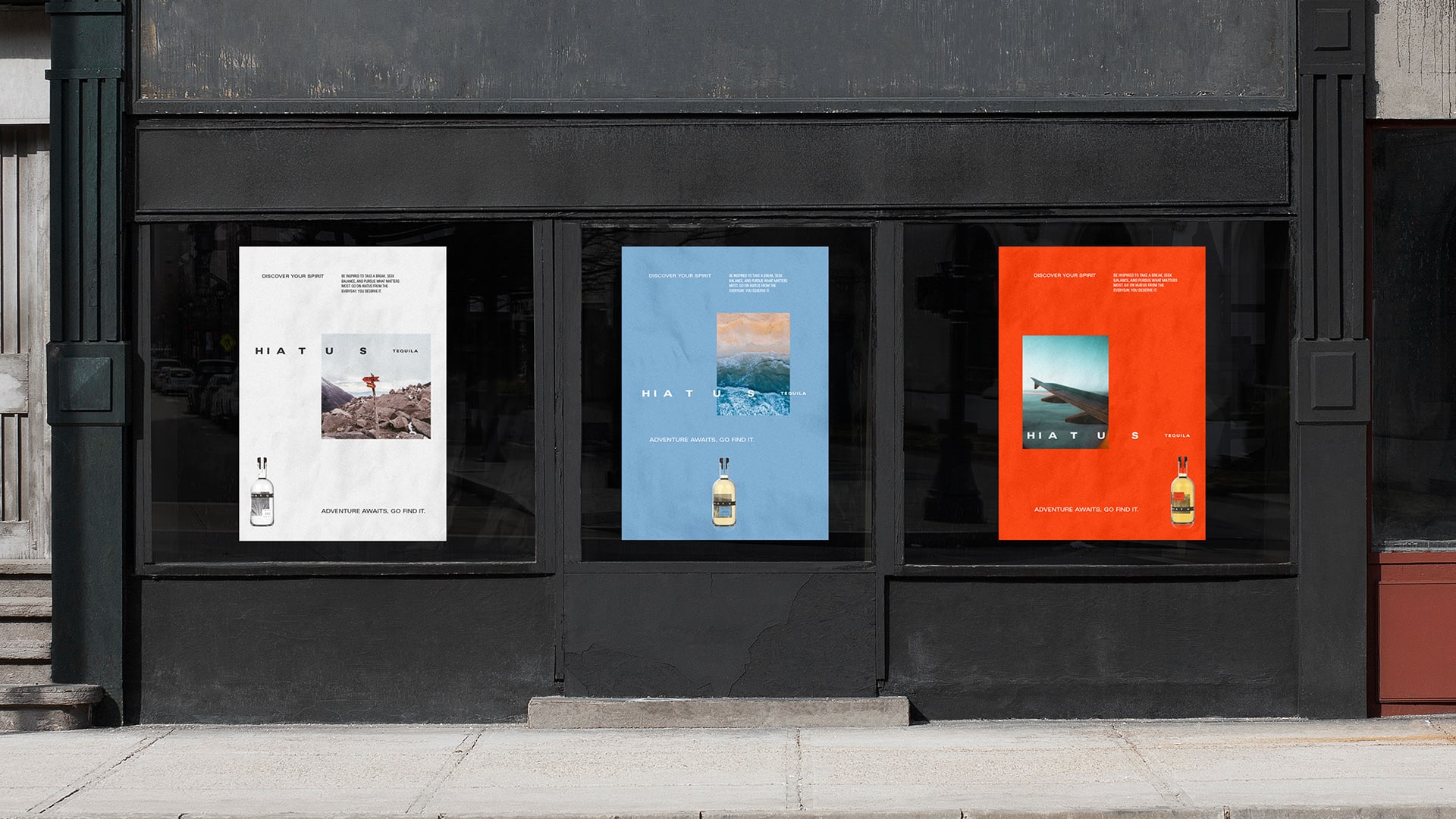
Lyon & Lyon designed the branding and packaging for Hiatus Tequila. The concept is built around a Hiatus and the word “space”. Space is a key feature throughout the brand and is used to symbolise the idea and essence of taking a break and enjoying the moment. The bottle design became a vessel of discovery. The content is split across 7 labels to take the user on a journey.
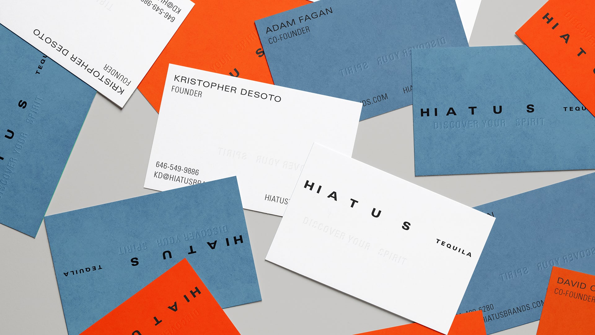
Credits: Lyon & Lyon


